Showing posts sorted by date for query frank reilly. Sort by relevance Show all posts

Saturday, November 27, 2021

Your Questions about Plein-Air Painting in Oil

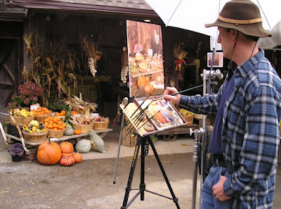
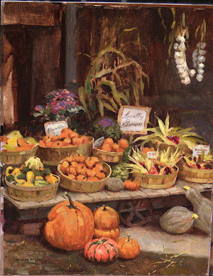
On Instagram, I posted about this plein-air still life in oil, and some of you had questions:


fefecru: "Can I ask you what umbrella is that? Anyone in particular you’ll recommend? 
A: It’s a Jullian umbrella, designed to clamp onto a French easel, but I keep it on a C-stand so that it doesn’t blow over and bring my painting into the wreckage."

agustin.poratti "How'd you build that camera trípod easel?"
A: That’s an Open Box M easel, which may not be made anymore, but there are others like it, and there's a Facebook group about building your own.

bencrastinate "Does painting with an easel help? Ive always painted my canvas flat on my desk. What are the benefits of painting on a vertical surface?"
A: I find it helps my speed and accuracy to have my painting set up perpendicular to my line of sight, and directly adjacent to, the same size as, and in the same light as my subject.


grinningink "Since you used oil here, wasn’t it still wet when you sold it that same day? Was there something to protect it when the customer took it?"
A: Yes, this was for a paint-out. I framed it and it was auctioned same day. I knew the owner, and after it was thoroughly dry I borrowed it back to varnish and photograph it.


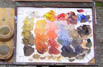
thefrankryan "Is this palette approach inspired by Carolous Duran’s method?"
A: A lot of oil painters have used premixed colors. I was thinking mainly of Frank Reilly, but using an adapted version of his practice.

janice_skivington
 "Please list the names of oil colors on the pallet, looks like three primaries and white." 
It’s the 5-color palette recommended by John Stobart in his book The Pleasures of Painting Outdoors: titanium white, cad yellow light, pyrrole red, burnt sienna, and ultramarine blue. You can paint almost anything with those five colors.

tomkatermurr
 "Would you also premix your colors when you paint with other mediums?"
In theory you could premix with water media, but the pools of color would tend to dry too fast.

Related previous posts: Painting Pumpkins 


Monday, November 23, 2020

Joe Bowler Visits Art School

When Joe Bowler (1928-2016) was just starting out as an illustrator he got a job as an apprentice for the legendary Cooper Studios in New York. 


Illustration by Joe Bowler

But he wanted to do more than just cut mats and wash out brushes for the master illustrators. He hoped to prove himself as a full-fledged artist. 

So he hung out in the bullpen to watch how master illustrators like Coby Whitmore produced their paintings. 

It was a revelation for Bowler to watch the way Coby Whitmore painted. Bowler said that Coby "would paint an illustration from beginning to end in about forty-five minutes, talking the whole time and I'd be watching every stroke, every mixture of paint just watching him work. Every color he put down on his palette, the way he applied the paint. That was my education really."

Illustration by Coby Whitmore

Still in his early twenties, Bowler was getting a practical education from the best painters in the business. 

But he  thought he should enroll in art school to get a better grounding. So he went to the Art Students League, where one of the main instructors was Frank Reilly.

(Frank Reilly conducting a class)

Bowler recalls: "I was going to night school at the Art Students League -- the Frank Reilly class in drawing I thought, well I guess I'll go sign up for his painting class too."

"In the middle of the first day of class, he started to tell everybody about the way to mix colors. He had this incredibly graduated value scale he was running down... and I finally put up my hand and said, 'That's not the way they do it.'"


"Reilly said, 'Oh, really?' and I said, 'Yeah, I'm working at the Cooper Studio.' And he said, 'Oh really? Well I guess you'd better just go and work there some more.' He literally kicked me outta the place."

Illustration by Joe Bowler

"Fifteen, twenty years later - the phone rings and it's Frank Reilly! He says. "Oh Joe, how are you? I'm just finishing up my book and putting the names of some of my more famous students in there...and I see your name is there, but I don't really remember too much about you."

Bowler said, "He asked me if he could use my name in his book and I said sure."
----
The new Illustration Magazine #70 has a feature on Joe Bowler written by Leif Peng, the basis for this anecdote.

Saturday, October 3, 2020

Reilly's Perspective Tip


Illustrator Frank Reilly painted this aerial view of a railroad yard. The perspective lines vanish to points far outside the composition's rectangle. How did he locate those points?


Reilly explains that the client wanted a certain number of freight cars to be visible in the shot, which meant he had to use a high point of view. 

He went to the lumber yard and found strips of wood that stood in for the railroad cars, then photographed them from a stepladder, experimenting with different angles.


He took a photo of the wood strips and put a print of the photo in the middle of a large sheet of paper (above) and traced the perspective lines back to all three vanishing points (VP). From each point "he then swung an arc on the paper near the edge of the photographic print." 


He then photographed this diagram and put it in a projector. He was able to trace onto his larger board the main lines of the separate railroad cars and the big arcs that would lead him to the remote VPs. 


"On the enlarged drawing (thumbtacked to a large drawing table), templates cut of thick cardboard were tacked, their curved edges identical with the arcs of the projected enlargement."

"The T-square, traveling along the curved arcs of the templates, served for all converging lines, many of which in addition to those of the photographic print, were needed for the detailed drawing."


"The lower vanishing point is located in a vertical that passes through the vertical lines of the picture quite near its left edge."

From American Artist Magazine, March 1951.

Books

The Frank Reilly School of Art (about Frank Reilly's teaching)
The Student's Guide to Painting by Jack Faragasso (student of Frank Reilly)

Monday, June 18, 2018

Art Talk Podcast: Studio Ramble to Ron

The Golden Palm Tape Network was a 1980s precursor of podcasting, where a small group of far-flung artists kept in touch by recording circulating ideas and readings via tape cassettes. (Video link) 


This one is addressed to my friend Ron Harris of southern California, a comic artist, collector, and art historian who still comments on this blog.

Sandor Bihari -- Before the Judge
Listening to the tape is a reminder to me of how it was in the 1980s. Discovering obscure information required sleuth work at libraries and used bookstores, plus the cooperation of friends with similar interests. 


The primary members of Golden Palm Tape Network were: 

Here are links to some of the books and artists referenced.

Books (links mostly go to Amazon)
The History of Modern Painting by Richard Müther 

Artists Mentioned (links mostly go to Wikipedia)

Tuesday, December 6, 2016

New Portrait Book from Nathan Fowkes

Many of us have been following Nathan Fowkes on the internet, both for his landscape gouache studies and his portrait studies.

Yesterday I received a copy of his new book "How to Draw Portraits in Charcoal," and it's every bit as beautifully produced as I hoped it would be.

I had the honor of writing the foreword to the book, and here's what I wrote:

This book presents a welcome opportunity to study Nathan's dazzling charcoal portraits in beautiful detail.

Nathan’s portraits overflow with virtuosity. Sweeping, energetic strokes dance across the page, as if animated by a master conjurer. The lighting is so brilliant that it seems to shine brighter than the paper. Shadows are soft and mysterious, concealing more than they reveal.

The student or fellow artist looking for the precise recipe will rejoice, for Nathan generously lists all the tools he uses and all the procedures he follows. There are plenty of step-by-step sequences showing how the drawings develop, and those process images are beautifully shot and printed.


If the book stopped there, it would still be a valuable contribution to a shelf of portrait drawing books. But it goes far beyond style and surface. Nathan delves deeply into the thought and planning that lies behind his drawings.


Beneath the painterly strokes lies a firm armature of line drawing, using an adaptation of the method taught by Frank Reilly (1906-1967), an instructor at the Art Students League. Having that diagrammatic foundation gives the drawings the structure that holds them together. The basic plan is: 1) a simple construction drawing, 2) simple masses of value to describe big forms, and 3) design hard and soft edges.

Nathan explains his principles of construction, lighting, planes, and edges. His insights are like gold: “I’m much more able to render complexity when I look for the simplest shapes first.” A recurring theme is that drawing is not a literal representation, but rather an interpretation of what we see.

Although he is specific about his methods and principles, he is not dogmatic about them. He invites the reader to question. He doesn’t want students to copy his outward style. Instead he encourages his reader to try out his way of drawing, and if they wish, to apply it to their own work.


Nathan shows compassion for his subjects. They are not nameless models, but rather human beings. He is not just documenting someone’s physiognomy, but rather creating probing studies of character. He tells the story of one of his models, Clark, who had a successful career as an actor until several tragic setbacks changed the course of his life. Nathan’s drawings of Clark express both the dignity and resilience of the man.

This book will become a cherished classic of portrait drawing, and I can only hope that we’ll see more books in the future that take a similar look at Nathan’s observational painting and imaginative work.
-------
How to Draw Portraits in Charcoal
Nathan Fowkes website
Nathan's gouache landscapes on Instagram

Tuesday, November 17, 2015

Harvey Dunn at the NRM

An exhibition of the work of Golden Age illustrator Harvey Dunn has opened at the Norman Rockwell Museum. 


Dunn grew up on a South Dakota farm and studied with Howard Pyle. He became an artist reporter in World War I, and then spent the balance of his career as an influential story illustrator and teacher.

The exhibition includes work from throughout his career, as well as paintings by some of his noteworthy students such as Dean Cornwell, Henry C. Pitz, Mead Schaeffer, Harold von Schmidt, Frank Street, Saul Tepper, John Clymer, Lyman Anderson, and James E. Allen. There will also be public talks by experts on Dunn.


They'll be showing the little film I put together using footage by Frank Reilly. (Link to Video)

Dunn said, “We think of art as sort of a flimsy thing,” he said, “but do you realize that the only thing left from ancient times is the art… The Greek statues that are armless and nameless are just as beautiful today as they were the day the unknown sculptor laid down his hammer and chisel and said, ‘Oh, hell, I can’t do it!'”
The exhibition will be up through March 13.
NRM presents: Harvey Dunn and His Students

Friday, November 13, 2015

Harold Speed on Painting: Preface and Intro

Let's resume the GJ Book Club with Harold Speed's 1924 classic The Science and Practice of Oil Painting, which continues where his previous book, The Practice and Science of Drawing left off.

I'll present his points in bold either verbatim or paraphrased, followed by comments of my own.

1. "Painting is drawing (form expression) with the added complication of tone and color."
One of Speed's great contributions as a teacher is to narrow the gulf in students' minds between drawing and painting. As he says, the key is to break down the problem into easy stages and to take one thing at a time. In his previous book, he talked a lot about "mass drawing," by which he meant seeing form in terms of tone. The jump from charcoal to monochromatic oil isn't that great. His book is a good lifeline for those who have been frustrated by all the variables of a full-color painting.

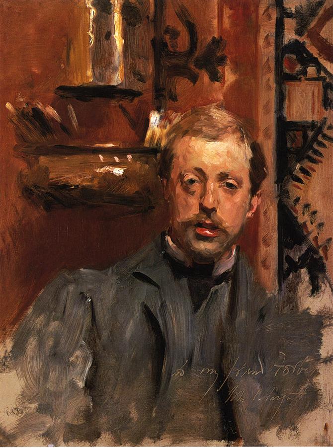
J. S. Sargent, portrait of Charles Stuart Forbes
2. The impressionist movement has required a reformulation of the course of study in art schools because of the new vision that the movement has given us.
From the standpoint of British art schools in the early 20th century, this impressionist way of seeing would have been regarded "Continental" or foreign, and not altogether acceptable. Eventually the British painters adopted the ideas of broken color and direct painting, but there were many in the Royal Academy who resisted it.

3. There are two modes of teaching: hard drilling on technical methods or leaving the student to figure out a technique on his own.
Some of the great teachers have come from both camps. Frank Reilly was more of the former, while Howard Pyle was more of the latter. But, Howard Pyle had the luxury of incoming students who had already been drilled on academic methods. The problem with the first method, Speed suggests, is that the student can get lost in technical issues and lose sight of their unique expressive potential. Later in the introduction Speed suggests that any art school should nurture the natural impulses of each individual student while providing the technical tools.

4. Every work of art starts with a nebulous idea.
This is true for me, and my thumbnail process is so important to work through. The buzzword for this process these days is "iteration." A lot of people seeing a finished painting assume the artist just sits down and renders out an idea fully formed.

5. "The best definition of a genius I have seen, is that he is described as the man most under the influence of these mental uprushes from the subconscious."
I know what he means, but I think the statement could be misleading. So many great geniuses like Michelangelo define genius as "eternal patience," or "the infinite capacity for taking pains" or "90% perspiration." Those uprushes from the subconscious only arrive, in my experience, in the context of steadfast effort. Patience, steadfastness, hard work, and an insatiable dissatisfaction. Who else but Sargent would have the intense application to wipe out a portrait again and again after 15-20 false starts.

6. Conscious / unconscious
Speed talks a lot about the relationship between the conscious and the unconscious. I love the idea that we should study consciously and paint intuitively. His preoccupation with the unconscious was very much of his time, as Henry James and other psychologists were building on what Freud had posited about the workings of the creative mind.

More recently, neuroscientists have explained the process by which skills are internalized. Beginners focus consciously on each skill, and then gradually, through practice, the neural pathways migrate into deeper subcortical regions of the brain.

7. Practical / intuitive
In the later part of the introduction, he sets up for the analytical approach that he'll use in his course of study, without neglecting the value of intuition and elusive rhythms that are harder to dissect. He wisely chooses to avoid the mysteries of the origins of creativity and to stick with more practical and rational matters.

At the end of the chapter, he decries the loss of drawing as a commonplace skill practiced by non-artists, perhaps a consequence of mystifying the process and undermining the value of traditional skills.

He ends with a great quote: "It is only those you cannot discourage who are worth encouraging."

I'd love to hear your thoughts in the comments.
-----
In its original edition, the book is called "The Science and Practice of Oil Painting." Unfortunately it's not available in a free edition that I know of, but there's an inexpensive print edition that Dover publishes under a different title "Oil Painting Techniques and Materials," and there's also a Kindle edition.
----
Previously on GJ
Speed's drawing book: Chapter 1: Preface and Introduction

Tuesday, May 19, 2015

Rare Video of Illustrator Arthur William Brown


Here's a rare archival sound film from 1949, showing Golden-Age illustrator Arthur William Brown (1881-1966) as he tells the story of his career and the principles behind his pictures. (Link to YouTube)

He says: "I think I was one of the first to realize the advantages of the camera, whether to get natural attitudes, telling expressions, and quick accidental poses that a model couldn't hold long enough for an artist to get on paper. Today, with a few exceptions, every illustrator uses the camera in some way. We don't copy the photograph. We use it as a guide."

"If I were giving advice, I would say, be sincere in your work. If you admire the work of a great illustrator, learn from him, but don't imitate. You won't last long if you do. And if you really want to be popular, make your girls beautiful. Then you can't miss."

Sorry the quality isn't any better. I added subtitles to make it a little clearer. It has been duplicated a few times, and I'm not sure if the original film even exists.

The footage was shot by Frank Reilly, part of his "Artists at Work" series. According to Reilly himself, the purpose of the film "is to impress upon us the accomplishments of those among us now and to perpetuate their memory for the inspiration of those who are to follow."

If you like this, you might also like the ones on Dean Cornwell and Harvey Dunn
-------
Wikipedia on Arthur William Brown

Thursday, April 9, 2015

Cornwell's Gangsters

Dean Cornwell, Saturday Evening Post, 1947, "Night Boat from Havana" 21x58 in. 
At their upcoming May 2 sale of American Art, Heritage Auctions is offering an illustration by Dean Cornwell (1892-1960). 


A car's headlights shine on a group of captured Cuban gangsters at the waterfront. Cornwell "saved $50 in models' fees" by having a group of his illustrator friends—some of the top talent in the business—pose for him as the smugglers.


The models include: Frank Reilly, Arthur William Brown, Gilbert Bundy, Harry Beckhoff, and John Gannam. Cornwell took a photo as a convenience, though in his earlier days he would have worked from life. Cornwell said, "Life models are soft these days and don't like to hold a pose long." Plus, they had deadlines.
-----
Quotes and photo from the book Illustrating for the Saturday Evening Post

Tuesday, September 2, 2014

Prismatic Palette


Frank Mason (1921-2009) was a painter and teacher at the Art Students League who used a shelf-like palette arrangement for his oil paints called "The Prismatic Palette." One of Mason's students, Keith Gunderson, explained it to me this way:


Prismatic Palette by Leslie Watkins 

"The value scale was the essence of the shelf arrangements, with emphasis on “Orange Value” as the unifying tone of the lights. The shelves were arrayed with a string of greens made from “Parent Green”; premixed value strings of Blue, Violet, and Grey to calibrate atmospheric perspective; a shelf for pre-mixed tints for the sky; and a “Control String” of pure colors squeezed from the tube, arranged by value from light to dark."

"Modulating a color with it’s complement was often substituted by mixing grey or brown into that color... perhaps an influence of Frank’s teacher [Frank Vincent] Dumond (1865-1951) and Dumond’s teacher, [Jules Joseph] Lefebvre (1836–1911)."

I have also heard "parent green" referred to as "vegetable green," the color of transmitted light through backlit young leaves.


Landscape by Frank Vincent Dumond 

Here are a couple of paintings by League instructor and link to the French tradition, Frank Vincent Dumond, showing his very sensitive approach to color.


Dumond, Christ and the Fishermen, 1891 

Leslie Watkins, another Mason student, describes the prismatic palette this way:


From Pinterest via Outdoor Painter

"It clarifies several strings of colors into even steps, with the lightest or highest values descending to the lowest or darkest tones."

"The steps are based on pure colors from cadmium lemon yellow to alizarin crimson. The different strings of colors consist of grays, violets, blues and greens."

Another Art Students League teacher (and another Frank), Frank Reilly (1906-1965), also taught a value-based system of premixing palette colors, but it was different from Mason's. Reilly's lineage connects him to Gérôme, Delaroche and Boulanger.

Both systems are descendants of a common practice among painters before the 20th century to premix colors in sequences of stepped values, analogous to the keys and manuals of a pipe organ.

I'm obviously no expert on the League instructors' systems, so I welcome further insights and discussion in the comments.

Previously on GJ Premixing Color
More on the Prismatic Palette by Leslie Watkins at the Art Times Journal
-----
Edit: After reading the post and the comments, Mason student Keith Gunderson adds this:
"Thanks for an excellent post on the Mason prismatic palette."

"I might add though that although most artists that studied with Frank had these shelf boxes at the ready when they painted both plein-air and in the studio, this palette functioned more as a landscape palette, especially with a great gob of “orange value” violet as a harmony- orange value being the lowest form of light. This violet was often brushed over a dried venetian red ground and would infiltrate all the subsequent colors that were applied on top. Unfortunately this would sometime result in an overly chalky appearance in the coloration."

"The palette would be organized along a string of nine values (sometimes more)—the four upper values representing values in light, Yellow Ochre value at value 5 in the middle of the string or “the turning plane,” and the lowest four values representing shadow values. In this case, Cad Orange was the lowest value of light and Cad Red was the lightest value of shadow."

"Often times artists would arrange their color strings on the shelves to mimic the progression of horizontal landscape bands, for example the control string would occupy the lowest shelf with the grey above this shelf, violet above this, blue above this, and finally the light pinks occupying the top shelf (or shelves)."

"Greens would be modulated by inserting a bit of the blue, violet or grey dollop of paint (or a combination of the three) from the value string that was the equivalent value in the vertical position above or beneath that green value on the string. As I said before, this meant that there was an abundance of white being mixed into the paint, since white was mixed into the violet, ivory black, and ultramarine blue base from which these strings were mixed."

"Parent or “vegetable “green pure ( Cadmium Yellow Lemon with a touch of Phthalo green at the value of Cad yellow medium) was scaled up two values with White and then scaled down to Ochre Value through the addition of Cobalt Blue and finally scaled down to the darkest values with the mixture of an Ultramarine Blue-Alizarin violet. Modulating these already-mixed greens with the blue, grey, and violet tint mixtures was an issue as all this modulation tended to muddy the greens."

"Often, F.V. Dumond and Mason, in an effort to keep the green’s chroma intact would use the green string unmodulated which sometimes resulted in “garish greens”. Personally, I was always amazed at how Dumond’s earlier paintings done in Paris where more subdued when compared to the “electric greens” of his more Old Lyme influence period paintings."

"Finally, the notion that greens could be modulated with their complements (reds) was never really broached, since this system sort of replaced a more truly prismatic approach as evidenced in the teaching of Gruppe and Hawthorne."

"Well, I could go on and on but I think you get the gist of all this. Having studied with Frank for many years, I was able to glean much from this approach to color, although I find it now to be limited in certain respects. Frank’s teaching was very intuitive and sometimes I think he himself was always trying new theories . I think that ultimately this approach was devised, whether in the studios of Paris or in Old Lyme, as a way to think about color and that it was less about matching the correct color and more about the emotional equivalence that color evokes in the mind of the viewer."
-----
Thanks, Keith, for sharing all that valuable information. Check out Keith's Blog, "Classic Realism."

Saturday, July 5, 2014

Plane Heads


Art teachers have proposed various schemes for simplifying the head into an arrangement of flat planes. Here are two plane breakdowns by Andrew Loomis, author of Figure Drawing for All It's Worth and Drawing the Head and Hands. 
The one on the left is a simple breakdown, with front, side, and bottom planes. The one on the right subdivides the planes further. To be precise, some of these "planes" aren't perfect planes in the geometric sense, such as the curving planes on the top of the cranium.

Fred Fixler, a student of famed Art Students League instructor Frank Reilly, came up with a slightly different plane breakdown for an idealized male head. There are some rounded forms too. The cranium is a ball with the sides sliced off. 

Sculpting the plane head brings the plane analysis into the realm of reality. This one is by painter and teacher John Asaro, who has a website called "Planes of the Head." He has taught head painting using his plane head. 

Many academic instructors have used plane heads as models before going to the live human, because it's much easier to accurately judge the values and color notes of each plane, compared to the infinitely variegated tones and curving forms of a real face. 

Drawing and painting from plane heads is a central part of Chinese and Russian academic practice, and various companies have resurrected some of these art school models, such as this 21-Inch plaster head.

This mini plaster head is very different from a European or American standard head, and the planes are broken down into a mosaic of small forms. But the ear is treated as a single plane.


People will debate the merits of these commercially available heads, but I've never been completely satisfied with any of them. I think it's a great exercise for any student to come up with their own analysis, and that's what I did when I was in art school. Before I knew about Sculpey, I made this the hard way, sculpting a plastilina original, and then making a two-piece mold and casting it in plaster. Mine was inspired mainly by Loomis and George Bridgman.

I have set up my little plane head and painted him in colored light.

Once a student has had practice drawing and painting from idealized plane heads, and even sculpting their own breakdowns, then I think the next best step is to look at real human models and break the planes down in a unique way for that individual model. 


This was the method taught in a seminar I took from Art Center instructor Paul Souza, and here's an exercise I did in that class, scumbling white oil paint over chip board sealed with shellac.


In truth, there is no single ideal plane head, and even an individual model's face can be analyzed in various ways.