 Frank Mason
(1921-2009) was a painter and teacher at the
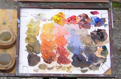
Art Students League who used a shelf-like palette arrangement for his oil paints called "The Prismatic Palette." One of Mason's students,
Keith Gunderson, explained it to me this way:

Prismatic Palette by Leslie Watkins
"The value scale was the essence of the shelf arrangements, with emphasis on “Orange Value” as the unifying tone of the lights. The shelves were arrayed with a string of greens made from “Parent Green”; premixed value strings of Blue, Violet, and Grey to calibrate atmospheric perspective; a shelf for pre-mixed tints for the sky; and a “Control String” of pure colors squeezed from the tube, arranged by value from light to dark."
"Modulating a color with it’s complement was often substituted by mixing grey or brown into that color... perhaps an influence of Frank’s teacher [Frank Vincent]
Dumond (1865-1951) and Dumond’s teacher, [Jules Joseph]
Lefebvre (1836–1911)."
I have also heard "parent green" referred to as "vegetable green," the color of transmitted light through backlit young leaves.

Landscape by Frank Vincent Dumond
Here are a couple of paintings by League instructor and link to the French tradition, Frank Vincent Dumond, showing his very sensitive approach to color.

Dumond, Christ and the Fishermen, 1891
Leslie Watkins, another Mason student, describes the prismatic palette this way:

"It clarifies several strings of colors into even steps, with the lightest or highest values descending to the lowest or darkest tones."
"The steps are based on pure colors from cadmium lemon yellow to alizarin crimson. The different strings of colors consist of grays, violets, blues and greens."
Another Art Students League teacher (and another Frank),
Frank Reilly (1906-1965), also taught a value-based system of premixing palette colors, but it was different from Mason's. Reilly's lineage connects him to
Gérôme,
Delaroche and
Boulanger.
Both systems are descendants of a common practice among painters before the 20th century to premix colors in sequences of stepped values, analogous to the keys and manuals of a pipe organ.
I'm obviously no expert on the League instructors' systems, so I welcome further insights and discussion in the comments.
Previously on GJ
Premixing ColorMore on the Prismatic Palette by Leslie Watkins at the Art Times Journal-----
Edit: After reading the post and the comments, Mason student Keith Gunderson adds this:
"Thanks for an excellent post on the Mason prismatic palette."
"I might add though that although most artists that studied with Frank had these shelf boxes at the ready when they painted both plein-air and in the studio, this palette functioned more as a landscape palette, especially with a great gob of “orange value” violet as a harmony- orange value being the lowest form of light. This violet was often brushed over a dried venetian red ground and would infiltrate all the subsequent colors that were applied on top. Unfortunately this would sometime result in an overly chalky appearance in the coloration."
"The palette would be organized along a string of nine values (sometimes more)—the four upper values representing values in light, Yellow Ochre value at value 5 in the middle of the string or “the turning plane,” and the lowest four values representing shadow values. In this case, Cad Orange was the lowest value of light and Cad Red was the lightest value of shadow."
"Often times artists would arrange their color strings on the shelves to mimic the progression of horizontal landscape bands, for example the control string would occupy the lowest shelf with the grey above this shelf, violet above this, blue above this, and finally the light pinks occupying the top shelf (or shelves)."
"Greens would be modulated by inserting a bit of the blue, violet or grey dollop of paint (or a combination of the three) from the value string that was the equivalent value in the vertical position above or beneath that green value on the string. As I said before, this meant that there was an abundance of white being mixed into the paint, since white was mixed into the violet, ivory black, and ultramarine blue base from which these strings were mixed."
"Parent or “vegetable “green pure ( Cadmium Yellow Lemon with a touch of Phthalo green at the value of Cad yellow medium) was scaled up two values with White and then scaled down to Ochre Value through the addition of Cobalt Blue and finally scaled down to the darkest values with the mixture of an Ultramarine Blue-Alizarin violet. Modulating these already-mixed greens with the blue, grey, and violet tint mixtures was an issue as all this modulation tended to muddy the greens."
"Often, F.V. Dumond and Mason, in an effort to keep the green’s chroma intact would use the green string unmodulated which sometimes resulted in “garish greens”. Personally, I was always amazed at how Dumond’s earlier paintings done in Paris where more subdued when compared to the “electric greens” of his more Old Lyme influence period paintings."
"Finally, the notion that greens could be modulated with their complements (reds) was never really broached, since this system sort of replaced a more truly prismatic approach as evidenced in the teaching of Gruppe and Hawthorne."
"Well, I could go on and on but I think you get the gist of all this. Having studied with Frank for many years, I was able to glean much from this approach to color, although I find it now to be limited in certain respects. Frank’s teaching was very intuitive and sometimes I think he himself was always trying new theories . I think that ultimately this approach was devised, whether in the studios of Paris or in Old Lyme, as a way to think about color and that it was less about matching the correct color and more about the emotional equivalence that color evokes in the mind of the viewer."
-----
Thanks, Keith, for sharing all that valuable information.
Check out Keith's Blog, "Classic Realism."


 (about Frank Reilly's teaching)




 ," and it's every bit as beautifully produced as I hoped it would be.


 and
 .


 , I made this the hard way, sculpting a
 original, and then making a two-piece mold and casting it in plaster. Mine was inspired mainly by Loomis and
 .


