Thursday, October 9, 2014

Painting a Street Scene in Watercolor

Here's a video that I made while painting a row of shopfronts in Huntington, Indiana. (Direct link to video)


My first step is to first measure out a reasonably accurate perspective drawing in pencil. I cover the surface with a light ghost wash.

Then I place the watercolor tones with a flat brush. I start with the idea of doing a sepia sketch, but decide to bring in a cerulean/light red combination.


As time runs out, I switch to a brown fountain pen to describe the small, fine linear accents.

Since the fountain pen is water soluble, I can't add further watercolor washes without dissolving the lines. The reason for adding the penwork at the end of the process is that I was more interested in using the pen for selective small accents rather than for boundary lines.
-----
Materials:
Homemade sketchbook pochade easel using adjustable torque hinges
Waterman Phileas fountain pen with brown ink

72- Minute Instructional Video: "Watercolor in the Wild"
More info about the HD download at Sellfy (Paypal) or Gumroad (credit cards)

Wednesday, October 8, 2014

Arthur Guptill Renders a Window

In 1935, Arthur Guptill demonstrated a sequential method frequently used by architectural illustrators for painting a window. 

Guptill first draws the subject in pencil, giving careful attention to the perspective. 

He rules the lines of the shutters very evenly. Then he lays down a warm wash in watercolor over the wall and the curtains, and sets up variegated flat colors for the stonework. He washes in the shutters in green.

The dark interior spaces are painted over the mullions, but not the sash. The dull orange color of the interior gives a feeling of depth and transparency.

Next come the shadows cast on the curtains and the shade from the sunlight coming from the upper left. He then adds the darks of the mullions and the outer moldings with a ruling pen.

If you're not familiar with a ruling pen, it's a tool for drawing a line of constant width, usually guided by a ruler that's raised a bit off the surface. It has two sharpened metal tips that taper together. The spacing of the gap between the tips governs the width of the line.

That gap is controlled by an adjustable wheel on the side. Ink or watercolor, applied by an eyedropper (Edit: or a brush), sits in the gap and flows by capillary action.

Guptill then draws mullions with the ruling pen filled with opaque white watercolor, slightly yellowed. The consistency has to be just right. Too wet and it puddles out; too dry and it won't flow at all. When a ruling pen works well, it's a joyful feeling.


Edit: After reading the post, blog reader Glenn Tait got out two of his old Kern ruling pens, ran some tests, and sent the photo, saying: "By rote, after so many years, I filled the pen by loading my brush (using M. Graham watercolors) and pulled it across the open side of the pen to fill it then, after adjusting the tip width, dragged it a bit along my left forefinger to get the flow started. The watercolour works great."
Thanks, Glenn. I'm going to throw one in my sketch kit, too.
-----
Arthur Guptill's classic book about rendering architecture in watercolor is called Color in Sketching and Rendering.
.

Tuesday, October 7, 2014

ImagineFX Article on Composition

The new issue of ImagineFX magazine, coming to newsstands soon, has an article that I wrote about composition. 
It begins by resisting the usual approaches to composition, which typically lay out systems of geometric grids, or talk about controlling the eye, or present a series of design prohibitions. 

In fact, I begin by mythbusting the theories of the golden mean that are often taught in composition classes. 

But wait! If you take away those elegant systems, what's left? I struggled a bit with this because, like my hero Howard Pyle, I'm suspicious of rules on this subject, and I believe composition is best taught on a case-by-case, picture-by-picture basis. 

In the end, I decided to approach the topic from a completely different direction. I thought the best place to start is by identifying the core emotion or idea of the piece. Then I offer some basic aesthetic tools to help get that idea across to the viewer. My topics include:

• You've got to feel something first.
• Do lots of thumbnails.
• Choose the supreme moment.
• Think about the viewpoint and eye level.
• Simplify extraneous details.
• Downplay the secondary areas. 
• Push extremes.
• Eliminate the inessential.
• Add photorealistic focus to the focal point.
• Make the color suit the emotion.
• Create contrasts.
• In a sequential work, vary the compositions.

Monday, October 6, 2014

Barker's Flower Fairies

Cicely Mary Barker, Privet Fairy
The portrayal of fairies often focuses on their supposed malicious or mischievous nature, but fairies in early 20th century British popular culture were more often portrayed as ethereal and innocent nature spirits.

Cicely Mary Barker, Bluebell
Cicely Mary Barker (1895 – 1973) was an English illustrator who produced a series of paintings of fairies combined with flowers, themed to the season. She was influenced by Kate Greenaway and the Pre-Raphaelites to paint nature accurately from observation.

She had a ready supply of child models because her sister conducted a kindergarten in the family home. She would do pencil studies of the kids from life, and then base the finished watercolors on those studies.

Cicely Mary Barker, Honeysuckle Fairy
The flowers were also painted from life, and if she didn't have the right flowers in her garden, she borrowed them from Kew Gardens. She made her own costumes for her models, including wings made from twigs and gauze. Each costume was designed to match features of the flower she was spotlighting.  

Cicely Mary Barker, Celandine
Her paintings were, and still are, commercialized in books, cards, and prints by Blackie and later Warne. One of the best books is The Complete Book of the Flower Fairies, though some of the subjects have been omitted and cropped from the earlier editions. A Treasury of Flower Fairies contains about 60 plates, together with Barker's poems about each flower fairy.
-----
Cicely Mary Barker on Wikipedia

Sunday, October 5, 2014

Dry Touching or Dragging

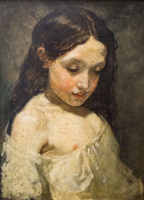
A 19th century painting manual describes a technique called "dry touching" where lighter tones of oils are scumbled over a middle tone base, with a result something like pastels.
Thomas Couture (1815-1879) Oil on canvas, 46 x 34 cm.
The manual says: "Dry-touching or Dragging,—is nothing more than going over certain parts of the picture, when it is dry, with light delicate finishing touches, in order to improve the character, and to relieve or give surface texture to objects requiring it. The tints used for this purpose may, as occasion dictates, be either lighter or darker than the parts to which they are applied; it must be dexterously done with a light free hand; in some places holding the brush loosely between the finger and thumb, so as to leave the colour contained in it, only partially adhering to the former more projecting touches."

Thomas Couture, (1815-1879) "Study of girl's head, oil on canvas
In this Couture sketch, the dry paint is used for modeling all the light tones, not just the finishing touches. 

For contemporary painters, the white paint coming from the tube may not be stiff or dry enough for this technique. If you squeeze out the paint on blotter paper (or newspaper or paper towels) the night before the painting session, the oil will be sucked out of the paint, making it drag nicely.

--J.S. Templeton, Guide to Oil Painting, 1845
Images from Flickr and Pinterest

Saturday, October 4, 2014

American Masters Show at the Salmagundi Club

I'm pleased to announce that four of my landscape paintings will be exhibited and offered for sale at the American Masters show from October 14 - 24 at the Salmagundi Club in New York.

I'll be honored to be sharing the walls with artists like John Stobart, Burt Silverman, Christopher Blossom, Dean Mitchell, and Scott Christensen.

Winter Sunset
oil on canvas mounted to birch panel, 11 x 14 in.
Framed Dimensions: 18 x 21 in.
Publication history:
Color and Light: A Guide for the Realist Painter by James Gurney, Andrews McMeel, 2010, p. 183.
American Artist magazine, Gurney cover feature, November 2006, p. 39.
International Artist magazine #80, August/September 2011
Exhibition history:
“Dinotopia: Art, Science, and Imagination,” Lyman Allyn Art Museum, September 22, 2012 – February 2, 2013 

Creek Above Kaaterskill Falls
oil on linen, 20 x 16 in.
Framed Dimensions: 23 x 27 in.
Publication history:
Color and Light: A Guide for the Realist Painter by James Gurney, Andrews McMeel, 2010, p. 2.
Plein Air magazine, April 2005, p. 54.
American Artist magazine, Gurney cover feature, November 2006, p. 38.

Falls at Devil’s Kitchen
oil on canvas mounted to birch panel, 12 x 16 in.
Framed Dimensions: 21.5 x 25.5 in.
Publication history:
American Artist magazine, Gurney cover feature, November 2006, p. 39.


Kaaterskill Falls
oil on linen, 20 x 16 in.
Framed Dimensions: 23 x 27 in.
Publication history:
Color and Light: A Guide for the Realist Painter by James Gurney, Andrews McMeel, 2010, p. 179.
The Conservationist magazine, December, 2004, p. 19.
American Artist magazine, Gurney cover feature, November 2006, p. 37.
International Artist magazine #79, June/July 2011.
Exhibition history:
“Dinotopia: Art, Science, and Imagination,” Lyman Allyn Art Museum, September 22, 2012 – February 2, 2013 

For art students, this will be a not-to-be-missed exhibition. For collectors, this is a rare chance outside of auctions to acquire my paintings, as I don't sell very many originals, and these are important ones from Color and Light.

Jeanette and I will be attending the opening event on October 17.

Friday, October 3, 2014

Kevin Crawford on the Flute

Here's Irish flutist Kevin Crawford, sketched from life in a pub session. It's just a couple inches square drawn in watercolor and water-soluble colored pencils.


He's a wonderfully dynamic player, and in truth he looks a lot less cadaverous than I made him appear -- sorry Kevin!

Skybax Car

I've always had a fondness for exuberantly painted cars. Here's one in Ohio that features Will Denison from Dinotopia: Journey to Chandara painted on the hood.


In case you couldn't make it out, here's the painting it's based on.

I love the wiggly yellow line against the blue and black stripes and the gradation from red to orange. Nice job!

Thanks, Azonthus.
Previously: Fan Fun, Waterfall City mosaic, and Dinotopia in Lego

Thursday, October 2, 2014

Brain Activity During Eye Movements

French philosopher Henri Bergson once said: "The eye sees only what the mind is prepared to comprehend." Psychologist Martin Rolfs has studied what happens in the brain when the eyes jump from one subject to another in the rapid eye movements called saccades.

Martin Rolfs et al, from Nature
These saccades happen largely unconsciously, about three times each second. Before each saccade, our visual system anticipates where it's going to jump next. A small part of our attention is distributed to possible future targets. 

The act of anticipation helps stabilize the image when it appears after the jump. During the moment of anticipation, the brain is beginning to form "theories" of what it's going to see.


Artists creating optical illusions enjoy experimenting with this dynamic of our perception, playing our fovea (the detailed center of visual attention) against our peripheral retina. 

How does this affect us as picture makers? It's important to know that the viewer is interpreting your image not only with their fovea , but also with their peripheral attention, which responds to broader cues. That's why it's so important to step back, squint, look in the mirror, and try to regard your composition from a distance, so that it will read well peripherally, too.

Science Friday video about Martin Rolfs' work


Wednesday, October 1, 2014

Clement on the Can — New CLEMENTOONS Adventure


In this brand new episode of CLEMENTOONS, Clement makes a sled out of a crushed soda can and embarks on a wild ride. (Direct link to video)

CLEMENTOONS is my stop-motion animated adventure series about a little cartoon person on a perilous journey through the real world to the toyland of Melville. 


The animation is painstakingly shot frame by frame and then compiled into a movie. In this shot, a geared-down Lego motor pulls the sleds at a constant but very slow rate, while a still camera shoots at five second intervals.


There's no green-screen and no digital effects. When Clement goes through the brambles, he's really going through them.

The episodes will be released out of order. Each one begins with an escape and ends with a cliffhanger. 
------
Previous videos:
Clement Meets Miss Bubbles
Clementoons: Behind the Scenes
Song by Frankie Trumbauer "There'll Come a Time," 1927,
Clementoons theme music by The Yanks, "If There Weren't Any Women in the World"