Saturday, July 18, 2015

Experiments with a Limited Palette

You can make a limited palette out of almost any two colors, as long as one is cool and the other is warm.

Catskill Roadhouse
For this painting I used ultramarine blue and cadmium red scarlet, together with white. It's basically red, white and blue, so you can call it the "American palette." 

Here's a video showing how the painting developed (Link to YouTube video):


With two colors that are near complements, it's fun to work over a surface primed with a color from the far side of the spectrum. I'm using blue and red over yellow. The yellow is about 95% covered up, but where it peeks through, it energizes the color scheme like a pinch of spice.


You might try orange + violet + white over a cyan underpainting, or yellow + cyan + white over magenta. You can also introduce black, either as an accent if you want to deepen the darks, or if you want to use it as a color of its own (such as black + orange + white over blue). 


A two-color-plus-white palette has some advantages:
1. It's extremely fast to set it up and get it running. (I was painting while Jeanette was still fooling with her umbrella.)
2. It's good for beginners because it reduces your choices to light or dark and warm or cool.
3. It puts you into realms of color that you would never think of if you had all the color choices available.

I was using casein, but this method would work for any opaque paint: gouache, acrylic, or oil. If you're doing the painting in gouache, the priming should be done with a paint that gives a sealed surface (such as colored gesso, acrylic, or acryla gouache) so that wet layers don't pick it up.
------
Previously on GJ: Limited Palettes (with 53 comments)
-------
Own the 72-minute feature "Gouache in the Wild"
• HD MP4 Download at Gumroad $14.95
• or HD MP4 Download at Sellfy (for Paypal customers) $14.95
• DVD at Purchase at Kunaki.com (Region 1 encoded NTSC video) $24.50

Friday, July 17, 2015

GJ Book Club: Chapter 15: Balance

On the GJ Book Club, we're looking at Chapter 15: "Balance" in Harold Speed's 1917 classic The Practice and Science of Drawing. The following numbered paragraphs cite key points in boldface. If you would like to respond to a specific image or point, please precede your comment by the corresponding number.

The chapter called “Balance” might better have been titled “Opposition” because central to Speed’s philosophy is that the picture should contain a contrast between compositional forces. As he says:

1. In art we have the same play of opposing factors, straight lines and curves, light and dark, warm and cold colour oppose each other.

He points out that these opposing forces generally don’t balance evenly, especially in an exciting subject, where you want one side to be winning.

2. The opposition between straight lines and curves.
The first thing that came to mind was the drawings of the two Disney animation legends Bill Tytla (top) compared to Milt Kahl (bottom), the former made up more of rounded shapes, and the latter with more of a preponderance of straight lines. Both were master animation draftsmen, and if you look closely they both alternated straights and curves.


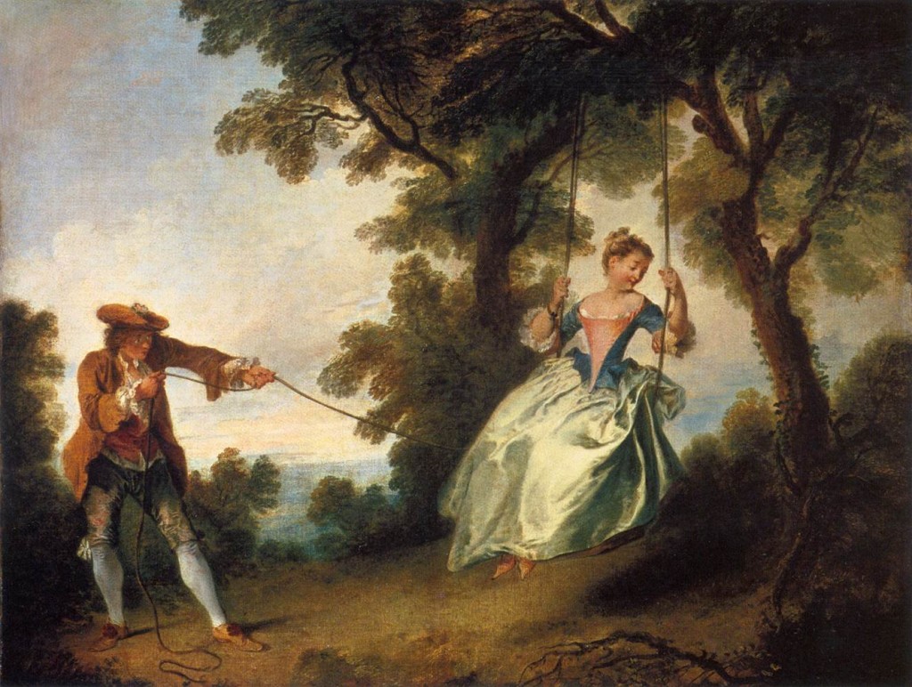
3. The rococo art of the eighteenth century is an instance of the excessive use of curved forms.
Speed’s view is that if you’re going to err on the side of straights or curves, it’s better to err on the side of more severe straight lines. (I kind of like rococo design, though).


3. Opposition between flat and gradated tones.
I thought of Maynard Dixon (top) vs. Thomas Hart Benton (bottom). Of course in the Dixon, the tones aren't all totally flat: there's some broken color and a gradation in the sky, but relative to the Benton, it's fairly flat. Note that the lines are straighter in the Dixon and rounder in the Beonton. 

Although Speed wrote earlier in the book about the importance of gradated tones, he said a painting can get messed up with too much ill-considered gradation and that a way to fix it is to replace the gradated areas with flat tones, kind of equivalent to the “Poster Edges” filter in Photoshop.

4. There should be some balance between the extremes of light and dark used in the tone scheme of the picture.

The Levels histogram in Photoshop shows this metric very clearly. Speed is suggesting that if you want to leave some space above the top end of the histogram, you should leave some at the bottom, too, so that the distance between the lightest lights and white is comparable to the distance from the darkest dark to black.

I had never heard before the old rule he refers to, “that a picture should be two-thirds light and one-third dark.” He’s certainly willing to challenge that idea.

5. Opposition between warm and cool colors. 
Speed says: “the further your colouring goes in the direction of warmth, the further it will be necessary to go in the opposite direction, to right the balance.”

This is similar to what our eyes do with chromatic adaptation. When we walk into a room lit by warm light, the “white balance” system of our eyes adjusts to even out the balance. In designing a color script for a film, we can temporarily upset the balance and plan a sequence that’s very much to the cool side, for example, but it should be followed soon after by a contrasting color scheme to provide relief.


6. Opposition between Interest and Mass.
Speed acknowledges here the psychological weight of certain objects, especially figures, which can often balance a large mass such as a tree or cloud.

-----
Harold Speed (Dover ed.)
The Practice and Science of Drawing is available in various formats:
1. Inexpensive softcover edition from Dover, (by far the majority of you are reading it in this format)
2. Fully illustrated and formatted for Kindle.
3. Free online Archive.org edition.
4. Project Gutenberg version
Articles on Harold Speed in the Studio Magazine The Studio, Volume 15, "The Work of Harold Speed" by A. L. Baldry. (XV. No. 69. — December, 1898.) page 151.
and The Windsor Magazine, Volume 25, "The Art of Mr. Harold Speed" by Austin Chester, page 335. (thanks, अर्जुन)
GJ Book Club on Pinterest (Thanks, Carolyn Kasper)
GJ Facebook page

Overview of the blog series

Announcing the GJ Book Club
Chapter 1: Preface and Introduction
Chapter 2: Drawing
Chapter 3: Vision
Chapter 4: Line Drawing
Chapter 5: Mass Drawing
Chapter 6: Academic and Conventional
Chapter 7: The Study of Drawing
Chapter 8: Line Drawing, Practical
Chapter 9: Mass Drawing
Chapter 10: Rhythm
Chapter 11: Variety of Lines
Chapter 12: Curved Lines
Chapter 13: Variety of Mass
Chapter 14: Unity of Mass
Chapter 15: Balance
Chapter 16: Proportion
Chapter 17: Portrait Drawing
Chapter 18: Visual Memory
Chapter 19: Procedure
Chapter 20: Materials

Thursday, July 16, 2015

Crash Course on Light


Here's a quick overview of the science of light at the subatomic and astronomical level.

Crash Course. (Link to video) Thanks, Robnonstop

Wednesday, July 15, 2015

Six Greedy Loafers


Albert Dorne,, one of the founders of the Famous Artist’s School correspondence course, shared his thumbnail sketches for a magazine illustration called "Six Greedy Loafers."

The finished picture was used to illustrate a story about an old farmer on his deathbed surrounded by his six lazy sons.


1. In his developmental sketches Dorne first thought of the symbol of vultures sitting around the bed, and wanted to make the sons actually look like vultures with long, scrawny necks and beaky noses. His first sketch tried for that feeling of macabre whimsy.

He says: “As I studied the sketch, it no longer appeared very exciting to me. Despite the outstretched necks, the figures didn’t seem to be doing anything in particular.”


2. Then he thought of the sons as pallbearers alongside a coffin, but he worried that the arrangement put too much emphasis on the foreground, and spaced them out too equally.


3. He had a breakthrough as he decided to put the sons in a group leaning over the bed. They make a dark, angular mass that contrasts with the light, horizontal shape of the old man. He added the cat to frame the scene from the left. The bottle, the bedspread, and the folds of the bed are all related to the compositional movement.


4. In the next version, he got rid of the black cat and brought two of the figures to the left. Covering up the old man’s face adds to the feeling of mystery. But Dorne was now worried about the empty space in the middle and the feeling that the base of the picture was dropping off to the right.


5. In the final arrangement, (which like the others was drawn without reference to models or photography) he tightened up the elements, added the chest of drawers in the background and the rug in the foreground.

Done concludes: “For me, this job teaches an important point. And that point is: Choose an appropriate, effective symbol—here it was the vultures—and stay with it. Regardless of how much you rearrange or discard, never lose sight of the basic feeling or symbol you want to communicate.”
-----
Recent book, well illustrated and written: Albert Dorne: Master Illustrator
The sketches above are from the original Famous Artists Course Lessons 1 - 24, which you can still find on Amazon. The link takes you to a set from 1954, by far the best era of the course binders. One day of art school tuition buys the best art education in print you can get.

Tuesday, July 14, 2015

Transparency and Reflections

The blue and white placemats are printed with ads for local businesses.
 
Reflections, gouache (black, white, ultra blue, raw umber), 5x8 inches
The creamer and the juice glass distort the patterns of the placemats in different ways. One reflects them, and the other refracts them. 

To the left of the base of the juice glass, there's an arc of light, a caustic projection of window light.


Here's what I'm looking as I put in my order for the turkey burger deluxe (+ grilled onions, lettuce, tomato and a side of fries). When Ann brings the plates steaming from the kitchen, I lift up the art studio and set it on the napkin holder.
-----

Monday, July 13, 2015

Graphics Before Photoshop


Art Center teacher Sean Adams explains how graphics were accomplished with physical tools before the digital revolution of Photoshop. (link to YouTube video)

For the amount of time he had, it's a pretty good summary, but I wish he had mentioned Lektro-Stik waxers, X-acto swivel knives, ruling pens, Chartpak line tape, Mayline parallel rules and Merganthaler Pica rulers, many of which are still useful today (I still use all of them).
------
Museum of Forgotten Art Supplies
Previously on GurneyJourney: Dead Tech

Gouache Insights from Caran d'Ache


Caran D'ache set of gouache
A lot of you have asked which is my favorite brand of gouache, and I have to answer that I can't say yet. I've been trying out a lot of different brands, such as:
M. Graham, Holbein, Winsor and Newton, Utrecht, Lukas Gouache
Schmincke, Pebeo, Royal Talens, and I've been having fun with all of them.

But my experiments haven't been very systematic, and I often mix several brands on a given painting outing.

One of the brands of gouache I just haven't tried out yet is Caran d'Ache, though I use their water-soluble colored pencils all the time.

Adrian Weber, a fine-art product developer from the Caran D'Ache company in Geneva, wrote me with further answers to the questions I posed to representatives of all the gouache manufacturers. I had inquired what ingredients they used and what qualities they thought were important. (See their answers in my post about Gouache Ingredients)

Mr. Weber started by offering three important "gouache criteria":

"A. Opacity : As you say, our definition of « gouache » (from Italian « guazzo ») means a rather opaque, covering « sauce » with a certain covering power on dark undergrounds."

"B. Water-solubility : According to our definition, gouache needs to be water soluble and stay water soluble. We do not understand how other producers can label colours writing things like : « Acrylic Gouache ». It can’t be both! Either it’s acrylic and permanent after drying (I call it a « liquid plastic » that hardens when water evaporates ; polymerization), or it’s gouache and you can always dissolve layers underneath."

"C. Matt surface : Typical for a good gouache should be it’s matt aspect when dried. It should be close to the pure pigment powder aspect and by this make a distinction to satinated, creamy or oily aspects of other types. This characteristic makes gouache so unique and essential for studying and teaching « colour mixing » based on primaries etc.!"

"To clarify this, I think you need to explain to your readers the terms « Gouache », « Plakatfarbe [in English we'd say "poster paint"] », and « Tempera » that all mean a kind of opaque water colour."

"Even in our own range, we’ve known and still know different types of « gouache ». We only speak for our own gouaches:"

"1. Gouache in tablets/cakes (dry)
To produce our dry gouache tablets, we extrude them with pressure from a highly pigmented, humide paste (unlike most other producer from dry powder similar to medical pills). In order to provide the right consistency and to make it extrudable, this gouache contains kaolin and calcium carbonite, not just as filler, but as « consistency provider ». We use vegetable binders without plastifiers here." Retail info on pans sets here


"2. Gouache extra-fine in small tubes (consistency like tooth paste)
Gouache extra-fine is close to a water colour, as the binder is arabic gum and that the quantity of mineral filler is just minimal." Retail info here for a product marked "Studio" but more expensive than the brand below [Edit: Here's a European link to a product marked "Extra Fine"]--Thanks, Steve


"3. Gouache studio in small tubes (consistency like tooth paste)
Gouache studio contains some kaolin and calcium carbonate, some colours containing white also titanium White PW6 which serves as pigment but also as « filler » at the same time." Retail info on gouache studio sets


"4. Gouache studio in bottles (liquid)
Liquid Gouache in bottles, mainly used by schools contains bigger quantities of these above mentioned mineral fillers, we use natural binders such as corn or potato starch. As regulations have become so strict on toys, this type of gouache nowadays is close to a food product, as there’s just a minimal quantity of conserving agent against spoilage (20 years ago, formaldehyde was used by most producers !)" Retail info on Caran d'Ache Fancolor Tempera

"Last remark : Our philosophy is that a good gouache colour, despite its covering qualities, should still be luminous and powerful. This is the reason why we use a strong concentration and a high quality of pigments that we carefully refine in our mills and grinders in our Genevan factory."

"I often compare a colour with coffee or chocolate : Concentrated black coffee made with the best beans has got power and makes an « explosion of taste» in your mouth and throat (similar effect on paper with highly concentrated watercolour without filler !). Now, some people like to add some milk in their coffee or producers add water to decrease the costs of the expensive coffee powder. That’s all ok, but if you add too much milk (filling material !) or too much water in your coffee, it loses its original power and taste, it just gets a characterless muddy sauce!"

"In other words : You can always break down a highly concentrated colour and lighten or darken it, but you can never « pimp up » a colour with too much filler, white or similar ingredients."

"Wishing you all the best for your great project, with kind regards from Geneva, Adrian"
----
Thanks, Adrian!
Previously on GurneyJourney: Gouache Ingredients: Info from Manufacturers
Visit the Caran d'Ache website at carandache.com
Own the 72-minute feature "Gouache in the Wild"
• HD MP4 Download at Gumroad $14.95
• or HD MP4 Download at Sellfy (for Paypal customers) $14.95
• DVD at Purchase at Kunaki.com (Region 1 encoded NTSC video) $24.50

Sunday, July 12, 2015

International Artist Article on Tyrannosaurs

International Artist Magazine has a big feature on my recent Tyrannosaur illustrations for Scientific American in their upcoming issue #104 (August / September). Some of the sketches are reproduced full size, so you can really see them.

It's a good supplement to the tutorial video "Tyrannosaurs: Behind the Art," about which Iain McCaig (concept artist for Guardians of the Galaxy and Harry Potter) said, "It's a humbling experience to watch any true Master perform. In James Gurney's case, he is so beguiling and unpretentious that it is nothing short of magic. One moment, a blank page, the next--presto! A living, breathing, feathered Tyrannosaur!”

Saturday, July 11, 2015

Bug Puppet Characters


I fell in love with these comic character puppets, so I wanted to paint them to better understand their design and construction. (Direct link to YouTube video) Collector Mel Birnkrant helped me set them up in front of the sketch easel, and he made them dance for us.

Bil Baird Bug Marionettes, casein, 5 x 8 inches
I drew them first in watercolor pencil, then painted them in casein, which is a lot like gouache, a water-based opaque paint.


Jeanette sat next to me and sketched them too, using pen and watercolor. We were both so impressed with the designs: the smiling mouths, bulging eyes, big cartoony hands and the round-toed shoes.


They were built and performed by Bil Baird (1904-1987), the puppeteer best known for his work in the "Lonely Goatherd" sequence of The Sound of Music.

DIG DEEPER
Read about Bil Baird and his puppets (including Miss Bubbles) at Mel Birnkrant's website.
Baird wrote a classic book about the The Art of the Puppet
I'm using casein over watercolor pencils in a watercolor journal


Friday, July 10, 2015

GJ Book Club, Speed, Chapter 14: Unity of Mass

On the GJ Book Club, we're looking at Chapter 14: "Unity of Mass" in Harold Speed's 1917 classic The Practice and Science of Drawing. The following numbered paragraphs cite key points in boldface. If you would like to respond to a specific image or point, please precede your comment by the corresponding number.

This is another core chapter of Speed's book, with invaluable advice on tonal organization.

1. The modifications in the relative tone values of objects seen under different aspects of light and atmosphere are infinite and ever varying.
In other words, the color you mix on your palette for a given object can be greatly altered by the light and atmosphere of a given situation. 


2. The painting of flesh higher in tone than the sky was201 almost universal at many periods of art, and in portraits is still often seen.
This is an artistic convention, which makes some sense compositionally, but it doesn't look naturalistic. That's a Tiepolo.

3. A black glass, by reducing the light, enables you to observe these relationships more accurately.
He's referring to a Lorrain mirror.

4. There should never be pure white or pure black masses in a 
203picture.
This is one of the best reasons to mix your "blacks": you get color character in the darks that way. You can't go as low in value, but you don't want to. How often do pianists hit the lowest note on their keyboard? This power in reserve is also true of chroma. "Keep a shot in your locker," as Pyle and Dunn used to say. 

5. Speed continues: "Also, the highest lights in nature are never without colour, and this will lower the tone; neither are the deepest darks colourless, and this will raise their tone."
Keep in mind that highlights partake of both the color of the light source and the local color of the object. Solar highlights with a little cadmium yellow look brighter than pure white.

6. Painting light to dark vs. dark to light
Interesting discussion here about painting sequence and value keying. What do you all think of his view of this?

7. These tone values are only to be perceived in their true relationship by the eye contemplating a wide field of vision. 
When he says "wide field of vision," I believe he doesn't mean viewing angle, but rather scope or range of awareness.

8. Light and shade and half tone are the great enemies of colour, sullying, as they do, its purity; and to some extent to design also, destroying, as they do, the flatness of the picture.
Sometimes the strongest color effects can happen when the chiaroscuro of form lighting are minimized, and the objects are shown more or less as flat shapes. He says, "Large flat tones give a power and simplicity to a design, and a largeness and breadth of expression that are very valuable, besides showing up every little variety in the values used for your modelling; and thus enabling you to model with the least expenditure of tones."

9. The nearer these tones are in the scale of values, the more reserved and quiet the impression created, and the further apart or greater the contrast, the more dramatic and intense the effect. 

Strong light and shade divides forms into light and shadow shapes, as he points out, but it also introduces cast shadows. All these things can complicate a picture unless you go out of your way to group values by shape welding.

10 Straight lines = flat tones. Curved lines = gradated tones.
I love the equivalency he draws here, which makes perfect sense, especially if you paint a still life of a polygonal vs. a rounded form. The lines and the tones are related.


11. Watteau created a dream country of his own.
Example above. So did Maxfield Parrish and Dulac and Moebius and Syd Mead.


12. Gradation
Pencil diagrams like the ones Speed demonstrates are a valuable way to study old masters. He mentions the magic of Turner and Watteau for their use of large gradations, and I would add the Hudson River School painters, especially Church and Bierstadt.

He also echoes Ruskin when he points out that these gradations should be looked for not only in large areas, but also in the rocks and leaves.

13. The desire of so many artists in these days to cut loose from tradition and start all over again puts a very severe strain upon their intuitive faculties
An interesting point. He also says that the lack of a traditional system "keeps them occupied correcting things that more knowledge of some of the fundamental principles that don't really alter and that are the same in all schools would have saved them. Knowledge in art is like a railway built behind the pioneers who have gone before; it offers a point of departure for those who come after, further on into the unknown country of nature's secrets—a help not lightly to be discarded."

14. But all artifice in art must be concealed, a picture obviously composed is badly composed. 
This is traditionally know by the Latin line: Ars est celare artem: True art is the concealment of artifice.
-----
Harold Speed (Dover ed.)
The Practice and Science of Drawing is available in various formats:
1. Inexpensive softcover edition from Dover, (by far the majority of you are reading it in this format)
2. Fully illustrated and formatted for Kindle.
3. Free online Archive.org edition.
4. Project Gutenberg version
Articles on Harold Speed in the Studio Magazine The Studio, Volume 15, "The Work of Harold Speed" by A. L. Baldry. (XV. No. 69. — December, 1898.) page 151.
and The Windsor Magazine, Volume 25, "The Art of Mr. Harold Speed" by Austin Chester, page 335. (thanks, अर्जुन)
GJ Book Club on Pinterest (Thanks, Carolyn Kasper)
GJ Facebook page

Overview of the blog series

Announcing the GJ Book Club
Chapter 1: Preface and Introduction
Chapter 2: Drawing
Chapter 3: Vision
Chapter 4: Line Drawing
Chapter 5: Mass Drawing
Chapter 6: Academic and Conventional
Chapter 7: The Study of Drawing
Chapter 8: Line Drawing, Practical
Chapter 9: Mass Drawing
Chapter 10: Rhythm
Chapter 11: Variety of Lines
Chapter 12: Curved Lines
Chapter 13: Variety of Mass
Chapter 14: Unity of Mass
Chapter 15: Balance
Chapter 16: Proportion
Chapter 17: Portrait Drawing
Chapter 18: Visual Memory
Chapter 19: Procedure
Chapter 20: Materials