


 On the GJ Book Club, we're looking at Chapter 13: "Variety of Mass" in Harold Speed's 1917 classic The Practice and Science of Drawing. The following numbered paragraphs cite key points in boldface. If you would like to respond to a specific image or point, please precede your comment by the corresponding number.
This chapter brings us to some Speed's best material about painting, with some insights that I haven't seen in other instructional manuals.

1. Variety of shape is one of the most difficult things to invent, and one of the commonest things in nature.
He brings up the excellent point that if you don't regularly study from nature, your work will contain "two or three pet forms repeated." I'm thinking of N.C. Wyeth's whipped-cream clouds, for example (sorry, N.C.) . I think this tendency to see forms in a standardized way can even be a problem for a plein-air painter if they aren't sufficiently patient and selfless to really observe carefully and slowly and vary their approach.
2. Nature does not so readily suggest a scheme of unity, for the simple reason that the first condition of your picture, the four bounding lines, does not exist in nature.
2. Nature does not so readily suggest a scheme of unity, for the simple reason that the first condition of your picture, the four bounding lines, does not exist in nature.
Despite the fact that we must go to nature to appreciate the endless variety of nature, at some point we need to impose design order on it because we're operating within the artificial universe of a rectangular picture.
3. Variety of tone values
Speed defines tone value (light to dark on a gray scale) as a property of light on form, and also as an element of pictorial design. Both of these properties can influence the tone you choose for a passage, and alter it from the actual local color of the object you're painting.
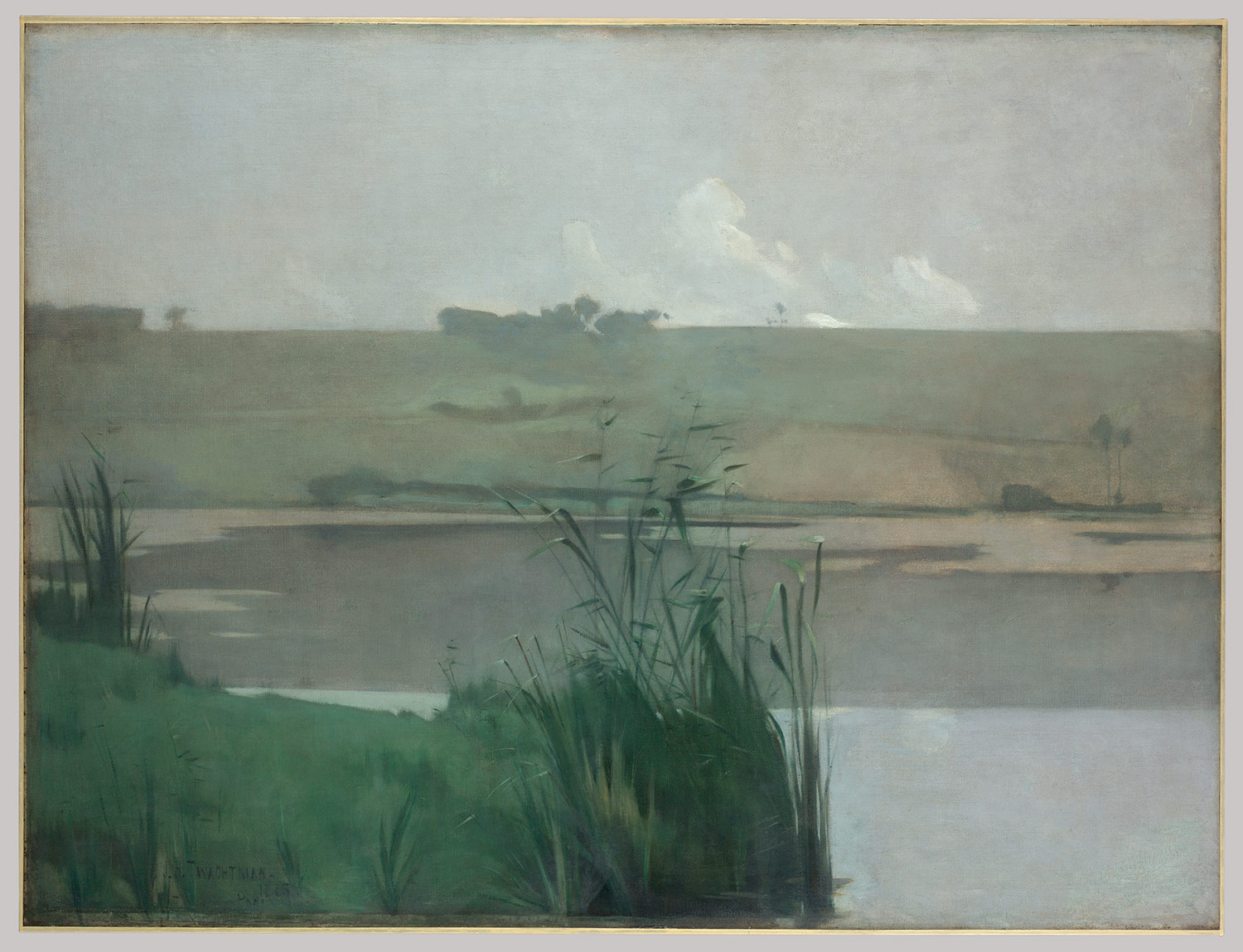 |
| Twachtman at the Metropolitan Museum |
Another way to say it is: "big tones create mood." The Twachtman above has both big tones and simple shapes. Large, simple masses of similar tone are what give a picture poetic impact, but they can be hard to achieve. Speed mentions that mist or fog can help. I would add that backlighting can too, because it automatically reduces complex value patterns to simpler silhouettes.
5. Tone relationships are most sympathetic when the middle values of your scale only are used, that is to say, when the lights are low in tone and the darks high. They are most dramatic and intense when the contrasts are great and the jumps from dark to light sudden.
This is a great truth in keying a picture. The value scale has a lot to do with lighting, as any photographer knows. Fashion or food photographers can control the lighting ratio and the softness of the light using fill lights and diffusers and thereby achieve an image well within the middle range. By contrast, film noir directors use lighting to emphasize dramatic contrasts between light and dark areas.
But unlike photographers, painters have complete control over all the variables of a picture, and we can achieve effects that are almost impossible in photography.
6. Variety in quality and nature is almost too subtle to write about with any prospect of being understood.
C'mon, Harold! It's a bit of a cop out for him to bring up this point and then not really explain it. But I think he's talking about variety of textures within a painting, including the types of brushstrokes (dry vs. wet, large vs. small, thick vs. thin paint, etc.). He argues—and I agree with him—that many of the celebrated Impressionists suffer from an overall sameness of paint texture, which interferes with any sense that you're looking at nature's infinite variety. You just get stuck in the paint instead.
I love his line "Nature is sufficiently vast for beautiful work to be done in separate departments of vision, although one cannot place such work on the same plane with successful pictures of wider scope."
7. Every student should make a chart of the colours he is likely to use.
The purpose of this chart is to see how the paint changes over time. In oil, the chart should have thick blobs of paint on one side thinned with the palette knife to a thin smear. There's a tendency, he says, for oil to rise up through the paint if it can't sink into an absorbent ground, and certain oils can darken. Can one of our paint material experts explain this a bit more?

8. Variety of edges.
He gives the usual advice to vary the edges around a given form—hard, soft, hard, etc.
He then makes the more unusual observation that in some great works: "the most accented edges are reserved for unessential parts." In other words the face is handled with a lot of softness, and the accessory areas around the face, such as the costume, is given more hard-edge handling. He shows the detail from Velazquez's Surrender of Breda, but I think Sargent has many good examples of this, too.
It strikes me that this quality is the opposite of what you would do in focusing a camera on a face with a shallow-focus prime lens, where you'd want sharpness and detail in the eyes and the center of the face, and softer edges everywhere else.
9. A picture that is a catalogue of many little parts separately focussed will not hang together as one visual impression.
Little bits separately focused is a common flaw in beginner's work. The unity of vision that he's setting up as a goal in picture-making is one of the marks of enduring masterpieces, and it requires conscious effort to achieve.
10. What perspective has done for drawing, the impressionist system of painting to one all-embracing focus has done for tone.
We're talking about atmospheric perspective here, which he says is as radical a discovery as the discovery of linear perspective in the Renaissance.
He continues, "Before perspective was introduced, each individual object in a picture was drawn with a separate centre of vision fixed on each object in turn. What perspective did was to insist that all objects in a picture should be drawn in relation to one fixed centre of vision." These days we've absorbed impressionist values so completely that it's hard to appreciate the impact that the revolution in vision brought to painting.

11. Treatment of foliage edges
Speed discusses the challenge of painting convincing foliage silhouettes. He says: "The poplar trees in Millais' "Vale of Rest" are painted in much the same manner as that employed by the Italians, and are exceptional among modern tree paintings, the trees being treated as a pattern of leaves against the sky. Millais has also got a raised quality of paint in his darks very similar to that of Bellini and many early painters."
He continues, "It is interesting to note how all the great painters have begun with a hard manner, with edges of little variety, from which they have gradually developed a looser manner, learning to master the difficulties of design that hard contours insist on your facing, and only when this is thoroughly mastered letting themselves develop freely this play on the edges, this looser handling."
12. Variety of Gradation
There's one more thing to consider when planning how to handle tone—variety of gradation. He concludes: "There you have only the one scale from black to white to work with, only one octave within the limits of which to compose your tone symphonies."
Overview of the blog series
Announcing the GJ Book Club
Chapter 1: Preface and Introduction
Chapter 2: Drawing
Chapter 3: Vision
Chapter 4: Line Drawing
Chapter 5: Mass Drawing
Chapter 6: Academic and Conventional
Chapter 7: The Study of Drawing
Chapter 8: Line Drawing, Practical
Chapter 9: Mass Drawing
Chapter 10: Rhythm
Chapter 11: Variety of Lines
Chapter 12: Curved Lines
Chapter 13: Variety of Mass
Chapter 14: Unity of Mass
Chapter 15: Balance
Chapter 16: Proportion
Chapter 17: Portrait Drawing
Chapter 18: Visual Memory
Chapter 19: Procedure
Chapter 20: Materials
 |
The Practice and Science of Drawing is available in various formats:
1. Inexpensive softcover edition from Dover, (by far the majority of you are reading it in this format)
3. Free online Archive.org edition.
Articles on Harold Speed in the Studio Magazine The Studio, Volume 15, "The Work of Harold Speed" by A. L. Baldry. (XV. No. 69. — December, 1898.) page 151.
and The Windsor Magazine, Volume 25, "The Art of Mr. Harold Speed" by Austin Chester, page 335. (thanks, अर्जुन)
GJ Book Club on Pinterest (Thanks, Carolyn Kasper)
Overview of the blog series
Announcing the GJ Book Club
Chapter 1: Preface and Introduction
Chapter 2: Drawing
Chapter 3: Vision
Chapter 4: Line Drawing
Chapter 5: Mass Drawing
Chapter 6: Academic and Conventional
Chapter 7: The Study of Drawing
Chapter 8: Line Drawing, Practical
Chapter 9: Mass Drawing
Chapter 10: Rhythm
Chapter 11: Variety of Lines
Chapter 12: Curved Lines
Chapter 13: Variety of Mass
Chapter 14: Unity of Mass
Chapter 15: Balance
Chapter 16: Proportion
Chapter 17: Portrait Drawing
Chapter 18: Visual Memory
Chapter 19: Procedure
Chapter 20: Materials
6 comments:
Thank you for the clear breakdown of these passages. I've had his book for the longest and have not read it in depth, only the first few chapters. There is much richness in thinking and knowledge in his writings to discover! Learning how to see is one of, if not the most important element to understand in this visual craft of drawing and painting. You've re-lit my interest in this book!!!
Great analysis, yet again! I'm particularly intrigued by point 8 about the softer handling of the heads. I'm wondering if they paradoxically make us look harder at them, trying to discern the form and satisfy our face recognition neurons. Maybe Francis Bacon was on to something here with his blurry screaming heads?
8. Variety of edges. is a very interesting point, both yours and his. I think both can be true, neither is exclusively right all the time as all fundamental rules of art have their exceptions. I always understood edges as a ratio of hard to soft or soft to hard. We learn hard edges command attention, as a general rule and as you have said, true. Harold Speed demonstrates the opposite can also be true.
The eye will go to the exception. A painting of mostly hard edges with a small area of soft edges our eye see's the soft edges as more important. Paint one of soft edges and throw in just a couple hard edges and see where your eye lands.
Gregory Manchess recently had a good post on edge control over there on Muddy Colors.
http://muddycolors.blogspot.com/2015/04/10-things-about-edges.html
James
Did you find that leading this book club (For which we are all grateful!) helped you artistically?
My Pen Name, well, yes, I'm learning new things from everyone's comments, and the effort of briefly summarizing the main points makes me a closer reader.
Mark, yes, the blurriness is somehow attractive and compelling. Kind of like the famously soft edges of the Mona Lisa's smile.
Aztc, Me too. The best books require repeated readings.
David, I love the idea of the ratio of edges—a picture can't be all soft or all hard.
5. Mr. Gurney. I think I am understanding the 5th point to mean that if you work within the middle range of values, then sharp jumps to light and shadow will be more dramatic (such as in areas where you would want to create focal points/points of interest? This is somewhat related to an idea I have been working hard to master. I am thinking specifically of Alan Lee whose pencil drawings are almost all within the middle range (or lower, even). Part of understanding this concept became clear while reading 'Creative Illustration.' Loomis spoke of working within steps of value and, as long as ones values stay the same number of steps apart, the value structure of a picture should still work (thinking of the light/dark adjustment feature of computers and photocopiers helped me to understand this point more clearly). The point you mention here has me linking the two books and relating the information. Loomis also mentioned that for the sake of ease, stress the lights and darks (not the middle tones) for the clarity and impact. But he is thinking of cover and commercial work almost exclusively (which is fine and indeed what I am interested in). Values are a struggle for me. I am working very hard to correct this in my work. I am not reading this book along with you, but I am studying every post you make for the book club and taking notes in addition to my normal morning routine of studying some technical art information. Thanks for your effort and the time you take to make these posts. It is unbelievably helpful.
Post a Comment