Saturday, January 1, 2011

Bull Encounter

I made this drawing on February 14, 1975 when I was sixteen. Back in those days I used to take a bottle of ink and a set of dip pens around with me in a canvas backpack. I didn’t have any art teachers and no one told me that sketching with dip pens was kind of a dumb idea.


Also, no one told me it’s a dumb idea to sit in a field and sketch bulls. This bull was OK at first, as long as he was surrounded by his cows. But my scratching pens annoyed his harem. One by one, they got up and headed off, leaving just me and the bull. He sat there, staring over at me and looking more and more irritated.

Then he struggled to his feet and started walking toward me.

I dropped my pen set and sidestepped slowly over to the middle of the field. I stood in a patch of high grass. For every step I took, the bull followed me.

“Nice bull,” I said. I yanked out a big wad of grass to offer him. He stared dully back at me.

I waved the grass back and forth a few times. He put his head down and started to trot toward me. I trotted backwards, but it was too far to the fence. I held out the grass so that he could really see it, and I tossed it to the side, figuring he would choose me or the grass.

At the very last second, he lurched to the side and bent down to eat the grass. I ran back to where I was sketching and picked all of my pen points out of a wet cow pie.

Friday, December 31, 2010

Blackberry and Apple


Here, in case you missed it, here’s a BBC skit that literalizes computer metaphors.

Imagine telling N. C. Wyeth that you can do a painting with a magnetized lasso and a rubber stamp tool. 

----
Link to YouTube

Jewcy's Top Ten

I’m grateful to Margarita Korol of the news and culture website Jewcy.com for picking “Color and Light” as one of the top ten art books of 2010.


“It is college. From James Gurney, whose Imaginative Realism fed the hungry brains of fantasy artists internationally, this new book is recession-friendly real world wisdom and poised to become a classic guidebook for the century. If you’ve felt like a failed artist all year, starting twenty eleven well-trained will get you on the right track.”


--------
Jewcy's Top Ten Art Books
Also, thanks to John Fleskes and to Greg Newbold ("Santa Brought Art Books") for pluggin' the tome.
Color and Light on Amazon internationally: USA | CA | UK | FR | DE | JP
Color and Light signed (and doodled in) by me, from the Dinotopia Store

Thursday, December 30, 2010

A Distraction

Roger Bansemer, a plein air painter and videographer from Florida, contends with a first-rate distraction in this short video.


-------
Roger Bansemer's website

Chromatic Adaptation

Have a look at the photo of the dinosaur Bix on the right in the photo below. The colors are split down the middle, with a cyan cast on the left half and a yellowish cast on the right.


Now stare for 20 seconds at the little “+” on the line between the color fields on the left. (Click on the whole image to make it bigger.)

When you look back at the "+" on the nose of Bix, the color distortions disappear and Bix looks normal, at least for a while.

This is a demonstration of chromatic adaptation, our visual system’s “white balance” control. Whenever the illumination changes in color temperature around us, the sensitivity of our color receptors changes in relative proportion, resulting in a balanced impression of color.

Wednesday, December 29, 2010

Stylelessness

One of the requirements of a backdrop for a museum diorama is that it creates an illusion of real space. If it makes you think of paint on a wall, it’s not working.
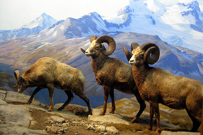

To really succeed, you have to paint a scene without any individual style. Some people call it “painting actuality.” It’s carefully composed, but composed to be artless, that is, it doesn’t make you conscious of the means it took to produce it. (Above, bighorn sheep diorama in New York, with background by James Perry Wilson correction: Belmore Brown.)

Carl Akeley, who helped develop the art of the diorama to its highest level at the American Museum of Natural History in New York, put it this way:

"The landscape painter who has cultivated a style or manner is not any good…the painted background must display a complete unity with the mounted animals.  The painter must make the beholder forget that he is looking at paint, and feel that he is looking at nature itself.  The artist must forget himself in his work.  We must set the standard to which others will have to rise."


William R. Leigh, one of the backdrop painters for the AMNH said painting backdrops "calls for the utmost measure of truth; there is in it no place for individuality."
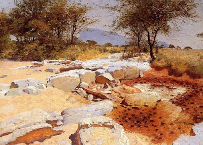


Leigh did brilliant studies in Africa (above) as preparation for his diorama paintings. But great as he was as a painter, some of his backdrops were criticized for their distracting style. Trained in Germany in the Dusseldorf tradition, he had a hard time getting rid of the very theatrical lighting, brushwork, and unnatural colors that served him well as an easel painter. The backdrop below is by W.R. Leigh.
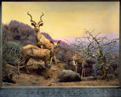


The person who fit into the role perfectly was James Perry Wilson, who I’ve mentioned a few times before in other contexts. Wilson came from a background in architectural illustration, and was largely self-taught. He first worked at the museum assisting Leigh, who was 20 years older. Wilson learned the craft, and then applied his own intellect to the unique challenges of the art form.
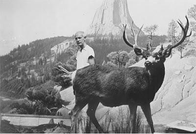
Wilson (above) was a slow painter and a bit aloof in his personality. The detailed story of what he went through to navigate the museum politics is told in the latest chapter of Wilson’s life by online biography.

This chapter is no ordinary blog post. Wilson’s story is being written by the Peabody Museum’s own Michael Anderson, who originally planned it for a book, but is publishing it online instead, chapter by chapter.
---------
Wilson Biography, Chapter 5: Joining the American Museum of Natural History (scroll halfway down for the discussion of stylelessness).
Quote is from W. R. Leigh, Frontiers of Enchantment. 1939, p.49.
The big book on the AMNH diorama is Windows on Nature by Stephen Quinn
Previously on GJ: "James Perry Wilson's Dioramas"

Tuesday, December 28, 2010

Bama’s Monsters

When James Bama was a six years old, he went to see the classic Universal monster movies: Wolfman, Frankenstein and Dracula. “They were seriously done and beautifully crafted,” Bama said. He was so scared afterward that he had to sleep in his mother’s bed.

When he later became a professional illustrator, he got the the assignment to illustrate the plastic model box covers. He used movie stills as reference for Frankenstein, the Wolfman, and Dracula.


But parents complained that the actual plastic models didn’t live up to the painted covers. So starting with the Mummy, he worked instead from reference photos of the completed models. Despite the truth in advertising, the painting based on the actual model might not be quite as successful at presenting the fantasy.

In all, Bama did 23 model covers, contributing to the Baby Boomer’s monster craze of the 1960s.
------
Images from:
Monster Kid
Full story and large color reproductions in: James Bama, American Realist, published by Flesk Publications.

Monday, December 27, 2010

Posing in the Picture-Show

In 1922, Punch magazine published the following E.H. Shepard cartoon:


“To brighten the modern picture-show, could not people be persuaded to pose in front of their own portraits?”

Pester Your Teachers

If you know who David Briggs is, you’ll know why I’m elecrified to read his review of Color and Light: A Guide for the Realist Painter.


“ Any single book on this subject can only be an introduction, but what an introduction this is! The book is very generously illustrated with his own works, plus those of many of his favourite past masters. These images fully justify their place by showing us what it is possible to achieve, especially from the imagination, by those who are willing to go beyond a simplistic approach to ‘colour theory.’

“...I'm quite certain that Color and Light will mark the beginning of the end for the simplistic approach to color that still predominates in art teaching. If you are an art or design student, get this book, study it, and then pester your teachers ceaselessly until THEY study it.”

David Briggs is none other than the mastermind behind the website “Dimensions of Color.” It’s one of the best resources on light and color on the Internet. I owe much of what I’ve learned on the topic to Mr. Briggs. For example, check out his analysis of "The Basics of Light and Shade/ Specular and Diffuse Reflection."

Along with his review of the book on a Concept Art forum, Mr. Briggs also offers a long list of links to free PDF versions of the out-of-print books listed in my bibliography.
---------
David Briggs Color and Light review on ConceptArt
The Dimensions of Color (huevaluechroma.com)
Color and Light on Amazon internationally: USA | CA | UK | FR | DE | JP
Color and Light signed (and doodled in) by me, from the Dinotopia Store

Saturday, December 25, 2010

Christmas Donkeys

We took a walk to the farm to see Joy, the donkey who was born exactly one year ago.


That’s Joy, the dark brown one one behind on the left. Lenny was asked to care for eight other donkeys temporarily. He needs to find homes for them because their owner died unexpectedly.


I don’t even know the name of this donkey, but she was very friendly, nibbling on my fingers (and the sketchbook) as I did her portrait. Handsome, the barn cat, curled up on my lap and swung his tail across the drawing.
-----
Previously on GJ:
Christmas Surprise (birth of Joy)
Joy in the Farmyard (one week old)
Donkey Portrait (Peanut)