Wednesday, October 16, 2019

J.M. Bergling and the Golden Age of Penmanship, Part 2

(Continued from Part 1)
J. M. Bergling was an authority in many different disciplines of lettering. As a boy he emigrated with his father from Sweden, working in California and Chicago, where he built his early reputation as an engraver for watch cases and jewelry. 


He became one of the foremost practitioners of the art of the monogram, a popular graphic form where an individual’s three initials are woven together into a clever artistic design. He produced three other design collections: Art Monograms and Lettering, Ornamental Designs and Illustrations, and Heraldic Designs and Engravings.


Art Alphabets and Lettering is his crowning achievement, culling the best specimens from his many years as a leading engraver and pen artist. To make room for more samples, Bergling eliminated the introductory text typically found in comparable books, such as the Ames’ Compendium of Practical and Ornamental Penmanship by Daniel T. Ames (1883) or Studies in Pen Art by William E. Dennis (1914). In such guidebooks, the text would have explained the theory and practice behind the alphabets. The modern reader might want to know at least the basics of the practical knowledge that Bergling took for granted.


For everyday penmanship, the steel dip pen had largely replaced the quill pen, which was made from a prepared primary flight feather of a goose or a turkey. However, the quill pen was—and still is—the preferred tool for certain kinds of elegant writing, and was the primary tool for letterers before the nineteenth century. Steel pen nibs in Bergling’s day were available in a range of degrees of flexibility, and many of them are still available today. The nibs fit into a pen holder, and were dipped into an inkwell of India ink, which was waterproof, or a water-soluble ink such as Higgins Eternal.


The collection begins with script alphabets, notable for their flowing, connected letters, such as “American Roundhand” and “Spencerian.” These models provide excellent guides for handwriting applications where a graceful elegance is required. The Spencerian alphabet was invented by Platt Rogers Spencer (1800-1864). It became standard in the United States between 1850 and 1925, after which it was replaced by the simpler Palmer method that still is taught in schools today. 

-----
Series on J.M. Bergling and the Golden Age of Penmanship
Part 1
Part 2
Part 3
Part 4
Part 5
----
------
Get a signed copy of Bergling from my website store (with your name nicely lettered if you want. Send me an email after you order it explaining how you'd like the dedication.)
----
Here's where you can get the Dover book on Amazon. You can also still find a vintage copy on Amazon.

Tuesday, October 15, 2019

J. M. Bergling and The Golden Age of Penmanship, Part 1

My first freelance work was as a calligrapher when I was in junior high school. I found clients by riding my bicycle to print shops and showing them my samples. I lettered a lot of wedding invitations and menus. My go-to source for alphabets and styles was an old book called Art Alphabets and Lettering that my Mom owned when she was young.

Recently, when I realized how rare that book was, and how it was out of print, I asked Dover Publications if they would consider republishing it. They agreed, on the condition that I would write the introduction. So here's the first installment of that introduction....

From the perspective of our own era of computer-generated typography, it is difficult to appreciate the ubiquity of handmade lettering a century ago. Writing made by hand appeared not only in personal letters and postcards, but also in business correspondence, architects’ plans, store windows, roadside billboards, theater lobbies, newspaper advertisements, college diplomas, engraved silverware, and even embroidered handkerchiefs.


At the dawn of the twentieth century, the art of hand lettering reached flamboyant, exuberant heights. The period known as the “Golden Age of Ornamental Penmanship” was still in full flower when John Mauritz Bergling (1866-1933) first published Art Alphabets and Lettering in 1914. He expanded his so-called “Encyclopedia of Lettering” through three subsequent editions, culminating in this enlarged fourth edition of 1923.

Art Alphabets and Lettering has been one of the most sought-after of the many treasuries of designs and alphabets from that period, not only because of the high standards of Bergling’s examples, but because of the wide range of practical applications that he addressed. In Bergling’s day, the field of artistic writing spanned the work of many specialists: engravers, engrossers, architects, showcard writers, and commercial artists. He took care to consider the appropriate spirit for each kind of communication, ranging all the way from a sober commemoration of a retirement from an insurance company  to a playful poster for a college dance.
-----
Series on J.M. Bergling and the Golden Age of Penmanship
Part 1
Part 2
Part 3
Part 4
Part 5
----
Get a signed copy of Bergling from my website store (with your name nicely lettered if you want. Send me an email after you order it explaining how you'd like the dedication.)
----
Here's where you can get the Dover book on Amazon. You can also still find a vintage copy on Amazon.


Monday, October 14, 2019

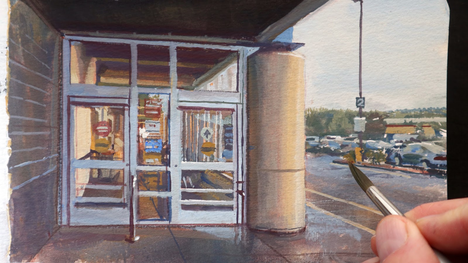
Painting a Supermarket Entrance

I have painted around this supermarket many times, and I keep discovering new views of it. On a rainy day, I notice how the warm inside lights contrast with the cool light outdoors.


I have to push the painting through the “ugly stage” by having faith in the process. 


The palette of colors is very simple: White gouacheYellow ochre (watercolor), Transparent red oxide (watercolor), and Ultramarine blue (gouache)


In the choice of subjects, I am inspired by French philosopher Emile Zola, who encouraged artists to paint commonplace subjects from our own era. 


He said: “The past was but the cemetery of our illusions: one simply stubbed one's toes on the gravestones.” (Le passé n'était que le cimetière de nos illusions, on s'y brisait les pieds contre des tombes.)

Zola also said: "A work of art is a corner of creation seen through a temperament” (Une oeuvre d'art est un coin de la création vu à travers un tempérament).

Somehow, by interpreting a subject that isn't often painted, it opens the doors to appreciating our world anew.
-----

Sunday, October 13, 2019

Sargent's Charcoal Portraits


The Morgan Library in New York is currently hosting a big show of John Singer Sargent's charcoal portraits. (Link to YouTube)


The exhibition includes over 50 drawings and it will be on view through January 12.

There is also a new book in Richard Ormond's series on complete works of Sargent that focuses entirely on Sargent's charcoal portraits.

"John Singer Sargent: Portraits in Charcoal" at the Morgan Library
Book: John Singer Sargent: Portraits in Charcoal

Thanks, Chris.

Saturday, October 12, 2019

Bastien-Lepage's Portrait of His Grandfather

Jules Bastien-Lepage, Portrait of my Grandfather, 1874
Jules Bastien-Lepage (1848-1884) was one of the founders of Naturalism. A critic in 1883 said, "The whole world paints so much today like M. Bastien-Lepage that M. Bastien-Lepage seems to paint like the whole world."

Roger Fry said that the public acceptance of Impressionism owed much to the pioneering work of M. Bastien-Lepage. Monet's popularity, he said, "required the teaching of men like Bastien-Lepage, who cleverly compromised between the truth and an accepted convention of what things looked like, to bring the world gradually around to admitting truths which a single walk in the country with purely unbiased vision would have established beyond doubt."


-----
Jules Bastien-Lepage on Wikipedia

Friday, October 11, 2019

Albert Wenzell's Illustrations

Albert Beck Wenzell (1864-1917) was an American illustrator who captured the personalities, gestures, and costumes of high  society. 


His black and white illustrations were frequently painted in gouache with a big, pointed brush on a warm-toned board.


He also painted in oil in full color, once color reproduction became an option.

Born in Detroit, he studied in Munich and Paris. He was best known for his fashionable scenes from high society.
"A Showdown" by Albert Beck Wenzell, oil on canvas, 1895
Historian Walt Reed said: "If his preoccupation with the rendering of the sheen of a silk dress or a starched shirt sometimes competes with the message of his pictures, he did, nevertheless, leave us an historic record of the settings and costumes of fashionable society at the turn of the century and set a high artistic standard."
----
You can read about Wenzell in Walt Reed's book The Illustrator in America, 1860-2000
In Vanity Fair is a contemporary book-length collection of his work.
Wenzell is another major illustrator with no Wikipedia page, so I hope one of you will do something about that.

Thursday, October 10, 2019

More Answers to Your Questions


You guys keep asking me interesting questions. These are from my Instagram and YouTube channels:

@koterminion: "What got you into classical dinosaurs?"jamesgurneyart The recent revolution in science made me see the dinosaurs of my childhood in a new light. Plus there are so many newly-discovered (non-classical?) dinosaurs that no one imagined decades ago.
----
sympaima: "What kind of tradition would you consider your work is?"
jamesgurneyart@sympaima I draw inspiration from a million sources: movies, games, comics, 1930s animation, Golden Age illustration, 1980s illustration, plein-air impressionism, academic painting, digital concept art. Each one has its heroes, its standards, and its way of doing things. At the same time, I feel outside of each one of those traditions, but I feel like they're all part of something bigger, which is telling stories with pictures.
-----
@alexwishard: About how many hours went into just the painting (excluding thumbs, initial sketches, etc)?
jamesgurneyart@alexwishard To keep up with quotas, a painting like this one (from Dinotopia: The World Beneath) took about three days total. I had to produce 10 pages of book art per month.
----
sthom4bad Your sketchbooks that I have seen are filled with miniature works of art - you seem to finish everything to completion. Do you have sketchbooks where you don't finish things or abort them in the middle or try things out that don't work?"

James Gurney I have lots of sketchbooks that are all drawn in pencil and other drawing media, but recently I've been painting primarily in gouache. I just love it because it's so direct and I can take it everywhere. I suppose some of my plein-air sketchbook pieces look finished, but other ones are quite loose and sketchy. I do try to achieve a finished effect immediately regardless of how much time I have.
----
Fiona Grigg: "As a student approaching a professional [at a convention], what is one question that I would benefit from asking everyone I can?" 
If they're my age, ask them how the business has changed and what skills they had to learn mid- career. If they're a younger pro, ask how their art school helped them. If their art training fell short, I'd ask what skills the school failed to provide.
-----
In the comments, I'd love it to hear your answers to those last questions.

Wednesday, October 9, 2019

Joaquín Sorolla's 'Sewing the Sail'

The Irish National Museum is showing a big retrospective of the Spanish painter Joaquin Sorolla.


The show includes many of his most famous paintings, including "Sewing the Sail."

Joaquin Sorolla, "Sewing the Sail," 1896, Oil on canvas
87 2/5 × 118 1/10 in, 222 × 300 cm
It's a very large painting, about 7 x 10 feet, immersing you in the dappled light splashing across the folds of cloth, the geraniums, and the various figures, who appear to have been painted from life.


How he accomplished such a large painting on location in the changing light boggles the mind, but I assume he set up his canvas under the grape arbor and set up the scene with individual models stepping in to their poses. 

The show is full of his best work throughout his career. It will be on view through 3 November, so don't miss it if you can make the trip. If you can't make it to Dublin, Ireland, the catalog Sorolla: Spanish Master of Light is the next best thing.

Tuesday, October 8, 2019

I Rub Out a Painting and Try Again


The weather changes from sunny to overcast. Should I rub out my painting and chase the light? (Link to YouTube)
Grafton Street near Trinity College, gouache, 5 x 8 inches
With a warm underpainting in casein, I can rub out the gouache layer without the casein lifting up.

PAINTS
White gouache (gouache)
Cadmium yellow light (watercolor)
Yellow ochre (watercolor)
Transparent red oxide (watercolor)
Neutral Tint
Underpainting in casein colors

OTHER MATERIALS
Empty watercolor tin
Pentalic Aqua Journal sketchbook
Liner brush (synthetic)
Winsor & Newton Series 995 synthetic flat brush

VIDEO TUTORIAL
"Gouache in the Wild" (Download on Gumroad)

Monday, October 7, 2019

Semantic Paintbrushes

Painting using artificial intelligence or machine learning may not have completely arrived yet, but at least the software can make educated guesses about textures and colors.


The brush has a "semantic" understanding of what sort of thing it is painting, meaning it "understands" whether it's sky, water, mountain, or a building, and it generates appropriate forms based on a giant database of existing images. Link on YouTube