Showing posts sorted by relevance for query your favorite art magazine. Sort by date Show all posts

Monday, December 17, 2012

Your Favorite Art Magazines

The poll results are finalized for your favorite art magazine, and here are the results:


#1: International Artist. (55 votes) This bimonthly Australia-based magazine features artists from around the world. It usually allows the artists themselves to explain their thinking and their process. There's a competition in every 160-page issue, with winners from previous rounds highlighted. Most kinds of traditional media are shown, sometimes with step-by-steps. Special features on portrait painting, wildlife art, and illustration extend its range. (Full disclosure-- I do a regular column called "Station Points" on a variety of topics).


#2. ImagineFX. (50 votes) Published in England, and available in many other countries, this magazine concentrates on fantasy and science fiction (or "imaginative realism" as many are calling it now), as well as concept art. The majority of artists working digitally, but there are some who use paints and brushes. There's always a feature for new talent. The DVD included, with demos of the techniques by each of the workshop leaders.

#3. The Artist's magazine (33 votes) This Ohio-based magazine covers a variety of painting media with lots of pragmatic information about technique with lots of how-to examples. It has features on drawing, Q&A, "Ask the Experts," and workshop listings. Its website has videos and other features. Other magazines from the same publisher include Pastel Journal and Watercolor Artist. The magazine is associated most strongly with North Light books, and it has inherited American Artist's former subscribers.

#4 Plein Air magazine. (29 votes). Launched, changed to Fine Art Connoisseur, and then relaunched by popular demand, this quarterly magazine features techniques and profiles of prominent outdoor painters and collectors, as well as information about contests and conventions. The emphasis is on oil painters, especially in the Edgar Payne thick-paint mode. The editor is M. Stephen Doherty and the publisher is Eric Rhoads.


#5 Southwest Art (23 votes).  The emphasis is on Southwestern USA Art and Native American Art and artists. There are features on artists, art galleries, show listings, plein air events, new artists and art towns.

Other strong vote-getters:
#6 Watercolor Artist (20 votes)
#7 Hi Fructose (18 votes)
#8 American Art Collector (16 votes)
#9, 10, and 11. A three-way tie for Pastel Journal, Fine Art Connoisseur, and Artists and Illustrators (13 votes each)

Friday, January 4, 2013

Art Competitions

Three submission deadlines for international art competitions are approaching toward the end of this month.

The competitions are: Spectrum Fantastic Art, the ARC Salon, and International Artist Magazine's Art Prize Challenge.


January 25 is the deadline for Spectrum's 20th annual collection of contemporary fantastic art. Published by Arnie and Cathy Fenner, this juried annual selects the best imaginative work in a variety of categories, including advertising, book, comics, concept art, dimensional, editorial, institutional, and unpublished.

The fees are $20 for a single piece and $40 for a series of 5 or fewer related pieces. If any one of your entries is chosen, you receive a complimentary copy of the full color oversize book , a good bargain, considering the book itself retails for $45.

Both digital and traditional media are welcomed. Entries are in the form of tearsheets or printouts. The all-star jury this year includes Tim Bruckner, Irene Gallo, Tim Kirk, Mark A. Nelson, and Michael Whelan.

Copies of last year's book Spectrum 19: The Best in Contemporary Fantastic Art are now available. Here's the link for Spectrum entry information, and the link for downloadable entry forms.

The second deadline is for the 2012-2013 Art Renewal Salon. Their deadline would have passed already, but it has been extended to January 21.

There are seven categories: figurative, imaginative realism, landscape, animals, still life, sculpture, and drawing, with special awards for best portrait, best nude, most ambitious work, best trompe l'oeil, and best social commentary. The entry fee is $50.00 US for the first artwork entered and $42.00 US for each additional artwork. Each entrant receives a copy of the 2012-2013 Salon Catalogue which is included in their first entry fee. Award winners and finalists will be featured on the Art Renewal Center's website, in the full color catalogue and in Fine Art Connoisseur Magazine.
-----

The third competition is the International Artist Magazine's Art Prize Challenge. International Artist won the poll on this blog for the favorite art magazine.

In every issue of the magazine there is a new art competition. Each issue of the magazine has a contest in one of six subject categories: Landscape, Flowers and Gardens, Seascapes/Rivers/Lakes, Your Favorite Subject, Still Life &, Florals, and People and Figures.

That final theme, "People and Figures," is the theme for the current competition. Entries must be received by the deadline of January 16. The entry fee per image is $9 US, €8 or £5, Aus$10. Prize Money totals $US4,500/ £2,250 in every issue. Grand prize winner receives $2,000, an awards certificate, a two page spread in the magazine (150,000 readers), a 4-page spread in American Art Collector magazine. 

Wednesday, April 8, 2015

Interview in Main Street Magazine

Main Street Magazine just released an interview in connection with the Stamford Museum show. The interview was by artist Brandon Kralik.

Kralik: It seems to me that by working in a representational style, by "breaking the rules," it goes to follow that we are actually operating under different rules, an alternative aesthetic criteria for judging what is good and what is valuable. Would you agree with this, that Illustration is something different than what we see in Post Modern aesthetic?

Gurney: I don’t think that painting representational images or telling stories with pictures necessarily breaks any rules. Who would make such rules? Telling stories and representing nature is what artists have been doing all through history.

Kralik: What are your "rules" that decide if a picture is good or not?

Gurney: My appreciation of art doesn’t follow any pre-set rules. I find myself moved by great works in all sorts of categories—landscapes, comic art, adventure illustration, landscape painting, portraiture. There’s good and bad art in every category, and I'm always ready to be surprised. I don’t spend much time evaluating what’s good or bad, because I’m a painter, not a critic. The best cure for bad art is good art.

Kralik: Do you make a distinction between Illustration and Fine Art?

Gurney: No, I don’t, because both terms are impossible to define. By fine art, do you mean gallery art? For some people the term "fine art" suggests a branch of art that's supposedly free from commercialism. Having been in the trenches in all sorts of art-making, I can attest that gallery art can often be the most commercial form. Gallery artists are always reminded of what's selling, and what's not, and are pressured by the marketplace to repeat successes more than any other kind of art. It's possible for a gallery artist to be unaffected by such things, but it's not easy. The least commercial art form I've ever experienced is magazine illustration, where the individual work of art has little influence on the ultimate commercial success of the larger work, namely the magazine. So if any art is fine in that sense, it is illustration.

If “fine art” means art that is created at the artist’s own initiative, then that would include illustrated books that the artist/illustrator creates.

“Illustration” is a term that means different things to different people. It can mean work that’s commissioned, work that tells a story, or work that is reproduced. Those are very different criteria, and there have been great works of art that fit one, two, or even all three of these measures.

A more meaningful distinction for me is between observational work and studio work—or you might say outdoor work versus indoor work, the outer eye versus the inner eye. Both aspects of the artistic life are essential to me, and always have been.

Kralik: Something that you have said, and which Mort Kunstler reiterated in his talk was that in part the goal is to create something, a painting, that cannot be photographed. You have done this with your Dinotopia series and in your numerous illustrations for National Geographic. Is this a primary concern or thought behind your work? What is the greatest benefit that realist painting has to offer us? To show us what we cannot see any other way, or to copy nature, or both?

Gurney: I agree with Mr. Kunstler—painting the things that we can only imagine is one of my favorite challenges as an artist. I did a lot of work for National Geographic, including pictures of the the legendary voyages of Jason and Ulysses, and reconstructions of the kingdom of Kush in Nubia and the civilization of the Etruscans in Italy. Each project was a stimulating chance to travel for research and to work directly with experts to recreate a world that could never be photographed.

I like to call this kind of painting “imaginative realism.” Imaginative realism is different from what we usually think of as fantasy. It’s a broader term, including any scene that can’t be photographed or observed directly.

Imaginative realism comes into play when reconstructing a scene from ancient Rome, a dinosaur in its habitat, a battle from the Civil War, or a portrayal of the Titanic on the sea floor. These are modern versions of what used to be called history painting.

Most wildlife art falls into this category, too, because wildlife artists can’t just snap a photo and interpret it in paint; they have to develop a scene first in their imagination and use their knowledge of nature to create a believable composition. What all these kinds of pictures have in common is that the artist begins with an imaginary idea, and then works hard to make the resulting picture as realistic as possible.

But I have also always painted and sketched from life at every opportunity. I’m currently working on a series of instructional documentaries on painting on location. The first one is called “Watercolor in the Wild,” and the next two will cover gouache and casein.

Kralik: What is the role of representational painting in our society?

Gurney: I can’t speak in general terms about what painting means for other artists or for society as a whole. I only know what motivates me to paint, and that’s the excitement that comes while making an image come to life out of the physical materials that I move around with my hands.

Whether it’s an imaginary scene or a portrayal of something I’m observing, each picture is a kind of conjuring process, and an illustrated book like Dinotopia combines my love of writing, lettering, book design, storytelling, and painting into a larger act of creation.

Kralik: For myself, I am interested in what connects us, as human beings from different cultures but also as societies and cultures existing in different times. Rockwell once said that he was not concerned about this. "Let future generations create their own artists," he said. Is timelessness something that you think about? Do you think about communicating with future generations through your work?

Gurney: I remember reading that statement about Rockwell, which suggests that he didn’t care about his legacy. Perhaps that was true early on. But once he realized that his paintings were taking on a life beyond their function as magazine covers, I believe he did care a lot about his legacy. Why would he bother to set up the Norman Rockwell Museum, and why would he write his autobiography and teach in the Famous Artists School? I think what he was saying with the quote about future generations was that artists should create their own art for their own times, and not copy him or anyone else. Rockwell was certainly concerned with connecting with his public. He painted the Four Freedoms completely on his own initiative, and it became a decisive factor in the war effort.

We live now in an age of transient technology and passing fads, but at least two things have the capacity of lasting: books and original paintings. Personally I’ve always preferred making art that has a physical embodiment, such as a drawing or painting, as opposed to digital art. I have no way of knowing whether my paintings will survive fires or floods, or whether they’ll speak to future generations.

Kralik: The idea that an artist must express themselves is paramount in Post Modern ideology and with representational painters it seems that it is partly this but also that it is important to "connect" with viewers using more universal symbols than purely subjective imagery. How much of your work is for yourself and how much is for your viewer? As if that were a measurable thing.

Gurney: Expression plays a role in my art certainly, because I have strong feelings that I bring to my paintings, and I like my art to communicate them. But expression isn’t as important for me as observation.

I love to capture the world around me, and I do that for my own pleasure, though more and more I’m sharing my sketchbooks through video and other new media.

I have literally dozens of pencil sketchbooks filled with studies of people that I’ve met and places that I’ve traveled. My studio is crowded with boxes full of small oil studies from faraway places and local vistas from the Hudson Valley. Sometimes the goal in an outdoor study is to capture a particular atmospheric effect or a color relationship, or to document the rapids in a stream or the unique quality of a sunset.

Kralik: How do you view the changes within the representational art world in the past 25 years or so? Realist painting seems to definitely be making a comeback it could be said. Do you agree? Why is that?

Gurney: Realist painting is certainly making a comeback, but I’ve also noticed a huge rise in interest in animation, graphic novels, and concept art when I visit art schools. Along with the return of realism as a mode of painting, popular forms of art are finding their way into academia and museums.

The Museum of Modern Art had huge successes with the exhibitions of Pixar and Tim Burton, and we’ve been fortunate to have had over 25 one-man museum shows on the art of Dinotopia. More and more people are realizing that illustration, comics, and animation are the mainstream story of twentieth-century American art. You couldn’t talk about 20th century music without telling the story of jazz and rock 'n' roll. The same is true in the visual arts.

That’s why we’re seeing more and more popular-culture college courses, not only on Bob Dylan and the Beatles, but also about children's literature, animation history, and the history of comics. All of these popular forms have dealt with the big topics—love and death—often with wit and humor.

Kralik: You have given a number of talks at universities and high schools. How can we, as painters, best encourage and educate students interested in representational art and, against the apparent rules of the art world, convince them and patrons who might support them, that it is ok to work in a realist or illustrative fashion?

Gurney: There’s no need to convince art students of any of this. They’ve grown up with the Internet, where they follow their own eyes to stuff they like. There are no rules in the art world. Old-school tastemakers and gatekeepers are getting swept away by new forms—and forums—of patronage and criticism. It’s not like it was in the old days, where you had to hope for the approval of the Pope or John Ruskin or the Salon Jury or Clement Greenberg. Art is wide open now, and there’s no single kind of art that’s dominant. The important trend is that for the first time ever, artists can connect directly with their audience and paint whatever they want to paint, supported by the people who love what they do.
-----
Dinotopia exhibit at the Stamford Museum and Nature Center through May 25
Brandon Kralik has an exhibit of his work at the Hotchkiss School in Connecticut, and will be giving a talk there on April 27.

Saturday, January 22, 2011

Fantasy in Films and Magazines

This week, Variety announced the top ten worldwide films of 2010 (measured by gross box office return):


1. Toy Story 3: 1,064 million
2. Alice in Wonderland: 1,024 million
3. Harry Potter: 895
4. Inception: 824
5. Shrek Forever After: 743
6. Twilight Saga Eclipse: 654
7. Iron Man 2: 623
8. Despicable Me: 542
9. How to Train Your Dragon: 496
10. Clash of the Titans: 494
...and that was right on the heels of last year’s Avatar, which grossed 1,953 million.

All of those top ten are arguably fantasy or science fiction films. Four of them are animated. Since motion pictures are today’s culturally dominant art form, it’s safe to say that fantasy and imagination are squarely in the mainstream of our collective consciousness.

Which is why, perhaps, the art magazines are featuring fantasy more and more. ImagineFX, Juxtapoz, and Hi Fructose are completely dedicated to imagination.


And as Jobot mentioned in yesterday's comments, the new February / March issue of International Artist has a special feature on fantasy illustration, edited by Rebecca Guay. It spotlights the faculty of the Illustration Master Class, including regulars like Donato Giancola and Greg Manchess (above: left and center), Dan Dos Santos, Scott Fischer, Julie Bell, and Boris Vallejo. This year there will also be visiting teachers like Peter de Sève and Iain McCaig (above, right) and I'll be tagging along, too.

If you want to see more imaginative art covered in your favorite art magazine, let the editors know! They will listen to you.
------
Image ©Disney from "Alice in Wonderland Trailer"
Illustration Master Class
Variety magazine
International Artist magazine
ImagineFX  magazine
Juxtapoz magazine
Hi Fructose magazine
Read about Donato, Greg, and other IMC'ers at Muddy Colors
Boris Vallejo and Julie Bell

Friday, December 14, 2012

American Artist, 1937-2012

When a person dies, there's a funeral and obituaries. But when a magazine falls victim to corporate buyouts, it just quietly disappears.


So let's take this opportunity to remember the legacy of American Artist magazine, which recently announced that it has ceased publication.

Just as it celebrated its 75th Anniversary, its Facebook page announced: "We are no longer publishing American Artist, and we're so sad to see it go!" In an announcement on its website, AA told subscribers that their subscription will roll over to the Artist's Magazine. American Artist's former rival acquired it, dissolved it, and adopted its readers.


American Artist was founded in 1937 under the name "Art Instruction" by the two architectural draughtsmen Ernest Watson and Arthur Guptill (above), who also founded Watson-Guptill, the book publishing company. Their founding mission was practical, didactic, and businesslike.

The first decades of the magazine spotlighted both easel painters and illustrators. The articles were usually based on studio visits, and the discussion always included process and professionalism as well as philosophy.

Mr. Watson went on such a flurry of visits to illustrators that he was able to assemble them into a book called Forty illustrators and how they work. In the '50s and '60s, there were plenty of post-impressionist-inspired painters, but the orientation was always relatively realistic compared to the more avante-garde magazines. During the decades of the 1970's and '80s, as the realist revival gained steam, American Artist was the most vocal champion.


American Artist helped popularize Andrew Wyeth, Robert Vickrey (below), Tom Nicholas, Richard Schmid, and even Frank Frazetta, who had a cover feature in 1976. For many artists, an article or a cover feature cemented their reputation.


For students wanting to learn about painting before the Internet era, it was the clearest window into the world of real working artists. The classified ads were the way to find out about workshops,  art schools, or new art supplies.

The formula perfected by editor M. Stephen Doherty (self portrait, left) and later Michael Gormley appealed both to professionals and amateurs working in all sorts of media.

In addition to the main magazine, they developed themed issues: drawing, watercolor, plein-air, studios, and workshops. Although these special issues spread the magazine's presence widely across the newsstands, they were taxing on the small staff to produce all those pages of content and still keep up its Internet presence.

The magazine was bought and sold by various large media companies, starting with Billboard, and later Nielsen and Interweave, and most recently F+W Media.


Thank you to Stephen Doherty, Michael Gormley, Allison Malafronte, Bob Bahr, John Parks, Naomi Ekperigin, and all the people who worked so hard to bring us the magazine over the years.

I'd love to hear your recollections about American Artist. Please vote for your favorite current art magazine in the poll at left. You can vote for more than one.
--------
GNSI spotlight on Arthur Guptill
(My articles in AA were on Color and Light and Portable Portraits, and my cover feature was Nov. 2006)

Wednesday, June 5, 2019

Can you use other artists' work as reference?

Painting by Louis Béroud depicting copyists in the Louvre
Joe asks: What is your take on illustrators using other painters' work as reference? What ethics stand behind a practice such as this?

A few thoughts:
Copying to learn 
Studying the work of other painters as a learning exercise is a time-honored practice. Copying is one of the best ways to absorb the influence of someone you admire. You can do anything from a quick thumbnail sketch to a full size replica copy done in the same medium. If you're doing a master copy, that's fine, but I think it's best not to post your copy online, because unless it's clearly identified as a copy, it might annoy or confuse people who are looking for the real thing. If you must post it, mark it very clearly as a copy or put it side by side with the original.

Satire or pastiche 
If you're copying another artist's style in order to do a pastiche or a satire, there's no ethical problem with that. Imitating another style is entirely appropriate, as when Rockwell aped Jackson Pollock's style for his painting in the background of the Art Critic, or when MAD magazine copied the look of the James Montgomery Flagg "I Want You" poster, or when a modern illustrator evokes the lurid style of a 1950s pulp paperback cover. If there's any doubt, or if you're being interviewed, always give credit to your inspiration, especially if you're inspired by one particular artist.

Reference for guidance or inspiration 
If you want to look at other artists for inspiration for how to approach a composition or how to handle a passage, I think it's best to do so in your free time at the end of the day or during a break, but not when you're in the heat of your own painting. You can do some thumbnail copies of your favorite artists when you're in sketch stage. But when you've got your painting going, it's time to close the art books. You don't want to be tempted to lift a passage from another artist's work into your own painting, or if you're working digitally to cut and paste elements from some other artist's painting. That has ethical problems, for sure.

Have multiple heroes
At any given time, always cultivate two or three artists that you admire and look at them side by side. Work your way around the buffet table. Also, I recommend looking at the work of artists who are deceased. You don't want to be seen as derivative of a living artist, nor do you want your work to be trailing a commonplace contemporary fashion. Try to understand not just the outward technique or brushwork, but also the thought process that your hero used. If you adopt similar philosophies and work habits, your work will develop naturally along its own track. And when you go back to nature with those inspirations in mind, try to apply them to your own interests and sensibilities, and eventually you'll make them your own.

Using real life for reference
If you're just doing your own original professional painting, it's best to reference real life / first hand observation as much as possible. If all you look at is other peoples' art, you might limit your own independent solutions. You'll never equal the artist you admire by drinking from their cup, because they have been getting their water from a deeper well.

George Clausen said: "The majority of people tune their eyes by pictures and not by nature, and only admire in nature that which is made manifest to them by their artistic prophet."

Cycles of inspiration
Painting, movies, and other art forms seem go through cycles. New movements seem to emerge from some combination of innovation from direct observation from nature together with reinterpretation or imitation of past styles or remote traditions. The Renaissance was fueled in part by the discovery of original Greek and Roman statues; Many Impressionists were fired up by Japanese prints; and many artists of the contemporary atelier movement are greatly inspired by academic studies by 19th century masters.

As they enter their later phases, art movements often take on a mannerist quality. Earlier ideas are mined over and over, often with a sense of ironic detachment and self-consciousness. This is a sign that the movement is on the decline. Superhero movies may have entered that stage, as westerns and noir films did in their turn. When an art movement becomes decadent or tired, it needs either a shot of direct, first-hand observation from life or a dose of fresh artistic influences.

There's no ethical issue here in any of this as long as you don't violate another's copyright.

Tuesday, July 9, 2013

How to sign your artwork

A while ago, blog reader Trevor asked "I'm confounded about where to sign, and what signature to use. I'm often worried I will ruin a perfectly good painting with a bad/distracting signature! Can my signature change? Do I sign the studies or the bad stuff? Also, what colors should I use? Should I include the date or anything other information?"


Thanks, Trevor. Great topic! It's generally a good idea to sign any work that you're reasonably proud of. It can increase the value of your work by a large factor, and it aids in identification, should your work get scattered after you're gone.


(Above: Serov) Sign your work in the same medium and with the same tool that the art was created in. The color can be lighter or darker than the background, but it should probably be a color that harmonizes something in the image. A dull red such as English red is traditional. Choose a spot in the painting that's not too busy and not too important. The normal place is at the lower right or lower left, just above the rabbet edge of the frame or within the crop margin of the painting, but many artists have signed at the top of the painting, too. 


Usually a painting is only signed when it is finished. However there are cases of artists who signed unfinished paintings, such as this one of the 1848 revolution by Adolph Menzel. He wisely signed it in the middle of the unfinished area. That way if someone after he died wanted to finish the painting for him, he would have to paint out the signature, too.

If you're a plein air painter, and you're painting on a light ground, especially an oil ground, you can scratch your signature and the location through the wet paint with the pointed end of the brush handle. A scratched-in signature serves as proof that you did the painting on the spot in one sitting.


My personal feeling is that the signature shouldn't jump out and demand attention, but it should be easily findable if you're looking for it, and it should be identifiable in a digital file of your picture that's as small as 500 pixels across.

You can come up with a rapid monogram or a way of signing with initials for your sketches. Sketchbooks, unfortunately, do get bladed. Adding a date or just a year helps future conservators or descendants. The picture above is by Adolph Menzel, who made tens of thousands of drawings and signed and dated most of them.

It's OK to work on your signature, especially when you're young. And it's normal for your signature to evolve through your career. It helps to have two or three ways of signing, such as a cursive signature for a pen, a brush signature for paint, and initials for a pencil sketch. The signature may change depending on the tone of the piece. Rockwell used elegant capitals for the Four Freedoms, but cursive or caps and lower case for his funny magazine covers.

All that said, signatures can be distracting or objectionable. Some artists make their signatures big and flashy (I'm talking to you, Rockwell, Frazetta, and Leyendecker), but that can be part of their visual identity. Let's face it: in their case, their signatures sold a lot of books and magazines, so it had to be a key part of the design. Some artists, like Howard Pyle and N.C. Wyeth, often quickly scrawled their signatures, tossing them off like they didn't care.  

If you work for a movie studio or an advertising account, you may be required not to sign a work. Or if your artwork is part of a larger published work, such as a comic page or a single illustration from a picture book, you probably don't want your signature on every page of the book. In that case you can sign the piece after it is shot for reproduction. You may want to shoot it again after it is signed should you wish to frame and sell the painting. Remember that if you sign the piece outside the image area, someone framing it in the future will have to cut the mat farther out to show the signature. 

In addition to signing the work, it's very helpful to write pertinent information on the back of the piece, such as title, date, location of a plein air, or circumstances of its creation, such as a study for something or a rejected sketch. Future conservators and archivists (should we be so lucky) will thank you. The back of your painting is important. Auction houses show the backs of your paintings, too.

Greg Shea, Senior Museum Preparator at the Yale Center for British Art, adds this:
"Working in an art museum has afforded me the opportunity to see the backs of thousands of paintings. Many artists also sign (in paint, India ink, etc.) the backs of their canvases, panels, or even on the stretcher bars. They often include additional information not contained in the signature on the front of the work, such as the subject's location or name, the sitter's name, the age of the sitter, the intended recipient, etc. This information is extremely useful for art historians, conservators, etc. as it can greatly enhance the understanding of the context of the work. In addition, the additional signatures or other information can show that the various components of the work are original (the frame, stretcher, canvas, etc.). These elements are also useful, as they can contain a wealth of information by themselves. In my institution, any information given on the back of a work is documented and preserved along with the object, as part of it's history. This can be anything from hand written paper notes, printed dealer labels, old exhibition labels, auction lot tags, etc. To an art historian, all of these are just as important as the signature on the front of the work. So do yourselves justice, add some information to your works. It might mean the difference in having your works cherished for posterity, rather than fading into obscurity..."
------
More about signing artwork at ArtBusiness.com and Making a Mark

Thursday, June 4, 2015

Interview about Science-Based Art


SciArt in America, a free online publication dedicated to science-based art, interviewed me recently, and they published the interview yesterday.

Here's an excerpt:

Raphael Rosen of SA: I know you primarily through Dinotopia, but I read that you used to illustrate scenes from ancient civilizations. How does illustrating archaeological scenes differ from paleontological subjects, if at all? Which one do you prefer?

Yes, I worked for National Geographic as an archaeologist-illustrator, and they sent me on assignment to Jordan, Italy, and Israel. These were dream jobs for me because I was an archaeology major in college. Archaeological and paleontological illustration are very similar in the way they develop from research to thumbnails to line drawings, to finished paintings, with consultants involved at every stage.

Captured Moche prisoners, illustration for National Geographic, oil
SA: What is your favorite medium, and why?

I can’t pick a favorite any more than I could choose a banana over an apple. Lately I’ve been concentrating on gouache, watercolor, oil, and casein. Switching between transparent and opaque media requires changing over to a very different mindset. Leaving the white of the paper in transparent watercolor takes considerable advance planning, the ability to visualize the finished effect from the start. As with all physical media, there is a sense of commitment and risk that I really enjoy, particularly when painting from life.


SA: In one of your YouTube videos, you state that you "come from a long line of mechanical engineers." Do you feel that that background has influenced your illustrations? If so, how?

Yes, because engineers use drawings to plan things they want to build. When I was developing Dinotopia, I wanted to include a lot of cutaways and machine diagrams. When I paint a flying machine or a steam powered walking machine, I imagine its entire walk cycle, and I try to figure out its working parts. A lot of the vehicles from Dinotopia are based on kit-bashed plastic models.


SA: In that same video, you state that your father used to say that, "If you can draw it, you can create it." Can you explain what he meant, and whether that saying has affected your artworks?
Most of my paintings try to make the impossible look inevitable. I like to think beyond a single work of art and imagine things from many angles, or imagine how they would look in a thousand years. What would happen if an object were picked up by an alien culture and used in a different way? Such leaps of imagination are what an engineer is doing all the time, and most science fiction people aren’t too far removed from that kind of thinking.
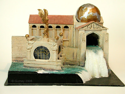

SA: I'm stunned by the detail and care you put into your maquettes. How would you explain to someone who knew noting about your work why you create them?

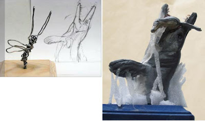
Inventing shapes and forms without using a maquette is not too hard, but where a maquette really makes a contribution is in allowing me to try out different lighting ideas. Good lighting is the key to believability. It’s rare for someone imagining poses to think of foreshortened forms, strange overlaps, and unexpected cast shadows.

SA: How do you make your maquettes? What are the materials? How long does the process take?

For dinosaurs and other prehistoric fauna, I make a small maquette, using Sculpey, an oven-hardening clay. I shape it over an aluminum wire armature, matching to a scale pencil drawing. After the maquette is cured, I paint it in acrylic and often glue feathers or other textures onto it. For a mosasaur leaping into the air, for example, I glued some strips of flexible packing foam to simulate water foam. I photograph the maquette in outdoor light using a single lens reflex camera on a tripod. This process allows me to experiment with a variety of lighting ideas and choose between front-lighting or back-lighting.

SA: I'm a great fan of fantasy illustrators, including Wayne Douglas Barlowe, who can depict alternative worlds in great detail. Can you tell me the challenges involved in this task, and how it differs from painting, say, a still life?

Wayne Barlowe was a big inspiration, and his parents, as well, who did illustrations for the Golden Guides of natural history. Any kind of imaginative realism: paleoart, concept art, wildlife art, or historical painting is totally different from a still life because you start with a hazy mental image and you have to provide the convincing details in stages.

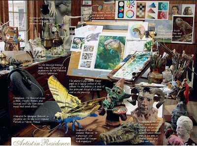
I’m thoroughly old-school. I start with small thumbnail sketches in pencil or watercolor. If it’s an architectural subject or a dinosaur, I’ll build a maquette out of any material at hand.


If necessary I enlist models to pose in costume, usually friends or neighbors. I either take photos or draw tone paper sketches of the models. I have a large mirror mounted in the studio and often do action studies of myself posing in costume to get the basic pose. I also have a scrap file of color magazine photos that I use for texture and form ideas. If the painting requires scientific or historical accuracy, I consult with experts at every stage of the process and incorporate their suggestions.

After all these studies, I work up the line drawing—and sometimes a full charcoal drawing—and finally begin the final painting. People can follow the process in my videos “How I Paint Dinosaurs” or “Tyrannosaur: Behind the Art.”


SA: Do you feel that illustrators who focus on science topics, including paleontology, have an impact on their respective fields? If so, how, exactly?

I don’t know. I suppose you’d have to talk to scientists in those fields. But perhaps it’s fair to repeat the old saying that paleontological illustrators and moviemakers are the eyes of paleontology. New discoveries and new theories take on a physical, concrete presence when they are visualized well. And if they’re not visualized well, old, incorrect stereotypes can be reinforced.

I come from a Renaissance mindset where science and art are very closely allied. At its most interesting hypothetical core, science is a powerfully imaginative discipline, where the ability to visualize and to draw connections between disparate elements allows for great leaps forward. A similar kind of imagination, informed by fact, and tempered by skepticism, makes for memorable art.


SA: How closely do you work with paleontologists, and have your drawings ever changed how they thought about fossils and ancient life?
I’ve worked with many different paleontologists while working on science articles for Discover, National Geographic, National Wildlife, and Scientific American.

For each project like that, we typically work with just one expert, so that we don’t run into the need to adjudicate conflicting theories. My job for such a publication is to try to give visual form to their ideas. In the case of the “World of Dinosaurs” postage stamps for the US Postal Service, I worked with five different experts, each in a different field of study, because we had to look after a variety of fauna and flora. For the Australian stamps (“Australia’s Age of Dinosaurs,”) we had a principal consultant, Tom Rich, who introduced me to several of his colleagues, and each expert helped with specific questions.

SA: Can you tell me a little about how clients find you for their dinosaur-related projects?

Some opportunities have come from visiting scientists in museums or conventions. Other times I’ve gotten jobs as a result of sending samples to art directors. In the age of the Internet, I suppose art buyers find out about my work from my blog, my website, or my videos.


SA: Are there concerns or challenges particular to creating images for stamps?

Yes, definitely. Recently, Australia Post commissioned me to design a set of postage stamps showing six prehistoric animals in a panoramic landscape. The project took several months and required a lot of work behind the scenes. The research stage was especially important since Australian dinosaurs are known only from fragmentary fossils, most of them recently discovered. Some of the dinosaurs would have to be reconstructed from single bones, so a good deal of extrapolation would be required.

Before I went too far with sketches, I traveled to Melbourne to meet with the museum specialists. I spent more than a week studying the collection of the Museum Victoria under Tom Rich’s guidance. We looked at the bones not only of the dinosaurs, but also the large amphibian Koolasuchus and various insects and small mammals that lived alongside them.

I also visited the Royal Botanical Gardens and some forest parks near Melbourne to sketch the growth habits of plants that were analogous to those of the middle Cretaceous. During this period, southern Australia was just beginning to detach from Antarctica and it was still a polar climate.

Like the “World of Dinosaurs” stamps I did for the US Postal Service, this was a larger panorama with stamp subjects inside it. One of the challenges of this kind of layout is that each stamp has to make sense by itself when it is detached, but it also has to work in the context of the larger scene. The design also presents a challenge of relative size. Since dinosaurs came in greatly varying sizes, the larger dinosaurs had to be pushed farther back in depth in order to be able to fit into the stamp grid.

I also had to be aware of fixed requirements of the stamp design. Each stamp needed to include the word “AUSTRALIA,” plus the denomination and the name of the animal. In those areas there couldn’t be any dark shapes or busy detail.

Furthermore, the outer areas of each stamp had to be kept light in value and warm in color so that the helicon areas would read. Helicon is a security feature consisting of a phosphor material printed on the front of stamps which helps automated machines identify the presence of a stamp. I learned about the helicon requirement after doing the comprehensive sketch, so I had to do away with the dark values between Qantassaurus and Australovenator.


SA: Do you have any advice for aspiring illustrators who might want to specialize in a field related to science?

It’s important to be able to read the scientific papers yourself, and not to have to rely on someone to interpret them for you. Sketch constantly. Be alert to living analogues as inspiration, and watch a lot of wildlife videos. Paint outdoors. It’s the only way to understand lighting and color. Think about behavior at least as much as morphology.


SA: I also have one more, wide-ranging question: what are your thoughts about the relationship of science and art? Can one inform the other?

Painting a dinosaur is a lot like finding a fossil in the ground. You pick up broken fragments out of the dust. You fit them together and fill in the missing pieces as well as you can. Somehow, out of the decay of deep time, an image begins to form. Something long dead lives again. The bone grows flesh and skin and a living creature steps from the shadow into the light, and we can almost feel its hot breath on our necks.

Dinosaurs and other prehistoric creatures live in the boundary zone between imagination and reality. After a picture leaves my easel, it begins its journey to the printed page. It will be published alongside the scientist’s article, and will reach potentially millions of people, and shape the way they imagine a world that they will never see with their own eyes.

My step in the process is to try to try to take a snapshot of world that we know once existed, but that no one has ever seen. This is why I love painting dinosaurs. It puts me on the knife edge between knowledge and imagination.
----
Read the full interview at SciArt in America

Thursday, February 17, 2011

Reader's Poll Finalist

Color and Light has been nominated as a finalist in About.com's "Reader's Choice" Awards. If you have a moment, please click over to the poll and give it your vote!

You can also vote for your favorite art materials and art magazine.

Friday, August 14, 2015

GJ Book Club Chapter 19: Harold Speed on Procedure


On the GJ Book Club, we're looking at Chapter 19: "Procedure" in Harold Speed's 1917 classic The Practice and Science of Drawing.

This is a short chapter, but it's crammed full of valuable pointers about the importance of intentionality in drawing. So I thought I'd pull out a few of my favorite sentences. I'll number them in case you want to refer to those points in the comments.

Byam Shaw criticizing a student's work
1. "It is seldom if ever that an artist puts on paper anything better than he has in his mind before he starts, and usually it is not nearly so good."

[James here] There's a corollary— if I have nothing in my mind when I start, I can be sure of producing nothing worthwhile.

2. "Try and see in your mind's eye the drawing you mean to do, and then try and make your hand realise it, making the paper more beautiful by every touch you give instead of spoiling it by a slovenly manner of procedure."

Drawing by Adolph Menzel
3. "To know what you want to do and then to do it is the secret of good style and technique."

4. "Look well at the model first; try and be moved by something in the form that you feel is fine or interesting, and try and see in your mind's eye what sort of drawing you mean to do before touching your paper." 

[James here] Yes! It's a good idea to sit for a few minutes in front of your subject before you start drawing to collect your thoughts and feelings, imagine the picture you want to make, and focus your energy on how to achieve it.
Drawing by Heinrich Kley. More Kleys on Muddy Colors today.
5. "Be extremely careful about the first few strokes you put on your paper: the quality of your drawing is often decided in these early stages."

Yeah, but don't get nervous.

6. "It is much easier to put down a statement correctly than to correct a wrong one; so out with the whole part if you are convinced it is wrong."

When I have to rub out a section and start over, I always remind myself that Sargent did that many times to get a good portrait.

7. "Do not work too long without giving your eye a little rest; a few moments will be quite sufficient.

A good reason to work standing. You're more likely to back up and look with a fresh eye.

8. "Do not go labouring at a drawing when your mind is not working."

You can tell from across the room (without even seeing the drawing) if an artist is doing a good a drawing by looking at their posture and their level of engagement.
Drawing by John Vanderpoel

9. "In the final stages of a drawing or painting, when, in adding details and small refinements, it is doubly necessary for the mind to be on fire with the initial impulse, or the main qualities will be obscured and the result enfeebled by these smaller matters."

This is why doing a thumbnail can be a good thing; it reminds you of what attracted you at the beginning.

10. "The great aim of the draughtsman should be to train himself to draw cleanly and fearlessly."

11. "Let painstaking accuracy be your aim for a long time. "

12. "Try and express yourself in as simple, not as complicated a manner as possible."

13. "Every student should begin collecting reproductions of the things that interest him."

-----
The Practice and Science of Drawing is available in various formats:
1. Inexpensive softcover edition from Dover, (by far the majority of you are reading it in this format)
3. Free online Archive.org edition.
and The Windsor Magazine, Volume 25, "The Art of Mr. Harold Speed" by Austin Chester, page 335. (thanks, अर्जुन)
GJ Book Club on Pinterest (Thanks, Carolyn Kasper)