


 Today we'll cover pages 181-187 of the chapter on "Tone and Colour Design," from Harold Speed's 1924 art instruction book Oil Painting Techniques and Materials
I'll present Speed's main points in boldface type either verbatim or paraphrased, followed by my comments. If you want to add a comment, please use the numbered points to refer to the relevant section of the chapter.
 |
| Andrew Wyeth The Sleepers |
The distinction between expression and communication is an important one, since the latter requires someone to receive the message. Expression can happen when an artist is all alone on the beach writing something on the sand. One thing the Internet has given artists is the ability to see right away how their work is received by real people. I don't know if being conscious of the audience's reaction is a good thing or a bad thing, but it sure is a thing. It's hard to ignore the audience and I wonder how it affects us in the long run.
2. Natural appearance vs. rhythm
Speed is setting up a distinction between something that looks convincingly real and a something that uses design principles to have an effective emotional impact. These two objectives in painting aren't necessarily in opposition. The way I think about it is that there are many kinds of realism, or many ways to paint something so that it looks convincingly real. You might for example focus on the texture or the atmospherics or the silhouette or the warm glowing colors, or whatever expresses your idea. And then there are all the qualities of paint handling. Each of us has to choose which type of realism best serves the idea.
3. Page 184, paragraph beginning: "It is not rather that...." Speed says: "We are continually seeking to transform the things of this existence into terms of this inner, more permanent realm."
Speed gets philosophical here, and the language is a bit difficult to unravel, but what he's saying is profound, connecting the world of our inner mental life with the external world that we perceive and interpret through art. Andrew Wyeth talks a lot about this. He doesn't head out looking for a scene to paint. He starts with an inner idea and builds it from the inside out. The result may be realistic to the eye, but it all starts with dreams and memories.
.jpg)
Tone Design
4. Flat tones create unity. A lot of light-to-dark modeling can create variety.
In the Raphael above, there's a lot of modeling within each form, and each form is distinguished from its surrounding background, creating a choppy effect. Thomas Hart Benton also has a tendency to define his forms all the way around. The tones are much more unified in the Cornwell below. One is not necessarily better than the other.
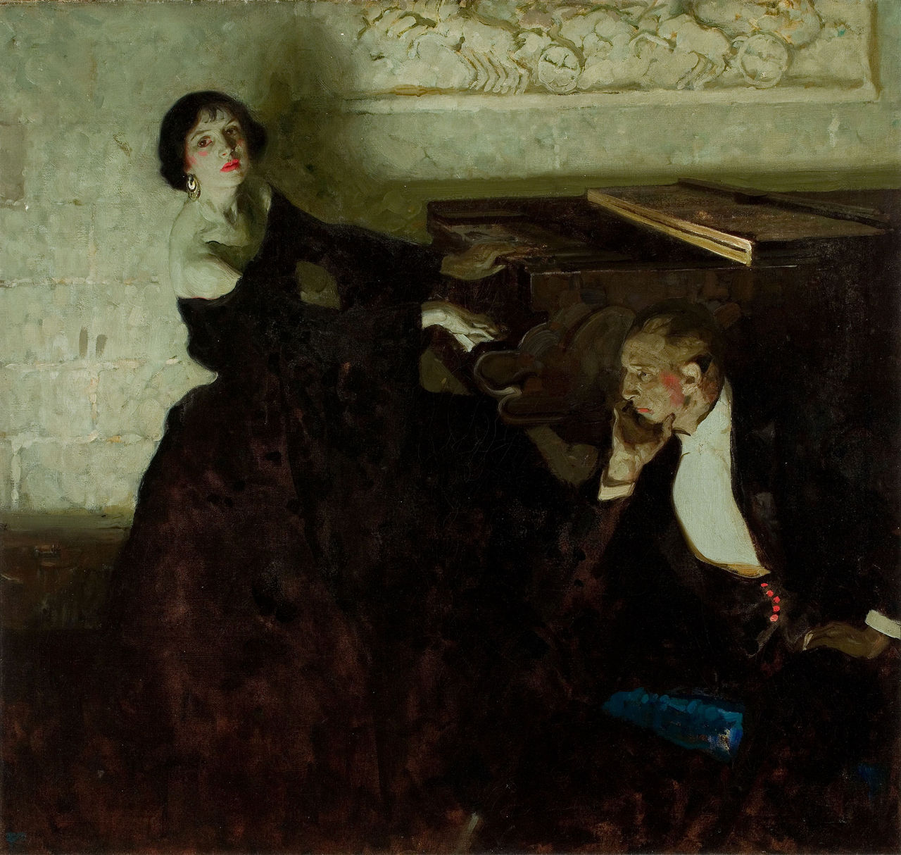 |
| Image: Dean Cornwell |
5. For broader effect, "assemble the light masses together and unite the dark masses also, so that the light and dark tones, instead of playing together throughout the picture, are divided and grouped separately."
Hey, this sounds like shapewelding, something that I discussed in a previous post.
Speed says: "This is why portrait painters so favour a dark background, as it so easily makes the light head the dominating interest in the picture."
 Next week—We'll continue on page 187 with his discussion of gradated and flat tones.
-----
More on Andrew Wyeth's thinking about art in the two books by Richard Meryman: Andrew Wyeth: A Secret Life and Andrew Wyeth: A Spoken Self-Portrait
In its original edition, the book is called "The Science and Practice of Oil Painting ." Unfortunately it's not available in a free edition, but there's an inexpensive print edition that Dover publishes under a different title "Oil Painting Techniques and Materials
 (with a Sargent cover)," and there's also a Kindle edition.
----GurneyJourney YouTube channel
My Public Facebook page
GurneyJourney on Pinterest
JamesGurneyArt on Instagram
@GurneyJourney on Twitter
7 comments:
Interesting to compare the Raphael and the Cornwell. You mentioned that neither approach is better than the other. Maybe I'm simplistic in my tastes but I prefer the shape welding (that's a great term, by the way) approach. Cornwell was a master at it. He does not ignore modeling but he beautifully subordinates all the modeling and values to his larger value shapes.
Thanks as always for your stimulating posts.
Do you have a book on Andrew Wyeth that you would recommend? I was intrigued by your comment about his philosophy, and would like to learn more. And just like Allen said above: thank you for your informative and stimulating posts.
Martin, I'd recommend either of the books by Richard Meryman, a biographer who knew him well. I've linked both at the end of the post.
Allen, agreed. You see this the most in early Cornwell. His later work was much busier, under the influence of Brangwyn and the mural style.
Note: I changed the Cornwell to another image. The one I had before was a student's copying exercise, and I was moving too fast to notice.
Hard to make a direct comparison of worth between the Raphael and the Cornwell: the former is dealing with far more figures to tell a narrative with heavy iconographic content and symbolism; the latter only has the two figures in a shallow space to unify and direct the eye to a few points of focus. The "linear" quality of Raphael has its defenders, and even the Pre-Raphaelites stole from it more than they would ever have admitted. It is not medievalist, however. The more Baroque, Rembrandtesque approach of Cornwell also has its share of proponents and detractors, and has since the 1600s when it became widespread for a time.
Your shapewelding link appears to be broken. Perhaps you meant this link to a prior blog post?
A question - hopefully not too off topic - can "shapewelding" apply to drawing too or is it fundamentally a painting concept?
Mitch, thanks for mentioning the broken link. Hopefully it's fixed now.
One of the reasons I read blogs is because I become exposed to great artists of whose works I had been previously unaware. Dean Cornwell is one of those. Because I find myself gazing into his illustrations with a sense of awe and admiration, I wanted to ask James and other readers of this blog what it is about Mr. Cornwell's art that appeals to you? What makes his technique stand out or how does it compare with the work of someone like Maxfield Parrish, or Norman Rockwell? Surely it's not just the storytelling staging, or is that the main thrust of why I admire his work? Is there something about his technique(s) that is driving my admiration? You can easily pick up how he creates dramatic lighting in his modeling, but I was having trouble articulating additional technical properties that elevate his skill above others. Thanks for any input.
Post a Comment