


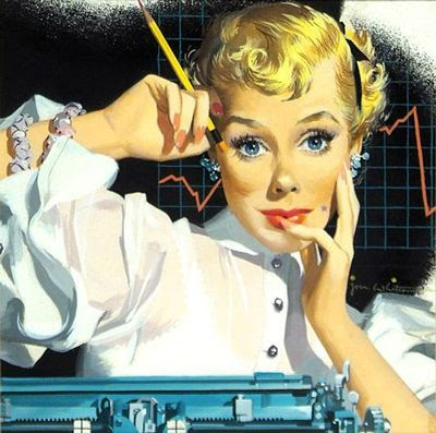
Golden Age illustrator Jon Whitcomb explained what elements he would change to idealize a woman's face, explaining "what makes a pretty girl pretty."

1. Eyes are sometimes moved further apart. This device helps make a face look younger.
2. The eyebrows are raised.
3. The irises of the eyes are enlarged very slightly.
4. Shadows from lighting are edited for simplicity and sometimes left out altogether.
5. Mouths are usually made a little fuller, especially the lower lip.
6. Superfluous lines, like laugh lines and wrinkles, and irregularities of the jaw and nose are ignored.

"The width of the face is narrowed slightly, since in life, your two eyes see a face that is a composite of the image from both. Eyes are roughly three inches apart, so that your left eye sees a little more of the left cheek, your right eye a little more of the right. Your visual impression is that of a thinner face."
---
From the Famous Artists Course, Lesson 13
4 comments:
I've always been fascinated by this chapter of the Famous Artists course, "Pretty Girls--Today's Men and Women." Of course the lesson is tuned to the strict standards of what constituted "pretty girls" in 1940s-1950s illustration: basically, slender Anglo-Saxon women.
I am a great admirer of Whitcomb's work, but I admit he reduced "pretty girl" to a rather rigid formula. All his women's faces tended to look the same. Al Parker's contribution to the same chapter makes an interesting contrast. He tried to give his women individual characters while still staying within the exacting definition of beauty. It was a tough act and he didn't always pull it off, but to me his women--his men, too, for that matter--felt a bit more believable than those of many of his contemporaries.
Very helpful! Thank you James!
I have to agree with the comments of “Smurfswacker”. I was also a great admirer of Whitcomb’s work and had a file folder of reproductions of his illustrations. As a young teenager, I was also fascinated by Lesson 13 of the Famous Artists Course. Whitcomb set a style that was sought after by art directors because it reflected the the ideals of beauty and glamour of that day. However, with changing times, I believe this style backed him into a corner. In that same FA course lesson featuring Whitcomb there was a page of a sketchy pencil style of his that I really admired and always remember. It’s too bad he wasn’t able to incorporate that in some of his major illustrations.
Joe Bowler, Coby Whitmore, Al Parker and many others were going in a slightly different direction. They introduced pretty girl and romantic illustrations that had a more believable quality.
Post a Comment