Thursday, April 9, 2015

Cornwell's Gangsters

Dean Cornwell, Saturday Evening Post, 1947, "Night Boat from Havana" 21x58 in. 
At their upcoming May 2 sale of American Art, Heritage Auctions is offering an illustration by Dean Cornwell (1892-1960). 


A car's headlights shine on a group of captured Cuban gangsters at the waterfront. Cornwell "saved $50 in models' fees" by having a group of his illustrator friends—some of the top talent in the business—pose for him as the smugglers.


The models include: Frank Reilly, Arthur William Brown, Gilbert Bundy, Harry Beckhoff, and John Gannam. Cornwell took a photo as a convenience, though in his earlier days he would have worked from life. Cornwell said, "Life models are soft these days and don't like to hold a pose long." Plus, they had deadlines.
-----
Quotes and photo from the book Illustrating for the Saturday Evening Post

Wednesday, April 8, 2015

Interview in Main Street Magazine

Main Street Magazine just released an interview in connection with the Stamford Museum show. The interview was by artist Brandon Kralik.

Kralik: It seems to me that by working in a representational style, by "breaking the rules," it goes to follow that we are actually operating under different rules, an alternative aesthetic criteria for judging what is good and what is valuable. Would you agree with this, that Illustration is something different than what we see in Post Modern aesthetic?

Gurney: I don’t think that painting representational images or telling stories with pictures necessarily breaks any rules. Who would make such rules? Telling stories and representing nature is what artists have been doing all through history.

Kralik: What are your "rules" that decide if a picture is good or not?

Gurney: My appreciation of art doesn’t follow any pre-set rules. I find myself moved by great works in all sorts of categories—landscapes, comic art, adventure illustration, landscape painting, portraiture. There’s good and bad art in every category, and I'm always ready to be surprised. I don’t spend much time evaluating what’s good or bad, because I’m a painter, not a critic. The best cure for bad art is good art.

Kralik: Do you make a distinction between Illustration and Fine Art?

Gurney: No, I don’t, because both terms are impossible to define. By fine art, do you mean gallery art? For some people the term "fine art" suggests a branch of art that's supposedly free from commercialism. Having been in the trenches in all sorts of art-making, I can attest that gallery art can often be the most commercial form. Gallery artists are always reminded of what's selling, and what's not, and are pressured by the marketplace to repeat successes more than any other kind of art. It's possible for a gallery artist to be unaffected by such things, but it's not easy. The least commercial art form I've ever experienced is magazine illustration, where the individual work of art has little influence on the ultimate commercial success of the larger work, namely the magazine. So if any art is fine in that sense, it is illustration.

If “fine art” means art that is created at the artist’s own initiative, then that would include illustrated books that the artist/illustrator creates.

“Illustration” is a term that means different things to different people. It can mean work that’s commissioned, work that tells a story, or work that is reproduced. Those are very different criteria, and there have been great works of art that fit one, two, or even all three of these measures.

A more meaningful distinction for me is between observational work and studio work—or you might say outdoor work versus indoor work, the outer eye versus the inner eye. Both aspects of the artistic life are essential to me, and always have been.

Kralik: Something that you have said, and which Mort Kunstler reiterated in his talk was that in part the goal is to create something, a painting, that cannot be photographed. You have done this with your Dinotopia series and in your numerous illustrations for National Geographic. Is this a primary concern or thought behind your work? What is the greatest benefit that realist painting has to offer us? To show us what we cannot see any other way, or to copy nature, or both?

Gurney: I agree with Mr. Kunstler—painting the things that we can only imagine is one of my favorite challenges as an artist. I did a lot of work for National Geographic, including pictures of the the legendary voyages of Jason and Ulysses, and reconstructions of the kingdom of Kush in Nubia and the civilization of the Etruscans in Italy. Each project was a stimulating chance to travel for research and to work directly with experts to recreate a world that could never be photographed.

I like to call this kind of painting “imaginative realism.” Imaginative realism is different from what we usually think of as fantasy. It’s a broader term, including any scene that can’t be photographed or observed directly.

Imaginative realism comes into play when reconstructing a scene from ancient Rome, a dinosaur in its habitat, a battle from the Civil War, or a portrayal of the Titanic on the sea floor. These are modern versions of what used to be called history painting.

Most wildlife art falls into this category, too, because wildlife artists can’t just snap a photo and interpret it in paint; they have to develop a scene first in their imagination and use their knowledge of nature to create a believable composition. What all these kinds of pictures have in common is that the artist begins with an imaginary idea, and then works hard to make the resulting picture as realistic as possible.

But I have also always painted and sketched from life at every opportunity. I’m currently working on a series of instructional documentaries on painting on location. The first one is called “Watercolor in the Wild,” and the next two will cover gouache and casein.

Kralik: What is the role of representational painting in our society?

Gurney: I can’t speak in general terms about what painting means for other artists or for society as a whole. I only know what motivates me to paint, and that’s the excitement that comes while making an image come to life out of the physical materials that I move around with my hands.

Whether it’s an imaginary scene or a portrayal of something I’m observing, each picture is a kind of conjuring process, and an illustrated book like Dinotopia combines my love of writing, lettering, book design, storytelling, and painting into a larger act of creation.

Kralik: For myself, I am interested in what connects us, as human beings from different cultures but also as societies and cultures existing in different times. Rockwell once said that he was not concerned about this. "Let future generations create their own artists," he said. Is timelessness something that you think about? Do you think about communicating with future generations through your work?

Gurney: I remember reading that statement about Rockwell, which suggests that he didn’t care about his legacy. Perhaps that was true early on. But once he realized that his paintings were taking on a life beyond their function as magazine covers, I believe he did care a lot about his legacy. Why would he bother to set up the Norman Rockwell Museum, and why would he write his autobiography and teach in the Famous Artists School? I think what he was saying with the quote about future generations was that artists should create their own art for their own times, and not copy him or anyone else. Rockwell was certainly concerned with connecting with his public. He painted the Four Freedoms completely on his own initiative, and it became a decisive factor in the war effort.

We live now in an age of transient technology and passing fads, but at least two things have the capacity of lasting: books and original paintings. Personally I’ve always preferred making art that has a physical embodiment, such as a drawing or painting, as opposed to digital art. I have no way of knowing whether my paintings will survive fires or floods, or whether they’ll speak to future generations.

Kralik: The idea that an artist must express themselves is paramount in Post Modern ideology and with representational painters it seems that it is partly this but also that it is important to "connect" with viewers using more universal symbols than purely subjective imagery. How much of your work is for yourself and how much is for your viewer? As if that were a measurable thing.

Gurney: Expression plays a role in my art certainly, because I have strong feelings that I bring to my paintings, and I like my art to communicate them. But expression isn’t as important for me as observation.

I love to capture the world around me, and I do that for my own pleasure, though more and more I’m sharing my sketchbooks through video and other new media.

I have literally dozens of pencil sketchbooks filled with studies of people that I’ve met and places that I’ve traveled. My studio is crowded with boxes full of small oil studies from faraway places and local vistas from the Hudson Valley. Sometimes the goal in an outdoor study is to capture a particular atmospheric effect or a color relationship, or to document the rapids in a stream or the unique quality of a sunset.

Kralik: How do you view the changes within the representational art world in the past 25 years or so? Realist painting seems to definitely be making a comeback it could be said. Do you agree? Why is that?

Gurney: Realist painting is certainly making a comeback, but I’ve also noticed a huge rise in interest in animation, graphic novels, and concept art when I visit art schools. Along with the return of realism as a mode of painting, popular forms of art are finding their way into academia and museums.

The Museum of Modern Art had huge successes with the exhibitions of Pixar and Tim Burton, and we’ve been fortunate to have had over 25 one-man museum shows on the art of Dinotopia. More and more people are realizing that illustration, comics, and animation are the mainstream story of twentieth-century American art. You couldn’t talk about 20th century music without telling the story of jazz and rock 'n' roll. The same is true in the visual arts.

That’s why we’re seeing more and more popular-culture college courses, not only on Bob Dylan and the Beatles, but also about children's literature, animation history, and the history of comics. All of these popular forms have dealt with the big topics—love and death—often with wit and humor.

Kralik: You have given a number of talks at universities and high schools. How can we, as painters, best encourage and educate students interested in representational art and, against the apparent rules of the art world, convince them and patrons who might support them, that it is ok to work in a realist or illustrative fashion?

Gurney: There’s no need to convince art students of any of this. They’ve grown up with the Internet, where they follow their own eyes to stuff they like. There are no rules in the art world. Old-school tastemakers and gatekeepers are getting swept away by new forms—and forums—of patronage and criticism. It’s not like it was in the old days, where you had to hope for the approval of the Pope or John Ruskin or the Salon Jury or Clement Greenberg. Art is wide open now, and there’s no single kind of art that’s dominant. The important trend is that for the first time ever, artists can connect directly with their audience and paint whatever they want to paint, supported by the people who love what they do.
-----
Dinotopia exhibit at the Stamford Museum and Nature Center through May 25
Brandon Kralik has an exhibit of his work at the Hotchkiss School in Connecticut, and will be giving a talk there on April 27.

Tuesday, April 7, 2015

Dinotopia World Beneath, Episode 10

It's Tuesday, time for Episode 10 of the serialized audio dramatization of Dinotopia: The World Beneath. You can listen to the track by clicking on the play button below, or by following the direct link to SoundCloud.


As they search for the legendary treasure of King Ogthar, Arthur, Oriana, Bix, and Crabb find a mothball fleet of biomechanical walkers, whose design is based on trilobites and dinosaurs.  

Back in the early 1990s, when I was painting these images, not many people called such things "steampunk," but they were definitely inspired by Victorian mechanics.  

The Podcast Series
This acoustic adventure was produced by Tom Lopez, mastermind of the ZBS Foundation, with an original music track by composer Tim Clark.

The Christian Science Monitor called this production "A dazzling soundscape that does full justice to Gurney’s wondrous lost world… perfect family listening.”

Episode 11 arrives in a week. Each short episode will only be live online for one week, and then it will disappear.

If you'd like to purchase the full two-hour World Beneath podcast right now and hear all fifteen episodes back to back in a feature-length production, check out The World Beneath at ZBS Foundation website for the MP3 download. It's also available as a CD.

The Book
You can also order the original printed book from my web store and I'll sign it for you. (It ships via Media Mail within 24 hours of your order. US orders only for the book, please). The book is also available from Amazon in a 20th Anniversary Edition with lots of extras.

The Museum Exhibition is now on view
Many of these paintings are now on view at the Dinotopia exhibition at the Stamford Art Museum and Nature Center through May 25.

Monday, April 6, 2015

How Sargent Interpreted Carolus-Duran


In 1879, at the dawn of his career, John Singer Sargent painted his teacher Carolus-Duran. Soon after, Carolus-Duran sat for a photograph. The painting was done from life, not from the photo; if anything it was the reverse: The photo was probably taken to match the famous painting.

Since the two images share a similar pose and lighting, it's possible to compare them for some insights into the subtle choices that Sargent must have been making.


1. Values of the skin tones are simplified and organized.
2. The principle highlights are reserved for the forehead and the nose.
3. The values of the hair are greatly simplified.
4. The mustache is twirled into up-facing points.
5. The face is slightly slimmer.
6. The eyebrows and eyes are drawn with more definite angles.
7. Throughout, there's a visual theme of the heart- or chevron-shape.

People who watched Sargent paint a portrait marveled at the process: "The lightness and certainty of his touch was marvelous to behold. Never was there any painter who could indicate a mouth with more subtlety, with more mobility, or with keener differentiation. As he painted it, the mouth bloomed out of the face, an integral part of it, not, as in the great majority of portraits, painted on it, a separate thing. He showed how much could be expressed in painting the form of the brow, the cheekbones, and the moving muscles around the eyes and mouth, where the character betrayed itself most readily; and under his hands, a head would be an amazing likeness long before he had so much as indicated the features themselves. In fact, it seemed to me the mouth and nose just happened with the modeling of the cheeks, and one eye, living luminous, had been placed in the socket so carefully prepared for it."


The painting won an Honorable Mention at the Salon, and an observer noted, "There was always a little crowd around it and I overheard constantly remarks in favour of its excellence."*

Adapted from "John Sargent" by Evan Charteris (New York: Scribner's Sons, 1927).
* from John Singer Sargent, Complete Paintings, Volume 1: The Early Portraits (Vol 1)

Previously: A similar comparison with his portrait of Coventry Patmore

Sunday, April 5, 2015

Happy Easter

Happy Easter! Here's a drawing that I did about 30 years ago of the Church of the Messiah in Rhinebeck, NY. 

I drew it with pen and ink on scratchboard. The style is an homage to Franklin Booth (1874-1948), whose work was in turn inspired by the look of wood engraving.

Saturday, April 4, 2015

Streaming a Plein-Air Painting


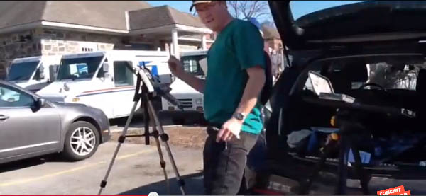
On Thursday, April 2, Jeanette and I web-streamed a plein-air painting to viewers around the world using ConcertWindow.com. We webcast from the parking lot of the Beekman Arms Hotel in Rhinebeck, NY using public wifi from the hotel.


Here's the painting in gouache, which took about an hour from start to finish. I streamed with an iPad2 using BUSK, Concert Window's streaming app for iOS smart phones and tablets.

This is the prototype iPad holder that I built. It's made of plywood and a piece of picture frame. But it's not adequate because it doesn't protect the iPad enough from a fall risk. I'll build an improved prototype and share that with you.

iPad holder for a camera tripod
Having the iPad on a tripod allows for a lot of flexibility of camera angles, letting me tilt the view down to the palette and up to the painting and the subject. I also had the option of switching the view from one side of the iPad (the sketch) to the other (me talking).

We were just testing this out, really, so we didn't announce, schedule, or promote the show. But the word mysteriously spread, and 53 viewers magically found their way to the stream. There were viewers all across the USA and Canada, and also in Ireland, Switzerland, Germany, as well as fellow artists watching from work at Hallmark Cards, ILM, and Pixar. The interactive quality of the show was fun for all. People could ask us to change the camera angle or ask any question about the process.
Thanks to all who watched. We appreciated your comments, questions, and generous tips.


(Link to YouTube video) Here's a random clip from the webcast to give you the flavor of it. Streaming an on-the-spot painting is filled with unexpected risks and surprises. We had motorcycles revving up around us, trucks backing, beeping, and blocking the motif. While we were painting, several passersby came up and interacted with us, and they became part of the webcast.

A few people told me this was the first ever web-streamed plein-air painting. I'm not sure—was it really? At least I'm pretty sure it was the first stream on a monetized platform of an outdoor painting using a public wifi connection. About the monetization: Shows can be set to be free, "Pay What You Want" ($1 minimum) or performers can set ticket price. Viewers can tip while the show is in progress. Concert Window splits the revenue: 70% to the artist / 30% to Concert Window.

Jim and Jeanette Gurney sketching. Photo by Susan Daly Voss
It helped to have an extra laptop so that Jeanette could be moderator and read the chat stream aloud. I tried to answer questions as I painted, or if I was concentrating too much, she answered them.

If you want to be sure you don't miss my next plein-air webcast, be sure to check Concert Window's James Gurney page and press the "Follow" button. They'll email you next time I go live.

If you're thinking of doing a webcast, I recommend it. It's free to sign up and do a show. You could stream your demos, connect with your gallery clients, and be on the cutting edge of new technology. And you can webcast using your smart phone from anywhere there's cell coverage, or from a laptop anywhere there's wifi.

Here's more info about Concert Window:
What can you earn? How does Concert Window work?
My first Concert Window show was in August 2013.

Friday, April 3, 2015

Harold Speed, "Drawing" / Preface and Intro

Today is Friday, the first gathering of the GJ Book Club. Each week we'll be looking at a new chapter of Harold Speed's classic The Practice and Science of Drawing (Dover Art Instruction), starting with the Preface and Introduction.

The following numbered paragraphs combine citations of key points in italics, followed by a few of my own remarks. Your thoughts are most welcome in the comment section of this blog. If you would like to respond to a specific point, please precede your comment by the corresponding number.

Preface
1. "The Practice and Science of Drawing"

Baked into the title is the classic dilemma of art instruction. Do you teach the practice or the science? The technique or the theory? The methods or the principles? The hand skills or the thinking behind them? Harold Speed aims to address both. Note: earliest editions of the book reverse the order thus: "The Science and Practice of Drawing."

Pages from J.D. Harding's "Lessons on Art

2. "...the drawing masters of our grandmothers and still dearly loved by a large number of people. No good can come of such methods, for there are no short cuts to excellence."

Speed is probably referring to the drawing manuals of J.D. Harding (1798–1863), such as "On Drawing Trees and Nature." Harding's how-to-draw books were immensely popular throughout the 19th century. Typically his books present the student with a series of drawing lessons, beginning with geometric solids, and graduating to commonplace forms like buckets or stairs or rocks. It's kind of a recipe for drawing, but not a bad one for beginners, in my opinion. I think Speed wants his students to dig beyond these drawing formulas. He proposes to achieve it by examining more fundamental principles. He's also interested in the student acquiring the "artistic" sensibilities of rhythm and unity, regardless of the forms he or she is drawing.

3. ".... having passed through the course of training in two of our chief schools of art..."

The two schools he is alluding to are the Royal College of Art (where he started out in architecture) and the Royal Academy Schools. He also won a traveling scholarship to Belgium, France, Italy and Spain. Source: Burlington.

4. "the long uphill road that separates mechanically accurate drawing and artistically accurate drawing."

The academic education one would have found in the 1890s in England and continental Europe might have seemed superficially similar. Students worked from the cast and from the model in both traditions, but there were differences. According Speed, the English school was more concerned with observationally accurate drawings, while the French schools were more "interpretive" or "artistic."

Does anyone know at which ateliers in France or Europe Mr. Speed studied, and what the prevailing sensibilities were in those schools? Also, does anyone know which teachers he would have had at the Royal College of Art and the Royal Academy? Maybe one of our atelier experts can explain more about the specific differences between the English and French schools in the 1890s.

5. To many in this country modern art is still a closed book.

Modernism's assault on the ramparts of art-thinking was far along in 1917, when Speed's book was published. Europe was torn by the Great War. Russia was in the midst of its revolution. The Edwardian world, with all its assumptions about the nature and purposes of art, was collapsing like an ornate marble edifice. Speed, it seems, is trying to examine his assumptions about art and to remain open-minded.

Contents of Speed's 1936 book What is the Good of Art?

By 1936, when he wrote is much lesser-known book "What is the Good of Art?," The world of art around him must have seemed to have gone completely off the rails. "We have no tradition to guide us," he says in Drawing, almost in desperation.

Speed's later books were even more philosophical, as if he was trying to work out an understanding of modernism that he could reconcile with his academic training. The 20th century illustrator and book author Andrew Loomis went through a similar evolution in his books as he went from "Fun With A Pencil" to "The Eye of the Painter." Loomis's earliest books are basic and practical, and as time went by, his books grappled more and more with serious and philosophical topics.

6. Where formerly the artistic food at the disposal of the student was restricted to the few pictures in his vicinity and some prints of others, not there is scarcely a picture of note in the world that is not known to the average student....It is no wonder that a period of artistic indigestion is upon us."

Wow, what would he make of the massive availability of art on the Internet?

7. The position of art to-day is like that of a river...

As I understand his whole metaphor, he's saying that we can't discard history and start all over again, nor can one pretend to be naive and see like a child again.

Introduction

8. The real matter of art lies above and beyond the scope of teaching.

Speed is aware of the blood-draining effect of too much cold analysis. He recognizes the mystery of intuition, and the idea that in a good painting, a higher power seems to flow through an artist. With a tip of the hat to the infinite, he wants to proceed to the practical matters of the book. But he gives us this introduction to provide an aesthetic context to the material that follows. Encompassed in this section of the book is his search for a definition of Art.

9. Variety of definitions of art

Speed summarizes several classic definitions of art, and ends up favoring that of Leo Tolstoy. I also love Tolstoy's definition, which hinges on the artist intentionally transmitting a felt emotion to the viewer. The great thing about that definition is the way it includes virtually every form of art, including music, painting, dance, and storytelling, but it excludes things like wallpaper or architect's blueprints.

If you would like to read the full text of Tolstoy's famous essay, it's available on Archive.org, and it's a good read, despite his bashing of opera at the beginning.

10. Each art has certain emotions belonging to the particular sense impressions connected with it.

Speed introduces his notion of "rhythm," for want of a better word, to encapsulate the abstract visual power of painting and drawing. He's talking about the effect of the design of the picture, apart from the representational subject matter. Speed was influenced by the English art critic Walter Pater (1839-1898), who said, "All art constantly aspires towards the condition of music." Speed points out that the abstract power of painting contains qualities that are unique to our visual life, and perhaps distinct from other art forms that appeal to other senses.

11. There seems to be a common centre in our human life.

Speed speaks to the universal human emotions and experience expressed in art.

12. The visible world is to the artist, as it were, a wonderful garment, at time revealing to him the Beyond, the Inner Truth there is in all things.

This notion goes all the way back to Plato, and can be found in the writings of the American Transcendentalists. I recommend, for example, Asher B. Durand's essay "Letters on Landscape Painting," which presents similar ideas about landscape painting.

13. Beauty is a state of mind.

Speed regards beauty not so much as a particular arrangement of proportions or a particular kind of object, but rather a state of mind in the observer which allows him or her to find rhythm in anything. He criticize artists "whose vision doesn't penetrate beyond the narrow limits of the commonplace."

Thus, finding beauty in the subject is not the same as altering it to meet some ideal formula. Instead, the artist must cultivate the feeling in the heart, and use the tools of the trade to put that feeling on canvas — while still painting the subject accurately.

14. Art for art's sake or art for subject's sake?

The former is the guiding idea of the Aestheticism, which was in full swing in the opening years of the 20th century. Speed strikes a reasonable middle course between the two classic art theories. He faults paintings that calls attention to surface technique, and he also dismisses the other extreme: artists so caught up in their subject matter that they create only "painted symbols."

15. It also serves to disturb the 'copying theory.'

Speed ends his introductory essay with an admonition to his readers not to fall into the common pitfall among academic students of his time, and perhaps now, to copy the outer surface of things, while missing the more elusive qualities of life and rhythm.
-----
I invite you to add your comments, as much as possible keyed to the numbers.

Harold Speed "Drawing"
Next week: Chapter 2: "Drawing"
-----
The Practice and Science of Drawing is available as an inexpensive softcover edition from Dover, You can also get the book fully illustrated and formatted for Kindle. Or you can read it online in a free Archive.org edition. Finally, there's a Project Gutenberg version
----
Articles on Harold Speed in the Studio Magazine The Studio, Volume 15, "The Work of Harold Speed" by A. L. Baldry. (XV. No. 69. — December, 1898.) page 151.
and The Windsor Magazine, Volume 25, "The Art of Mr. Harold Speed" by Austin Chester, page 335. (thanks, अर्जुन)
------
There will be additional discussions and postings related to the GJ Book Club on:
GJ Book Club Facebook page  organized by Keita Hopkinson
Pinterest page by Carolyn Kasper. Thanks for moderating those.
Original blog post Announcing the GJ Book Club
Overview of the blog series
Chapter 1: Preface and Introduction
Chapter 2: Drawing
Chapter 3: Vision
Chapter 4: Line Drawing
Chapter 5: Mass Drawing
Chapter 6: Academic and Conventional
Chapter 7: The Study of Drawing
Chapter 8: Line Drawing, Practical
Chapter 9: Mass Drawing
Chapter 10: Rhythm
Chapter 11: Variety of Lines
Chapter 12: Curved Lines
Chapter 13: Variety of Mass
Chapter 14: Unity of Mass
Chapter 15: Balance
Chapter 16: Proportion
Chapter 17: Portrait Drawing
Chapter 18: Visual Memory
Chapter 19: Procedure
Chapter 20: Materials

Thursday, April 2, 2015

Seb Lester's Lettering Tools

The video begins: "My name is Seb Lester. I'm a designer and artist based in the U.K. The focus of all of my work is letterforms." (Link to video)


Seb Lester's calligraphy is best known from a series of videos showing a wide range of calligraphy styles.


A freehand demo of some familiar corporate logos recently went viral. (Link to Video)
On his Facebook page, Mr. Lester has generously shared a detailed description of his lettering tools:

"In terms of broad edge tools, necessary for Gothic and Italic styles of calligraphy, Pilot Parallel Pens are good tools for beginners. These are the pens I have been using for the clips that have recently gone viral on social media and websites like Design Taxi and Buzzfeed. ‘Manuscript’ brand calligraphy fountain pens are widely available and practical beginners tools. As you advance you will probably want to start using traditional metal calligraphy nibs made by established manufacturers like Brause and Mitchell and also Automatic Pens. They can be a bit more difficult to handle but can help achieve finer, crisper results."
'How To Get Started in Calligraphy 

Many hundreds of people have been asking me questions about what pens I use and how to get started in Calligraphy over the last few days. This seems like the perfect time and place to help promote the practice and appreciation of this beautiful, ancient art form. Calligraphy has been created with a wide variety of tools over the past 2,000 years or so in the West. This article describes some of them.

In terms of broad edge tools, necessary for Gothic and Italic styles of calligraphy, Pilot Parallel Pens are good tools for beginners. These are the pens I have been using for the clips that have recently gone viral on social media and websites like Design Taxi and Buzzfeed. ‘Manuscript’ brand calligraphy fountain pens are widely available and practical beginners tools. As you advance you will probably want to start using traditional metal calligraphy nibs made by established manufacturers like Brause and Mitchell and also Automatic Pens. They can be a bit more difficult to handle but can help achieve finer, crisper results.

For pointed pen calligraphy, characterised by graceful curves and strong contrasts in line width, I would recommend trying Nikko G nibs. You can use these in either a traditional or an oblique pen holder, it is a matter of personal preference. Iron Gall ink is best for this type of calligraphy. Walker’s Copperplate Ink and McCaffrey’s Ink get good results for me.

Paper is always an important consideration. The paper I often use with Pilot Parallel Pens is Daler Rowney Smooth Cartridge Paper, but any smooth cartridge paper should be fine. When I’m working on roughs for any type of calligraphy I often use layout paper and marker pads. In terms of sketch pads a lot of calligraphers like the Rhodia and Claire Fontaine brands as the paper doesn’t bleed very easily. As with everything the key is to experiment, paper with more texture can produce interesting results too.

In terms of books for inspiration I can recommend ‘Scribe: Artist of the Written Word’ by John Stevens, a true modern master. For instruction I would also suggest ‘Foundations of Calligraphy’ by the brilliant Sheila Waters. ‘Calligraphy’ by Gaye Godfrey-Nicholls was published last year, a good book for beginners. Any of ‘The Speedball Textbook’ series are also inexpensive sources of instruction and inspiration.

The key to producing beautiful calligraphy is perseverance. Progress comes through focused and sustained study and practice. You will only persevere if you enjoy what you’re doing. For this reason I’d personally suggest starting with a calligraphy style you particularly like the look of. When you have a reasonable grasp of that style you will notice many of the skills are transferable to other styles.

I feel so lucky to have found what Hermann Zapf described as “this peaceful and noble art”. My working process as a designer and artist has evolved into a hybrid style blending my knowledge of both traditional and digital tools. There are some things that computers can't do and vice versa, so I think this is a great way to work. I have a broader palette of tools at my disposal than ever before and I find this very beneficial. I feel I am becoming a better artist and designer every day, which makes me very happy. So if you want to try calligraphy just have fun. Don’t be discouraged by early failures, there will be many of those. However, I can say with lots of personal experience that success is built on failure.

Some recommended tools from the attached image. These tools reflect my personal taste and are not a definitive list. Other calligraphers would most likely recommend other tools. From top to bottom: Pilot Parallel Pen, Pentel Colour Brush, Kuretake No. 13 Fountain Brush Pen, Manuscript Italic Fountain Pen, Nikko G Nib with oblique pen holder, Automatic Pen, Copic Wide Marker, Ruling Pen.'
Top to bottom: Pilot Parallel PenPentel Colour BrushKuretake Fountain Brush PenManuscript Italic Fountain PenNikko G-Pen with oblique pen holder, Automatic PensCopic Wide MarkerRuling Pen.
"For pointed pen calligraphy, characterised by graceful curves and strong contrasts in line width, I would recommend trying Nikko G-Pen nibs. You can use these in either a traditional or an oblique pen holder, it is a matter of personal preference. Iron Gall ink is best for this type of calligraphy. Walker’s Copperplate Ink and McCaffrey’s Ink get good results for me."

"Paper is always an important consideration. The paper I often use with Pilot Parallel Pens is Daler Rowney Smooth Cartridge Paper, but any smooth cartridge paper should be fine. When I’m working on roughs for any type of calligraphy I often use layout paper and marker pads. In terms of sketch pads a lot of calligraphers like the Rhodia and Clairefontaine brands as the paper doesn’t bleed very easily. As with everything the key is to experiment, paper with more texture can produce interesting results too."

"In terms of books for inspiration I can recommend ‘Scribe: Artist of the Written Word’ by John Stevens, a true modern master. For instruction I would also suggest ‘Foundations of Calligraphy’ by the brilliant Sheila Waters. ‘Calligraphy’ by Gaye Godfrey-Nicholls was published last year, a good book for beginners. Any of ‘Speedball Textbook’ series are also inexpensive sources of instruction and inspiration."

"The key to producing beautiful calligraphy is perseverance. Progress comes through focused and sustained study and practice. You will only persevere if you enjoy what you’re doing. For this reason I’d personally suggest starting with a calligraphy style you particularly like the look of. When you have a reasonable grasp of that style you will notice many of the skills are transferable to other styles."
-----

Wednesday, April 1, 2015

Watercolor Ban Announced in California


California has just announced sweeping new restrictions on water use that will affect working artists. The ban applies not only to watercolor, but also to acrylic, casein, gouache, and other water media. Pencils and pastels and other dry media are not affected.
---
CNN: California Drought: Gov. Jerry Brown issues mandatory water restrictions

New group of Equihominids discovered


Scientists who exhumed the original skeleton of Equihominid aprilis near Volos, Greece in 1980 report that they have uncovered more than a dozen new individuals in the exposed shoreline sediments near Samsun in northern Turkey.


"The preservation of these fossils is extraordinary," said Project Director Manolis Ipponikos, who led a team from the Istanbul University of Turkey. "Having a larger sample size of these rare specimens allows us to better understand the variability of this species."


According to Professor Ipponikos, fish bones were found in the stomach contents of the centaurines, along with spearpoints nearby, which points to a pescetarian diet. "Some of the male skeletons exhibited healed postcranial injuries," he said, "suggesting that they had previously engaged in some form of violent conflict."

However, the creatures appear to have perished from a mass drowning event, most likely when the Black Sea was inundated from the Bosphorus, as suggested by Walter Pitman's Black Sea deluge hypothesis. Radiocarbon evidence from the skeletons confirms the  6500BC date for the flooding event.
------
Previously:
Uffizi to Auction its Collection 
Bold New Art in the White House
Dinotopia-Themed Caskets
Copro-Lights
Village Books