Sunday, July 26, 2015

New Painting Challenge: Outdoor Market

Eugene Galien Laloue (1854 - 1941) Paris, le marchĂ© aux fleurs 
Gouache on board, 8 1/4 x 13 1/4 inches
We had such an enthusiastic response to our last Gouache Challenge that many of you asked for another opportunity.

I hesitate to call it a "contest" because there's no entry fee and the spirit is more about cooperation, community, and camaraderie than competition. We're all at different levels of skill and experience, but we're all out there braving the elements and trying out new painting ideas.

Helen Allingham Market Stall in Venice, watercolor
The August Challenge
Paint an outdoor market on location with a limited palette of opaque water media. The limited palette is just three colors of your choice plus white.

Norman Price, Eastern European Market, gouache
What kinds of outdoor markets?
Any outdoor place where people are selling things: fruit or flower markets, farmers' markets, roadside stands, craft fairs, flea markets, yard sales, swap meets, sidewalk sales, fish markets, Chinese wet markets, Latin-American mercados, and Arab souks.

On Location
It must be painted on location and it must be a new painting done for this challenge. In addition to a scan of the final painting, your entry must include a photo of your painting in progress in front of the motif.

Alfred Glendening Parisienne Flower Market
Paints
Any of the opaque water media are acceptable: casein, gouache, Acryla-gouache, or acrylic. Sorry, for this challenge there's no oil and no dry media. You can combine with transparent watercolor and watercolor pencils as long as they're the same colors, but there should be at least some opaque passages. 

The Limited Palette
The reason for the limited palette is to keep your painting harmonious, which can be difficult with such a kaleidoscopic subject.

Here are some suggestions, giving equal time to different companies: 
Holbein gouache: Viridian, Cadmium red deep, and Yellow ochre plus white
M. Graham gouache: Ultramarine blue, Cadmium yellow deep, and Burnt umber plus white
Winsor and Newton gouache: Perylene maroon, Cadmium yellow, Cobalt blue plus white
Richeson casein: Cobalt blue, Light red, Golden ochre, and white
Feel free to come up with your own, you don't have to follow these suggestions.

Deadline
It's free to enter. You can enter as soon as you finish the piece, but no later than the deadline: Monday, August 31 at midnight New York time. Winners will be announced on Wednesday September 2. 

Edward Seago, Moroccan souk
What and How to Enter
Just shoot two image files: 1. Your finished painting and 2. A photo of the painting on the easel in front of the subject. Your face doesn't have to be in the photo unless you want to.

Upload the images this Facebook Event page (This way I don't have to deal with email, and you get to present your images your way). If you don't have a Facebook account, please ask a friend with an account to help you. Please include in the FB post the list of the three colors you chose (plus white), and if you want, a word about your inspiration or design strategy, or an anecdote about your painting experience. 
Prizes
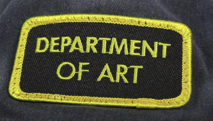
I'll pick one Grand Prize, three Finalists, and six Honorable Mentions. Those 10 will be published on GurneyJourney. The Grand Prize winner and Finalists will receive an exclusive "Department of Art" embroidered patch. In addition, the Grand Prize winner receives a video (DVD or download) of their choice. Everybody who participates will have their work on the Facebook page, too.
-----
Own the 72-minute feature "Gouache in the Wild"
• HD MP4 Download at Gumroad $14.95
• or HD MP4 Download at Sellfy (for Paypal customers) $14.95
• DVD at Purchase at Kunaki.com (Region 1 encoded NTSC video) $24.50



Saturday, July 25, 2015

GJ Book Club Chapter 16: Proportion

On the GJ Book Club, we're looking at Chapter 16: "Rhythm/Proportion" in Harold Speed's 1917 classic The Practice and Science of Drawing. The following numbered paragraphs cite key points in boldface. If you would like to respond to a specific image or point, please precede your comment by the corresponding number.

Speed begins by introducing the idea that mathematical proportions may lie behind the design principles of older artists. He says:

1. There appears to be no doubt that the ancient sculptors used some such system.
Speed doesn't mention which system, or which proportions, whether phi, pi, square root of 2, Vitruvian or what? I, for one, am skeptical, and would want to see proof beyond the superimposed diagrams; I'd need to see actual texts from the artists themselves that specifically discuss the question of which system they supposedly used. There's more in my series "Mythbusting the Golden Mean." Speed himself says that art probably shouldn't be reduced to a mathematical formula. Then he asks a key question:

2. The question we are interested to ask here is: are there particular sentiments connected with the different relations of quantities, their proportions, as we found there were in connection with different arrangements of lines and masses? Have abstract proportions any significance in art, as we found abstract line and mass arrangements had?  

Speed answers his question in a simple way that makes sense. In his words: "unity makes for sublimity, while variety makes for the expression of life." Here I don't think he means "sublimity" from the point of view of Edmund Burke's concept of the sublime as apocalyptic or terrifying, but rather more as calmly reverential.

3. Nature seems to abhor equalities, never making two things alike or the same proportion if she can help it. All systems founded on equalities, as are so many modern systems of social reform, are man's work, the products of a machine-made age.


Pepsi headquarters building, 1960

I wonder what Speed would have thought of modern architecture, which made a virtue of even repetition of forms. Speed says, "although you often find repetitions of the same forms equidistant in architecture, it is seldom that equality of proportion is observable in the main distribution of the large masses."

4. Diagrams.

The remainder of the chapter discusses the many diagrams of even spacing (reverential, sublime) versus uneven spacing (life and variety).

Feel free to offer your comments on any of the points mentioned above, or other points I may have missed.

-----


The Practice and Science of Drawing is available in various formats:
1. Inexpensive softcover edition from Dover, (by far the majority of you are reading it in this format)
3. Free online Archive.org edition.
and The Windsor Magazine, Volume 25, "The Art of Mr. Harold Speed" by Austin Chester, page 335. (thanks, अर्जुन)
GJ Book Club on Pinterest (Thanks, Carolyn Kasper)

Friday, July 24, 2015

The Artistic Revival of Austin Brigs, Part 2

Yesterday we read how Austin Briggs took time away from his busy illustration career to spend four months in the GaspĂ© Peninsula painting from nature. In this Part 2, he'll tell us how this sabbatical paid dividends when he returned.


"My landscapes became more alive and convincing and I knew that I was no longer dependent on other artists for a point of view. In a way, that landscape painting trip to Canada was my declaration of independence."


"While on the Peninsula I used my camera a great deal to record information which I believed I could use later. I was right as you can see here. I painted this sample illustration upon my return from Canada with a feeling of confidence. In painting this picture, I relied entirely on my personal reactions to a subject and on my stored up experience in actually observing and painting from nature."


"My studying began to pay off handsomely because many assignments I received required some landscape in the background. In doing this job for the Woman's Home Companion, I felt that I could see the actual sunlight and shadow on the men as they advanced through the jungle."


"The sky pattern in this Cosmopolitan illustration is one remembered from my Gaspé trip."


"Here is another example of the useful information you can store away in a photograph and eventually use. The shadow pattern in the photograph served as a springboard for the structure of this illustration for The Post. Notice the manner in which the figures follow this pattern. As a result, the picture appears to be 'of a piece.'"


"Here is one illustration from a serial done for The Post. The locale was Charleston, South Carolina and for a long time I struggled to illustrate the story with the help of photographs and studio props The job just wouldn't come off, so I went to Charleston and in a short time had plenty of information as well as a personal knowledge of the countryside."


"This picture was planned with the landscape of a nearby hill in mind. After I had worked out my arrangement, I moved my easel and the model to the hill and painted directly from nature. The sky is as it appeared on the day I painted it and adds much to the mood of the picture. I heartily recommend painting on location whenever circumstances permit it — particularly if the picture is predominantly a landscape. Keep in mind, however, the necessity of integrating the figures into the landscape, rather than slavishly copying the landscape as it appears.
-----
We'll do the Harold Speed Book Club tomorrow.
Previously:
The Artistic Revival of Austin Briggs, Part 1
Quoted from Famous Artists Course (1954 Edition) Lesson 16.
Austin Briggs Flickr set by Leif Peng

Thursday, July 23, 2015

The Artistic Revival of Austin Briggs, Part 1

One of the most inspiring stories of a mid-career revival came from the mid-20th century illustrator Austin Briggs (1908-1973), who told how he rediscovered painting from nature:

"Some years ago," he says, "I became very discouraged with my work. I was studying the work of other illustrators, which, in the beginning, was very helpful."

"But my own work had no individuality. Every few months as I became aware of a new illustrator's work, my style changed and not one of my pictures looked as though it was painted by me — especially the backgrounds and the landscapes. What had happened was that my ability to observe and learn from nature was dying from disuse."

"Finally it dawned on me that I should get away from the influence of other artists and work directly from nature to develop my own personal reaction to the visual world. Having decided this, I took an immediate vacation and went to the GaspĂ© Peninsula in Canada for four months. There I sketched any and everything — from nature."

"During my vacation on the Gaspé Peninsula, I did this painting of sailboats. While painting many pictures like this, I began to experience a very personal reaction to forms and the play of light on them. In fact, I became so interested in landscapes that they became, and still are, an integral part of my work, almost a trade mark you might say."

"Here is another landscape done after returning from the Gaspé Peninsula. By now I knew that the points of view borrowed from other artists were not suited to my temperament. Indeed they were damaging and antagonistic."

"As you can see, in this landscape I began to realize a positive and individual reaction to nature."
-----
Tomorrow: Part 2: What happened next.
Quoted from Famous Artists Course (1954 Edition) Lesson 16.
Austin Briggs Flickr set by Leif Peng
Briggs Flickr collection by Matt Dicke

Wednesday, July 22, 2015

Your Gas Station Paintings

We had a tremendous response to the Gas Station Challenge. I put out a call a few weeks ago for you to paint a gas station on location in black and white gouache. One of the reasons I suggested that subject was because I figured no one would have any such painting already completed.

Thanks to everyone who took part. You braved biting flies, extreme heat, rain, and station owners who were suspicious or who thought you were crazy. Some of you painted outdoors for the first time, or painted in gouache for the first time. And there were some old pros stepping up to the plate. 

It was really hard to pick the winners, but here 'goes.

Grand Prize
The Grand Prize Winner is Randy Raak's painting of the "Dino Mart" in Golden, Colorado. I would have loved this one even without the dinosaur because it captures such a sense of place, with the new retail construction on the hills above the station. The perspective is really good, and the values are carefully observed. Translating bright colors into gray tones is a challenge. 

Randy says "The painting is 9" x 11" on 140# rough watercolor paper, completed 100% on location during five, two hour sessions."

 3 Honorable Mention Winners

Olivier Martin is one of three Honorable Mentions for this interesting study of a Parisian gas station. 

He had a lot of complicated forms and lettering to sort out, and he did so with real affection for the detail.


He said that it was hard to find a quiet place to paint in Paris, and that his position was a "little bit strange for people who pass on the street, but next to this tree I was in calm."

The second Honorable Mention goes to Eelis Kyttänen for his boat fueling station. He picked an unusual subject and viewpoint. He carefully observed the values of the shadow side of the building, which makes the lighting very convincing.

Here he is showing the painting from the bridge where he painted it.

But just to show that not all paintings have to be highly detailed, I'm giving the third Honorable Mention to Dave Lebow for this pump study (below). I like the way he described the curving forms of the modern pump catching the shimmery hot light from the surrounding environment. 

This is a good example of the selectivity you can get with gouache. He focused on the pump, and did some of his drawing over the opaque paint. He softened the edges of the distant buildings and trees. It's an artistic effect without calling attention to itself.


Soft edges take conscious effort in gouache, especially if you use full opaques in the hot sun. I also like the way he included a vehicle, knowing how briefly they stay next to pumps.

Pictures of Merit
Braelyn Snow did this study of a single pump. She chose to remove it from the surroundings so that she could spend her time focusing on the variety of surface textures, including the reflection of the hose on the chrome side.

She says, "While I was working at the vacant Apple Pie Inn, a van drove up beside me and the driver asked what I was doing. When I told her, she told me she was the owner and had been worried I was up to something suspicious. Apparently the other two pumps had been stolen. After I assured her I would not steal the pump, only paint it, she gave her blessing and drove away. This is why I like to call ahead when I know who to ask!"

Daniel New also chose to concentrate on a single pump. That way he could describe the decaying plastic covering the advertising sign, the bent metal pieces, and the eroded stickers.


In the part-way finished painting, you can see how he built a lot of those details over flat base tones. 

I was surprised how many of you painted from your cars, but judging from the droplets on the window, this was a rainy day.

Jared Cullum captured the full scene with all its detail: the signs, the plantings, and even the cars. The result gives a strong feeling of being there. 


He deserves special commendation for doing the painting while babysitting and adapting the stroller into an easel.


Matt Sterbenz painted this night scene. I find this study moody and compelling, with the solid black night sky on the right, and the glow of light under the canopy raising the values of all the darks. It feels like a weird space station, and it would be fun to go back there with full color.

Like a spy, Matt dresses in black and works from his car in a super portable setup. He's kind of a night-painting ninja who might strike anywhere anytime!


Evidently, Larry Kitchen has a lot of experience with gouache. He lays down those lines very professionally and gets the perspective right. 

Larry says, "There really is something great about going out on a cool summer morning to catch a scene."

This painting by Nicholas Elias picks up on the weird forms of the superstructure above the pump, with all those fire prevention nozzles. 

And it looks like he's got a cool palette rig to hold the sketchbook vertically.

Finally, Jeff Simutis, an experienced architectural painter, painted this old gas station. Nice relaxed handling throughout, with a lot of affection for that false front.

Jeff is using a gray scale called Rankin's Perception Kit that helps in judging values.

Thanks again to everyone for taking on the challenge. There are a lot more entries, and you can see them all at the Facebook event page. I'll be contacting Randy, Olivier, Eelis, and Dave about getting their "Department of Art" prize patches. 
By the way, does it work for everyone to upload your entries directly to a Facebook event page? That would save me a lot of work and make these more do-able for the future.
----

Tuesday, July 21, 2015

Tip: Keep Gouache Fresh in Jars


Tip: Tubes of gouache stay fresh if you keep them sealed in big glass jars.
When you're in the field and you don't want to take glass, you can use those resealable faux-Tupperware containers , which are unbreakable, airtight, and they protect the paints from being crushed in your kit.
----
Previously: Keeping Watercolors in Jars
-------
Own the 72-minute feature "Gouache in the Wild"
• HD MP4 Download at Gumroad $14.95
• or HD MP4 Download at Sellfy (for Paypal customers) $14.95
• DVD at Purchase at Kunaki.com (Region 1 encoded NTSC video) $24.50

Monday, July 20, 2015

Gas Station in Gouache Contest Deadline Tonight

Gouache billboard art from Charlie Allen's blog.
Today at midnight is the deadline for the "Gas Station in Black-and-White Gouache" assignment. I've been posting the entries so far on a Facebook event page, so you can see and comment on what everybody has been doing, all around the world. I'll add the rest of the entries by tomorrow morning.
---
Gas Station Contest Announcement

Proposed Copyright Law Explained


Illustrator and artists'-rights activist Brad Holland explains the details of the proposed new copyright law. According to Holland, if this is passed, it would undermine the rights of artists in the age of the internet (link to YouTube video).

Here's a written article about the same topic by Brad Holland
Submit your letter here.
Sample letters.
Thanks, Will Terry, Bryn Barnard, and everyone else who mentioned this

Sunday, July 19, 2015

The Artistry of Chuck Jones


(Link to YouTube) Film editor Tony Zhou presents this concise summary of what makes the cartoons of Chuck Jones so memorable. Jones developed from a good director to a great one by refining perfectly timed gags driven by memorable characters.

Animation is a medium of movement, and the characters' movements were always original and understated, based on observations of real life.
-----
The YouTube channel Every Frame a Painting analyzes the techniques of great filmmakers. Check out the episodes on Akira Kurosawa and Jackie Chan.
The book Chuck Amuck:  The Life and Times of an Animated Cartoonist, written by Jones himself, is a good source for his thinking.