Showing posts sorted by relevance for query mucha. Sort by date Show all posts

Saturday, January 20, 2018

Alphonse Mucha Exhibition in Upstate New York

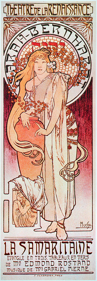
Superstar actress Sarah Bernhardt desperately needed a poster for her play Gismonda.

But the three top poster artists were on vacation. So she turned to a little-known Bohemian artist named Alphonse Mucha.

The rush order came on Christmas Day. The final was due January 1.

Mucha delivered on time. His poster was narrow and tall—7 feet tall—not the square format others used. It was full of detail, with many layers of muted colors. Each color had to be separately drawn on huge stone lithographic plates.

Mucha's poster was displayed throughout the streets of Paris in January of 1895. The "street galleries" generated as much passionate art talk as did the oil paintings in the Salon.

His design looked nothing like the ones by Toulouse Lautrec or Jules Chéret or any of the other poster specialists in Paris. Everyone was enraptured by his distinctive brand of confident femininity, ornate botanical detail, and extravagant pattern.

The Gismonda poster so enchanted Bernhardt that she signed him to a multi-year contract. After years of relative obscurity, he was the toast of artistic Paris, an overnight success.


This photo wasn't taken at the Hyde Collection,
but it's from the same show in another location.
The Gismonda poster was the first thing to greet us as we entered the exhibition ALPHONSE MUCHA: MASTER OF ART NOUVEAU, Selections from the Dhawan Collection, which opened last weekend at the Hyde Collection in Glens Falls, New York.


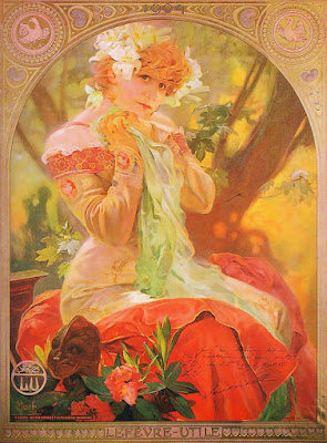
Mucha unleashed a torrent of creativity. He contributed designs not only to posters, but also to menus, books, calendars, furniture, jewelry, cigarette advertisements, and chocolate boxes. He said, “I prefer to be someone who makes pictures for people, rather than who creates art for art’s sake.”

People called it 'Le Style Mucha' or 'Art Nouveau.' But Mucha preferred not to be labeled. He just believed that artistry belonged to everyone and that artistry should be lavished on every aspect of life.

He was so much in demand that he couldn't fill all his orders. So he produced an Art Nouveau Stylebook, with sample designs for various settings, encouraging others to absorb the ideas and adapt them to their needs.


The exhibition includes 63 major works plus books and ephemera, 75 works in all. There are a few original drawings and paintings, but the glory of the show is the selection of original color lithographs, which need to be seen in person to be fully appreciated. The lithos are huge and subtle, far more impressive in person than they appear in books.


Some of the lithos are more soft and painterly than I expected, and they reward close examination. These works demonstrate the academic foundation to his skills. Mucha studied at the Munich Academy, and then at Academie Julien with Boulanger and Lefebvre, continuing at the Academie Colarossi, and finally under Jean-Paul Laurens (source).


The exhibit has a whole room of Mucha's later work leading up to the Slav Epics, including an original ink drawing that shows how he used stippling and hatching. His later work is exotic and expressive, infused with mysterious Masonic symbolism and a passion for Czech nationalism.

The show is curated by Gabriel Weisberg of the University of Minnesota, an expert on academic painting. Even if you can't make it to the show, there's an illustrated museum publication in PDF form that you can download here for free.

To celebrate its Mucha exhibition, the Museum will be hosting costume events, musical concerts, and free educational experiences for school-age children. As Interim Director Anne Saile told us, "The Museum is more than just the artwork on the walls."

Museum information.
The Hyde Collection is located in Glens Falls, just off the New York I-87 Northway, about four hours north of New York City or three hours south of Montréal. The show will continue in Glens Falls through March 18. It continues to Texas A&M in September.

Five best books on Mucha
Alphonse Mucha: Masterworks Emphasizes his posters and decorative work with large color reproductions.
Alphonse Mucha pub. by Prestel Oversize, 354 pages, with his photo reference in back, good selection of drawings and Slav Epics.
Alphonse Maria Mucha Text by Mucha's son Jirí Mucha gives extensive insight into Mucha's life and work.
Mucha: The Triumph of Art Nouveau Contains many prints, jewelry, drawings, and photos not included in other books.
Art Nouveau Stylebook, also called Documents Decoratifs, this is a Dover reproduction of Mucha's influential style book.

Previous posts
Mucha's Le Pater
Sarah Bernhardt's Leg
Mucha's Hearst Magazine Covers
Scaling Up with a Grid

Wednesday, March 16, 2011

Mucha’s "Le Pater"

Half-naked figures prostrate themselves in misty gorges, struggling and writhing before serene spirits of light.


Among Alphonse Mucha’s greatest achievements in his mature years were his seven pictures from the Lord’s Prayer, known as the “Pater Noster” or “Le Pater.”

He created a separate image for each line of the prayer. Above are the images for “Thy kingdom come,” and “Forgive us our trespasses as we forgive those who trespass against us.”

Mucha visualized the familiar prayer as a universal expression of humankind’s relationship with the divine, mixing traditional Catholic devotion with an Asiatic-tinged occult mysticism.
 
Above: “Lead us not into temptation” and the cover.

The Century magazine in 1904 described Mucha’s unique conception of God as “no longer the benign or wrathful Father, but a mysterious Being whose shadow fills the earth. Nature is personified as a luminous, adolescent giant, and Love descends from heaven in the guise of a woman.”

You can see all seven images, as well as the decorative elements and calligraphy Mucha produced for the cover and the intervening pages at this website.
Quote from: “Alfons Mucha and the New Mysticism,” by Christian Brinton, Century Magazine, 1904.
Alphonse Mucha (1860-1939) on Wikipedia
Lines and Colors update on Mucha with a LOT of helpful links 
Good reproductions of all seven pictures in the Belvedere Catalog 

Tuesday, April 16, 2019

Remembering Alphonse Mucha


Alphonse Mucha's son Jiří (1915-1991), who wrote one of the best books on the artist, went before the camera in 1975 to share his recollections. He leafs through old prints and portfolios and tours the family home in Prague.

About 14 minutes into the video, he talks about the reference photographs that he discovered among his father's things. The photos were especially helpful for drapery. Mucha would not copy the photograph, Jiri says, instead he would just use it as inspiration. (Link to video)

He says that his father put the idea of the perfect women on such a high pedestal that he was aloof and even disdainful around his actual models. When his father was about 13, he fell in love with a girl his age, who died. Forever afterward, he cherished that childlike feminine ideal, and tried to recapture it in his work.


Another video that's well worth seeing is the slide lecture on Mucha given by Felicia Zavarella Stadelman. The vivid stories she tells brings the artist to life.  (Link to video)
-----
Alphonse Maria Mucha by Jiri Mucha (1989-03-15)
Previous posts on Mucha

Sunday, June 15, 2008

Mucha and Emotional Color

Color doesn’t have be used in a literal or naturalistic way. Alphonse Mucha (1860-1939), best known for his Art Nouveau posters, was also an accomplished oil painter with an unusually evocative sense of color.

His color conception for “Madonna of the Lilies” (1905) changed from the sketch stage (left) to the finished painting. In the sketch, which appears to be created from his imagination, he keeps everything pale and warm, with reds, greens, and oranges giving a spiritual glow to the figures.

In the finished work, painted over a careful drawing after the benefit of models, the background stays high-key, but relatively cool. The warm notes and dark accents are reserved for the figures and for the areas of the picture nearer the earth.

He restricts the values mainly in the light or middle range, avoiding strong tonal contrasts and large expanses of dark. The adjacent tints take on a richness beyond reality. Mucha wrote in his “Lectures on Art,” (Academy Editions, London): “If we wish to add to the luminosity of a color, it is placed in a higher key.”

Above is one of his Slav Epic paintings. The color scheme is extremely disciplined, just pale blue and orange. The dreamy feeling comes from the light value range, reserving the darks for the upper left and lower right of the composition.

Mucha’s artistic choices serve emotion rather than illusionism for its own sake. “The expression of beauty is by emotion,” he said. “The person who can communicate his emotions to the soul of the other is the artist.”

Alphonse Mucha Foundation website, link.
Article in Lines and Colors, link.

Saturday, December 19, 2009

Sarah Bernhardt's Leg

Sarah Bernhardt (1844-1923) was a legendary French actress of the stage and screen, famously portrayed on posters by Alphonse Mucha.

According to Mucha's son Jiří, as Sarah Bernhardt was still clinging to the pinnacle of her fame, she injured her foot on a rusty nail. For many years she tried to battle the decay of the leg, but it was no use. An amputation would necessary because it was becoming increasingly difficult to hide her infirmity.

According to Jiří Mucha's account:
"'Madame,' said Barnum on day to her, 'I will give you $50,000 for your leg if you will allow me to exhibit it in spirit.' Sarah turned the offer down, but subsequently when during her stay in New York the leg became gangrenous and surgical intervention could not be delayed any longer, she sent word to Barnum.

But the great showman was dead by then and his successors were not interested. The leg was amputated and, weighted with a heavy stone, secretly buried in the depths of the Hudson."


Image from Olga's Gallery.
From "Alphonse Maria Mucha: His Life in Art" by Jiří Mucha, p. 241.

Friday, November 12, 2021

Mucha: 'Beauty is the Communication of Emotion'

Alphonse Mucha's ideas about beauty come across as strongly in his oil paintings as it does in his better known Art Nouveau posters.

In his lectures on art, he said: "The expression of beauty is by emotion. The person who can communicate his emotions to the souls of others is the artist."

"To communicate with the souls of man the artist must address himself to the senses of the body."


"This harmony between the suggestion of the artist and the senses is memory, the first condition of beauty."


The goal of the artist, Mucha said, is to communicate "the emotions of his own soul to the souls of others, even at the price of laborious work, and his greatest joy will be that of seeing other souls also vibrating with the happiness of his emotions."
--
Lectures on art: A supplement to The graphic work of Alphonse Mucha 

Thursday, December 31, 2020

Happy New Year


Alphonse Mucha's cover for Hearst's Magazine in 1922 showed his fair-haired son Jiří.

--


Wednesday, October 27, 2021

Paintings of Sarah Bernhardt


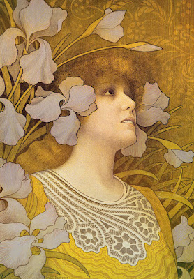
Sarah Bernhardt by Paul Merton

Sarah Bernhardt was a French actress who lived from 1844-1923.

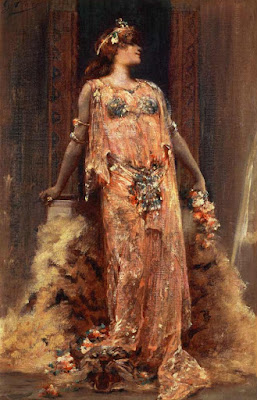
Sarah Bernhardt in the Role of Cleopatra by Georges Clairin

She was greatly admired for her stage presence, her striking poses, and her emotional presentation.

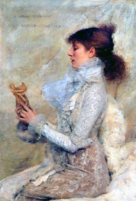
Sarah Bernhardt by Jules Bastien-Lepage

Because of her striking appearance and theatricality, she was a favorite model of artists of the period.

Sarah Bernhardt by Georges Antoine Rochegrosse

Rochegrosse painted her several times in Orientalist mode.

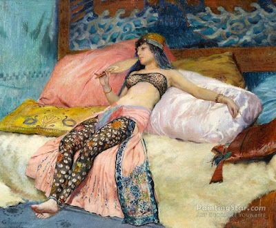
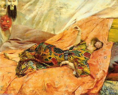
Sarah Bernhardt by Georges Antoine Rochegrosse

In this one she reclines in a chinois interior.

Poster design by Alphonse Mucha

She chose a young Alphonse Mucha to create one of her posters, and the image was a sensation, making both of them much more famous.

Alphonse Mucha

Mucha went on to do many portrayals of her in various guises.

Portrait of Sarah Bernhardt as Roxanna by Walford Graham Robertson (1866-1948) 

The playwright Edmond Rostand referred to her as "the queen of the pose and the princess of the gesture." 

Sarah Bernhardt by Georges Clairin

Victor Hugo said she had a "golden voice."

She's one of the first actors from the period who appeared in silent movies.

Her voice also appears fleetingly in sound recordings. It sounds strange to our ears, but in her day it brought people to tears.
---
Book: Sarah Bernhardt: The Art of High Drama (Yale University Press) 

Tuesday, February 15, 2022

Mucha: 'The Purpose of My Work'

Alphonse Mucha, Portrait of Madame Deschamps, 1903, pencil & white chalk on tan paper

Alphonse Mucha said: "The purpose of my work was never to destroy but always to create, to construct bridges, because we must live in the hope that humankind will draw together and that the better we understand each other the easier this will become."


Wednesday, December 25, 2013

Alphonse Mucha's Hearst magazine covers.

Alphonse Mucha Hearst magazine cover
Best wishes to all the Journeyers for a Happy Christmas or whatever midwinter holidays you celebrate.
Alphonse Mucha Hearst magazine cover, December

Monday, December 7, 2009

Mucha's Epic Vision

I just love this photograph of Alphonse Mucha dwarfed by his gigantic canvases from the Slav Epics.

A link-rich post on Mucha on Lines and Colors

Friday, June 12, 2015

GJ Book Club, Chapter 11: Variety of Line


On the GJ Book Club, we're looking at Chapter 11: "Rhythm, Variety of Line" Harold Speed's 1917 classic The Practice and Science of Drawing. The following numbered paragraphs cite key points in boldface, followed by a brief remark of my own. If you would like to respond to a specific point, please precede your comment by the corresponding number.

1. Line Rhythm depends on the shape of your lines, their relation to each other and their relation to the boundaries of your panel.
He continues that circles and straight lines can be dull because of their lack of variety and that they're seldom used except to enhance the variety of other lines.

Naturally, I thought of Alphonse Mucha, one of the great pictorial designers, who uses the circle and the straight line as 2D design elements. But he varies the edges of those geometric lines and interrupts them with overlapping forms so that it's not too mechanical.

In his essay on design, Mucha makes a strong case for the necessity of book or magazine cover illustrations to reinforce the shape of the page or cover.
Like Rockwell, J. C. Leyendecker used the standard circle device of the Saturday Evening Post magazine. He also used horizontal or vertical lines inside the picture that were parallel to the edges of the magazine itself. 

Speed then goes on to discuss ellipses and egg shapes, which have more variety, since their curvatures are constantly changing. That made me think of the evolution of character design at the Disney studios, which started out as a lot of circle shapes early on, and over time the characters kept getting the redesign treatment.

2. Speed's "Variety in Symmetry" diagrams  

One of the most valuable takeaways from this chapter are the two diagrams showing how convex roundness (B) on one side of an arm or leg is often opposed by hollows (A) on the other side.

Here's the idea played out on the whole figure. Hollows (A) vs. Convexities (B). 

It's helpful to look across the form to compare the kinds of lines and to allow them to answer each other.

Walt Stanchfield, from Drawn to Life 
Other drawing teachers suggest contrasting straights against curves across the form. Animation teacher Walt Stanchfield, in his book Drawn to Life, talks about comparing straights and curves across the form as an expression of how the form is bending.


3. Greeks did away with the indentation above the nose.
I've always wondered about this, because it is such a consistent feature of Greek art and Victorian art. I haven't met too many people who really look like this. Speed says the Greeks chose to sculpt the ideal face that way to create more unity of line, extending the line of the forehead down along the nose without breaking it with an angle or an indentation. 
-----

By saying "shape of your lines" he's reminding us that lines can function in two ways: the edges of shapes and standalone lines.
The Practice and Science of Drawing is available in various formats:
1. Inexpensive softcover edition from Dover, (by far the majority of you are reading it in this format)
3. Free online Archive.org edition.
and The Windsor Magazine, Volume 25, "The Art of Mr. Harold Speed" by Austin Chester, page 335. (thanks, अर्जुन)
GJ Book Club on Pinterest (Thanks, Carolyn Kasper)
New GJ Facebook page, credit Jenna Berry