


There's a big snow pile behind the supermarket, with a view down John M. Clark Road in Kingston. The sun is rim-lighting the white snow, and the shadows are blue.
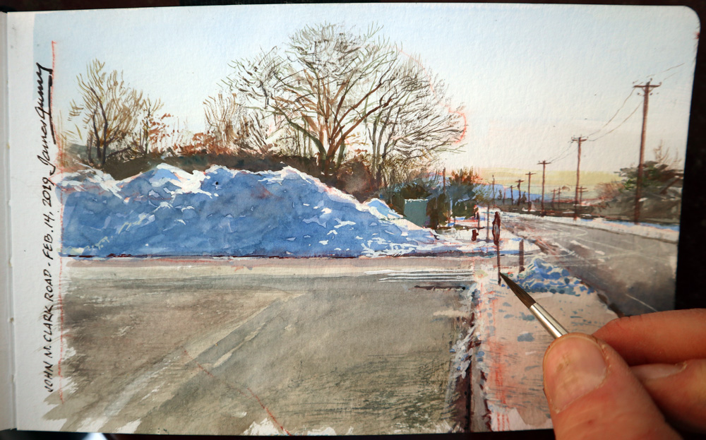
I like this view because it includes the deep perspective of the road going back to the vanishing point.
(Link to video on Facebook)
Here are some questions on Instagram and Facebook:
Noa Katzir asks: "How do you keep the water and colors from crystallizing and freezing?"
Luckily it was nearly 50 degrees Fahrenheit, well above freezing.
M. Hopper asks: "How do you choose what you're going to paint?
All my supermarket parking lot sketches are done under a strict time constraint of about 50 minutes. That's the time it takes my wife to do the food run. I look for a subject that I can paint in that time, and one suited to the visual ideas I want to explore. For the previous painting, I was interested in conveying a smoggy atmosphere. This time I was interested in the light on the snow.
SpaceLion asks: "What kind of sketchbook did you use?"
Gurney: It's a Pentalic Aqua Journal, which has good paper for water media.
 ValeoftheRose asks: "In Color and Light you say it's better to mix grays using only opposite colors rather than black and white, but that just makes brown. By grays did you just mean browns or is it because I'm using only CMYK and white of low quality gouache? I think you mentioned in the book CMYK is not great for painting?"
There are a lot of different issues raised by your questions. The colors packaged as CMYK (cyan, magenta, yellow, and black) in paints are usually convenience mixtures, which means they're made up of a couple different pigments. They can be helpful for painting color wheels, but for actual paintings I think you're better off just using the pigments individually and getting to know their properties, because in painting we're not limited by four printer's inks or by the graphics displays on our computers. Instead we're limited by the actual chemical pigments we're using. In this case I used ultramarine blue, lemon yellow, and terra rosa, plus titanium white.
Grays and browns are both fairly neutral in chroma, but browns are usually warmer. The reason for mixing grays out of complements instead of black and white is that you end up with interesting variations and partial mixtures. If you mix your colors with two or three tube colors, you can get exactly the color you want, as long as it's within the gamut. I would suggest that you use a small number of tube colors on a given painting excursion, and that you experiment with new combinations.
Charley Parker says: "One thought: speeding through the drawing and wash phases with time lapse doesn't leave that much out, but It might be helpful if you would slow down to normal speed for things like the split-bristle brushwork — a less common technique — to give a better idea of how it's done."
Good point, Charley. I'm limited here by the 1-minute constraint of the video for Instagram. But I'll be doing a somewhat longer version for YouTube, and I can slow some of the clips down a bit to show more of that split brush technique.
2 comments:
How romantic this image is: a pile of snow in a parking lot - you are amazing. Beauty is everywhere.
To knock out paintings like that in 50 minutes is a testimony to exquisite technical mastery. To create an interesting visual out of a parking lot snow pile is a testimony to amazing artistic sensibility. Bravo
Post a Comment