


Painting in black and white (also known as grisaille) is a useful way for the beginner to enter the world of painting. Let's have a look at what some experienced illustrators did with grisaille.
Search Results
Web results
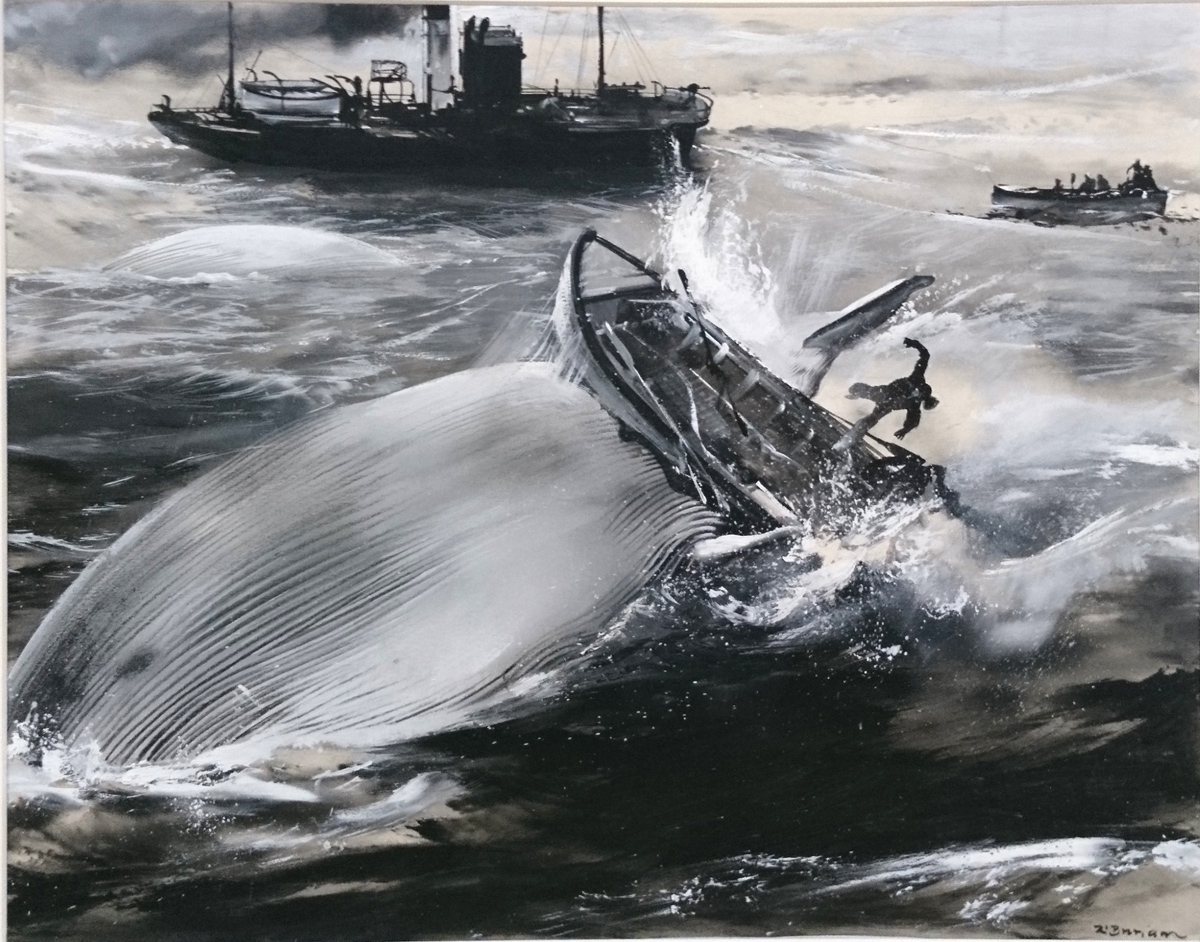
Czech illustrator Zdeněk Burian, best known for his dinosaur reconstructions, was also a prolific illustrator of adventure stories. This whaling scene appears to have been created with considerable freedom and looseness. He puts detail where he wants it, and leaves it out where he doesn't want it.
Howard Pyle paints a reading room, linking together all the white newspapers into a big shape that silhouettes the main figure. Simple, dark values surround that big white shape.

Frederic Remington used grisailles for a lot of magazine illustrations. This 1904 painting of a Manchurian bandit is painted in oil, 30 x 20¼ inches. The background is comprised of bands of gray and light tones that spotlight certain key features of the silhouette such as both ends of the rifle.

Arthur Ignatius Keller was known for his historical costume illustrations. He shows the wary passengers grouped together near and their stricken stagecoach as a flashy fellow makes his approach. The light sky behind all the heads makes it read immediately.

And finally, Winslow Homer, who was also a great colorist, did many paintings in monochrome. This canoeing scene creates vast spaces by placing elements toward the edge of the picture and allowing large shapes to be quiet and flat.
----
My new video tutorial "Color in Practice" starts out exploring how to paint in grisaille. Find out about the digital download at Gumroad.
10 comments:
IS it just the difference in screens or do some of these paintings have a touch of an ocher color or some other color mixed in - some of them seem warm.
Susan, many artists, then and now, used a toned background page/panel. My guess is the black and white painting was done on top of a toned background which adds extra depth and color by virtue of transparent and translucent passages of the black and white paints. I have done several paintings this way and it is so much fun.
I agree with what Stephen said, and add that you can mix in a little yellow ochre and raw umber into your black and white to pull the mixtures more toward the warm side.
I have been recently preparing oil panels with a warm yellow ground for just this sort of thing having noticed it frequently in Reubens monochrome sketches. It adds a nice warm glow where it shows through.
Like painters, directors & cinematographers may also choose to limit their palette to "grisaille" to stunning effect. Below are some of my favorite black & white films:
The Lighthouse (2019)
Roma (2018)
Ida (2013) <-- Gorgeous! Do yourself a favor and watch it.
Good Night, and Good Luck (2005)
The Man Who Wasn't There (2001)
Schindler's List (1993)
Raging Bull (1980)
Manhattan (1979)
Psycho (1960)
Looking at Jim's list it reminds me that I don't always remember that a good modern film is in black and white. I recall actors who starred, memorable scenes and dialog but the fact that it wasn't in color doesn't seem to matter much. How strange...
Oh, and add to the list my perennial favorite (every Halloween), Young Frankenstein!
Burian's illustrations to Jules Verne are some of the best ever.
Golden Age illustrators did indeed mix yellow ochre with their greys. In how-to books on illustration from the period I read that greys mixed from black and white tended to be bluish. The film in halftone cameras wasn't sensitive to blue (that's the reason for non-photo blue pencils, etc.) The books recommended warming greys with yellow ochre as insurance against dropouts.
Smurfswacker, thanks for that insight—I had never made that connection before.
Stephen & Nyee, thank you—your "guess" is a wonderful description!
Here's a link to all of the Jules Verne illustrations. http://jv.gilead.org.il/rpaul/
It turns out that France was trying to encourage universal literacy at the time, and Jules Verne wrote tons of books aimed at adult language learners that sought to entertain, foster an enjoyment of reading, and also educate.
Post a Comment