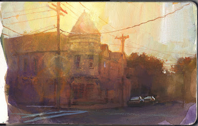
In a new YouTube video I show how I painted this moody morning scene in gouache by sacrificing detail and emphasizing light effects.
My goal is to capture a fleeing light effect by using a warm priming color to achieve a "photographic" lens flare. Halfway through, I paint over the whole thing with a glaze to reduce detail. The glaze is risky because gouache reactivates when it's rewet, and to be honest, it's kind of a disaster for a while.
Here are some takeaway quotes about the theory of sacrifices:
“Nature instills sentiments in the spectator through the selective sacrifice of details in order to improve the overall effect.”
--The Theory and Practice of Water Colour Painting: Elucidated in a Series of Letters
“Painters without experience often weaken the effect they wish to produce by a prodigality which multiplies uselessly the figures and accessories of a picture. It will not be long before they learn that, the greater the conciseness and simplicity with which a thought is interpreted, the more it gains in expressive force.”
—Jules Breton, The Life of an Artist: An Autobiography, 1890


6 comments:
Amazing, the principle of parsimony can be applied everywhere. "Entities should not be multiplied beyond necessity".
Big is beautiful, isn't it?
Hi James, from France. I'm totally amazed by the huge amount of time you take to share with us you passions and your humanity.
But I'm very puzzled by the size of most of your gouache painting. For me, size matter, an a painting twice as big is 10 times more enjoyable to dive into when finished (and I'm not considering commercial value...).
But you mostly use a format around A5, which gives it a status of a study, where the same work on a A3 would become a masterpiece.
So could you enlighten us on this choice of small formats?
- Either because you do consider those as study where I see a (small) masterpiece?
- Or because you would never dare to start big and risk new techniques (even if your videos are proving that you most always succeed to turn experiments into happy accidents) ?
- or because you just don't want to carry outside big equipment?
- or because "big" reminds you too much of your professional activity, so small equals leisure for you?
- or because "big" is not compatible with some of your techniques? this last point is for me of a big interest if you could develop, because I don't see why it should be so.
Thank you so much for all you do to make this world more enjoyable!
Gigi, I have worked big and small. I usually work bigger for my professional illustration work in the studio, anywhere from 1.3-4 times printed size. I like working large, too, but not so much on location. I like the 5 x 8 inch size for 1-3 hour paintings on location because:
1. It closely matches sight size for my viewing angle,
2. It's super portable, possible to paint in museums and restaurants,
3. It's easy to archive, and
4. Actual size doesn't matter. Apparent detail online is relative to scan resolution and level of finish. Many of my little paintings have more information that those of artists who work 30 x 40 inches.
5. Many of my heroes worked this size (such as Frederic Church, Adolph Menzel, and Wm. Trost Richards.)
You asked during the video whether anyone would enjoy ASMR sounds of you painting in one of your videos. I would say yes. Does a sable brush filled with pigment make enough noise to pick up with your microphones? The pencils and hard Carb Othello pastels certainly would. I assume brushes with stiffer bristles would as well. Just watching and listening to you painting would certainly be immersive since we could turn off the language processing part of our brains while you paint.
Scott
Those two quotes are very thought provoking, I've read them multiple times over the last two days and I am reconsidering then again tonight. I'm curious to hear more about this concept.
great video
Post a Comment