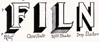
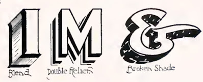
Sign painters and show-card artists in the golden age of penmanship had a variety of styles of applying shadows to make letters stand out.
"On letters A, Y, V, W, M, the shade is narrower in width on the diagonal "letter strokes" that are affected by the shade at a forty-five degree angle.

"On ordinary work and Card Writing, the relief shade is most commonly used, as it permits of quick execution, and in most cases is rendered in single stroke, using a brush that will accommodate itself to the width of the shade desired.
"Where extremities of letters are close together, the stroke can be left disconnected, which liberty is legitimate and permissible, especially on card work.
"On the relief shade leave "relief space" quite wide—i. e., the space between the edge of letter and inner edge of shade; it gives the letter better emphasis and is more professional."
From A Show at Sho'-Cards by Atkinson


2 comments:
The book talks about an air pencil combined with a plastico mixture to create raisted effects. Do you know if there is a modern equivalent to this?
Do you have any of your old cards?
Post a Comment