Thursday, January 31, 2008

Taboret

The taboret is a little drawer unit that sits to the right of me me when I’m painting in oil in the studio. It holds paints, brushes, pens and pencils.

The white palette surface where I mix my paints rests on a hinged board which can can be set to any angle. If I need to refer to the color wheel (see posts on color), I can hook it above the mixing surface.


1. The blobs of paint squeezed from the tube rest on a 3x18 inch paint shelf. This is a wooden plywood surface that floats above the mixing surface.
2. I mix paints with a palette knife on a roll of standard white freezer paper, which is coated with polyethylene. The roll hangs on a wooden dowel below the paint shelf (see photo below).
3. Mixing cups with Grumtine and Liquin. Little wedges nearby hold the paper in tightly.
4. Peanut butter jar with kerosene for cleaning brushes. There’s a screen halfway down inside the jar to give something for the brush to scrub against.
5. Jar of Liquin, an alkyd based medium. It dries fast, but with a dull sheen that needs to be varnished later.
6. Plastic tub from a Chinese restaurant. I cut a rectangular hole in the lid with a mat knife. At the end of the day I scrape down the paints on the paint shelf using a palette knife, and the scrapings go in here. When it’s full, I dispose of the whole tub.
7. Paint rag with a wiggly wire to hold the brush handles. This is where brushes sit while they’re in use.
8. Note the door hinges under the mixing panel. This allows the whole panel to be raised up. Unseen beneath the hinged panel, is an adjustable sliding clamp that fixes the slope at any angle.
9. Brushes are mostly bristles and white nylon flats.


Here’s how the freezer paper fits under the edge of the tip-up palette. Fresh paper unrolls with the plastic side up, and constantly gives a new surface for mixing. The used paper tears off on the right of the palette.

In drawers below are pencils, pens, markers, paints, and mediums.

The whole thing is on wheels, allowing it to roll around.

Tomorrow: Downfacing Planes

Wednesday, January 30, 2008

Dinotopia in DeathRay

Readers of Dinotopia: Journey to Chandara will want to check out the six page feature in the new issue of DeathRay magazine, now on newsstands in the U.S.A and the UK. There’s also an interview with Spiderwick creator and artist Tony DiTerlizzi.

Line and Wash

Here’s a sketch from Jerusalem. It’s an example of the “line and wash” technique, a favorite with travel sketchers.

The line is pencil, and the wash is ivory black watercolor mixed with water in a film can, whose snap-on lid never leaks. It’s one of the easiest ways to get started with painting on the spot, because the tools are so simple. It all fits in your pocket.


May I show you a page from my wife Jeanette’s sketchbook? The line is from a ballpoint pen, and the washes are raw sienna, ultramarine, and burnt umber watercolors. She was thinking of the colors that John Singer Sargent used in his Venetian watercolors (too bad it's Poughkeepsie, not Venice). To see more Sargents, visit the post on “warm and cool.”

Tomorrow: Taboret

Tuesday, January 29, 2008

Stroke Module

If you paint in oil with big flat bristle brushes, it gives the painting a kind of “big pixel” look. Here’s a plein-air study I did of some rooftops.

On the left is the actual painting, and on the right is a computer interpretation. The idea of the digitized version is to suggest the approximate module of the patches or brushstrokes. Each square is more or less equal to the width of the brush. So for a 16 x 12 inch painting, the brush was about a half inch wide.

I don’t think this painting was very successful. Part of the problem is that the units of detail are all about the same size throughout the picture. The effect is kind of clunky and simplistic, and there’s no center of interest. It’s like a whole symphony played at the same tempo and in the same key.

Let me propose this principle: a broad handling works better if there’s a center of interest in sharper focus.

You may have seen my painting of a McDonald’s sign before, but I want to make a different point with it. In the actual painting (oil, 10x8 inches), the word “McDonald’s” is painted as tightly and carefully as I could manage while standing outdoors in the parking lot.


But the line of writing below “McDonalds” is almost not readable. And the type on the yellow and red signboards lower down are just suggested with blocky shapes. In the background, the scale of blockiness increases even more.

In the mosaic version of the painting at right, I’ve interpreted the image in two sizes of tiles, with smaller tiles near the center of interest to make the simple point about varying the module of brushstrokes.

This principle of the scaling of detail is one of the hallmarks of the late 19th century portrait painters, like Sargent, Zorn, Sorolla, or Valentin Serov. Serov isn’t well enough known in America. Here is his portrait of the composer Rimsky-Korsakov. Click on it; it's a big juicy file, thanks to Wikimedia Commons.


Serov painted the face in relatively tight focus, but he represented all other areas of the picture with rough strokes made with a bigger brush module.

I find this orchestration of detail deeply satisfying because it captures the way our eyes actually perceive the world. There’s a tight focus at the center of interest, and bigger shapes in the periphery. Serov gives us all the information we need to understand the character of the man, no less and no more.

Look at this background detail from the Serov portrait. It has a wonderful “pixelly” abstract quality, like something caught at the edge of vision.


And here’s another detail, placed out of context next to the rendering of the face, and turned upside down to help us see them abstractly. Note that these two detail areas are shown at exactly the same relative scale of enlargement.

In context, the strokes effectively describe the clutter of papers on the desk. They don’t call attention to themselves as strokes or as paint. Instead they convey what they need to convey and then they keep encouraging the eye to return to the face and hands. If he had painted the outer areas with the same level of detail, the sense of immediacy would have been lost.

I call this scaling of brushstrokes the “stroke module.”

It’s a good general rule to strive for variety in the stroke module. Use a smaller stroke module (with smaller brushes or digital brush tools) for the center of interest, and then use bigger brushes and broader handling for the peripheral areas.

Tomorrow: Line and Wash

Monday, January 28, 2008

Inner and Outer Growth


When a tree grows each year, it adds some twigs and branches, but it also increases the girth of its trunk.

As artists we grow the same way. Our outer growth includes the practical skills of the hand: things like smooth calligraphy, accurate drawing, efficient color mixing, or an intuitive digital interface. We develop these skills from daily practice.

Our inner growth as artists has more to do with what we’re doing when we’re not actually painting. It includes our art historical awareness, our scientific understanding, our observational sensitivity, and our aesthetic taste.

That inner growth—the trunk of the tree—takes a lifetime to develop. If our roots are drawing inspiration throughout our lives, we can add a growth ring to our inner artistic selves, even if we are not practicing art daily.

This is encouraging news for people who are out of the habit with daily skills. You can keep growing as an artist even if you’re a busy parent with your art supplies languishing in the closet or a college student wrapped up in other concerns for a few years. As long as we keep seeing and thinking as artists every day, the trunk of the tree keeps growing.

On May 28, 2007, The New Yorker published the following about playwright Tennessee Williams:

"When, in late 1948, his play 'Summer and Smoke' failed on Broadway, Williams’ confidence dipped still further; he felt, he said, like a 'discredited old conjurer.' To his champion Brook Atkinson, the drama critic of the Times, he wrote in June 1949:

'The trouble is that you can’t make any real philosophical progress in a couple of years. The scope of understanding enlarges quite slowly, if it enlarges at all, and the scope of interest seems to wait upon understanding. . . . All artists who work from the inside out have all the same problem: they cannot make sudden, arbitrary changes of matter and treatment until the inner man is ripe for it.'"
All of which leads to a philosophical question that I’d like to pose to those of you who are teachers or students of art: What can or should an art school nurture? The inner or outer artist? Is it possible for a school to nurture both?

Painting above by Peder Mork Monsted (1859-1941), Link.
Thanks for the quote, Dave S.


Tomorrow: Stroke Module

Sunday, January 27, 2008

Color Wheel Masking, Part 1

Today I’d like to introduce an approach to color that I’ve been developing over the last 10 years. I’m very excited about it, and I'd love to know your reactions. I call it “Color Wheel Masking.” I’m going to show you a practical method that you can use to accurately describe any color scheme that you see.


Let’s start with the basic color wheel with the primary and secondary colors are arranged around the outside of the circle in the normal way. As each of these colors approaches the center, it becomes a neutral gray. Any individual color can be pinpointed on the surface of the wheel in terms of its hue and chroma (“chroma” is also known as “intensity” or “saturation”). For the moment, we’re ignoring value as a dimension of color.

If a single color can be charted on the circle, then it follows that the whole scheme can be charted, too. To chart an entire color scheme, it helps to think not only which colors are included in a composition, but also which colors are left out.

Let’s look at some actual pictures to see which colors are in and which are out of the color scheme.


On the left is a photo of some roses and leaves; on the right is a Christmas painting by Norman Rockwell. Each of these painting has greens and reds in different distributions. Both essentially lack yellow, orange, violet and blue.


Here’s another photo and painting paired together. What they have in common is blue and orange—but no red, no yellow, no yellow-green.


Here are two more pictures. Their color schemes are not identical, but basically they’ve got strong reds and yellows, some greens, and a dull blue-violet. What they’re both missing are full-intensity blues and greens.


Now let’s see if we can design a mask to fit over the color wheel to fit these schemes. We want the mask to show only the colors we see in the picture and to leave out the colors that are absent. The Rockwell painting is pretty easy, because it only includes greens and reds (plus a hint of blue in the package and very dull yellow in the ribbon).

The color mask here is a long diamond shape that includes the complementary colors that oppose each other across the middle of the wheel, leaving out everything else.


Here are the images with the blue-orange polarity, along with a masked color wheel. Note that inside this diamond shape, there are some other colors near the center: just a hint of red and a touch of yellow-green and blue-green. The colors inside the perimeter feel sufficient for a complete color scheme, even though we’ve left out a lot.


The mask doesn’t have to be this long diamond shape, because not all color schemes are complementary. Nor does it have to go all the way to the edges, because plenty of paintings lack full-intensity chromatics.

The mask can also be a small triangle in one part of the wheel. Here I’ve taken two paintings from Dinotopia: Journey to Chandara and mapped out their color schemes by digitally defining a shape on the wheel and ghosting the rest.


The swamp scene has dull yellow-greens and browns (browns are really dull oranges). The colors can be contained in the small triangle. The corners of that triangle never touch the edges of the wheel, because the painting doesn’t have any colors of full intensity. As you can see from the ghosted perimeter, the color scheme excludes blue, purple, and red.

Now all of a sudden we have a great way to describe any existing color scheme. But that’s just the first application of color wheel masking. Next Sunday I’ll show you a range of shapes for color wheel masks. Following that, I’ll describe exactly how to use color wheel masks to generate and experiment with color schemes.

In the intervening time, if you get a chance, I recommend that you can paint or digitally create your own color wheel to use as a tool for your own experiments.

Tomorrow: Inner and Outer Growth

Saturday, January 26, 2008

Lorrain Mirrors

For centuries artist have used darkened mirrors and smoked lenses to help them view a real landscape in simplified tonal values.


By the nineteenth century these optical devices became widely known as “Lorrain mirrors” or “Claude glasses.” Their darkened reflections suggested the work of landscape painter Claude Lorrain (1604?-1682). Lorrain himself, though, probably never used them. The name appeared long after his death, and for a time the devices were associated with the English poet, Thomas Gray (1716-1771).


Antique Lorrain mirrors were usually elliptical and slightly convex to allow the viewer to see the entire scene in miniature.
Here’s a simple homemade Lorrain mirror fashioned out of an ordinary piece of glass painted black on one side. The backside and edges were then protected with tape. In a pinch you could get the same effect by looking at the reflection in a lens of your sunglasses cupped in your hand.

For artists nowadays, the benefit of studying a darkened reflection is that it desaturates the colors, reduces the detail, and organizes the tones. By grouping the darks together into large masses, the vista takes on a romantic or picturesque aura. You can immediately see how to proceed with your tonal design. It’s easier to compare the relative brightness of light values—such as clouds compared to white buildings.


Here’s a photo manipulated with Photoshop to simulate the effect. I occasionally use Lorrain mirrors to help me choose a motif, or study it before commencing to paint. They’re also helpful for a mid-course check during the painting. They guard against the tendency we all have to lighten the values of the shadows, which results from our eyes adjusting to the dark areas and seeing too much detail in them.

If you prefer looking through a transparent viewer rather than seeing a reflection in a mirror, you can improvise your own Lorrain glass using a dark gray filter, a welding goggle, or an unexposed piece of film.


In an era before photography, both artists and tourists enjoyed the novelty of looking at real landscapes through gold- or blue-tinted Lorrain glasses. A heroine from an English play dating from 1798 said, as she peered through her warm-tinted glass: “How gorgeously glowing.” Then switching to a dark glass, she said, “How gloomily glaring.” Finally, looking through a cobalt-tinted glass, she exclaimed, “How frigidly frozen.”

For more:
Tintern Abbey Viewing Station with live Lorrain mirror webcam. Link.
Archived webcam shots show changes of light through the day. Link.

Final quote from Spectacles and Other Vision Aids: A History and Guide to Collecting, by J. William Rosenthal. p. 276,
Tomorrow: Color Wheel Masking

Friday, January 25, 2008

Giganotosaurus

Tomorrow the Allentown Art Museum in Pennsylvania will open an exhibition of artwork from the National Geographic magazine. The show includes over a hundred paintings from the magazine’s 120-year history.


I’m very excited to have three paintings in the show, especially since the show contains the work of some of my all-time heroes, like Tom Lovell (see post on Lovell on the blog Lines and Colors).

One of my pictures shows the giant meat-eating dinosaur Giganotosaurus, which made a stir in the paleo universe because it was said to be larger than T.rex.


I met the Argentinian paleontologist Dr. Rodolfo Coria on October 7, 1994, a few short months after he had uncovered the bones, and before he had even come up with a name for the creature.

But even before I painted the Geographic piece, I did this rendering of Giganotosaurus for Dinotopia: The World Beneath (1995).

When it came to coloring the dinosaur I called Dr. Coria: “This is your dinosaur,” I said. “What color do you want him to be?”

“Color?” he replied. “That’s your problem.” So I took the artistic liberty of giving the dinosaur a bright color scheme to make him look as impressive as possible.

A year after The World Beneath was published, National Geographic asked me to do a couple of illustrations for an article on Argentinian dinosaurs. One painting shows the skull of Giganotosaurus compared with “Sue,” the famous giant T.rex.


Here’s a cast of a tooth from a Giganotosaurus.


The second painting shows Giganotosaurus running at a thundering pace. This time I used a slightly more conservative coloration. To accentuate the motion, I used shallow depth of field (see earlier post on the subject), blurring the distant trees, and kicking up a splash and a dust cloud from the feet.

This painting was done over ten years ago. Since then, John Hutchinson of Stanford University has convincingly argued that giant dinosaurs like T.rex or Giganotosaurus probably didn’t have the leg muscles to be able to run at the kind of speeds we imagine.

So if I were to do this painting again, I’d show him at a fast walk. A walking dinosaur may not be quite as impressive as a running dinosaur, but as long as he’s walking faster than his prey, it’s fast enough.

For more info:

  • YouTube video with interview clips of artists: Link.
  • Lines and Colors article on the exhibit:Link.
  • Art Department post by Irene Gallo: Link.
  • Allentown newspaper story: Link.
  • Related events: Link.
  • Collectible print available as part of Home Planet Portfolio. Link.

Tomorrow: Lorrain Mirrors

Thursday, January 24, 2008

Motion Blur


We took a look at speed blur on a previous post. Speed blur is what happens when a camera tracks along with a fast moving object, blurring the entire background along the path that the camera travels.

Motion blur is a little different. It’s what happens when a form moves rapidly in front of a stationary “camera.”


If you look at individual frames from live action films, any fast moving object has a softly blurred edge. The ability to simulate motion blur in CG animation was the revolutionary breakthrough that made the embryonic Pixar company take off in its first successful films. Very primitive CG animation, like traditional stop motion animation, left hard edges on moving objects, which gave a jittery rather than a fluid feeling to the motion.

As painters of still images—digital or traditional— we can take a lesson from these animation pioneers.


This oil painting from Dinotopia: First Flight (1999) shows dancers dressed up as dinosaurs parading at night through a city. They’re caught mid-stride in a wild dance. Their left feet are swinging forward, and their arms are flapping upward.

The faster the form is moving, the more it is blurred.

I painted in the figures and the background all wet together, and then softened all the edges in the direction of the line of action. For this kind of soft passagework, a slower drying medium helps.

To suggest that the “camera” was tracking along with the dancers, and to give a sense of shallow focus, I also blurred the details of the crowd across the street. If I had painted all these elements with crisp edges, they would have lost the feeling of depth and motion.

For more examples of motion blur in painting, have a look at the wildlife art of Manfred Schatz. Link.

Tomorrow: Giganotosaurus in Allentown

Wednesday, January 23, 2008

Mystery Artist Revealed

Radikin guessed it right: Today's painting called “Blossomed Furze” was by Beatrix Potter. Most of her famous books, like Peter Rabbit and Benjamin Bunny were based on her own pets by the same name. She carried them around with her on vacations and sketched them often.

Throughout her life she made many studies of mushrooms, flowers, animals, birds, landscapes, and interiors, which still set a high standard of observation, even among natural science illustrators.

She was a stickler for truth to nature. As much as she adored Wind in the Willows, she once offered this gentle criticism:

Kenneth Grahame ought to have been an artist—at least all writers for children ought to have sufficient recognition of what things look like—did he not describe “Toad” as combing his hair? A mistake to fly in the face of nature—a frog may wear galoshes, but I don’t hold with toads having beards or wigs! So I prefer Badger.”

Artwork and quote from The Art of Beatrix Potter, © Frederick Warne Co, 1955.

Tomorrow: Motion Blur

Mystery Artist

The first of you to name the artist who created this work gets a free deluxe map of Dinotopia and a 2-CD Audio Adventure of The World Beneath. One guess per person, please.

Tuesday, January 22, 2008

Virtual Reality, 1979

Back in 1979 there was no such thing as “virtual reality.” Heck, there was no such thing as a personal computer, either. Or computer animation, unless you count Pong, Atari’s hot new game.

But that didn’t stop my inner Leonardo from daydreaming about how we might interact with CG alternate universes.


At the time I was an anthro major at UC Berkeley. According to my sophomoric prognostication, we would someday be able to enter “a world of pure illusion, utterly free from danger, into which one can actually walk and explore!”

Here, for your amusement, is “Vision Quest,” my 1979 prediction of what was supposed to come. Wasn’t the future fun back then? So why hasn’t it gotten here yet? Click to enlarge any page.

The headpiece unit:
Field size and sound:
Alternate reality:
Off a cliff:
Your friend the 8-ball:

Tomorrow: Mystery Artist

Monday, January 21, 2008

Gurney Journey in Eastpointe

Fans of Gurney Journey will be interested to know that, in the words of Detroit Free Press reporter Kim Shine, "The Gurney Journey takes place from 11 a.m. to 1 p.m. Saturday.”

If you go to Eastpointe, Michigan's Art and Ice Festival next Saturday and Sunday be sure to check out the gurney races. These events “have team members pushing one another on wheeled stretchers. The event is open to any four-person team that wants to race through an obstacle course for a $40 donation per team." Link.

Elegant Graphics


In his book The Visual Display of Quantitative Information, Edward Tufte offers this graphic by Charles Minard of the depletion of Napoleon’s troops during his disastrous march to Moscow in 1812 as an example of the principle that “graphic excellence is that which gives to the viewer the greatest number of ideas in the shortest time with the least ink in the smallest space.”

Among other things, Tufte’s books have presented an ardent case against the mind-numbing way that people use PowerPoint to communicate information in business and education. Link.

Tomorrow: Virtual Reality, 1979

Sunday, January 20, 2008

Is Moonlight Blue?

Moonlight is about 400,000 times weaker than direct sunlight. It’s so dim that the color receptors in our retinas, called the cones, can barely function.

In moonlight the other retinal cells called rods are doing most of the work. Rods detect relative lightness and darkness, but they are entirely color-blind.


Moonlight is simply the white light of the sun reflecting off the gray surface of the moon. There’s nothing in that interaction to give the light a bluish or greenish quality. In fact, scientific instruments have shown that the light from the moon is very slightly redder in color than direct sunlight.

These facts added together suggest a mystery at the heart of how we as artists choose to portray moonlight in paintings. If moonlight is just gray-colored light, and if it’s close to the minimal threshold of our color receptors anyway, then why do so many artists paint moonlight as bluish or greenish? Do we really see it that way? Is it some kind of illusion, or perhaps is it just an artistic convention?

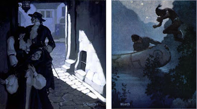
Let’s look at some paintings by master painters of moonlight. As you look at them, consider your own perception of the colors at night, and ask yourself which of the paintings best convey your own experience.

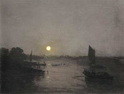
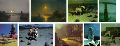
Here’s a painting by J.M.W. Turner. It’s fairly gray, with just a hint of warm color around the moon. Notice that there isn’t much detail in the shadow area. All you really see clearly are the silhouettes of the sail and the boat on the water.


Russian seascape painter Aivazovsky painted this night scene lit by a golden moon. The sky, the water, and the shadows all sink into blue-green tones. He doesn’t show very much detail, and he stops well short of black in the shadows.


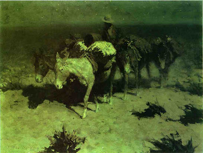
This lightening of darks was also a feature of Remington’s nocturnes. The cast shadow to the left of the pony’s nose is composed of dull umbers and greens. These luminous shadows lighten and liven the obscurity. Except for the light saddle cover, Remington has left most of the edges soft and undefined, especially on the donkey on the right.


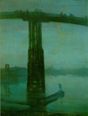
This famous nocturne by Whistler of the Battersea Bridge uses a fairly saturated blue-green color, especially in the water and in the silhouetted figure. The detail is blurred throughout, even in the areas where the bridge appears against the sky, setting up for the tiny sparkles of light in the distance.

One of the reasons for softening the edges is that we depend on the cones for fine discrimination of edges. Unfortunately the cones are located on the fovea, the centerpoint of vision, and with them off-line in the darkness, we just can’t sort out small details.

If you take a book or newspaper outdoors in moonlight, you can see that there is writing on the page, and you might be able to read headlines or other large type, especially when you glance around with your peripheral vision. But reading normal size text is almost impossible. When you look directly at the words, the blind spots get in the way.

I said earlier that our cones are barely functioning in moonlight. In fact, contrary to what some authorities have claimed, most people’s cones can make basic color judgments by the light of a full moon. But how much variation in color can we really see?


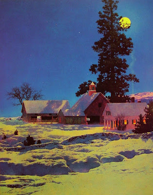
Maxfield Parrish rendered this moonlight scene with quite a bit of color saturation. He painted the yellow moonlight, the reddish cupula on the barn, the deep blue of the sky, and the orange color on the shadow side of the house. Did he really see such colors in moonlight, or did he invent them for pictorial effect? Too bad he’s not here to ask.

Direct plein-air painting is virtually impossible in moonlight. Every artist has to work from memory and imagination. We may try to convey our actual optical sensations, but we’re not scientists. Each of us is also trying to make a subjective aesthetic statement intended to evoke a particular mood or emotion. Any moonlight painting is an attempt to translate a “rod experience” into a “cone experience,” an image that will be seen in a brightly lit environment.

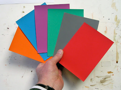
Here’s how you can test how your cones actually respond to color in moonlight. Paint a set of separate, matching, unmarked color swatches or find some construction paper at about the same value. Take them into full moonlight (this Tuesday) and let your eyes adjust (it takes about 30 minutes). Shuffle the cards, and while you’re still outdoors, mark on the back what colors you think they are.

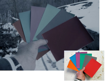
I have used Photoshop to manipulate a photo of the swatches (actually shot in daylight) to simulate how they appeared to me under the full moon: dulling, darkening, and blurring them. Both Jeanette and I could easily identify the basic hue family of each swatch. But beyond that basic classification, we weren’t sure, and the gray swatch confused us both.

When I looked at the same swatches in the much dimmer light of a half-moon, or in a moon shadow, I found my cones went sub-threshold and shut down completely, and the swatches became completely monochromatic.

Although the rods of the eye can’t actually see color, scientists have shown that they are most sensitive to greenish wavelengths of light. As a result blue-green hues appear lighter in tone in dim conditions. There’s a name for this: the Purkinje Shift. It’s a different phenomenon from, and often mistaken for, the perception of moonlight as blue.

You can demonstrate the Purkinje Shift by comparing a red and green swatch that start out indoors at the same value. If you take them outdoors in moonlight, the greenish one will seem much lighter in tone. Many observers have noticed that red roses look black in the moonlight.

If you scroll back up to my Photoshopped version of the moonlight color swatches, you can see I’ve adjusted the values to simulate the way the red and green looked to me as a result of the Purkinje Shift.


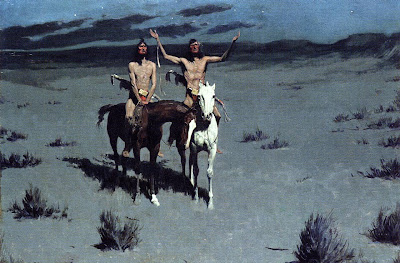
Here, Remington shows a scene with Indians in moonlight. We see their flesh tones and some clear red touches in their costumes. Throughout, the edges are much crisper than his other painting.

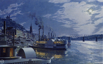
This nocturne of old Cincinatti by contemporary artist John Stobart has a distinctly bluish cast. He introduces much more detail than we’ve seen in the other examples, reminiscent of the “day-for-night” film shoots in old westerns. You can even read the name “Bonanza” on the shadow side of the ship.

In addition to the moonlight, there’s a secondary source of yellow-orange lamplight. In this case, one could argue that the blue cast to the picture may be a complementary color induced in opposition to the color of the lamplight.

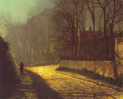
Atkinson Grimshaw was famous for his poetic moonlight studies. Here the shadow masses at the left are fairly soft and impenetrable, but the bricks and branches show up very clearly. The moonlight on the road is an intense yellow-orange, assuming this reproduction is accurate. The shape of the patch of light points to the lovers standing in silhouette at left.


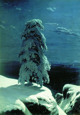
Russian landscape realist Ivan Shishkin, painted this haunting image of a winter night in the wild north. The snow in moonlight is relatively brilliant, with a soft halation along the edge at left, but it’s not yellowish. The cast shadow gradates in tone, getting lighter as it catches more sky fill and bounced light. There’s quite a bit of detail in the tree form, but he has kept the foreground and background description to a minimum.

So, to get back to the question posed earlier, why do we see moonlight as blue?

Saad M. Khan and Sumanta N. Pattanaik of University of Central Florida have proposed that the blue color is a perceptual illusion, caused by a spillover of neural activity from the rods to the adjacent cones.

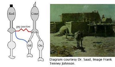
A small synaptic bridge between the active rods and the inactive cones touches off the blue receptors in the cones, kind of like an insomniac turning over in bed and rousing his sleeping spouse.

This influence of rod activity on the adjacent cones tricks the brain into thinking we’re seeing blue colored light, even though we’re really not.

As the authors put it: “We hypothesize that the rod cells predominantly synapse onto the S-cone (cone cells sensitive to bluish light) circuitry resulting in the visual cortex perceiving a tinge of blue.”


So moonlight isn’t blue; our eyes are just playing tricks on us.

Unfortunately, this tantalyzing hypothesis remains untested. I contacted Dr. Khan and he told me that because of other projects he hasn’t had time to prove the hypothesis in controlled conditions. I hope that he can shed more light—of whatever color—on this elusive topic.

Until then, moonlight remains a mystery at the meeting point of art and science.

Further reading:
  1. Khan and Pattanaik’s summary article in Journal of Vision, 2004. Link.
  2. Related discussion on the NASA web site. Link
  3. "The Eye and Night Vision," from American Optometric Association. Link.
  4. More on Remington’s nocturnes at David Apatoff's blog. Link
Tomorrow: Elegant Graphics

Saturday, January 19, 2008

Watercolor Humidor

Do you have a drawer full of dried-up watercolor tubes? I do.


Here’s an idea to protect your newer tubes from suffering the same fate. Store them in tightly sealed canning jars, or if you’d rather, Tupperware. You can use one jar for warm colors and another for cools. This way they stay fresh forever.

Maybe someone out there has an suggestion for what to do with those dried up tubes. Someone once told me you could rehydrate them with a large hypodermic needle. I tried that but it didn't work. Maybe you could cut them open to regrind them. Hmmm. Any ideas?

Don’t miss a big Color Sunday post tomorrow….

Tomorrow: Is Moonlight Blue?

Friday, January 18, 2008

Painting as Magic


At age ten, Ilya Repin watched his cousin paint a watermelon. The budding artist regarded the process of creating an illusion out of raw pigments as utterly magical, and he “never lost fascination and wonderment for the process of painting, investing it with an autonomous, mystical, almost religious quality.”

This, according to David Jackson’s new biography of the 19th Century realist, entitled Ilya Repin: The Russian Vision.

Below: Repin's early work "Sadko in the Underwater Kingdom." (Click on it to enlarge.)


Tomorrow: Storage Tip for Watercolor Tubes


Thursday, January 17, 2008

L'Art Pompier

The French language, which has the richest vocabulary for art, has a wonderful word: “pompier.” Literally it means “fireman.” It is used as an affectionate put-down to describe a certain kind of painting.


I first ran across the term in the book Artistes Pompiers by James Harding (Rizzoli, 1979). Mr. Harding associates “pompier” with the excesses of academic painting.


Art that is “pompier” is like a noisy parade of firemen. It is brash, tacky, gaudy, extravagant, melodramatic, and overblown. Hey! That’s everything I love!


I asked Odile S. Chilton, Visiting Professor of French at Bard College, to explain the sources and connotations of the word further.

She wrote:
“One possible origin of the expression might come from the poet T. de Banville as he described some of David's paintings depicting scenes from Antiquity (perhaps, the battle of Thermopilae). Those scenes were full of characters wearing shiny helmets, hence the (unkind) reference to firemen: "Look they are naked! No, actually they are taking their helmets off, perhaps they are firemen going to bed..." Another origin might also be linguistic, ie a pun on the words: pompe, pompeux = pomposity, pompous.
"It is interesting to me since when I show biblical art to children, they invariably prefer that type of painting to others. For example “The Finding of Moses” by Sir Lawrence Alma-Tadema was a huge hit!"

Thank you, Dr. Chilton. Artists, in order of appearance: Makart, Cabanel, Solomon, David, Alma-Tadema. Professor Chilton’s references come from Le Trésor de la langue française informatisé, an online version of the French equivalent of the OED.

Tomorrow: Painting as Magic

Wednesday, January 16, 2008

Sky Panels

We take it for granted that all landscape painting in oil should be undertaken “alla prima,” that is, starting with a blank canvas and completing the entire statement in one session, keeping all the adjacent areas wet together. Below is a tree that I painted in this way.


Alla prima is a great way to work if you want a soft, painterly handling, but it can be a problem if you want to describe intricate details against a light sky, because the wet paint of the sky interferes with the dark strokes that you want to place on top.


Earlier painters generally didn’t work alla prima, at least not in the studio. Painters before the advent of Impressionism would typically paint a sky first, let it dry, and then paint the trees and other foreground elements over dry passages.


I have experimented with applying this idea to plein air painting and I can recommend it to you as an option. The tree study above was done in this way. It’s useful in situations where your chief interest is in the complex middle-ground tracery: road signs, telephone poles, sailing ships, trees, or intricate cloud formations.

The cloud study (detail, below) which I showed in an earlier post, was painted over a cloud-free sky panel.

Since clear skies are fairly standard and predictable, you can prepare a set of “sky panels” a few days in advance of an outdoor painting session. Cover the sky panel with a typical gradation of sky-colored pigments, and let it dry completely.


Later in the field you can rub the surface with a thin layer of oil painting medium to make it receptive. You can then paint the foreground details of trees or foliage without any danger of the sky color lifting up and mixing with the dark colors of the branches or leaves.

Tomorrow: L’Art Pompier

Tuesday, January 15, 2008

Moving Mountains

How much did the Hudson River School painters alter what they saw? Did they move mountains and trees around to make a better landscape composition?

The quick answer is that they moved rocks and trees, but not mountains.

Thanks to the work of John J. Henderson and Roger E. Belson of the White Mountain Art and Artists organization of New Hampshire, you can see for yourself. Mr. Henderson has taken photos from the same vantage points that the 19th Century artists used, giving us a remarkable chance to compare each painting with the scene that inspired it.

It’s hard to be exactly sure what foregrounds the artists were looking at 150 years ago, but it’s clear that they drew the mountain contours very carefully. They may have increased the height a bit, but they were faithful to the silhouette.

The issue of mountain contours was a hot topic among 19th Century landscape painters. Asher B. Durand (1796-1886), one of the co-founders of the Hudson River School, and its most influential writer, addressed the subject in his Letters on Landscape Painting (1855). The artist, he said, may:
…displace a tree, for instance, if disagreeable, or render it a more perfect one of its kind if retained, but the elevations and depressions of the earth’s surface composing the middle ground and distance, the magnitude of objects, and extent of space presented in the view, characteristic outline, undulating or angular, of all the great divisions, may not be changed in the least perceptible degree, most especially the mountain and hill forms. On these God has set his signet, and Art may not remove it when the picture professes to represent the scene.”


I would warrant that these very words were ringing in the ears of each of the artists who painted these pictures. (Click on pictures to enlarge.)

Thanks, Chris.
For 12 more examples, visit http://whitemountainart.com/PhotoComparisons.htm.
For more about Durand, visit http://www.outdoorpainting.com/History/Asher-Durand.php
Full text of "Letters on Landscape Painting" appears in the book Kindred Spirits, by Linda Ferber, 2007


Tomorrow: Sky Panels

Monday, January 14, 2008

Pizza Dreams

I first met Sean Andrew Murray twelve years ago when he was an art student at Syracuse University. He held still long enough during our pizza dinner to let me sketch a quick portrait.

I ran into him again recently. I was pleased to learn that he’s one of the most sought-after concept designers in the game industry, working for Big Huge, EA, Turbine, and MindEngine.

I met a lot of amazingly gifted and hard-working art students during the recent book tour. Who knows where each one of them will turn up a dozen years from now?

Tomorrow: Moving Mountains

Sunday, January 13, 2008

The Golden Hour

Here are two plein-air paintings I made during of the last hour of the same day, as the sun was setting over the Hudson River. I painted them about 15 minutes apart.

In the second painting, on the right, the sun was sinking into a bank of clouds. The air was full of haze and mist, which reduced the intensity of the sun, allowing me to look safely directly towards it.

Photographers call this time of day the golden hour, or magic hour. The sun is so low in the sky that its light travels almost parallel to the surface of the earth. Or to put it more another way, the rays of light are intersecting the sphere of the earth on a line of tangent, like a needle pushed into an orange peel at a very shallow angle. Sunlight travels through much more atmosphere at this angle than when it’s coming steeply down to earth at noontime.

Because of this greater distance traveled through the air, more bluish wavelengths are scattered out of each parcel of light. This makes the sky above a richer blue. The remaining sunlight is weaker in overall brightness, and more orange or red in color.

In the sky itself, there’s a noticeable progression of color from the blue above to the soft yellows and dull reds near the horizon.


If you face away from the sun, the sunlight shines on forms with a golden color, and the shadows are relatively bluish. In this painting from Dinotopia: First Flight (1999), I chose to light the scene with this warm golden hour light. The bottom half of the forms are beginning to be covered with a soft-edged cast shadow. Note that light hitting the top of the clouds behind the figures remains relatively white compared to the light that’s closer to the ground.

In fact whenever there are several layers of clouds at various altitudes, the higher clouds are always whiter because the light touching them has traveled through less atmosphere and therefore has had less blue light removed from it.

I painted these plein air sketches after the sun had set. But it’s still during that golden hour. If you face toward the spot where the sun set, there’s a bold red-orange glow in the sky. The ground below is dark and cool.

Here’s where a painter can beat the camera. Our eyes can see so much more color than the camera can see because they can accommodate to huge range of brilliance.

Gradually a grey layer rises up from the horizon opposite from the sun. This is the plane of the cast shadow of the earth itself.

When you’re painting golden hour colors from life, it helps to premix the colors before the moment arrives, anticipating the effect you want to capture. Then, as the light fades, you can work almost from memory as you look at the darkening colors on your palette. Or you can use a little fluorescent flashlight to illuminate your work area.

Eventually the warm colors drain out of the sky entirely. Sometimes a soft violet glow is all that remains. At this point of dusk, artificial lights begin to stand out, like these streetlights in the small town of Corofin in Ireland. From the doorway of a little pub behind me, the sound of accordion and fiddle was just starting up for the night.

During the first hour of morning, these color progressions are reversed.

I'm usually sleeping in, but the early riser is lucky enough to behold what Wordsworth called the “vision splendid” before the colors “fade into the light of common day.”

Tomorrow: Pizza Dreams

Saturday, January 12, 2008

Flower Girls

Here's the answer to Patrick's question after the last post. Yes, I did pose the models outdoors, in the open shade behind my house. The dinosaurs, well, that was another story.

Overcast Light, Part 2

Yesterday we looked at how the French academic masters used overcast light to orchestrate complex scenes. Those artists are a tough act to follow, but I thought you might like to see how I’ve tried to put these lessons to work in my own paintings.

To get the hang of it, I’ve done some plein air sketches in overcast weather. An example is White Church, which I showed in an earlier post.

Here’s an 8x12 inch sketch I did at a boatyard with the overcast sky just beginning to break up. I love painting in this light because it doesn’t change much, even in four or five hours. This is not the case with direct sunlight, where in the span of two hours the light completely changes.


When it came to inventing a complicated fantasy panorama like Dinosaur Parade, (1989, detail above) I used overcast light. I was also influenced by Sir Lawrence Alma-Tadema, who loved to set his scenes in indirect light, (in his case, usually open shade).

I used it again on Dinosaur Boulevard, shown in a detail below. Link for full composition. This light made it easier to show the patterns of the costumes and to render most of their forms close to their true local colors. I put a lot of haze in the air to push back the background planes.


In art school you don’t often get a chance to paint overcast light conditions because there’s no way to simulate it perfectly indoors. A very large north-facing window comes close, but studio north light is still quite directional compared to actual overcast light. Even a bank of fluorescent fixtures across the ceiling doesn’t match it exactly because the light needs to be coming equally and evenly from above.

Lighting experts in the CGI animation field told me recently that overcast light is one of the hardest light conditions to simulate on the computer because it involves such a vast number of mathematical calculations.

P.S. Thanks to Grant Butler of the Oregonian for naming Dinotopia “one of the 10 great moments in dinosaur pop culture.” Link.

Tomorrow: The Golden Hour

Friday, January 11, 2008

Overcast Light, Part 1

When a thin veil of clouds covers the sky, sunlight is diffused and indirect.


The sky appears light grey or white. It gives a soft overall illumination that lightens all the upward-facing planes. As planes face progressively downward, they get darker. But there’s no sharp demarcation between light and shadow, and there aren’t any definite cast shadows.


Overcast light is ideal for complicated outdoor scenes. It was a favorite with the French academic painters, like Edouard Detaille (1847-1912), above. One of its virtues is that it allows you to paint forms in their true local color with a minimum of modeling (description of form using light and dark values).


Ernest Meissonier (1815-1891) was a leading academic painter who frequently made use of this kind of light. With overcast light his picture is simpler than it would have been with direct sunlight.


For example, here’s a painting by Meissonier in the full sunlight. You can see how the shapes of the cast shadows become new elements that he has to manage in the composition.


Technically speaking, this painting by Meissonier is set in open shade—note the sunny window on the other side of the house—but it’s the same basic effect as overcast light.


I believe Meissonier was a huge inspiration for Howard Pyle (above). Meissonier was the artist that every history painter was talking about during Pyle’s formative years, but he’s still in eclipse among most American art historians, unfortunately.


Pascal-Adolphe-Jean Dagnan-Bouveret (1852-1929) used overcast light to beautiful effect in this painting of Breton women. The light allowed him to reduce modeling. The white headdresses appear as simple silhouettes first.


Dagnan-Bouveret used shape welding in both the light and dark areas to unify the tonal masses even further. Painting a scene with nine major figures and still keeping it simple is very, very difficult to do.

You can survey more work by these artists, some in very large files, at the website artrenewal.org. Links to: Detaille, Meissonier, Pyle, Dagnan-Bouveret.

Tomorrow: Overcast light in plein-air and fantasy.

Thursday, January 10, 2008

Stretching a Face

Sometimes when I’m sketching a portrait from life I just try to draw the person the way they appear to me, without exaggerating anything too much.


Here’s a pencil study of the accordion player Terry Winch performing a concert of Irish music.


Other times I use my sketchbook to experiment. Instead of drawing the way these two musicians actually appeared to my retina, I wanted to try to capture the way their personalities struck my mind. That meant exaggerating a few things and leaving out some details (it helped that I was sitting pretty far away from the stage).


Another time I heard a lecture about Beethoven by Harvard professor Robert Levin. He talked about how Beethoven stretched the limits of the piano keyboard, and pushed the boundaries of the musical forms. Without thinking about it, I found myself stretching his face like a piece of kneaded eraser.

Tomorrow: Overcast light

Wednesday, January 9, 2008

Eye Magnets


Have a look at this painting of bears in a forest by Ivan Shishkin. As you look at the composition, take note of where your eyes travel.


Do the same thing with this one by Thomas Moran. What did you notice first? What parts of the picture did you just you glance at, and where do your eyes linger the longest?


Here’s another Turner. There are a lot of things to look at here. Allow your eyes to peruse it casually, but try to be aware of what they just glance at and where they spend the most time.

Here’s one by David Roberts. Where do you look first? How do your eyes explore the scene?

OK, one last picture. You saw this on an earlier post. Look at it again, and try to be aware of how your eyes track around the picture.

I asked you to play this game in order to pose a couple of fundamental questions: Does everyone look at pictures in the same way? And do we really understand how pictorial design influences the movements of our eyes?

Scientists have designed experiments to explore these questions. In 1967, Russian psychologist Alfred Yarbus developed sensitive instruments to track the involuntary jumping movement of the eyes, called “saccades.”


Here’s a map, or “scanpath,” of the movement of one person’s center of vision, or fovea, as it scans the bears in the forest. The eyes clearly fixate on the bears, but they also circulate generally around the perimeter of the picture.


Yarbus showed his subjects the Repin painting “They Did Not Expect Him.” The scene shows a prisoner returning to his family after a long exile. Yarbus asked his subjects a series of different leading questions, like how old the people were, or how rich they were, or how long the man was away. He found the chart of eye movements differed wildly each time. And the scanpaths varied from person to person.

These scanpath studies lead to a number of conclusions—and questions—for us as artists:

1. Different people don’t look at the same picture in the same way. And a single person will look at a given picture differently depending on what questions they bring to the image. This has profound implications to curators writing museum tags and comic artists writing word balloons.

2. Pictures do not “control” the eye. The viewer’s thought process plays a huge role in how their eyes travel through a composition.

3. Standard compositional theory assumes that our eyes follow contours. That doesn’t seem to happen at all. They never follow along the curve of the woman’s back, for example, they just jump from face to face. Of course we do perceive lines of action and flowing contours, but our eyes don’t actually follow along them.

I also wondered if there is any basis to the assumption in standard compositional theory that the eye is attracted to areas of strongest contrast. That’s why I showed you the Turner and the Roberts and the Moran. I noticed when I looked at those pictures that my attention was sometimes attracted to the edges with the least contrast.


In the Turner, for example, I found myself looking at the light-colored tower (1) more than the black gondola (2), which had much more contrast. Was that true for you, too?

My hunch is that the areas of strong contrast are somehow felt or registered by the peripheral vision, but that the eye’s center of vision quickly moves to other tasks, in this case to sorting out close contrasts.

To my knowledge, there hasn't been much scientific study at all on the subject of what's going on in our peripheral vision when we're decoding an image.

In any case, when it comes to how we look at pictures, there is more than just abstract design theory going on. Regardless of how the picture is designed in abstract terms, we seem to be involuntarily attracted to sorting out the human stories.

I hope you’ll share your own experience of looking at these pictures in the comment section. For more information on the science of eye tracking, check out this link:

Tomorrow: Stretching a Face

Tuesday, January 8, 2008

Disappearing Snow

With the thermometer over 50 degrees and the snow rapidly melting, Jeanette and I headed over to the nearby town of Rhinecliff today to paint a streetscape. In Rhinecliff, everyone gets their mail at the Post Office, so a lot of people walked by with their little kids, and you could hear the faraway sounds of hammers and radial saws.


Here's the pochade box, with what's left of the colors: ultra blue, white, naples yellow, cadmium yellow light, burnt sienna, burnt umber, and Winsor red. Because the whole scene consisted mainly of warm and cool greys, I premixed a warm string and cool string in the center of the mixing surface and worked mostly from those colors.

Perspective Tip

Here’s a tip that really helps when you’re painting a scene with fairly complex perspective.

The image below is a photo of my pencil drawing on illustration board for “Scholar’s Stairway,” page 138 of Dinotopia: Journey to Chandara. Over that I have superimposed a slice of the final painting in oil, so you can see how the picture ended up.


The perspective is fairly complicated, with three vanishing points, each one a few meters away from the edge of the painting. Rather than worrying about those remote VPs, I established a series of graduating slopes for each VP by means of a set of evenly spaced guide marks alongside the margins of the picture. They’re marked off on a piece of white tape superimposed over the low-tack blue tape at the edge of the painting.


Any intermediate slope for any of the three vanishing points can easily be determined by lining up the mahl stick with the guide marks along the edge. Since the painting is not tied in space to the VPs, it can be moved around or turned upside down while you're working.

Having these guides was important in a painting like this, where the line drawing itself (including the center lines for the domes) was eventually covered up by the opaque paint. When the painting was finished, I stripped off all the tape, leaving a clean white edge around the image. Thanks to Ted Youngkin and Jack Wemp for teaching me this.

Tomorrow: Eye Magnets.

Monday, January 7, 2008

Technique Nuts and Bolts

Todd N. of Ontario, Canada emailed me yesterday asking about the paints, supports, mediums, and drying times for the Dinotopia artwork.

I admit that I haven't really explained my oil technique yet. I've been meaning to get to it, but since you asked, here it is.

All of the paintings in the Dinotopia books are done with traditional oil paints. I use Gamsol turpentine to thin the paints. To extend the flow of the paint, I sometimes add a little Liquin painting medium. This alkyd medium accelerates drying time, but it dries to a matte surface, which needs varnishing at the end. I use Kamar spray varnish for the final varnish after the painting has completely dried.

The mixing surface is a roll of white polyethylene-coated freezer paper, set up in a sloping palette arrangement. I use kerosene in a peanut butter jar for cleaning the brushes.

For some of the larger paintings I work on an acrylic-primed cotton canvas glued to ¼ inch birch plywood, but most of the paintings are worked out on heavyweight 100% rag illustration board. I use three different textures: smooth, medium, and rough surface. The brand I use, “Columbia 1776,” is, to my knowledge, no longer being manufactured, but there are equivalents out there. Below: canvas primed with a tint of light red gesso, with the sealed pencil drawing and partial oil block-in. Note pre-texturing in lower left.

I don’t use tracings, light tables, or projected photos. Rarely, on large paintings on canvas, I’ll use an Artograph projector to blow up a compositional line drawing that I’ve worked out at a smaller scale. The drawing above was projected from a sketch.

Nine times out of ten, I’ll do the drawing in pencil directly on the illustration board. As I work out the drawing, I erase it often with a kneaded eraser until I'm satisfied with the linework and I’m ready to paint.


I then seal the drawing, first with Krylon workable fixative and then with Liquitex acrylic matte medium. The latter can be applied fairly thinly with a brush and then squeegeed off with a piece of mat board. That thin layer of acrylic medium will keep the oil paint from soaking into the board or disturbing the drawing. It’s at this point that I may pretexture the surface with acrylic modeling paste. You can see the texture above next to the orange figure.


Over that sealed pencil drawing I sometimes block in with acrylic in the first layer to save time. I then begin with thin washes of oil. I often cover the surface with a complete tone (or "imprimatura") to get rid of the white and to set the basic color mood of the scene. Sometimes I'll block in with a complementary color, especially under a painting with a green tonality. Then I proceed with a quick overall block-in and a final rendering, usually working area-by-area, starting with the center of interest.

The nice thing about this way of working in oil is that you can lay down the paint opaquely, transparently, or a combination of opaque and transparent. While the paint is wet you can scratch through with the brush handle to get light accents.

I don’t usually use accelerators or fast-drying mediums, except for the Liquin itself. Rarely, if I’m building up a light impasto with thick paint that has to dry by the next day, I’ll add a drop of cobalt drier to the supply of white paint. Since white paint insinuates itself into all the opaque mixtures, the drying agent does its work, and the whole painting is dry to the touch within 24 hours.

By the way, if you like this nuts-and-bolts stuff, check out Jeffrey Freedner's helpful comment about the palettes of the old masters at the end of yesterday's post on color. Thanks, Painterdog.

Todd, I hope that answers your question!

Tomorrow: A handy tip for perspective.

Sunday, January 6, 2008

Limited Palettes

Every Sunday I’ve been sharing some thoughts about color, and today I want to touch on limited palettes.

When we were in grade school we all envied the other kid who owned the giant-size Crayola set. In the art store we still ogle the all the delicious colors.

But it’s a good idea to limit the range of color pigments or the “palette” that you use on any particular painting. There are at least four good reasons to limit your palette.

1. If you have all the colors squeezed out around the edges of your mixing surface, you might tend to use them all in a single picture. I present my own book cover illustration, called “Glory Lane,” as a negative example. I did this painting as an experiment in bad taste. This is what happens if you use every color in the spectrum and fill the whole canvas with details. Visual cacophony!

2. If you construct a picture out of fewer colors, the resulting mixtures are more likely to be unified and harmonious—and more interesting. Every color you mix is automatically related. It’s easier to convey a mood or to explore strange realms you wouldn’t normally choose. Magazine illustrators in the 1920s and 30s were often required to paint in two-color palettes, like the black and orange painting above by Mead Schaeffer. The two-color discipline made those old illustrators into very resourceful colorists.

I painted this head study in a sketch group with just a blue and black and just a hint of warm. I wouldn’t have tried this color scheme if I weren’t forced to by a limited palette. Below is the actual color of her forehead, the warmest the colors ever get in this scheme:

3. The third reason to limit the palette is to force yourself away of color mixing habits. If you have colors called “flesh tone” and “grass green,” you’ll probably reach for them when you’re painting skin or a lawn.

It’s a good idea every once in a while to leave of all your browns and greens in the cabinet and mix them from the primary colors instead. The legendary background painter of museum dioramas, James Perry Wilson, never used browns or black because he wanted to keep his mixtures more pure. There’s nothing wrong with black or brown or green, but you should know how to mix color without them, too.

You can make color wheel tests to preview the range of possibilities with limited palettes. Click to enlarge and see their component colors. Painting from one of these limited sets is like writing music for a string quartet instead of for a symphony orchestra.

4. The final reason to consider limited palettes is that they’re portable and you can save money. In fact you can paint almost anything in nature with just four or five colors. There are a lot of limited palettes that still give you a full range of mixtures. Below: a plein-air painting I did in Windham, New York.

One simplified palette that I particularly like for landscape painting in oil is from John Stobart in his excellent book, “The Pleasures of Painting Outdoors.” He recommends:

Cadmium Yellow Light, Winsor Red, Burnt Sienna, Ultramarine Blue Deep, Permanent Green (optional), and Titanium White.

You can get a good “black” from Burnt Sienna and Ultramarine. This is a good palette to use in miniature plein air kits, like thumb boxes. You can paint almost anything in nature with Stobart’s six colors.

Sometimes, like a madman on a crash diet, I like to jettison even more colors from this already spartan palette. Here’s a painting that I did with just White, Ultramarine Blue, Burnt Sienna, and Winsor Red. Doing without green or yellow was a challenge, but I enjoyed pushing the limits.

Here’s another painting with just black, white, and burnt sienna. I starved myself from blue, yellow, and red. The reason was that I just wanted to think about form, not color.

There are lots of other formulations for limited palettes, both for oils and watercolors, but that’s enough from me. Your turn. Please chime in.

Saturday, January 5, 2008

Fan Fun

Dinotopia fans have sent me amazing things.


Here, for example, is Magnolia, one of the Habitat Partners from Dinotopia: A Land Apart from Time. I can imagine the parent or teacher behind the scenes, devoting hours at the sewing machine, dedicated to making books come alive for their kids.


And here's a postcard portraying “Jim Gurney’s Pet Dinosaur.” It says: “I lick e Dinotopia because it’s magical.” I can hear the parent's voice in the background saying: "If you liked the book, you should write to the author." A bulletin board in the office next to my painting studio is festooned with such delights.

Friday, January 4, 2008

Elf Alien

In a previous post I suggested that you can make maquettes to help visualize realistic human or dinosaur characters. But you can also use 3-D miniatures for completely imaginary characters, too.
For example, Berkley Publishing asked me to design an elf-like alien for a science fiction book cover. To begin with, I sketched out the character in charcoal.

Then I sculpted a model in an oil-based clay. I was short on time, so I decided not to photograph the maquette (which meant a half-day outing to get the photos processed), and drew this study on tone paper instead. The clay maquette and the charcoal study together took about two days.

The study guided the form modeling in the final oil painting. You can see how it helped with the cast shadow on his left ear, and the reflected light under his left eyelid and cheekbone.

I also dug into the scrap file for pictures of frogs’ eyes. And I set up a leather jacket with an electrical clip and a zipper to give inspiration for his hat.

Thursday, January 3, 2008

Pitfalls of Virtuosity

Many people say they love a vigorous and direct brushwork that shows the touch of the hand. We all take pleasure in dazzling technique. But there’s a risk in making the brushstrokes the main subject of painting.


Above is a detail from “Pigs in a Wood, Cornwall” by Sir Alfred J. Munnings. Evidently he painted this from life with the pigs moving around in front of him in the dappled light of a forest. The technique is impressive, because every brushstroke describes form, movement, light, and local color.

Good technique like this happens when you try to convey the most complete illusion in the least time with the simplest means. The goal should be to make an accurate statement in the time allotted, not to dash off some eye-catching brushstrokes.

Above is another example of fine paint handling, this time by Anders Zorn. It’s painted with urgency and directness. He worked from life in a limited amount of time, probably an hour or two. We see beyond the paint surface to the musician’s chiseled face, the rosin from his bow, the cool light from the window.

Here’s a small detail from a magazine illustration in gouache by Harry Anderson from the 1950s, showing a group of sisters conferring about their grieving mother. It’s another example of a functional bravura that stops short of being self-indulgent. There’s no wasted effort. Most of the passages are kept wet together, softening the modeling and immersing most of the strokes.

All of these are quick paintings, all virtuoso efforts. Great paint technique can also be manifest in a carefully crafted month-long effort. In this case, the brushwork can still be economical, but it’s evident on a smaller scale of reference.

For example, here’s a painting from 1885 called “Fish Sale on a Cornish Beach” by Stanhope Forbes, along with a detail of the fish. Click to enlarge.

The painting took Forbes weeks to complete. He worked entirely outdoors from life. When you look at the painting, you see more than just the paint. You practically smell the fish.

Good technique always draws attention beyond the surface of the painting and toward something else, something intangible, something invisible—light, atmosphere, character, or story.

OK, so if these are examples of true virtuosity, where is the pitfall?

Unfortunately, by the end of the 19th Century, many artists became concerned primarily with the paint surface as an end in itself.


Here’s a detail of a painting by Frederick Frieseke from 1913. The paint strokes have taken on a life of their own. It’s a bit hard to tell what the strokes are trying to represent. They’re painted in a completely different style from the woman’s knees.


This detail is from a painting by Childe Hassam called “The Bricklayers.” Hassam seems to be stuck on the surface, too, as if he was just frosting a cake. What has he told us about these bricklayers, or about the environment they’re in, or about the light shining on them? Not much, because the paint gets in the way. It's not a problem with a lack of drawing ability. Both of these guys could draw well if they wanted to. The problem is with the thought process.

It’s easy to make a painting look like paint. But it’s a lifelong challenge to use paint to evoke the chill of autumn or the smell of a rose.

A century and a half ago, Asher B. Durand wrote that when execution “becomes conspicuous as a principal feature of the picture, it is presumptive evidence, at least, of a deficiency in some higher qualities.”

Wednesday, January 2, 2008

Maestro Bagwell

Here’s a page from my “Face Book.” The faces are from the Bard College Symphonic Chorus in New York State. The figure is the conductor, James Bagwell.
Maestro Bagwell is the dynamo behind Bard’s choral music program. He paces across the stage with all the brooding intensity of Beethoven. When he turns to face the audience, he bends forward stiffly, mouth tight, cheeks puffing out, unable to mask his passion for the music. When the music turns lyrical, he melts and looks as if he were holding a baby.

Sitting in the audience with my sketchbook in my lap, I was nervous that sketching might be as distracting as coughing, so I tried not to bob my head up and down, and I worked very small. I had only a few seconds to observe his pose, remember it, and then try to jot it down in the tiny book.

Tuesday, January 1, 2008

Dinotopia at LAPL through Jan 6

Happy New Year, everyone! And for those of you in Southern California, don't forget that the Dinotopia exhibition at the Los Angeles Public Library will be up only through this Sunday. For more info, check the LAPL or Dinotopia sites.

Recycled Galleon

Dinotopia: Journey to Chandara contains a total of about 150 paintings and drawings. Out of that number, about 144 are newly created for the book. But half a dozen or so are images that pre-existed the story, and were originally created for an entirely different purpose.

One example is the painting of the flying galleon. The image illustrates the vision of Captain Goldsworthy Marlinspike, who presides over Bilgewater, a village made up of sailing ships turned up on end.

I did this painting twenty-five years ago for the cover of a science fiction paperback book called Annals of Klepsis by R.A. Lafferty about some space pirates.

The painting was already sold to a collector, so retouching it was out of the question. But I had to get rid of the pirate motif on the flag and the plume of smoke (which didn’t make sense in space anyway--but then neither does the wind or gravity on the flag and sails, come to think of it).

So I did some Photoshop retouching work (the only use of Photoshop in the entire book) to make the necessary changes and to flop the image.

Speaking of recycling, thank you Dr. Fabre for the post about Dinotopian retro-tech on your fun blog Voyages of a Steampunk Physician.