Tuesday, November 30, 2010

Release Day for Color and Light

Today is the official release day for Color and Light, and there’s lots of news.

We just got our shipment yesterday, and I’ve been busy signing books for the customers who have pre-ordered. Everyone who mailed in an order as of yesterday will get their shipment out in today’s mail.

And you’ll get a very special sketch inside as a thank-you for your patience.


Yesterday, Color and Light received a very generous review from Armand Cabrera on his blog Art and Influence. Armand is one of America’s leading landscape painters. He has a background in fantasy, since he got his start in the world of game design. His thoughtful and detailed weekly posts on art history, composition, color, and plein-air painting are always inspiring and helpful, so if you haven’t checked out his blog in a while, it’s a must-read. Here’s Armand’s review.


Another review just came in, from another master landscape painter—and daily blogger—Stapleton Kearns. Like Armand’s, his blog is also a must read, and I’m sure many of you G.J.-ers already are regulars of Stapleton Kearns, which recently has covered everything from Raymond Loewy to detailed analysis of Sargent’s painting methods. Also, I mention Stape in the book, for the phrase “smuggling reds,” which I learned from his blog. You can read Stape’s review here. 

If that's not enough to go to my head (and make my cardboard top hat not fit anymore), there's a review from Nathan Fowkes. Nathan is one of the top concept artists at DreamWorks. And in my opinion, he's one of the finest colorists on the planet, able to effortlessly switch between observational and imaginative color. His drawing and painting demos at his workshops in LA are legendary, and you can see some of his work in the new DreamWorks book Moonshine.

And one more, a review from Sidebar, the blog of the podcast that covers comics, art, and pop culture. These interviews make fun listening in the studio, so check them out. Sidebar review here. 

If you missed it, here's the Lines and Colors review.
-------
Color and Light on Amazon internationally: USA | CA | UK | FR | DE | JP
Color and Light on Barnes & Noble.com
Color and Light on IndieBound (Independent booksellers)
Color and Light signed (and doodled in) by me, from the Dinotopia Store

Monday, November 29, 2010

Art Supply Poll Results

The results are in from the art supply poll. There were 465 responses to the question “Where do you get your art supplies?” Here’s how they break down, ranked and linked:

1. Local art store    287 votes
2. Dick Blick    240 votes
3. Michael's   114 votes
4. Jerry's Artarama   72 votes
5. Direct from manufacturer   51 votes
6. Art Supply Warehouse    49 votes
7. Cheap Joe's   35 votes
8. Pearl Fine Art  21 votes
9. Flax  4 votes
10. Richeson   0 votes
-----
See the first post announcing the poll, with 30 helpful reader comments. Also, the website Wet Canvas has a forum with discussion of pros and cons of Jerry's, ASW,  and other suppiers.

Today is "Cyber Monday," so a lot of the online art supply companies, as well as Amazon (who I forgot to mention), have special deals today.

Sunday, November 28, 2010

Stymied

“Stymied: A Cornish Sketching Tragedy” by Ernest H. Shepard in 1925.


Shepard, better known for his Winnie the Pooh illustrations, was also a frequent contributor to the British humor magazine Punch.


There’s a lot of knowledge and experience behind those apparently scribbly lines.
-----------
Previous GJ Post about Shepard’s training in the Royal Academy.
From “Fun and Fantasy,” Drawings from Punch, Methuen & Co. London, 1927.
For a good illustrated bio, see The Work of E H Shepard, by Knox, 1980.
Thanks, Dave!

Saturday, November 27, 2010

Tangencies in Real Life

A tangency happens when two objects in your drawing touch instead of overlapping. This can attract attention where you don't want it and confuse the sense of depth.


Sometimes a real scene is full of tangencies, as it was in this airport sketch. Normally you’d want to change the viewpoint or move elements around. But just for fun, I drew it the way I saw it. It’s so awkward I sort of like it.

Previously on GJ: Tangencies

Friday, November 26, 2010

Color and Light Reviews

Thanks to Charley Parker for the really nice and detailed review of Color and Light on his blog Lines and Colors.  Lines and Colors review of Color and Light

And to Adam Koford of Drawn! for his short-and-sweet review.  Review of C&L on Drawn!
Previous review (and flip-through) on Spectrum
 --------
Color and Light on Amazon internationally: USA | CA | UK | FR | DE | JP
Color and Light on Barnes & Noble.com
Color and Light on IndieBound (Independent booksellers)
Color and Light signed by the author from the Dinotopia Store
Art Supply Sources

Here’s a question in recognition of America’s traditional big shopping day. Where do you get most of your art supplies? Please take the poll at left. Multiple answers are OK. If I’ve missed a source, please mention it in the comments.

Thursday, November 25, 2010

Loomis Baby Heads

These drawings of baby heads by Andrew Loomis show the importance of careful construction, especially in foreshortened poses.

When the head tips upward, downward, or to the side, those center lines and equator lines really help to place the smaller forms in their proper relationship.

Happy Thanksgiving, everyone!

From “Fun with a Pencil,” by Andrew Loomis.

Wednesday, November 24, 2010

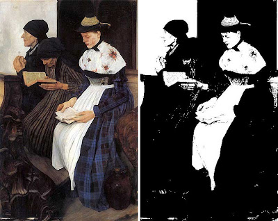
Threshold Filter

If a painting makes sense in pure black and white, it will also be effective in the full range of values and colors.


Put a painting through the “Threshold” filter in Photoshop (Image >Adjustments >Threshold) and see what happens.

William Liebl’s painting Drei Frauen in der Kirche (Three Women in Church), 1882,  benefits from a strong and simple value arrangement. The book and the hands of the young woman fuse into the light of the near girl’s apron. The dark elements (dresses, head scarves, ceramic jug and carved pew) are all shape-welded together and kept in a mass.

The result is that this painting would speak across a room of a gallery. Its meaning would be clear even from a great distance.
-------
See this and other images from the 1889 Universal Exposition on Matthew Innis’s blog "Underpaintings."
Previously on GurneyJourney: Shape Welding

Tuesday, November 23, 2010

Darwinian Theory of Beauty

Philosopher Denis Dutton shares his theory of beauty in this 15 minute TED lecture, illustrated with the white-board animation of Andrew Park.

Dutton dismisses the notion that beauty is in the eye of the beholder or is somehow connected to ideal form. Instead he takes a Darwinian approach, arguing that our response to beauty is wired into our human existence and our need to find mates.


He describes the ideal pictorial landscape as containing an open vista, with an element of water, a forked tree, and a sampling of wildlife, and a path or a road leading into the distance.
Above: Asher Durand.

This landscape, Dutton argues, is universally appealing across cultures because it appealed to our Pleistocene hunter-gatherer ancestors, presumably scanning for game to feed their mates.

Although I was impressed with Park’s animation, I didn’t find Dutton’s aesthetic theory particularly convincing, nor useful from an artist’s perspective. Part of the problem is semantic. As he says, we are impressed by skilled action, and we call it beautiful. It attracts the girls. Or vice versa.

But what skilled actions are we talking about? Do we include backing a trailer or skateboarding or card-shuffling? What about soccer? These things might be described as “beautiful” only in the loosest sense of the term. Most people wouldn’t include all of them in a definition of art.

And art does not include only skilled action. Many people regard as art certain objects that consciously exhibit a lack of skill: fauve, neo-primitive, and such.

Dutton doesn’t dig very deeply into the nature and the range of the core aesthetic responses, and why those responses might be evolutionarily adaptive. He makes rather unsupportable claims about how he thinks Homo Erectus responded to hand axes. How does he know the axes were art objects? Maybe they were used as money, not art. And how does he know Homo Erectus didn’t have language?  

Dutton’s theory also proposes that natural selection provides for a repulsion reaction to such dangerous things as standing at the edge a cliff. How, then, would Dutton’s theory account for the experience of the sublime, as formulated by aesthetic philosophers such as Edmund Burke? According to Burke, we’re attracted, rather than repulsed, by unsettling and disquieting experiences. (Example above: Wanderer by Caspar David Friedrich.)

Far more convincing—and useful— is Tolstoy’s notion that art is the deliberate transmission of emotion. It applies to dance, theater, painting, music, and all other forms. And it is immensely practical to the working artist, because it provides a clear test for the aesthetic value of a particular work. Tolstoy’s theory is a rich topic, perhaps fodder for a future post. 
-----
Dutton’s TED lecture on YouTube
Burke’s theory of the sublime
Tolstoy’s essay: “What is Art?”
Related GurneyJourney post: Neuroaesthetics

Monday, November 22, 2010

Petar Meseldžija's New Blog

Petar Meseldžija has started a blog. The second post starts with the proverb: “ There is no shortcut to the place that is truly worthwhile of being at.”

Seeing his sketches, photo reference, and closeup details shows how true that proverb is.
 ---------
 Petar Meseldžija Art
Previously on GJ: Steel Bashaw
Thanks, Dragan

Christophe

I did this portrait in a bistro while waiting for the salad. Christophe Curien is an painter/sculptor from Paris. He was concentrating on watching the drawing, so he has a rather serious expression.


I used two or three water-soluble colored pencils, and I painted the background with a water brush filled with fountain-pen ink.

 -------
Thanks, Christophe and Michael. 
Christophe's website

Sunday, November 21, 2010

Ice on the Bus

Note to concept artists: If you’re designing a frozen world, consider the fact that ice can form on the inside of things as well as on the outside.


Here’s a bus in Siberia. The wipers scrape the outside of the windshield. On the inside, the dashboard is covered with frozen precipitation. The bus driver sees the lights of the dashboard through a layer of ice.


Moisture condenses on everything, just like the frost in your freezer.

If someone leaves a window cracked open, the snow blows in and forms drifts.
--------
Pictures from “Siberian Ghost Cities” on Dark Roasted Blend

Saturday, November 20, 2010

Krüger One-Man Show

A one-man gallery exhibition of the portraits of Sebastian Krüger is on view in Boston Massachusetts through November 30.


Krüger is known for his large-scale acrylic portraits of rock stars, particularly his friends, the Rolling Stones. That’s Charlie, Keith, Mick, and Ronnie above.

The portraits are mostly larger than life-size. They command prices in the five- and low six-figures, and large giclée prints are also available. Krüger delights in the craggy topography of the aging rascals of the pop world, often exploring their wrinkled faces in photographic detail, but he generally reserves other areas of the canvas for a looser painterly flourish.


All of his portraits have a keen attention to what constitutes a likeness. He knows how far to push the exaggeration to make his point. Some of his portraits of Mick Jagger are in-your-face and over-the-top, but others are amazingly restrained and sensitive.

The painting “Keith Richards: The Devil in Focus” (200cm x 140cm) shows the old pirate just as he appears.

Krüger wants to use the term “New Pop Realism” to describe his new direction of subtler interpretation  He’s interested in exploring the intersection between the image of the pop icon and the identity of real person—both the mask and the man. 
-------------
Newbury Fine Arts Gallery Phone 617.536.0210
Sebastian Krüger Publications 
Sebastian Krüger News Blog
Official Krüger site site
 ---------
Thanks, Liz and Mike

Spectrum 17

The new issue of Spectrum has touched down on store shelves and mailboxes. The oversize art book showcases 400 digital and traditional paintings by 300 artists in the field of contemporary fantastic art.


The categories include Advertising, Book, Comics, Concept Art, Dimensional, Editorial, Institutional, and Unpublished.

In an essay at the beginning of the book, co-founder Arnie Fenner gives a health assessment of each of those categories. Even though times are tough, the artists overall have managed to produce some of the most striking, memorable, and ambitious paintings ever, making it clear that we’re living right now in the Golden Age of fantastic art. 

Spectrum 17 at Amazon
Spectrum News
Video Flip-Through
Spectrum 18 Call for Entries

Friday, November 19, 2010

Drawing with the Brush

The new December/ January issue of International Artist magazine includes a special feature that I wrote for them about “Drawing with the Brush.”


I use direct painting methods for most of my plein-air work, for portraits, and studio landscapes and cityscapes—any time reality rather than fantasy is the starting point.

Rather than refining the design on the panel with a pencil first, as I would typically do with a Dinotopia painting, I dive right in and establish the lines of the composition with a bristle brush on an oil-primed panel or canvas.


The step-by-step sequence in the magazine takes you through the whole process and the thinking behind it. Also included in the article is a picture of Jeanette that I drew in with a brush on a pre-textured board.

Both paintings (discussed in other contexts) also appear in the new book: Color and Light: A Guide for the Realist Painter.
Other articles in the magazine feature Howard Terpning and Rose Frantzen, and there’s a Call for Entries for “Flowers and Gardens.” 

----------------
Look inside the current issue of International Artist.
Related GurneyJourney post: The Ninety Degree Rule (“Jeanette Sketching”)

Why Stamp Art is Small


The National Institute of Health Library recently held a symposium about sickle cell disease.

Here’s the display they did in the library showing the original stamp art. The tiny oil painting is framed in the lower left of the glass case.

The original oil painting is no bigger than a postcard. There’s a reason that the Post Office asks artists to paint stamp art that small. If you let an artist do a large painting, they’ll most likely put in lots of detail that will become lost when the art is reduced.
----------
Photos by ED’WW Flickr Pool
Previous GJ Posts: Sickle Cell 1, Sickle Cell 2
NIH Symposium

Thursday, November 18, 2010

Fish Dreams

These fish live in a tank in a restaurant. I wonder if they have ever swum in a real stream or a lake.

Are they like the lobsters in the supermarket, kept apart from their home waters? I search their faces, but I can’t tell the answer.

They make me think of all immigrants and expatriates, who cherish memories of a more accustomed world.

Wednesday, November 17, 2010

Illustration's Fall Issue

The new Illustration magazine has three juicy articles on mid-century American illustration.


The first explores the work and career of J. Frederick Smith (1917-2006), who painted and photographed glamorous women. His first-hand account describes his fast-paced lifestyle, and the challenges in getting the right models for the photo shoots. This article alone has 70 reproductions, including excellent scans original art, photo reference, tearsheets, and behind-the scenes photos.

Another article chronicles the career of Clark Hulings, one of the great illustrators of paperbacks and album covers in the 1950s and ‘60s, before his love of travel led him to a career (that he’s still pursuing) painting gallery canvases of picturesque destinations.

The coverage rounds out with the story of the life of John Fleming Gould, who painted pulp art and car renderings. All three articles benefit from the first-hand voice of the artists themselves.

The magazine announces two other exciting developments. First is the imminent arrival of “Masters of American Illustration: 41 Illustrators and How They Worked,” by veteran illustration historian Fred Taraba and publisher Dan Zimmer. This promises to be a worthy successor to the classic book “Forty Illustrators and How They Worked.”

The other is the announcement of “The Illustration Gallery,” part of the Illustration catalog, a new place to buy and sell original works of illustration art.
--------
Illustration Magazine
Taraba Illustration Art
Clark Hulings.com (Image above: "Ville Franche")
J. Frederick Smith on AskArt 
40 Illustrators and How they Work (The 1940s classic from Amazon.com)
The Illustration Gallery contact info.

Tuesday, November 16, 2010

Sickle Cell Stamp, Part 2

This is Part 2 of the making of the Sickle Cell stamp for the U.S. Post Office. Part 1 is here.

Normally I use friends and neighbors as models, but I didn’t know anyone who had the right look for a young African American woman or a baby of the right age. Through a modeling agency, I located excellent models for both characters. Unfortunately, they were no relation to each other and had never met.


That meant the modeling session might be risky because babies of that age often are afraid to be held by strangers. And in this case, the woman posing as the mother was a young dancer who didn’t yet have children of her own. If the baby started crying, the session would be a disaster. To be safe, I scheduled the modeling sessions back to back.

The “mother” posed first, holding a stuffed bear as a stand-in for the baby. Then I photographed the baby being held by a favorite aunt. Finally, we put the baby in the model’s arms. After a moment of wide-eyed consternation, the baby broke into a smile, and the two got along wonderfully.


The resulting photos provided a basis for the final oil painting. I had to change the little girl into a boy, and I changed the pose so that the mother was leaning back more. I also softened the light source to remove the harsh shadows.


Even a photo reference shot from professional models should be regarded as just a starting point, and you should feel free to change anything to make the final result express your initial vision for the pose.
------------

Sickle Cell Conference at the NIH Campus in Bethesda, MD, Nov. 16 and 17
Wikipedia on Sickle Cell Disease
Sickle Cell Stamp, Part 1
Previously on GurneyJourney: Tips on using photo reference.
-----------

Monday, November 15, 2010

Sickle Cell Stamp, Part 1

Tomorrow, the National Institute of Health will host a symposium discussing sickle cell disease. On display at the gathering will be the original oil painting I produced for the 2004 U.S. Postal Service stamp commemorating the disease.

Today and tomorrow I’ll tell the story of the making of that stamp.

Over the years the U.S. Postal Service has released stamps designed to help raise awareness about health issues. When the Stamp Committee decided on a stamp recognizing sickle cell disease and asked me to design it, I was honored to take on the challenge.

I knew it would not be easy to visualize an incurable hereditary blood disease in a way that would be inviting and interesting. The image that comes readily to mind when people think of sickle cell disease is a microscope slide showing the elongated red blood cells alongside normal round cells.


The credit for the design solution belongs to veteran art director Howard Paine, who suggested portraying the scene in universal human terms. Because the disease or the trait is passed down from parent to child, he proposed showing a parent’s love for her baby. Why not show a mother and a child interacting with love and affection? The message then becomes a positive one, reminding at-risk parents to test early to find out whether they carry the gene.

I sketched up several different design ideas in color. The most successful version shows the mother holding up her year-old child in profile and giving him a kiss. The committee approved the design (sans microscope slide) and gave me the go-ahead.
--------
In part 2, I describe how I went from the roughs to the finished art.
-------
Sickle Cell Conference at the NIH Campus in Bethesda, MD, Nov. 16 and 17
Wikipedia on Sickle Cell Disease

Sunday, November 14, 2010

Matania at Work

Archival newsreel film footage brings to life the working process of Italian/British historical illustrator Fortunino Matania.


You can click the image above to link over and see the film.

It shows Matania directing costumed models, who pose as he draws them directly into the finished illustration. He adds the missing elements, such as settings and horses, from his imagination.


Ever the showman, Matania puffs from his cigarette as he draws, jumping up from his chair to joke around with the model. The film ends with him working away, surrounded by a a Bohemian throng, with one of them strumming a guitar.


(Link to British Pathe, where you can watch a small-scale preview or pay to get a full-rez download)
Previously: Matania's Models and Props
Matania: Without a Net
Image: "Goodbye Old Pal" (Man comforts dying horse)
Thanks, Daniel 

Saturday, November 13, 2010

The Spell of the Cell

Cell phone users hold predictable poses for relatively long periods. They’re oblivious to the world around them, making them good sketching subjects.


This man in France was talking energetically while gesturing with the non-phone hand. His right hand held a slip of paper and a pen.

The fact that people gesture while talking on cell phones suggests that hand movements benefit the speaker more than the hearer.


When men check messages, they usually stand with their feet wide apart and their pelvis forward. They duck their chin to their chest and hold the cellphone against the base of their sternums.


Children melt into their chairs. They totally relax their legs and feet. The outer world disappears. They fall into a reverie. Their minds link with the machine.

(Note: We’re home now in New York. Many of the upcoming posts will be from places we’ve been over the last two months--western USA and Europe. I’m just catching up from a lot of material generated over the last month of touring. I’ll try to keep the Facebook page updated with what we’re doing and what’s coming up.)
------

Friday, November 12, 2010

The Angel Academy of Art

The three great domes of Florence were shining in the morning light yesterday.


On the left of the picture is Jay Blums and on the right is Martinho Isidro Correia. Both instructors are originally from Canada. We're standing in the Angel Academy of Art, one of the world’s leading centers for academic training.


The school was founded by Michael John Angel, known as “Il Maestro” by his students. Mr. Angel was a student of portrait painter and muralist Pietro Annigoni (1910-1988).


The school consists of two buildings near the center of Florence, where 60 students from 29 countries follow a focused curriculum. The method is based on traditional realistic painting methods that Mr. Angel has painstakingly researched.

Students begin by carefully copying plates from Charles Bargue’s 19th-century drawing course. Then they proceed to portraying the plaster cast under artificial light, using "sight-size" procedures, first in charcoal, and then in oil.

They graduate to working from still life subjects and to drawing and painting the living figure.

The entire regimen has taken as little as two years for a few very precocious students. More typically it takes three or four years. A single oil or charcoal can take several months. People move to succeeding steps in the curriculum depending purely on their readiness.
-------------
Angel Academy of Art
Michael John Angel
Cast drawing at left is by Dorian Iten
Charles Bargue Painting Course (Book from Amazon)
Pietro Annigoni on Wikipedia
Wikipedia on the Atelier Method & Sight-Size Drawing
Related GurneyJourney posts:
    Academy of Realist Art, Toronto
    Grand Central Academy, New York
   En Loge (Prix de Rome) Competition

Wednesday, November 10, 2010

The Marais

Around the city of Bourges, France, is a vast system of marshes and canals called the Marais. The low land has been reclaimed as allotments for gardeners, who grow swiss chard and lettuce.


Footpaths follow the canals, punctuated with pollarded willows . Pensioners walk their dogs or ride along on bicycles, greeting each other as they pass. The air is hazy, and fragrant with the smell of burning leaves.

Last Judgment

One of the stained-glass windows of the cathedral of Bourges shows scenes the Last Judgment.


Here, the souls are thrown into the mouth of the Leviathan. The scene is conjured with all the vividness of the 13th century imagination.

Guest-blogger Jeanette

This sketch was done in ballpoint pen with watercolor wash. I sat next to Jim, and my picture begins just to the left of where his sketch ends. Trying to get the half-timbering (pan-de-bois) correct was insanely time-consuming.

As we sat there on our folding stools, people from Bourges kept walking by us, saying encouraging things in French. At least I assume it was encouraging from their facial expressions, as I don’t speak much French.

It’s amazing how Jim and I can sketch the same subject at the same time and come up with entirely different results. Almost invariably, mine is breezy and cheerful, and Jim’s is carefully drawn, with moody lighting. I see everything in line, Jim sees form and light first.

Tuesday, November 9, 2010

Tao of Painting People


Don’t paint a figure; Paint a person.
Don’t paint a head; Paint an individual.
Be accurate, but see beyond the surface.
Beware of pictures that are correct but lifeless.


The face is the window to the soul.
All of humanity’s greatness and frailty can be found in a single pair of eyes.


---------
Portraits by Peder Krøyer (1851-1909). Thanks to Tim Adkins for the close-up.
Krøyer on Wikipedia

Map Crunch


What do other countries in the world really look like? Standard tourist photos don’t give you genuine slices of life.


The website “MapCrunch.com” allows you to view random images from the vast Google street view archives. You can select from 18 different countries around the world and choose whether you want country roads or not. The examples above are from Spain, Hong Kong, Mexico, and Missouri (USA).

This would be a fun motif-generator for the tiny landscape painting exercise in yesterday’s post. Press the button and paint the scene in 10 minutes or less!

MapCrunch.com
GurneyJourney: Tiny Landscapes
Thanks, Toby Neve

Unveiling at the Jules Verne Museum

Yesterday I had the privilege of attending the unveiling of two paintings that are now part of the permanent collection at the Jules Verne Museum in Nantes, France.


Upper left: The paintings on the wall of the museum near the entrance; the dedication ceremony yesterday; the Jules Verne medal presented to me by Jean-Louis Jossic, the cultural minister of Nantes; and standing near the fountain in the Place Royale, where the painting is set.

According to the article in today's Ouest-France:

"Le musée acquiert deux illustrations de l'auteur de Dinotopia: l'une, Décollage nocturne, a servi pour l'affice du festival des Utopiales 2009, tandis qu'une autre représenet le musée installé sur son rocher."
------
Ouest France: "Deux oeuvres de James Gurney au musée Jules Verne"
Musée Jules Verne
Utopiales Festival 2009

Previous GJ Posts:
Floating Jules Verne Museum
Utopiales Painting, Part 7: Final Painting
Part 6: Washin
Part 5: Pencil Drawing
Part 4: Lighting
Part 3: Maquette
Part 2: Researching Insect Flight
Part 1: Initial Sketches

Muddy Colors Blog

The new blog called "Muddy Colors" brings together an all-star line-up of illustrators and designers with daily insights into the thinking behind the art of contemporary fantastic art.

In the last five posts:
Dan Dos Santos reflects on digital versus traditional and violence in covers.
Arnie Fenner describes how movie posters and paperback covers got him fired up about art.
Greg Manchess shows how he painted a cover with clockwork fairies.
Jon Foster explains how he uses thumbnails to find the best image.
Dan Dos Santos shows the various sketches on a job and the thinking behind them.

Monday, November 8, 2010

Tiny Landscape Nuts and Bolts

This is an answer to the questions from Petr and Vicki from the previous post (by the way, I appreciate all the kind comments, and the haiku, Dan!)


Anyway, the tiny landscapes were done with a mixture of watercolor and water-soluble colored pencils. I usually start with a quick lay-in using a brown Caran-d'Ache pencil. The watercolor is a Schmincke half-pan set.

Then I painted the sky with a flat watercolor travel brush. The brush is the gold metallic thing just to the right of the rows of paints. It divides into two pieces, with the handle acting as a cover and protector for the brush tip when stored. I also used a Niji water brush for softening some areas.

Then I painted the other big shapes of the landscape with watercolor, and added detail and foliage texture with the colored pencil. The notes are written with the blue Waterman Phileas fountain pen (filled with brown ink) that's just visible above the Moleskine watercolor book.

The rag is a scrap of cotton flannel, and the cup is a Nalgene plastic jar.

Sorry, the Mac iBox (upper right) is a prototype only, and is not for sale.
----------
Previously on GJ: How to refill a fountain pen.

Tiny Landscapes

Traveling often gives you time in 15 minute intervals. This morning, for example, I found myself on the train platform in Bourges from 7:25 until 7:39 AM.


But that’s enough time for a painting the size of a postage stamp. I got out my Moleskine watercolor book and the other little tools that I keep in the side pouch of the computer case.


There’s the painting on the far right of the second row (click to enlarge). A few minutes later the TGV train passed farms near Vierzon, where the lights of the houses still glowed. The landscapes—and the weather—changed moment to moment.

This is a really fun way to work if you want to tackle new subjects, or to try a new medium, or to explore new compositional ideas.