Wednesday, December 30, 2015

Patrick McCormack


This is Patrick McCormack playing the fiddle at Anderson's Thatched Pub, Carrick-On-Shannon, Roscommon, Ireland. 

He was a farmer who came in late from haying, with bits of hay still on his shoulders. Tired as he was he shared his music with us all and took time to show the young players a thing or two.  

My next article for International Artist will be about sketching in pubs and concert halls.

Tuesday, December 29, 2015

Street Painting Safety Gear

Street painting in Hudson, New York.
Painting a street view sometimes means standing in the street. The advantage of the street position is that the view isn't blocked by parked cars. But it's good to follow basic safety precautions. I like to use a traffic cone and a safety triangle (links take you to Amazon).

The safety triangle sits on a weighted base. The reflective triangle pieces fold down. I cut the "Department of Art" stencil to customize the traffic cone. You can also wear a reflective safety vest or even reflective suspenders over your clothes to allow cars to see you.

Edit: Joe Kulka made this sign after reading the post. Thanks, Joe!

Korean Edition of Imaginative Realism


There's now a Korean edition of Imaginative Realism: How to Paint What Doesn't Exist, published by Viz&Biz.

Monday, December 28, 2015

Shishkin's Print Albums


In addition to painting in oil, Ivan Shishkin (1832-1898) worked in pen and ink, etching, and engraving. 

He produced lavish albums of his prints with ornate title pages. His name (in Cyrillic letters) is written in the fenceposts seen through the arch.

Some of the etchings were interpretations of his oil paintings, but others were original compositions.

Below is one of the albums of 60 etchings showing the outer cover and the illustrated title page.


Read more about Shiskhin's print albums at the following link to Rarus's Gallery.
-----
Just a few days left to join the Six Word Story Challenge. Free to enter.

Sunday, December 27, 2015

Artists in the Royal Tree

The British Royal Family has for centuries included some devoted and accomplished artists.

A view of Windsor Town and Castle by Prince Ernest Augustus, 1780, Daily Mail
Royals have always had the benefit of travel and of excellent instruction, and the blessing — or the curse — of being free from commercial considerations.


Prince Charles is a devoted watercolor painter, but he's also the most articulate advocate of amateur painting since Winston Churchill. (Link to video) He hosts this BBC documentary charting the artistic apples on his family tree.

Saturday, December 26, 2015

Call for Entries: Natural Science Art

Spear Lily by Mali Moir

Attention natural science illustrators: The Focus on Nature XIV exhibition is accepting online entries.

What is it? Focus on Nature is an international juried exhibit of natural history illustration. It has taken place every two years since 1990. Artists all the way from Australia to Argentina to Austria send their work, and some come to the openings.

Who is on the jury? The jury includes a scientist (evaluating the scientific merit) and an artist (evaluating the aesthetics).

What are the criteria the jury will be looking for?
  • a high degree of technical skill
  • scientific accuracy, including taxonomic definition
  • aesthetic qualities, including composition
  • a unique scientific and/or artistic viewpoint, techniques, medium, or format (organic depiction, schematics, diagrams, etc.) including traditional, mixed and multimedia, or computer-generated images
  • a broad representation of artists
How many pieces may I enter? Up to two submissions in any one subject [but no limit on media]. No more than a total of four entries will be considered.
What's the deadline? March 16, 2016.

What does it cost to enter? Nothing! It's free to enter.

Where will the exhibition be? Roger Tory Peterson Institute in Jamestown, NY, December 3, 2016 – April 9, 2017. 

Official website: Focus on Nature

In the comments, please let me know about other calls for entry (especially those that are free or cheap to enter) that you think GurneyJourney readers would be interested in.

Thursday, December 24, 2015

Merry Christmas 2015

Santa Claus by James Gurney, Oil on canvas, 24 x 36.
Here's my idea of Santa: biker dude meets the Coke Santa. The model was the real Santa from our small town who worked by day in the hardware store.

All my warmest wishes to each of you during this festive season.

Wednesday, December 23, 2015

Basic Painting Tip: Palette Position


Here's the second in a series of brief videos called "Basic Painting Tips." (Link to YouTube).


The idea here is to lift up the painting as close as you can to your view of the subject, with the palette as close as possible to the painting. Both palette and painting should be approximately perpendicular to the line of sight (arrows). It's also important that palette and painting are in the same lighting. If the painting is in shadow and the palette is in full sunlight, judging color mixtures becomes needlessly difficult.

Pochade easels for oil painters, like the Open Box M above, place the palette just below the painting, while other systems such as the Parallel Pallette place it just to the side. With watercolor or runny paint, the palette usually has to be more horizontal. The homemade Lightweight Sketch Easel that I've been using lately uses a hinge system that lets you place the palette at any angle.

These short tip videos are intended for beginning painters, but I hope they will interest experienced painters, too. The idea is to grab an excerpt from my longer videos that can serve both as a stand-alone information piece and a teaser for my longer content, which covers both beginning and advanced material.

Future videos will include things like:
• Palette Arrangements (how the colors can be placed)
• Diffusers
• Brush materials
• Brush shapes
• Oil priming
• Overlapping edges
• Drying time
• Shadow colors
• Using enough paint
• Area by area
• Loose block-in
• Brush cleaning
• Brush storage
• Color isolators
• Unifying glazes

BASIC DRAWING TIPS
• Eye level
• Viewfinders
• Measuring lengths
• Measuring slopes
• Ellipses

Is there a topic you would like to see covered in a future video? Teachers, are there reminders that would help your students? Please let me know in the comments.
-----
On topic of palette position, you might also check out my previous blog posts:
• Using a sketchbook easel vertically
• Plein-air tip: Go vertical
PAINTING TIP #1: Large to Small)
Full video "Fantasy in the Wild" available in two forms:
Digital download from Gumroad (HD MP4)
DVD (NTSC Region 1)

Tuesday, December 22, 2015

William Hart's technique for studies


This unfinished Maine seacoast study by Hudson River School artist William Hart (1823 – 1894) gives an insight into his oil painting method.


It appears that he has pre-toned the canvas in the lower area with a thin layer of burnt sienna which was dry when he arrived the location. The gray area of the beach at lower left and the blue colors of the sea at right are laid opaquely over the warm underpainting.

Those blue colors are just a flat base coat that, had there been time to finish, would have been detailed with waves. The top area of the rocks are subdivided further and further with the brush, progressing from large forms to small ones.

William Hart, White Pine, Shokan, Ulster County, New York, c. 1850-'60
The idea of laying large, flat areas and subdividing them applies to Hart's watercolors as well. He lays down the entire silhouette shape of the tree mass in a flat, dull-green tone, preserving the white of the paper where he needs it. Then he systematically subdivides those green tones with smaller forms.
-----
Watercolor from Albany Institute
More insights on Hart on Mike Ettner's blog

Monday, December 21, 2015

Is Failure the Key to Success?


There's a recent bestseller called Fail Fast, Fail Often: How Losing Can Help You Win that is very popular in Silicon Valley lately.

Part of the idea is to give yourself permission to fail. So many people with good ideas never get started or take risks because they’re afraid of failing or being embarrassed. 

According to Pixar founder Ed Catmull in his book Creativity, Inc.: Overcoming the Unseen Forces That Stand in the Way of True Inspiration, Director Andrew Stanton (Nemo) urges his staff to "fail early and fail fast” and “be wrong as fast as you can.” Working through problems makes sense in the animation business because the costs mount quickly as an idea moves through the pipeline.

Neil Gaiman says: “Make New Mistakes. Make glorious, amazing mistakes. Make mistakes nobody’s ever made before.”

The BBC reported about a design college that divided a class into two groups, one that was told they would be graded on the quantity of what they produced, and another that was told they would be graded on quality. The quantity group produced not only more work, but more quality work. The quality group was stuck in the envisioning stage.

At Google, the mantra in their skunkworks is a little different. It's "Build fast, break stuff." They create lots of new ideas, and as a strong one emerges, they develop it, but they also actively try to kill it. If an idea survives that process, they keep going with it. 

As for me, I think it's important to allow a space for failure, but I think a person or an organization only wins by focusing on winning. I'm personally doubtful about the "fail fast, fail often" mantra. It definitely doesn't apply to enterprises where failures can be catastrophic, such as auto racing, aeronautics, or space travel.

But even in the relatively low-risk arena of picture making, I think focusing on failure as a goal is not terribly helpful. 

There's an interesting MIT study that looks at what goes on in the brains of monkeys when they're learning. It turns out that "brain cells may only learn from experience when we do something right and not when we fail." The study leader says: "We have shown that brain cells keep track of whether recent behaviors were successful or not." Author Deborah Halber continues, "When a behavior was successful, cells became more finely tuned to what the animal was learning. After a failure, there was little or no change in the brain - nor was there any improvement in behavior." 

The way I would describe my mindset is: Visualize the goal and start out with a playful, experimental attitude. Keep a low enough investment in any preliminary idea to allow yourself to let it go if it’s not working so you can find a better idea. Many ideas that turn out to be successful start off looking weak and unlikely at first. 

Once you’ve got a good idea and you’ve tested it and thought through all the ways it could go wrong, then the mindset has to change. Carrying a big idea to its conclusion requires a dogged, long-term commitment. Don’t let anything stop you until the final result is as good as it can be. 

Unsuccessful efforts are not failures. They’re only a real failure if you don’t learn anything from them. Each trial generates a nugget of value, even if it turns out to be off track. The successful final result, which may look to someone from the outside like a stroke of genius, is just the harvesting of little successes plucked from the abandoned prototypes developed along the way.

To boil that down: “Generate lots of ideas, test them, and then build on what works, always with an eye toward success.”

Read more
BBC: "How Creativity is Helped by Failure"
MIT Study: Why we learn more from our successes than our failures
The Verge: The Good Dinosaur is looking like Pixar's first box-office failure
Thanks to blog reader Paul Foxton and to Frank and Dan Gurney (all three of you).

Sunday, December 20, 2015

Questions about Casein and Gouache


Carlos Angeli writes from Argentina: "I've just finished watching Fantasy in the Wild (shared some thoughts on the blog as well), and loved it. Because there are no casein paints here in Argentina, I was wondering; if you had to go with a substitute for paintings like the ones in your video, would you go with either gouache or acrylics? 

Also, Julien in France asked on YouTube: "Richeson casein is not distributed in France yet, a bit expensive to get. Couldn't find a casein set less than 60/80€."

Gurney: Yes Carlos and Julien, it's too bad that Richeson doesn't distribute casein where you live, but gouache is nearly the same— good colors, opaque, and nice handling. I did the excavator study in gouache and transparent watercolors.

Julien: "I thought casein was more 'creamy' than gouache? I already have gouache, maybe not tested extra fine quality gouache (only white with my watercolors). In French shops, casein seems to be only a basic paint for old furnitures, as 'ecologic' way. The milk protein is only in casein isn't it? And you have both gouache and casein in the US, even if only Shiva (Richeson) seems to offer casein, no?

Gurney: Yes, casein is formulated with a milk protein for the binder. It's a bit creamier than gouache, but if you're using your transparent watercolors with gouache white, you would get more of a creamy feeling if you used tubed gouache for all the colors instead. You could also mix your gouache with a little casein emulsion or even acrylic emulsion. Richeson makes a separate emulsion product, as does Pelikan.

If you want a sealed surface when the paint is dry, you could use Holbein Acryla Gouache or any of the "acrylic gouaches", which are really acrylic paints with opaque, matte, "gouache-like" qualities. 

Carlos: "I'd like to know if you use something to protect your paintings once they're finished. I've been doing many watercolor and some gouache attempts lately and I don't know if there's a product for that."

When I was doing animation background painting, I used an aerosol product called Crystal Clear to varnish gouaches and cel-vinyl paintings. It gives them an impermeable, glossy depth that resembles oil paintings, but it makes the surface no longer workable in gouache, pencil, or pen.

Richeson (Shiva) makes a casein varnish to protect the surface and deepen the colors with a glossier finish. I've tried it, but haven't had much luck with it because it keeps soaking into the paper, even after many coats. Maybe if I used a less absorbent ground than watercolor paper, such as a gesso surface, the varnish might not soak in.

Most of the time, and especially for my sketchbooks, I like to leave the surface of gouache and casein just as it is, with a matte finish. It photographs better and it's always workable. 

Fantasy in the Wild: Painting Concept Art on Location is available in two forms:

Saturday, December 19, 2015

Streaming, Renting and Downloading Question


In the blog comments yesterday, Tom asked a question that I thought we could bring up with the group mind: 


Tom Hart said...

Sorry to sidetrack the discussion. I just bought Fantasy in the Wild (download). Can anyone help me understand the advantage of watching it as a download versus streaming it from the Gumroad site "on demand", once purchased? I can't see an advantage in downloading (taking up the 1G) except for the issue of data usage if you're not connected to wifi. (Maybe I just answered my own question.) Will it be available to stream from Gumroad "indefinitely".

In any case, I'm really looking forward to watching it this weekend.


James Gurney said...

Tom, you're not sidetracking at all. I'd be interested in people's answers, too. I may have only set it up for downloading, I'm not sure. EDIT: When you buy the digital from Gumroad, you get the option to download and own the file for any device, even if you're offline, and you also get the option to stream the content later in case you don't want to take up hard drive space. 
To be honest, I'm not sure if streaming and renting are the same thing.* What form is best for everyone? Should I offer a rental, too, and if so, for what price? 
---- Gumroad: Fantasy in the Wild: Painting Concept Art on Location
*EDIT: Regarding rentals, I haven't configured that option yet. I looked on the Gumroad site, and here's the explanation of how creators can configure rentals: "When they (customers) buy a rental from you, customers will have 30 days to stream (not download) the video files. Once they click "play" on a video file, their access to this file will expire in 72 hours."

Friday, December 18, 2015

10k on Instagram


Thanks to Ash Faulkner for following me on Instagram and being the one to push me over the 10K mark. I started up with Instagram 14 weeks ago, and I love the forum it provides artists. 

If you want to check out my IG postings, you'll find a daily serving of my artwork, both new and old, familiar and obscure, plus a few fun video clips. 

Harold Speed Chapter 5: Tone Values


Today we'll take a look at Chapter 5: "Tone Values" from Harold Speed's 1924 art instruction book Oil Painting Techniques and Materials.

I'll present Speed's main points in boldface type either verbatim or paraphrased, followed by comments of my own. If you want to add a comment, please use the numbered points to refer to the relevant section of the chapter.


1. Beauty in tone values comes from tones that are large and simple.

Speed points out that this isn't the only kind of pictorial beauty, but it's an important one. What he means by large and simple tones is big, unbroken shape of tone. We've talked about this principle in terms of "Shape Welding."

It also has do do with the modeling of form, where the light areas are grouped into close values to give a sense of a flat poster-like appearance, even if there is subtle glazing and variation, as in the Velazsquez below.

Portrait of Cardinal Camillo Astali Pamphili - Diego Velazquez
He makes the analogy with music often in this chapter as he has done elsewhere, comparing the "big tone" approach with a pure note on a violin. He also mentions that using opaque paint gives greater tonal control. In fact with opaques it can be a challenge to get variety and color change.

2. "The thick atmosphere of our towns simplifies the tones, and is responsible for much of the beauty our artists find in such unexpected places of manufacture."

A nice side benefit of smog from coal in London 100 years ago, where the air was so polluted you couldn't see to the end of the block.

3. Tone beauty not important to the Pre-Raphaelite Brotherhood (PRB).

Speed isn't knocking them exactly, but just saying they were after other pictorial goals. Ruskin, a friend and champion of the PRB and other super-naturalist painters, was a great fan of microscopic detail, and also an advocate of gradation, rather than the flat-tone approach of Whistler, Brangwyn, and the Newlyn School. Speed makes a few exceptions among PRB painters, such as the Blind Girl by Millais, which is reproduced in my book Color and Light.

4. Velazquez was the great master of tone values.

Carolus-Duran, Sargent's teacher, was also a huge fan of Velazquez, and much of Sargent's love of the big tone approach came from him. Pyle of course in this country was a big tone fan, and I've talked about that on this blog quite a bit.


5. Head of Aesopus (Aesop, i.e. of Fable fame) probably painted with warm and cold black, burnt sienna and white.

Here's the image Speed is referring to. Has anyone tried this? By the way, I love using a warm black and a cool black in watercolor, too. A cool black might be Payne's Gray, and a warm black might be Sepia, for example.

Vermeer, Lady at the Virginal
6. Vermeer's technique
I don't have time to recapitulate Speed's points here, but maybe some of you who have experimented with the methods Speed is talking about would care to comment.


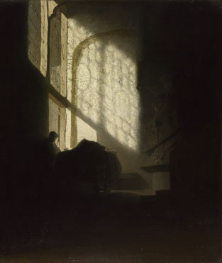
7. "Strongly contrasted schemes of tone had been in use since the days of Leonardo da Vinci, but used chiefly to augment the expression of form; whereas Rembrandt used it as an expressive thing in itself, giving it aesthetic value."

"The Philosopher" by Rembrandt, above, may be different from the one Speed showed in the book, but it makes the same point. Intriguing big tones. EDIT: The one Speed referred to is below (thanks, Steven).

A Man seated reading at a Table in a Lofty Room
about 1628-30, Follower of Rembrandt


8. "What is often called muddy colour is generally the result of bad tone relationships."

A very important point that has come up before and will come up again here.

Next week—Chapter 6: Elementary Tone Exercises
-----
In its original edition, the book is called "The Science and Practice of Oil Painting." Unfortunately it's not available in a free edition, but there's an inexpensive print edition that Dover publishes under a different title "Oil Painting Techniques and Materials," and there's also a Kindle edition.

Dancing Banana


I'll bet you've got 13 seconds to give a dancing banana. Spoiler warning: sad ending. (link to YouTube) Animation by Patrick Boivin.

Thursday, December 17, 2015

Painting Tip: Start Big, End Small


In this new YouTube video, I demonstrate a useful principle that will help you with speed and accuracy in plein-air painting. (Link to YouTube)

I do a study of an excavator in gouache (opaque watercolor), using big brushes and big shapes at first, and then I finish with smaller brushes, spending time only on the details that interest me the most. The whole study took about two hours, but it gave me essential information as I developed the design for the giant robot.

This is an excerpt from Fantasy in the Wild: Painting Concept Art on Location, a 71-minute video workshop packed full of such essential info. 

This video is especially valuable to you if you're interested in fantasy, science fiction, concept art, or anything that requires combining imagination with observation.

Wednesday, December 16, 2015

Using Maquettes on Location

Today is the release of my new video, "Fantasy in the Wild."


In this excerpt I show a fast technique for making a reference maquette that's practically indestructible and it can be put into almost any pose (Link to YouTube). It's also a fun, quick build that you can do with a kid.


I hot-glued braided cord along the arms to simulate the hydraulic lines. The pins were supposed to suggest antennas.


The maquette was helpful while I was out on location generating picture ideas and then doing the final painting.


I also used a maquette in the Rhinecliff location to help me imagine the flying car.

In its 71 minutes of running time, "Fantasy in the Wild" is packed full of practical tips that you can use regardless of your preferred medium or subject matter.

It's really a story of imagination meeting observation.
-----
"Fantasy in the Wild: Painting Concept Art on Location" is available in two forms:
HD MP4 video download...$14.95
DVD (Region 1 NTSC)......$24.50

Tuesday, December 15, 2015

Some come easy....


Some paintings come easy and some come hard. The robot painting that you saw on Sunday comes the hard way, with lots of orphaned sketches.

Robot sketches, watercolor and gouache
I know I want the robot to be about 40 feet tall and designed like a modern yellow excavator. And I know I wanted him interacting with a modern streetscape. But should he be parked behind a repair shop? Asleep around construction equipment? Wading in a harbor? Looking in a third floor window? 

The only way to find out is to do thumbnails, lots of them. 

Giant robot enters the human world, sketch, casein, 5 x 7 inches.

What if the robot is an autonomous A.I., built far away by other robots? What if he has never met a human before? Here he is entering a town, meeting humans. I like the idea, but it doesn't suggest enough backstory or peril. 

I keep sketching actual excavators to see how they are built. This sketch is in gouache.


What if I show the aftermath of some accident that the robot is involved in? He could be surrounded by wreckage and tangled up in wires.


This has possibilities, and I keep wrestling with it. Each of these sketches is about two inches wide, and I spend only a few minutes on each one, so I'm not too attached to anything. 


There's an accident scene in front of fast-food restaurants. Putting the robot on one knee makes him more active. The robot is trying to help out, but is only making things worse.


This idea suggests a lot of ideas for backstory. As the story comes into focus, so does the composition.

This entire process is captured on video in "Fantasy in the Wild," which releases tomorrow. It's 71 minutes long, and profiles the creation of two imaginative paintings outdoors, on location.


There's a DVD version ($24.50 Region 1 NTSC) with an extra slide show, and a digital video download (HD MP4, $14.95) that you'll be able to own or stream. 

"Fantasy in the Wild" goes on sale tomorrow, Wednesday December 16, and tomorrow only it will be 10% off.
-----
GurneyJourney YouTube channel
My Public Facebook page
GurneyJourney on Pinterest
JamesGurney Art on Instagram
@GurneyJourney on Twitter