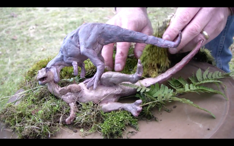
Tuesday, September 30, 2014

Turner Paints a Man-of-War


Once while staying as a guest at the estate of Walter Fawkes, J.M.W. Turner was asked to paint a watercolor of a British man-of-war.

His process of painting was extraordinary. According to an eyewitness, "He began by pouring wet paint onto the paper till it was saturated. He tore, he scratched, he scrubbed at it in a kind of frenzy and the whole thing was chaos -- but gradually, and as if by magic the lovely ship, with all its exquisite minutia, came into being, and by luncheon time the drawing was taken down in triumph."

Tomorrow —a new episode of Clementoons.

Monday, September 29, 2014

Troll-Caught Tuna Contest Results


We received almost 40 entries, all in the illustration category, for the "Troll-Caught Tuna" contest. The inspiration was a label on a tuna can that suggested that maybe trolls did the fishing. I asked you to imagine how trolls might catch, sell, or prep the tuna. The results were wonderful, and it was hard to choose. 

The Grand Prize winner is Jaimie Whitbred, who imagined the trolls bagging their fish as they jog along the seafloor, their feet weighted down with cinderblocks. Jaimie says, "Trolls keep their ancestral fishing methods a closely guarded secret. After all, it's these methods which have allowed trolls fisheries to thrive in waters where other fishermen come up empty-hooked." 

Way to go, Jaimie! You win a set of all three of my instructional videos (either DVDs or downloads), plus a "Department of Art" embroidered patch.

 There were three Honorable Mentions, each of whom wins a "Department of Art" patch. First off is German illustrator Helmut Dohle (Poul).

 The second Honorable Mention prize goes to Cory Van Den Akker, who shows how thoroughly monstrous and determined those trolls are when they want to catch their fish.

And the third Honorable Mention goes to Drew Camino. You get a Dept. of Art patch, too!

All winners, please email me your mailing address, and Jaimie, please let me know in what form you want your videos.


Thanks to everyone for entering. I tried to embed a gallery widget to show all the other entries, but Flickr blocked the code on Blogger. You can see all the additional images by following this link directly to the Flickr album.
----
Announcement of Troll Caught Tuna Contest

Sunday, September 28, 2014

Night Sketching in Alleys


Night sketching in alleys opens up new worlds of light and color.

Streetlights come in a variety of color casts: the yellow of sodium vapor, the green of mercury vapor, the red of neon, and the blue-white of metal halide. Our eyes can see variations in these light colors that elude the camera.

This casein sketch is about the size of a baseball card. In the semi-darkness, it's difficult to distinguish subtle color differences on the palette, so I take a basic palette of about seven colors.


I take a variety of compact LED lamps with me in order to match the illumination on my sketchbook with the levels and colors in the scene. Clockwise from upper left is a single head book light, a Mighty Bright "Hammerhead" light, and a Petzl Headlamp (customized with a nylon diffuser and a 1/4" 20 nut held on with Sugru as a tripod attachment point). I also sometimes use an Artist's Road Night-Light Cap.

The lights are clipped to my newest sketchbook, titled "Hitting the Whiskers," following my custom of lifting a line from the first page of the sketchbook.


A garbage collector's shirt or uniform is helpful, too, because you want night vehicles to see you. You can pick up these uniforms used at a uniform store. Or you can get a reflective safety vest online.
----
Previously: Multi-Colored Streetlights
Vintage Streetlight Collection
More light colors in my book Color and Light

Saturday, September 27, 2014

John Seerey-Lester Doing a Demo

John Seerey-Lester is known for his wildlife, landscape, and historical paintings. He and his wife Suzie are featured on the cover of the upcoming October/November issue of International Artist magazine.

While John did a demo at the SKB Workshop recently in Wyoming, I sat off to the side and painted his portrait in watercolor. 


Here's the first stage. I sketched the lay-in with a raw sienna colored pencil, and then added some watercolor washes on the face, hat, and background.

I then painted the black shirt and the hand, carefully dodging around the suspenders and the bracelet. For the white sideburn hair and the glasses I used a white colored pencil and a touch of gouache. 
John and Suzie kept up a running commentary of painting advice and stories of encounters with big game as the group of students huddled around and asked questions. The apparent color shift is between a digital camera and a scanner.


Friday, September 26, 2014

Equinox Effect

Here's an unusual effect in Indiana where the sun is setting directly behind us due west on the autumnal equinox, and the light bounces back from all the signs lined up due east.

Launching an Art Tutorial on Gumroad

If you are interested in publishing video tutorials of your own artmaking process, I recommend using Gumroad as a digital distribution partner. Gumroad is an online company that provides an easy to use platform for individual creators who want to sell their own digital content, such as ebooks and videos.

One of the things I love about Gumroad is their commitment to helping individual creators figure out how to market their content. They asked me to share my experience with "Watercolor in the Wild" as a case study for the Gumroad blog. 
Traffic by channel to the Gumroad page for "Watercolor in the Wild"


Here's my conclusion to the article:

Any final thoughts to share?

My background is as a painter and a writer, not a marketer or a sales guy, so all this is kind of new to me, and it’s fun. Instead of working with a big publisher that keeps all this info to itself, I get to work all the levers.

I’m grateful to Gumroad and its community of artist-publishers for sharing information to help me succeed with self-publishing.

What I come away with is that the new digital arts economy is different in several fundamental ways compared to the old one. These differences are suggested by the following four paradoxes:
• You have to give something away in order to sell it.
• Some people will pay more than your asking price if you give them the option.
• Promote others if you want to advance your career.
• Share your trade secrets and you will benefit.
These principles seem counterintuitive to someone like me raised in the pre-digital arts economy. The differences arise because people buying digital content understand that they’re directly supporting the personal vision of the artist. They’re not just buying a product; they’re buying into a relationship.

Thursday, September 25, 2014

Pixar supercut arranged ROYGBIV


ROYGBIV: A Pixar Supercut from Rishi Kaneria on Vimeo.
Editor Rishi Kaneria excerpted short scenes from the Pixar films and arranged them according to the spectrum, showing how much individual sequences are shifted to a particular narrow color gamuts. (Link to Vimeo video)

Here's the color script for the movie "Up." The high-chroma sequences are interspersed between gray or neutral ones, and the intense colors are reserved for important emotional moments of the film.

Film = color + time.

This color script for "The Incredibles" not only suggests a palette of colors for each sequence, but a set of basic geometric ingredients, known as the "shape language" for that part of the film.

All images © Disney/Pixar, via TNW

Wednesday, September 24, 2014

Recital Audience

Stopped in at the Butler Institute of Art in Youngstown, Ohio. The audience for the piano recital didn't see me off in the shadows of the side gallery...moo-hoo-ha-ha.

Flint's Watercolor Sketching Gear


Francis Russell Flint (1915-1977) was the son of the more famous watercolorist Sir William Russell Flint. He wrote a book called "Water-Colour for Beginners" which explains his suggested plein-air gear.

"There are many good types of easel available but I suggest the best is a small compact easel, not too light, and sufficiently strong not to be troubled by the wind. An aluminum or light wood easel may look very nice in a shop, but they are quite different in a strong breeze. The easel should have three telescopic legs with spikes at the ends, and at the apex of these a flat arm which can be firmly secured in any position, that will tip up and down on a hinge, and slide backwards and forwards."

Francis Russell Flint (1915-1977) 'Steps in the Sun ' St. Jean - de - Cole'
He preferred to stand rather than sit, so if he brought a stool, it was generally to use as a place to lay out his gear if he was painting in a wet or muddy place.

He said that the thing to look for in a watercolor box is deep wells for mixing generous washes, and the wells or depressions in the mixing area should have the deepest part toward the center, so that colors don't get mixed up with each other. He used a large sable brush for broad washes and an aluminum flask for extra water.

It's probably a safe bet that the son modeled this setup after the father. A vintage British Pathe film (linked below) showing Russell Flint's palette, which also has three deep wells.
-----

Tuesday, September 23, 2014

Book Review: Sketching from Square One to Trafalgar Square


Richard Scott's new book, "Sketching - from Square One to Trafalgar Square" is a comprehensive introduction to drawing from observation.


The book presents practical advice for achieving accuracy, including measuring angles and organizing value shapes. One tip is that you can size up an appropriate cone of vision by holding your arms out at the width of your shoulders in front of you.

Scott includes a variety of excellent examples of sketch techniques, including pen and ink, marker, pencil, and wash drawing, all in black and white.


He discusses not only linear perspective, but also the simplification of a subject into tonal shapes, with fresh ideas that will appeal to painters, too. He acknowledges not only objective features of the scene, but also subjective aspects of visual perception, such as how certain edges go in and out of focus when you squint.


Scott's background is in architectural rendering, so he approaches subjects from the built environment with particular authority.

Although his approach is clear and analytical, it's not just technical. He has an artist's eye throughout. One of the inspiring qualities of the book is the focus on conveying feeling, and the emphasis on digging into why a subject appeals to you in the first place and how to play up that emotional quality.


The book lays out useful methods that anyone can use to see better, think better, and draw better. The result is a practical drawing manual that is a worthy successor of classic sketching books by Betty Edwards and Arthur Guptill, one that will improve the drawing skills of the beginner and master sketcher alike.
-----
Details: 192 pages, 8" x 10" (horizontal format), softcover (with covers that are a bit too thin, unfortunately). The book is organized into three parts, with 10 chapters and 419 illustrations. It is priced at $29.95.-----
Available on Amazon: Sketching - from Square One to Trafalgar Square
Official website: Sketching from Square One

Underpainting Review of "How I Paint Dinosaurs"

Thanks to Matthew Innis of the "Underpaintings" blog for his extensive review of my instructional video "How I Paint Dinosaurs." Here's an excerpt:

"The overall feeling and presentation of the film is “old school,” but “old school” at its best. It does not have all of the bells and whistles of computer graphics and 3-D object renderings, but that is not missed here, nor would it have been welcome (and I usually like the bells and whistles too). Gurney speaks throughout the film, is always clear, and the information he shares is always spot-on. The filming is good, and the delivery, in many ways, is reminiscent of 1950′s educational films mixed with old episodes of Mutual of Omaha’s Wild Kingdom, which I found interesting. And of course, the artwork itself is excellent, and shows how much, both intellectually and technically, Gurney is the progeny of the greatest of the Golden Age Illustrators.
"Gurney’s talent at finding a balance, as I alluded to earlier, is really what makes the backbone of this film. Never is the film too heady, nor too simple. Every topic is explored well, but not in unwanted detail. The music is good, but not over-played. It is as if Gurney can instinctively find the perfect fulcrum point for any topic, and just balance there effortlessly.
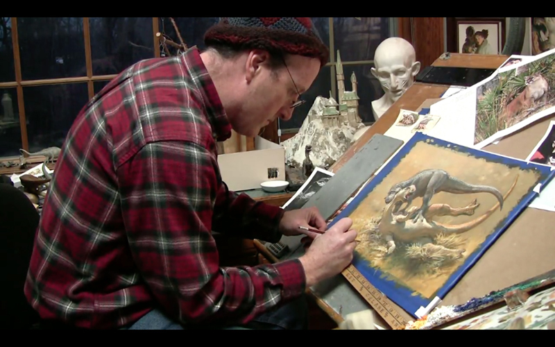


"My favorite parts of the film were when Gurney was painting the background in the first segment, for which he relied heavily upon his experience painting plein air landscapes, the demonstration of the color gamut model in action in the second half, his use of maquettes to determine composition and value arrangements, and the fact that I was able to watch the full movie on a cross-country flight with my six-year-old, and that he was engaged the entire time (again, this is part of Gurney’s skill – even though some of the topics were over the head of my young son, certain elements, like the quirky appearances of Mr. Kooks, were able to re-draw his attention when he was at risk of being overwhelmed with information).
"The running time of How I Paint Dinosaurs is 52 minutes, and is available as both a DVD for $32.00 USD, or as a digital download for $15.00 USD. Although best suited for beginner to intermediate painters, there is much in it to be appreciated by all levels, from young amateurs with an interest in dinosaurs to experienced Academic artists wishing to experiment with painting more imaginative subjects and making them look real. It should also be of particular interest to young persons interested in the field of illustration as the film gives a clear breakdown of completing an illustration commission.


"For more information on the video, or to place an order, please visit James Gurney’s website: www.jamesgurney.com. And while you are there, make sure to look at Gurney’s books, Color and Light and Imaginative Realism, two indispensable guides which cover in more depth everything discussed in the film, and so much more. All are highly recommended.

Matthew Innis's blog Underpaintings is a subscription resource for the field of representational painting, past and present. More info at the Underpaintings home page.

Monday, September 22, 2014

Lunch Prep in Casein

For the two hour Quick-Draw event in Dubois, Wyoming, I painted the action in the commercial kitchen where the food crew was prepping lunch. While I painted, I had a GoPro time lapse camera set up in the midst of the scene. (Direct link to video).

What attracted me was the cool light coming from the window and bouncing off the stainless steel surfaces of the stove, in contrast with the relatively warm light of the indoor fluorescents. 

I painted it in casein on an 8x10 acrylic-primed masonite panel. I used half-inch and 3/4 inch flat synthetic travel brushes, with just a few touches with the smaller rounds.

This is how the casein looks when it's handled with thicker impastos than I would normally use on a sketchbook page. On a panel you don't have to worry about the emulsion cracking.

Casein is the most like oil painting of all the water media. The difference is that with the fast drying time, detail can be added to detail without previous layers picking up, so the medium is perfect for a subject like a kitchen counter with loads of overlapping details, and it's ideal for a plein-air quick-draw, because it encourages faster and more direct handling than oil painting.
-----
Susan Kathleen Black Foundation Workshop

Sunday, September 21, 2014

Painting from Taxidermy

At the SKB Foundation Workshop in Dubois, Wyoming, most of the painting practice involves landscape painting outdoors, or wildlife painting from photographs indoors. 

I thought it would also be a helpful exercise for everyone to paint real, three dimensional animals from observation, but living models weren't available on short notice.

So we arranged to borrow a fine specimen of coyote, a pronghorn antelope, and a wolf from local taxidermy artist Lynn Stewart, who very generously brought them over to the art center.

This was my view of a running white wolf. I liked the pose, but I imagined it backlit against the bold fall colors of the quaking aspens, with sagebrush in the foreground, as I remembered the setting from a horseback ride in the morning.


Here's the two hour gouache demo I did  with that idea in mind.

It would have been even better to do a location study separately outdoors and combine it with the taxidermy study, properly lit -- or to take the taxidermy outside into a natural setting. The idea is to put away the camera and see if there's a way to do a wildlife study as much as possible from life and imagination.

On the other side of the room, John Seerey-Lester did this magnificent acrylic study of the same wolf. He chose to set it within a snowy winter backdrop. 

That's John and his wife Suzie (pink hat) in the right foreground of the photo below. They are featured in the current issue of International Artist magazine, not only for their wildlife art, but also for their landscapes and nostalgia scenes.

It was a marvelous experience for all of us to paint together with a combination of imagination and observation.
-----
Links:
John and Suzie Seerey-Lester's website
Stewart Taxidermy, Dubois, Wyoming
SKB Foundation Workshop