Monday, January 31, 2022

Gouache Painting in Sub-Freezing Weather


Here are two tips for painting in gouache in sub-freezing temperatures (10° F, -12° C):
1. Put a chemical hand warmer under the metal palette to keep squeezed paint alive.
2. Instead of water in the cup, use vodka (80 proof/40% ethyl alcohol) OR water + isopropyl alcohol (50/50). Either one will keep your washes from freezing.
--
Coming in a week or two: an extensive YouTube video and even more complete Gumroad tutorial on "5 Problems with Gouache...and How to Solve Them," with tips for storing the paint, managing layers, how to safely glaze, dealing with value shifts, when and how to varnish, how to paint a reactivation test, plus some of your questions and comments...and a close look at Hudson River ice yachts.

Sunday, January 30, 2022

Frank Millet's Genre Interiors

Francis Millet (1848-1912) was a member of a semi-secret club of artists called The Tile Club. His nickname was "The Bulgarian." 

Other members of the club included his friends Edwin Austin Abbey, nicknamed "Chestnut," J. Alden Weir "Cadmium", Augustus Saint Gaudens "The Saint," William Merritt Chase "Briareus," Stanford White "The Builder," and Elihu Vedder "The Bishop." 

Together they were a well-traveled, but domestic-loving bunch. 

The Expansionist (The Traveled Man) - Francis Davis Millet (1899) High Museum

Frank Millet painted this domestic genre scene of a married couple in their home. The husband works at his table, which is festooned with puppets from Southeast Asia. 

Curators at the High Museum describe it this way: "Following extensive travel in Asia, Francis Millet painted this ambitious work. A couple in historical dress occupy a room filled with exotic souvenirs—Indonesian puppets, Javanese dolls, Japanese books, and other curiosities—that Millet based on his own collection. He also modeled the setting after the parlor of a sixteenth-century house where he had lived in England. Despite these autobiographical elements, the figures are dressed in eighteenth-century costume, and the mood of the work, with its soft natural light and exquisite still lifes, recalls seventeenth-century Dutch genre painting."

Between Two Fires, by Francis Millet, 1892. Oil on canvas 36" x 29" Tate Gallery, London.
--
Frank Millet died in the sinking of the Titanic.

Read more on Wikipedia Francis Millet 

Saturday, January 29, 2022

Cass Gilbert, Architect and Painter

American architect Cass Gilbert (1854-1934) designed the Minnesota State Capitol and the Woolworth building. 


An early proponent of skyscrapers, he was president of the American Institute of Architects during the optimistic years of 1908-9.


He was also a devoted plein-air watercolorist, deriving inspiration from old-world cathedrals and castles.


Whenever he traveled he brought a set of watercolors with him, and allowed time to capture scenes that inspired him.


His architectural studies demonstrate careful observation and a subtle sense of color.

Cass Gilbert, Arch of Titus, 1933

Book: Cass Gilbert, Life and Work: Architect of the Public Domain
 

Friday, January 28, 2022

Shout Me a Question About Problems With Gouache

Want to have your spoken question in my next YouTube video? The topic will be: "5 Problems with Gouache (and How to Solve Them)."


What challenges have you had with gouache? Please follow this link to Speakpipe and leave a brief question or comment.

Thursday, January 27, 2022

Watercolor by Mariano Fortuny


Mariano Fortuny, Hombre semidesnudo, pencil and watercolor, 
around 1870-72. Height: 32.5cm; Width: 23.1 cm

After I last posted about Fortuny's watercolors a few years ago, blog reader Ramon left the following insightful comments:
"Some sources list Fortuny as a student of Gerome and/or Meissonier, but by the time Fortuny went to Paris, he was already a fairly mature painter. As far as I understand, and what I've seen from Spanish sources, his only formal training was with Claudi Lorenzale and Pau Mila i Fontanals at the Escola Provincial de Belles Arts in Barcelona (he and his grandfather had to walk there from their home in Reus, because they couldn't afford anything else).

"Fortuny was the most promising pupil, and a Rome prize was organized more or less so he could win it, which he did in 1857. Once in Rome, he frequented Gigi's academy, which was really just an open model session. Gigi's attracted an international group of students and each session had 2 hrs of clothed modeling and 2 of nude modeling. Students voted on whether they would like the pose for 3 or 4 evenings. Crucifixion poses were apparently popular and there was a large wooden cross there for the purpose.

"I don't recall about how many times Fortuny visited Paris, but I believe his major visit was around 1868 when he was working on La Vicaria. Gerome lent him a studio and Meissonier insisted on posing for one of the main figures (man with a saber). Fortuny was not a pupil, but he had studied Meissonier's work. His friend Zamacois had, however, studied with Meissonier.

"Meissonier apparently claimed that he would give his left hand (some say just the little finger) to paint watercolors as well as Fortuny. I remember reading that, when someone told him Fortuny was copying him, he said something like "if a genius like Mariano Fortuny were to copy me, it would be the greatest compliment of my professional career". Unfortunately, I haven't been able to track down the quote.

We also don't know exactly what he died of (some say malaria, some say stomach ulcer) and many American sources inexplicably refer to him Mariano Fortuny y Carbo, which is bizarre, since his mother's maiden name was Marsal, thus his name in Spanish sources is Mariano Fortuny y Marsal or Maria Fortuny i Marsal in Catalan."

Wednesday, January 26, 2022

Hasui Kawase at the Clark

Hasui Kawase designed many ukiyo-e prints in a style influenced by Western art. He portrayed landscapes and cityscapes, with an emphasis on pattern and mood.


He created over 600 prints during a four-decade career. The Japanese government called him a Living National Treasure for his contribution to the culture of Japan.
--
This print is included in the current exhibition at the Clark Art Institute in Massachusetts: "Competing Currents: 20th Century Japanese Prints" which is on show through this Sunday, January 30, 2022.

Monday, January 24, 2022

Twachtman Exploring Different Styles

John Henry Twachtman (1853-1902) is best known for his atmospheric impressionism, where forms dissolve into a haze of small brushstrokes. 

The White Bridge, ca. 1895, Minneapolis Institute of Arts

But he went through dramatically different styles before that. When he was studying at the Académie Julian in Paris, his paintings explored a tonalist approach. He uses soft grays and greens painted flat and a little out of focus.

John Twachtman, “Springtime,” 1884-1885, oil on canvas, 
36 7/8 x 50 in, Cincinnati Art Museum

Before that, he explored the world more objectively. 

Here is a 24-year-old John Henry Twachtman painting in a more realistic mode, with fine details and a full range of values. This grew out of a visit to Venice in 1878 in the company of Munich-trained Duveneck and Chase. Munich academic painters didn't hesitate to use extreme darks and blacks. 

One style isn't better than another, of course, but it's interesting to know that they were all produced by the same person. It's entirely natural for any of us to travel through completely different ways of seeing. 

--

John Henry Twachtman on Wikipedia

Sunday, January 23, 2022

Dan at 8 Weeks

At 8 weeks, our son Dan was starting to look like himself. 


We really noticed how he looked unique when we compared him to other babies his age. 


Jeanette and I took turns holding him and sketching him (portrait is by Jeanette).

Saturday, January 22, 2022

Menzel and His Models

Adolph Menzel, Study of Three Heads, 1898

"Menzel required great efforts from his models, often bringing them to the point of total exhaustion, but at the same time he was very grateful. 

Drawing by Adolph Menzel

"He once had a soldier sitting on a wooden model of a horse. 


"All of a sudden the man fainted and slid from the back of the horse to the ground, but before he ran after a glass of water, Menzel quickly noted with a few strokes the (fallen) position of the soldier."

From Memories of Adolph Menzel, translations of Menzel's student Carl Johann Arnold by Christian Schlierkamp.

Christian S. and I co-edited a book on Menzel's drawings, which you can get signed here.

Friday, January 21, 2022

Why Are Sheep Shorn in Frosty Weather?

Why are sheep shorn in the late fall, as the weather is getting frosty? Don't they need their warm coats?


(Link to YouTube) The farm manager explained that the fleece grows back in time for them to deal with the really cold winter weather, and lambs of shorn ewes actually survive at higher rates compared with unshorn ewes. The fall fleeces are the best quality, better than the spring fleeces, which mainly get used for felt.

The Icelandic sheep are super hardy anyway, and they love the cold weather. 

Thursday, January 20, 2022

Copying the Sheep Shearers

Jean-François Millet (1814-1875) wanted to paint a woman and a man shearing a sheep.

He started by sketching the scene in pencil on tone paper. The man who is holding the sheep is in the shadow of a tree, while the woman is in light.

He developed the idea into a color study. The woman wears a red skirt, a white apron, and a blue top. The man is still mostly in shadow, though now he's under a rustic awning instead of a tree. 

Millet adapted the idea to a larger composition. Now there are three spots of light: her cap, her right arm, and the sheep.


Van Gogh made a copy of Millet's painting, changing a lot of things. He unified the color of her outfit, lightened all the colors and focused more on the blue/yellow dynamic. The forms are outlined with dark, short, bent lines.


John Singer Sargent was interested in Millet's composition, and he made a sketch in pencil. Is it a copy of the Van Gogh or the Millet? To my eye, it seems closer to the Millet, but I'm not sure. 

Wednesday, January 19, 2022

Oscar Reutersvärd, Master of Illusion

Oscar Reutersvärd (1915-2002) has been called the "father of the impossible figure." 


He created many drawings that looked solid, but that couldn't actually be built in three dimensions.


One of his best known illusions is the impossible staircase, made even more famous by Roger Penrose and M.C. Escher.
--
Oscar Reutersvärd on Wikipedia

Tuesday, January 18, 2022

Watercolor of Another Artist by Polenov

Polenov's watercolor portrait of a another artist at work reminds us of a basic strategy in watercolor painting. In the dress, notice how he laid down the large dark shape first and then defined the smaller folds and wrinkles. Big shapes first, details second.

Vasily Polenov (1844–1927) Portrait of N. Yakunchikova

She's using a wooden box hinged open with an upward extension, and she has her painting surface (probably oil on panel) almost vertical. 

Monday, January 17, 2022

Spectrum Fantastic Art Quarterly

The new book called Spectrum Fantastic Art Quarterly takes a fresh look at what's already been published about Frank Frazetta. 

Instead of just adding to "The Legend" of Frazetta, publisher and author Arnie Fenner documents the behind-the-scenes story of how Frazetta and his wife Ellie created and maintained the legend. 


We hear from Frazetta's sisters Carol and Jean, his children Bill, Holly, and Heidi Frazetta, granddaughter Sara, plus collaborators Steve Gordon, Bill Stout, and me. 

I share a few reminiscences about working with Frazetta on the animated film Fire and Ice. The whole article is 18 pages long and includes plenty of unpublished art and photos.


In another feature, artist Kristine Poole interviews award-winning sculptor Forest Rogers.


There's a 10 page article where Cathy Fenner interviews Hugo-Award-winning artist Elizabeth Leggett. 

And the book includes;
• Q and A with Lauren Panepinto, Creative Director of Orbit Books
• 28 page feature on Dan dos Santos about his covers for the Mercy Thompson series of fantasy books.
• Gregory Manchess shares ten secrets to painting a successful book cover.
• And remembrances of fantasy masters who have passed this year: Richard Corben, Stephen Hickman, Ron Cobb, and Rowena Morrill

Spectrum Fantastic Art Quarterly is a full color, 92-page 12 x 12 inch softcover book-like magazine. It's edited by Cathy and Arnie Fenner. The print run is only 1000 copies, there's no online or electronic version.

Sunday, January 16, 2022

Self Portrait with Sleeping Baby


There's nothing like a sleeping one-month-old baby to make a new dad sit still for an hour or two. Yeah, that's me, minus 34 years.

Saturday, January 15, 2022

Sculpting a Bobble Head Dog

I made a little bobblehead sculpture of Smooth to give my son for his birthday. (Link to YouTube)


There are basically two types of bobble head designs: 

1) Head on a loose, bouncy spring, which works for upright human characters.
2) Head on a counterweight, which works best for animals.

With type 2, the trick is to make the head light enough to balance against the lead weight, so I used craft foam for the head. You also have to sculpt the hollow body with enough space for the counterweight to swing freely up and down and side to side. 

All the materials are linked in the description of the YouTube video. 

Friday, January 14, 2022

Koolasuchus Named Victoria's State Fossil

Car-sized monster amphibian Koolasuchus has been chosen by public vote as the state fossil emblem of Victoria, Australia.

It was one of the subjects of the "Australia's Age of Dinosaurs" stamp issue that I designed for Australia Post.

Museums Victoria: Victoria's 'kool' new State Fossil Emblem Koolasuchus cleelandi

Thursday, January 13, 2022

Anisotropic Material

Some surfaces reflect a different value depending on the angle they're seen by the viewer. This surface property is called anisotropic.


Such materials include brushed stainless steel (above), horse hair, velvet (below), wood grain, or a wet road. 


Bearded Man with a Velvet Cap, 1645, Govert Flinck Dutch, Met Museum, NY

Wednesday, January 12, 2022

Bongo, the Plesiadapis

Bongo is a good animal to have on your team. He's 3.5 feet long and likes to eat frogs and nuts. He's good at rock climbing, with a good hand with the lasso. In his backpack tool kit he's got a rope, a grappling hook and a hammer, and he knows how to use them.

In Dinotopia: First Flight, I was excited to include some of the mammals from the fossil record, such as Plesiadapis, since we tend to fixate so much on dinosaurs. I was inspired by Joseph Campbell's idea of hero partners with specific skills and talents who join you on a quest.

--  

Dinotopia: First Flight (signed)

Tuesday, January 11, 2022

Under a Freezing Waterfall

This Japanese woodblock print by Utagawa Kuniyoshi (1797-1861) shows a man sitting under a waterfall. 

Here's an explanation: "The priest Mongaku Shonin doing thirty-seven days penance under the freezing Nachi waterfall near Kyoto. He is helped by Fudo Myo-o’s two attendants Seitaka and Kongara seen here top right. This act of self-mortification is because he accidentally killed his beloved cousin Kesa." Source of quote 

The water effects are stylized into four zones: 
1. Vertical curtains of falling water.
2. Radiating spray from his head.
3. Splatters of foam in front of him.
4. Blue billows of water.

The stylization yields a powerful graphic impact. Even if your goal is a realistic approach, it's good to analyze your subject for thematic groups of visual elements.


Book: SAMURAI-YOKAI WARS: Monsters, Ghosts & Demons By Kuniyoshi (Samurai Ghost Wars)

Monday, January 10, 2022

How to Edit an Art Video

The upcoming issue of International Artist Magazine has my top tips for making art videos.

For example, here's what I suggest in the section on Editing:

Don’t waste the viewer’s time.
✅ Do cut anything that doesn’t advance the story.

Don’t hide your reference.
✅ Do show a short video clip of the scene you’re looking at or the photo you’re working from. To save cutting, put the subject and painting side by side in split-screen mode.

Don’t use gimmicky transitions.
✅ Do use straight cuts, dissolves (to suggest time passing between similar shots), and fade-to-black (for an interruption or shift in story).

Don’t leave out key steps, but at the other extreme, don’t be tedious.
✅ Do capture the key moments when you make noticeable changes. Show the steps along the way, without any large leaps. If there’s a part of the process that’s repetitive or boring, just include a representative segment of it, and then dissolve between clips of it at various stages, or speed up the playback.

Don’t just show off and make it look easy.
✅ Do share your mistakes. Show how to fix them. It goes against the presenter’s instincts to switch on the camera when things screw up, but it makes for better instruction and better storytelling. As YouTube community member Travis Noble said: “Watching an expert make mistakes is the best part of an art tutorial, because you learn truly what makes the difference between an expert and beginner is not in the mistakes but how they recover from them.”

I learned a lot from the 200+ user comments from on my YouTube Community page. Thanks to all who contributed.

The article is in issue #143 (Feb/March 2022) of International Artist Magazine.


Sunday, January 9, 2022

Louise Wright Paints a Fashion Illo

It's rare to see step-by-step sequences for illustrations done over a century ago. 

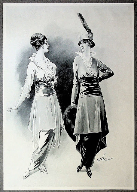
British illustrator Louise Wright (born 1863) creates a fashion plate with two female figures, and the process was captured by Percy Bradshaw in a book called The Art of the Illustrator


Stage 1: "The figures are lightly touched in with pencil on Roberson’s Fashion Board, B surface (extra smooth), the board measuring 14 inches wide by 21 inches high. The design of the costumes is original, and was suggested by certain characteristic details which were in fashion at the time when Miss Wright commenced the drawing."

Stage 2: "Brush work is commenced, Lamp Black and Sables of various sizes from No. 0 to No. 5 being used. Faint washes of tone are introduced into the face seen in profile, for instance around the eyes, nose and chin, while in the other face light washes can be seen across the forehead, down the nose, mouth and shadow side of the face, beneath the chin, and on the neck of the front view."

Stage 3: "The modeling of the faces is carried considerably further, by stippling up the light tones previously introduced. Dead white is still left over the major portion of the heads, but the strengthening of tone which would be noted in the reproduction is accomplished by a delicate cross-hatching with the point of the brush used comparatively dry. This cross-hatching needs very dexterous manipulation, and wherever it is possible to obtain the effect by fresh washes it is preferable."


Stage 4: "
The artist has been chiefly concerned here with the strengthening of tone all over the outdoor costume, while the Evening dress is taken a stage further by the introduction of some fresh, simple washes. It was noticed, in working upon the outdoor costume, that the drawing of the left hip created a somewhat ugly line, and the outline has consequently been reduced or flattened here by the introduction of a little Chinese White. A flat light wash has been taken all over the cloth portion of the dress, the folds at the left arm and the outline of the bust have been more definitely shaded, and the sash in the centre very considerably increased in color."

Stage 5: "The drapery of the sleeve has also been emphasized by outlining each of the shadows with this opaque white, a wash has been carried over the edge of the sleeve to form a frill, and further broad touches of white added to give transparency to the material. A bunch of flowers has been broadly indicated, chiefly with a wash of tone, the petals of the white rose being indicated with the opaque white, the dark flower with a wash of half tone, the shadows being filled in with black. The high lights on the waist-band have also been emphasized with the Blanc d’Argent and the outline of the band defined in the same way."

Stage 6: "The hair has been slightly strengthened in color, the outline of the face altered by introducing a slightly fuller chin, and rather more prominence and fullness in the lips, which formerly suggested a rather simpering mouth. These alterations have been made with Chinese White. The eye and eyebrow have been introduced more heavily, the lips strengthened in color, the line at the back of the neck more definitely drawn."

On Archive.org: Percy Bradshaw "The Art of the Illustrator"

Saturday, January 8, 2022

Color in French Art Prints

The Clark Art Institute in northwestern Massachusetts is presenting an exhibit of French printmaking called Hue and Cry: French Printmaking and the Debate Over Colors. It examines how color found its way into the world of black and white prints. 


Philibert Louis Debucourt, The Climb, or Morning Farewell, 1787, 
Color engraving on paper. The Clark Art Institute, 1955.1897.

The earliest prints were all black and white, using methods such as woodcut, wood engraving, and etching. When the technology made it possible to print in full color, tastemakers in France dismissed them, arguing that they were cheap and low-class. 

The exhibit includes fine examples of these early intaglio color prints, such as the one above.

When color lithography was developed, artists embraced it as a fast and efficient method that was perfect for large public posters. The show includes many prints by Jules Chéret, the master of the show poster.

Jules Chéret, Lady with a Mask [Comedy], c. 1891, Lithograph in sanguine on paper. The Clark Art Institute, 1955.2391.

I was also impressed by the informal sanguine prints by Jules Chéret, where he explores different arrangements of carefree figures. 

Henri de Toulouse-Lautrec, An Englishman at the Moulin Rouge

The exhibition also includes prints by Pierre Bonnard, Mary Cassatt, Paul Cézanne, Maurice Denis, Camille Pissarro, Edouard Vuillard, and Henri de Toulouse-Lautrec.  

I was hoping the show would include printed works by Alphonse Mucha. He was Czech, technically, but he was the major star in the Paris print scene, and his graphic works were extremely influential. Théophile-Alexandre Steinlen and Eugène Grasset were also notably missing from the show, perhaps because the Clark doesn't have good examples of the color prints in their collection. 

A secondary exhibit called "Competing Currents" about Japanese prints of the 20th century makes a perfect enhancement to the show. I'll share more about that on a future post. 

Hue and Cry: French Printmaking and the Debate Over Colors closes March 6. Admission is free for the month of January.