Wednesday, January 31, 2018

How Darwin Verified Color

In the 19th century, artists and naturalists were obsessed with color charts that they could use to record observations they made in the field.

Darwin used an 1814 volume called Werner's Nomenclature of Colours by Scottish artist Patrick Syme. The book has just been reprinted by Smithsonian and is currently a bestseller in the natural history category.


"Darwin said that he always named the colors he saw 'with the book in hand,' and, indeed, Syme’s terms are scattered throughout the diaries and notebooks that he filled while aboard the Beagle. Darwin describes cuttlefish as tinted with 'hyacinth red and chestnut brown,' a sea slug as 'primrose yellow,' and a type of soft coral as 'light auricular purple.' Specimens could degrade, paintings could fade, and color photography was still a far-off dream, but with Syme’s help Darwin could encode the colors of an unfamiliar world—and carry them safely home."New Yorker
Syme's book, with its evocative color names, might well be a stimulus today to artists who want to explore color and think about it in new ways.

In recent times, artists and naturalists tend to be better acquainted with the Pantone Guide and the Munsell system, which attempt to be more numerical and comprehensive in their mapping of color. The Pantone system is particularly useful because you can tear off little swatches and hold them right up to whatever design you're creating.

If it's the relationships between multiple colors that you're interested in, check out the classic Japanese volume called A Dictionary Of Color Combinations, which has also been reprinted.
------
Book: Werner's Nomenclature of Colours: Adapted to Zoology, Botany, Chemistry, Mineralogy, Anatomy, and the Arts
Previous posts: 


Tuesday, January 30, 2018

Seago's Restraint with Chroma

Edward Seago's oils and watercolors use greyed-down warm and cool colors to convey light and atmosphere.


This watercolor uses warm and cool hues on either side of neutral gray. The colors are very low in chroma.


This painting has a golden glow with more chroma, but note that he leaves out a lot of high-chroma blues or reds. The values of the ships in the distance are kept in the mid range.


You'd probably have to see the original to get the full impression of a painting like this. Seago achieves a lot by suggestion, with dots and dragging strokes.


Everything is grayed down except for that sky effect, and even that is not full chroma. In this oil, the sky would probably be dry before he dry -rushed the branches of the tree. 
----

Monday, January 29, 2018

Kawanabe Kyōsai's Monsters

Kawanabe Kyōsai (1831-1889) was a Japanese artist who created exuberant monsters. 

Japan was closed to the outside world for a couple of hundred years during the Edo period. Kyōsai was born the son of a samurai in a feudal society. 


Japanese government and society underwent radical change between the Edo and the Meiji periods, including an opening to the West. Kyōsai responded with wild living and biting satire. 

According to a Western observer, he would fuel up on 1.8 liters of the strongest sake before he started painting.


Kyōsai criticized not only European culture, but also of Japan's submission to it.
"He is recorded as having assaulted fellow artists and in 1870 was imprisoned for his scurrilous depictions of western visitors. While his contemporaries of the Meiji period chose to depict the elegant society of Ukiyo-e, the 'floating world', Kyosai plumbed the depths of his own drink-addled mind to create a fantastic menagerie of animals, ghosts and demons which rivals the most excessive grotesqueries of Disney's Fantasia or Marvel comics."—The Independent

If you don't mind outrageous visual humor, check out this NSFW link to his epic "Fart Battle" and blogger Dr. Yokai's interpretation of it.
----
Wikipedia Kawanabe Kyōsai
Online:
• A Crazy Sake-Fuelled Trip to Kawanabe Kyōsai's School for Spooks
• Crazy like a badger: The Japanese demon painter, Kawanabe Kyosai, overindulged in sake for art's sake. Iain Gale inspects the damage

Sunday, January 28, 2018

Do skills at face recognition help you draw a better likeness?

Vision scientists from the University of Wellington wondered about the relationship between face-recognition skills and the ability to draw a convincing likeness.

Another related question: If you're not so great at recognizing faces, can you ever be any good as a portrait artist, even if you practice a lot?

A diverse group of participants were asked to draw a likeness based on a photo. The participants were also evaluated separately with various standard face recognition tasks.


The participants included those with some expertise (black frames) and novices at drawing (gray frames).

The drawings were ranked according to a numerical score that was given by judges who didn't know anything about the people who did the drawings. The drawings with the highest likeness scores are shown at the top of the chart. Not surprisingly, artists with practice at drawing got more recognizable results.

But the scientists wondered: what about the subjects who were novices at drawing? Presumably they would not have derived any advantage from training. Would those novices with better native face recognition abilities be more successful at drawing a likeness?

The answer is yes: there is a strong correlation: The ability to successfully recognize faces predicts how well a non-expert can capture a likeness in a drawn portrait.

Art by Chuck Close
What kind of training or method can help to overcome these deficits? I believe there are some art approaches: Notably the small shape-mapping technique used by Chuck Close, who has admitted to being face blind. I presume also that the skills taught in Bargue-based ateliers can help a person with poor face recognition abilities to produce effective likenesses.

Daumier
But what about caricature, which can't benefit from such methodical systems? To be an incisive caricaturist, or to paint "realistic" portraits with subtle exaggerations, do you need to have expert native skills or can training overcome deficits? I'd love to know the answer to that question.
----
Scientific paper: "Face processing skills predict faithfulness of portraits drawn by novices."
Side note: National Gallery has cancelled a planned exhibition of Chuck Close due to concerns over allegations of sexual harassment
Video: Oliver Sachs talks about face blindness

Saturday, January 27, 2018

Adjustable Triangle

(Link to video on Facebook) The client wanted a warm, handmade look for their logo, so I painted it in gouache.


The tool I use at the beginning is an adjustable triangle / protractor which lets you rule a consistent slope of a known angle. It also has an "inking edge," which is beveled so that the ink or paint won't crawl under it.


Friday, January 26, 2018

Louis Wain's Cats

Louis Wain (English 1860-1939) was an artist who loved to paint cats, and he painted them in a variety of styles. When viewed in the sequence below, his cat pictures seem to reveal a person losing his grip on reality.


Do Louis Wain's cat pictures reflect a brain suffering from mental illness? People have speculated for years:
"Wain's schizophrenia may have been precipitated by Toxoplasma gondii, a parasite which is excreted by cats in their feces." —Nietzsche Girard Mimetism 
"Wain may have been suffering from Asperger’s Syndrome, an autism spectrum disorder" —Scientific American
In fact, most of Wain's images are not dated, and he produced conventional cat pictures alongside highly patterned ones throughout his career. The sequence of images from cute to bizarre was arranged by psychologists to support their theories.
"The belief that his abstract drawings demonstrate the progressive deterioration of his mental state is quite likely a falsehood – the result of a claim made in a book called Psychotic Art that was published in the 1960s. All art should be considered as an expression of the artist and Wain’s progression into psychedelia is just one aspect of his creative identity." —Illustration Chronicles
It is known that Wain's life encompassed much unhappiness and anxiety, but without more concrete diagnostic information, we'll probably never really know exactly why he painted cats the way he did. Psychologists and art historians who infer mental states purely from artwork may be dancing on thin ice.

Thursday, January 25, 2018

Spectrum Deadline Today


Detail of Spectrum poster by Scott Gustafson
Today is the deadline for entering the annual Spectrum competition. Spectrum is one of the few juried showcases that I enter each year, and here are some of the reasons I why think it stands out from the rest:
  1. The people who run Spectrum don't try too hard to define the category beyond calling it "contemporary fantastic art." Broadly speaking, it encompasses fantasy, science fiction, concept art, 3D, comics, paleoart, and experimental unpublished work. The people who run the organization don't have an axe to grind in terms of the art they like or don't like. They allow Spectrum to be defined purely by what artists choose to enter and what the jury chooses to honor.
  2. The jury is different each year, so the selection isn't tied to one person's taste. They meet in Kansas City Santa Cruz for the jury process, but their choices for accepted entries are uninfluenced by other jurors. The jury is comprised of leading artists, art directors, and teachers. This year it's a dream-team gathering of industry legends: Terry DodsonTyler JacobsonTran NguyenKarla Ortiz, and Charles S. Pyle
  3. The accepted entries are all published in a big hardbound book which gets wide distribution in bookstores and online. So art buyers and fellow artists will see your work. 
  4. That book is provided free to every person who has an accepted entry, no matter where they live around the world (Edit: The Spectrum book is shipped for free to artists living in the USA, and there's a $35 fee for shipping overseas). This is a very expensive proposition, and it's a contrast to other competitions that are set up to get artists to purchase vanity books.
  5. The entry fees have been kept very low, and they haven't gone up: just $20 for a single entry and $40 for a series of five or fewer.
  6. The digital entry form is easy to use. If you really want to, you can still send in print entries if they're postmarked today, but this is the last year they'll accept print entries. Here's a link to frequently asked questions.
  7. It's hard to get in, with one of the smallest acceptance/entry ratios. Even though that can be disappointing, it's a good thing, because it means you'll be in good company if your piece gets picked.
-------
Here's the current edition, Spectrum 24: The Best In Contemporary Fantastic Art 304 pages, 300 artists, 9 x 12 inches. 

Wednesday, January 24, 2018

Editing an Art Video

What's the strategy behind editing an art video? Here are some practical tips that I keep in mind:

Time lapse vs. real time 
Time lapse can compress a slow, repetitive series of steps into a short segment of time. A typical time lapse interval is one frame per second, which compresses an hour into a minute two minutes. You can create a time lapse with a GoPro or a mirrorless camera, both of which have built in shutter release timers. Time lapse can aid the viewer's understanding of the overall painting process or show the broad-scale strategy of a time-consuming step. You can also speed up footage that was shot in real time, but that puts demands on your external hard drive.

But time lapse can have an unreal, detached quality that can be frustrating for viewers who want to understand how long each step really takes.

My most-watched YouTube video is called "Street Painting in Indiana"
It's about 10 minutes long, and it has a variety
of coverage and a little bit of drama.
The advantage of shooting in real time is that you can show what happens with each brushstroke. Painting can take many hours of repetitive action, and it usually needs to be edited down to make it watchable.

A good solution is to select representative excerpts of each stage and cut or dissolve between them. As long as you don't jump-cut across a big change, the viewer will hardly notice that they're missing anything.

How can you get the best of both worlds? One solution is to show an analog pocket watch in the frame of your time lapse so you can actually watch the minute hand go around. Another thing you can do is to alternate time lapse with real-time footage, using time lapse when you want to show the long-term result of an extended repetitive action, and real time when you want to bring the viewer into the moment. When you change the speed, tell the viewer why you're doing it in the voiceover.

Since time lapse comes without audio, I would recommend using voiceover to explain what’s going on. You can include real-time recorded audio of painting sounds under the time lapse footage, even if that sound doesn't correspond exactly to the action. Either way, you want the audio to connect the viewer with the real-time experience of painting.

Screenshots from my video “Snyder Swamp.” Even though the video
is only 1.5 minutes, I made sure to get the following shots
(reading across from upper left): 1. Establishing shot; 2. Easel setup;
3. View of scene; 4. Detail of palette; 5. Detail of painting; 6. Detail of foliage
Music
People often use low-level music throughout the whole production to cover bad or missing field audio. Not everyone agrees on musical taste. Personally, I can't tune out low-level music in a video, especially if it endlessly repeats. I tend to fixate on it, which distracts me. The actual sounds of the painting environment are usually more immersive and compelling.

However, there are times when a piece of music is really central to the concept of the piece. Music usually works best if you restrict it to the first and last minute of the video, or when you use it for transitions. In the first minute it sets the emotional tone, and in the last minute it signals the impending close. You can also use music to flavor an interlude of short montage cuts, which can show important details or set a certain mood. Make sure you capture a long take of field audio or voiceover for the body of the video, because you don't want to jump-cut the resident audio from clip to clip.

Music must be cleared for copyright before using it in a video. You may be able to use copyrighted music if you ask permission or give credit. Copyright-free music is available for free from Kevin MacLeod in exchange for credit and links. Another source is Freeplay Music, which lets you use music for free as long as you don't generate income from your video (thanks, NextMoran). Freesound is a website with a lot of user-uploaded sound effects that have a variety of usage licenses. The iMovie software has a range of free music, and you can also get free music and sound effects from YouTube’s Creator Academy.

How long should an art video be?
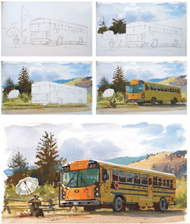
School Bus, 2014, gouache on watercolor paper,
A video for a painting like this needs to
compress the action of two or three hours
into about 10 minutes, and to demonstrate
the important choices made at each step.
Answer: As long as it needs to be—but not one minute longer. How many of us own a multi-hour video tutorial sitting on the shelf unwatched, or one that we have watched just once?

Why should a painting tutorial need to take two, three or four hours? Who wants to watch someone paint every blade of grass? That would be like watching a cooking video showing onions slowly caramelizing in the pan. These long art videos result from the assumption that the video is equivalent to a real-time workshop. It’s not the same thing! In an actual workshop, you're freely in control of your attention, but in a video, your attention is locked down and passive.

To have genuine instructional value, a video should show each step clearly, but it should skip over or compress repetitive actions. Unless you really need to demonstrate a complex series of different steps (such as researching, building maquettes, thumbnailing, posing models, grinding pigments, stretching canvases, etc), the story of a single painting probably doesn’t need to take more than 45 minutes.

I know that I have probably made a few videos that seemed too short, but that's usually because I just just didn't capture any more coverage.

Suggested running times for art videos
  • 1 hour: a case study of a multifaceted project like a mural or a researched illustration, with many separate actions in addition to the painting sequence itself, where each step receives thorough but concise coverage. 
  • 15 - 30 minutes: a single painting presented as a case study, with each step of the painting demonstrated in detail from start to finish.
  • 5 - 15 minutes: a location-based painting or studio life study that is relatively straightforward 
  • 3 minutes: a painting sequence boiled down to its essentials, and focusing on just two or three principles, ideal for YouTube. 
  • 2 minutes: a promo piece, highlight reel or trailer.
  • 1 minute: a video that makes a single point, ideal for Instagram, ebooks, apps, or online presentation.
(Link to video) Here's an outtake from the next video feature, which I'm editing now.

Editing
There are a variety of professional and entry-level editing programs, including Adobe Premiere Pro, Final Cut Pro , Sony Movie Studio and iMovie (which comes with your Mac). All of them let you juggle the order of clips around, change their lengths, color-correct, zoom in, crop, and add multiple tracks of audio.

I would suggest restricting the use of transitions to simple cuts. Use dissolves for transitions that bridge a gap of time. Start with your strongest visual, or express immediately what you want to accomplish, and if you want to title the video, put that a few seconds in, but not at the very beginning. Use subtitles to identify anyone who is talking on camera, to explain where you are, or to name pigments you're using.

Painting iceboats on the Hudson, March 2014. The simplest setup
is a down-facing camcorder on a tripod while you hold the
sketchbook in your lap. By extending the legs of the tripod unevenly,
the camera can lean out over your work.
Distribution
There are many ways an instructional video can serve your goals. As a promotional tool, a video brings your methods to life, connects your paintings with your personality, and reveals the circumstances of your painting’s creation. It can give your students a lasting record of your teaching methods, and can connect you with your collectors by sharing behind-the-scenes insights about your inspiration.

You can share promotional videos on YouTube, or sell downloads via digital content distribution services like Sellfy or Gumroad, which take only a tiny percentage of the sale. Kunaki is a disc producer that will produce shrink-wrapped DVDs on demand with Amazon-ready bar codes.

Media devices like smartphones and tablets offer opportunities for presenting your art together with text, audio and video in formats. We've developed an app called the Living Sketchbook that lets you page through a complete sketchbook with high res scalable files and experience audio and video taken at the time of the painting.

There’s no reason that videos about the making of art shouldn’t be artistic as well as educational. As the great director Jean Cocteau once said, “Film will only become an art when its materials are as inexpensive as pencil and paper.”
----------
Read more in these previous posts:

I have 11 painting tutorials so far
"Living Sketchbook" app for Android
"Living Sketchbook" app for Apple iPhones and iPads
My DVDs from the manufacturer Kunaki

Great gear for making videos
The GoPro is compact, so you can see past it when you're painting
Canon M6 mirrorless camera is excellent for time lapse, video, and stills.
Shutter release timers (or intervalometer)
An external hard drive helps because video files are so big

Tuesday, January 23, 2018

Sleeping Footman

A footman—or uniformed servant—must keep up appearances in a wealthy household.
A Footman Sleeping by Charles Bargue (French, Paris 1825/26–1883 Paris)
1871, Oil on wood, 13 3/4 x 10 1/4 in. (34.9 x 26 cm), Metropolitan Museum (not on view)
This fellow evidently opens the front doors and escorts important guests out to the coach, unfolding the big umbrella when it's raining. But he also has long periods of down time, so he reads his well-thumbed books and occasionally succumbs to an undignified catnap, not even noticing the fallen glove.

The artist is Charles Bargue, the author of the Drawing Course used in many contemporary ateliers.
The painting is reminiscent of the tiny but exquisitely observed paintings by Ernest Meissonier.
-----
Books
Charles Bargue Drawing Course
Meissonier is well represented in this French exhibition catalog.

Monday, January 22, 2018

Analysis of a Watson Lino Print

Ernest Watson created this linoleum block print called "Mousehole in Cornwall."


As you look at the image, can you guess how many plates he used, and in what order they were printed?

Answers below (scroll down):

There are four plates. Fortunately, Mr. Watson isolated them for us.

1. He starts with a pale yellow shape under the entire silhouette of the buildings. The yellow was probably not quite as dark as it appears below.

2. A graded blue-green plate goes under the large areas of the sky and water. A few of the birds are cut out to the white of the paper, and he has also cut out some sparkles in the water.

3. A plate for the shadows of the buildings. These shadows overlay the initial pale yellow run. This plate is inked unevenly to give it texture and to make some of the birds darker.


4. Finally, a dark blue-green key plate provides the windows, ropes, wavelets, and details of the figure.

Watson was able to multiply the effect of each of plates 2 and 3 by inking them with more than a single color. He said: "It is quite possible to 'paint' rather freely with the rollers in this manner, producing an infinite variety of gradations of hues."

Quiet Anchorage, lino cut by Ernest Watson.
This sequential thinking is similar to the way watercolor and gouache painters typically plan a picture, painting large color areas first, and adding the details later.
-----
Resources
Online article by Ernest Watson: "Color Printing from Relief Blocks"
Books by Ernest Watson: 
Image: courtesy ErnestWatson.com, which has more samples of his prints. Thanks, Thomas Watson for building the website.
Previous Posts:
The El Dorado Page (pencil drawings by Watson)
American Artist (1937-2012) (Watson was co-founder of the magazine)