Monday, June 30, 2008
The Two Rules of Foliage
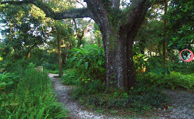
1. When seen against the skyline, leaves are always darker than the background.
2. When seen below the skyline, leaves in a natural setting are always lighter than their surroundings.
The "skyline" is the line of the top of the trees against the sky. Here's an example of Rule 1, which is not surprising.
The second law may come as a surprise, because we always tend to think of leaves as dark silhouettes, and we tend to paint them that way. But in a natural setting, whenever you see any leaf against any background below the sky, chances are that nearly every single leaf is lighter than what is behind it.
The exceptions to Rule #1 are so rare that they are momentary and breathtaking. Here’s a shot of a Rule 1 exception, taken from a fast-moving car when the late afternoon light penetrated beneath a deck of stormclouds. The effect only lasted five minutes. It can be very exciting to break this rule, but all the conditions should be carefully observed.
The exceptions to Rule #2 (pink circle at right) happen a little more often, but usually only when leaves are seen against human interventions, like lawns, walls, or cleared areas. If you walk around in a forest or a meadow, the leaves are almost always lighter than what’s around them.
I assume that Rule #2 happens because of the light-seeking nature of leaves. They are little machines that are superb at angling for the best position to capture the most light.
Labels:
Plein Air Painting,
Rabbit Trails
Sunday, June 29, 2008
High Dynamic Range (HDR) Imaging
This photo of the interior of John Burroughs’s writing studio illustrates a fundamental limitation of photography.
The view out the window is so bright that it has burned out (or “clipped”) to white, and the shadows in the corner are an impenetrable black. In both instances, the optical sensors are unable to record any meaningful color data. But in real life, our human eyes could see plenty of color and detail in both areas of the view.
The problem is that the camera, whether film or digital, can only record within roughly a 300/1 ratio of light intensities, while the human eye can easily respond to a range of 50,000/1 within a single scene.
The range of intensities is called the dynamic range. The camera is not the only thing with a limited dynamic range. The same 300/1 ratio also applies to digital printers, computer screens, or artist’s pigments.
It’s analogous to the problem you’d have playing Beethoven’s Ninth over a cellphone.
Photographers have found a way around the problem. By taking several different exposures of the same scene (one shot exposed for the bright sky and another for the dark shadows), the photos can be combined, or “tone-mapped” into a single image where every part of the scene is visible in rich, glowing color.
Here is a photo of a room interior with a normal exposure.
With tone mapping in HDR photography, color is saturated and detail is present throughout the image.
The effect of HDR can look a bit garish at first, partly because we’re not used to it, but also because it can take away the excitement of strong contrast. But in artistic hands, it can also be otherworldly and attractive, reproducing the feeling of what an artist might see, with color and detail infusing the entire scene, both in the shadows and in the blue sky.
The real frontier for HDR photography will be the new brighter computer screens, like the new BrightSide technology, which will be able to output HDR image files in their true range of brilliancy, giving the viewer the feeling of standing in a real street in the bright sunlight.
What does all this mean to painters? Although our eyes can see greater dynamic range than the camera can see, we’re still forced to translate our observation through the measly 300/1 funnel of pigments on canvas.
When you're painting subjects in soft, overcast light, it's easy to convert reality into paint. But when you have subjects with extreme tonal contrasts, like views out windows, or illuminated signs at night, a successful painting requires a keen awareness of the distribution of tones.
--------
Flickr HDR groups, link and link.
Wikipedia on HDR imaging, link.
Saturday, June 28, 2008
Action Figures
What? An Arthur Denison action figure? And isn’t that Nallab the librarian all beefed up and ready for adventure?
Back in 1995 when Dinotopia was in development for a theatrical motion picture, the Hasbro toy company embarked on an ambitious proposal for a Dinotopia toy line. What you are looking at are one-of-a-kind presentation prototypes, not production toys.
Focus group tests at Hasbro showed that boys and girls liked Dinotopia equally and that kids spontaneously played with dinosaur toys by having people feeding the dinosaurs and riding them, not just the “attack mode” that has become so commonplace. Hasbro took the unprecedented step of teaming up their boy and girl toy designers to generate ideas in what is normally a very gender-segregated and conceptually stereotyped category of merchandise.
For my own part, starting as early as 1991, I did a number of sketches to explore how my characters might look if they were translated visually in other forms.
Above are some character key drawings in gouache with an acetate overlay to see how they would look in line and flat color.
The theatrical motion picture never came to pass, and neither did the toys, which is a common fate of concept proposals. In 1999, we decided to permit a TV miniseries to move forward instead, and we strictly limited the merchandising—but that’s another story.
On future posts, if you’re interested, I’ll share a few of the exploratory prototypes as well as some of my own unpublished development sketches.
---------
I’d like to express my thanks and appreciation to the talented team at Hasbro, as well as Michael Stone of The Beanstalk Group, plus Jim Black, Ken Ralston and Lynda Guber, together with Robert Gould of Imaginosis, who helped develop the film project.
Labels:
Dinosaurs,
Journey to Chandara,
Preliminary Sketches
Friday, June 27, 2008
Vasnetsov’s Flight of Fantasy
We tend to associate 19th century Russian painting with earthy and uncompromising realism, so it’s a rare treat to see what one of the Russian painters came up with in the realm of fantasy.
This image by Victor Vasnetsov (1848-1926) is called “Flying Carpet” from 1880. It was commissioned for a railway station, and contains some of the era’s sense of optimism and adventure.
The colors are muted, both in the cloudy sky and the winter landscape below. A scrap of cloud, a slice of river, and a trio of owls hover at the edges of the composition.
The hero stands astride the carpet, his jacket flapping. What is his mission? And what is that enigmatic object in front of him? A lamp? The Ark of the Covenant? A steampunk jukebox?
This painting was criticized by Russian writers for undermining the new spirit of realism. The influential writer Chernyshevsky argued that “aesthetic beauty can only exist as an exact reflection of physical reality and not a manifestation of the imagination. Only in representations of physical reality…can the artist reveal true beauty.”
Eventually thinkers like Nikolai Chernyshevsky and Vladimir Stasov won over Repin, Vasnetsov’s good friend, who had painted a few fantastic scenes, like "Sadko in the Underwater Kingdom" (for which Vasnetsov was the model). Repin gradually moved away from imaginative subjects, but Vasnetsov, despite the critics, followed his vision of painting scenes from folklore and mythology.
-----------
Wikipedia entry on Vasnetsov, link.
Link to GJ post showing Sadko in the Underwater Kingdom by Repin.
Thanks, Barry.
Labels:
Academic Painters
Thursday, June 26, 2008
Dinotopia Arrives in Switzerland
Yesterday a truck arrived outside a museum called Maison d’Ailleurs in Yverdon, Switzerland and unloaded several wooden crates containing over 50 original Dinotopia paintings.
The exhibition, called “Return to Dinotopia,” will open October 4 and will run for five months, then continue to other museums in Europe. It will include new paintings and maquettes from Dinotopia: Journey to Chandara.
Maison d’Ailleurs (literally "House of Elsewhere") is a jewel of a museum specializing in "science fiction, utopia and extraordinary journeys," with a recently expanded Jules Verne collection. I did this plein-air watercolor sketch of the museum (the white building) when it hosted the last Dinotopia exhibit five years ago.
I’ll be in attendance for the opening of “Return to Dinotopia” in October, which will coincide with the publication of the French edition of Chandara from Editions Fleurus of Paris. After a visit to Switzerland, I’m planning to visit Paris for a few signing events. I am as excited as a schoolboy because I’ve never been to France before!
-------
Maison d'Ailleurs, link.
"Return to Dinotopia" and "Fantastical Art" exhibitions, link.
Editions Fleurus, link.
Mr. Patrick Gyger of Maison d'Ailleurs is arranging the European tour after Switzerland. To contact him: maison@ailleurs.ch
Labels:
Journey to Chandara,
Museum Visits
Wednesday, June 25, 2008
Art By Committee: Mutated Rodents
On Wednesdays we play a group sketch game called "Art By Committee." This all began with a sketchbook that I bring to coffee shops whenever I have lunch with fellow artists. The challenge is to illustrate an actual excerpt taken out of context from a science fiction novel.
This week’s quote about mutated rodents brought out some brilliant solutions. Thanks to everyone for lending your time and talent.
If you think you might like to give it a try next week, check at the end of the post for the submission guidelines and the next challenge.
Here’s next week’s quote: “I was thankful I had brought goggles when the quick deadly dust storms came boiling up.”
Please scale your JPG to around 700 pixels across (I'm trying to keep the files small so I don't top out my Blogger account). Title it with your name, send it to: jgurneyart(at)yahoo.com, subject line ABC, and let me know in your email if you want me to link to your blog or website. Please have your entries in by next Tuesday at 10:00 AM Eastern Time USA.
This week’s quote about mutated rodents brought out some brilliant solutions. Thanks to everyone for lending your time and talent.
If you think you might like to give it a try next week, check at the end of the post for the submission guidelines and the next challenge.
Joe Sutphin
Tidah Adipat
Roberta Baird Anthony VanArsdale
Andy Wales Art Keegan
Paul Bozzo
Tony Upton
John Randall York
Jen Zeller
Gregory Bockis Andrew Walker
Tidah Adipat
Roberta Baird Anthony VanArsdale
Andy Wales Art Keegan
Paul Bozzo
Tony Upton
John Randall York
Jen Zeller
Gregory Bockis Andrew Walker
Here’s next week’s quote: “I was thankful I had brought goggles when the quick deadly dust storms came boiling up.”
Please scale your JPG to around 700 pixels across (I'm trying to keep the files small so I don't top out my Blogger account). Title it with your name, send it to: jgurneyart(at)yahoo.com, subject line ABC, and let me know in your email if you want me to link to your blog or website. Please have your entries in by next Tuesday at 10:00 AM Eastern Time USA.
Labels:
Art By Committee,
Comics/Cartooning
Tuesday, June 24, 2008
Pareidolia and Apophenia
Whenever you see a face in a cloud or the man in the moon you’re experiencing a phenomenon called “pareidoliac apophenia.” One example is the apparent face that emerged from the shadows of a mesa on Mars.
The term apophenia was coined by Klaus Conrad in 1958. It refers to our tendency to find meaningful patterns or to draw connections in random sets of data.
In east Asian folklore, by the way, they don’t see a man in the moon; they see a rabbit.
Another example of apophenia is the apparent synchronicity between the 1939 film Wizard of Oz and the Pink Floyd album Dark Side of the Moon. If you watch this YouTube clip of the album playing as the movie soundtrack, meaningful connections seem to emerge.
Pareidolia is a specific kind of apophenia where faces or other patterns emerge from random shapes. The Rorschach test is a classic example. It also explains the remarkable discovery in 1978 of the face of Jesus in the burn marks of a tortilla, and the appearance of the Virgin Mary in a grilled cheese sandwich.
In September of 2007, a monkey god was observed in a car-damaged tree in Singapore. Pilgrims have flocked there ever since then to offer bananas to the monkey deity.
As artists, we can have some fun with this phenomenon. Whenever I sense a face emerging from the randomness of the world, I like to sketch it, accentuating the pareidolia just slightly. Maybe I’m going crazy, but last week I saw a face in the dormer windows of a building, and did this quick sketch to push it just a little.
Another time on a hike I stopped in my tracks when I saw a face in the rocky cliff. I did this sketch to accentuate the forms just enough to make it apparent, but without making it too obvious, hopefully. Rackham did the same thing with tree roots.
Though I didn’t know the name for it at the time, I used the idea in The World Beneath (1995), where Lee Crabb sees a skull (center) and Oriana sees a mother figure (right) in an apparently random grouping of stalagmites (left). Designing a form that could be interpreted in two different ways was a real brain-teaser.
-------------------
Wikipedia entries on pareidolia and apophenia and Dark Side of the Rainbow
More on the Monkey Tree phenomenon, link.
Man in the Moon, link.
Rabbit in the Moon, link.
Alien face in duck x-ray, link.
Thanks, Andy
Labels:
Rabbit Trails
Monday, June 23, 2008
Selectivity
In any given plein-air painting of a few hours, you can probably only capture one percent of the detail that meets your eyes.
There have been some amazing attempts to capture more with extended periods of close observation. The PreRaphaelites tried to follow John Ruskin’s advice in his influential treatise Modern Painters in 1843. Ruskin suggested that artists should to “Go to Nature in all singleness of heart, and walk with her laboriously and trustingly, having no other thought but how best to penetrate her meaning, rejecting nothing, selecting nothing, and scorning nothing.”
In other words, go for the 100 percent.
Here’s a closeup of William Holman Hunt’s Hireling Shepherd (1851), where he lovingly painted the tiniest blades of grass. The level of detail creates a haunting, dreamlike quality, and everything is imbued with symbolic meaning.
Assuming that not many of us have the time or patience or desire for such infinite exactitude, the question is WHICH fraction—which one percent—of the immensity of Nature should we try to capture?
When Daniel Robinson set out to paint this beached sailing ship he had a hierarchy of interest. With the limited time he had to paint the scene, he had to “reject, select, and scorn” a lot of details. He scrubbed in the grass as a flat tone and did the same with the beach, the far mountain, and the sky.
Instead he lavished his attention on the ship’s standing and running rigging. He most likely used a small sable brush (either a round or a rigger brush) with his hand steadied with a mahl stick. He painted what interested him the most and simplified the rest.
It’s a completely different aesthetic from what Ruskin advocated. The point is to convey a feeling of completeness, selecting only the one percent that interests you.
--------
For a deep analysis of Holman Hunt's Hireling Shepherd, check out the Victorian Web Book and the Wikipedia entry about the painting.
For Ruskin's quote in context, link.
Labels:
Academic Painters,
Plein Air Painting
Sunday, June 22, 2008
Palette Arrangements
Palettes appear in many paintings, especially self-portraits, and they reveal something about the artist’s thinking and working process.
Charles Willson Peale (1741-1827) doesn’t show his working palette: after all, where’s the white? Instead he wants to let us know that he understands Isaac Newton’s theory of primaries and color mixing.
In the Middle Ages, artists kept their paint in shallow containers like shells or saucers, and expressed a dislike of mixing paint.
The first reference to a mixing palette was from an account of the Duke of Burgundy in the 1460s, where he described “trenchers of wood for painters to put oil colors on and to hold them in the hand.” Often palettes were set up by assistants, which helped standardize the procedure for laying out the colors.
The practice of mixing colors on a palette was common in the early 1500s. By 1630 it was a lively topic. Vasari said of Lorenzo di Credi that he “made on his palette a great number of color mixtures.” Above, Velasquez painted himself in Las Meninas in 1656. Note the sequence: red and white, yellow, with dark and cool colors away from the thumb.
This detail of a portrait of Asher Durand by Daniel Huntington, reveals a typical arrangement, with light colors at the top, that is, near the thumb hole.
As this self-portrait by Milly Childers shows, often bright red pigments like vermillion were placed ahead of white because red was seen as a valuable, intense color, different from all the others and in a sense brighter than white.
Above and below are by Sargent. Blues, greens, and black went away from the thumbhole. The paints were usually placed on the outer edge, away from the body, which makes Paul Helleu’s layout (below) a bit puzzling—there’s a real danger of getting paint on his jacket.
References to palette knives show up around 1650. Elaborate premixed tints became a common practice by the late 1600s. During the next century artists more frequencly used a “loaded palette” with fully developed gradations of tints and variations. A Swiss painter’s manual in the 1820s compared the gradations on the palette to the notes of a piano keyboard.
Whistler was said to spend an hour preparing his mixtures. Delacroix’s assistant reported that it sometimes took days to set up his master’s palette.
Cezanne (left) and Picasso (right) were evidently either ignorant or indifferent to these traditions, and showed their own palettes hanging vertically with a few confused and random smudges of color.
Now with the resurgence of realism and a revived interest in the craft of painting, palette arrangements are a hot topic again. Many artists work on a tabletop or taboret-mounted palette instead of a hand-held palette. Let me know how you set up your palette, and I’ll try to do another post in the future about contemporary methods.
My source for this post is Color and Culture: Practice and Meaning from Antiquity to Abstraction, by John Gage, Little, Brown, 1993.
Labels:
Color,
Painting Gear
Saturday, June 21, 2008
Three Value Study
American illustrator Tom Lovell (1909-1997) often planned his compositions with soft charcoal, keeping the design to three simple tones: light, middle, and dark. This preliminary sketch was done with vine and compressed charcoal on tracing paper, about 3 by 6 inches.
The three-value study is an effective way to plan a painting, not only because it’s fast, but because the medium lends itself to a simple, bold statement. Instead of getting carried away with details of the figures, Lovell is concerned only with their overall position and gesture. He shapewelds the figures at the right, and accentuates the central caped figure by lightening the tone of the far bank behind him.
Labels:
Composition,
Golden Age Illustration
Friday, June 20, 2008
The Creative Habitats of John Burroughs
Artists and writers love to customize the perfect environment for their creative life.
John Burroughs, (1837-1921) strove for rustic simplicity. Burroughs was an American naturalist and essayist, a friend of Walt Whitman, John Muir, and Theodore Roosevelt. According to Jeff Walker, professor of geology at Vassar College, Burroughs was “a pioneer of the new school of nature writing, and one of the most widely read authors of his time.”
Yesterday we joined Jeff Walker and a small group of scholars from the Burroughs Association to be the first outside visitors in decades to tour the 9-acre family-owned estate south of Kingston, New York.
The first house that Burroughs built here was a stone cottage called “Riverby” (above), now abandoned, with a collapsing porch and three floors of accumulated bric-a-brac. Burroughs became disenchanted with its dark and crowded interiors, and wanted another place to write.
Fifty yards downhill from Riverby he built a 15x20 foot structure called “Bark Study,” covered with chestnut bark, with a cobble chimney on the north side.
Inside Bark Study his writing desk remains just as he left it, with round stream stones, ink bottles, and quill pens. The ashes in the fireplace were from his last fire in 1921. Members of the family told us that they had to remove the books from the shelves for safekeeping because they were getting eaten by bugs.
In good weather, Burroughs would do his writing in this place, called the “Summer House,” which has survived for over a hundred years because of the rot-resistance of the cedar wood. In his day, there would have been no trees to block the wide vista of the Hudson River. But Burroughs didn't care for big views of the Hudson. He aspired to live in a shack by a swamp.
After 1895, he built nearby "Slabsides," a masterpiece of rustic architecture, which is the only structure open to the public, twice a year in the spring and fall. Here his only view was a swampy celery patch. He would entertain guests like Harvey Firestone, Thomas Edison, and Henry Ford—and legions of adoring fans, sometimes 100 per day.
He was always trying to rid himself of pretentions and to keep his life simple: “Unless, therefore, you have had the rare success of building without pride, your house will offend you by and by, and offend others.”
---------
John Burroughs Association, link.
Wikipedia entry on JB, link.
Labels:
Rabbit Trails,
Writing
Subscribe to:
Posts (Atom)