Saturday, February 28, 2009

Milton Caniff's Studio

Creating a comic like Steve Canyon or Terry and the Pirates involves a lot of tasks besides drawing. Milton Caniff laid out his studio to have separate workspaces for different parts of his job. Click to enlarge the picture.


Under the large north window are two drawing tables (penciling and inking?), but also bookshelves, a model of an airplane and a jeep, filing cabinets, a typewriter, a globe, a writing desk, a barometer, a radio, four fluorescent task lights and a wood floor.

The Norman Rockwell Museum currently has an exhibition through May 25 featuring artists in their studios. The Rockwell exhibit includes photos of the ateliers of John S. Sargent, N.C. Wyeth, and William Merritt Chase (though I don't think they include Milton Caniff). For more info, link.

The photo of Caniff's studio courtesy of ASIFA, Hollywood Animation Archive, link.

Friday, February 27, 2009

Filling In

“Filling in” is a 19th century art term that refers to the process of association that a picture induces in a spectator. A picture was said to be capable of filling in when it suggested layers of meaning or awakened long dormant feelings.


A good example of this process comes from the writing of Asher B. Durand (1796-1886) in his "Letters on Landscape Painting," 1855. In a passage where he described the joys of picture-gazing, he wrote that the viewer
“becomes absorbed in the picture—a gentle breeze fans his forehead, and he hears a distant rumbling [from] far away in the haunts of his boyhood—and that soft wind is chasing the trout stream down the woody glen, beyond which gleams the ‘deep and silent lake,’ where the wild deer seeks a fatal refuge.”

This sense of art’s power to charm the soul risks sounding sentimental to our modern ears, accustomed as we are to a very different aesthetic culture. And perhaps it did so even to Durand himself in 1855, when he said, “I need scarcely apologize for the seeming sentimentalism of this letter. In this day the sentiment of Art is so overrun by the the technique, that it can scarcely be insisted upon too strongly.”
-------------
Image is by Arthur Parton (1842-1914), "Summer Afternoon on the Delaware," 1879.

American Artist has an excerpt of "Letters on Landscape Painting" here.
Linda Ferber's recent book "Kindred Spirits: Asher B. Durand and the American Landscape" has the full text printed in an appendix.

Thursday, February 26, 2009

Tiny Train

Why do the railroad cars in this painting by George Inness (1825-1894) appear to be size of refrigerator cartons?


1. The top of the engine’s smokestack is even with the man’s nose, which makes the top of the boxcars—and our eye level—about four feet above the ground.

2. The train can’t be any lower than the man because we can see the man is crossing a small stream, and a stream is always the lowest part of a meadow.

3. The train seems to be about as far away as the tall yellow tree. If the tree is about 60 feet average height, then each train car, by comparison, would be just a few feet long. (A passenger car on a mid-19th century train would be about 60 feet long, and a boxcar about 40 feet long, link).

4. The church at the far side of the meadow appears to be about 30 feet tall at the top of its nave. Given that the train is about a third of the way between us and the church, that makes the engine about 10 feet long.

If Mr. Inness wanted to show the train in proper scale to the scene, it would have to be tall enough to nearly block the view of the town.

If he wanted to keep the train small for artistic effect, he'd have to do two things: put the man on a hillock at the edge of the valley, rather than on a footbridge, and scale down the nearby trees and the far town.

The point here is that perspective operates all the time, not just with architectural subjects.
------
The painting is called "Short Cut, Watchung Station, New Jersey," 1883, in the Philadelphia Museum.

Related GJ posts on Eye Level, part 1, part 2, and part 3.

Wednesday, February 25, 2009

Fa Presto

In Italian, "fa presto" literally means "make quickly." It became a painting term when the father of Luca Giordano (1634-1705) urged his son to speed up his studies.

The term became a nickname for Giordano, and more broadly, a byword among baroque painters like Tintoretto (self portrait, below) who were seeking a more spontaneous handling.


In a fa presto technique, the composition is established quickly over an earth-toned ground with no preliminary drawing. The paint is laid on thinly in the darker areas and broadly and generously in the lights.

Tuesday, February 24, 2009

Écorché

In the late 1870s, Thomas Eakins and his colleague Dr. Keen at the Pennsylvania Academy realized to their dismay that their dissected cadavers were getting a little past their prime.

So they had them cast in plaster. Eakins cast his own hand, too. Later on the plaster casts were converted to bronze.

The tradition of studying skinless cadavers goes back to Leonardo da Vinci. When you remove the dermal layers, the insertion points and the overlapping of the muscles becomes much more apparent.

A body without its skin is called a “flayed figure” or “écorché.” I did this study of an écorché dog from a plate in the book Animal Painting & Anatomy, by Frank Calderon, (London 1936, now Dover)


The French sculptor Jean-Antoine Houdon created this écorché figure as a study aid for artists. Écorchés were in common use at the École des Beaux Arts in the 19th century.

In this painting of a sculptor by Edouard Joseph Dantan, there’s an écorché figure behind the model.

Some art schools and ateliers have returned to using Houdon’s écorchés, and some present-day artists have created new écorché reference sculptures.

A few retail sources carry écorchés, but you should get a good look before buying because some castings are many generations away from the original. Also, consider your intent. A white écorché is better for understanding the planar geometry, while a polychromed, medical-style écorché might be better for studying the muscular anatomy. Example of a polychromed ecorche: link.
Example of white ecorches: link.

"Freedom of Teach" reference figures, link. (Thanks, Bowlin, Mr. Atrocity, and Drew!)

Feel free to pimp other sources in the comments.
-------
Related GurneyJourney post on plaster drawing casts.

Monday, February 23, 2009

Nordic Landscape Painters

Yesterday, in the comments about P.S. Krøyer, blog readers Jeff Freedner and C.Gertz Bech, brought up the names of some other great Nordic painters, including Anders Zorn and Peder Mønsted (GJ post on Mønsted here).

I didn't want to let the moment pass without mentioning a few other Nordic landscape painters who captured the sublime qualities of the northern wilderness. They are not well enough known outside their own region.

Hans Gude Wiki

Eilif Peterssen Wiki Commons

Eero Järnefelt Wiki

Alfred Wahlberg ARC

An exhibition of Nordic Painting just ended, unfortunately, but there is a catalog.

There's another book on Nordic Landscape Painting available at Amazon.

Sunday, February 22, 2009

Sympathy and Range

Technical matters aside, a measure of the greatness of a painter of people is the ability to convey humanity in all its forms.

In this painting of the interior of a tavern, Norwegian-Danish painter Peder Severin Krøyer (1851-1909) portrays a couple of groups of hard-working men, probably fishermen from the village of Skagen.


Krøyer brings his compassionate focus to a man who sits alone with his pipe and his bottle of drink. The man has a ruddy face, a heavy brow, a bent ear, a protruding lower lip, and a broken nose.

From the same hand comes this painting of the Benzon daughters of 1897. They are the essence of freshness and innocence, smiling shyly, bathed in the warmth of summer light and air.

This sympathy for the full range of the human condition is as welcome in a painter as it is in a great writer, like Dickens or Shakespeare.
--------
Wikipedia on Kroyer: link.
Tavern painting is in the Philadelphia Museum.
Earlier GJ post about Kroyer's "Hip, Hip, Hurra!", link.

Saturday, February 21, 2009

Translucent sketch paper

When you’re developing a preliminary drawing for a composition, it often helps to refine it with layers of semi-transparent tracing paper. Architects use a cheap, pulp-based sketch paper that comes on a roll, available in white or canary.

It has been affectionately called “bumwad,” “fodder,” “tissue,” “trash,” "onion skin," “flimsy,” and “pattern paper.”

For the illustrator, it’s especially helpful for planning a group of overlapping figures, or for flopping a drawing. I know—you can do all this in Photoshop. But working out the drawing on paper is deliciously tactile, and just as fast.
----------
Bienfang's line of bumwad: link.

Friday, February 20, 2009

Poultrysaurus


Who needs Jurassic Park? According to Jack Horner, we can make a dinosaur—or something like a dinosaur—by retro-engineering the DNA in a chicken. The blueprint is already sitting there; it’s just a matter of controlling gene expression. Jack’s book “How to Build a Dinosaur” comes out next month.

How Stuff Works video, link.

Thursday, February 19, 2009

What Are You Looking At?

As designers, we spend a lot of time crafting our images or graphics, but how much do we really know about how people look at them?

Greg Edwards uses eye tracking technology to understand how our eyes move over computer screens.

He helped create the Advanced Eye Interpretation Project at Stanford University, and is the CEO and founder of Eyetools, Inc. in San Francisco. Most of the work that Dr. Edwards currently does at Eyetools is to help clients understand how to make their websites communicate more effectively through a better understanding of viewer behavior.

The eye tracking tools have come a long way since the first pioneering work decades ago (see GJ post on the 1967 Yarbus eye tracking studies).

A typical basic hardware setup (this example from the lab at University of California San Diego) includes a non-invasive head-mounted system.


With eye tracking technology, scientists can carefully follow the saccades (jumps) and fixations of subject’s eyes as they review text and images on a computer screen. This graphic, sometimes called a scanpath or a gaze trace shows the sequence and position of an individual’s center of attention.


Scientists can also record the gaze behavior of a large group of people to find out what part of the design attracts the eyes the most, creating what’s known as a heatmap. The areas receiving the most attention are indicated in red and yellow. Areas receiving less attention are mapped in blue or dark.

The technology can also record the activity of the hands on the keyboard and mouse and correlate it with the gaze data.

Dr. Edwards and his team at Stanford were able to use this information to infer the mental state of the computer user. They called their technology “the eye interpretation engine.”

You can make basic inferences about mental states from this data. There’s a clear difference between “reading,” “scanning,” and “searching,” for example. Another discovery is that people look at banner ads even though they don't click on them.

As Dr. Edwards puts it, “the eye interpretation engine parses eye-position data into higher-level patterns that can then be used to infer a user's mental state or behavior.”

I asked Dr. Edwards if we can we tell from scanpath data if a subject is just looking at the style of a type font rather than reading the text? He replied:

“We can tell if a graphic designer is looking at the style of a type font or reading because the behavior changes -- looking at the font keeps the eyes localized in areas longer than would be natural as they examine the font, or the eye movement wouldn't be consistent since they would be looking at features of the font as the driving factor rather than the text itself. Now, could someone purposefully fool this to behave as if they were reading while they were actually examining the font? Yes, if one consciously did that. Would it occur naturally? No.”


I also wondered if it is possible develop higher levels of inference about the cognitive behavior behind eye behavior, to know not merely where someone is looking, but what they’re thinking when they’re looking at it.

For example, you might look at this woman’s red jacket and think that it doesn’t fit her right, and I might look at the same red coat and wonder where she bought it.

At the present time, Dr. Edwards told me, we cannot make such conclusions from the data. The purpose of his original patent work was not to determine what people were thinking, but to determine their mental state and current behavior—are they searching, examining, spacing out—which is different from thinking.

“You can see someone initially checking out the lay of the land of an unfamiliar scene, and you can see when they narrow in to focus on particular areas -- these are behavioral shifts that often happen very quickly and unconsciously -- people are not often able to accurate self report these. You can tell these with the scanpath data. You can't tell how they feel without some other means.”

It seems to me that this would be a very interesting area for future research, especially if eye tracking and keyboard/mouse data were combined with functional MRI (fMRI) data, which shows where activity is localized within the brain in real time.
------------
For more on fMRI data, check out the previous GurneyJourney post on Neuroaesthetics
Eye Interpretation Project, link.
Wikipedia article on eye tracking, link.
Eyetools blog, link.
Thanks to Dr. Edwards.

Wednesday, February 18, 2009

Kushite King

In an earlier post I mentioned that a good way to develop reference for figure work is to pose yourself in front of a mirror and make a charcoal study on tone paper.


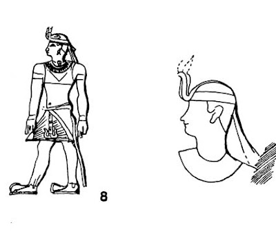
For this National Geographic illustration I needed to show a triumphant Kushite king accepting the homage of vanquished princes in Egypt in 724 BCE.

I first met with the project archaeologist Dr. Timothy Kendall in the basement of the Museum of Fine Arts in Boston. He showed me primary-source drawings of the snake headdress, sandals, wing corselet, and transparent garment worn by Kushite royalty.

I wrapped myself in a sheer curtain to simulate the costume. I set up the tone paper on an easel and acted out the pose, looking at the reflection in a full-length mirror mounted on a door.

Even though I’m not exactly the right type for the character I was portraying, I was only looking for the basic structure of the pose. I could get the Nubian features from other sources.

I recommend the method for three reasons. It’s often faster than shooting photo reference. It gets you immediately away from the photographic look. And it forces you to begin interpreting the pose, making artistic decisions that give your result more coherence and impact.

Mirror studies have always been a favorite method for animators acting out facial expressions and gestures. For faces, you can use a medium sized mirror hung in front of your work table.
------------
For a previous GJ post on installing a full-length mirror, link.

Here's a selected list of articles I've illustrated for National Geographic:

March 2006 Battle of Hampton Roads
Dec. 1997 Patagonian Dinosaurs
Nov. 1990 Kingdom of Kush
Feb. 1989 Attic Scene
Oct. 1988 Moche, Peru
May 1988 Wool
June 1988 Etruscans
July 1987 Soybeans
June 1987 Eskimos
Aug. 1986 Ulysses
Sept. 1985 Jason
Sept. 1985 Humboldt

Tuesday, February 17, 2009

Outer Limits of the Pencil

One of the 19 works in the exhibition William Trost Richards: Land and Sea is a landscape drawing that pushes the limit of what’s possible with a pencil.

Executed in the 1860s, early in his career, the work reflects Trost Richards' allegiance to a philosophy of meticulous observation. According to the “New Path,” a statement of the Society of the Advancement of Truth in Art,

“The artist is a telescope…and the best artist is he who has the clearest lens, and so makes you forget that you are looking through him.”


The exhibit spans WTR’s career and includes plein air studies, watercolor and oil seascapes, and some larger oils that showcase his mastery of moisture-rich illuminated atmosphere.

Acting director of the museum Crista A. Detweiler told us that for most visitors Trost Richards is “an eye-opener. ‘How come I’ve never heard of him?’”

The exhibition has been extended through February 22.

Next up at the Arnold Art Gallery is an exhibit exploring academic art training, “Academic Allure: Art and Instruction in Nineteenth-Century Paris," It will be comprised of work borrowed from the Dahesh collection.

From the press release:
The academic exhibition will be on view from March 13 – April 19, 2009. An opening reception will be held on Friday, March 13 from 5-7 p.m. All events are free and open to the public. Gallery hours are Wednesday 5-8 p.m., Thursday and Friday 1 – 4:30 p.m., Saturday and Sunday 11 a.m. – 5 p.m. and by appointment for groups. Schools and other groups are encouraged to contact the Gallery at 717-867-6445 for a guided tour.

In conjunction with the exhibition, Dr. Barbara Anderman, curator of the exhibition, will present a lecture entitled “Politics, Practice, Discipline, Display: The Art of Academic Survival in Nineteenth-Century Paris” on Monday, April 6 at 7 p.m. in Zimmerman Recital Hall. The lecture is free and open to the public.


Trost Richards pencil drawing is courtesy William Varieka Fine Arts, who graciously loaned several works to the exhibition.

Other gallery lenders include Godel and Co. and Questroyal Fine Art in New York City.

Night Class, 1881

Electrical lights were a new-fangled invention when Jehan-Georges Vibert (French, 1840 - 1902) exhibited “A Night Class” (Un atelier de soir) in the Paris Salon of 1881 (See post below for the image). Congratulations to the 8% of you who guessed the right answer.

The artist himself describes the painting this way:
"Under smoldering electric lights, a model in historical costume poses for eager, ambitious art students. A few of them might have real talent, some could become commercial artists, but most, unfortunately, have no future in art at all."

The painting is in the collection of the Cleveland Museum and is not on display.

Cleveland Museum page: link
Biography and works by Vibert, link.
Timeline of the electric light, link.

Monday, February 16, 2009

Night Class Mystery

You’re looking at a picture of a costumed model posing for art students. It's nighttime, and they're working by electric light.


Can you guess when it was painted? Please vote in the poll at left. Answer tomorrow.
---------

For those coming to my 12:00 talk today "Dinotopia: Behind the Scenes" at Montgomery College in Rockville, Maryland, USA, here are some more details:

Free visitor parking only in lot 13 across Mannakee Street from the college to the left of the Board of Education Building. No ticketing in this lot from 10:00 AM until 3:00 PM, 2/16/09. The Theater Arts Building is at the center of the campus. Contact Professor Ahlstrom at 240-567-7639 Ed.Ahlstrom@montgomerycollege.edu

Sunday, February 15, 2009

Art By Committee: Eye Out

The 15th of the month is the day for our group sketch game called "Art by Committee." I share an actual excerpt from a science fiction manuscript and each week you visualize it.

This month's quote was “I should stay here and keep an eye out.” This is one of those lines you can take literally or figuratively, and the results are surprising and impressive.

Peter Nyberg
Image
Website


Andy Wales
Image/Blog

Roberta Baird
Image
Website

Marisa Bryan
Flickr/Image


Elizabeth Khoo
Image/Blog


Patrick Waugh
Image
Website

Sean Hornoff

Mark Colton
Website

Thomas Nackid
Image
Blog


Kathy Jeffords
Image

Michael Geissler
Website
Image:

Rose Dawson
Image
Blog

Mei-Yi Chun
Website
Image

Dave Harshberger
Image

Rob Hummer
Image

And the one from the original sketchbook.

Next week's quote is:


Have fun! For next time, please scale your JPG to 300 pixels across and please compress it as much as possible. Title it with your name, send it to: jgurneyart(at)yahoo.com, subject line ABC, and let me know in your email the full URL of the link to your blog, website, or larger image file (just one link, please) and please give me the URL, even if you gave it to me before. Please have your entries in by the 12th of March. I'll post the results March 15.

Saturday, February 14, 2009

The Muse and the Marriage

On this Valentine’s Day, I’d like to raise a topic about being an artist and how it affects our relationships with the ones we love.

Blog reader Haylee, an art student, recently wrote me to ask about how an artist balances work with the demands of family life.


First, a couple of slightly depressing quotes:

“Here is a piece of advice worth having. Never let your daughter marry an artist. You will bring her to sorrow if you do…An artist cannot be hampered by family cares. He must be free, able to devote himself entirely to his work.” ---Ernest Meissonier

"If you must economize, be stingy with your wife, your clothes, your food, but never on what will make your pictures better. This may sound almost immoral but in the end if you make better pictures you will make more money and then you can enjoy the food and the clothes and buy your wife a mink coat." --Norman Rockwell

Shucks, guys, say it ain’t so!

I would agree with the general statement that you have to pull out all the stops and do your best work, and both Meissonier’s and Rockwell's legacies are proof of the value of their incredible effort.

Where I would disagree is the idea that the art life has to damage your personal life. Here are some things I would recommend to a young artist who is thinking about balancing the two:

1. Either stay single (like Frederick Lord Leighton or John Singer Sargent) or marry another artist (like Stanhope Forbes) or figure out an unconventional arrangement with fellow artists (The Red Rose Girls). An artist-spouse actually helps deepen your commitment to your work.

Let me hasten to add that there are plenty of happy marriages with sympathetic non-artists. And there are successful relationships where the couple function as a dissimilar team: an artist and a business manager, for example (Frank Frazetta or Andrew Wyeth). Hopefully the partner is someone who is OK with a wildly fluctuating income.

2. Put your studio in your home if it suits your work and temperament. If you have kids, make the studio a place that they're welcome. Then they can be a part of your work life. We used to have a box of Legos next to the painting table.

3. Try to keep normal hours and schedule regular family time off and time for inspiration. This just makes quality and productivity better anyway.


One of the most inspiring examples of an art life wedded to a family life is the Swedish artist Carl Larsson. In his memoirs he reflects that the paintings of his home and family "became the most immediate and lasting part of my life's work. For these pictures are of course a very genuine expression of my personality, of my deepest feelings, of all my limitless love for my wife and children."

I welcome any thoughts you might have, or better yet, comments from your spouse.

---------
Thanks to Francis Vallejo, who brought this topic up, link.
Thanks, Haylee!, and may you have a happy life, whatever you choose.
And thanks to Jeanette, and love of my life and my sketching buddy.