Showing posts with label Color. Show all posts

Monday, June 26, 2023

The Hunt Effect

The Hunt effect is a phenomenon in which object colors at low light levels are perceived less saturated compared to those observed at higher light levels.


As this illustration demonstrates, a color's saturation appears to increase as the luminance increases. This effect can influence how we perceive color intensity on monitors with variable brightness levels.
----
The Hunt Effect (Wikipedia)


. 

Saturday, April 29, 2023

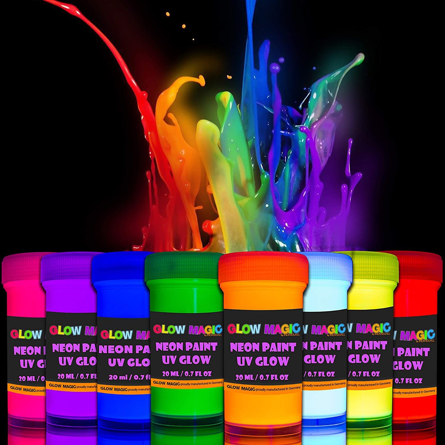
How Fluorescent Colors Work

Conventional color pigments absorb visible light energy and convert it into visible wavelengths of light. So a white light can bounce back to you after interacting with a red sweater, and you'll see the light coming into your eye as red. 


Fluorescent—or "neon"—colors do that, too, but they have an additional trick. Fluorescent colors also absorb and convert ultraviolet rays, which are invisible, and convert them into visible light. Fluorescence shifts energy in the incident illumination from shorter wavelengths to longer (such as blue to yellow) and thus can make the fluorescent color appear brighter (more saturated or lighter in luminance) than it could possibly be by reflection alone. The absorbed energy excites electrons in the pigment molecules to a higher energy level, which then relax back to their ground state by emitting light at a longer wavelength than that absorbed, resulting in a visible glow

As a result, your eye perceives a far more saturated color or a tone that's higher in tone relative to the white paper they're drawn or painted on.

Ultraviolet light is usually present in outdoor light, whether direct sunlight or overcast. Without a source of short-wavelength light (like a black light), the fluorescent pigments won't stand out. As soon as you add an ultraviolet light source, the fluorescent pigments will appear to glow, while conventional colors remain dull and hardly visible. If a subject is lit only by ultraviolet light and no visible wavelengths, fluorescent colors will appear to glow magically in the dark. 
--

Tuesday, April 11, 2023

How Birds See Each Other


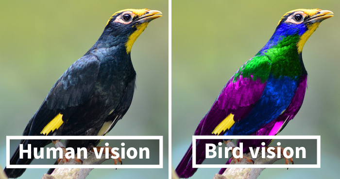
Many birds and insects have receptors for colors that we humans can't see. 


Starlings, for example, can see colors in reflected ultraviolet light that are beyond our human capacity. On the left is how starlings look to humans. On the right is how starlings may look to each other. 

Image credit: Klaus Schmitt 
According to Neringa Utaraitė: "Birds are tetrachromats, [so] they see four colors: UV, blue, green, and red, whereas we are trichromats and can only see three colors: blue, green, red. Bear in mind, that the magenta UV “color” shown here has been chosen to make it visible for us humans, it is a “false color”, as per definition UV light has no color."

Thanks, Massimo via Bored Panda

Friday, May 20, 2022

Is Opera Rose Fugitive?

Is the pigment called opera rose lightfast or fugitive? I had always heard it was extremely fugitive, but experts don't agree. 


Opera rose is a quinacridone pigment defined as PR122. According to the authoritative website Handprint, it's very reliable. In fact Handprint rates it as a "Top 40" pigment. They say: "after 800+ hours of sunlight exposure, the samples show no fading or discoloration."

Here's how they explain it:

"Quinacridone magenta PR122 is a lightfast, semitransparent, staining, dark valued, intense violet red pigment, offered by more than 20 pigment manufacturers worldwide. The ASTM (in technical report D5067-99) rates the lightfastness of PR122 in watercolors as "fair" (III, "may be satisfactory when used full strength or with extra protection from exposure to light"), but other manufacturer and independent tests rate it higher. My 2004 lightfastness tests of the nine paint brands listed above, which show color variations that suggest several different pigment particle sizes or pigment suppliers, revealed very little or no color degradation, after 800+ hours of direct sunlight exposure, in both heavy and diluted applications. This puts the pigment solidly in the "excellent" (I) category (BWS 7+)."

"For context, compare these samples to naphthol red (PR170), a pigment with a well established "very good (II)" rating, or with quinacridone rose (PV19), which is considered to have "excellent (I)" lightfastness. This is such a glaring discrepancy that the ASTM test must be flawed or unrepresentative in some way. Because Michael Wilcox relies on the ASTM documents for his pigment ratings, he has been critical of this pigment without any corroborating evidence of its fallability. I suggest you do your own lightfastness test on PR122 paints until a consensus emerges, but at present I see absolutely no reason to avoid this splendid pigment." 
 

I haven't tried it yet in a controlled fade test, but I've used the color in a painting. You can watch the whole 12 minute YouTube video here.

Wednesday, December 1, 2021

Unraveling Color Pigment Terms

Organic / Inorganic

Pigments are divided into organic (containing carbon) and inorganic (without carbon). 

Inorganic pigments were traditionally made from natural earths such as the ochres and siennas, and the hard minerals such as azurite and lapis lazuli, plus metals such as cadmium, cobalt, iron, and zinc. They are more opaque, denser, and generally weaker in tints than organic pigments. 

Organic pigments were originally made from plant materials, such as root madder, or animal materials such as cochineal. Organics tend to be more transparent, lighter in weight, and higher in tinting strength. 

Synthetic pigments

Both organic and inorganic pigments can be manufactured artificially in the lab, and the resulting pigments are for the most part indistinguishable from their natural counterparts. 

So, for example, ultramarine is a synthetic replacement for the rare and expensive mineral lapis lazuli. The properties are identical, but the price has become so low that it's used in low cost children's paint. 

Light / Deep

When a color is called "light" or "deep," it doesn't only mean light or dark in value. It also has to do with the position on the hue circle. Cadmium yellow deep is more toward red, really orange, while cadmium yellow light is not only lighter in value but also more toward the green side of yellow. 

Convenience Colors / Hue

Some pigments are blended to make colors with familiar names such as “mauve” or "peacock blue." Convenience mixtures fill gaps by offering intermediate mixtures for which no pigment exists, such as phthalo yellow-green. In watercolor, Payne’s gray is a blue-black made from black and ultramarine or other blends. 

When a color is called a "hue," such as "cerulean blue hue," it's a color that resembles its expensive counterpart, but it's made of a blend of inexpensive ingredients.

Designers Colors

The term "designers color" has been used for a paint color that is meant to match a particular color note. A designers color is made to match not only a hue, but a particular tint or shade and a level of chroma or saturation. Designers colors are often mixed with white to result in colors like "pale rose blush" and "cobalt turquoise light." House paints and hobby acrylics frequently are formulated in this way because people use them right out of the bottle for a given use.

Nowadays most manufacturers of artists' pigments use pure pigments and let you do the adjusting, because you may not want the white in the mixture from the beginning. So if a pigment is naturally transparent, it will still be transparent, even in gouache. 

Permanent / Lightfast

The word “permanent” appears on many different art products, but it’s a confusing term. On some graphic art products, such as inks or felt-tipped markers, it really means “waterproof,” rather than “lightfast” (resistant to fading). Many calligraphy or fountain pen inks are not waterproof, but they’re reasonably lightfast, considering that most handwriting isn’t usually subjected to light for long periods.

--

Learn more:

Color terms explained on the website Handprint

Color of art pigment database listed by pigment numbers on website ArtisCreation

Signed copies of my book Color and Light: A Guide for the Realist Painter

Did I get something wrong, or do you have something to add? Please let me know in the comments.


Saturday, November 13, 2021

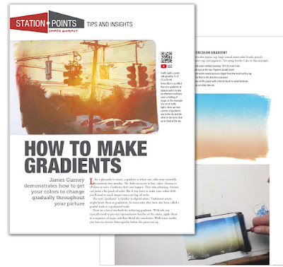
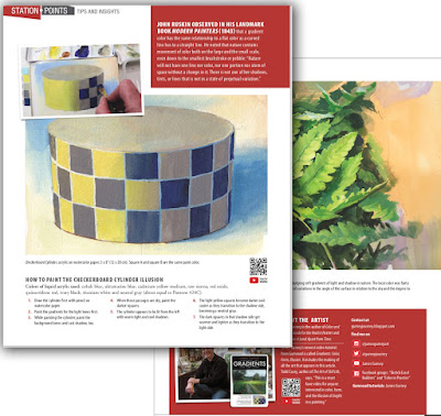
Article on Gradients in International Artist #142


The new issue of International Artist Magazine features exercises and insights about painting smooth gradients, using watercolor washes, brayers, and stipple blends. 


John Ruskin observed in his landmark book Modern Painters (1843) that a gradient color has the same relationship to a flat color as a curved line has to a straight line. He noted that nature contains movement of color both on the large and the small scale, even down to the smallest brushstroke or pebble: “Nature will not have one line nor color, nor one portion nor atom of space without a change in it. There is not one of her shadows, tints, or lines that is not in a state of perpetual variation.”

Also included in the magazine are features on Brad Teare, Julia Albo, Natalia Karpman, Kristine Rapohina, Vanessa Rothe, and Anastasia Mily
--
You can get a copy from the publisher or get the video download

Thursday, October 14, 2021

How Sacrificing Detail Can Add Mood

In a new YouTube video I show how I painted this moody morning scene in gouache by sacrificing detail and emphasizing light effects.


My goal is to capture a fleeing light effect by using a warm priming color to achieve a "photographic" lens flare. Halfway through, I paint over the whole thing with a glaze to reduce detail. The glaze is risky because gouache reactivates when it's rewet, and to be honest, it's kind of a disaster for a while.


Here are some takeaway quotes about the theory of sacrifices: 

“Nature instills sentiments in the spectator through the selective sacrifice of details in order to improve the overall effect.” 
--The Theory and Practice of Water Colour Painting: Elucidated in a Series of Letters

“Painters without experience often weaken the effect they wish to produce by a prodigality which multiplies uselessly the figures and accessories of a picture. It will not be long before they learn that, the greater the conciseness and simplicity with which a thought is interpreted, the more it gains in expressive force.” 

Tuesday, June 29, 2021

Mass Tone and Undertone

The appearance of a watercolor pigment as it comes out of the tube may be rather different from the way it looks when it is thinned with water.

Mass tone and undertone demo by Winsor & Newton

The tube color is called the mass tone (or masstone), and the color when thinned down is called the undertone.


For example, what inspired the color treatment on this sketch was the strange behavior of Azo green watercolor. It has a dull olive-green mass tone but the undertone is a rather strong yellow.


If you're not too familiar with the difference between mass tone and undertone, here's a short video by Winsor & Newton that demonstrates the difference.

Friday, June 25, 2021

Hooker's Green

BDSuits asks: "Why is it called Hookers Green? I don't see the connection."
 
The Dutch Codlin by William Hooker

Answer: It's named after a botanical illustrator named William Hooker (1779–1832). He created the pigment to capture a certain green leaf color.

Saturday, April 17, 2021

A Whiter White Paint

Scientists at Purdue University have developed a white pigment that they say is significantly whiter than existing pigments. A surface looks white because it reflects back a diffuse version of most of the the light hitting it. 

This new pigment reflects back up to 98% of the sunlight, while commercially available white pigments only reflect back between 80 and 90 percent.


Professor Xiulin Ruan with a sample of his "ultra-white" paint, courtesy BBC and Purdue

According to the BBC:

"The new paint contains a compound called barium sulfate, which is also used to make photo paper and cosmetics. 'We used a very high concentration of the compound particles,' explained Prof Ruan. 'And we use lots of different sizes of particles, because sunlight has different colours at the different wavelength.' How much each particle scatters light depends on its size, 'so we deliberately used different particle sizes to scatter each wavelength.'"

The new white pigment should be more reasonably affordable and available compared to the ultra black "Vantablack" or the new blue pigment that I mentioned in 2016.

It looks intriguing. I'd like to see how it looks next to Titanium or lead white. But I don't know how useful it would be to me as a painter because I almost always want to darken my lightest light and raise my darkest dark in a picture anyway. The challenge isn't pushing the absolute range of values but rather organizing the tones so that the picture makes sense.
--
Thanks, Joseph and Dan


Sunday, January 17, 2021

Painting with Two Colors (Plus White)

Here's a great exercise to try: paint a snow scene with just ultramarine blue and burnt sienna, plus white gouache.  (Link to YouTube video)


Art teachers of the past have recommended this method for centuries.

Arthur Guptill said, "A rich effect can be obtained with only a limited palette. A warm and cool combination affords the student the best approach to his color problems, especially as they relate to outdoor sketching." 


In his book on the history of watercolor painting, E. Barnard Lintott said, "For a young student there cannot be a better way of entering upon the study of water colour than by rigorously banishing all but two colours from his palette. It is the best and surest way to the study of full colour. The colours should be a cold and warm one; cobalt blue and warm sienna—or Prussian blue and burnt sienna—are two combinations which lend themselves to a great variety of treatment."

Paint 
I also used a tiny bit of Alizarin crimson

Get the full video
Gumroad (HD download or lifetime streaming)
Sellfy (HD download) 
Cubebrush (HD download) 
DVD direct from publisher 

Tuesday, December 8, 2020

YInMn Blue

YInMn Blue or Yin Min blue is a recently developed inorganic pigment, the first inorganic blue pigment discovered since cobalt blue was discovered in 1802. 


The pigment was accidentally discovered a decade ago by Professor M.A. Subramanian in Oregon. Composed of yttrium, indium, and manganese, it yields a blue pigment that is chemically stable, fade-proof, opaque and non-toxic. 

Because some of the ingredients are fairly rare, the patented pigment is still mostly inaccessible as an artist's color, but Gamblin has made a 164-tube limited run of the color for oil painters at a cost of $75 per tube. 

Professor Subramanian has experimented with other variations of the basic recipe, substituting some less expensive ingredients, and the result has been some additional colors, which also look promising.

Thursday, October 8, 2020

The Iron Triad

One of my favorite limited palettes is the Iron Triad, which is composed of Prussian blueyellow ochre, and light red, plus titanium white.

Prussian blue is made of ferric ammonium ferrocyanide, and yellow ochre and light red are iron oxides, which gives them that rusty color. Together with titanium white, they made a harmonious limited palette.

Watch the full video on YouTube, where I also explain my thinking about the perspective.

Saturday, September 12, 2020

TRIADS now available


Painting a high-chroma still life outside with just three colors forces you to keep your mixtures pure and your brushes clean. That's just the first painting exercise in my new tutorial "TRIADS: Painting with Three Colors." 
----
Watch a sample video on YouTube of the painting of this teapot.

Download the 90 minute tutorial from Gumroad and Sellfy 

Wednesday, August 19, 2020

The Science of Color by Captain Disillusion

This new YouTube video by "Captain Disillusion" (Link to YouTube) explains a lot of important points about color: how we perceive it and how we chart it, from the hue circle of Isaac Newton to modern 3D luminance diagrams. 

Every second of the video is packed with information, all beautifully illustrated with motion graphics.  It goes by so fast you almost have to watch it twice to get it all.

For painters, a key quote is "A limited palette works just fine as long as the color relationships remain the same."

In the comments, can someone please share the links to the free software he mentioned that lets you chart 3D color gamuts and luminance charts?

Monday, June 29, 2020

Limited Palettes and Constrained Writing

With no yellow and no green, this limited palette knocked me out of my color mixing habits and forced me to improvise in an alternate universe that felt alien, but still harmonious. Colors: ultramarine blue, burnt sienna, pyrrole red, and titanium white.

Writers have played with self-limiting challenges, such as E.V. Wright, who wrote the 1939 novel called "Gadsby" as a lipogram, without using the letter "e." Here's an excerpt: "Now, any author, from history's dawn, always had that most important aid to writing:—an ability to call upon any word in his dictionary in building up his story. That is, our strict laws as to word construction did not block his path. But in my story that mighty obstruction will constantly stand in my path; for many an important, common word I cannot adopt, owing to its orthography."

There are other examples of constrained writing, such as sonnets, limericks, and haiku, all of which thrive within strict limitations of form and meter, or palindromes, where the sentence reads the same forward, such as "Never odd or even."
----
Limited palettes are discussed in my book Color and Light: A Guide for the Realist Painter.

Saturday, June 20, 2020

How do you mix a color you're looking at?

Malcolm Marcus asked: "I would really like to see a video on how to understand what colors you are looking at. Sounds kind of nutty, but for those of us relatively new to painting, it's often hard to figure out what color something actually is."

Oil study by Charles Hawthorne (1872-1930)
Answer: The color you're looking at is a consequence of four main factors: 

1. The local color (or surface color) of the object.
2. The relative color of the light shining on it.
3. The relative amount of light shining on it.
3. The quality of atmosphere between the observer and the object.

You have to mentally combine all those factors in order to arrive at the color you will have to mix for that paint stroke.

For example, the girl's hat at left is a medium-value blue because it's a white hat lit by blue skylight which is less bright than the sunshine, and there's much atmosphere intervening.

The underside of her sleeve is a medium dull orange because it's in shadow, too, but this time the white material is picking up some bounced light from the warm-colored ground surface below her. Her skin is a dark brown because it's a light-skinned tan local color in relatively dim illumination. Backlit white subjects are popular with impressionist painters because they make make Factors #2 and #3 vividly clear. 

Most beginning painters see only the local color, because they don't yet recognize how their perceptual systems are filtering out the effects of the next three factors.

Learning to paint involves recognizing how those perceptual filters work. Once you understand them, you can analyze a subject in terms of the the relative influence of the four factors. 

I would recommend setting up a backlit white object on a sunny day and painting what you see. You could use a volleyball, skull, white cardboard box, or t-shirt. The experience of mixing the resulting colors will make these principles vividly clear.
-----
There's a lot of beginning painting instruction on my new Gumroad tutorial "Color in Practice: Black, White, and Complements." and in my book Color and Light, available signed from my webstore or from Amazon. There's also a lot of information in my book: Imaginative Realism: How to Paint What Doesn't Exist.

Tuesday, June 16, 2020

Compared to Hummingbirds, We're Colorblind

Birds can perceive colors in parts of the electromagnetic spectrum beyond what we humans can see. 

Costa Rican hummingbird, from Ask a Biologist

Humans have only three color receptors, but birds are tetrachromats, with four color receptors. In addition to birds, many reptiles, fish, insects, spiders, shrimp, and other invertebrates can see colors beyond our range of awareness. The scientists estimate that as much as 35 percent of the color experience of birds includes colors we can't even imagine, not just additional colors, but combinations of colors such as ultraviolet plus green. 

Some birds that look plain to our eyes have patterns that can only be revealed by translating those extraspectral colors into visible light. According to NatGeo:
"This extra level of discernment might also have been a trait of dinosaurs, which are thought to have sported colorful feathers. Mammals evolved as nocturnal beings that did not need to see the rich hues of the daylight world, so most—like your pet dog and cat—are dichromatic, and have only blue and green cones. People evolved a third cone (red), possibly because early primates developed an appetite for ripening fruits."
-----
More online resources
Science Friday Podcast: A Bird's Eye View of Color

Saturday, June 6, 2020

Complementary Color Scheme

Arthur Guptill said, "A rich effect can be obtained with only a limited palette. A warm and cool combination affords the student the best approach to his color problems, especially as they relate to outdoor sketching."

Greta Bridge by John Sell Cotman
In his book on the history of watercolor painting, E. Barnard Lintott said, "For a young student there cannot be a better way of entering upon the study of water colour than by rigorously banishing all but two colours from his palette. It is the best and surest way to the study of full colour. The colours should be a cold and warm one; cobalt blue and warm sienna—or Prussian blue and burnt sienna—are two combinations which lend themselves to a great variety of treatment."
----
More about painting in complementary colors on m Gumroad tutorial "Color in Practice: Black, White, and Complements."
Quotes comes from Color in Sketching and Rendering, p. 71.

Monday, April 20, 2020

Color in Practice Now Available

My new tutorial, "Color in Practice, Part 1: Black, White, and Complements" is now available. (Link to 1-minute trailer on YouTube)


Gary Geraths, Artist and Professor at Otis College of Art and Design, says:
“After 30 years of being in the trenches, teaching college students the theory and practice of landscape drawing and painting there is always the intimidation of them taking it into the real world and practicing it. Watching James walk us through the process really sands off the "sharp edges" of translating tone to color in plein-air painting and makes it thoroughly understandable. My students really watched and listened to the "down and dirty" realness of the practical knowledge in the video and it certainly help them in their own artwork. Having been painting for years I watched and learned a lot myself, amazed at the fluidity and simplicity of how James presented the step-by-step instruction and painted results. This is such a great learning tool and would be a great addition to any classroom.”

Color in Practice --69 minutes. Studio exercises and practical applications on location. 


Sunday, April 19, 2020

Color in Practice—Comments from the Experts

My new video "Color in Practice, Part 1: Black, White, and Complements" is now available on Gumroad and Sellfy.

 Here's what the reviewers are saying:


The digital video download is available at Gumroad and Sellfy


Tuesday, April 14, 2020

New video tutorial comes out Monday, April 20

On Monday April 20 I’ll be releasing a new tutorial video called “Color in Practice, Part 1: Black, White, and Complements.”


Painting in full color can be an intimidating experience for many students, or even for professionals who want to explore a new medium. There so many colors and brushes to choose from. And there are so many variables to consider, including hue, chroma, value, and wetness.


What I’ll do in this video workshop is start with a few basic, inexpensive materials and foundational ideas. I’ll demonstrate grisaille (black and white) painting in gouache. We’ll explore the variations you can get with the contrast between transparency and opacity.


Then I'll paint Greg at his workstation in a tire shop, demonstrating a single-accent scheme based on the Zorn palette (basically, black, white, red, and an iron-based yellow).


The painting developed spontaneously on location and it takes advantage of a raw-sienna colored underpainting.


And we'll examine the opportunities of a complementary relationship using just two colors: ultramarine blue and burnt sienna.


The video alternates between simple practical exercises that are well worth doing, regardless of your skill level, followed by paintings made on location that put the principles into action. I use gouache and watercolor, but the painting insights are universal and will benefit oil and acrylic painters as well. 


What this video does is to take the concepts from my book Color and Light: A Guide for the Realist Painter and translate them into basic practical assignments.

The video is 70 minutes long. The download will be $17.99, and the DVD is $24.50, but there will be a launch day sale of 15% off on Monday, April 20.

Tia Kratter, Teacher and Art Director at Pixar and Disney said:
“As an art instructor, I am truly grateful for this approach. Here's why: so many people who want to learn how to use color start out by squeezing every tube of paint on their palettes and end up with a confusion of color. Your method of beginning simply with black and white, and showing that one can get so much variety with just two tubes of paint is excellent. I love how you move forward by slowly introducing new colors one-by-one. It makes the whole process seem so much less overwhelming. Thank you for your generosity of information!”

Tuesday, March 17, 2020

What about Greens?

A blog reader asked: "Do you carry any greens with you and if so, what’s a decent green for landscape? I’ve been trying out sap green and Hooker green which I believe is a mixture of Prussian blue and gamboge. Or would you recommend mixing greens on the spot as a better general practice and to learn the extents of a limited palette?"

Foreground detail of Peder Mork Mønsted

Yes! I encourage you to experiment. As you may have noticed I have been bringing some greens from time to time, especially sap green, viridian and permanent green light. The last one can give you that powerful "vegetable green" that you see when light transmits through a young leaf.

But there's also an argument from mixing your greens, which you can do with many blue-yellow combinations, such as ultramarine blue and gamboge.

To keep your green colors looking like they belong, remember to vary the colors according to the four conditions of light on foliage, and it often looks good to vary greens with their complements, such as reds. Monsted does that very well in the above detail

Sunday, January 12, 2020

Frank Brangwyn: Color and Tone

Frank Brangwyn (Anglo-Welsh 1867-1956) typically worked with a relatively limited palette that included flake white, yellow ochre, raw sienna, burnt sienna, cadmium red, Venetian red, vermilion, and French blue.

Frank Brangwyn, Market Scene Jaffa, 1890 50.5 x 61cm (19 7/8 x 24in).
Biographer Walter Shaw-Sparrow said, "The thing that counted as the saving grace of style was tone, which may be described as a unifying mystery of colour that permeates a picture, and binds all its parts together, giving a sort of inner depth and richness....Nature is a vast unity with scattered parts, while art is a limited harmony; and it is tone that helps us to resolve profusion into a definite whole, true to the same key in every plot of colour." 

Sunday, January 5, 2020

The Body and Soul of Landscape

Birge Harrison, Winter Sunset
In his book Landscape Painting , Birge Harrison (1854-1929) said: "Any landscape has a soul as well as a body. Its body is our great rock-ribbed mother-earth with her endless expanse of fields and hills, of rivers and surging seas. Its soul is the spirit of light — of sunlight, of moonlight, of starlight— which plays ceaselessly across the face of the landscape, veiling it at night in mystery and shadow, painting it at dawn with the colors of the pearl-shell, and bathing it at mid-day in a luminous glory."

L. Birge Harrison (1854-1929),
Grand Central and the Biltmore in Hazy Twilight
Harrison continues: "To this and to the ambient and all-enveloping atmosphere, with its clouds and its mists, its rain and its veiling haze, are due the infinite and ever-shifting moods of nature. He who paints the body alone may be an excellent craftsman, but the true artist is he who paints the beautiful body informed and irradiated by the still more lovely and fascinating spirit — he who renders the mood."
-----
Birge Harrison Landscape Painting (reprint)
Wikipedia on Birge Harrison

Monday, December 9, 2019

Why Can't Flower Pigments Be Used in Paints?


Thom Rozendaal asks: "Why don't we use flowers to make pigments? I understand it would be hard to separate the biological matter from the pigments so maybe it would be possible to study how flowers produce these colors and recreate the processes in a lab? Has this ever been attempted before? Are there any pigments that are already made from flowers? It seems most are made of some type of mineral or something, and I guess I'm just worried we'll some day over-mine some of them as we are already doing with so many other things, whereas flowers are already being produced on a mass scale and are a renewable resource."

Thom, There are two main types of pigments in flowers: carotenoids and flavonoids. Scientific American says: "Carotenoids include carotene pigments (which produce yellow, orange and red colors). Carotene pigments are also found in vegetables, which is what gives carrots their colors. Flavonoids include anthocyanin pigments (which produce red, purple, magenta and blue colors)."

Both of these are natural organic pigment compositions that fade quickly because the large molecules are easily broken by ultraviolet light. You can make ink out of anthocyanin pigment, but it will be subject to photodegradation. People who collect dried flowers keep them pressed in books to protect them from ultraviolet light.

One organic pigment that has been traditionally been used as an artists' pigment or a vegetable dye is madder root, made from the dried root of rubia tinctorium. The root pigment is "laked" which means "bonded chemically to a colorless, transparent, insoluble salt that often acts as its own mordant — which turns the dye into an insoluble pigment. The gum arabic in watercolors then binds this complex but chemically stable pigment to the paper." (Source)

Natural organic pigments are rarely used in modern paints because of issues of lightfastness, so paint manufacturers use synthetic organic pigments or inorganic pigments. This webpage explains more about that process.
----
Scientific American: Springtime Science: Exploring the Pigments in Flowers
Anthocyanin pigments on Wikipedia


Sunday, December 8, 2019

Clean the Brush Before Each Mixture?


Doan Le says: “What do you do when you need to change colors? Do you simply change brushes, or wash off the previous paint with water?”

If the new color I need to mix is not a big color change, I can keep using the same brush, even if there’s already some paint in it. I factor the paint that's in the brush into the new mixture. If the color I want to mix is significantly different, I may need to remove most of the paint with a paint rag. If I must mix a fresh, pure mixture that’s different from what’s in the brush, I have to thoroughly wash out the brush in a plastic tub of water and then dry it off with the rag. Each of these water cleanings dirties up the water supply, so if I’ve only brought a small amount of water, I try to limit the number of deep cleanings.

Tuesday, July 30, 2019

Are Sunrise and Sunset Colors Different?

A listener to the BBC podcast The Naked Scientists asks: ""Can you tell from a painting, or a photo, whether it's sunrise or sunset?"


My answer: No, there's nothing fundamentally different about the light effects at sunset or sunrise, and there's no way to tell which you're looking at from the light and color effects alone.

The cause of those light effects are the same. Sunlight travels through more atmosphere as the rays approach the horizontal. Passing through more air scatters out more blue wavelengths from the light rays, making the light that remains appear increasingly orange or red. As the sun passes below the horizon, beneath the curvature of the earth, it may briefly illuminate the bottoms of the clouds. Of course this effect happens both at sunrise and at sunset when colors are at their richest.

A single photo or a painting can tell you something about the position of the sun and about the height and distribution of cloud layers. And some art historians have argued that paintings of sunsets after the eruption of Krakatoa in 1883 reveal colors that were more pronounced worldwide. But it can't tell you whether it's morning or evening.

If there are differences between sunrise and sunset, they're qualitative and subjective. In some environments, humidity and dust may be stirred up at the end of the day because of evaporation and turbulence, and these effects can increase the saturation of the colors. But you wouldn't be able to guess that from a single image. Emotional subjectivity also plays a part in our human perception of sunsets and sunrises as we experience them in time. While a sunset builds gradually to a dramatic crescendo before quickly transitioning to twilight, a sunrise starts off with a blast of color and, as Wordsworth says, the "vision splendid" fades "into the light of common day."
---
M. Minnaert, author of the book "The Nature of Light and Color in the Open Air," addressed this topic and here's how he puts it: "Are there any differences between dawn and dusk? If any they are so small that it is not possible to mention any really typical differences. One important thing, however, is that the eye is completely rested in the morning and sees the light-intensity increase continuously, so that it is more sensitive to dawn phenomena than to dusk phenomena. The latter have generally a greater richness of colour on account of the greater humidity of the air, and because the air is a little more turbulent, and contains more particles of dust than in the morning." (page 280, paragraph 193)

Listen to the Q and A on The Naked Scientists Podcast: Can you tell if it's sunrise or sunset?