Showing posts sorted by relevance for query tom lovell. Sort by date Show all posts

Monday, May 27, 2013

Sergeant Tom Lovell, USMC

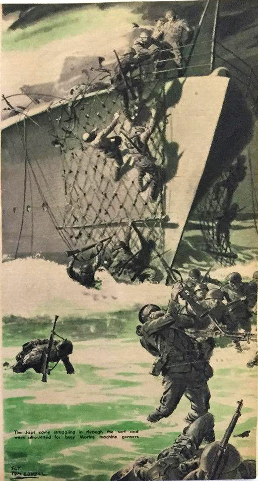
In 1944, illustrator Tom Lovell (1909-1997) joined the U.S. Marines with the hope that he would be assigned as a combat artist. He ended up serving for two years as a sergeant and staff artist for the Leatherneck Magazine, a publication of U.S. Marines.

Among the many paintings he did were historical reconstructions, such as General Quitman's 1847 entry into Mexico City with a battalion of Marines.
 ....and a charge of soldiers on horseback...

....and the U.S. Marines in action at the Battle Belleau Wood in June 1918.

Lovell painted the landing at the Battle of Tarawa (US code name Operation Galvanic) in the Gilbert Islands, in the Pacific Theater of World War Two. The original is in the USMC Marine Corps Combat Art Collection. 

Finally, Lovell recreated in paint the moment captured by Joe Rosenthal's famous photo at Iwo Jima. 
-----
Book: The Art of Tom Lovell: An Invitation to History
The Wikipedia article for Lovell is just a stub. Would anyone care to write it? I'll help with info.
Sources: Tom Lovell papers at the Cowboy Hall of Fame in Oklahoma City
Jones, Byron B., "Stories of Survival: Tom Lovell" Southwest Art. May 1983, p. 66-83)

Thursday, March 16, 2017

Graveyard Scene by Tom Lovell

This 1947 illustration by Tom Lovell for True Magazine was for an article called "Extra Corpse in the Graveyard." It's a good image to study for color and composition.


Color and Value
• You could probably paint this with Venetian red, viridian, and white, maybe with a touch of raw umber and yellow ochre.
• Note the grouping of tones in the white gravestones and the simplicity of the grassy ground texture.
• Tones are also grouped in the dark background trees and in the shadowed foreground grasses.

Composition
• Except for the walking figure, all the other key elements are cropped intriguingly: the arm, the gravestone with its fragmentary name, and the white gravestone on the right.
• This design is not an obvious one, and I would guess that Lovell arrived at this composition after doing a lot of tonal thumbnails in pencil.  
• Positioning the hand in the extreme foreground also places viewer in the grave and in the path of discovery. 
-----


Monday, November 26, 2018

Lovell's Leatherneck Illustrations

When he was a sergeant in Marines, Tom Lovell was stationed in the barracks in Washington, where he "fought the war at his easel" for the official publication Leatherneck


The technique for these grisaille illustrations was transparent watercolor wash rather than his usual oil paint (which he used for covers). In the picture above, there are a few small touches of gouache, such as in the initials at upper left and the wisps of smoke. 

Due to the low pay and need to produce a lot of pictures, Lovell often had to work without models, and had "to learn to draw from the mirror or do without. It was an ideal way to learn composition."


Lovell said that this technique "reproduced well on the poor stock and depended little on a middle tone; the picture story had to be told with the greatest economy of means and at a small scale. It was a question of boiling down and closing in on the subject."


"You had to learn to make your pictures with the greatest economy of means, to tell your story simply." That served him well later in his professional career as an illustrator for the "slick" popular magazines, for which he used oil paints in full color.  
-----
Quotes: from North Light and Persimmon Hill magazines.
Previous Posts on Tom Lovell
Thanks, Jim Pinkoski

Monday, January 4, 2016

New Tom Lovell Website

Fans of illustrator Tom Lovell (1909-1997) can now sample from an online gallery of more than 200 images spanning his remarkable career, from the women's and adventure magazines to National Geographic and Western art.


Lovell was an artist's artist who produced work that was consistently well crafted in terms of design, perspective, and figure work, and it always delivered the dramatic mystery required of a magazine illustration.


The website is an outgrowth of the magazine tearsheet archives of Jim Pinkoski, who has amassed similar collections of the published work of John Berkey and Harry Anderson.

Jim Pinkoski's Tom Lovell Collection
Previous GJ Posts on Lovell

Monday, April 26, 2010

Lovell’s Painting Advice

Between 1986 to 1995, I corresponded with veteran illustrator Tom Lovell (1909-1997), asking him some specific questions about his approach to composition and color.


For those of you who don’t know his work, Tom Lovell illustrated for the pulps and all the top magazines, and he did some legendary illustrations for National Geographic before he headed out west to paint western subjects.

He wrote back with helpful tips that I’d like to share with you over the next few days.

Color

“A good general rule is that color obtains in the light. Areas lose richness as they move into shadow. Restated: shadows tend toward the complement.

Look for movement in color—warm to cool, light to dark. It is all around us: sky, earth, grass, walls, etc. Areas will go back in space if slight amounts of complement are added.

Use of heavy reds tend to flatten out the illusion of depth.”
-------
Above: "Rendezvous with a Traitor", illustration from Colliers, oil, 21 x 16 inches. From Leif Peng’s Lovell tearsheet collection.
Previously on GJ: Color Obtains in the Light.

Tomorrow: Lovell on Flesh Tones and Design

Friday, April 10, 2009

Lovell's Soldier

When American illustrator Tom Lovell (1909-1997) painted the standing soldier for The Continental Insurance Company, he researched the weapons and costume at a museum and did a charcoal study from a nude figure to understand the pose. The studies appear surrounding the finished illustration in this page from an article in North Light Magazine.

Here's how Lovell himself described the process:
The requirement here was to create an heroic, slightly larger than life embodiment of a man who could be identified with dependability and authenticity and at the same time be real. This was done to replace the original trademark figure used for many years by the Continental Insurance Company.

Before consulting a model, I drew this basically strong figure, to be certain he would not be overpowered by his equipment. Research in depth was done at West Point Museum under the guidance of Col. Frederck P. Todd, then curator. The painting later won a gold medal at the Society of Illustrators Annual National Show.

---------
Image is trademark of the Continental Life Insurance Companies.

Leif Peng's excellent illustration art blog "Today's Inspiration" has been doing a feature this week on Lovell , drawing from the 1956 American Artist profile by Norman Kent.

The material in this post was drawn an article "Tom, The Unswervable Lovell," in the North Light Collection, Volume 2, 1979, a compilation from the North Light Magazine.

Lines and Colors tribute to Lovell, link.

Monday, August 15, 2011

Lovell Article

The new issue of Illustration magazine has an extensive feature on the American illustrator Tom Lovell (1909-1996). The article has 67 illustrations, mostly in color.


Lovell’s career spanned six decades, beginning with covers and black and white drybrush drawings for the pulp magazines. He went on to the mainstream “slick” magazines, specializing in historical, adventurous, and romantic subjects.


His dedication to research and accuracy culminated in landmark articles for National Geographic throughout the 1960s, including multi-painting features on the Vikings and the life of Abraham.

I had a chance to meet him and correspond with him, and he was probably the biggest single influence on my early work. A lot of what I learned from him appears in the following links, and in Imaginative Realism.

Illustration Magazine (you can see the whole issue digitally)
Previously on GurneyJourney:
Lovell on Pyle and Dunn
Lovell on Flesh Tones and Design
Lovell's Painting Advice
Lovell's Soldier
Three Value Study

Wednesday, July 13, 2016

Lovell Book Announced

Publisher Dan Zimmer has announced that he's working on a book about Tom Lovell's work as an illustrator. Here is the unfolded dust jacket design.

There was a previous book about Lovell from the 1980s, but it mainly covered his western art work. This one spans his whole career, focusing mainly on his magazine illustrations. 

The book begins with a biography and shows his early pulp illustrations. But this book will be mainly pure pictures, reproduced large, the way art books should be.

It includes the wide range of subjects: pretty women, male action, romantic subjects, and historical reconstructions. The book will include some scans of tearsheets so you can see how they appeared on the page. There's also some discussion of his method, with examples of his thorough preliminary sketch process. 


There are plenty of original art scans showing paint texture and brushstrokes. Lovell has always been the artists' artist, one whose style doesn't seem particularly locked into a given time period.

Young artists today can learn from his use of color, his sense of dramatic staging and lighting, his striking compositions, and his paint handling. You can see more page spreads from the book in a low rez preview at this link.


The Lovell book is coming out this October. Dan isn't doing a Kickstarter campaign this time because he's already got enough early orders to cover the printing.

Instead at this stage he's taking prepublication orders. Since this is a limited edition, it might be wise to order one now, because they'll probably sell out by the publication date (like his last book on Dean Cornwell) and they'll be hard to get after that.

Here are the specs:
The book is 224 pages, 9”x12”, full-color on premium low-gloss stock, hardbound with dust jacket.
A Standard Edition copy of the book is available for only $44.95 plus postage. It's limited to just 900 copies.
A Special Edition copy of the book is available for $65.00 plus postage.
The Special Edition book is signed and numbered with slipcase. Limited to 100 copies.

Friday, March 24, 2017

Question about Flesh Tones

Thomas DuVal asks: any tips for getting realistic skin tones with watercolor? I'm having a hard time with my portraits looking lifeless, or like dolls. Thanks!

Tom Lovell, oil 
Thomas, here's what one of my heroes, Tom Lovell, said I when asked him the same question (about oil): 
"Keep in mind that flesh tones are essentially quite neutral. If they are overstated, figures tend to look like painted dolls. Avoid lavish use of highlights. Avoid heaviness. Try reducing chroma with complementary color."  
John Gannam, watercolor
The same principles apply if you're working in watercolor. Keep the chroma down, use simple lighting and modeling, and look for other kinds of contrasting textures around the skin in the same light.

Anders Zorn, watercolor


If you like my blog, you'll love my new app: Living Sketchbook, Vol. 1: Boyhood Home. It's available for iOS on Apple phones and tablets at the App Store and for Android devices at Google Play.

''James Gurney's Living Sketchbook: Vol. 1 celebrates the mobility and charm of gouache, casein, colored pencil, and pen and ink in sketchbook form. This brilliant app is loaded with beautiful high resolution artwork set to a powerful environmental soundscape that brings you there. The narration is full of insightful observations and wisdom to pass on to artists of all levels. Additional layers of video are dispersed in the volume to clearly illustrate approaches by a master teacher and storyteller. An elegant and generous offering that will immediately make you want to sketch out ‘in the wild'!"
—Erik Tiemens - Watersketch.com

Wednesday, June 12, 2019

Joe De Mers, American Illustrator

Joe De Mers (1910-1984) was a style setter in the mid-20th century illustrated magazines.


He painted glamorous women in romantic situations, in a style reminiscent of Coby Whitmore, Tom Lovell, or Harry Anderson

He typically combined abstract areas of flat colors with carefully rendered faces and hands. Large heads in illustrations were an exciting innovation borrowed from the closeup in movies.


He painted often in gouache. Note the crop marks at the corners, the registration marks on the left, and the brown stain of rubber cement around the outside edges. The rubber cement probably held a presentation mat board on the front.


Illustrator Joe De Mers is the featured artist of the new Illustration Magazine #64. In over 38 color illustrations, some full page, the article chronicles his development from Hollywood concept artist to a star in the Charles Cooper Studios in New York, where top illustrators created advertising art for all the leading accounts.
----
"Illustration Art" blog posts: Joe De Mers and the "Big Head" School of Illustration
"Art Contrarion" Joe De Mers: Mainstream 1950s Illustrator

Thursday, January 14, 2016

Harvey Dunn and His Students at the Rockwell

Last week we visited the Norman Rockwell Museum to see the exhibition "Masters of the Golden Age: Harvey Dunn and His Students." 

  
Dunn was a vital link between Howard Pyle's teaching and a generation of story illustrators in the Golden Age of Illustration. The exhibit includes a room showcasing Dunn's students, including Dean Cornwell, Harold Von Schmidt, Mead Schaeffer, Saul Tepper, and Dan Content. They produced big canvases brimming with color, character, and drama.


For example, here's a painting of "The Count of Monte Cristo" by Mead Schaeffer (from the Kelly Collection of American Art). The head is lit from above by a greenish light, shadowing the brows, and the bright yellow / white slash of light behind is applied boldly with a painting knife.


Dunn's precepts were forthright and positive, leaving no room for weak or tentative handling. He emphasized the same kind of mental projection that Pyle advocated. For example:
Everything must be positive. Never in doubt.
Put yourself in the picture and the situation.
To eliminate takes a great deal of study.
A man cannot lie unless he knows the truth.
Two of the rooms show the work of Harvey Dunn himself, and the work is beautifully presented by the museum staff. His students made a life cast of his face and hand, and those are displayed in a vitrine in the show.

You can watch archival footage of Dunn painting on YouTube at this link.


Unfortunately, even though I came to the show wanting to love his paintings, I found them less inspiring than the work of his students. Although many of Dunn's initial ideas had epic potential, the execution often suffers from awkward drawing and heavy-handed paint application. 

We found a letter in the museum archives where Tom Lovell summed up the problem: "Harvey Dunn could draw when it suited his purpose—all the "old ones" were well drawn. Later he became more crude in drawing and value."

This crudeness, I believe, comes from skipping over preparatory steps and proceeding directly from idea to the finished canvas. Many of the Golden Age illustrators produced such a volume of work on such short schedules that they often dispensed with preliminary steps. Illustrators who neglect those stages are more hit-or-miss, producing work that is often sub-par.

I think the consistently high quality of the work of Norman Rockwell, J.C. Leyendecker, and Tom Lovell results from the thoroughness and professionalism of their intermediate stages: sketch, color sketch, figure study, charcoal comp, etc.


We finished the day visiting the Museum archives and the classrooms with Patrick O'Donnell, a game designer and teacher. He's doing a program called "Art in Motion" where he demonstrates drawing for families who visit the museum. He'll be doing it again on February 13.
----
"Masters of the Golden Age: Harvey Dunn and His Students" will be at the Norman Rockwell Museum in Stockbridge, Massachusetts through March 6, 2016
More on Mead Schaeffer on Illustration Art
PDF of Dunn's teaching "An Evening in the Clasroom"

Friday, September 20, 2019

Al Parker Book Review


In recent years, the leading midcentury American illustrators, such as Tom Lovell, Coby Whitmore, Harry Anderson, and Albert Dorne are finally being represented with well-illustrated monographs.


Now it's Al Parker's turn. This edition by Auad Publishing showcases the work of one of the chief innovators of American illustration.


Parker pioneered the trend for the designed title spread in the glossy women's magazines.


Rather than compositions that fit neatly in a rectangular shape, these inviting openers combine hand-drawn headlines with an intriguing tagline and an illustration that promises drama.


Parker was always original in his use of posing, his color schemes and his approaches to storytelling.

None other than Norman Rockwell wrote him a fan letter, and said, "While the rest of us are working knee-deep in a groove, (Al Parker is) forever changing and improving."


Most of the book is devoted to visuals, including reproductions of original art, tearsheets, and comparisons between photo reference and final art.


The text includes personal reflections by Parker's son Kit, an article about Parker written by Stephanie Plunkett, thoughts about his artistry by David Apatoff, and a reprint of a 1964 interview.

Al Parker: Illustrator, Innovator is 9 x 12 inches, 208 pages, $44.95
----

Related books:
Albert Dorne: Master Illustrator
Tom Lovell—Illustrator
Coby Whitmore: Artist and Illustrator
The Art of Harry Anderson
The Art of Jon Whitcomb
Henry Patrick Raleigh: The Confident Illustrator
Auad Publishing
Previously:
Al Parker at the Rockwell Museum