Showing posts sorted by date for query tom lovell. Sort by relevance Show all posts

Tuesday, July 11, 2023

Archaeology and Art Style


Oil painting of Central American artifacts for a Nat Geo map supplement

Pranab Thomas asks
"How has the study of Archaeological and Anthropological aspects influenced the style of Imaginative Realism in [your] Artworks?"

When I was very young I fell in love with archaeology as a result of reading in National Geographic Magazine about the discoveries of lost cities like Machu PIcchu in 1911. I majored in Anthropology (which included Archaeology) in college at University of California at Berkeley. This was a subject that interested me intellectually, but while I was studying it, I had no idea how I would connect it to my even more consuming interest in art.

After graduating college, I went briefly to art school and subsequently learned to paint and draw by reading old instructional books and getting some professional experience in the paperback field. Eventually I got an opportunity to work for National Geographic as a freelance illustrator.

When I started there, National Geographic still sent its artists and art directors to meet the archaeologists on location. On some of my first assignments I had a chance to see Rome, Tarquinia, Cerveteri, Norchia, and Populonia for an article on the Etruscans. We visited some newly discovered tombs with an archaeologist named Rick Bronson.

I wasn't thinking about a style as such. The goal in my mind was to eradicate style as much as possible and to visualize what I believed to be the vision of the archaeologist. I wanted to paint the scene as if I were a witness to lost moments of history. I was inspired by the previous National Geographic illustrators such as Tom Lovell, who I later met and corresponded with.


My method was modeled after his. I would start by reading as much as I could about the history then sketch up dozens of small thumbnail sketches. After the basic direction was worked out, we would travel to the location and go over all the details. The archaeologists and paleontologists were always incredibly helpful, as was the National Geographic staff, which includes full-time art researchers.

I had to get used to the fact that most of the work would never be seen. National Geographic is a photo magazine, not an art or illustration magazine, so the art never had a secure place, unless there was no other way to solve the problem. That meant working up full comprehensive layouts for editorial meetings to try to steal layout space away from the hundreds of dazzling photographs that had already been taken.

It was routine for entire stories to be cut after a lot of work was done. I did dozens of comprehensive studies for a story on the Roman empire in the Holy Land, but the whole story was canceled because the editor questioned the scholarship of the author. But I didn’t mind too much. It was like taking a college course and getting paid for it.

Monday, November 8, 2021

Google Cloud Vision

Google Cloud Vision is a free service that lets you harness the power of machine learning to analyze images. 

You can upload any picture. The algorithm will then compare the image to a vast database of labeled pictures and then make its best guess about what objects it sees. 

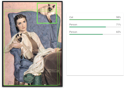
In this Tom Lovell illustration, GCV is very certain that it sees a single cat, and it's relatively certain that it sees a person. No mention of the other cat, the knitting, the blue chair and the white sweater. 

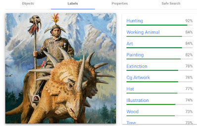
What happens if you give it a fantasy image that doesn't exist in the real world, such as a renegade warrior astride a Styracosaurus with a T.rex-tooth-helmet holding a saber-tooth cat skull on a staff? In this Dinotopia image it recognizes two generalized objects: "a person and an animal."

Clicking on the "labels" tab, you can see that it identifies general qualities of the image with decreasing certainty. It's wrong about hunting and it's wrong about a working animal, but it knows that it's an illustration of an extinct animal.

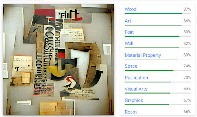
What happens if you input an image that has no analog in the real world because the image was itself generated by a machine-learning algorithm? Can it find something in the DNA of the image that could help it identify the word prompt that generated the image?


This picture was created by (VQGAN+Clip) with the prompt "Constructionist Typography." The properties that it finds are more general than that, but it's in the ballpark.
--
Try Google Cloud Vision yourself and let me know in the comments what you discover.


Monday, July 26, 2021

When Did the Golden Age End?

A friend of mine who teaches art history asked for my view on this question:

"How and when did the "Golden Age of Illustration" end? Did it end, or just shrink? Has there been a revival? Do you have thoughts on this, as an illustrator working with traditional media, in an imaginative realist genre, in the 21st century. How do artists now, relate to a golden age of illustration that supposedly ended? I would prefer to offer a hopeful analysis!"


My answer: A lot of illustrators who lived through the Golden Age years (from 1890-1920) complained that the great era of story illustration ended as the 1920s settled in, as a result of advertising, photographic illustrations, and other distractions such as radio, movies, and later TV. 

But if you look at magazines from the late '40s and early '50s, they were bursting with great illustrations, in creative layouts and strong storytelling. 

The 1940s and 1950s were a time of remarkable creativity under Coby Whitmore, Al Parker, and the other innovators. The '60s, '70s, and '80s was also a creative, productive era for story illustration, especially in paperback covers, movie posters, album covers and National Geographic illustrations: Consider Tom Lovell, Drew Struzan, James Bama, Frank Frazetta, and Mort Drucker. Big corporate accounts were still buying illustrated advertisements and annual reports all through the '70s and 80s.

When I started doing book covers and Nat Geo illustrations in the early 1980s, it sure felt like the Golden Age was still alive in my little corner of the profession. I didn't pay much attention to the famous illustrators that were popular in my time, but instead I oriented to Rockwell, Loomis, and Pyle and built my reality around their ideas. The art directors I was working with were giving me a lot of freedom, and there was a small but loyal fan base.

But there was no doubt that illustration has been far less mainstream for the last half century than it was in the days of Pyle, Wyeth, Rockwell, Leyendecker, and the illustrators of the "slicks." That difference is reflected in the fees illustrators receive. For instance, Charles Gibson was regarded like a movie star. The pay he would receive for a single pen and ink drawing would be equivalent to about $45,000 today.

Wednesday, January 27, 2021

Posing for a Painting Saved a Man's Life

Illustrator Saul Tepper (New York City, 1899-1987) hunted throughout the city for amateur models to pose for his illustrations. One time, as a deadline approached for a painting of a lumberjack, he entered a cafe, where he saw "a man of the proper features, sitting alone."


"Saul approached him," recalled illustrator Mason Combs, "explained the situation and presented his card, telling the potential model to be at the studio at 10:00 the next morning. The man took the card without conversation. The next morning he appeared, posed, and before leaving asked when the illustration would appear."


"A week after the issue hit the newsstands, the man reappeared at the studio. He told Saul that he had been sitting in the cafe, having decided to put the .38 he carried to his head and end it all. He had left his wife and family in his hometown upstate, lost his job, and been on a binge when Saul arrived on the scene."

"Once the Saturday Evening Post illustration came out, everyone in the man's hometown recognized him; his job was offered back; he was reunited with his family; and he became a town celebrity. Yes, Tepper touched many people's lives."


This story is part of a new book on Saul Tepper produced by The Illustrated Press. The book continues the series of monographs on Golden Age masters such as Dean Cornwell and Tom Lovell. The short introductory biographical essay by Dan Zimmer covers Tepper's career and his painting methods, and then the rest of the book is devoted to high quality color reproductions, mostly from the original art.

---

The Art of Saul Tepper hardback, 224 pages, $44.95

Friday, September 20, 2019

Al Parker Book Review


In recent years, the leading midcentury American illustrators, such as Tom Lovell, Coby Whitmore, Harry Anderson, and Albert Dorne are finally being represented with well-illustrated monographs.


Now it's Al Parker's turn. This edition by Auad Publishing showcases the work of one of the chief innovators of American illustration.


Parker pioneered the trend for the designed title spread in the glossy women's magazines.


Rather than compositions that fit neatly in a rectangular shape, these inviting openers combine hand-drawn headlines with an intriguing tagline and an illustration that promises drama.


Parker was always original in his use of posing, his color schemes and his approaches to storytelling.

None other than Norman Rockwell wrote him a fan letter, and said, "While the rest of us are working knee-deep in a groove, (Al Parker is) forever changing and improving."


Most of the book is devoted to visuals, including reproductions of original art, tearsheets, and comparisons between photo reference and final art.


The text includes personal reflections by Parker's son Kit, an article about Parker written by Stephanie Plunkett, thoughts about his artistry by David Apatoff, and a reprint of a 1964 interview.

Al Parker: Illustrator, Innovator is 9 x 12 inches, 208 pages, $44.95
----

Related books:
Albert Dorne: Master Illustrator
Tom Lovell—Illustrator
Coby Whitmore: Artist and Illustrator
The Art of Harry Anderson
The Art of Jon Whitcomb
Henry Patrick Raleigh: The Confident Illustrator
Auad Publishing
Previously:
Al Parker at the Rockwell Museum

Thursday, July 25, 2019

'I Went to the Morgues'

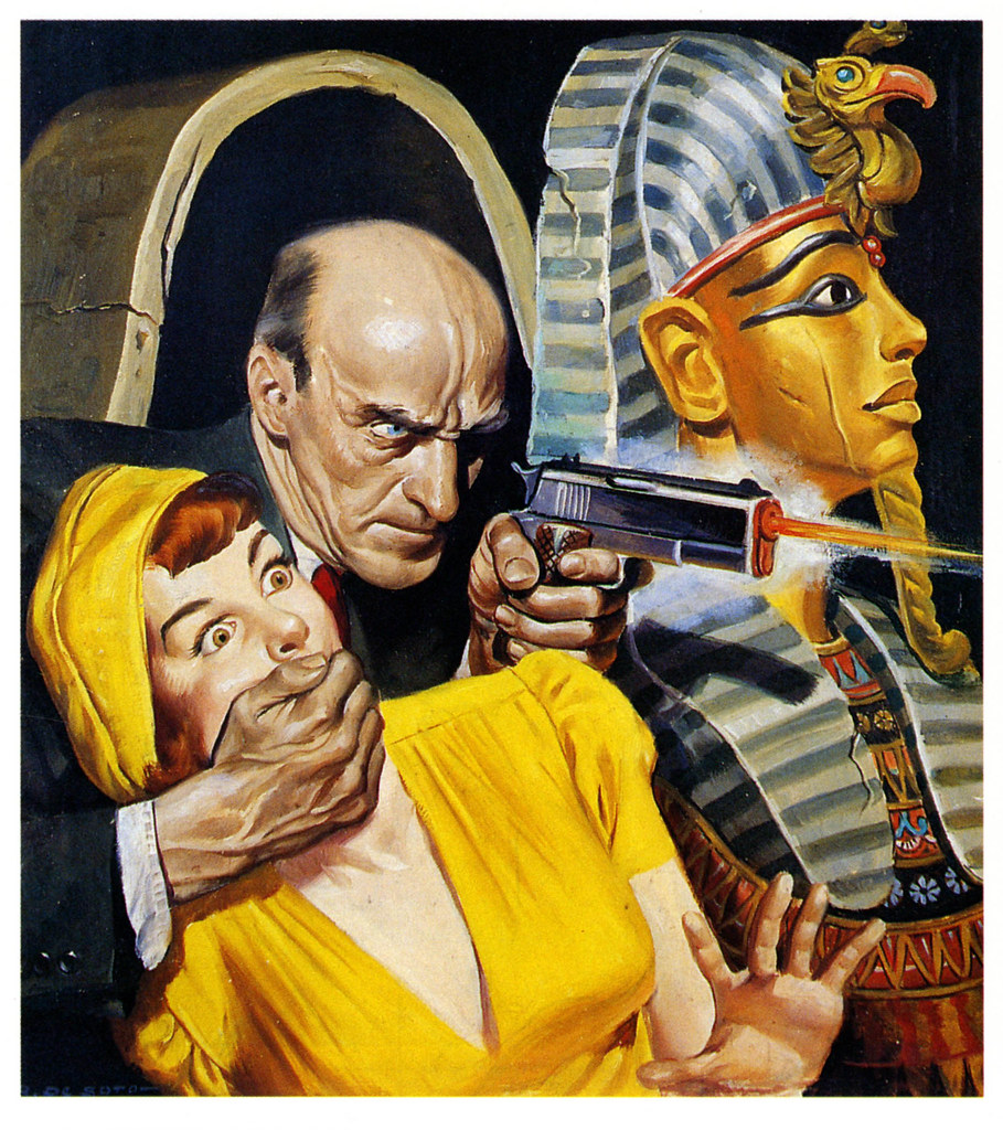
The Illustrated Press has released a new book on Rafael De Soto, who painted colorful scenes of crime and murder for the popular magazines.  


As with other monographs in this series, this one begins with a biography. It tells of his origins in Puerto Rico and his journey to New York to break into the illustration market.


The images are made both from original art and rare tearsheets, and most of the book is devoted to large reproductions of the artwork.

De Soto said: "The experience that I had in the pulps was unbelievable because I had to paint the most gruesome things that anyone can think up to attract the attention of the public." 


"To paint those kinds of covers I needed to do a lot of reference work. I went to the morgues and they pulled out girls' bodies for me to study! I went to the autopsies! This was not in my nature at all, but that's what I painted and that is the kind of stuff people wanted to read about in those days. I am a man of peace, who would rather be painting chapels than making those things."


At one point a friend of his who was a priest visited him. Troubled by the images he was painting, the priest asked De Soto why he didn't paint beautiful things. "Nobody buys my paintings of beautiful things," he answered.


The Art of Rafael De Soto is written by pulp expert David Saunders and published by the Illustrated Press. It's 224 pages, 9x12 inches, hardcover with dust jacket and priced at $44.95
----
Previous books in the series on Coby WhitmoreTom Lovell, and Harry Anderson

Wednesday, June 12, 2019

Joe De Mers, American Illustrator

Joe De Mers (1910-1984) was a style setter in the mid-20th century illustrated magazines.


He painted glamorous women in romantic situations, in a style reminiscent of Coby Whitmore, Tom Lovell, or Harry Anderson

He typically combined abstract areas of flat colors with carefully rendered faces and hands. Large heads in illustrations were an exciting innovation borrowed from the closeup in movies.


He painted often in gouache. Note the crop marks at the corners, the registration marks on the left, and the brown stain of rubber cement around the outside edges. The rubber cement probably held a presentation mat board on the front.


Illustrator Joe De Mers is the featured artist of the new Illustration Magazine #64. In over 38 color illustrations, some full page, the article chronicles his development from Hollywood concept artist to a star in the Charles Cooper Studios in New York, where top illustrators created advertising art for all the leading accounts.
----
"Illustration Art" blog posts: Joe De Mers and the "Big Head" School of Illustration
"Art Contrarion" Joe De Mers: Mainstream 1950s Illustrator

Saturday, April 27, 2019

Lightening Colors with White

Painting by Frank Brangwyn
When you're using opaque paint to create the illusion of lighted objects, you need to lighten colors on the planes that face toward the light. So you just add white to those colors, right?

Well, not so fast. Just adding white to a pure color tends to weaken the chroma and shift the hue toward blue or gray, with an dulling effect on reds and yellows in particular. If you use too much white in the lighted areas without adjusting the mid-tones and shadows, it can lead to a pale, chalky look.

Paul Strisik, in his book The Art of Landscape Painting, said: "Always think twice before using white. It can give your pictures a chalky look. If you want to lighten a color, sometimes try using another color instead of white. If you want your paintings to have brilliance, think in terms of more color, night lighter color."

Tom Lovell said, "color obtains in the light," meaning that we perceive chroma growing in force as it become more brightly illuminated within a scene. Therefore, we don't want to risk weakening it with white without adjusting all the color relationships.

In her book Daily Painting, Carol Marine describes the remedy this way: "If you can't quite get the color light enough without adding white, but white makes it chalky, maybe it doesn't need to be so light! Maybe the values around it simply need to be darker. If you're sure it needs white and it still looks chalky, try adding a little yellow and/or red."

Do you have personal experience with this issue? Did your teacher ever express a similar caution about white? Please share it in the comments.
-----
Books:
Paul Strisik:The Art of Landscape Painting
Carol Marine: Daily Painting: Paint Small and Often To Become a More Creative, Productive, and Successful Artist

Previous blog post: Color Obtains in the Light, with insights from a vision scientist

Monday, November 26, 2018

Lovell's Leatherneck Illustrations

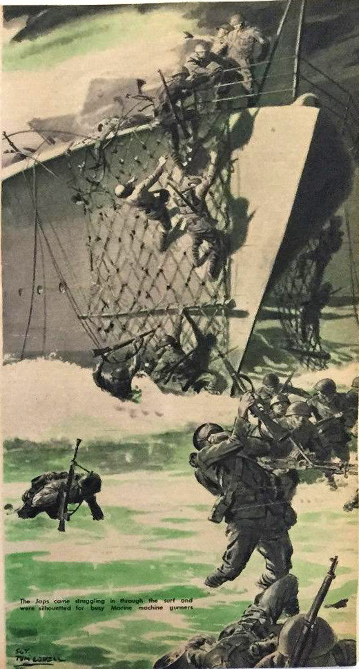
When he was a sergeant in Marines, Tom Lovell was stationed in the barracks in Washington, where he "fought the war at his easel" for the official publication Leatherneck


The technique for these grisaille illustrations was transparent watercolor wash rather than his usual oil paint (which he used for covers). In the picture above, there are a few small touches of gouache, such as in the initials at upper left and the wisps of smoke. 

Due to the low pay and need to produce a lot of pictures, Lovell often had to work without models, and had "to learn to draw from the mirror or do without. It was an ideal way to learn composition."


Lovell said that this technique "reproduced well on the poor stock and depended little on a middle tone; the picture story had to be told with the greatest economy of means and at a small scale. It was a question of boiling down and closing in on the subject."


"You had to learn to make your pictures with the greatest economy of means, to tell your story simply." That served him well later in his professional career as an illustrator for the "slick" popular magazines, for which he used oil paints in full color.  
-----
Quotes: from North Light and Persimmon Hill magazines.
Previous Posts on Tom Lovell
Thanks, Jim Pinkoski

Saturday, November 10, 2018

Adventure Illustrators at the Rockwell

Left: Frank Schoonover (1877–1972) Canadian Trapper
Right: Greg Manchess, Above the Timberline (detail) ©Manchess
Two exhibitions have opened at the Norman Rockwell Museum which highlight illustrators of adventure. One focuses on Frank Schoonover, a Howard Pyle student who painted scenes from history and outdoor life, and the other show features the oil paintings by Greg Manchess for his recent book Above the Timberline
-----
Books: Above the Timberline and Frank Schoonover, Illustrator of the North American Frontier
Speaking of adventure illustrators, the recent Tom Lovell book is going into a second printing if the publisher can get enough subscriptions on Kickstarter.