Sunday, March 9, 2008

Warm Underpainting

Here’s a brief but important post for Color Sunday. If you prime your panels with a tint of venetian red or burnt sienna, you can get a good base for many kinds of paintings.


A warm underpainting is especially helpful for paintings of skies or foliage, or any painting with a blue or green tonality. The little bits of color that inevitably remain between your strokes will make blues or greens sparkle by complementary contrast.

An insistent warm underpainting also can act to force you to cover the background with opaques. This 6 by 4 inch painting of an elephant from the zoo is just partially finished. Normally I would cover the entire red-orange surface with opaque paint.

For plein air painting I use Gamblin oil priming, which I buy in a quart tin, and tint it using using a palette knife on a scrap of palette paper. A drop or two of cobalt drier will get the priming to set up overnight if you’re prepping for a painting trip.

For studio work I will more often prime with gesso tinted with acrylic, as this surface allows for a pencil preliminary drawing.

Saturday, March 8, 2008

The Sinking of the Cumberland

One hundred and forty-six years ago today, an epic naval battle took place in Hampton Roads, Virginia. The central event on that day was the sinking of the USS Cumberland. I had the honor of commemorating the event in a 30 x 40 inch painting commissioned by the National Geographic Society. This is the first time I’ve shared the painting publicly.


In a future post, I’ll describe what went into the painting, which took well over a year to complete. I’ll also share more about the artwork in an illustrated lecture that I’ll be giving this Sunday, March 9 at the Allentown Art Museum in Pennsylvania, as well as on Thursday, March 13 at the Mariner’s Museum in Newport News, Virginia. The Mariner’s Museum currently has the original painting on exhibition.

“Give them a broadside, boys, as she goes!”

The USS Cumberland went down at 3:37 p.m. on March 8, 1862, the victim of the Virginia’s (also known as the Merrimac’s) 1500 pound iron ram and a relentless barrage that covered the deck with carnage. Lieutenant George U. Morris gave the command for all hands to save themselves, but he remained on deck to encourage the decimated pivot gun crew, who took a final shot even as the waves closed around them.

To Buchanan’s request for surrender, he defiantly replied, “Never! We will sink with our colors flying.” The destruction of the Cumberland was a decisive but short-lived victory for the Confederate Navy. The Virginia, which sustained only superficial damage, survived to challenge the Monitor the following day.
-----
Read the full series:

Sinking of the Cumberland, Part 1A: The Backstory
Sinking of the Cumberland, Part 1B: The Research
Sinking of the Cumberland, Part 2: Choosing the Scene
Sinking of the Cumberland, Part 3: Acting it Out
Sinking of the Cumberland, Part 4: Final Art


Mark O'Connor

I'm in Boston today with my wife Jeanette, and we'll be heading to Pennsylvania tonight.

On Thursday we enjoyed the music of the great violinist Mark O'Connor. Here's a sketch in watercolor that I did from the second row of his performance/lecture, arranged by the Harvard College American Music Association. I used a couple of hollow-handled brush pens and a very tiny watercolor set all balanced discreetly, but dangerously, in my lap.


I made this sketch yesterday during Mark's improvisation workshop, which our son attended with his accordion. I'm using watercolor again in the Moleskine drawing book. This paper has a heavy weight and a smooth texture, but it's really not made for watercolor, so the washes tended to bead up at first.

More on Mark O'Connor, Link.
Dan Gurney, Link
Moleskine sketchbook blog, Link.

Friday, March 7, 2008

Microraptor

NOVA recently aired a documentary about the flying dinosaur called Microraptor gui, which was discovered a few years ago in Liaoning, China.


I love this little four-winged wonder, and featured it in Dinotopia: Journey to Chandara. Here is Microraptor flying over the rooftops of Chandara, with its front wings up and its back “wings” or legs down.


Whether this creature was capable of flapping, and what position it held its arms and legs in flight are the subjects of lively debate among both scientists and artists.

What I’d like to show you here is a practical tip for making a quick reference maquette for a creature like this so that you can get the perspective right. I call it a “2D to 3D maquette.” This method would also work for insects, birds, and fish.

To begin with, I found the science article by the Chinese paleontologist Xu Xing, and printed out the dorsal view of the creature, with its arms and legs splayed out flat. The printout was on card stock.

Then I hot-glued some thin aluminum armature wire underneath the paper cutout. I tried to place the wire where the bones go. I then beefed up the volume of the head and chest with plasticene, or modeling clay.


I now had a fully poseable maquette in 3D, which allowed me to experiment with different wing positions. I placed a light source to see how the big planes would look in light and shadow.


This is the work of only an hour or two, but it helped me choose the angle and pose, and it gave me crucial information about the foreshortening of the wing shapes, the cast shadow on his left wing, and the appearance of the tail.

NOVA video on its website, Link.
New Scientist Article, Link.
Wikipedia article on Microraptor, Link.
Thanks, Mike Sheehan.

Tomorrow: The Sinking of the Cumberland

Thursday, March 6, 2008

Costumed Model

Howard Pyle once said that painting a nude model is like painting a plucked bird.

As illustrators, comic artists, and animators, we’re most often called upon to portray the clothed figure. Why then don’t we spend more time in the studio drawing the figure fully feathered?

Below is a very hasty 20-minute oil sketch. It’s nothing to crow about, but I relished the chance to try something different.


Granted, there are plenty of good reasons to study the nude figure. It’s a good way to learn principles of light and shade on form. It’s essential to understand the structure of the human figure beneath the garment. And the nude is the Everest for artists, given its expressive potential and interpretive subtlety.

But there’s an anatomy of costume, too. Fabric follows different principles from bone and skin. How many art schools or ateliers teach about velvet vs. satin, halflock vs. spiral folds, and dolman vs. set-in sleeves?

Tomorrow: Microraptor Maquette

Wednesday, March 5, 2008

Your Khalian Sketches


Last Wednesday I introduced the “Art by Committee” sketchbook, where I take excerpts from an actual science fiction manuscripts, and then illustrate them with the help a coffee-shop committee of artist friends.

I then invited you to join in. The results follow, with the one from the official A.B.C. book the very end, along with another new challenge.
Kevin Hedgepeth

Guillaume Decaux

Dan Root

Jon Hrubesch

Robert Sloan
Jen Zeller


Michael Dambold

Pat Dizon
Erik Bongers


Rick Carlsen

Rob Hummer
Sarah
Tidah Adipat
Weston Gaylord

…and the Committee: Jeanette Gurney, James Warhola, and me.

Thanks so much to all of you for contributing. Shall we try this once more? Here’s a new line:

“I never understood why you were with him in the first place.”

If you'd like to email me your sketch at jgurneyart@yahoo.com, I'll post those results next Wednesday.

Tomorrow: Costumed Model

Tuesday, March 4, 2008

Perspective Ink Drawing

You may recall the work of Atkinson Grimshaw, the Victorian moonlight specialist.

A typical finished Grimshaw dockside scene combines mysterious and atmospheric distances with the delicate tracery of rigging and other fine details.

What procedure did he follow to work out the perspective?


Fortunately there are a few unfinished Grimshaws which show his method. This one has a thin layer of brownish oil color scrubbed over the entire surface to establish the overall tonality and mood, but he has not yet moved on to the finished opaque rendering.


Here’s a detail of the same canvas. Grimshaw’s crisp preliminary line drawing shows right through the thin paint. I haven’t seen the original, but most likely the drawing was accomplished in India ink.


Grimshaw, like Bouguereau, Gerome, and many others in his day, preferred to have the foundational perspective work carefully completed in ink on the canvas before going on to the final painting. The drawing would eventually disappear under later opaque layers.

Gerome also used a perspective ink drawing on the canvas before he dove into his renderings of complex tilework.

Other painters like Sorolla, Sargent, Duveneck, and Zorn (and, more recently, Richard Estes and Frank McCarthy) took a more improvisatory approach, and “found it in the paint,” drawing loosely at first with the brush. Both methods are completely valid.

More about Atkinson Grimshaw at ARC.org
Previous posts on the color of moonlight, Link; on perspective grids, Link; and on a Dinotopia preliminary line drawing, Link.

Tomorrow: Your Khalian Sketches (Deadline noon today)

Monday, March 3, 2008

Backs of Heads

I sketch a lot when I’m sitting in an audience. As a result, I end up sketching the backs of a lot of heads. It’s not the angle you would usually pick for a portrait.


But that’s OK with me because I’m fascinated with the challenge of trying to capture a personality from that angle.

Tomorrow: Perspective Ink Drawing

Sunday, March 2, 2008

Color Gradations

Like a glissando in music, a color gradation moves smoothly from one note to another. Gradations can be very beautiful in purely abstract terms. They take you from one hue to another, or from a light color to a dark color, or from a dull color to a saturated one. Let’s have a look at some examples.

This gradation goes from a dark desaturated blue to a pale desaturated yellow. So it shifts in hue and value, but not very much in saturation.


This one is fairly similar, but it moves from a neutral (or grayed down) dark to a warm light tone, passing through a slightly more saturated oranges in the middle of its range.


Here are three gradated strips of color. The top one changes primarily in hue as it goes quickly away from a dull red-orange and gradually arrives at a saturated blue, without changing very much in value. The middle one shifts darker in value, and the third one moves in and around related pinks and oranges before arriving at a paler pink.


Now that you’ve seen some gradations out of context, let’s see where they came from. The first color strip comes from the right side of this painting by Caspar David Friedrich. Note that the brownish color of the trees also gradates as it moves away from the bright center of light. When two color sets move together, I call it a "parallel gradation."


The second color gradation appears in the sky of this painting by Maxfield Parrish. The stone wall also gradates very slightly from warmer at the top to cooler at the base.

The group of three strips are all taken from a single Gerome painting of Arab horsemen. This painting is full of gradations, many more than I’ve shown. It owes much of its luminosity to the skillful use of changing color.


John Ruskin observed in Modern Painters (1843) that a gradated color has the same relationship to a flat color as a curved line has to a straight one. He noted that a painting of Turner—and that nature herself—contains movement or gradation of color both on the large and the small scale:

“I wish to insist…that nature will not have one line nor color, nor one portion nor atom of space without a change in it. There is not one of her shadows, tints, or lines that is not in a state of perpetual variation.”

Gradations don’t just happen. They take planning. In some future post we’ll explore some techniques for painting gradations and look at ways to use them in composition.

More from the Art Renewal Center database on Friedrich, Parrish, and Gerome.

Tomorrow: Backs of Heads

Saturday, March 1, 2008

Matania: Without a Net

Fortunino Matania (1881-1963) was a historical illustrator and war correspondent who worked for the British magazine Sphere and other publications.

He had a wide range of interests, and his command of historical detail was unrivaled. He could render costumes, weapons, architecture, and furnishings with authority and assurance. He was equally at home in ancient Rome, in the Italian Renaissance, or in the world of the Aztecs. But his specialty was World War 1.
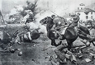

His instincts for composition and staging came from years of studying the old masters, yet for the most part he managed to avoid conventional compositions or formulaic poses in favor of a relaxed truthfulness to nature and a vivid sense of action.

But his gifts went beyond the pedantic accuracy of documentary detail. He brought a sympathetic heart to his characters; nowhere is this more evident than the unforgettable painting of a World War I soldier lingering behind on a battle-scarred road to comfort his dying horse.


Matania’s ability to paint realistic tableaus from the pages of history would be impressive enough had he approached his craft in the normal way¬—that is, by producing dozens of preliminary studies, gathering actual props, sketching on location, and posing models.

He was fully capable of this kind of comprehensive method, but he more typically worked under tight deadlines, dispensing altogether with preliminaries, and laid down a final rendering on a white surface, guided by a vision fully formed in his head.


This would have been hard to believe were it not for eyewitnesses like Percy Bradshaw, who watched him paint a complex scene of a [] cavalry soldier breaching a [Belgian] barricade. He started with a blank board with no sketches, and just started rendering. This is like tightrope walking without a net.

Here’s the finished picture. Bradshaw documented the process photographically in stages and published it in a portfolio that stunned Matania’s contemporaries.


Thanks to the work of Stuart Williams and Geoff Gehman, an art book on Matania is in the works from FHD Publishing's Book Palace imprint—with much higher quality reproductions than I’ve shown here. They've pushed back the pub date because they keep finding great new works. It will be worth the wait.

Detailed bio and collection of color illustrations, Link.
More from Book Palace, Link.

Other GurneyJourney posts
Matania at Work
Matania on Mary Ann Talbot (we own these originals)
Matania's Models and Props