


Wednesday, June 10, 2009
Tuesday, June 9, 2009
Genesis by R. Crumb
R. Crumb, the comic artist who brought us Fritz the Cat and Mr. Natural, has chosen an unexpected subject for his latest project: the book of Genesis.

The current issue of New Yorker includes a long excerpt. The 200-page book will come with a warning label “Adult supervision recommended for minors.” Crumb, who was raised Catholic, was fascinated by the raw power of the imagery. He started with the idea of doing a satire, and instead decided to present it straight, verse by verse.
In a recent interview with TIME’s Robert Hughes, he said,
Interview in Time, link.

The current issue of New Yorker includes a long excerpt. The 200-page book will come with a warning label “Adult supervision recommended for minors.” Crumb, who was raised Catholic, was fascinated by the raw power of the imagery. He started with the idea of doing a satire, and instead decided to present it straight, verse by verse.
In a recent interview with TIME’s Robert Hughes, he said,
“My problem was, how am I going to draw God? Should I just draw him as a light in the sky that has dialogue balloons coming out from it? Then I had this dream. God came to me in this dream, only for a split second, but I saw very clearly what he looked like. And I thought, ok, there it is, I've got God."
HUGHES: "And what did she look like?"
CRUMB: "I went through that whole thing too; maybe I'll draw God as a black woman. But if you actually read the Old Testament he's just an old, cranky Jewish patriarch. It's a lot of fun doing Genesis, actually. It's very visual. It's lurid. Full of all kinds of crazy, weird things that will really surprise people."
Interview in Time, link.
Monday, June 8, 2009
Transparency of Foliage
Foliage in trees has different degrees of transparency.

When the leaves emerge in the spring, you can easily see the sky through the tree. The leaves make a whisper-thin veil that has to be painted very delicately.
 Some trees, like the one on the left, cover the sky more completely, with fewer skyholes. (Asher B. Durand)
 The tree on the right is an oak, and it happens to be very opaque. As the foliage becomes more opaque, you can begin to see the form of the tree in terms of a light side and a shadow side. The maple on the left is more transparent. The foliage was drybrushed over the sky to suggest the delicacy of the leaves.
 Look for a variety of degrees of transparency within a single picture, for beauty almost always accompanies variety. Claude Lorrain almost always had one tree that was very transparent adjacent to another that was more opaque.

When the leaves emerge in the spring, you can easily see the sky through the tree. The leaves make a whisper-thin veil that has to be painted very delicately.
 Some trees, like the one on the left, cover the sky more completely, with fewer skyholes. (Asher B. Durand)
 The tree on the right is an oak, and it happens to be very opaque. As the foliage becomes more opaque, you can begin to see the form of the tree in terms of a light side and a shadow side. The maple on the left is more transparent. The foliage was drybrushed over the sky to suggest the delicacy of the leaves.
  Look for a variety of degrees of transparency within a single picture, for beauty almost always accompanies variety. Claude Lorrain almost always had one tree that was very transparent adjacent to another that was more opaque.
Sunday, June 7, 2009
Style
Thanks for all the fascinating and helpful comments in yesterday's post about the subject of teachers drawing on top of student work.
To follow up and finish, here's a twelve panel cartoon called "Style," by A. B. Frost, published in Scribners in 1891. Note that the young artist asks the older artist to rework his piece, so he has only himself to blame for the calamatous result. (Click to enlarge.)


To follow up and finish, here's a twelve panel cartoon called "Style," by A. B. Frost, published in Scribners in 1891. Note that the young artist asks the older artist to rework his piece, so he has only himself to blame for the calamatous result. (Click to enlarge.)


Saturday, June 6, 2009
Teachers Reworking

Artist Clark Hulings recalls how the art teacher George Bridgman at the Art Student's League insisted on erasing student work and redrawing over it.
How do you feel about art teachers who draw on your work? Students are paying teachers for their expertise, and it’s a privilege to own an example of a master’s hand, right?
But it’s also can feel like an act of vandalism. It can be infuriating if the teacher doesn't respect or understand what you were trying to accomplish. Should teachers ask permission? Should they do their drawing on the blank paper off to the side? If you have an opinion or a story, please share it.
-------
More about Clark Hulings at clarkhulings.com.
Thanks, Alex!
Friday, June 5, 2009
Dan’s Squeezebox
My son Dan plays Irish accordion. Which is funny, because Jeanette and I aren’t Irish, and we’re not musicians either.
 Dan figured out how to play the squeezebox on his own, starting when we gave him a toy accordion at age four. He played it and played it until it broke. He listened over and over to a CD called “The Big Squeeze” while reading Hardy Boys books.
So we did what every sensible parent should do…we kept him up late in pubs.
 At age seven he got to meet some Irish squeezebox heroes—Father Charlie Coen, Billy McComiskey, and John Whelan. They became musical mentors and set him on the right path. He bought a real accordion with his lawn mowing money. I did this life portrait of him when he was 11. Since then he won the North American Irish accordion championship six times.
 Now he’s twice that age, 22 years old. Yesterday he graduated from Harvard College with a concentration in music.
 The commencement ceremony was full of pomp and pageantry. It was funny to see all the alumni, with their bow ties and panama hats.
What’s next for Dan? Well, he collects accordion jokes. One of his favorites is: “What’s the definition of an optimist?” “An accordion player with a business card.”
This summer he will travel throughout Europe as a writer-reporter for the Let’s Go travel guide book company. He did this the previous two summers in Thailand and Greece.
For the remainder of 2009-2010 he’ll be on a fellowship in Ireland, where he’ll learn more about the music tradition from the legendary players there. He is grateful to the Shaw and Payne Foundations for providing the fellowship opportunities.
Within the last month he has played for the president of Ireland and for the passersby on the sidewalks of Cambridge (for which he needed a busker’s license.) Congratulations, Dan, and may you always bring the gift of music to confirm the joys and to lighten the sorrows of all sorts of people.
-----
Dan's new travel blog "Have Accordion Will Travel" link.
Dan's website: dangurney.net.
Hear him playing at his MySpace music page.
His band is called "The Hay Brigade," and they were interviewed on PRI's The World.
Listen to the Hay Brigade at their MySpace page.
Read his amazing travel blog posts about the Monk from Sukhothai. and The Hotel of the One-Eyed Cats
 Dan figured out how to play the squeezebox on his own, starting when we gave him a toy accordion at age four. He played it and played it until it broke. He listened over and over to a CD called “The Big Squeeze” while reading Hardy Boys books.
 So we did what every sensible parent should do…we kept him up late in pubs.
 At age seven he got to meet some Irish squeezebox heroes—Father Charlie Coen, Billy McComiskey, and John Whelan. They became musical mentors and set him on the right path. He bought a real accordion with his lawn mowing money. I did this life portrait of him when he was 11. Since then he won the North American Irish accordion championship six times.
 Now he’s twice that age, 22 years old. Yesterday he graduated from Harvard College with a concentration in music.
  The commencement ceremony was full of pomp and pageantry. It was funny to see all the alumni, with their bow ties and panama hats.
 What’s next for Dan? Well, he collects accordion jokes. One of his favorites is: “What’s the definition of an optimist?” “An accordion player with a business card.”
This summer he will travel throughout Europe as a writer-reporter for the Let’s Go travel guide book company. He did this the previous two summers in Thailand and Greece.
For the remainder of 2009-2010 he’ll be on a fellowship in Ireland, where he’ll learn more about the music tradition from the legendary players there. He is grateful to the Shaw and Payne Foundations for providing the fellowship opportunities.
Within the last month he has played for the president of Ireland and for the passersby on the sidewalks of Cambridge (for which he needed a busker’s license.) Congratulations, Dan, and may you always bring the gift of music to confirm the joys and to lighten the sorrows of all sorts of people.
-----
Dan's new travel blog "Have Accordion Will Travel" link.
Dan's website: dangurney.net.
Hear him playing at his MySpace music page.
His band is called "The Hay Brigade," and they were interviewed on PRI's The World.
Listen to the Hay Brigade at their MySpace page.
Read his amazing travel blog posts about the Monk from Sukhothai. and The Hotel of the One-Eyed Cats
Thursday, June 4, 2009
Lawrence Summers
Lawrence Summers is the former president of Harvard University and Secretary of the Treasury under President Clinton. He is currently the Director of the National Economic Council for President Obama.

I sketched him yesterday in his home in Brookline, Massachusetts. If you’re wondering why I’m here in Massachusetts, stay tuned until tomorrow…I’ll explain.
This is a tiny Woodnotes pocket sketchbook, only 3.5 x 4.5 inches, with a Derwent Inktense watercolor pencil and a fountain pen, softened up with a water brush.
 Above, photo by Kerry Anne Bradford
-----
Wiki on Summers, link.
Wednesday, June 3, 2009
Ancient Pixel Knowledge
Take a photo of a face and break down to about 30 pixels across, and you’ve got a low-res deconstruction in the manner of Chuck Close.
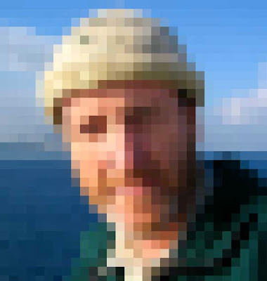
It seems like a very modern notion until you see how the Romans did the same thing a couple thousand years ago.
 The mosaic artists in Tunisia created these faces according to the same kind of reductive thinking. They were mostly itinerant artists, carrying a huge batch of tile colors.
 They would cover a whole floor with scenes of mermaids and animals and gods, working pixel by pixel.
It seems like a very modern notion until you see how the Romans did the same thing a couple thousand years ago.
Tuesday, June 2, 2009
Catcher in the Rye Cover
The reclusive author J.D. Salinger is in the news today. He's suing to block the publication of an unauthorized sequel to his 1951 novel The Catcher in the Rye.
 Many of us remember the novel from its plain red cover (right). But its first paperback edition went through 27 printings with a cover by James Avati. Salinger was against showing Holden Caulfield on the cover of the book.
After some tense meetings, Avati won over the editors, arguing:
Which cover do you prefer? Please vote in the poll. (Added later: The plain red cover won 87 percent of the voting with 178 votes, compared with 25 votes for the Avati cover.)
More about the Salinger lawsuit, link.
Quote from "The Paperback Art of James Avati" by Piet Schreuders, link.
 Many of us remember the novel from its plain red cover (right). But its first paperback edition went through 27 printings with a cover by James Avati. Salinger was against showing Holden Caulfield on the cover of the book.
After some tense meetings, Avati won over the editors, arguing:
"Mr. Salinger felt that since he had not described Holden in physical detail his face sould not appear on the cover. We always had that problem. It is, in fact, quite frequently the core of our cover thinking, to the extent that it is the resolution of personality as expressed by some graphic device that makes up the cover. We try to find a way of conveying the mood of the book rather than describing some particular scene. Within reasonable limits it has proved true that physical characteristics are of much less importance than reactions expressed."
Which cover do you prefer? Please vote in the poll. (Added later: The plain red cover won 87 percent of the voting with 178 votes, compared with 25 votes for the Avati cover.)
More about the Salinger lawsuit, link.
Quote from "The Paperback Art of James Avati" by Piet Schreuders, link.
Monday, June 1, 2009
The Düsseldorf School
The Düsseldorf School of painting had a big influence on 19th century landscape painting from the 1830s through the 1860s.
 The school was notable for its dramatically lit historical subjects, often featuring scenes like shipwrecks, noble peasants, or epic mountainscapes.
 The artists associated with the school include Wilhelm von Schadow, Karl Friedrich Lessing, the brothers Andreas and Oswald Achenbach, and Hans Fredrik Gude. Johann Wilhelm Schirmer is shown above. Some of them had experience painting theatrical backdrops, and they took some of those sensibilities into their easel paintings. Some of those pictorial features include:
Realistic and detailed treatment of form.
Strongest accents and focal point in middle ground.
Dark framing masses at the sides of the compositions.
Stormy skies and dramatic lighting.
Road or trail leading into the picture.
Filmy or atmospheric distances.
Literary references in genre scenes.
 Americans who studied there included George Caleb Bingham, Eastman Johnson, Worthington Whittredge, William Stanley Haseltine, James McDougal Hart, and William Morris Hunt, and Emanuel Leutze, who painted "Washington Crossing the Delaware" in Germany using American Dusseldorf students as models.
Although he wasn’t formally enrolled at the academy, Albert Bierstadt worked and studied among the community of artists, and became probably the best exponent of the style. The Russian painter Ivan Shishkin also spent time there soaking up the landscape vocabulary.
 Above: Oswald Achenbach, "The Bay of Naples."
The goal of the Dusseldorf artists was to infuse the landscape with “stimmung” (mood). Their romantic sensibilities were tied to “Volkskarakter” or national character. According to Henk Van Os,
------
Quote from Russian Landscape, National Gallery exhibition, link.
 The school was notable for its dramatically lit historical subjects, often featuring scenes like shipwrecks, noble peasants, or epic mountainscapes.
 The artists associated with the school include Wilhelm von Schadow, Karl Friedrich Lessing, the brothers Andreas and Oswald Achenbach, and Hans Fredrik Gude. Johann Wilhelm Schirmer is shown above. Some of them had experience painting theatrical backdrops, and they took some of those sensibilities into their easel paintings. Some of those pictorial features include:
Realistic and detailed treatment of form.
Strongest accents and focal point in middle ground.
Dark framing masses at the sides of the compositions.
Stormy skies and dramatic lighting.
Road or trail leading into the picture.
Filmy or atmospheric distances.
Literary references in genre scenes.
 Americans who studied there included George Caleb Bingham, Eastman Johnson, Worthington Whittredge, William Stanley Haseltine, James McDougal Hart, and William Morris Hunt, and Emanuel Leutze, who painted "Washington Crossing the Delaware" in Germany using American Dusseldorf students as models.
Although he wasn’t formally enrolled at the academy, Albert Bierstadt worked and studied among the community of artists, and became probably the best exponent of the style. The Russian painter Ivan Shishkin also spent time there soaking up the landscape vocabulary.
 Above: Oswald Achenbach, "The Bay of Naples."
The goal of the Dusseldorf artists was to infuse the landscape with “stimmung” (mood). Their romantic sensibilities were tied to “Volkskarakter” or national character. According to Henk Van Os,
“The idea is that the soul of a people is expressed through its countryside, its landscape; painters make this soul visible. This was to become the cornerstone of realistic landscape in the second half of the nineteenth century.”
------
Quote from Russian Landscape, National Gallery exhibition, link.
Subscribe to:
Comments (Atom)