


Sunday, September 27, 2009
Storybox
Don't think outside the box. Think INSIDE the box.
----------
This spoof of movie trailers brings Video Week to a close. I hope you enjoyed these little commercials. Tomorrow we return to regular programming.


Saturday, September 26, 2009
Special Delivery
Yesterday morning our shipment of Imaginative Realism arrived, and we packaged up all the orders so far. Here's a look behind the scenes at our high-tech operation.
Amazon says they won't ship until October 20, so it's not too late for you U.S. customers to switch your order to the Dinotopia Store. Where else can you get a signed book, plus service from a parakeet and a puppet, and our unique C.R.U.D. service (Custom Rural Unicycle Delivery)?

Tomorrow: Don't miss the last installment of Video Week.
Friday, September 25, 2009
Thursday, September 24, 2009
Wednesday, September 23, 2009
Tuesday, September 22, 2009
Monday, September 21, 2009
Sunday, September 20, 2009
Eye Tracking and Composition, Part 3
(Note: This is the third and final part of a series of posts adapted from Imaginative Realism, Andrews McMeel, October, 2009). Please follow these links to the earlier posts, Part 1 and Part 2.)
By adding together the eye movement data from a group of test subjects, we can learn where most people look in a given picture.
To create the image below, the eye-tracking technology recorded the scanpath data of sixteen different subjects and compiled the information into composite images, called heatmaps. The red and orange colors show where 80-100% of the subjects halted their gaze. The bluer or darker areas show where hardly anyone looked.
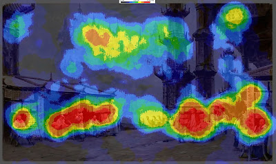 Here’s the heatmap for the painting Marketplace of Ideas, which we discussed in the last two posts.
It turns out that there was very little interest in either of the main vertical columns. Instead, the red splotches reveal a concentration of interest in the figures. There were secondary interest areas in the far buildings and the sign in the upper right.
The interest in people, especially faces, appears to reflect a hardwired instinct to understand our fellow humans.
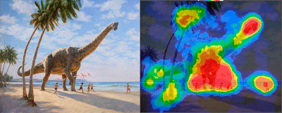 In the heatmap for Chasing Shadows, which shows a group of children running along a beach with a Brachiosaurus, there’s a strong focal point around the dinosaur's front feet and the nearby running children.
There are secondary points of interest at the dinosaur’s head and the leading child. Note how the action of the walking pose was read without directly looking at the rear leg.
Other spots of interest congregate around the dinosaur’s tail, the base and the top of the tree, and the vanishing point along the beach.
Hardly anyone looked directly at the sky, the upper palm fronds, or the middle section of the palm trunk. But these areas were presumably perceived in the halo of peripheral vision around the center point of vision.
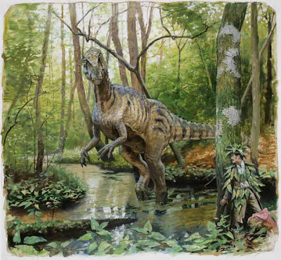 Have a look at this painting, and be aware of where your eyes travel.
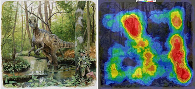
The heatmap for the painting Camouflage (click to enlarge) shows that everyone noticed the dinosaur’s face. They also spotted the hidden man and the small pink dinosaur.
According to statistical data connected to timing, these three faces drew almost everyone’s attention within the first five seconds. The dinosaur's face was statistically the first thing most people looked at, followed quickly by the hiding man. Below is one subject's scanpath, with the black numbers counting off seconds.
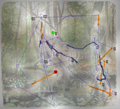 I was surprised that the two patches of lichen on the tree above the man scored near 100% attention. Evidently viewers noticed these strange shapes in their peripheral vision and checked them to make sure they weren’t important, or somehow a threat to the man. From a narrative standpoint, I suppose they were a bit of a red herring, distracting with no payoff.
The sunken log and the detailed patch of leaves in the lower left drew 60% of the viewers, perhaps because those were likely places for other dangers to hide.
Just because an element has sharp detail or strong tonal contrasts, it doesn’t necessarily attract the eye. The dark branches behind the dinosaur’s head drew almost no attention because they fit into the natural schema of a forest scene. Apparently the viewers developed a search strategy based on the threatening situation of a hungry dinosaur looking for a bite to eat.
PRELIMINARY CONCLUSIONS
These experiments force us to question a few of our cherished notions about composition and picture-gazing.
--------------
Related posts on GurneyJourney:
Eyetracking and Composition, part 1
Eyetracking and Composition, part 2
Eyetracking and Composition part 3
Introduction to eyetracking, link.
How perception of faces is coded differently, link.
All the paintings are from Dinotopia: Journey to Chandara.
Many thanks to the team at Eyetools, Inc. for their assistance.
By adding together the eye movement data from a group of test subjects, we can learn where most people look in a given picture.
To create the image below, the eye-tracking technology recorded the scanpath data of sixteen different subjects and compiled the information into composite images, called heatmaps. The red and orange colors show where 80-100% of the subjects halted their gaze. The bluer or darker areas show where hardly anyone looked.
 Here’s the heatmap for the painting Marketplace of Ideas, which we discussed in the last two posts.
 It turns out that there was very little interest in either of the main vertical columns. Instead, the red splotches reveal a concentration of interest in the figures. There were secondary interest areas in the far buildings and the sign in the upper right.
The interest in people, especially faces, appears to reflect a hardwired instinct to understand our fellow humans.
 In the heatmap for Chasing Shadows, which shows a group of children running along a beach with a Brachiosaurus, there’s a strong focal point around the dinosaur's front feet and the nearby running children.
There are secondary points of interest at the dinosaur’s head and the leading child. Note how the action of the walking pose was read without directly looking at the rear leg.
Other spots of interest congregate around the dinosaur’s tail, the base and the top of the tree, and the vanishing point along the beach.
Hardly anyone looked directly at the sky, the upper palm fronds, or the middle section of the palm trunk. But these areas were presumably perceived in the halo of peripheral vision around the center point of vision.
 Have a look at this painting, and be aware of where your eyes travel.
The heatmap for the painting Camouflage (click to enlarge) shows that everyone noticed the dinosaur’s face. They also spotted the hidden man and the small pink dinosaur.
According to statistical data connected to timing, these three faces drew almost everyone’s attention within the first five seconds. The dinosaur's face was statistically the first thing most people looked at, followed quickly by the hiding man. Below is one subject's scanpath, with the black numbers counting off seconds.
 I was surprised that the two patches of lichen on the tree above the man scored near 100% attention. Evidently viewers noticed these strange shapes in their peripheral vision and checked them to make sure they weren’t important, or somehow a threat to the man. From a narrative standpoint, I suppose they were a bit of a red herring, distracting with no payoff.
The sunken log and the detailed patch of leaves in the lower left drew 60% of the viewers, perhaps because those were likely places for other dangers to hide.
Just because an element has sharp detail or strong tonal contrasts, it doesn’t necessarily attract the eye. The dark branches behind the dinosaur’s head drew almost no attention because they fit into the natural schema of a forest scene. Apparently the viewers developed a search strategy based on the threatening situation of a hungry dinosaur looking for a bite to eat.
PRELIMINARY CONCLUSIONS
These experiments force us to question a few of our cherished notions about composition and picture-gazing.
1. The eye does not flow in smooth curves or circles, nor does it follow contours. It leaps from one point of interest to another. Curving lines or other devices may be "felt" in some way peripherally, but the eye doesn't move along them.
2. Placing an element on a golden section grid line doesn’t automatically attract attention. If an attention-getting element such as a face is placed in the scene, it will gather attention wherever you place it.
3. Two people don’t scan the same picture along the same route. But they do behave according to an overall strategy that alternates between establishing context and studying detail.
4. The viewer is not a passive player continuously controlled by a composition. Each person confronts an image actively, driven by a combination of conscious and unconscious impulses, which are influenced, but not determined, by the design of the picture.
5. The unconscious impulses seem to include the establishment of hierarchies of interest based on normal expectations or schema of a scene. For example, highly contrasting patterns of foliage or branches will not directly draw the gaze unless they are perceived as anomalous in the peripheral vision.
5. As pictorial designers we shouldn’t think in abstract terms alone. Abstract design elements do play a role in influencing where viewers look in a picture, but in pictures that include people or animals or a suggestion of a story, the human and narrative elements are what direct our exploration of a picture.
As Dr. Edwards succinctly puts it, “abstract design gets trumped by human stories.” The job of the artist, then, in composing pictures about people is to use abstract tools to reinforce the viewer’s natural desire to seek out a face and a story.
--------------
Related posts on GurneyJourney:
Eyetracking and Composition, part 1
Eyetracking and Composition, part 2
Eyetracking and Composition part 3
Introduction to eyetracking, link.
How perception of faces is coded differently, link.
All the paintings are from Dinotopia: Journey to Chandara.
Many thanks to the team at Eyetools, Inc. for their assistance.
Saturday, September 19, 2009
Eye Tracking and Composition, Part 2
Below is a scanpath image of the artwork that we saw in yesterday’s post. The chart represents the behavior of an individual who, with no prompting, looked at the artwork for a sixteen second period on a computer screen.
The computer recorded a series of circles, indicating where the eye paused momentarily, connected by a thin blue line.
The scanpath reveals that the eye darts unpredictably in straight jagged leaps known as saccades. Saccades occur between three and five times per second, alternating with brief periods of rest called fixations.
 The white glow around each circle represents the subject’s peripheral vision. (The heavier blue shows a running average of the center of attention and the orange line is an attempt by the computer to detect reading behavior. Those lines are not important for the study of artwork.)
The numbered black boxes are time markers, indicating the position of the eye at each passing second. The session begins at the green dot and ends at the red dot, the last point of rest before the image disappeared. By following the blue line second by second, you can precisely reconstruct the viewer’s experience.
The test subject’s eye enters the composition at the top center and zigzags down to the figures at left center. This happens within the first second. In the next three seconds it swoops to the right, leaps upward to glance at the upper right corner, and then moves across the center of the picture in large strokes, pausing briefly to look at the near and far buildings.
For the remaining ten seconds the subject’s gaze slides back and forth in smaller saccades, examining the people in the scene.
According to Greg Edwards, President and CEO of Eyetools, “During the first 3 1/2 seconds, this particular person was getting the lay of the land. How long people take to get this initial overview will depend on each picture. They’re trying to understand the basic structure or the context of the picture.”
 After that, they usually settle into finer eye movements. “If they make a big movement,” he said, “they’re typically searching for context. If they make a smaller movement, they’re looking for detail.”
The second person’s scanpath (above) both resembles and differs from the first one. The eye also makes large orienting moves initially, taking in the far vista and the full array of people below. But this scanpath shifts between large and small movements throughout the session and spends more of the time looking at the distant vista and the surrounding architecture.
It might be hard to make out these diagrams in small Web illustrations. For the sake of clarity, this video roughly reconstructs the sequence of saccades over the same approximate overall duration——though it doesn’t accurately represent the relative duration of each fixation.
Tomorrow we’ll see what we can learn from crunching together data from a lot of different observers, and I'll suggest some preliminary conclusions.
---
Thanks, Greg! Link to Greg Edwards's Eyetools blog. and Eyetools website.
Related posts on GurneyJourney:
Eyetracking and Composition, part 1
Eyetracking and Composition, part 2
Eyetracking and Composition part 3
Introduction to eyetracking, link.
How perception of faces is coded differently, link.
The computer recorded a series of circles, indicating where the eye paused momentarily, connected by a thin blue line.
The scanpath reveals that the eye darts unpredictably in straight jagged leaps known as saccades. Saccades occur between three and five times per second, alternating with brief periods of rest called fixations.
 The white glow around each circle represents the subject’s peripheral vision. (The heavier blue shows a running average of the center of attention and the orange line is an attempt by the computer to detect reading behavior. Those lines are not important for the study of artwork.)
 The numbered black boxes are time markers, indicating the position of the eye at each passing second. The session begins at the green dot and ends at the red dot, the last point of rest before the image disappeared. By following the blue line second by second, you can precisely reconstruct the viewer’s experience.
The test subject’s eye enters the composition at the top center and zigzags down to the figures at left center. This happens within the first second. In the next three seconds it swoops to the right, leaps upward to glance at the upper right corner, and then moves across the center of the picture in large strokes, pausing briefly to look at the near and far buildings.
For the remaining ten seconds the subject’s gaze slides back and forth in smaller saccades, examining the people in the scene.
According to Greg Edwards, President and CEO of Eyetools, “During the first 3 1/2 seconds, this particular person was getting the lay of the land. How long people take to get this initial overview will depend on each picture. They’re trying to understand the basic structure or the context of the picture.”
 After that, they usually settle into finer eye movements. “If they make a big movement,” he said, “they’re typically searching for context. If they make a smaller movement, they’re looking for detail.”
The second person’s scanpath (above) both resembles and differs from the first one. The eye also makes large orienting moves initially, taking in the far vista and the full array of people below. But this scanpath shifts between large and small movements throughout the session and spends more of the time looking at the distant vista and the surrounding architecture.
It might be hard to make out these diagrams in small Web illustrations. For the sake of clarity, this video roughly reconstructs the sequence of saccades over the same approximate overall duration——though it doesn’t accurately represent the relative duration of each fixation.
Tomorrow we’ll see what we can learn from crunching together data from a lot of different observers, and I'll suggest some preliminary conclusions.
---
Thanks, Greg! Link to Greg Edwards's Eyetools blog. and Eyetools website.
Related posts on GurneyJourney:
Eyetracking and Composition, part 1
Eyetracking and Composition, part 2
Eyetracking and Composition part 3
Introduction to eyetracking, link.
How perception of faces is coded differently, link.
Friday, September 18, 2009
Eye Tracking and Composition, Part 1
When a viewer looks at a painting, how does the eye travel? Does it move in a circular pathway? Does it follow contours? Does it go to the grid lines of a golden section? Is it attracted to areas of maximum contrast? Is it possible to design a picture so that it controls the eye?
Eye-tracking scanpath studies show how individual viewers actually explore an image. This information can be valuable for us as artists, because it allows us to test our assumptions about how the design of a picture influences the way people perceive it.
 TRADITIONAL VIEWS
Most books on composition seem fairly sure about how people’s eyes move around in pictures. Henry R. Poore’s influential book Pictorial Composition (1903) presents the notion that the eye moves in a flowing, circular way through a design.
In his book Composing Pictures (1970), Donald W. Graham argues that the artist “must find graphic controls so strong that they will force most of his audience to see the elements of his picture in the order he has planned.”
 I was curious to find out whether these claims had any basis in fact, and I really wanted to try a study using my own artwork. So I approached Greg Edwards, president and CEO of Eyetools, Inc. (Left to right: Larry Kresek of RMCAD, Greg Edwards, and me).
Scientists at Eyetools use the latest technology to record how a viewer’s gaze actually travels over a picture. Sensitive instruments track the pathway of the center of vision, or fovea. The eye movements are input into a computer, which then outputs a map called a scanpath, superimposed over the image itself.
 Here's the first painting we'll take a look at: Marketplace of Ideas, from my recent book called Dinotopia: Journey to Chandara. The painting is approximately 12 by 18 inches, roughly a golden rectangle. When I designed the painting, I placed the main vertical column near one of the key grid lines of the golden section. I was curious to see if the placement of that column drew any particular attention.
Tomorrow we’ll see what happens when we try this image with a series of test subjects.
-------
(Note: This material is adapted from Imaginative Realism: How to Paint What Doesn’t Exist, published by Andrews McMeel, ©James Gurney 2009.)
Related posts on GurneyJourney:
Eyetracking and Composition, part 1
Eyetracking and Composition, part 2
Eyetracking and Composition part 3
Introduction to eyetracking, link.
How perception of faces is coded differently, link.
Eye-tracking scanpath studies show how individual viewers actually explore an image. This information can be valuable for us as artists, because it allows us to test our assumptions about how the design of a picture influences the way people perceive it.
 TRADITIONAL VIEWS
Most books on composition seem fairly sure about how people’s eyes move around in pictures. Henry R. Poore’s influential book Pictorial Composition (1903) presents the notion that the eye moves in a flowing, circular way through a design.
“One’s vision involuntarily makes a circuit of the items presented,” Poore claims, “starting at the most interesting and widening its review toward the circumference, as ring follows ring when a stone is thrown into water.”
In his book Composing Pictures (1970), Donald W. Graham argues that the artist “must find graphic controls so strong that they will force most of his audience to see the elements of his picture in the order he has planned.”
 I was curious to find out whether these claims had any basis in fact, and I really wanted to try a study using my own artwork. So I approached Greg Edwards, president and CEO of Eyetools, Inc. (Left to right: Larry Kresek of RMCAD, Greg Edwards, and me).
 Scientists at Eyetools use the latest technology to record how a viewer’s gaze actually travels over a picture. Sensitive instruments track the pathway of the center of vision, or fovea. The eye movements are input into a computer, which then outputs a map called a scanpath, superimposed over the image itself.
 Here's the first painting we'll take a look at: Marketplace of Ideas, from my recent book called Dinotopia: Journey to Chandara. The painting is approximately 12 by 18 inches, roughly a golden rectangle. When I designed the painting, I placed the main vertical column near one of the key grid lines of the golden section. I was curious to see if the placement of that column drew any particular attention.
Tomorrow we’ll see what happens when we try this image with a series of test subjects.
-------
(Note: This material is adapted from Imaginative Realism: How to Paint What Doesn’t Exist, published by Andrews McMeel, ©James Gurney 2009.)
Related posts on GurneyJourney:
Eyetracking and Composition, part 1
Eyetracking and Composition, part 2
Eyetracking and Composition part 3
Introduction to eyetracking, link.
How perception of faces is coded differently, link.
Subscribe to:
Posts (Atom)