Tuesday, December 24, 2019

Abbey's Studies for the Coronation

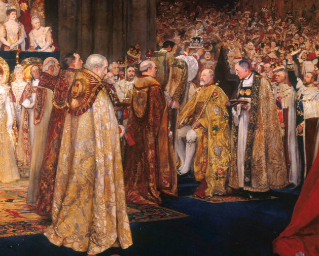
In 1901, American expatriate Edwin Austin Abbey (1852-1911) received a commission to paint the coronation of King Edward VII at Westminster Hall.

Edwin Austin Abbey,  The Coronation of King Edward VII (1841-1910) c. 1902-7
Oil on canvas | 275.0 x 458.0 cm (support, canvas/panel/str external)
John S. Sargent was offered the job but felt unequal to the task and declined, so the commission passed to his friend EA Abbey.

Edwin Austin Abbey: The Coronation of Edward VII,
study of Queen Alexandra's Dress, c.1902.
Abbey did a wealth of studies for the commission, including oil studies of Queen Alexandra's dress....

Study of Westminster Abbey and the Coronation Chair,
for The Coronation of King Edward VII
...and studies inside Westminster Abbey to understand the light and color of the space where the event took place.


According to the Royal Collections Trust:
"During preparations and rehearsals in Westminster Abbey the artist had been able to prepare sketches and fill in positions of the main participants of the ceremony. Later he reported: ‘it was fortunate I had been able to sketch at the rehearsals or I should have been in a great muddle’. However, due to the King’s ill-health the coronation had to be postponed and was re-scheduled for 9 August 1902. The artist’s viewpoint was a specially built box in the tomb of Edmund Lancaster in the north transept. Unfortunately, it was a dull day and Westminster Abbey appeared more than usually gloomy and dark."

Detail of E.A. Abbey's  Coronation of King Edward VII
"But despite this Abbey was profoundly impressed with what he saw: ‘It was a sight indeed. They had white satin dresses and long trains of crimson velvet and ermine capes – trains and their coronets in hands. They came by twos or threes and dozens, and were marvellous to behold. I never saw so many jewels in my life.’"
-----
Read more online at the Royal Collections Trust


Monday, December 23, 2019

Painting in the Alaskan Wilderness Residency Program


The Alaskan artist residency program is looking for new candidates. Here's a word from the director, Barbara Lydon:

"Greetings! We’re pleased to announce that the Voices of the Wilderness Alaskan artist residency program will be offering twelve unique opportunities sponsored by the US Forest Service, US Fish & Wildlife Service, and National Park Service in the summer of 2020. Each residency differs by geographic location, modes of travel, length of time and stewardship projects. Participating hosts span the state--from the Tongass National Forest in southeast Alaska to Prince William Sound in central Alaska to the Arctic National Wildlife Refuge in the far north. Artists may kayak, motorboat, fly or hike while camping in remote areas, all the while partnered with a wilderness professional and engaged in projects that assist with resource management. Truly a once-in-a-lifetime opportunity for twelve lucky artists (and maybe more, as some hosting areas may select more than one artist)."

"The deadline to apply is March 1, 2020. Feel free to contact me with any questions at barbara.lydon@usda.gov, and also check out our website "

Sunday, December 22, 2019

Overcoming a Discouraging Start


Mark asks: "How do you fix a painting that looks discouragingly bad halfway through?"

Sometimes a painting doesn’t come together right away. Even though I know I’m following the right steps, it starts looking pretty awful, and doubts set in. When that happens I try to push the painting through the “ugly stage” by sheer willpower. I usually trust the process, but if I feel I might be heading down the wrong path, I re-examine my goal and my strategy. Here are some tips that can bring me through the rough stages:
1. Concentrate on one small area, usually a face or a central detail, and get that right.
2. Get a fresh eye by looking at the painting in a mirror, or by turning it upside down.
3. Set the picture aside and work on something else for a while.
4. If there’s a fundamental flaw in the basic start, sponge it off and start again, no regrets.
This will be part of an article coming up in the next International Artist Magazine. 

Saturday, December 21, 2019

Top Nine of Instagram

Thanks for tapping that ❤️ button and sharing your thoughts on my Instagram channel in 2019. 

Friday, December 20, 2019

Dual Axis Illusion


The "dual axis illusion" appears to turn on a horizontal axis, and then a vertical one, spinning in one direction and then another. (Link to YouTube).
----
Via BoingBoing

Thursday, December 19, 2019

Paradox Alley Cover

No problem! The driver had an ejection seat.

This painting was used on a cover for science fiction paperback “Paradox Alley” by John DeChancie. 

Previous post: Starrigger

Wednesday, December 18, 2019

Guptill Explains Architectural Shadows

In this diagram from Watercolor Painting Step-By-Step, Arthur Guptill shares some insights about shadows.

He points out that shadows aren't just darker versions of the local colors, nor are they necessarily a bluer version of those colors. Rather there is often a shift in color within the shadow. 

In diagrams 6, 7, and 8, the planes that face downward tend to be warmer because of the color of the ground, and the vertical surfaces at the bottom margin of the shadow are more blue or violet because they are filled more with blue skylight. 

------
Diagram from Watercolor Painting Step-By-Step, Arthur Guptill 

Sandrine's Color and Light Review


Thanks to Sandrine for her review (Link to YouTube) of Color and Light: A Guide for the Realist Artist.
-----
The book is available signed from my webstore or from Amazon.

Tuesday, December 17, 2019

Why Should I Mass Values?

After yesterday's post, Ca.Via.seattle asks: "WHY is value massing so important? I’ve read your entire blog, including everything about shape welding, read Arthur Wesley Dow’s book on notan studies, and have generally scoured the internet, so I know HOW to mass values, but still don’t have a deep understanding as to why it is so important and powerful. Can you possibly elaborate?"

Howard Pyle
Good question. The reason value massing is so important is that a simple tonal design has much more impact. You can tell at a glance what's going on, and it reads from across the room or when reduced to a tiny size.

The parts of the scene that are less important can be relegated to the light-on-light mass or the dark-on-dark mass. The parts that you want the viewer to notice are highly contrasting.
Pascal Dagnan-Bouveret
Here the wedding dress connects to the tablecloth and the female figures behind, while the people dressed in dark clothes join together to make a simple shape. 


Here's the YouTube video demonstrating value grouping. (Link to YouTube)
----
Previously: Shape Welding
Plein-Air Tip: Grouping Tonal Values
Books: Composition: Understanding Line, Notan and Color
Composition tips in: Imaginative Realism: How to Paint What Doesn't Exist


Monday, December 16, 2019

Plein-Air Tip: Grouping Tonal Values

An essential composition strategy is to organize values or tones into a light group and a dark group.

In this plein-air painting of a house in Sebastopol, California, my main focus is to create a single unbroken mass of dark for the trees, which then connects to the shadowed parts of the structure and the garbage can.


In this 15 minute video (Link to YouTube) I demonstrate my approach, including a little about perspective, painting procedure, brushes, and compositional design. 

I'm using a limited palette that includes M. Graham watercolor in just four colors: yellow ochre and transparent red oxide, titanium white gouache and black gouache.
-----
Related post: Shape Welding