Monday, March 13, 2023

Changing Color Preferences Over Time

If you had the impression that cars were more colorful in the past, you'd be right. Thirty years ago, green was quite popular, but its popularity decreased, while white has increased rather dramatically.

In recent decades, consumer products and advertising have tended to head more in the direction of neutrality: white, gray, and black.

The objects we surround ourselves with are sometimes colorful and sometimes gray, white, or black. How have the colors of those objects changed over time?

The chart below was created by sampling the distribution of pixels in samples of online museum collections of objects. The machine-learning algorithm also presumably also filtered out background colors. 


The chart starts at the left with objects from 1800 and it finishes on the right in 2020. The range of warm colors has compressed in the last 20 years.  But blue has increased in frequency. 

At first I thought this was simply the result of objects yellowing with age, but there seem to be other factors at play as well. Before about 1900, most objects were made of wood, paper, brass, or other metals. When colorful plastics and printing became available, the gamut of colors widened. 
--
Read more from Science Museum Lab via Paul Graham.

Sunday, March 12, 2023

Drawing over Watercolor Washes


Here’s an urban sketch from Montreal using the technique of fountain pen over watercolor washes.

More about this technique at this YouTube link.


Saturday, March 11, 2023

Pen Over Watercolor

Here's a strategy for sketching subjects with a lot of surface complexity.


In this YouTube video, I demo a sketch of a woodpile using fountain pen over loose watercolor washes.


It's more common for artists to do the line drawing first, which I presume is how Thomas Girtin did this one....
...or this one by John Sell Cotman.

The first stages can be remarkably loose, just setting up possibilities for the pen line.

I use a few blobs of white acrylic to suggest the bright sun, and add loose, scrubby textures from a house painting brush.


Check out the whole presentation in the YouTube video, which contains links for supplies in the description.

Thursday, March 9, 2023

What did Andrew Wyeth mean by "drybrush?"

What did Andrew Wyeth mean when he called his paintings "drybrush?"

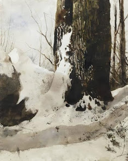
Undersnow by Andrew Wyeth, drybrush, 1977

I've found Wyeth's use of the term misleading, because Wyeth's "drybrush" paintings often have a lot of very wet passages. Wyeth didn't think like other artists, and his notions about his use of the medium are mixed in with a lot of emotions and instincts. Here's what Wyeth himself said: 

"Drybrush is for more contemplative works (as compared with watercolor), or when a work arrives at a profound emotional stage. I use a smaller brush, dip into the color, splay out the bristles, squeeze out a good deal of the moisture and color with my fingers so that only a very small amount of paint is left." Drybrush is layer upon layer — a definite 'weaving process.' Source of quote: Thomas Hoving in conversation with Andrew Wyeth, From Handprint

Wyeth also said to Hoving: “Now drybrush comes to me through the fact that after I finish a tempera I may feel exhausted. I may have worked four or five or six months on it and I’m desperately tired. But then I may see something that interests me and watercolor doesn’t have the strength somehow. I start with a watercolor sometimes and realise, damn it all, I feel stronger than that. I want to go into it with a little more detail so I start working in drybrush.... " 

Garret Room" (right) is a very good example.

Wyeth continues: “When I stroke the paper with the dried brush, it will make various distinct strokes at once, and I start to develop the forms of whatever object it is until they start to have real body. But, if you want to have it come to life underneath, you must have an exciting undertone of wash. Otherwise, if you just work drybrush over a white surface, it will look too much like drybrush."

It was rare for Wyeth to allow other artists to watch him paint, but he made a few exceptions, and what follows are some quotes from what these observers noticed about his materials and methods.

Les Linton says: "I met Andrew Wyeth in March of 1976 and was able to not only speak to him about his materials, but also ask about his techniques. He was usually reticent about tech talk, but for some reason he warmed up to me and I was able to spend an entire afternoon asking questions.

Les continues: His paint box was there on the table by the back door and that's when I got the first clue about his use of gouache. I did notice he had a tube of Shiva casein white in there also. When I asked him about it he said once it dried, it was less likely to pick up when painted over again. I think that was the opaque white he used most in his watercolors and drybrush paintings, but I can't swear to it."

According to Linton and other observers, "most of the paper was Imperial (22" x 30") 140 lb. Cold Press (or "Not," which in Brit-speak means not smooth or rough) woven linen, not cotton, and handmade. This is why the sizing was "harder," unlike the softer cotton watercolor paper later revived under the Whatman name (and mould made mimicking the original Whatman handmade texture). This harder surface is one of the reasons why Wyeth was able to abuse the surface of the paper so easily. He used sandpaper, knives, steel wool, and just about anything else he could find. Wyeth also had a large supply of rough Whatman Imperial sheets on hand as well."

"Many of Wyeth's drybrush watercolors were painted on extremely smooth 3-ply, plate finish (Bristol) from Strathmore. Some of the earlier Bristol paper he used (50's & 60's) was not archival, but current production is. You can see yellowing in some of his earlier studies and drawings on that particular paper.

"Mr. Wyeth used Winsor & Newton watercolors (with a few Grumbacher colors) and also made much use of W/N Gouache in his darker, earthier passages. The opaque watercolor came in handy in his drybrush watercolors painted in a more detailed egg tempera technique. He occasionally added alcohol (or whiskey) to his water when painting outdoors in cold weather to retard freezing."

"The paint thickener came from liquid gum arabic as well. These passages look thicker, 'juicier,' and are characterized by little bubbles (not possible with just water). He used an old, beat up, folding, enameled metal watercolor palette when I saw it in the 70s. I'm pretty sure his own watercolor palette was made in the U.S., but the nearest thing I've seen to it is the large, black, metal folding palette made by Holbein of Japan - most likely a copy of that same design. He favored W/N Series 7 Kolinsky sable rounds and used to buy the size #1's "by the fistful," again according to Berndt (who used to baby sit Andy when he was a child!). I've always assumed these very small brushes were purchased for his temperas and drybrush paintings and he wore them out readily."

"The main thing I came away with from my visit was Mr. Wyeth's willingness to break 'the rules' and use anything that gave him the effect he wanted in a painting. There were studies littered all over the floor of his studio, some with dusty shoe prints where he'd walked on them. 

Tuesday, March 7, 2023

E.H. Shepard meets E.A. Abbey

Pen illustration by E.A. Abbey 

When Ernest H. Shepard (1879-1976) was a young, aspiring artist, he dreamed of meeting the reigning king of pen-and-ink illustration, Edwin A. Abbey (1852-1911).

E.H. Shepard, illustration for A.A. Milne

Shepard first met Abbey while a student at the Royal Academy Schools, but he also went to meet the master painter and pen draughtsman in his studio:

"Abbey was already one of the world's most distinguished artists, but it was his incomparable illustrations in line to Old English Songs, and the Comedies of Shakespeare, which made him the outstanding idol of all young illustrators of his time. Shepard acknowledges his deep gratitude to Abbey, who showed him what black and white work really meant. All of us knew Abbey's enchanting work can easily understand the influence which it had on Shepard's own graceful talent. That influence has remained. Shepard's line has always been delicate and sensitive, and his feeling for atmosphere especially notable. Abbey was most generous in his encouragement, and, selecting one of the young man's drawings, insisted on sending it to Punch, with a strong recommendation. That drawing was accepted, and Shepard began to add a very pleasant chapter to the history of illustration."

Shepard would later become the beloved illustrator of Winnie the Pooh and The House at Pooh Corner.

Wikipedia on E.H. Shepard and E.A. Abbey 

Quote from The Artist Magazine, May 1941 (Thanks, James W.) 

Books: The Drawings of E.A. Abbey and The Work of E.H. Shepard

Sunday, March 5, 2023

The Architect

The architect stands above us, framed by soaring arches, holding his plan for the structure that is being built by workers scurrying among the scaffolding. 

Henri Marcel Magne, L'Architecte, 1910 Musée d'Orsay

The architect gestures upward with his cane. He grips the plans against the tug of the wind, and his assistant holds onto his hat. The billowing clouds behind him appear weightless, while in the foreground rope lifts a heavy block against the pull of gravity.

Everything in the composition speaks to the lofty ambitions of the architect during an era of optimism.

Saturday, March 4, 2023

A Cottage Garden


A Gardener in a Cottage Garden by Helen Allingham, 
watercolor, 28 x 37.5cm (11 x 14 3/4in)

Friday, March 3, 2023

Learning by Sketching


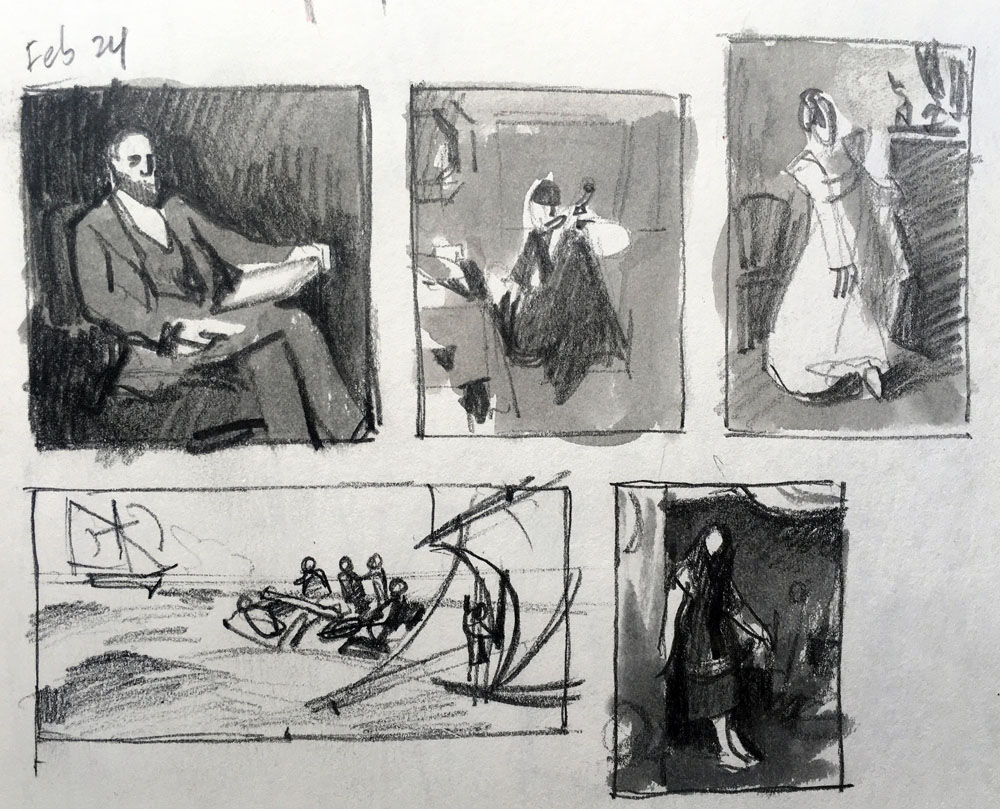
Quick pencil and gray-wash study thumbnails of compositions are a helpful way to “train your mental model with an optimized dataset.”


The composition on the lower right is "Cinderella," 1880, by Valentine Cameron Princep (British, 1838-1904).

Thursday, March 2, 2023

Charles Léandre


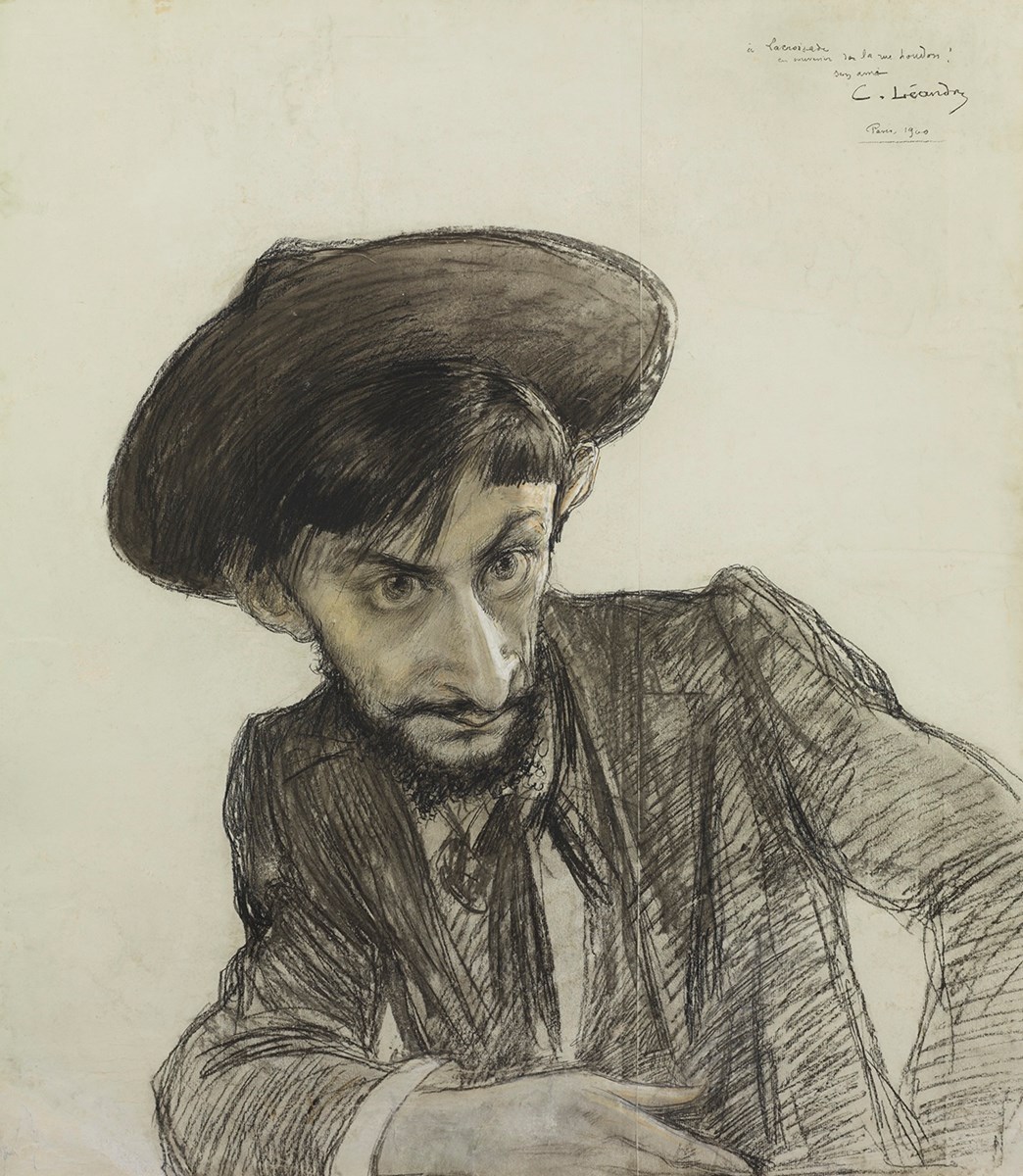
Charles Léandre (1862-1934) was a French artist best known for his comic drawings and caricatures.


When he drew caricatures, he knew just what features to exaggerate, and how much to exaggerate them to convey the character.

But he was much more than a caricaturist, painting scenes that were true to nature. This one is in pastel.

He often portrayed children and women, doing so with remarkable sympathy.

Wednesday, March 1, 2023

Herbert Olivier's Spring Scene

Herbert Arnould Olivier, Summer is Icumen in, 1902, oil on canvas

In 1902, English painter Herbert Arnould Olivier painted a charming image of a young woman beside a flowering tree and exhibited it at the Royal Academy.


Sotheby's says: When the picture was exhibited at the Royal Academy in 1902 it was given the title of "Summer is Icumen In," being the first line of a traditional English song known from a thirteenth century manuscript at Reading Abbey:

Summer is icumen in,
Loudly sing, Cuckoo!
The seed grows and the meadow blooms
And the wood springs anew,
Sing, Cuckoo!

"The song describes the approach of summer and the glories of the reawakening of nature after the somnolence of winter. Olivier therefore used the symbolism to create a painting imbibed with the symbolism of abundance, fertility and rebirth. The subject of Primavera and of Persephone, the Greek Goddess of Spring was popular in the twentieth century as an allegory of rebirth, of the optimism for a new century."

More at Sotheby's. Thanks, James W.