Saturday, February 16, 2008

The Sultan's Elephant

Take one part Jules Verne, add a dash of Steampunk, mix in a little Cirque du Soleil and you've got the Royal de Luxe, a French street theater company that has staged magnificent performances in London, Antwerp, Calais, and Santiago.

The sultan's time-traveling elephant, weighing 42 tons, moves through the streets, walking, bellowing, and spraying water.

But the elephant is just part of a carefully planned series of events that unfolds in each of the lucky cities who host the show. There is also the giant girl, one of the dreams of the sultan. She interacts with the elephant, licks a lollypop, and lets a few children from the audience ride on her arms.

The giantess is about 20 feet tall and weighs 1800 pounds. She is operated like a giant marionette, with the assistance of hydraulics and motors, though her arms and legs require individual operators to pull on ropes.


While parts of the show travel to various cities, a permanent exhibition of the giant puppets can be seen in Nantes France at the Galerie des machines.

YouTube video of the elephant in action: Link
YouTube video of the little girl giant: Link.
Website for Les Machines de l'Île à Nantes http://www.lesmachines-nantes.fr/machines.html
Wikipedia entry "The Sultan's Elephant" Link.

Tomorrow: Serial Painting

Friday, February 15, 2008

Keyframe Animation

Sometimes at a sketch group I’m at a complete loss with the one-minute static poses. I can’t get anything on paper. But give me a real life scene with the subject in constant motion, and for some reason I have better luck.


I happened to be holding my sketchbook when my young son was pulling a bell rope. Naturally he didn’t hold still for a second. But as I watched a couple of repetitions of the action, I realized that he kept returning to the same extreme or "keyframe" poses. So I switched back and forth between those poses, using the flash-glance method to hold them just long enough in memory.

As early as the 1930s, the Disney Studios hired instructor Don Graham to offer the animators a class in “action analysis” using models who moved through a series of poses.

Tomorrow: The Sultan's Elephant

Thursday, February 14, 2008

Windblown Cape

How do you get reference for a cape flapping in the wind? That’s something we all have to paint from time to time.

Unless you hang out a lot in hurricanes or on airport runways wearing your cape, you just don’t get to observe the effect too often.


That was my dilemma when I needed to paint a guy riding way up high on a Brachiosaurus. I took the pose in my backyard wearing a satin gown and a red velvet cape just to get into the spirit of it.

In the movies they have those giant fans to simulate wind, but all I had was a puny window fan, and that didn’t move the cape at all. So I had my wife yank the cape back and give it a little flip right before the camera took the picture.


That helped, but I needed to see how the cape might really look with the wind filling it and pushing it back. So I made a little manikin out of chunks of wood and wire and set it on a brachiosaur model that I sculpted out of polymer clay.

I cut the cape from a small piece of red fabric and then soaked it in acrylic matte medium. I arranged it the way I wanted it, and let it dry. Matte medium is like plastic. When it dries, it holds all the folds just the way you arranged them. For the photo it's held up by little wires underneath.

You could also soak a cotton cloth in plaster, but that gets heavy and fragile. The plaster method worked well for a lot of the old masters when they painted angels. Another trick would be to put a cape on a little manikin and photograph it moving it through a fish tank. But I didn't have a fish tank.


Here’s the final picture, called “Up High,” as it appears in Dinotopia: Journey to Chandara.

Tomorrow: Keyframe Animation

Wednesday, February 13, 2008

Frontal Lighting

Next time you’re at a figure sketch group, set up your easel right next to the spotlight. From that position, the light will be streaming right over your shoulder, shining almost directly at the model. Below is a 20-minute oil study with the light just off my left shoulder.


Usually no one in the sketch group wants that spot anyway because the form has practially no shadow side. Most people prefer to draw or paint from locations where the light strikes the form sideways, reasoning that they can get the form to turn better with more of a shadow side.


But they are missing something wonderful! Frontal lighting does tend to flatten form, but it gives power to the two-dimensional design instead. It gives your whole picture a striking postery impact. It's a good lighting to choose if you want to emphasize color or pattern—to feature a fashion or costume, for instance (below from Dinotopia: Journey to Chandara).


And it’s one of the few times when outlines actually appear in real life. The outline is really the thin fringe of shadow that appears at the very edge of the form (kind of the opposite of edge lighting). The line bears close study. It varies in weight in proportion to the width of the plane that is turning away.


So, in the example above, the wide forehead plane yields a broad outline, while smaller planes of the lips and chin result in a thinner shadow/outline.

Tomorrow: Windblown Cape

Tuesday, February 12, 2008

Juste Milieu

Juste milieu is a name given to both a philosophy of painting and a movement of painters in 19th century France.


The juste milieu artists have been unjustly ignored in the oversimplified and polarizing narrative offered by most art history texts.

These days there aren't many books on them; they don't yet have a Wikipedia entry; they're not even mentioned in many authoritative books about French painting—at least not books in English. But if you read accounts from the period, they were talked about constantly. (Click on any image for enlargement, and to see the artist's name and the title of a work.)


"Juste milieu" translates as “the right mean,” or the “happy medium.” These artists aimed for a middle way between the Impressionist and Academic camps.


Many of today’s new realist painters are trying for a similar kind of synthesis, introducing the best of both approaches into their work.


Starting in the Third Republic in the 1870s, independent painters were beginning to make inroads into the authority of the French Academy.


By the late 1880s, the juste milieu group separated from the Academy, forming under the name “Societe Nationale des Beaux-Arts.” Among these defectors were Carolus-Duran, Duez, Besnard, Raffaelli, Roll, and Braquemond.


They combined progressive ideas, like a lighter palette and looser brushwork, with high standards of draftsmanship. Those drawing skills were often lacking in the radical—and now famous—proponents of the new style, Impressionism.


The work of the juste milieu had a looser handling than would have been acceptable during the July Monarchy. They preferred to avoid the “licked” finish of Gerome, Cabanel, and Bouguereau.


At the same time, certain members like Dagnan-Bouveret (above) portrayed contemporary rural folk traditions with a dignity that Academic painters had previously given to classical subjects.


The juste milieu commitment to the middle way won them the admiration of many of the artists from around the globe who came to France for training and inspiration. Joaquin Sorolla journeyed to Paris not to see Monet, but to see Bastien-Lepage. (above).


Most of the worldwide impressionist movements, particularly in England, Australia, Russia, and America, were more influenced by the juste milieu artists than by those that we think of as Impressionists, like Sisley, Pissarro, and Renoir.

Degas, who felt the impact of the group, said of Besnard, (ceiling decoration, above) “[He] has stolen our wings.”

Tomorrow: Frontal Lighting

Monday, February 11, 2008

Pinkwater Portrayed

If you listen to National Public Radio, you’re probably familiar with the velvety voice of commentator Daniel Pinkwater. He’s also the author of many brilliant absurdist books for young people, including The Big Orange Splot and Fat Men from Space.


According to Wikipedia, “Pinkwater tends to write books about frequently obese social misfits who find themselves in bizarre situations, such as searching for a floating island populated by human-sized intelligent lizards.” I sketched him from life at an author event in the basement of a nearby library.


The enlargement shows his characteristic expression when he’s talking: wide eyes, raised eyebrows, and smiling mouth. He was constantly moving during his talk, charming the audience with his anecdotes, but he kept returning to a basic pose, with both hands resting on his cane.

Podcast interview: "Just One More Book," Link.

Tomorrow: Juste Milieu

Sunday, February 10, 2008

From Mask to Palette

How do you get exactly the colors you want in a picture….and no others?

This is the third post in a Sunday series about a method called color wheel masking. The first post showed how color masks can help to analyze color schemes, and the second post explored different shapes of masks.

In this post I’ll demonstrate how to actually mix the colors you have chosen for a given painting.

To start with, here’s the color wheel on the left. To the right above the palette paper are some primary colors of oil paint. You can use as many tube colors as you want at this stage. I just have little demo dabs of Winsor Red, Cadmium Yellow, Titanium White, and Ultramarine Blue.


Let’s say you want a monochromatic atmospheric triad with the dominant (and the most saturated) color in the red-orange range. Using your palette knife, mix a batch of each of the three colors that you see in the corners of the triangular gamut.

I've placed a little white box over those colors in this photo. In this case, it’s a saturated red-orange, a desaturated red-violet, and a desaturated yellow-green.


Now you’ve created the “heads of the families” or subjective primaries. Next, extend those colors into four different values or tones. Try to keep the hue and the saturation constant as you do so.

Look again at the color wheel mask. Halfway along the edge of the triangle are little marks indicating your secondaries. These are your in-between colors, which you may want to mix as well. You may end up mixing and working with anywhere from three to six strings of colors.

Before you start painting, remove from the palette all the tube colors that you squeezed out, except for white. This is important, because these colors are outside your gamut. You don’t want to have access to those anymore during the painting process.
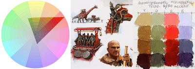

At left is a color wheel with a monochromatic atmospheric triad emphasizing red. This time it’s laid out on Tobey Sanford’s digital color wheel (link to download). On the far right are the color ranges I mixed. In the middle is the resulting painting from Dinotopia: Journey to Chandara.
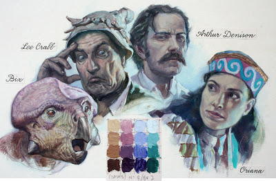
This group portrait takes place in Dinotopia’s phosphorescent caverns in the book The World Beneath (1995). I wanted the colors to suggest a cool, magical ambiance. With the colors in this gamut, it’s impossible to mix any intense warms, even if you wanted to. But as your eyes adjust to the color mood, it feels complete. The relative warm colors appear warm enough in the context of the picture.

I have noticed that when I use the color wheel masking system I am more careful to keep the brushes clean and to push against the outside of the range. Harmony and unity are a given, so the effort goes into reaching for accents. It's the opposite of the color-mixing mindset when mixing color from a full palette of tube colors, where I'm always neutralizing mixtures.
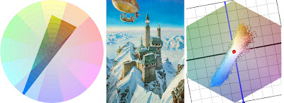

To conclude, here’s a painting from Dinotopia: A Land Apart from Time (1992), about the time when I first developed this method. I have digitally reconstructed the gamut I used for the narrow complementary color scheme.

Blog reader Briggsy provided the diagram on the right. He processed the image through a filter created by P. Colantoni, and available for Windows users at couleur.org. What you’re looking at to the right of the painting above is an objective computer visualization of the actual color scheme.

As you can see, it corresponds pretty closely to the generating mask, proof that the system is giving us exactly the intended color scheme. The blue colors are very intense, almost touching the edge of the wheel. The rest of the colors are in a narrow swath running across the grey center to the weaker complements.

I look forward to hearing how this method works for you, either with traditional or digital techniques.

Tomorrow: Pinkwater Portrayed

Saturday, February 9, 2008

Mahl Stick

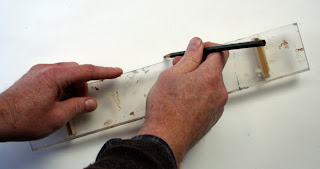
The mahl stick is a rod with a padded or cork tip held in the non-painting hand.


The brush hand rests on the the mahl stick to give it control and to keep it from touching the wet paint.


My plein air mahl sticks are made from metal or wooden dowel rods. But in the studio I use a 26 inch section of a wooden yardstick instead of a dowel. It is sanded and finished with tung oil.


On the underside of the tip is a wooden spacer. This holds the stick at a constant height of about ¾ inch above the paint surface. The inside of the tip is hooked so that the mahl stick can hang vertically onto the top of the drawing board when not in use.


The yardstick markings make it handy for measuring and for ruling lines in the pencil stage. Wood-burned into the top surface is the classic maxim from Ovid: “ARS EST CELARE ARTEM” (it is art to conceal art); in other words, "true art conceals the means by which it is achieved." You might find another maxim that fits you better at this link or this link.


From time to time I use an acrylic bridge. This also stands about ¾ inch off the drawing surface on two legs. This is especially good for inking with a dip pen or Rapidograph.

Tomorrow: Color—from Mask to Palette

Friday, February 8, 2008

Eye Stripe

Once in a while a design feature will show up in animals that are not closely related. A good example is the “eye stripe” coloration pattern, which appears in sparrows, antelopes, and chipmunks.


In all of these creatures, a dark facial stripe runs from the snout to the eye. Directly above the eye stripe is a bright white line called a supercilium, and above that another dark line called a lateral crown stripe. Presumably, eye stripes serve as protective coloration in all of these prey animals, disguising their eyes from predators.


Whenever such features exist in animals as diverse as birds, ungulates and rodents, it’s reasonable to speculate that they may have appeared in dinosaurs as well. This was my rationale for showing eye stripes on the Beipiaosaurus in Dinotopia: Journey to Chandara.


I used the same idea when I painted a dark patch on the flank of a Camptosaurus in the World of Dinosaurs stamps for the US Postal Service. This flank patch also appears in the springbok.

The Camptosaurus was a tasty morsel for ceratosaurs and allosaurs in the Jurassic, just as the springbok is the Chicken McNugget of the Kalahari.

Tomorrow: Mahl Stick

Thursday, February 7, 2008

Stormtrooper Doughboy

Has anyone ever noticed that an upside-down Star Wars Stormtrooper is really the Pillsbury Doughboy's evil father?

Tomorrow: Eye Stripe