Thursday, May 7, 2009

Dead Tech: Waxers


The waxer was a basic tool that every graphic designer used in the analog era. Waxers applied a thin layer of molten beeswax to the back of a piece of paper.

At the bottom of the waxer was a roller that distributed the wax on the paper in a honeycomb pattern.

The piece of paper might be a headline or a column of type used in a newspaper or magazine layout.

This layout process was called paste-up. The waxer was a big improvement over paste or rubber cement, because it was non-toxic, the element could be easily repositioned, and the adhesive didn’t turn brown.

The photo above shows a Lectro-Stick handheld waxer. There were larger sheet-fed waxers, but this little one did any small- to medium-size waxing job.

By removing the red plug at the top, you could push in a sticky square of yellowish beeswax. A heating element inside melted down the wax. It took about a half an hour to warm up.

You could leave the waxer plugged in all day and it didn’t hurt it. It gave off a friendly warm smell, reminiscent of candles.

This is one tool that still has some practical uses. If you can still find one (along with a supply of wax squares), grab it! It’s still the best repositionable way to hold down small pieces of paper, like thumbnail sketches, on a larger board.

Wednesday, May 6, 2009

Edges in Moonlight

When you go out on a moonlit night, away from streetlights, can you see the cracks in the sidewalk? How about the blades of grass, the clapboards on a house or the small twigs and branches?

Unless you’re a cat or an owl, these smaller details melt into the larger shapes. Everything has blurry edges. The reason visual acuity drops off at night is because the central point of vision where we see small detail is filled with photoreceptors that only work best in bright light.

James Perry Wilson, the artist famous for his diorama backdrops, conveyed this subjective experience in this architectural rendering. He softened the edges and suppressed the detail everywhere except in the brightly-lit windows where the light levels are higher.

Assuming that he wanted to simulate this perceived effect, this rendering by Edward McDonald is not quite as effective because he kept all of his edges too sharp.

If you use night photography as reference, remember that the camera doesn’t see as the eye does, and you have to make this adjustment if you want to suggest human vision.
---------
Related GJ posts:
James Perry Wilson, Part 1 and Part 2
Why moonlight is blue.
Day for night shooting.

Images from "Color in Sketching and Rendering" by Arthur Guptill. It's a book on watercolor rendering, mainly of architectural subjects, with lots of color plates, one of Guptill's best books.

Tuesday, May 5, 2009

Empty Coffee Cups

The caption to this photo of American illustrator John Gannam says: “Empty coffee cups bear witness to the artist’s insistence upon a clean cup for each fresh drink—of which there may be a half a dozen at one sitting.”

I drink coffee, and I agree with Gannam on this one. I definitely grab a new cup each time. How about you? Check out the poll at left.
-----
Photo from "Forty Illustrators and How The Work."
------
Poll results added later from 334 voters:
37 New cup each time.
222 Reuse the same cup.
5 Use disposable cups.
67 Don't do coffee.
3 Other.

Monday, May 4, 2009

Bonheur Ram Studies


Rosa Bonheur (1822-1899) set the standard for oil studies of animals.

These studies of rams are masterpieces of texture, lighting, and expression. For her larger works, like The Horse Fair, she did innumerable studies in oil and charcoal.

Wiki on Rosa Bonheur

Sunday, May 3, 2009

Chrysler Personalities

With all the talk lately about the bankruptcy of the Chrysler Corporation, Jeanette and I decided to take our sketchbooks yesterday to the Rhinebeck Car Show to look at Dodge, Plymouth, and Chrysler.

We sat next to each other on folding chairs. Jeanette got out her ballpoint pen and watercolors and sketched the 1961 Dodge Lancer and the 1958 Plymouth Fury, slightly exaggerating to bring out their personalities.

I liked her idea, so I tried to graft the cars onto the bodies of people walking by. I jotted down fragments from conversations that I overheard.

In 1958 America seemed to be caught between memories of war, fears of nuclear devastation, and dreams of space, and that zeitgeist is written on the cars’ faces.

Maybe Chrysler will bounce back to life like a ‘toon car. Let’s hope so. Maybe the key to the success of the company is putting a little more personality into the car designs.

More on this blog about automotive zeitgeist and car names.

Saturday, May 2, 2009

Backyard Posing Party

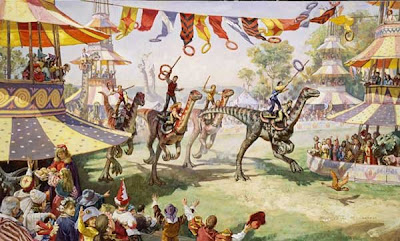
Creating Dinotopia paintings has often led to strange parties in my backyard.

In the spring of 1991, I invited a whole bunch of friends to pose for a painting of a dinosaur Olympic event called Ring Riders. The painting appeared in Dinotopia: A Land Apart from Time,

Each kid chose which hat or headdress they wanted to wear. I played both actor and director while my wife Jeanette worked the camera.

One mom made a bunch of pastries and handed them out. I used that moment in the final painting.

Using chairs and cushions and cardboard rings as props, the kids took their positions, imagining they were riding on the backs of the dinosaurs. It helped when it I acted it out first, hamming it up a little to try to get them to loosen up.


A group with mismatched costumes and with varying levels of enthusiasm acted out the part of the crowd watching the sporting event. I’m sure they could sympathize with modern actors who have to emote in front of a greenscreen.

This form of group acting works especially well with young people. Chance moments and improvisations can take your conception to another level.
------
Related post on using photo reference, link.
Thanks, Nancy, Jake, Aliza, Judy, James, Mike, Joey, Morgan, Justin, Franklin, Jeanette, and everyone else who took part!

Friday, May 1, 2009

The Hind Leg

The hind leg is the engine of the quadruped. When a draft horse pulls a heavy load, the read end drops lower and the legs develop tremendous power.

The front legs pull hard, too, and they are important in turning and in leading off gait changes.

The rear legs seem to play a key role in changes of forward and backward direction.


Here's a brief film clip of the 2-week-old filly Flashy Princess. She gets confused about the barn gate and doesn’t know which way to go. If you watch her hind legs, they're doing a lot of work has she changes her mind about going forward and backward.

I'm trying to learn more about this, so I’d be interested if any animators or horse experts among you can offer your thoughts about the different roles of the front and rear legs in a horse's movement.
-------
If you have trouble with the embedded video, try this link: http://www.youtube.com/watch?v=TvHOFUAKt1k
-----
By the way, thanks to Irene Gallo for mentioning my upcoming book in her blog. Check out her post here, and if you don't know about "The Art Department," it's a must read for anyone in the fantasy and science fiction art field.

Wednesday, April 29, 2009

The Grand Central Academy

Most people think of drawing as a form of personal expression, a mark of individual style. But before the twentieth century, drawing was regarded more as a basic way to understand the world, a path of knowledge that was unavailable to the casual observer. If you could draw, the world’s secrets would open to you.

According to art historian Barbara Anderman, “Seventeenth-century French art theorists…conceived of drawing as the means by which the intellect could apprehend reality, before the imagination could render it with expression.”

This sense of drawing as a path to a special kind of knowledge infuses the Grand Central Academy in New York City. The drawing is by Ariel Zabloski.

The art school is on the sixth floor of an 1880s building, which it shares with the Institute of Classical Architecture & Classical America (ICA & CA). The Grand Central Academy and its forerunner, the Water Street Atelier, were both founded by Jacob Collins. Above, Spencer Brainard copies a plate from the Charles Bargue Drawing course.

According to its website, the school “was created by professional, exhibiting artists to offer classical training to serious students.”

The GCA includes an impressive roster of teachers, such as Travis Schlaht and Edward Minoff. One of Mr. Collins’s students was Juliette Aristides, who wrote the Classical Painting Atelier.

Students at the Grand Central Academy begin by copying line drawings and plaster casts. The casts of Renaissance and antique sculpture come from the 200-cast collection of the ICA & CA, who acquired them from the Metropolitan Museum.

On one wall is a set of cubby holes with plaster noses, ears, and eyes that you can check out and study. Tacked up on the wall are various drawings and paintings by students and masters alike.

Angela Cunningham was in the process of painting this amazing oil copy of a polychromed head. The light over each work area is shielded so that it doesn’t spill over into the adjacent space. The windows are blacked out, giving the studios the feeling of a secret laboratory.

To supplement the classes in observational work, the GCA offers special courses in anatomy, sculpture, perspective and art history.

But the foundation of everything at the GCA is close observation. “I believe in a late introduction of anatomy,” Mr. Collins told me, explaining that he didn’t want any system of analysis to get in the way of pure seeing.

The school has set a high ambition: “to offer a public place for the revival of the classical art tradition; to foster and support a community of artists in pursuit of aesthetic refinement, a high level of skill and beauty.”
-----
Grand Central Academy, link.

Tuesday, April 28, 2009

Imaginative Realism

I’ve been waiting to tell you the good news: This September Andrews McMeel Publishing will be releasing a book that I have written based on this blog.

I was waiting to tell you until the cover was finalized. It just came in! Here’s what the book looks like. The book is called Imaginative Realism: How to Paint What Doesn’t Exist. It’s a big book: 224 pages, 400 illustrations. Andrews McMeel will be doing a beautiful job of production, and they are keeping the price down to $24.99.

This is the main project I’ve been working on during the last year. The material comes from my art school lectures and also from this blog. The reason I wrote the book—and this blog—is that there’s a lot of information that I think is crucial to imaginative picturemaking but I’ve never been able to find it in how-to art books.

Adapting material from a blog into a book turned out to be a much, much bigger job than I first imagined. They’re two different animals, though I tried to keep some of the blog’s informal and practical tone.

A lot of the material in the book has never before been published and hasn’t even been seen on this blog.

The spark for doing the book grew out of a discussion on this very blog a year ago last February, where you all shared profound insights about what you liked in an art book. I have learned so much from you all, and I hope you’ll see that reflected in the book.

I’ll tell you more about Imaginative Realism in future posts.

Monday, April 27, 2009

Growing Princess


The Belgian filly named Princess is getting bigger and stronger day by day. I bring my sketchbook on the morning walk and try to do a sketch each day.
She's in constant motion, so I find I have to try to observe her so that I internalize her form, choose a pose, and then draw her from memory. She has a very slender muzzle and undeveloped chewing muscles in her cheeks. I love the curly brown mane and the fuzzy topknot.

The sketches are done with water-soluble colored pencils.