Thursday, December 10, 2020

Why Do You Work So Small?

A question that comes up from time to time on YouTube and Instagram is why I often work so small. 

Tamir Erez asks: "Would I be wrong to say that the larger the size of paper you're drawing [on], the easier it will be for you to be precise in small details? So why are the paintings always so small, looking like 30-35 cm by 20-25 cm. Maybe less. Isn't it better for you to paint on a larger surface? More details, more convenient for you and to your brushes ... Thank you for good lessons, and good videos."

Sno Kones, gouache, 5 x 7 inches.

I have painted all different sizes, from relatively big fantasy panoramas (roughly 4 feet by 2 feet), to tiny miniatures. Most of my Dinotopia paintings are about 30% larger than printed size, which allows for plenty of detail without losing the sense of brushstrokes at the reproduced size. So if I have an "average" size for my illustration paintings, it's about 18 x 24 inches. 

Size becomes an issue when you're trying to frame, transport, and store a lot of original paintings. I have a couple of complete exhibitions of Dinotopia paintings (about 70 paintings each), and they take up a fair amount of storage space. I'm glad they're not bigger.


Jean-Louis-Ernest Meissonier - Musketeer, oil on panel, Height: 24.5 cm (9.6 in) , Width: 15 cm (5.9 in) 

When a viewer is looking at an original in a museum or gallery, average isn't always desirable. There's an old rule of thumb that if you want to make an impression, you should either paint very large or very small. Frederic Church's large panoramas were like IMAX theater experiences in their day. But the most popular and expensive artist of the 19th century was Ernest Meissonier, who painted exquisite, tiny paintings. The Paris Salon actually had to station a guard in front of them because viewers often scuffled to get their chance to see the paintings.

If you scan my previous posts about William Trost Richards and Adolph Menzel, you'll find plenty of examples of tiny paintings.

When I'm painting from life, there are practical considerations: portability, storage, and access. If you want to paint in a crowded waiting room, a concert audience, or a restaurant, it's not really practical to have a sketchbook wider than 16 inches laying open on the table.

Most of my paintings live their lives as images on people's computers, so the actual size of the original doesn't really matter any more than it does for digital art. Resolution (pixels per inch) is more important than physical size. I realized this when I painted backgrounds for animated movies. Most of them were around 9 x 12 inches, but they could be epic in conception and treatment, and when seen on the big movie screen, no one knew how small they really were.

So to answer your question, it's just a matter of personal preference. For me, as long as my eyesight and hand skills hold out, it's easier and more convenient to work on precise detail at a smaller size, but I admire artwork of all sizes. 
----
Related post: Seven Inch Figures


Wednesday, December 9, 2020

T. rex -- People's Choice?


Hey, may I ask you to consider voting for my painting "T. Rex in Forest) for the People's Choice Award in Richeson's Animals, Birds & Wildlife exhibition? 

Just press "like" at this link to the image, or here's the link to the whole exhibition.


Tuesday, December 8, 2020

YInMn Blue

YInMn Blue or Yin Min blue is a recently developed inorganic pigment, the first inorganic blue pigment discovered since cobalt blue was discovered in 1802. 


The pigment was accidentally discovered a decade ago by Professor M.A. Subramanian in Oregon. Composed of yttrium, indium, and manganese, it yields a blue pigment that is chemically stable, fade-proof, opaque and non-toxic. 

Because some of the ingredients are fairly rare, the patented pigment is still mostly inaccessible as an artist's color, but Gamblin has made a 164-tube limited run of the color for oil painters at a cost of $75 per tube. 

Professor Subramanian has experimented with other variations of the basic recipe, substituting some less expensive ingredients, and the result has been some additional colors, which also look promising.

Monday, December 7, 2020

Mothlike Aliens


"He counted eight of the mene, fluttering about him like large moths, moths the size of human children, but with furry vestigial wings, hourglass ab­domens, sticklike limbs." 
From the short story Face Value by Karen Fowler, 1986.


Sunday, December 6, 2020

Knitting and Architecture

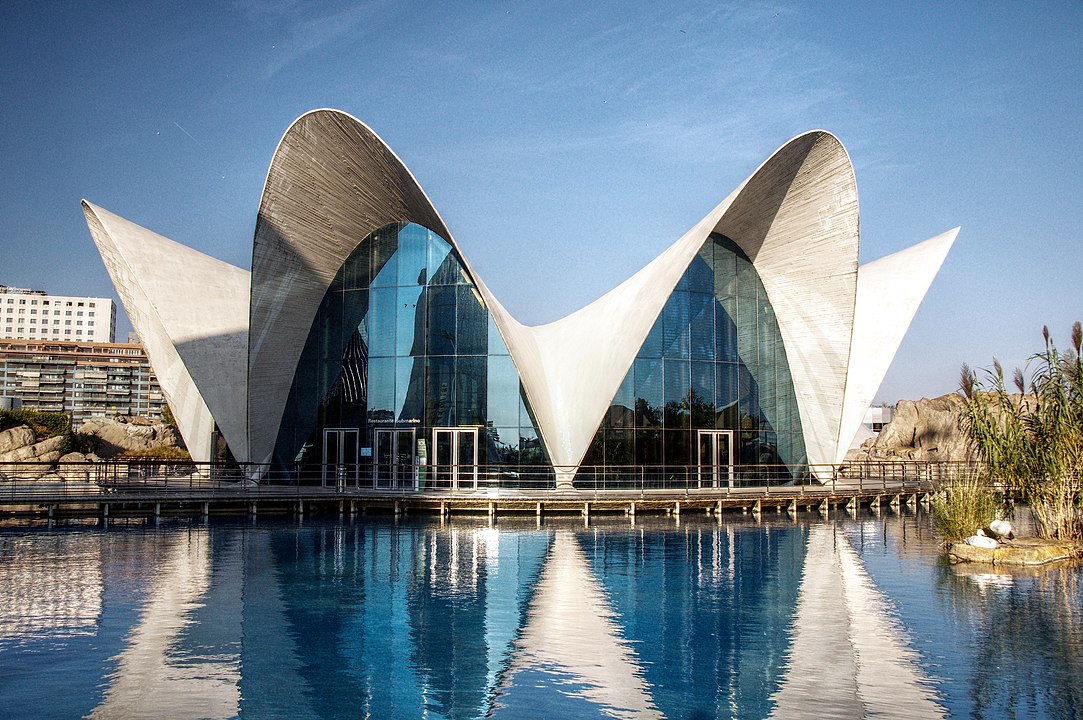
Surfaces with compound curves can create structures that are far lighter and stronger than rectangular forms.

In the 20th century the architect Felix Candela used thin shells of concrete to make undulating rooflines that used much less material to create a durable exterior, more akin to natural forms. 


Architect Mariana Popescu has taken this idea a step further. She recently gave a Ted talk showing how she and her team used knitting machines to efficiently create curved space architecture.
----


Saturday, December 5, 2020

How Do You Choose a Painting Subject?

Claire Scribner on YouTube asks:
"Someday I hope you make a video about your thought process when looking for subjects to paint. You tend to choose very mundane but familiar scenes. What makes something special? Composition? Lighting? Mood? I’d love to get a peek into your thought process."


This is a rich topic, and I'm glad you asked. You're right: I do often choose mundane scenes from a radius of about 15 miles of where I live, especially now in pandemic times. For me, the problem with "artistic" subjects like fishing boats or farm scenes with red barns is that I feel it's hard to create an original interpretation that hasn't been seen a million times before. 

I'm more emotionally connected to ordinary scenes from my own quotidian experience, such as parking lots, gas stations, and grocery stores. For some reason I haven't seen such scenes painted very often by other artists. I get really excited by the prospect of interpreting something that I have never seen painted before, especially when that subject stirs emotions in me. 

When I get to a location I often use a viewfinder to try to limit the view to something I can fit in a pictorial rectangle. Sometimes I do a quick thumbnail of the effect I want to capture before getting started.

Typically I'll have a rough idea in mind in advance of what I want to accomplish. Sometimes that idea is a color effect or a lighting idea, and the subject is almost secondary. If I'm mainly interested in lighting—such as a rim-lighting effect—I'll wait for a day and a time of day when that lighting effect is happening and try to find an angle where I can paint it. That same motif may be completely uninspiring at another time of day.

If it's a very complex subject, my first consideration before I start is how I can simplify it. Can I vignette it, or delete part of it, or reduce the colors, or use line. If there's an element that will be changing or moving, I think about capturing that element first so that I'm not caught short. Parked cars don't stay parked, and dairy cows don't stay grazing in the same spot. 

I try to verbalize what's my goal for a given painting because I find it helps to keep that singular goal in mind as I get deeper into it. On a sunny day it's important to commit to the sun and shadows at one specific point in time, and try not to chase alluring effects that may emerge as the sun travels west.

There are a number of practical considerations that limit the available options, such as: 
1. Do I have a chair or an easel? Do I need to find a bench?
2. How much will the light change in the time I have available? 
3. Is it safe to stand or sit there? Is there a risk of a "gamestopper" event?
4. Women tell me that they need to think about whether it's too lonely or isolated.
5. Is there room for an easel? Will I be blocking pedestrian traffic? Or attracting onlookers?
6. Are there other artists with me on the painting trip? What do they want to paint?

All these things get factored together in choosing a subject. 


Friday, December 4, 2020

Gustavo Simoni

Gustavo Simoni (1846-1926) was an Italian artist who specialized in subjects from the Islamic world.


He traveled in Spain, France, and Africa, and he opened up a school of Orientalist painting in Italy and had a studio in Paris. 

G. Simoni Figura con cornamusa, 1889, oil on canvas

His younger brother Scipione and three of his five kids were also artists. He was one of the founders of the Society of Watercolorists of Rome.


He worked in both watercolor and oil.

Gustavo Simoni, Morra Players, 1894

In the game of Morra, "all players throw out a single hand, each showing zero to five fingers, and call out their guess at what the sum of all fingers shown will be. If one player guesses the sum, that player earns one point. The first player to reach three points wins the game."
 

Simoni, detail of Morra Players


The Halt of the Caravan by Gustavo Simoni, 1885, oil on canvas, 61 by 90 cm., 24 by 35 in.

Thursday, December 3, 2020

Painting Raindrops on a Windshield

Painting in gouache is usually impossible if it's raining. But why not paint from inside the car? There's an interesting effect that I wanted to capture: raindrops on the windshield.


That meant painting the out-of-focus landscape view first, so that the attention stays on the plane of the window.


This YouTube video shows the initial challenge and the process for executing the gouache-over-casein painting.

Wednesday, December 2, 2020

First Paintings of Underwater Landscapes

Eugen Ransonnet-Villez (1838-1926) was the first artist to record underwater views from direct observation.


From his specially constructed diving bell, he drew with a soft pencil on green-colored varnished paper. He put his drawings in a tin box to send up to the surface, and he later overpainted them with oil.


According to the Public Domain Review, the submersible measured three feet high by two and a half wide and deep, and was made:
"of sheet iron and inch-thick glass, had the user's legs sticking out of the bottom so that he could propel himself along the seabed at a depth of five meters or so. It was weighed down by cannonballs, and with air pumped in, the diving bell allowed him to descend for sessions of up to three hours."
Thanks, Ron


Tuesday, December 1, 2020

Color Accents

A color accent is any small area of color that is noticeably different from the rest
of the colors in the composition.

Marek Piwnicki, Kyoto, Japan

Color accents are usually more highly chromatic than the rest of the picture. If you restrict the entire image to something close to a monochromatic scheme, anything different will jump out and grab the viewer. 

In the photo above, the orange color of the shop at night creates a magnet for the attention. Color accents don’t have to be used only for the main focus of interest. They can also be added as a seasoning throughout a picture, to provide relief from large areas of unrelieved hues. 


If you have a picture with a strong blue cast, it can help to sneak in a little yellow or orange here and there—just a set of floating dots or an outline, or a weird reflection in a window. This becomes a matter of taste and of momentary inspiration, keeping your color scheme from being too mechanical or predictable.
----
Learn more in my Gumroad tutorial TRIADS: Painting with Three Colors.