


Showing posts sorted by relevance for query checkerboard. Sort by date Show all posts
Showing posts sorted by relevance for query checkerboard. Sort by date Show all posts
Thursday, August 18, 2011
Checkerboard Illusion Video
Here's an impressive video version of the "checkerboard illusion." The lighting conditions in the room are set up to trick us into thinking the low light is the main light in the scene, but actually the top light facing down is dominant.
The giveaway is the lack of a cast shadow of the whole checkboard table onto the floor from the purported key light. They should have painted that, too.
Thanks, Jocque


Monday, December 19, 2022
Checkerboard Illusion
I painted this checkerboard using the exact same gray mixture for the dark square in the light area (A) as I did for the light square in the shadow (B).
Why do the tones seem so different?
1. They have soft edges, and soft edges usually belong to shadows.
2. Those edges are parallel, and cast shadows from the sun on flat surface are parallel.
3. The tones of adjacent colored squares shift gradually in value to an equal degree, just the way shadows do.
Tuesday, January 26, 2010
Checkerboard Illusion
The recent colored cube illusion showed us how our brain compensates for a color cast, making hues seem constant, even when they’re really not.
Our visual system does a similar thing with tones, discounting the effect of shadows and grouping tones into meaningful sets.
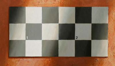 This checkerboard is an example. I painted it using the exact same gray mixture for the dark square in the light area (1) as I did for the light square in the shadow (2).
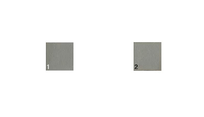 Don’t believe it? Here are the exact same squares with everything else made white.
Why do the tones seem so different? The light square is surrounded by darker squares. This makes our visual system automatically conclude that the actual tone is light in value, and we group it with the other light squares.
We interpret the diagonal bars of darker tone as shadows for the following reasons:
1. They have soft edges, and soft edges usually belong to shadows.
2. Those edges are parallel, and cast shadows from the sun on flat surface are parallel.
3. The tones of adjacent colored squares gradate to an equal degree, just the way shadows do.
Our visual system is designed to help us determine the actual color of objects in the world. The fact that it seems to deceive us is not a defect of our vision. It’s central to our survival.
But we have to know about this mechanism of visual perception if we want to paint tones accurately.
----------
A related illusion from Edward Adelson’s website.
Our visual system does a similar thing with tones, discounting the effect of shadows and grouping tones into meaningful sets.
 This checkerboard is an example. I painted it using the exact same gray mixture for the dark square in the light area (1) as I did for the light square in the shadow (2).
  Don’t believe it? Here are the exact same squares with everything else made white.
Why do the tones seem so different? The light square is surrounded by darker squares. This makes our visual system automatically conclude that the actual tone is light in value, and we group it with the other light squares.
We interpret the diagonal bars of darker tone as shadows for the following reasons:
1. They have soft edges, and soft edges usually belong to shadows.
2. Those edges are parallel, and cast shadows from the sun on flat surface are parallel.
3. The tones of adjacent colored squares gradate to an equal degree, just the way shadows do.
Our visual system is designed to help us determine the actual color of objects in the world. The fact that it seems to deceive us is not a defect of our vision. It’s central to our survival.
But we have to know about this mechanism of visual perception if we want to paint tones accurately.
----------
A related illusion from Edward Adelson’s website.
Monday, November 17, 2014
Your DIY Pochade Easel Designs
Last month after sharing my own lightweight sketch easel design, I put out a call to all you Do-It-Yourselfers to share your home-built sketch easels, and you came through with some extraordinary innovations.
I promised to pick my favorite entry, but I couldn’t narrow the field down to one, so I picked seven. Each of the following submissions will win an official GurneyJourney “Department of Art” patch.
I’ll also award a D of A patch to the best FB share of this blog post.
Bryan Coombes
Bryan Coombes says: “I’m in the Vancouver BC area, been painting for about 5 years in oil and acrylic. I LOVE painting and now- thanks to you, I love painting in watercolour. I’m looking forward to trying out casein next."
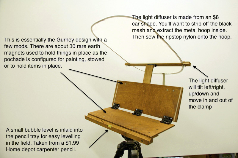
Here’s Bryan Coombes’ design fully deployed.
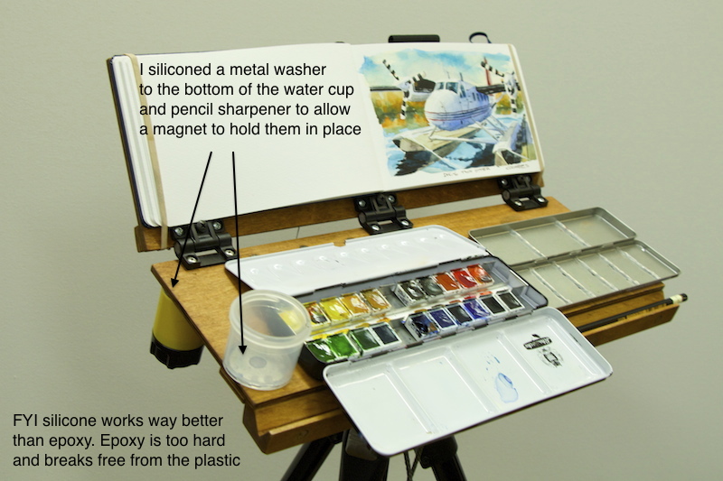
Bryan improves my design in various ways, including by having a place to attach the pencil sharpener, and a pencil- or brush-holding groove on the front. Good point about the silicone for attaching stuff to the plastic cups. The rest of the notes speak for themselves.


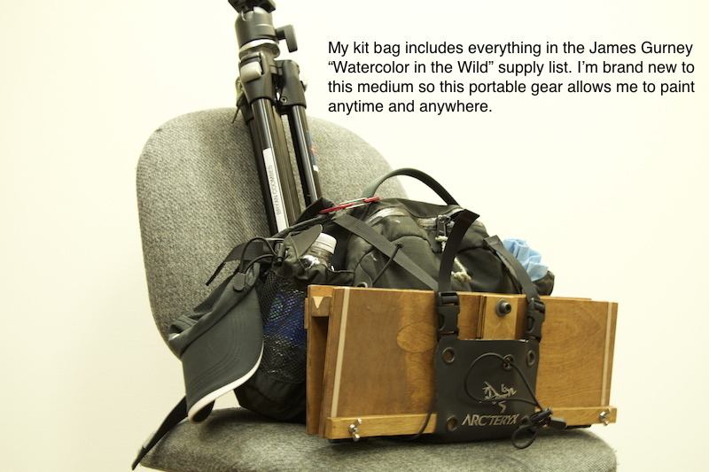
ERC
ERC sent me photos of two ideas that he and his friends came up with.
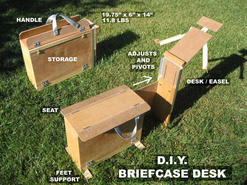
The first is a folding drawing horse. It looks like a big wooden briefcase — with storage inside — but it folds out to a stable and sturdy drawing bench that you can take to any sketch group.
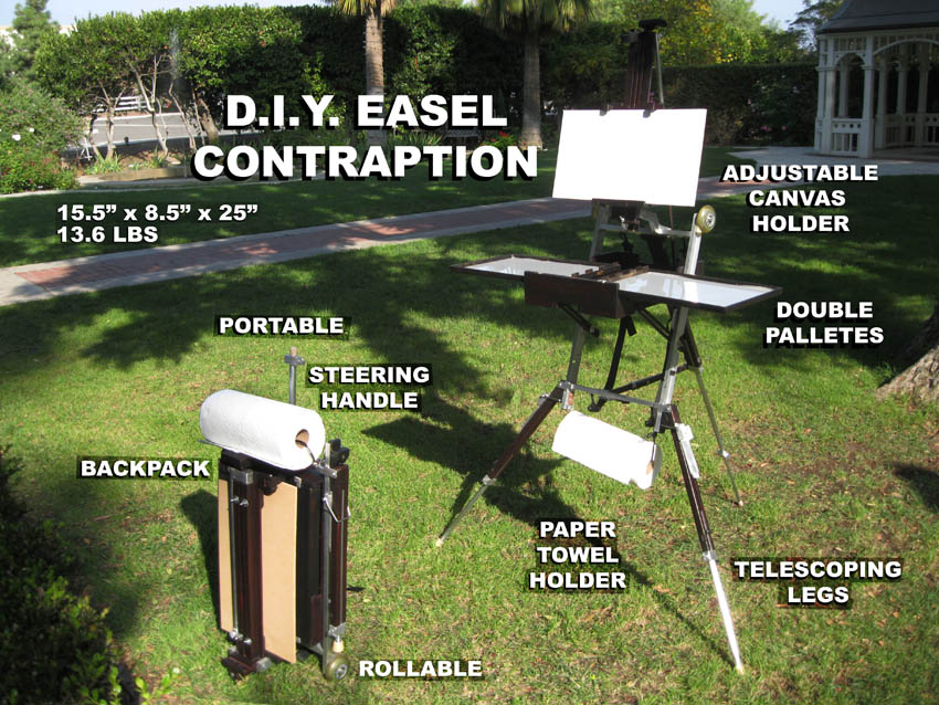
ERC’s second design rolls on skateboard wheels like a modern suitcase. Or you can carry it like a backpack to a painting location. Then the legs fold out to a wide tripod stance, holding any size canvas and a double-wide palette.
Jason Peck
Jason says, “Here is my most recent lightweight watercolor palette. I had a friend cut and drill the wood pieces for me."

"All I had to do was glue it all together, and stain it. It measures 9X10 inches, and weighs less than one pound. I’m still using the old hinges that you used on your first pochade rig, but I will be swapping them for the Southco adjustable torque hinge s soon.”
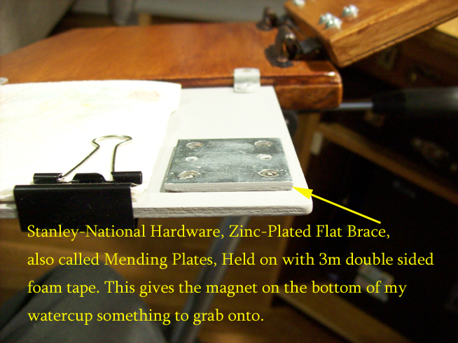
“This palette is lightweight and easy to pack and carry, but I have one more idea for an even lighter palette. I’m thinking of making one from old clipboards. My plan is to polyurethane the clipboards to waterproof them.”
Steve
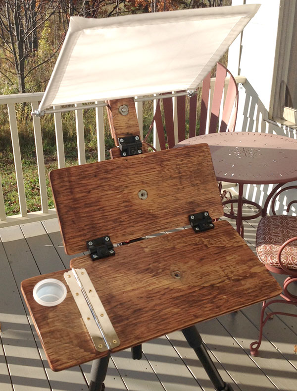
Steve says: "My casein mixing tray that I already had happens to be made out of aluminum, so magnets will have to be replaced with Velcro, not my favorite choice. Maybe I'll glue sheet metal strips on the bottom."
s soon.”“This palette is lightweight and easy to pack and carry, but I have one more idea for an even lighter palette. I’m thinking of making one from old clipboards. My plan is to polyurethane the clipboards to waterproof them.”
Steve
Steve says: "My casein mixing tray that I already had happens to be made out of aluminum, so magnets will have to be replaced with Velcro, not my favorite choice. Maybe I'll glue sheet metal strips on the bottom."
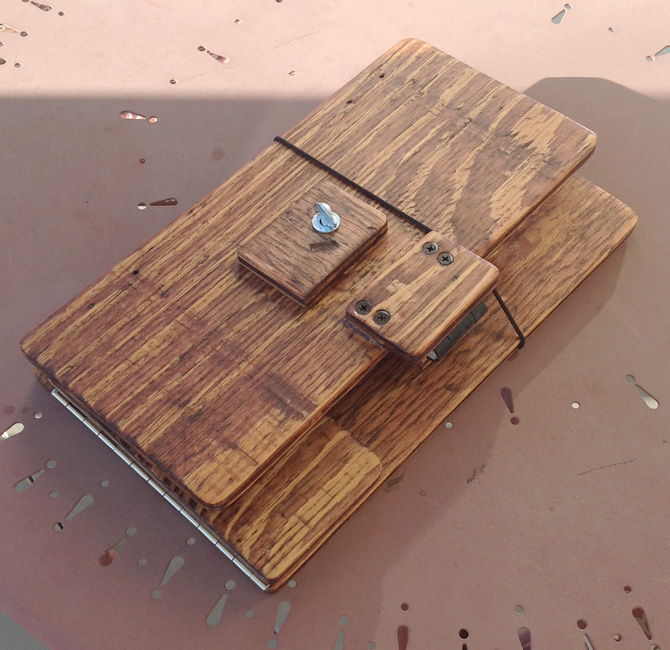
"I've found the easel kind of evolves as you go along. Because of the tension hinge thickness I couldn't get it to fold completely flat, so I came up with the water cup hole/piano hinge/spacer idea."
Randall Cogburn
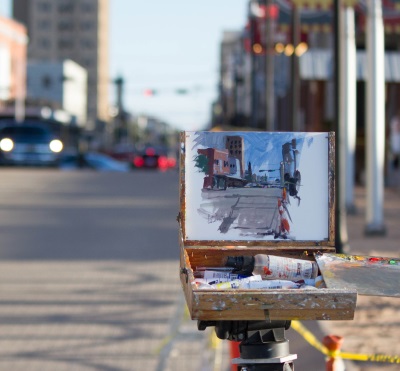
Randall Cogburn of Texas uses his lightweight sketch easel for various media.
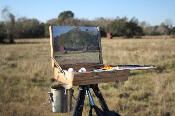
Here it is in oil mode.
He has also adapted it for use with gouache. “This is the first time I used gouache and loving it,” he says.
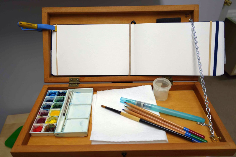
Nancy Vance made this easel from an old checkerboard. The boxlike interior, once used for holding the game pieces, forms a tray to keep brushes and cups from falling off.
It stays open as far as you want it to with a length of chain looped over a cup hook. If you want to paint on the right side of the book, you could mount the chain on the left side of the box.
Jeff Allen
Jeff Allen says, “I made this box for a trip to Hawaii. It was designed to fit into a USPS "if it fits it ships" box."

Here it is in oil mode.
He has also adapted it for use with gouache. “This is the first time I used gouache and loving it,” he says.
Nancy Vance made this easel from an old checkerboard. The boxlike interior, once used for holding the game pieces, forms a tray to keep brushes and cups from falling off.
It stays open as far as you want it to with a length of chain looped over a cup hook. If you want to paint on the right side of the book, you could mount the chain on the left side of the box.
Jeff Allen
Jeff Allen says, “I made this box for a trip to Hawaii. It was designed to fit into a USPS "if it fits it ships" box."
"That way I could ship all my painting equipment to the post office in Kauai where I could pick it up when I arrived. At the time it was $7.00 per box for shipping to Hawaii! It was constructed in oak with a standard thread for a tripod and saw a lot of use in Hawaii. It will hold 6 x 8 to 12 x 16 panels. The pallete is removable for cleaning.”
-----
Thanks to everyone who entered, and sorry I couldn’t include all of them. I'm glad we can keep this all open-source to benefit the entire maker community.
To the seven winners, please email me your mailing address with the subject line "ART PATCH," and I'll send an embroidered "DEPARTMENT OF ART" patch out to you.
--------------------------------------------------
 Video Tutorial
The HD download of "How to Make a Sketch Easel" is more than an hour long and costs only $14.95.
It's available now from Gumroad, and I'll upload it to Sellfy and Cubebrush later today.
The DVD version is available for $24.50, and it includes a slide show. The DVD is also available on Amazon
Earlier post on Your DIY Watercolor Easels.
More info on my easels and watercolor materials
-----
Thanks to everyone who entered, and sorry I couldn’t include all of them. I'm glad we can keep this all open-source to benefit the entire maker community.
To the seven winners, please email me your mailing address with the subject line "ART PATCH," and I'll send an embroidered "DEPARTMENT OF ART" patch out to you.
--------------------------------------------------
 Video Tutorial
The HD download of "How to Make a Sketch Easel" is more than an hour long and costs only $14.95.
It's available now from Gumroad, and I'll upload it to Sellfy and Cubebrush later today.
The DVD version is available for $24.50, and it includes a slide show. The DVD is also available on Amazon
More Links
My original Lightweight Sketch Easel.Earlier post on Your DIY Watercolor Easels.
More info on my easels and watercolor materials


Sunday, March 24, 2019
Cube and Checkerboard Illusions
The dark square marked “A” is painted with the identical mixture as the light square marked “B”. (Link to video on Facebook.)
The square marked “A” is painted with the identical color mixture as the square marked “B”. Both are a neutral gray. (Link to video.)
The lesson from both of these diagrams is that our visual system uses context cues to override the raw information that our eyes receive. It's good to keep this rule in mind when estimating the value and the color of objects.
David Briggs, an expert on color theory, did this lecture on color constancy and painting. (Link to YouTube)
----
From my book "Color and Light: A Guide for The Realist Painter."
Sunday, November 8, 2020
What happens when you shine blue light on an orange object?
Petr Macháně asks:
"What happens if there is orange object [seen in] blue light? What color should I paint part of the object that's in the light? Blue and orange are opposites on color wheel. I am just looking for advice on how to think about this."
"What happens if there is orange object [seen in] blue light? What color should I paint part of the object that's in the light? Blue and orange are opposites on color wheel. I am just looking for advice on how to think about this."
Petr, the color you need to mix is the apparent color you see. The word "apparent" is important here, because a given color must be seen in context. Those context cues tell you what color of light seems to be shining in the scene. If the light is white, the color you see will match the color of the object, but in colored light, everything changes.

In the diagram above, for example, we see see a checkerboard with a multicolored bar hovering over it. In the left sub-rectangle, it appears to be lit by yellow light because our visual system is tricked by the yellow shift of all the colors inside the rectangle. On the right we believe it's lit by blue light. The actual color note of the intersection piece is the same on both sides: It's a neutral gray.

In the diagram above, for example, we see see a checkerboard with a multicolored bar hovering over it. In the left sub-rectangle, it appears to be lit by yellow light because our visual system is tricked by the yellow shift of all the colors inside the rectangle. On the right we believe it's lit by blue light. The actual color note of the intersection piece is the same on both sides: It's a neutral gray.
So the color you paint is the color of the light plus the local color of the object. Sometimes this results in a color canceled out to neutral gray. But this effect can enhance a color, too. If you put green light on a green surface the result will be even brighter green. You see this in folds of flesh, where the reflected light shines back into a fold of skin and makes it a brighter orange."
"To answer your question, if you put an orange object in blue light, the color you mix may be a rather dull gray, but if you do it right, it will look orange. Try it and see if it works for you."
"To answer your question, if you put an orange object in blue light, the color you mix may be a rather dull gray, but if you do it right, it will look orange. Try it and see if it works for you."
Subscribe to:
Posts (Atom)