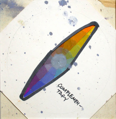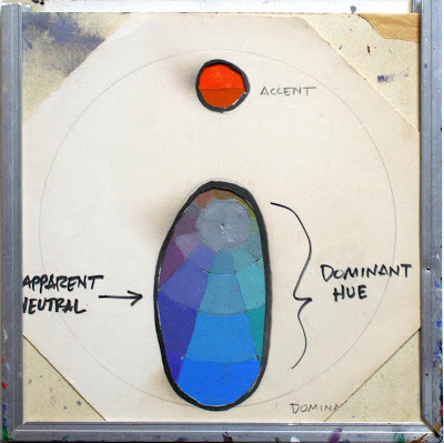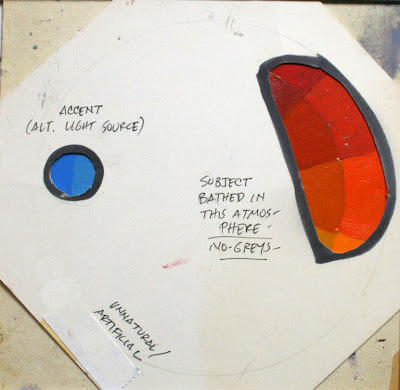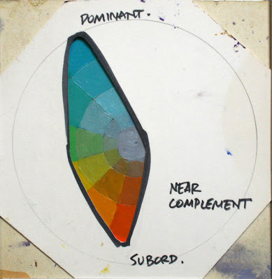
Showing posts sorted by relevance for query color scheme. Sort by date Show all posts

Sunday, January 27, 2008

Color Wheel Masking, Part 1

Today I’d like to introduce an approach to color that I’ve been developing over the last 10 years. I’m very excited about it, and I'd love to know your reactions. I call it “Color Wheel Masking.” I’m going to show you a practical method that you can use to accurately describe any color scheme that you see.


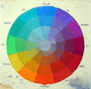
Let’s start with the basic color wheel with the primary and secondary colors are arranged around the outside of the circle in the normal way. As each of these colors approaches the center, it becomes a neutral gray. Any individual color can be pinpointed on the surface of the wheel in terms of its hue and chroma (“chroma” is also known as “intensity” or “saturation”). For the moment, we’re ignoring value as a dimension of color.

If a single color can be charted on the circle, then it follows that the whole scheme can be charted, too. To chart an entire color scheme, it helps to think not only which colors are included in a composition, but also which colors are left out.

Let’s look at some actual pictures to see which colors are in and which are out of the color scheme.
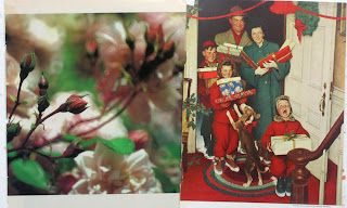

On the left is a photo of some roses and leaves; on the right is a Christmas painting by Norman Rockwell. Each of these painting has greens and reds in different distributions. Both essentially lack yellow, orange, violet and blue.


Here’s another photo and painting paired together. What they have in common is blue and orange—but no red, no yellow, no yellow-green.


Here are two more pictures. Their color schemes are not identical, but basically they’ve got strong reds and yellows, some greens, and a dull blue-violet. What they’re both missing are full-intensity blues and greens.


Now let’s see if we can design a mask to fit over the color wheel to fit these schemes. We want the mask to show only the colors we see in the picture and to leave out the colors that are absent. The Rockwell painting is pretty easy, because it only includes greens and reds (plus a hint of blue in the package and very dull yellow in the ribbon).

The color mask here is a long diamond shape that includes the complementary colors that oppose each other across the middle of the wheel, leaving out everything else.


Here are the images with the blue-orange polarity, along with a masked color wheel. Note that inside this diamond shape, there are some other colors near the center: just a hint of red and a touch of yellow-green and blue-green. The colors inside the perimeter feel sufficient for a complete color scheme, even though we’ve left out a lot.


The mask doesn’t have to be this long diamond shape, because not all color schemes are complementary. Nor does it have to go all the way to the edges, because plenty of paintings lack full-intensity chromatics.

The mask can also be a small triangle in one part of the wheel. Here I’ve taken two paintings from Dinotopia: Journey to Chandara and mapped out their color schemes by digitally defining a shape on the wheel and ghosting the rest.
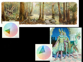

The swamp scene has dull yellow-greens and browns (browns are really dull oranges). The colors can be contained in the small triangle. The corners of that triangle never touch the edges of the wheel, because the painting doesn’t have any colors of full intensity. As you can see from the ghosted perimeter, the color scheme excludes blue, purple, and red.

Now all of a sudden we have a great way to describe any existing color scheme. But that’s just the first application of color wheel masking. Next Sunday I’ll show you a range of shapes for color wheel masks. Following that, I’ll describe exactly how to use color wheel masks to generate and experiment with color schemes.

In the intervening time, if you get a chance, I recommend that you can paint or digitally create your own color wheel to use as a tool for your own experiments.

Tomorrow: Inner and Outer Growth

Monday, May 10, 2010

Color Scheme Designer

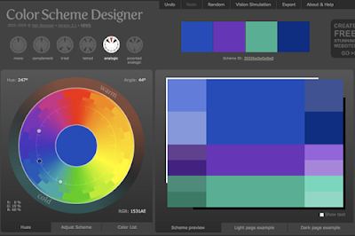
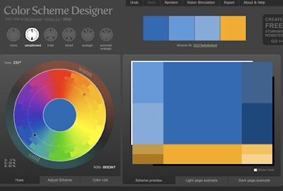
A free online interactive tool called Color Scheme Designer lets you play with color relationships. You start by selecting the type of color scheme, such as monochromatic, complementary, or triadic (The small circles at top left).

You can dial the scheme around the wheel by placing your cursor onto the floating dark dot. In this way you can see how color relationships change. Here’s a set of cool analogous colors.

The color swatches on the right are from a complementary scheme playing blues against orange-yellows. The swatches that come out are automatically produced in a variety of values.

For the designer or decorator, this tool is an interesting way to stimulate new ideas and try things on for size.

Color Scheme Designer
Thanks, Gene

Tuesday, February 5, 2008

Color Wheel Masking Update

On the two last Color Sunday posts here and here, we’ve been looking at the concept of color wheel masking, the idea that we can map out a color scheme on top of a color wheel.

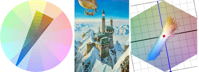
Blog reader David Briggs has made a brilliant contribution to this idea. He discovered a website called couleur.org by Philippe Colantoni that allows us to actually visualize a color scheme in three dimensions.

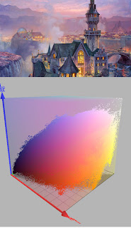
What you’re looking at here is a Dinotopia painting called “Palace in the Clouds” paired with a representation of the color scheme expressed in three dimensions.


The little floating blobs represent the amounts of each component color of the composition. On the left you see the hexagonal color wheel in pastel tones. Floating above that, white and blue blobs indicate the large areas of white and blue areas of the picture.

The diagram on the right shows the same diagram as viewed from the side. The vertical dimension indicates the value—or the level of lightness or darkness. The yellow and brown colors show up as little beads floating to the right of the red center line.


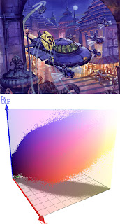
Here’s another painting with its color scheme chart. You’ll notice that most of the colors are fairly grayed down, which places them near the center of the axes. The light warm colors show up as a sprinkling of dots in the yellow-orange region at the upper right. The diagram on the right shows dark dots clustered at the bottom, greenish on the left of the red line, and brownish to the right.

My thanks to Mr. Colantoni and and Mr. Briggs for your generosity in sharing your discoveries. Don’t miss this coming Sunday, where we’ll continue our exploration of color wheel masking.

Tomorrow: Two Values

Monday, December 30, 2013

Questions about Black, Part 4 of 4

The last question is deceptively simple.

Is black a color?
The answer is no and yes, depending on how you mean the question, and what you mean by "color."

The "No" answer:
If you're talking about how the abstract concept of black fits into the infinite range of hues and chromas within the three-dimensional color universe, you might argue that it doesn't really belong with the others at all, because by definition it has no hue and no chroma. Black is not only the absence of color; it's even the absence of light.

Munsell Color Solid from Munsell.com
The "Yes" answer:
Looking at the question another way, the answer is yes. Black does have its place at the base of the 3-D chart of the color universe, where hues are arrayed around the outside, chroma (saturation) decreases toward the vertical center line, and value goes up or down with height.

Black has its own color swatch just like all the others. It sits at the zero point of value, the extreme pole beneath all dark colors. It's like the lowest note on the piano, one that you can include in a composition if you want to. In yesterday's post, we explored the arguments for and against using pure black in a painting, and just how pure that black pigment can be.

Just as black is a color, white and all the gray tones are colors, too, since each has its own location within the 3D color universe. They are like other keys on the piano, each a legitimate option that an artist may wish to include.

The surprising thing is that black, white, and the gray notes can function in a color scheme in such a way that they don't seem neutral at all. If you choose a gamut with two bright colors plus neutral black (and tints of black), the black suddenly becomes a very distinct subjective color. In the case of the color scheme at right, it would appear blue.

And this is where the "yes" answer becomes more than academic. Black really is a color that can be a core component of a luminous color scheme.


I demonstrate how this principle works in this video, which perhaps a lot of you have already seen. (Direct link to video)

In the end, it's good for beginning painters to be aware of the hazards of black. Many teachers rightly warn against using black carelessly, because it can deaden mixtures or kill the mood or the illusion of light in a painting. It's good to know how and when to mix your own black from other colors. But if you use black consciously, it deserves to be a valued part of any painter's toolkit.

"Questions about Black" Series
Part 2: Mixing your own black
Part 3: Using black in a painting
Part 4: Is Black a color?
Get my book "Color and Light" signed from my website or from Amazon.

Sunday, February 10, 2008

From Mask to Palette

How do you get exactly the colors you want in a picture….and no others?

This is the third post in a Sunday series about a method called color wheel masking. The first post showed how color masks can help to analyze color schemes, and the second post explored different shapes of masks.

In this post I’ll demonstrate how to actually mix the colors you have chosen for a given painting.

To start with, here’s the color wheel on the left. To the right above the palette paper are some primary colors of oil paint. You can use as many tube colors as you want at this stage. I just have little demo dabs of Winsor Red, Cadmium Yellow, Titanium White, and Ultramarine Blue.


Let’s say you want a monochromatic atmospheric triad with the dominant (and the most saturated) color in the red-orange range. Using your palette knife, mix a batch of each of the three colors that you see in the corners of the triangular gamut.

I've placed a little white box over those colors in this photo. In this case, it’s a saturated red-orange, a desaturated red-violet, and a desaturated yellow-green.


Now you’ve created the “heads of the families” or subjective primaries. Next, extend those colors into four different values or tones. Try to keep the hue and the saturation constant as you do so.

Look again at the color wheel mask. Halfway along the edge of the triangle are little marks indicating your secondaries. These are your in-between colors, which you may want to mix as well. You may end up mixing and working with anywhere from three to six strings of colors.

Before you start painting, remove from the palette all the tube colors that you squeezed out, except for white. This is important, because these colors are outside your gamut. You don’t want to have access to those anymore during the painting process.


At left is a color wheel with a monochromatic atmospheric triad emphasizing red. This time it’s laid out on Tobey Sanford’s digital color wheel (link to download). On the far right are the color ranges I mixed. In the middle is the resulting painting from Dinotopia: Journey to Chandara.

This group portrait takes place in Dinotopia’s phosphorescent caverns in the book The World Beneath (1995). I wanted the colors to suggest a cool, magical ambiance. With the colors in this gamut, it’s impossible to mix any intense warms, even if you wanted to. But as your eyes adjust to the color mood, it feels complete. The relative warm colors appear warm enough in the context of the picture.

I have noticed that when I use the color wheel masking system I am more careful to keep the brushes clean and to push against the outside of the range. Harmony and unity are a given, so the effort goes into reaching for accents. It's the opposite of the color-mixing mindset when mixing color from a full palette of tube colors, where I'm always neutralizing mixtures.


To conclude, here’s a painting from Dinotopia: A Land Apart from Time (1992), about the time when I first developed this method. I have digitally reconstructed the gamut I used for the narrow complementary color scheme.

Blog reader Briggsy provided the diagram on the right. He processed the image through a filter created by P. Colantoni, and available for Windows users at couleur.org. What you’re looking at to the right of the painting above is an objective computer visualization of the actual color scheme.

As you can see, it corresponds pretty closely to the generating mask, proof that the system is giving us exactly the intended color scheme. The blue colors are very intense, almost touching the edge of the wheel. The rest of the colors are in a narrow swath running across the grey center to the weaker complements.

I look forward to hearing how this method works for you, either with traditional or digital techniques.

Tomorrow: Pinkwater Portrayed

Sunday, March 14, 2010

3D Gamut Animations

First, let's have a look at a video. What you’ll see is a visualization of three different color schemes as 3D shapes floating within the RGB color space.


(If this embedded video doesn't play, try this link to YouTube). Each painting will be followed by an irregular shape that represents the range of colors used within that composition.

If you’ve read this blog for a while or dug back in the archives, you may remember seeing how we can chart a color scheme as a shape or gamut that takes up part of a color wheel. Everything outside the gamut is left out of the composition.

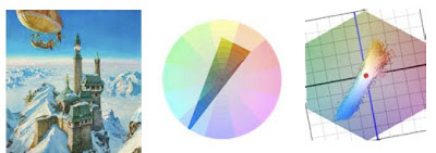
The painting Palace in the Clouds, above, has a gamut limited to intense blue, opposed by fairly dull reds and yellows, and some fairly dull dark greens.

To the right of that is a computer-generated image made by sampling all the pixels and charting them on a color wheel. The software was created by Phillipe Colantoni, and is available for Windows users at couleur.org.

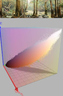
We can also combine the value or lightness data to see the color scheme as a 3D representation inside an RGB cube. The RGB color space is created by graphing red, green, and blue as three separate vectors in XYZ space. (The green vector above is hidden by the gamut.)

Where the vectors intersect is pure black. At the opposite corner is pure white. In this configuration, the secondaries are cyan, magenta, and yellow, which would lie on the plane between each of the two vectors. A pure yellow, for example, would be on the plane formed by red and green (the horizontal plane in this view).

By comparing each of the paintings with its gamut in RGB color space, and then comparing the gamuts to each other, you can see how the gamuts vary. The gamut for Crocodile Swamp is narrower because the color scheme is more limited. There are hardly any blues.

The yellow windows in this scene show up as a scattering of yellow dots at the bottom of the gamut.
------
Software by P. Colantoni at couleur.org.
Animation by Lester Yocum at lesteryocum.com
Previously on GurneyJourney: Color Wheel Masking Update

Sunday, February 3, 2008

The Shapes of Color Schemes

Last week I introduced the concept of color wheel masking, and suggested that any color scheme can be represented or mapped as a shape on a color wheel. Let’s take that idea and run with it.


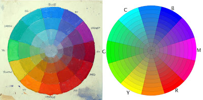
I painted the wheel at left, below. As you recall, it has the full-intensity hues arranged around the outside edge, gradating to neutral gray in the center. It uses the traditional subtractive red-yellow-blue pigment primaries.

This painter's color wheel goes back for centuries, and was influenced by the theories of Goethe and Newton. Two of the astute commentators on this blog, ZD and Painterdog, correctly pointed out that the traditional painter's color wheel is technically obsolete and even somewhat arbitrary and dogmatic, but I still have a fondness for it.


On the right is a mathematically correct digital color wheel based on the red-green-blue “additive” primaries of light. Spaced halfway between RG and B are cyan, magenta, and yellow, the subtractive colors used in printing inks.

My photographer friend Tobey Sanford created this wheel (downloadable here). It may be less familiar to traditional painters. It places the component colors differently around the wheel, but for the purpose of exploring the world of color, especially on our computer screens, it will serve us better in some respects, and we’ll see it again from time to time on future Color Sundays.

Regardless of which wheel we use, most color schemes are built from three component colors or primaries arranged in a triangle called a triad. The area inside the triangle is called the “gamut.” It includes all the possible mixtures from those three primaries, whatever they are.

The primaries don’t have to be red, yellow, and blue. You can use any three colors as primaries, even orange-green-purple—which in fact is what early color photographs called “autochromes” used.

In the case of the limited palettes we looked at a couple weeks ago, for example, we talked about using a less saturated pigment like yellow ochre instead of cadmium yellow. This reduced or muted yellow corresponds with a point well inside the margin of the wheel.

By using a paper mask and rotating it around the wheel, we automatically get interesting reduced gamuts, each with a dominant full-intensity hue and two subordinate, weaker “primaries”.


The mask sets us free to choose exactly the color schemes we want. We’re not limited to the haphazard choices of existing tube colors in limited palettes; instead we can use the mask to analyze or invent any gamut.

The equilateral triangle that I call the “atmospheric triad” is only one kind of color wheel mask. There are other shapes, and each of these basic shapes carries its own personality, regardless of the component colors. Atmospheric triads are moody and subjective, great for “color scripting” a graphic novel or a film.

When you rotate the triangular window around the color wheel, you can see the color groupings change, yet each one seems complete to itself. It suggests the feeling of walking from a room lit by incandescent light into another room lit by fluorescent light, and then stepping outside into the blue twilight. Your brain shifts from one color environment to another. I’ll talk more about the brain physiology behind color adaptation in a future Color Sunday.


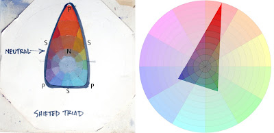
Here’s a color mask that crosses over the center a bit more, which I call the “shifted triad.” It’s shifted toward red, which means the subjective gray or neutral (N) in the composition is also shifted toward red. The secondaries (S) are what you get when you mix the dominant full-intensity red with the weaker blue-violet and blue-green primaries (P).


Here’s a complementary scheme, similar to what we’ve seen before. The complementary gamut, regardless of its component colors, suggests an opposition of elemental principles, like fire and ice. At the same time, it’s fairly stable, because its neutral coincides with the center of the wheel.


This one is called “mood and accent.” Most of the picture is in one color mood, with just one accent area from across the wheel and no intermediate mixtures. By the way, note that the octagonal color wheel mask and the color wheel slide into the top of the aluminum U-molding.


You could also pick an accent color that’s offset from the complement. It looks less natural, and therefore perhaps more attention-getting.


What happens when you create a mask that shifts the color balance off the axis? To me it feels like one of those diminished seventh guitar chords, or a dollop of sour cream dropped into sweet squash soup.


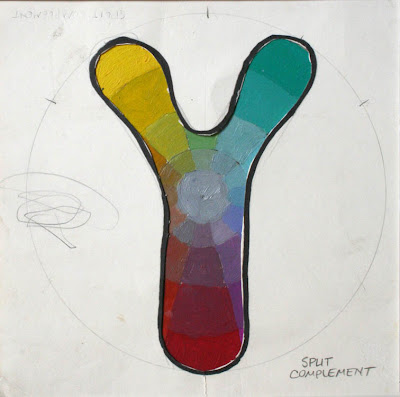
What effect do you feel with a split complementary arrangement, avoiding secondaries? To me it seems vibrant and attractive, but also a little unsettled and jarring.


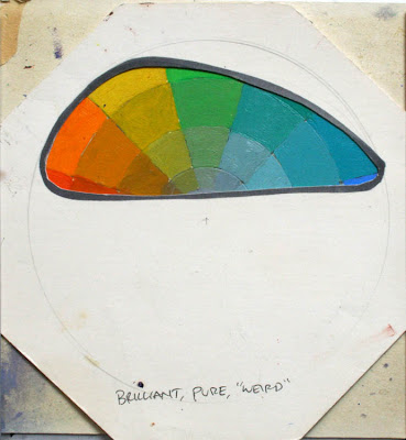
What if the mask selects colors all to one side of the wheel? To me it gives a sense of brilliancy, purity, or weirdness, not something you’d find in nature, but great for otherworldly science fiction.

There’s no limit to the kinds of masks you can cut, and then the infinite combinations you can generate when you start rotating a mask above your own wheel.

Next week, I’ll show you how to take a gamut you’ve selected, and prepare the paints on your palette so that you can use those exact colors in your own painting. The beauty of this method is that it jolts you out of any color mixing habits, and at the same time it forces you to stay within the limits you’ve chosen.

Tomorrow: Mountains Underfoot

Thursday, September 7, 2017

New Book: The Color of Pixar

A new visual book called The Color of Pixar by long-time Pixar artist Tia Kratter presents color schemes used in the Pixar movies.

The book presents hundreds of stills taken from all the Pixar films so far, including Cars 3 and the upcoming Coco. The stills are chosen for their predominant hue, and arranged by color. 

As you flip through the book, you proceed through the rainbow, making it easy to compare related color schemes that appear on adjacent pages.


Each image is presented singly, surrounded by a full-bleed colored border. The captions tell you the movie that the still came from, but there's no text explaining why the sequence was rendered in that color scheme. 


It's really a purely visual book that will appeal to artists looking for inspiration on color choices. It might also appeal to teachers who want to explore the subject of color with students.

Kratter says: "Color doesn't just make things beautiful—it makes things emotional."


The book invites speculation about how Pixar uses warm, glowing colors to evoke happiness, and dull, cool blues to suggest sadness, or green-grays to convey fear or alienation.

Sample page from The Art of Pixar: The Complete Color Scripts

If you're more interested in how color is used to enhance the particular story arc of each film, another fascinating book is The Art of Pixar: The Complete Color Scripts, which presents each of the films in terms of the color thumbnail plan called the color script.

Throughout Pixar's history, these color scripts evolved from little pastel studies to a digital plan that expresses not only the color schemes, but also the shape language of each sequence.
-----
Books
The Color of Pixar by Tia Kratter, currently $20.36 on Amazon.
The Art of Pixar: The Complete Color Scripts, currently $28.49 on Amazon.

Previously on GurneyJourney
Pixar supercut arranged by color (video)
Resource for movie screenshots (website)

Sunday, January 30, 2011

Van Gogh’s Color Schemes Served as Pie Charts

There are various ways to show a color scheme in diagrammatic form. One way is through the color gamut overlaid on the color wheel, as I’ve shown several times on this blog and in my book. That’s best for defining which color types are in and out of your scheme.


But it doesn’t let you know how much of each color is represented in the color scheme. To show that, you can graph the distribution of colors in a pie chart. Here’s one from Arthur Buxton’s blog. It converts 28 Van Gogh paintings into sector graphs showing the percentages of the five most common colors in each painting.

Warm colors in the dark yellow family predominate, often played against deep blues. Van Gogh doesn’t use much green, red or violet.

Working in reverse, from a set of pie chart to a series of pictures, this would be a useful method for film or graphic novel designers to plan color scripts.
-------
Arthur Buxton’s blog
via BoingBoing
suggested by John Harris and Susan Fox

Monday, January 12, 2015

Digital tool for analyzing color gamuts

Joost van Dongen, lead programmer and co-founder of Ronimo Games, wrote me to say that my book Color and Light inspired him to create a digital tool for analyzing color schemes.


When he developed the geometric racing game Proun (screenshots above), he was thinking about restricted color schemes, but his new tool let him see exactly what parts of the color spectrum were occupied by the colors he chose.

The blacked out areas of his diagrams represent the parts of the entire range of colors that are not included in a given color scheme.

He also used the tool to analyze screenshots from Awesomenauts (below), a game that his art team developed.

Looking at the gamut maps, he says: "the colour scheme is all over the place. It really is an explosion of colour, as is fitting for the over-the-top Eighties themes of Awesomenauts. Nevertheless you can see that even in the top image the colour scheme ignores large parts of the colour wheel, so even there the colour usage is limited."

He used the tool to analyze the color gamuts on other games, including Uncharted 3, Star Control II, and Far Cry 4, above. The first is a narrow complementary gamut, the second uses high chroma primaries without neutrals, and the third is clustered around a fairly muted gamut near the gray center of the spectrum. 

On his blog post, he shares a link to download the tool for free so that you can try it yourself. Thanks for sharing, Joost.
-----