Showing posts sorted by relevance for query shishkin. Sort by date Show all posts

Monday, September 21, 2015

Shishkin and Photography

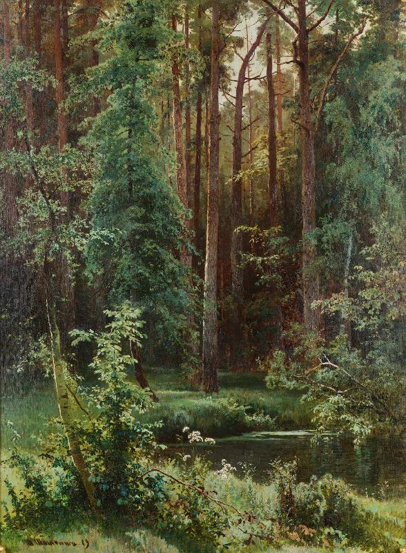
Ivan Shishkin, Woodland. 1889. Oil on canvas. 39 1-2 x 29 in. Date 1889
Although he was a devoted and prolific outdoor painter, Russian landscape painter Ivan Shishkin was also a big fan of photography, according to an article in the Russian archives.

He became closely involved with photos while working in Andrey Karelin's photography studio in 1870, coloring black and white photos for an album that was presented to emperor Alexander II.

Shishkin encouraged his students to work from photos, especially in the depths of winter, for example, when painting outdoors was impractical. Shishkin wrote in one of his letters:
"... Let me give you one major piece of advice, that underlies all of my painting secrets and techniques, and that advice is — photography. It is a mediator between the artist and nature and one of the most strict mentors you'll ever have. And if you understand the intelligent way of using it, you'll learn much faster and improve your weak points. You'll learn how to paint clouds, water, trees — everything. You'll better understand atmospheric effects and linear perspective and so on..."
Shishkin enlarged details with a magnifying glass, and he also used a projector. When he came to teach at the Academy of Fine Arts in 1897, he specifically mentioned the need for a "magic lantern" type projection device to aid in student learning, not only for enlarging photos, but for presenting drawings at a larger scale.

Although photographs were used widely by artists during his time, Shishkin was conscious of not mindlessly copying. He told his students that the way an artist uses a photo will reveal the artist with talent, because "a mediocre artist will slavishly copy all the unnecessary detail from photos, but a man with a flair will take only what he needs."

Shishkin's enthusiasm for modern tools like photography is not surprising during an era of technological innovation, and in an age of positivism, which placed a value on verifiable facts. His friend, portrait painter Ivan Kramskoi also used photography, and he probably used one to guide his portrait of Shishkin below:

Portrait of Shishkin by Ivan Kramskoi
But Shishkin never regarded photography as a substitute for painting outdoors from life. Kramskoi marveled at his productivity: "He paints two or three studies a day and completely finishes each of them."

Shishkin wrote: "In the case of art - be it art, architecture, such practice is of the greatest importance. It alone allows the artist to appreciate the substance of the raw material which nature presents. Therefore, the study of nature is necessary for any artist, but especially for the landscape."
Shishkin knew as much about individual plant forms as did the professional botanists of his day. He probably would have agreed with the critic Adrian Prakhov, who said, "I love the original character of every tree, every bush, and every blade of grass, and as a loving son who values ​​each wrinkle on the face of his mother."

Shishkin said, "Work every day as if it is your daily duty. There's no need to wait for inspiration! Inspiration is the work itself!"
------
Thanks to Samir Rakhmanov for the link and the help with translation.
Previously on GJ: Using Photo Reference
GurneyJourney YouTube channel
My Public Facebook page
GurneyJourney on Pinterest
JamesGurney Art on Instagram

Thursday, December 3, 2015

Shishkin Painting Methods

Ivan Shishkin (1832-1898)
A couple of months ago we took a look at Ivan Shishkin's opinion of photo reference in his landscape painting. Now let's examine more about his specific working methods.

Preliminary Drawings
He would advise his students: "Before starting the painting, you have to do a sketch to clarify the idea and plan what you're going to be doing on a big canvas."

Note in the sketch at left, Shishkin draws a grid, probably to help him enlarge the composition onto the canvas. 

Shishkin continues: "It's also important to do a preliminary drawing [on the canvas] with charcoal. Put a layer of charcoal on a clean canvas and wipe it with a dry tissue. You'll have a smooth base tone, and you can draw over that with more charcoal. You can erase off halftones and lights using an eraser made from a chunk of black bread. If you do that you will get the effect of lighting you need, and then you're ready to continue with the final painting."

Shishkin typically used ink to clarify the outlines of the trees in his preliminary drawings. Once the preliminary drawing was finished, he would proceed to do a tonal underpainting in monochrome before painting in full color.

Paint and palette organization
"He carefully mixed organized groups of colors on his palette. All the colors must be prepared in groups in advance on the palette. He began by applying the darkest tones of paint. Then he proceeded to the halftones, and so on up to the light." (From a letter from Ivan Shishkin, St. Petersburg, 1896).

Shishkin studied in Düsseldorf, so it's not surprising that he used primarily German paints. "He used zinc whites for big studio paintings and lead whites during his traveling and for outdoor painting, because they dry more quickly. He painted on canvases from Dresden if he could." 

"He used to buy a lot of different paints. But if he didn't know the specifications of a given kind of paint, such as lightfastness and durability, he avoided it." 

"Because of this he completely stopped using carmine oil paint after [Vasily] Polenov showed him a chart of paints that was left in the sun for 10 years, and carmine completely disappeared."

Ivan Shishkin and A. Guinet in the studio on the island of Valaam
Here's a list of Shishkin's paints:
Red paints: 
English red, Chinese vermilion, rose madder, and rose doré, mostly used for glazing. Burnt sienna was his favorite.

Yellows: 
Yellow ocher, cadmium yellows and oranges, zinc yellow (for backgrounds and leaves in the sunlight), raw sienna, chrome yellow (rarely), and Indian yellow (for glazing). He never used gamboge or aureolin. Sometimes he used Naples yellow for sand and roots. Occasionally for foreground textures he would mix fine sand into the paints. 

Blues: 
Sky blue (?) and Prussian blue.

Greens:
He used a lot of different ones, including: permanent green, cobalt green, chrome green, vermilion green, emerald green, and others.

Blacks: 
Ivory black and lamp black oil paint.
-----

Saturday, November 14, 2020

Shishkin: Plussing the Sketch to Make a Better Finish

Ivan Shishkin (Russian, 1832-1898) painted "Midday in the Environs of Moscow" (right) in the studio based on a great many plein-air studies, such as the one at left. While the study is colorful, it doesn't convey a very strong feeling or concept. 

The final composition (right, above, 1869, 111.2 cm. × 80 cm) increases the focus on the workers returning from the field. Their heads are closer to the horizon. The standing water in the ruts of the cart tracks of the rutted road hint at the potential of rain in the towering clouds above.

Other versions of the composition exist, such as the one below, showing how Shishkin developed the concept. 

He must have realized the masses of trees in the middle ground weren't necessary. 

Would a long horizontal version convey more effective sense of space? This version, called "In the Rye" is from 1866. He later explored the power of a horizontal view of rye fields ten years later

Improving the sketch gets you to a final that's more powerful than what you can accomplish on location. It often requires removing some elements and simplifying the design.

It also means elaborating or "plussing" the things that are working. Plussing —adding to a good idea to make it better—is a word that Walt Disney liked to use, and they still use it at Pixar. 

Monday, January 4, 2021

Shishkin's Winter Forests

In his painting Winter Forest, Ivan Shishkin presents a dark forest filled with snow. 

Winter Forest by Ivan Shishkin

The lure of being lost in the shadows of a forest in winter is a compelling visual idea that stirs deep mythic feelings. 

Shishkin studied painting in Germany, a nation that has a special word for the poetic feeling of being alone in the forest: Waldeinsamkeit. 

Ivan Shishkin Winter in the Forest (Hoarfrost) 

In this winter forest painting, the visual pathway leads back to a light-filled distant clearing. On a sunny day, wet snow sticking to small branches lasts only a couple of hours before it melts away. 

Shishkin was an advocate of using photo references, so he may have been aided by photographs as well as plein air studies for this one.

----

Previously: Shishkin and Photography and Using Photo Reference

GurneyJourney YouTube channel
My Public Facebook page
GurneyJourney on Pinterest
JamesGurney Art on Instagram
@GurneyJourney on Twitter

The classic book on Shishkin is this Russian edition from the 1980s.

Wednesday, February 10, 2021

Shishkin's Sketch vs. Finish

A popular meme these days is "sketch vs. finish." Late last year I did a sketch/finish comparison of the Russian landscape painter Ivan Shishkin (1832-1898).

Here's another set of comparisons, starting with a preliminary sketch in pencil where he explores the overall composition.

A road leads back through fenced pastures to a gate. In the distance is a turn in the Kama River. 


He must have liked this design because he drew a grid over it for enlargement. 


Here's the finished painting. He arranged the lighting to put a spot of light on the road ahead. To get to that farther spot of light in the valley, you have to pass through the dark forest.

Shishkin used this basic idea in a night scene, apparently drawn in charcoal with gouache.

----

Ivan Shishkin on WikiArt

Previously: Ivan Shishkin's comments about photo reference

The classic book on Shishkin is this Russian edition from the 1980s.

Friday, February 14, 2014

Book Review: Shishkin Books


There's a new book on Ivan Shishkin (1832-1898) that offers a helpful introduction for the new fan or the confirmed collector of the great Russian realist who specialized in forest scenes.


The new book is the one on the right. It's in the series of inexpensive books (under $15) in English on Russian realists that have been coming out recently. A similar book in the same series on Ilya Repin that came out in 2011 is now out of print and costs well over $60, and the one on Valentin Serov is also out of print and costs over $100. So people have been snapping these up, and I'm sure the Shishkin book will be no exception.

The new book is hardcover, 200 pages, and about 9x12 inches. It has a short biography and overview of Shishkin's place in Russian art, but it's mostly illustrations. There's a sampling of his pen-and-ink work, his etchings, and his pencil studies, as well as a good representation of his oil paintings and studies. But I found that the colors tended to be too contrasty and warm, with the shadows going to black.

A 1996 book called Shishkin (Great Painters) (shown in the middle of the photo above) is comparable in scope and coverage. It's a little larger, about 9.5 x 13 inches. The color in the reproductions is a little better, but some paintings are reproduced smaller than they need to be.

The best book in my opinion is the large, thick 1981 book, printed in the old Soviet Union, and called Shishkin Album. It's shown on the left in the photo above. You can still get this one in its paperback form as a used book, but it's rather expensive. The book is about 254 pages long, and the reproductions are quite good, with many of Shishkin's plein air studies.


Sunday, October 22, 2023

How Shishkin Used Preliminary Drawings


Ivan Shishkin, a renowned Russian landscape painter, used preliminary drawings to develop his studio compositions. He typically established a grid for enlarging the drawing to the final canvas, and he used ink to clarify the outlines of the trees in his preliminary drawings.

Mast Tree Grove (Drawing) by Ivan Shishkin

Once the preliminary drawing was finished, he would proceed to do a tonal underpainting in monochrome before painting in full color.


"Before starting the painting, you have to do a sketch to clarify the idea and plan what you're going to be doing on a big canvas." Sometimes he would also do a color study to work out the plan for the painting.


Shishkin continues: "It's also important to do a preliminary drawing [on the canvas] with charcoal. Put a layer of charcoal on a clean canvas and wipe it with a dry tissue. You'll have a smooth base tone, and you can draw over that with more charcoal. You can erase off halftones and lights using an eraser made from a chunk of black bread. If you do that you will get the effect of lighting you need, and then you're ready to continue with the final painting."

Saturday, August 20, 2022

Should We Change What We See?

Pine, 1892, by Ivan Shishkin

It's an age-old question: Should you as a plein-air painter try to capture exactly what you see, or should you deliberately make changes? 

Ivan Shishkin said: "The main thing for a landscape painter is a diligent study of nature. Because of this, the picture from life must be without imagination." John Ruskin said that the student should: “Go to Nature in all singleness of heart, and walk with her laboriously and trustingly, having no other thought but how best to penetrate her meaning, rejecting nothing, selecting nothing, and scorning nothing.”

I don't think Shishkin is really dumping on imagination. Instead of the word "imagination," we might substitute "conventionalism" or "idealization." 

I sympathize with what Shishkin and Ruskin are advocating. There is a real joy and challenge for trying to capture exactly what's in front of you without changing or editing or "improving" it. Of course attempting to copy a scene from nature in all its color and detail is not really possible. You have to make choices and simplify something, because you can't capture it all. 

Back in the studio, armed with these studies, the artist can assemble the raw material of plein-air studies to create a virtual world of imagination.

I like having a lot of different conceptual approaches ready, like arrows in a quiver, when I head out. Sometimes when I'm on location I want to hold a mirror to nature. But other times I like to exaggerate, elaborate, or invent a fantastical scene while looking at nature.

Saturday, September 12, 2015

Chernyshevsky's Philosophy of Art

I've been reading about 19th century Russian painting, and several books on the topic have mentioned that the artists were influenced by an 1853 essay called "The Aesthetic Relations of Art to Reality" by Nicolas Chernyshevsky.

By all accounts this essay was a kind of manifesto for the Russian painters and was a particularly significant influence on its leaders, such as Ilya Repin, Ivan Shishkin and Kramskoy. It explains why realism flourished longer there than it did in Western Europe.
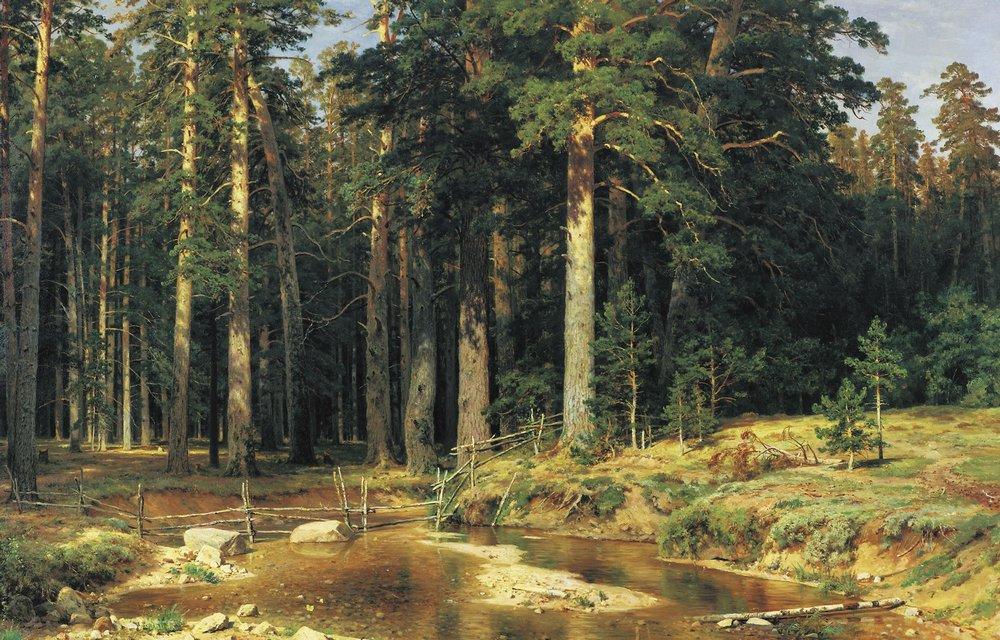
Ivan Shishkin, Mast Tree Grove, 1898
For example, compare this painting by Shishkin in Russia in 1898....

Paul Cezanne, The Bathers, 1898-1905
...to this one by Paul Cezanne in France at the same time. What was different about the aesthetic philosophy in Russia?

The central notion of Chernyshevsky's essay is that reality is greater than art. At best, art is an attempt to replicate or reproduce reality, and therefore art is on a plane lower than reality.

This is a very different idea from the aestheticism of J.M.W. Whistler and others who suggested that it is the business of art to improve on nature. Whistler said, "Nature is very rarely right, to such an extent, even that it might almost be said that Nature is usually wrong." 

Around the same time that Chernyshevsky's influential essay was published in Russia, related ideas were published in England and America. John Ruskin's Modern Painters and Asher B. Durand's Letters on Landscape Painting (1855) preached a version of Truth to Nature that had a great influence on the movements Pre-Raphaelitism and the Hudson River School in English speaking countries. The main difference with Chernyshevsky is that he seems to lack the moralizing tone of Durand and Ruskin.

Ilya Repin, Portrait of Aleksei Pisemsky. 1880
All these thinkers advocated that the artist should have a reverence for the concrete facts of reality and to allow as much as possible for the painting to be a clear window to that reality. Repin's portrait of Pisemsky is a good example, where the technique is subordinated to the force of personality, made manifest in concrete facts.

Ruskin, Durand, and Chernyshevsky all advocated that artists—students especially— paint as faithfully from nature as possible, but since absolute leaf-for-leaf imitation of external details is impossible, artists should re-create (Durand used the word "represent") on canvas the truth they have experienced, penetrating to the Platonic essence.


In Shishkin's case this meant painting scenes that seemed "found" or "photographic" to the untrained eye, but were in fact carefully constructed using his deep knowledge of natural effects.

It took him a lifetime to discard the conventional formulas of the picturesque in landscape, and to invent a way to interpret the reality of a forest interior in oil paint.

Many contemporary realists place a great value on the aesthetics of brushwork, paint texture, and composition, but Chernyshevsky would have regarded this preoccupation as a foolish distraction, like focusing on the scratches and skips on a phonograph record instead of listening to the music. Just as a phonograph record aspires to deliver the experience of a live concert, a painting aspires to the fullness and presence of reality. (The concert/phonograph analogy is my own, and of course the phonograph came after his time; Chernyshevsky actually uses the analogy of an original painting versus an engraved reproduction of it).

Here are some excerpts of Chernyshevsky:
  • A reproduction must as far as possible preserve the essence of the thing reproduced; therefore, a work of art must contain as little of the abstract as possible.
  • Art expresses an idea not through abstract concepts, but through a living, individual fact.
  • The essential purpose of art is to reproduce what is of interest to man in real life. 
  • Reality stands higher than dreams.
In order to grapple with these ideas, I imagined a conversation between myself and Chernyshevsky. Please note that Cherny's comments are my supposition of how he would answer.

Me: Can a camera or a high resolution motion picture achieve this result? 
Cherny: No. The excitement that the human being experiences in the presence of reality can only be evoked by an artist with an inquiring mind who can imaginatively see into the structure and essential features of the subject, and express what it is about that subject that makes it interesting.

Me: Is the imitation of reality what we're after?
Cherny: No, the mere copying of external features will only lead to boredom, both for the artist and the viewer. There's a big difference between mindless copying and insightful reproduction of nature.

Me: Aren't such insights highly subjective? Science in recent decades has shown that there is no such thing as objective reality. Our perception of the world around us is a construct of our perceptual systems. Therefore, shouldn't we paint the world in a personal style that matches our own subjective view of the world?
Cherny: You make too much of that. Painting in the way you suggest is just an excuse for laziness. Two careful artists with good training will produce studies that match each other very closely. But such studies are just the beginning. It takes a lifetime to create works that address the deep experiences of life. 

Me: What about the Surrealist's goal of painting what is inside the mind, the world of dreams and nightmares?
Cherny: Your dreams ultimately come from reality. Imagination plays a key role, but the aim of the artist is to use the imagination to see into the heart of reality itself, which is the source of everything in its fullest and purest form. Reality is also full of latent mystery that cannot be fully understood by either the poetic avenue of art or the fact-based avenue of science.

Me: If reality is greater than art, of what value is a visit to the art museum?
Cherny: If it's a choice between the two, artists should look to reality for their chief inspiration; otherwise their work will become second-hand and mannered. But it is extremely valuable to study the means by which great artists of the past have expressed the essence of reality. Look for artwork that brings you closest to the feeling that you are in the presence of real life, and then try to understand how those effects are achieved. The challenge when you leave the art museum is to leave behind the conventions of past art movements, and to see reality for yourself without preconceptions.

Me: What categories of art are most worthy—sublime, comic, tragic, or beautiful?
Cherny: They are all important. A sensitive person will respond to the problems presented by life, and will want to create art that speaks to those problems, so that a fellow human can gain wisdom and insight from the art. Those impulses can run the gamut of emotions. Whatever way you respond to nature should be the subject of your art, but it should be conveyed in concrete, material terms.  

My concluding thoughts: I don't think Chernyshevsky's idea is completely tenable intellectually for me. I can't get past the idea that "reality" is a provisional thing, constructed in our own minds, and subject to the whims of our very selective and subjective visual systems. I also resist the notion that abstraction must always be avoided. Of course I love the Russian realists, but I also feel that a pulsing sense of life can emerge from certain highly abstracted forms of art, such as hand-drawn animation or comic art. 

But Cherny's idea that reality stands on a plane above art is for me an extremely useful driving concept that helps focus my mind when I'm out painting from nature. I often achieve my best results when I try to capture what's in front of me without trying to "improve" on it in any way. When I compare the immense complexity, subtlety, and richness of the real world to my own paltry efforts, I'm left with a sense of how far I have fallen short of the truth in front of me.
-----
"The Aesthetic Relations of Art to Reality" by Nicolas Chernyshevsky.
Nicolas Chernyshevsky on Wikipedia
Recommended book: The Russian Vision: The Art of Ilya Repin by David Jackson

Tuesday, July 6, 2021

Two Russian Realists and Their Choices

If you compare the handling of a similar subject by two different realist painters, it becomes clear how each makes consistent choices, lending a recognizable style to each.

Ivan Shishkin

Backlighting adds contrast, and there are strong value shifts throughout. For Shishkin, emphasizing the local contrasts reduces the effect of large color fields.

Isaac Levitan

Indirect light allows Levitan to focus on three large value groups: the fern tops, the ground moss and the far forest. I would guess he consciously grouped those values to simplify what could otherwise be a very complex scene.

Ivan Shishkin

Here again, Shishkin uses relatively neutral colors and pursues local contrasts rather than large color fields.

Isaac Levitan

Levitan uses the backlighting to set up the strong colors of birch leaves. He handles the far leaves as an almost flat region of color.

If there's a lesson here, it's that the reality that we see and capture in paint is a direct consequence of the quality of attention we give it. There's no objective reality out there. It only comes into being in terms of the encounter with our unique brains based on what we're looking for. 


Wednesday, May 13, 2015

Shishkin Landscape


The landscapes of Ivan Shishkin (Russian, 1832-1898) are notable for their truth to nature. He knew a lot about botany and painted outdoors on a regular basis. This autumn landscape in oil is about 16 x 26 inches.

 A detail suggests three things to my eye.

1. The sky must have been dry or nearly dry from a previous session, rather than painted all wet together. If it was previously painted, it then have been "oiled out" with a very thin layer of painting medium to make it receptive.

2. He must have had a wide variety of brushes, and switched between them as he built up the foliage and branch textures. A big old, splayed brush, dabbed against the canvas, could have provided the foliage textures.

3. The branches are painted with a very thin round brush, and some of the lighter branches in the lower right of this detail seem to be scraped out of the wet paint with a knife or a brush.

4. The foreground leaf masses are laid on quite thickly. The full effect is loose and direct, but not "brushy"—that is, it doesn't look like a collection of brushstrokes.
-----
The Shishkin painting is Lot #1 in an upcoming Sotheby's sale of Russian pictures in London on June 2.

Sunday, December 30, 2018

Shishkin's 'First Snow'

First Snow by Ivan Shishkin, 1875 
The snow has melted in contact with the relatively warm, wet ground, but it still clings to the branches, surrounded by the colder air. 
----

Sunday, September 27, 2020

Shishkin's Burdock Drawing

Drawing of burdock by Ivan Shishkin.

 Book by Parkstone Press: Ivan Shishkin

Tuesday, May 24, 2016

Weed Painting Challenge


“A weed is but an unloved flower.” ― Ella Wheeler Wilcox

It's time for the next GurneyJourney painting challenge. Let's paint some weeds.

Ivan Shishkin, Aegopodium, Pargolovo (study) 1884, 35x59 cm
Fidelia Bridges, Thistle and Landscape
How does the challenge work?
We've done this before with gas stations, graveyards, and outdoor markets (Links take you to results). 

This time we'll paint some weeds on location. Everyone can upload their examples to this special Facebook event page. I'll choose a Grand Prize winner and five Finalists. Each receive a coveted "Department of Art" embroidered patch, and the Grand Prize winner will also receive a free tutorial download.

I hesitate to call it a "contest" because there's no entry fee and the spirit is more about cooperation, community, and camaraderie than competition. We're all at different levels of skill and experience, but we're all out there braving the elements and trying out new painting ideas.

Ivan Shishkin Grasses
How do you define a weed?
• By "weed" I mean any naturally growing herbaceous plant. For example: wildflowers, cattails, vines, lily pads, grasses, dandelions, ferns, mushrooms—really any natural plants. 

• That excludes anything planted, cultivated, or tended by humans, such as nursery or garden flowers or food crops.

• Nothing too big: no woody plants and no trees. 

Ivan Shishkin A Woman Under an Umbrella
• Must be painted outdoors with the weeds in situThe weeds can't be cut and brought indoors or painted from photos. 

• The scene can include a landscape background, but the emphasis should be on the foreground with the plant carefully observed, with some botanical detail. 

• You can put a piece of white or black board behind a weed if you want to isolate it against a simple flat background. But I'm not looking for botanical studies so much as weeds in natural (or man-made) settings.

• OK to include some trash, insects, signs or other things you find around the weeds.

William Scott The Butterflies' Haunt--
Dandelion Clocks and Thistles
What media are OK?
• All painting media accepted, such as oil, watercolor, acrylic, gouache, acryla-gouache, alkyd, casein, or water-soluble colored pencils. 

• No limits on palette of colors.

Deadline
• You can enter as soon as you finish the piece, but no later than the deadline: Friday, June 24, 2016 at midnight New York time. Winners will be announced on Sunday, June 26.


William Henry Hunt Birds Nest and Primroses
Fidelia Bridges
Thistle in a Field
Submission Guidelines
• Free to enter

• It must be a new painting done for this challenge. In addition to a scan of the final painting, your entry must include a photo (or video) of your painting in progress in front of the motif. 

• Please include somewhere in the title or description the name of the weed, either a common name or Latin name.

• Upload the images to this Facebook Event Page. If you don't have a Facebook account, please ask a friend with an account to help you. Please include in the FB post a mention of what medium you used, and if you want, a word about your inspiration or design strategy, or an anecdote about your painting experience.

• In addition to the Facebook event page, you can use the hashtag #weedpaintingchallenge on Instagram or Twitter to see what other people are doing. 

• If you end up doing more than one entry, please delete your weaker entry so that we end up with just one entry per person.

Aaron Draper Shattuck Leaf Study with Swallowtail
Prizes
I'll pick one Grand Prize and five Finalists. All six entries will be published on GurneyJourney, and all six will receive an exclusive "Department of Art" embroidered patch. In addition, the Grand Prize winner receives a video (DVD or download) of their choice. Everybody who participates will have their work on the Facebook page, too.

EDIT: Winners of the Weed Painting Challenge
-----
Check out the previous results for gas stationsgraveyards, and outdoor markets.
Own the 72-minute feature "Gouache in the Wild"
• HD MP4 Download at Gumroad $14.95
• or HD MP4 Download at Sellfy (for Paypal customers) $14.95
• DVD at Purchase at Kunaki.com (NTSC video) $24.50
GurneyJourney YouTube channel
My Public Facebook page
GurneyJourney on Pinterest
JamesGurney Art on Instagram
@GurneyJourney on Twitter