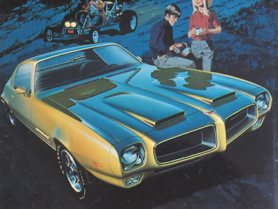
The illustrator team Art Fitzpatrick and Van Kaufman painted glamorous cars set in posh backgrounds, and their art was reproduced in magazine advertisements in the 1960s.
Their teamwork started before beginning each gouache painting.
According to Hemmings Motor News: "The men would each travel with their cameras, bringing home thousands of 35-millimeter slides. They would then sort them to find the most promising backgrounds. In the meantime, Art would take hundreds of photos of the feature cars at GM's Tech Center: 'I used the turntable and cherry picker to capture different angles, and took most of the photos I'd use for one year in a few days. We would match a car's view and a suitable situation-it was all carefully thought out. We'd then do a pencil sketch of the background, indicating the shape of the car, and figure out what the color scheme would be.'"
"If Art's car was to be placed on Van's background, he painted in opaque watercolor gouache on one-ply Strathmore art paper. 'If I was working on a convertible or a car with a detailed background, I'd often only do the body, cutting along the windowsill with an X-ACTO knife. I'd turn the car over and sandpaper the edges to a knife-point so that they wouldn't show on the background-then I'd rubber-cement both surfaces, and paint the roof or other details right on Van's background.'"

"Art's willingness to adapt his technique earned them great acclaim. 'We came up with a different way of rendering the paintings," he recalls. "I started cropping part of the car out of the picture, making it too large to fit the page...they had impact. Clients liked how single-page magazine ads usually showed a side-view of their car, but they were paying for 'X' square inches of space and using only fifteen percent. My idea was to show a larger front view, cropped-the near headlamps look the same as the far ones, anyway.'"

Read the rest of the Hemmings Feature about Art Fitzpatrick, by Mark J. McCourt
Thanks, Mike Geraghty


11 comments:
I've always been curious about how these types of illos were done. Syd Mead mentioned that artists used multiple vanishing points and purposely made the cars wider than they were in reality for more impact. Some of the cars here, definitely seem to have that wider look to me.
I've always been curious about how these types of illos used to be done. Syd Mead mentioned that they used multiple vanishing points and purposely made the cars wider than they were in reality for more impact. Some of the cars here seem to have that wider than average look to me.
Michael, good eye. They would often cut a drawing and extend the width of the car because it looked more cool to people back then to see a wide car.
I am glad you gave Van "equal time." Various car sites emphasize Fitz--Van is merely the guy who "sketched in the backgrounds." These pictures don't work without the vehicle and the rest of the painting being in sync. Thanks!
The sample images are all Pontiacs. I have childhood memories of Pontiac's "Wide Track" advertising. That, and the split grille, defined Pontiac in the late 50s and early 60s.
Didn't Bermie Fuchs also work as a team doing the"background for the car and a car specialist doing the actual car in the ad?
I have long wished there was a comprehensive books on them with the hundreds of illustrations they did for GM during the late 1950s and 1960s. Alas, it seems unlikely.
the book will be out this year from rob keil in san fran
my thoughts exactly
The book of Art Fitzpatrick & Van Kaufman's car illustrations can now be previewed and ordered at www.FitzAndVan.com
Hi Rob Keil here. I'm the author of the book on Art Fitzpatrick & Van Kaufman. A preview of the book is up on www.FitzAndVan.com
Post a Comment