


On Saturday and Sunday at noon, California time, YouTube will premiere samples from my next Gumroad tutorial called TRIADS. Full version is 90 minutes long and it releases on Saturday morning with a 10% off sale all day Saturday. (Link to Saturday YT Premiere)
Showing posts sorted by relevance for query triads. Sort by date Show all posts
Showing posts sorted by relevance for query triads. Sort by date Show all posts
Thursday, September 10, 2020
Previews of "Triads" on YouTube this Weekend


Sunday, September 6, 2020
Announcing TRIADS Next Saturday
Can this outdoor still life be painted with just three colors plus white? If so, which colors?

Can this still life be painted with just three colors plus white? If so, which colors? Find out on my next Gumroad tutorial TRIADS, which releases September 12. I'll present free videos as YouTube premieres (with live Q and A) on Sept 12 and 13 at noon, California time.

Can this still life be painted with just three colors plus white? If so, which colors? Find out on my next Gumroad tutorial TRIADS, which releases September 12. I'll present free videos as YouTube premieres (with live Q and A) on Sept 12 and 13 at noon, California time.
You don't have to join LightBox Expo to watch, but I recommend it because LBX a good virtual hub for a lot of activity next weekend.
Wednesday, January 6, 2021
Triads in International Artist
(Link to Instagram) Coming up in the next issue of International Artist Magazine is an article on Triads, the subject of my recent Gumroad video. This is my 65th consecutive article for the magazine.
Sunday, September 13, 2020
Revisiting Your Childhood House
When I started painting this house I could tell that it was uninhabited from the dumpster next to it. I was halfway through the sketch when a car drove up.

I captured the moment in my new 90 minute Gumroad tutorial, "TRIADS: Painting with Three Colors.”
Check out TRIADS from Gumroad and Sellfy.
Saturday, September 12, 2020
TRIADS now available

----
Watch a sample video on YouTube of the painting of this teapot.
Saturday, November 30, 2024
Tiny Triads
Here are two gouache plein air sketches painted with tiny triads.

Right: white, cadmium yellow deep, raw sienna, and brilliant purple.
Tuesday, September 15, 2020
Emily Dickinson's Home Poem #440
Rita asks: "Please tell me the name of the Emily Dickinson poem about going to the old home" from the new TRIADS video.

"Years I had been from home,
And now, before the door
I dared not open, lest a face
I never saw before
Stare vacant into mine
And ask my business there.
My business, - just a life I left,
Was such still dwelling there?
I fumbled at my nerve,
I scanned the windows near;
The silence like an ocean rolled,
And broke against my ear.
I laughed a wooden laugh
That I could fear a door,
Who danger and the dead had faced,
But never quaked before.
I fitted to the latch
My hand, with trembling care,
Lest back the awful door should spring,
And leave me standing there.
I moved my fingers off
As cautiously as glass,
And held my ears, and like a thief
Fled gasping from the house."

Rita, the Emily Dickinson poem is known by the number: #F440. Here it is, quoted from the website PoemHunter.
And now, before the door
I dared not open, lest a face
I never saw before
Stare vacant into mine
And ask my business there.
My business, - just a life I left,
Was such still dwelling there?
I fumbled at my nerve,
I scanned the windows near;
The silence like an ocean rolled,
And broke against my ear.
I laughed a wooden laugh
That I could fear a door,
Who danger and the dead had faced,
But never quaked before.
I fitted to the latch
My hand, with trembling care,
Lest back the awful door should spring,
And leave me standing there.
I moved my fingers off
As cautiously as glass,
And held my ears, and like a thief
Fled gasping from the house."
There are other variants of F440, including: this one.
I Years had been from HomeAnd now before the DoorI dared not enter, lest a FaceI never saw beforeStare stolid into mineAnd ask my Business there –“My Business but a Life I leftWas such remaining there?”I leaned upon the Awe –I lingered with Before –The Second like an Ocean rolledAnd broke against my ear –I laughed a crumbling LaughThat I could fear a DoorWho Consternation compassedAnd never winced before.I fitted to the LatchMy Hand, with trembling careLeft back the awful Door should springAnd leave me in the Floor –Then moved my Fingers offAs cautiously as GlassAnd held my ears, and like a ThiefFled gasping from the House –
The differences apparently derive from the fact that most of Dickinson's poems weren't published when she was alive. She had kept nearly 2,000 poems hidden away in manuscript form, and they were discovered and divided between two different collections. The editors were baffled by the many marginal notations, second thoughts, and alternate wordings, so it's hard to say which version is the one Dickinson would have wanted.
In this poem, the following stanza is written two different ways:
I fumbled at my nerve,I scanned the windows near;The silence like an ocean rolled,And broke against my ear.
or
I leaned upon the Awe –
I lingered with Before –
The Second like an Ocean rolled
And broke against my ear –
The first version:
"Who danger and the dead had faced,While the second says:
But never quaked before."
"Who Consternation compassedAnd never winced before."
and
"wooden laugh" becomes "crumbling Laugh."
Here's an interesting analysis of the poem, which suggests that the "Face I never saw before" is not the home's new owner, but rather the ghost of the writer's former self. That's a potential meeting that would fill both the older self and the younger self with trepidation.
Tuesday, December 1, 2020
Color Accents
A color accent is any small area of color that is noticeably different from the rest
of the colors in the composition.


If you have a picture with a strong blue cast, it can help to sneak in a little yellow or orange here and there—just a set of floating dots or an outline, or a weird reflection in a window. This becomes a matter of taste and of momentary inspiration, keeping your color scheme from being too mechanical or predictable.
of the colors in the composition.

Color accents are usually more highly chromatic than the rest of the picture. If you restrict the entire image to something close to a monochromatic scheme, anything different will jump out and grab the viewer.
In the photo above, the orange color of the shop at night creates a magnet for the attention. Color accents don’t have to be used only for the main focus of interest. They can also be added as a seasoning throughout a picture, to provide relief from large areas of unrelieved hues.

If you have a picture with a strong blue cast, it can help to sneak in a little yellow or orange here and there—just a set of floating dots or an outline, or a weird reflection in a window. This becomes a matter of taste and of momentary inspiration, keeping your color scheme from being too mechanical or predictable.
----
Learn more in my Gumroad tutorial TRIADS: Painting with Three Colors.
Or in my book Color and Light: A Guide for the Realist Painter
Sunday, February 3, 2008
The Shapes of Color Schemes
Last week I introduced the concept of color wheel masking, and suggested that any color scheme can be represented or mapped as a shape on a color wheel. Let’s take that idea and run with it.

I painted the wheel at left, below. As you recall, it has the full-intensity hues arranged around the outside edge, gradating to neutral gray in the center. It uses the traditional subtractive red-yellow-blue pigment primaries.
This painter's color wheel goes back for centuries, and was influenced by the theories of Goethe and Newton. Two of the astute commentators on this blog, ZD and Painterdog, correctly pointed out that the traditional painter's color wheel is technically obsolete and even somewhat arbitrary and dogmatic, but I still have a fondness for it.
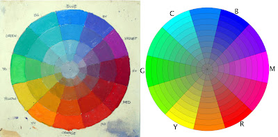
On the right is a mathematically correct digital color wheel based on the red-green-blue “additive” primaries of light. Spaced halfway between RG and B are cyan, magenta, and yellow, the subtractive colors used in printing inks.
My photographer friend Tobey Sanford created this wheel (downloadable here). It may be less familiar to traditional painters. It places the component colors differently around the wheel, but for the purpose of exploring the world of color, especially on our computer screens, it will serve us better in some respects, and we’ll see it again from time to time on future Color Sundays.
Regardless of which wheel we use, most color schemes are built from three component colors or primaries arranged in a triangle called a triad. The area inside the triangle is called the “gamut.” It includes all the possible mixtures from those three primaries, whatever they are.
 The primaries don’t have to be red, yellow, and blue. You can use any three colors as primaries, even orange-green-purple—which in fact is what early color photographs called “autochromes” used.
In the case of the limited palettes we looked at a couple weeks ago, for example, we talked about using a less saturated pigment like yellow ochre instead of cadmium yellow. This reduced or muted yellow corresponds with a point well inside the margin of the wheel.
By using a paper mask and rotating it around the wheel, we automatically get interesting reduced gamuts, each with a dominant full-intensity hue and two subordinate, weaker “primaries”.
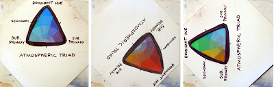
The mask sets us free to choose exactly the color schemes we want. We’re not limited to the haphazard choices of existing tube colors in limited palettes; instead we can use the mask to analyze or invent any gamut.
The equilateral triangle that I call the “atmospheric triad” is only one kind of color wheel mask. There are other shapes, and each of these basic shapes carries its own personality, regardless of the component colors. Atmospheric triads are moody and subjective, great for “color scripting” a graphic novel or a film.
When you rotate the triangular window around the color wheel, you can see the color groupings change, yet each one seems complete to itself. It suggests the feeling of walking from a room lit by incandescent light into another room lit by fluorescent light, and then stepping outside into the blue twilight. Your brain shifts from one color environment to another. I’ll talk more about the brain physiology behind color adaptation in a future Color Sunday.
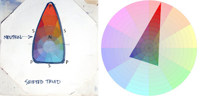
Here’s a color mask that crosses over the center a bit more, which I call the “shifted triad.” It’s shifted toward red, which means the subjective gray or neutral (N) in the composition is also shifted toward red. The secondaries (S) are what you get when you mix the dominant full-intensity red with the weaker blue-violet and blue-green primaries (P).
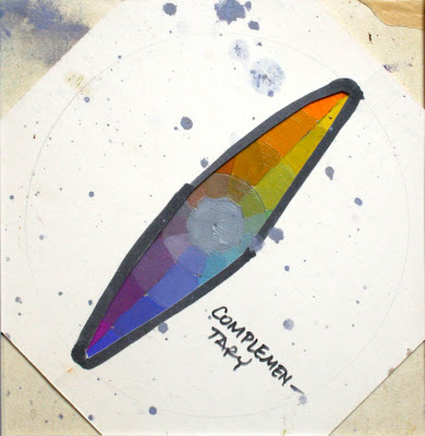
Here’s a complementary scheme, similar to what we’ve seen before. The complementary gamut, regardless of its component colors, suggests an opposition of elemental principles, like fire and ice. At the same time, it’s fairly stable, because its neutral coincides with the center of the wheel.
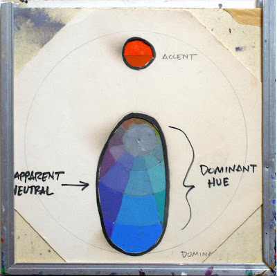
This one is called “mood and accent.” Most of the picture is in one color mood, with just one accent area from across the wheel and no intermediate mixtures. By the way, note that the octagonal color wheel mask and the color wheel slide into the top of the aluminum U-molding.
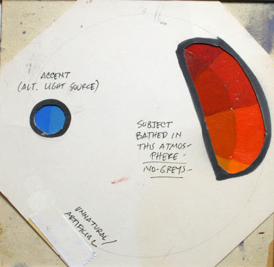
You could also pick an accent color that’s offset from the complement. It looks less natural, and therefore perhaps more attention-getting.
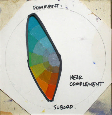
What happens when you create a mask that shifts the color balance off the axis? To me it feels like one of those diminished seventh guitar chords, or a dollop of sour cream dropped into sweet squash soup.
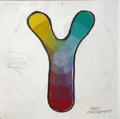
What effect do you feel with a split complementary arrangement, avoiding secondaries? To me it seems vibrant and attractive, but also a little unsettled and jarring.
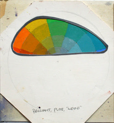
What if the mask selects colors all to one side of the wheel? To me it gives a sense of brilliancy, purity, or weirdness, not something you’d find in nature, but great for otherworldly science fiction.
There’s no limit to the kinds of masks you can cut, and then the infinite combinations you can generate when you start rotating a mask above your own wheel.
Next week, I’ll show you how to take a gamut you’ve selected, and prepare the paints on your palette so that you can use those exact colors in your own painting. The beauty of this method is that it jolts you out of any color mixing habits, and at the same time it forces you to stay within the limits you’ve chosen.

I painted the wheel at left, below. As you recall, it has the full-intensity hues arranged around the outside edge, gradating to neutral gray in the center. It uses the traditional subtractive red-yellow-blue pigment primaries.
This painter's color wheel goes back for centuries, and was influenced by the theories of Goethe and Newton. Two of the astute commentators on this blog, ZD and Painterdog, correctly pointed out that the traditional painter's color wheel is technically obsolete and even somewhat arbitrary and dogmatic, but I still have a fondness for it.

On the right is a mathematically correct digital color wheel based on the red-green-blue “additive” primaries of light. Spaced halfway between RG and B are cyan, magenta, and yellow, the subtractive colors used in printing inks.
My photographer friend Tobey Sanford created this wheel (downloadable here). It may be less familiar to traditional painters. It places the component colors differently around the wheel, but for the purpose of exploring the world of color, especially on our computer screens, it will serve us better in some respects, and we’ll see it again from time to time on future Color Sundays.
Regardless of which wheel we use, most color schemes are built from three component colors or primaries arranged in a triangle called a triad. The area inside the triangle is called the “gamut.” It includes all the possible mixtures from those three primaries, whatever they are.
 The primaries don’t have to be red, yellow, and blue. You can use any three colors as primaries, even orange-green-purple—which in fact is what early color photographs called “autochromes” used.
In the case of the limited palettes we looked at a couple weeks ago, for example, we talked about using a less saturated pigment like yellow ochre instead of cadmium yellow. This reduced or muted yellow corresponds with a point well inside the margin of the wheel.
By using a paper mask and rotating it around the wheel, we automatically get interesting reduced gamuts, each with a dominant full-intensity hue and two subordinate, weaker “primaries”.

The mask sets us free to choose exactly the color schemes we want. We’re not limited to the haphazard choices of existing tube colors in limited palettes; instead we can use the mask to analyze or invent any gamut.
The equilateral triangle that I call the “atmospheric triad” is only one kind of color wheel mask. There are other shapes, and each of these basic shapes carries its own personality, regardless of the component colors. Atmospheric triads are moody and subjective, great for “color scripting” a graphic novel or a film.
When you rotate the triangular window around the color wheel, you can see the color groupings change, yet each one seems complete to itself. It suggests the feeling of walking from a room lit by incandescent light into another room lit by fluorescent light, and then stepping outside into the blue twilight. Your brain shifts from one color environment to another. I’ll talk more about the brain physiology behind color adaptation in a future Color Sunday.

Here’s a color mask that crosses over the center a bit more, which I call the “shifted triad.” It’s shifted toward red, which means the subjective gray or neutral (N) in the composition is also shifted toward red. The secondaries (S) are what you get when you mix the dominant full-intensity red with the weaker blue-violet and blue-green primaries (P).

Here’s a complementary scheme, similar to what we’ve seen before. The complementary gamut, regardless of its component colors, suggests an opposition of elemental principles, like fire and ice. At the same time, it’s fairly stable, because its neutral coincides with the center of the wheel.

This one is called “mood and accent.” Most of the picture is in one color mood, with just one accent area from across the wheel and no intermediate mixtures. By the way, note that the octagonal color wheel mask and the color wheel slide into the top of the aluminum U-molding.

You could also pick an accent color that’s offset from the complement. It looks less natural, and therefore perhaps more attention-getting.

What happens when you create a mask that shifts the color balance off the axis? To me it feels like one of those diminished seventh guitar chords, or a dollop of sour cream dropped into sweet squash soup.

What effect do you feel with a split complementary arrangement, avoiding secondaries? To me it seems vibrant and attractive, but also a little unsettled and jarring.

What if the mask selects colors all to one side of the wheel? To me it gives a sense of brilliancy, purity, or weirdness, not something you’d find in nature, but great for otherworldly science fiction.
There’s no limit to the kinds of masks you can cut, and then the infinite combinations you can generate when you start rotating a mask above your own wheel.
Next week, I’ll show you how to take a gamut you’ve selected, and prepare the paints on your palette so that you can use those exact colors in your own painting. The beauty of this method is that it jolts you out of any color mixing habits, and at the same time it forces you to stay within the limits you’ve chosen.
Tomorrow: Mountains Underfoot
Thursday, February 11, 2021
How do you choose limited-palette colors?
On Instagram yesterday, @leetheillustrator asked: "How do you decide on what colours to include when selecting a limited colour palette?"


You might try orange + violet + white over a cyan underpainting, or yellow + cyan + white over magenta. You can also introduce black, either as an accent if you want to deepen the darks, or if you want to use it as a color of its own (such as black + orange + white over blue).
A two-color-plus-white palette has some advantages:
1. It's extremely fast to set it up and get it running.
2. It's good for beginners because it reduces your choices to light or dark and warm or cool.
3. It puts you into realms of color that you would never think of if you had all the color choices available.

Leeds, oil, 11 x 14 inches
Answer: In my experience, a limited palette can be made out of almost any two or three colors, as long as they're separated from each other on the color wheel. Ideally at one should be cool and the other should be warm.
In this case I often choose the colors that seem most important in the scene. In this case it was the red signs versus the blue of the sky. They're not complements (red and green would be), but they're warm vs. cool.
But when choosing colors, the goal is often not to select which colors you want to include, but rather which ones you want to leave out, for interesting color schemes result from what you've left out of them.

Catskill Roadhouse, East Durham, New York. Casein, 5x8 inches.
Cadmium red scarlet, ultramarine blue, and titanium white over a yellow underpainting.
For this painting I used ultramarine blue and cadmium red scarlet, together with white, and I left out yellow and green. The red and blue colors are near-complements, and I'm painting over a surface primed with yellow. The yellow is about 95% covered up, but where it peeks through, it energizes the color scheme like a pinch of spice.
Here's a video that shows that painting in the works: Link to YouTube.
A two-color-plus-white palette has some advantages:
1. It's extremely fast to set it up and get it running.
2. It's good for beginners because it reduces your choices to light or dark and warm or cool.
3. It puts you into realms of color that you would never think of if you had all the color choices available.
----
TRIADS: Painting with Three Colors" (plus white) is the subject of my recent Gumroad video.
Friday, September 11, 2020
Sunday YouTube Premiere

What happens when you use secondary colors (orange, violet, and green) as primaries? I set up in front of an abandoned house to find out.
Then something amazing happens! The guy who grew up in the house randomly stops by to share his memories.
Don't miss the free YouTube premiere (with live Q and A) on September 13 at noon, California time. Here's the link. It's all part of my next painting tutorial TRIADS, which releases tomorrow, Saturday, September 12. You don't have to join LightBox Expo to watch, but I recommend it because LBX a good virtual hub for a lot of artistic activity this weekend.
Thursday, November 5, 2020
Eight-Gray Test
Grays are anything but dull and neutral. They’re the subtle chef’s sauce, the unifying ingredient, of any color scheme. And there are many ways to make them.

Here's what I used for this array of eight swatches:
Top row
TB: Transparent black made from Ivory black tinted with water to a middle gray
T3: Transparent blend of Cadmium Yellow Light, Quinacridone Rose, and Phthalo Blue.
T3A: Transparent blend of Cadmium Yellow Light, Pyrrole Red, and Ultramarine Blue.
LT: Three layers of transparent color: Cadmium Yellow light, Quinacridone Rose, and Phthalo Blue. Be sure to let each layer dry before adding the next one.
Bottom row
OB: Opaque black tint, from ivory black tinted with titanium white and warmed with a little yellow and red.
O3: Opaque gray made from a blend Cadmium Yellow Light, Quinacridone Rose, and Phthalo Blue, lightened with Titanium White rather than being thinned with water.
O3A: Opaque gray made from a blend of Cadmium Yellow Light, Pyrrole Red, and Ultramarine Blue, lightened with Titanium White rather than being thinned with water.
LTA: Three separate layers of Cadmium Yellow Light, Pyrrole Red, and Ultramarine Blue. Note how the gray is more active than the others, with colors vibrating.

Here's what I used for this array of eight swatches:
Top row
TB: Transparent black made from Ivory black tinted with water to a middle gray
T3: Transparent blend of Cadmium Yellow Light, Quinacridone Rose, and Phthalo Blue.
T3A: Transparent blend of Cadmium Yellow Light, Pyrrole Red, and Ultramarine Blue.
LT: Three layers of transparent color: Cadmium Yellow light, Quinacridone Rose, and Phthalo Blue. Be sure to let each layer dry before adding the next one.
Bottom row
OB: Opaque black tint, from ivory black tinted with titanium white and warmed with a little yellow and red.
O3: Opaque gray made from a blend Cadmium Yellow Light, Quinacridone Rose, and Phthalo Blue, lightened with Titanium White rather than being thinned with water.
O3A: Opaque gray made from a blend of Cadmium Yellow Light, Pyrrole Red, and Ultramarine Blue, lightened with Titanium White rather than being thinned with water.
LTA: Three separate layers of Cadmium Yellow Light, Pyrrole Red, and Ultramarine Blue. Note how the gray is more active than the others, with colors vibrating.
Try it Yourself
Make a middle-value gray swatch with black tinted with water. The goal is to match that particular note with seven other grays made with different ingredients.
---
Share your results with the free Facebook Group Color in Practice.
Learn more in my Gumroad tutorial TRIADS: Painting with Three Colors.
Learn more in my Gumroad tutorial TRIADS: Painting with Three Colors.
Sunday, November 22, 2020
Using a Yellow Underpainting
Starting with a yellow underpainting puts "fire in the belly" of a gray painting.

Art Materials

The yellow layer is made up of a thin layer of casein brushed on in advance of the plein-air session.
The underpainting gets mostly covered up by opaque or semi-opaque paint, but it manages to peek through in a few places.
This YouTube excerpt is from my new Gumroad tutorial "TRIADS"
Art Materials
Wednesday, October 7, 2020
Painting in a Parking Garage
I have a couple of hours to burn in Poughkeepsie, so I set up my sketch easel in a parking garage. I like the way the sunlight cuts across the ramp.

I limit the palette to just three colors (plus white.) yellow ochre, Prussian blue, and light red. I call it the Iron Triad because each of those pigments contains iron.
In this video, I explain the perspective with a diagram on tracing paper and take you through the making of the picture.
More resources
Wednesday, February 2, 2022
How Can I Learn Painting Without Art School?

It's hard for me to say without knowing more about you and your circumstances. Here's my own experience. Although I went briefly to art school, I learned mainly from books and lots of practice and trial and error.
Books, such as Carlson's Guide to Landscape Painting and Creative Illustration are extremely valuable, especially for understanding the principles and the history behind what you're doing.
But for the practice of painting itself, if I were learning today, I would probably watch a lot of YouTube and Gumroad videos.
 My way of learning new skills is to limit the variables and experiment in a playful way so that I can solve the problems one by one and try out new combinations. For painting, I recommend starting off with black and white first, then adding simple complementary schemes, then triads, etc. I would suggest alternating between oil paint and a water medium like gouache, with lots of pencil drawing too.
Carlson's Guide to Landscape Painting
My way of learning new skills is to limit the variables and experiment in a playful way so that I can solve the problems one by one and try out new combinations. For painting, I recommend starting off with black and white first, then adding simple complementary schemes, then triads, etc. I would suggest alternating between oil paint and a water medium like gouache, with lots of pencil drawing too.If you're more of a social learner, you might prefer to join a sketch group or take a class, or just hang out with artist friends who like to paint. Sorry, I can't evaluate virtual online courses because I haven't tried them.
Monday, September 14, 2020
Triad Challenge: "Sunny Still Life"
We've had such an enthusiastic response to our previous painting challenges that many of you asked for another opportunity.
I hesitate to call it a "contest" because there's no entry fee and the spirit is more about cooperation, community, and camaraderie than competition. We're all at different levels of skill and experience |
Laura Coombs Hills, (American,1859-1952) |
"Sunny Still Life" Challenge
The challenge is to paint a still life in sunlight from observation with a limited palette.
The Triad
The limited palette must be a triad of your choice—just three colors plus white.
For example, here are some suggestions, giving equal time to different companies:
Holbein gouache: Viridian , Cadmium red deep
 , and Yellow ochre
 plus white

M. Graham gouache: Ultramarine blue, Cadmium yellow deep
 , and Burnt sienna plus
 white

Winsor and Newton gouache: Perylene maroon , Cadmium yellow
 , Cobalt blue
 plus white

Assorted makers: Prussian blue , light red
 , golden ochre
 , and white

The limited palette must be a triad of your choice—just three colors plus white.
For example, here are some suggestions, giving equal time to different companies:
Holbein gouache: Viridian
, Cadmium red deep, and Yellow ochre plus whiteM. Graham gouache: Ultramarine blue, Cadmium yellow deep
, and Burnt sienna plus whiteWinsor and Newton gouache: Perylene maroon
, Cadmium yellow, Cobalt blue plus whiteAssorted makers: Prussian blue
, light red, golden ochre, and whiteFeel free to come up with your own triad. You don't have to follow these suggestions, and you'll probably want to choose colors that more or less fit your subject.
What kinds of subjects?
You can paint any objects, such as flowers, fruit, toys, tools, products, or harvest vegetables. They can be things you arrange into a group or objects that you found in place. Regardless of what you paint, I'm looking for a colorful, sunny effect, either from light streaming in a window or direct sunlight outdoors.
On Location
Your picture must be painted mainly from observation and it must be a new painting done for this challenge.
Paints
All traditional painting media are acceptable, such as: oil, watercolor, casein, or gouache, acrylic-gouache, or acrylic. Sorry, no dry media or digital.
Deadline
It's free to enter. Please submit only one painting. You can enter as soon as you finish the piece, but no later than the deadline: Tuesday, October 20, 2020 at midnight New York time. Winners will be announced on October 27.
What and How to Enter
Shoot three image files: 1. Your finished painting, 2. A photo of the painting in progress in front of the subject, and 3. A Triad Test of your chosen gamut. Your face doesn't have to be in the photo unless you want to.
If you do Instagram or Twitter, please use the hashtag #sunnystilllife You can also upload the images to the Facebook Group Color in Practice. If you don't have an Instagram or Facebook account, please ask a friend with an account to help you. Please include in the FB or IG post the list of the three colors you chose (plus white), and if you want, a word about your inspiration or design strategy, or an anecdote about your painting experience.

 |
| Painting by Vladimir Zhdanov (Russian 1902-1964) |
You can paint any objects, such as flowers, fruit, toys, tools, products, or harvest vegetables. They can be things you arrange into a group or objects that you found in place. Regardless of what you paint, I'm looking for a colorful, sunny effect, either from light streaming in a window or direct sunlight outdoors.
On Location
Your picture must be painted mainly from observation and it must be a new painting done for this challenge.
Paints
All traditional painting media are acceptable, such as: oil, watercolor, casein, or gouache, acrylic-gouache, or acrylic. Sorry, no dry media or digital.
Deadline
It's free to enter. Please submit only one painting. You can enter as soon as you finish the piece, but no later than the deadline: Tuesday, October 20, 2020 at midnight New York time. Winners will be announced on October 27.
What and How to Enter
Shoot three image files: 1. Your finished painting, 2. A photo of the painting in progress in front of the subject, and 3. A Triad Test of your chosen gamut. Your face doesn't have to be in the photo unless you want to.
If you do Instagram or Twitter, please use the hashtag #sunnystilllife You can also upload the images to the Facebook Group Color in Practice. If you don't have an Instagram or Facebook account, please ask a friend with an account to help you. Please include in the FB or IG post the list of the three colors you chose (plus white), and if you want, a word about your inspiration or design strategy, or an anecdote about your painting experience.
Prizes
I'll pick one Grand Prize and five Finalists. All six entries will be published on GurneyJourney, and all six will receive an exclusive "Department of Art" embroidered patch. In addition, the Grand Prize winner receives a Gurney video (DVD or download) of their choice.
-----
Own the 90-minute feature "TRIADS: Painting with Three Colors" for only $17.98
• HD MP4 Download at Gumroad
• or HD MP4 Download at Sellfy
I'll pick one Grand Prize and five Finalists. All six entries will be published on GurneyJourney, and all six will receive an exclusive "Department of Art" embroidered patch. In addition, the Grand Prize winner receives a Gurney video (DVD or download) of their choice.
-----
Own the 90-minute feature "TRIADS: Painting with Three Colors" for only $17.98
• HD MP4 Download at Gumroad
• or HD MP4 Download at Sellfy
Tuesday, March 9, 2021
Triad Tests in International Artist

 I also show how to paint a gray color eight different ways. It's a very interesting experience to mix a neutral gray swatch with black and white and then to do it again with three transparent colors, and then again with three opaque colors.It's all covered on my video tutorial TRIADS
Monday, April 19, 2021
Triad Test Stencil
On our Facebook group "Color in Practice," Ryan Coker came up with a great solution for drawing the grids for the Triad Tests.

He says: "I used my 3D printer/software to create/build a Triad Maker Stencil. Two are shown here in black and clear. And to the left (top), I connected the lines using the straight edge on the outside of the stencil."
You can also draw them with a 30/60/90 triangle, or just freehand them.
Tutorial video: Triads: Painting with Three Colors

Subscribe to:
Posts (Atom)