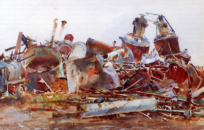
As I suggested last time, most books or classes discuss color in an abstract, theoretical sense. But I’d like to concentrate on the pictorial application of color. Why, for example, did John Singer Sargent choose to emphasize those browns and blues in his plein-air painting of a wrecked sugar refinery, above? I'm sure if you had taken a color photo of the same subject, it would have looked nothing like this painting.
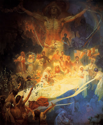
And why did Alphonse Mucha choose this particular blue and gold palette to express his deepest feelings about his homeland?
I’d rather give you useful tips about color that you can apply to your own pictures. So please forgive me if I don’t approach the subject comprehensively. Instead I’ll just fast-forward over the concepts that most of you are already familiar with.
Let’s assume that you already understand the foundation terms:
--the color wheel
--primaries and secondaries
--the concepts of hue, value, and saturation (aka chroma)
If you’re not sure about these ideas, you’ll find answers on Wikipedia or on the website Handprint (thorough and techical) or in most any book on color.

Here’s the color wheel I like to use. It has the various full-chroma hues arranged around the outside margin. Neutral gray is at the center. As each color approaches the center, the chroma decreases until it arrives at neutral gray.
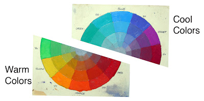 To get started, let’s take the color wheel and chop it in half. On the bottom half are all the warm colors: from yellow-greens, to oranges, reds. On the top half are the cool colors, the blue-greens, blues, and cool violets.
Someone might argue about where to divide the wheel. The greens and violets seem to have divided loyalties. But if you consider the “heads of the families,” blue and orange, there seems to be some basic psychological difference between them.
The cool colors seem to evoke feelings of winter, of night, of death and sleep. They remind us of quietness, restfulness, and calm.
 The basic feelings suggested by the warm colors are completely different. We associate the warm colors with fire, sunlight and blood. (Above, The Burning of the Houses of Parliament, by J.M.W. Turner.) They make us think of energy and passion. Orange and yellow are ephemeral colors. We see them only fleetingly in nature: at sunsets, in flowers, or in autumn leaves.
This basic perception of the two families of color seems to be woven into the fabric of our human existence. The anthropologists Paul Kay and Brent Berlin have studied the evolution of color terms in languages around the world. In European languages we have about 11 or 12 basic terms to describe colors.
But some so-called “primitive” languages, like the New Guinean language Dani, have only two basic terms. Kay and Berlin write: “One of the two encompasses black, green, blue and other ‘cool’ colors; the other encompasses white, red, yellow and other ‘warm’ colors.” (Link for full story in Scientific American).
Primitive peoples didn’t have poor vision; far from it. But rather, anthropologists suggest that as language evolved, it developed its first word-concepts around the most psychologically important divisions or groupings.
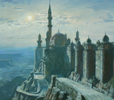
I think a lot about “warm and cool” when I’m painting. The moonlight painting of Khasra from Dinotopia shown earlier is painted with colors primarily from the cool side. I wanted to suggest mystery, calm, and night.
 In a painting of one predominant family, an accent from the other side of the spectrum adds a lively contrast. Here’s a painting by Richard Parkes Bonington where he has enlivened his warm colors with a few accents of blue. Notice that there’s no green or red in this one. It’s painted almost entirely with blue and orange in various value ranges and degrees of saturation (mostly its duller cousins in the ochre and sienna ranges).
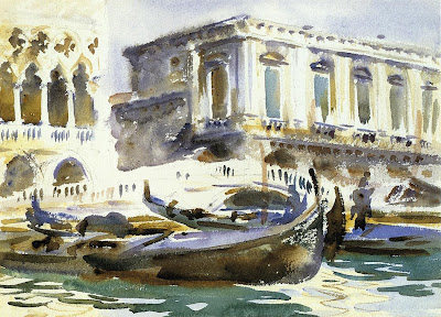
Warm and cool colors bring each other to life by these adjacent contrasts. This quick sketch of Venice by Sargent has a lot of areas where warm and cool are played against each other.
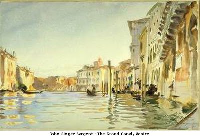 Many of Sargent’s best watercolors were painted primarily with two colors, probably ultramarine blue and raw sienna, exploring the dance between the cool and the warm. He must have been looking at other colors, like red and green, in the scene before him, but he was ignoring them.
Please let me know if this kind of stuff is useful, and if I'm pitching it to the right level.


32 comments:
I always wondered why painters used blue or purple to describe shadows Or use other colors to portray different things. Did they see those colors or was it just a design choice? Were they painting the actual colors they saw? I would like to know what you think about this.
I'd like to share this website about color: http://huevaluechroma.com/
I haven't read all of it, but it looks very thorough. You might want to check it out.
Thanks for this wonderful post. It's great to have people like you. People who like to share their knowledge as opposed to just keeping it to themselves. It's the best thing any artist could do.
Good Lord yes, it's useful! Please don't stop. I come to this site almost every day, and almost every day I learn something from it.
Yes, it's useful! I appreciate hearing how *you* think as well as your historical examples.
It's been an ongoing discussion in my critique group as to where exactly the warm/cool division occurs. Some of us come down on the side of green, others - purple. I do it by connotation (green = living things/life, i.e. warm(th)) more than visual cues I suspect. You can make a case for either. So how much is arbitrary or intuitive rather than actual?
very useful! (a translation in french would help me ;-)
Thank you for sharing your knowledge.
I'm hoping that all these posts are building up to a draft for a book...
Definitely useful. I would like to ask when making your color wheel and painting in general, do you use complementary colors or do you simply use gray paint to lower your saturation?
just like colin said, Good Lord yes!
i'm a young french illustrator and in every post there is something to learn.
please keep going on this way!
JAMES' S QUESTION
why did Alphonse Mucha choose this particular blue and gold palette to express his deepest feelings about his homeland ?
To every child bred in peace and cares, his homeland shall become " paradise "...
Allow me answer that Historically the French flag was Blue and Golden.
1) BLUE expresses the upper sky ( as the lower ones have Naples yellow inside) ; the virgin, and the flower " IRIS " .
About the flower IRIS ( blue, velvet and yellow colors ) ; as far as symbols are concerned, this is somehow " mixed " with the lily.
LILY is white ... that is probably also why Alphonse MUCHA has white inside the painting).
Both flowers ( mixed into ONE ) are the KINGS 's heraldic flowers...Blues are the colors of KINGDOMS.
Also the " IRIS " is the name of the center of the eye ( entrance of leonardo's black room : retina) and the " SCARF OF GODS " in the Greek mythologies.
2) GOLD * is the color used to
a/ magnifyi the so called " LILY flower " = symbol of KINGDOM ( but again, historically this Lily = Iris flower)
b/ remember the shine of IERUSHALOM city's doors when the sunrises... European chivalry for instance Richard Coeur de Lion ( surrounded by numbers of incredibly beautiful nobles ) wanted to rescue IERUSHALOM around year 1000...( note the year 1000 was perfetly described by english Historian Sir Robert LACEY also the author of an intersting book about SOTHEBY'S ed. brown & company).
c/In french Golden* is called OR, which also in Hebrew means LIGHT ( thus the RAINBOW )
3)By the way allow me ad that the color wheel, ( as Iris of the Eyes ! ) wonderfully starred by JAMES, central in his marvellous speech is ; in fact ; a SPHERE.
The sphere is proposed as figure 49, 50, 51,52 ) by founder of BAUHAUS : Herr Johannes ITTEN, in his " ART OF COLOR " ( my reference book since i was 12 years old and after having been famous in my tiny willage of FLANDERS, aged of 5 years old for drawing a allwall frescoe about Nature's marvels and laces from Brittanies as human marvels ! )
Johannes ITTEN studied the color theory of Sirs Goethe, Runge, Betzold and Emile de Chevreul...
Johannes ITTEN wrote " speak about color harmony is try to judge of the simultaneous action of 2 or more colors " and this is also a matter of
" subjectivity "...
please forgive me for long posts
sylvia
arimathee.blogspot.com
Nota Bene
how fun, yesterday at a bus stop ( but not with Marilyn ! ) ... Moves attracted my eyes... European, french, italian, and Monaco flags were waving their veil hands, just up a palm tree... Thoughts of all of us on this blog came to my mind... cheers...
The bus just arrived.....
I like seeing the examples, but your posts about color so far are old news to me so I'm looking forward to the more advanced ones.
Yes, extremely useful! Thanks for going into so much detail. I was only required to take one color theory class in college and it was very vague on such subjects. I came away from the class not completely grasping the concept as I would have hoped to. Perhaps one day a compilation of these lessons could go into a new book...although it is much more helpful to get the information in little bites like you present it here. Please keep it up!
Great post, even for the most amateur of artists, like moi.
I've dusted off my sketchbook and am carrying it around now after years of neglect.
Your blog is both inspiring and addictive. Keep it going!
Thanks so much for your post. It might be basic to some, but I really appreciate it. I'm finding I need to revisit what I thought I already knew. It's been very benefical for me.
No, James, this the clearest and most succinct discussion of color and how to use it with intelligence is wasted effort, indeed!HAHA!! So, when do you compile and make a book? "Colortopia" the voyage to artistic literacy. As that is what you have, my friend, an excellent book in the making! Happy New Year, chuck
I agree with chuck that a book is definitely needed. All the great info in this blog should be compiled into a book. I read your blog almost every other day for new insight into the art of painting. In fact, even your travels are so interesting to read :)
Pls if you have the time, consider writing a book on all that you have discuss. I will buy it for sure. :D
I appreciate all of you for your feedback and encouragement. It has occurred to me to compile some of these posts into a book or a magazine column. Perhaps some day. But for now blogging is a fun way for me to test ideas informally.
A book would have to have a much more focused and logical presentation, and I kind of agree with Meredith that there's an appeal to the bite size bits.
A big part of the fun is hearing what you have to say, to learn how art is taught in Europe, and to hear not only from you who are professional artists, but also those of you who are beginning or who are courageously fitting art into the spaces of your busy lives.
I'm learning a lot! Thank you. I really appreciate your wonderful blog.
Yes, these are very informative and interesting.
I come to this site daily, and love anticipating which new "secrets" and "tips" I'm going to discover. While I've branched away from traditional painting, the color theory and art history posts are always helpful! Don't stop blogging!
And thanks for your dedication!
Sigh . . . I'm in love with your blog. I would like to marry it and have little artsy bloglets!
Even though me and the color wheel are like this (insert image of me crossing my fingers), this post was insightful. I love Sargent's work -- thanks for doing this post.
Thanks, all, and thanks Maggie.
To my readers: if you want to see some brilliant equestrian art and some dog portraits with real personality——all mixed with solid inspiration——check out Maggie's blog "Greywaren Art."
I've just finished transcribing your observation about Sargent using primarily two colours into my Colour Notebook, so I'd say you are pitching this at a perfect level for me. I'm very excited to have discovered your blog. Thank you so much.
*blushes/ faints* Thanks, James, it means a lot, coming from you.
This is great, except to me warm and cool are to vague as terms.
You mention the Handprint web site which has excellent color information on it.
Bruce MacEvoy finds that the Munsell color wheel is the most intuitive. I have been studying and it deals with color as hue, value and chroma and how they relate.
It has changed the way I deal with and think about color.
There are no primaries or secondaries in the wheel at least the way it is organized(they are there only it's not set up that way), color moves in and out of chroma and value, very interesting and for me a lot more open as a system.
Wow. Popped my eyes wide open with your comment about Sargent's two-color watercolors!
I got out my some of my Sargent books and you're absolutely right. Many in blue and earth tones as you suggest, also red and green (notably in some of the war paintings) and even yellow and green in some of the Venetian watercolors.
His masteful handling of them gives such and impression of a wide color range that, for all of my fascination with Sargent, I never noticed.
Amazing. Thanks!
Thanks, Charley,
If anyone wants their own eyes to pop out, go to Charley's blog "Lines and Colors" and put "Sargent" in the search box. You'll not only find Sargent, Zorn, and Sorolla, but lots of other artists inspired by the giant example of Sargent.
This is great stuff. Very informative. Thanks so much!!
Great posts -- I am adding your site under my list of blogs :). Will be visiting often. Thanks for sharing your knowledge.
Thanks, Meera, for visiting and linking.
A curious fact that I came across in my study is that modern colour science proposes a CMY (cyan, magenta, yellow) model for use with pigments as opposed to the traditional RBY (red, blue, yellow) model.
The CMY wheel represents a broader range of hues, and its primaries are actual primaries by definition ("hues that can't be obtained by the mixing of one or more hues").
It also disproves the hues red and blue as primaries, since they are surprisingly obtained with yellow + magenta and cyan + magenta, respectively. They are secondary colours because of this.
Another fundamental difference is that the complementary pairs are different, some to a greater degree. The complementary to red is cyan, not green as a traditional artist may be accustomed with.
Most digital painting software offer a CMY colour picking wheel.
Regards.
Thanks for the read Pre Search
Las Vegas Real Estate Experts
James, would you still agree with this warm/cool separation? I know now you use the Yurmby model, but in regards to the traditional YRB model, do you still agree with this kind of warm/cool separation?
I noticed because in the "Warm and Cool" chapter in your "Color & Light" book, there are some conflicts against the Warm/Cool separation that you posted in this article.
For example, in your book, Green is in the Warm category, while in this post it is in the Cool category.
Would you be interested in updating your Warm/Cool separation of the YRB model or are you sticking with what you posted in this article?
Patrick, I think what I've said is fairly consistent. Green and violet are on the dividing line, so yellow green is warmer-than blue-green and red-violet is warmer than blue-violet. If you want to draw a dividing line through the whole color wheel, you could split those two colors there. But the essential usefulness of warm vs. cool colors is in the blue-orange dimension. If you leave violet and green out of a color scheme altogether (as Turner usually did), you can play with that basic dimension.
Post a Comment