Wednesday, October 31, 2007

Rest Stop Visitor

A weird thing happened at 6:32 p.m. at the rest stop on the north side of I-90 near Angola, New York. We were stopped to look at a map and we heard someone doing something at the back of the car. We saw a guy with a long brown coat jog off past the dog walk area into the forest.

We checked and nothing seemed to be taken from the back of Trusty Rusty, but there was a little note on top of the load. It was kind of creepy—some crackpot stalker apparently trying to take credit for Dinotopia: Journey to Chandara.

I guess you can expect anything on Halloween, but how would this guy, whoever he is, know where we were at that moment?

Happy Halloween

Today it's Off to Oshkosh. We start the long drive west toward Wisconsin. Sorry to miss Halloween back home, but I'm looking forward to the next part of the road tour.

Studio Lighting II: Key and Fill

Before there was light, utter darkness moved upon the face of the world.

That might sound sort of biblical, but it’s the best way to think about lighting. Everything starts out as black as night until the light comes into the scene.

It’s easy enough to see how the main light source illuminates the form. But it would be a mistake to think of the shadow side as the absence of light. There’s light filling the shadow, too, but it’s just another kind of light from a weaker source.

Here’s an example. I’m posing here with a kaffiyeh as a reference for a painting of Arthur Denison on page 119 of Dinotopia: Journey to Chandara. The main light, from the baby spot, is coming from above and to the right. The shadow side is getting weak, cool light coming from the skylight and the north window at left. The shadow side of the form wouldn’t be anywhere near black unless I was in a windowless room with black velvet wallpaper.

Here’s an oil study of a model lit from a low light coming from the left. Photographers call this main light the “key” light. The shadow is getting greenish light bouncing back from a cloth that was behind the model. This light that enters the shadow is called the “fill” light. In TV and movie lighting, a second, weaker electric light usually provides the fill light. But most often we painters use natural reflected light for the fill.

This head in profile has the key light coming from the left, shining directly in the face of the model. The fill light is much weaker, making an extreme “lighting ratio” of key to fill light. The greater the ratio, the more low-key or dramatic the form will appear.

Note that I placed the light in the direction of the subject’s gaze. I think we all have a basic instinct to look toward the light of a window or a doorway, and to me it is satisfying in some deep way to look at a face that is oriented toward the light. Next time you’re sitting absent-mindedly in a dark room, take note of the fact that you instinctively rest your gaze on the lightest area of the scene.

On this half-hour oil sketch from life, I used the baby spot with an orange gel for the key light coming from the right. I set up a second fill light with a contrasting blue-green gel. The brightness of the fill light almost equals the key light, leading to a close or “high key” lighting ratio. It looks unnatural and weird simply because such a relationship could not happen under natural conditions.

Only a few places on the face are not touched by either the key or fill lights: the side of the nose, the edge of the eye, the lower cheek, and the neck. As a result those areas are quite a bit darker.

Check back in a couple of days for the last in the studio lighting series: edge lighting.

Tuesday, October 30, 2007

Studio Lighting, Part 1: Equipment

When you’re setting up a model to paint from life, it helps to use a strong light source, placed well away from the model. If the light is set too close, you get a variation in light intensity: a hotspot on the top half of the figure, and the feet lit dimly from a different angle. Painting is hard enough! We don’t need obstacles like that.

The standard clamp-on reflector lights from the hardware store don’t cut it. Their light is just too weak. But they’re used all the time, even in art schools, which should know better.


It’s well worth investing in a professional light designed for use on the stage or movie set. Here’s a Mole Richardson Baby spotlight, a good solid workhorse for a small to medium-sized studio. It attaches to an adjustable tripod that lets you lift the light up to 14 feet in the air.

It will easily take a 600 watt bulb (about $30 each), which shines through a fresnel lens. If you want a lower intensity, you can use a smaller bulb. You can place the baby spot 20 feet away from a model and twirl a knob to zoom in the light just where you want it.

The baby spot also has adjustable “barn doors” to control how much light spills to the sides, and a rack for hanging the plastic gels or color filters in front of the light. The gels are made to withstand heat, but with a really hot light, you might want to clip the gels to the barn doors, farther from the heat of the bulb. In the photo I’m putting a blue gel in the rack.

It’s shining on a plaster cast of Abe Lincoln and a plastic chrome hemisphere. I mentioned the mirror ball on a previous post. It’s useful for recording the source and character of the light influences in a given scene.

Art supply catalogs don’t usually carry these lights, instead stocking wimpier equipment that isn’t worth investing in. I don’t want to sound like I’m giving anyone a commercial plug, so I’ll leave it to you to hunt down sources and brands. Try googling “stage or theater lighting supply” or search Ebay. The retail stores also sell C-stands, mentioned in an earlier post.


This 30-minute oil study of a model was painted using the baby spot set right up behind and above me for a fairly simple frontal lighting.

In tomorrow's post, (Studio Lighting II: Key, Fill and Edge) we'll take a look at strategies for placing the lights.

Monday, October 29, 2007

Rhode Island School of Design

RISD student Kelly Berg said that one of the favorite parts of her job as monitor in the Nature Lab of Rhode Island School of Design in Providence, Rhode Island is handling the Madagascar hissing cockroaches. “The make great pets,” she told me. "They hiss a bit, but they’re quite friendly."

The lab’s collection gives art students access to living animal specimens to use as models. Besides the giant cockroaches, there are millipedes, rhinoceros chameleons, rats, frogs and turtles.

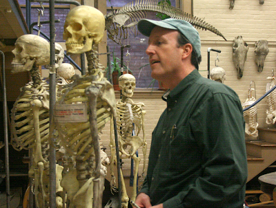
There’s also a large variety of animal skulls and skeletons. One room adjoining the nature lab collection had half a dozen human skeletons with drawing easels set up beside them.

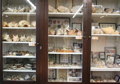
Along the walls were cabinets crammed full of shells, seedpods, and crystals.


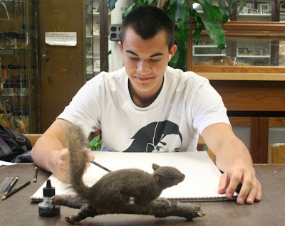
This student from nearby Brown University, one of the Ivy League colleges, was doing a careful pencil drawing of a stuffed squirrel. Brown students can share in RISD’s art offerings. In exchange, RISD students can broaden their education by enrolling in Brown’s first-rate courses in academic subjects to supplement the focused art curriculum.

RISD students also have access to the collection of the RISD art museum, whose collection ranks with some of the finest small museum collections of the northeast.


Illustration chairman Nick Jainschigg (above) toured me through the building which houses classes for the approximately 250 illustration majors. The school has graduated some notable illustrators like Chris Van Allsburg and has attracted some current high-profile teaching talent, including Jon Foster. Classes keep current with emerging trends, and include offerings in graphic novels, 3-D character animation, and video game design.


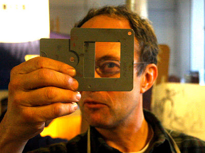
We met painting instructor Nick Palermo, here demonstrating a “View Catcher” device, which helps new painting students frame a composition. Palermo’s class was working on oil studies of a model posing on a stand with colorful props and upshot lighting.

Part of what makes RISD’s program unique is the winter session, sandwiched between the regular semesters. The six week winter session is both informal and intensive, allowing students to try out something outside their normal experience, like stone lithography or glassblowing.


The Fleet Library in the newly refurbished bank building contains not only a rich collection of art books dating back to the 1860s, but also a vast array of scrapbooks, sketchbooks, design collections, clippings, art prints and ephemera.

More than one person admitted that not enough RISD students take advantage of the school’s rich resources, and that the requirement to use them is not woven enough into the curriculum. But for a motivated student, RISD certainly has a lot to offer.

Sunday, October 28, 2007

Two More Lecture Portraits

Two more lectures yesterday yielded two more portraits.
First was Jack Levin, Ph.D., a leader in the study of violence in the media.

He started off his talk saying he is often mistaken for: Albert Einstein, Gene Shalit, David Crosby, Captain Kangaroo, Captain Krunch, Mr. Monopoly, Ben&Jerry, Mark Twain, Jerry Garcia, Juan Valdez (without the coffee), Grandpa Joe in Willy Wonka, Mr. Kotter (25 years later), Don King (with white skin), or even Beethoven.


My sketch, made during his hour-long presentation, looks no more like him than anyone on that list does, because I rushed the layin stage, and spent all the time modulating the tones. I arbitrarily introduced the dark backgound to dramatize his white hair.

The second lecture was by Robert Kraft, chief executive of Fox Film Music, Inc. He described his job this way: “At 20th Century Fox we have lots of film entertainment flooding your multiplexes and small screens, much of it garbage…I never imagined myself in the bosom of Hollywood.”


Unlike Professor Levin, who had a great many rounded forms and soft edges, Mr. Kraft had strong planes and straight lines. There were three sources of light—window light from the left, and two fluorescents from the right. With such complex lighting, I knew the form wouldn’t carry with tonal modeling. So I kept the shading light and tried to concentrate on the subforms around his eyes and mouth.

Saturday, October 27, 2007

Framer, Painter

The Museum of Fine Arts in Boston had a puzzle to solve.

Curators had always suspected that Bernardo Strozzi’s painting of Saint Sebastian, acquired in 1972, had at some earlier time been hacked down from its original size. The painting must have been incomplete because the saint was reaching heavenward and yet there was nothing in the composition above him. When the museum received a call that the missing top half of the painting had been located, they wanted to reunite the two pieces.


But that meant that Andrew Haines, the museum’s conservator of framing, would have to chuck the old picture frame and create a whole new one to match the period of the 17th century painting. Haines and his staff constructed a special frame with a black divider to artfully disguise the gap between Sebastian and the angels.

Haines is one of only about five full-time picture frame conservators in America. My wife Jeanette and I visited him yesterday morning in a workroom deep in the bowels of Boston’s beloved MFA.

He and his assistants were painstakingly restoring a large frame from a Courbet (left), using dental molding material to cast missing chunks of ropelike relief elements. Repairing this one frame required the labor of three people working full time for three weeks.

“A fun aspect of this job is that we get to see a painting in different frames,” he told us. Each period of art history had its own unique sensibility for framing. But all the fancy gold styles ultimately trace back to the decorative bling prized by the church in the middle ages. “European painting comes out of the Catholic church,” he said, and so do the frames. "Before the Renaissance, painters, carpenters, and gilders were all seen as craftsmen of equal stature, all working together as contractors to make altarpieces," he said.


Haines rolled out the storage dividers in the painting collection to show us how the history of frames mirrored the history of art.

Frames for American paintings, for example, often included decorative motifs from nature, like leaves and flowers. Here, Adeline is painstakingly using purified water to clean the gilded decoration that once graced a painting by Fitz Henry Lane (formerly known as Fitz Hugh Lane).

Jeanette and I first met Andrew Haines in his second life as a realist painter. We attended the opening of his one man show at the George Billis gallery on October 11.

Mr. Haines gets up at six in the morning, sees his kids off to school, and then paints his own pictures for a couple hours before riding his bicycle to work at the museum. Take heart, you painters in spare hours!

His own paintings are breathtaking in their Hopperesque simplicity and mood. His mastery of light, color, and composition clearly grows out of the close working knowledge of art that he receives every day at the MFA.

Friday, October 26, 2007

Mike Dukakis


Here's a pencil portrait of Mike Dukakis that I made a few hours ago in my Moleskine drawing sketchbook. I was sitting about five feet from him as he gave a lecture. It was a bit of a challenge, because it was an upshot, and he was constantly moving during his hour-long talk.

Mike Dukakis was a three-term governor of Massachusetts, won the Democratic nomination for President in 1988, and has been a professor of political science here at Northeastern University in Boston for sixteen years.

Painting Pumpkins

To celebrate autumn, here’s a step-by-step painting demo from a local farmstand.


The pochade box is set up on a camera tripod, with the white umbrella mounted on a C-stand nearby. It’s an overcast day, so the umbrella isn’t really necessary as a light diffuser, but it protects against occasional sprinkles of rain.


To speed up the painting, I spent about 15 minutes premixing little piles of the main colors of the scene: dull yellow, orange, red, and cool gray. For each hue, there are about four or five separate steps of tone or value. The palette cups hold Grumtine turpentine and Liquin. The brushes and palette knife hang off the board on the left.


Here are the basic shapes sketched in with a bristle brush using burnt sienna and raw umber thinned down with turpentine.


Now the tones are lightly washed in transparently, just to cover the whiteness of the canvas.


Here it is about an hour and a half along, with the pumpkins in the foreground and the basket of ornamental gourds at left finished. Time is racing by, and customers keep coming up and trying to buy the gourds.


Here’s the finished painting after about four hours of work time. This was a "paint out" day, so it had to be auctioned off as a wet painting later that afternoon.

This amount of painting would have taken about four days in the studio. There’s something about the urgency of being on the spot that speeds up painting decisions. But the real secret to painting fast either in the studio or on the spot is premixing pools of color, because otherwise most of the time is wasted with color mixing.

Thursday, October 25, 2007

Contre-Jour Lighting

Contre-jour lighting is a type of backlighting where you place the subject right in front of a bright, sunny sky. In French the phrase literally means “against the day,” a poetic way to express this mysterious and powerful effect.

The term is still in common use among photographers. But cameras can’t deliver this effect as powerfully as painters can, because cameras are unable to respond to a wide enough range of intensities, and the silhouettes tend to go to black.

Artists of the 19th Century did wonders with contre jour. You’ll find it with Royal Academicians like Atkinson Grimshaw (upper left), Barbizon painters like Constant Troyon (the other images here), and American landscapists like Frederick Church.


Troyon’s student Leon Belly used this effect to capture a feeling of dazzling, intoxicating illumination in several of his Orientalist paintings, like this one of water buffalo in a desert oasis. I learned about contre-jour lighting from art historian Kristian Davies, who discusses it in his brilliant book The Orientalists (Laynfaroh, 2005).


When a form is placed contre-jour, it goes into silhouette. The colors weaken. Shadows stretch forward. Details disappear as the glare of the light spills over the edges of the form. The sun itself often shines from inside the frame of the picture, making the viewer’s eyes squint involuntarily.


I’ve been fascinated by the idea of contre-jour since starting work on Dinotopia: Journey to Chandara, and it crops up in quite a few of the paintings in the new book, like the one above, where Arthur and Bix are approaching the Imperial Palace.

Today I visit Rhode Island School of Design. Stay tuned in a couple of days for the report.

Wednesday, October 24, 2007

Bookplates from Bud

On the Journey to Chandara Road Tour, I’ve been spotlighting some of the bookstores that Jeanette and I have visited along the way. But I don’t want to overlook the mail order companies, who work quietly in the background and bring their own artistry to bookselling.

Bud Plant Comic Art in Grass Valley, California is the premier catalog retailer for fantasy and illustrated books. They have a staff of people that really know and love comics and visually told stories. They wanted to do something special for the new Dinotopia, so they asked me to design a custom bookplate to match the endpaper design.

The endpaper art (above) shows multi-lobed ginkgo, horsetail ferns, mayflies and other things from the fossil record.

I drew up the bookplate in pen and ink, trying to stay in the spirit of book design a hundred years ago, and showing maple seeds, which also turn up in fossils.

John Reed at Bud Plant took the drawing and had it printed (above) on a 1918 letterpress. The printers cast the image into a metal die and inked each impression by hand. Here’s a shot of the press being inked on the Dinotopia job.

And here’s the stage called “rolling.”


Thank goodness there are still people in the world who know how to run these glorious old letterpresses. I love the smell of the ink. It makes me want to put on green eyeshades and suspenders.

Letterpress printing is an art form that is almost lost, like harnessing an eight-horse team, or making a mechanical wristwatch. Check out the fascinating video about the art of letterpress printing, where the narrator muses about the potential disappearance of such skill and knowledge.

Tuesday, October 23, 2007

Cool Schools

Last week I visited the St. Albans School for boys in Washington, DC for a "Parents and Sons" event. After a potluck supper I shared my digital slide presentation.

Both the students and their parents had perceptive questions afterward about dinosaurs and about the process of writing and illustrating. I signed a lot of books, sketching pictures of Tyrannosaurs playing soccer, hockey, and even hang gliding.

On November 2, I'll spend a day at the Carl Traeger Elementary School in Oshkosh, Wisconsin. Since the beginning of the school year, students there have been developing their own fantasy worlds based on their direct observation of nature.

The students have carried their sketchbooks into the tall grass of the prairie outside the classroom to sketch bugs and flowers, and in class they've drawn pictures of stuffed animals, shells, and skeletons. They'll create their own fantasy characters and their own utopia, which might be called "Pigtopia" or "Dogtopia."

This method of sewing together science and art with the golden thread of fantasy was developed by teachers Teresa Moucha and Alice Toepel, who wrote the grant and developed the curriculum.

Transmitted Light

When sunlight travels through a semi-transparent material, the light becomes richly colored. Light that just bounces off the surface is fairly dull by comparison.

This “stained-glass-window effect" is called transmitted light, and you often see it when the sun shines through the green or yellow leaves of a tree. You might also see transmitted light when the sun backlights colored balloons, a sailboat’s spinnaker, or a translucent nylon awning.

This on-the-spot oil painting of a skunk cabbage plant is a study of transmitted light. The bright yellow-green area is much more intense than the other greens.

Here’s the picture again, with numbers superimposed in each area of the foliage to analyze what’s going on with the light and color:


1. Transmitted light, with intense chroma or saturation in the yellow-green range.
2. The leaf in shadow, facing downward. This is the darkest green, and would be even darker if it wasn't picking up reflected light from the adjacent leaf seen edge-on.
3. The leaf in shadow, facing upward. These ‘up-facing planes’ are blue-green, because they are picking up the blue light from the sky.
4. Sunlight reflecting off the top surface of the leaf. This is the highest tone or value, and the most textural, especially where it transitions to shadow. But the chroma is not very intense, because most of the light bounces off the waxy cuticle of the leaf.

When you are painting a faraway tree backlit by sunlight, it’s good to keep in mind these four conditions: transmitted, downfacing shadow, upfacing shadow and sunlit. These colors, visible in the skunk cabbage up close on a micro scale, are present here, too, mixed together like tiny pixels even if you can’t really see the component leaves.


The distant foliage is a composite of all four color elements, blended with the atmospheric effects. As you can see in this faraway view of autumn maples, there are more leaves shining with transmitted light at the lower left margin of the tree. The leaves in the central area are darker and duller because they’re lit by the cool skylight.

Monday, October 22, 2007

The Disaster at Kaaterskill Creek

Blog reader J. Fullmer asked about the disaster I referred to a while ago on the posts called From Endor to Chelsea and White Umbrellas. To recap, my artist friend Chris Evans and my wife and I were up in the Catskills doing some plein air painting.

We staggered down the rocky banks of Kaaterskill Clove in search of a waterfall called Fawn’s Leap, a favorite motif of the early Hudson River School Painters. I found a good vista from the middle of the stream, where a flat rock the size of a kitchen table provided just enough space to set up my tripod, pochade box, and white umbrella.


As I worked, the water surged around me from several days of heavy rain. The painting was finished in time for lunch. I left everything set up and hopped across the boulders to join Chris and Jeanette for a sandwich and coffee.

Suddenly there came a blast of cold wind down the clove. I heard a shout: “It’s going over!”

I looked up to see the umbrella fill like a sail and carry the whole rig—tripod, brushes, palette, and painting— into the rapids. Thinking quickly, Jeanette grabbed the umbrella, which had broken free and was floating upside down, circling like a leaf in one of the side eddies. I stood astraddle two boulders to rescue a couple of the brushes as they drifted by. The rest of them had entered the main current and disappeared into the next set of rapids.


Chris fished out the tripod and intercepted the painting as it floated downstream. It was cruising half-submerged with the wet oil palette stuck against the backside of it. Amazingly, the painting suffered only minor damage from the water, and only a few thumb prints and scrapes where it had bounced against some boulders.

The only moral to this story is to take down the umbrella when you break for lunch!

Sunday, October 21, 2007

The Schedule and the Leaky Roof

It’s a funny thing about schedules. When you’ve got all the time in the world, ideas often don’t flow as well as when you’re on a tight deadline.

At least it’s that way for me. Doing the art for the new Dinotopia book meant generating 150 paintings in about a four year period. Four years sounds like a lot of time, but as the crunch got closer, I had to produce each painting in less than a week, start to finish.

This schedule helped keep me on track. I tallied the finished pages in the margins, with the goal of six to eight pages a month. I completed the artwork out of sequence, following the plan of the storyboard and outline.

I had to completely lose myself in the project. Let the roof leak! Chuck the ‘Do List.’ Never mind Christmas! Chain your ankle to the easel and start another audio book! Somehow this regimen put me into the same kind of creative tunnel that monks, prisoners, and students often describe with a grim fondness. The painting studio became a kind of sideways elevator taking me completely into another world.

But now I’m back in this world. For the moment I’m wrung dry. And now I've got to do something about that leaky roof.

Saturday, October 20, 2007

Ringling College of Art and Design

It’s only a small step from the sophomore still life painting class, with its enticing linseed-oil aroma, to a balcony overlooking a palmetto-lined bayou, where manatees swim by from time to time. The Ringling College of Art and Design occupies a diverse group of Spanish-style buildings on its 35 acre campus in Sarasota, along the Gulf Coast of Florida. The school is still growing, actively acquiring new land, new degree programs and new students.


“We’re about destroying the myth of the starving artist,” college president Dr. Larry Thompson told me. Alumni polled a few years after graduation revealed that ninety percent were working in their field of interest. The school gives each student a fully loaded PowerMac Pro as they enter. According to Dr. Johnson, the two-to-one student to computer ratio rivals some of the top engineering schools. “Ringling is the MIT of colleges of art and design,” he said, reeling off a list of companies—Pixar, Lucasfilm, Dreamworks, American Greetings, and Electronic Arts—whose recruiters regularly lure away graduates.


Ringling offers a comprehensive program in computer animation and interactive game design, the latter using the latest CryENGINE 2 software tools. The new five-storey Ulla Searing Center is lined with framed posters from movies that Ringling graduates have worked on. Seniors in the animation department were hard at work in air-conditioned computer rooms refining their long-range assignments, which includes storyboarding, designing, sculpting, rigging, animating, and lighting their own short films.


But the school is not all high tech and corporate. Old-fashioned animation tables donated by the defunct Disney animation studios are still in use for teaching the traditional methods. The library has a huge collection of art books. I was impressed that when one of the librarians in Ringling’s library saw the listing of recommended art instruction books on this blog she got right to work tracking them down.


Department chairman Tom Casmer, himself an accomplished children’s book illustrator, supervises 400 students in the illustration major, almost a third of the 1200 member student body. “We focus on the basics of painting, drawing, and thinking,” he said. “We push drawing for the first two years of study.” At heart, he said, illustrators are storytellers, and “the narrative aspect permeates all majors.” He wants illustration majors to be “scholar-practitioners.” Art can’t just be an end in itself. It has to be founded on primary research, timeless ideas and clear communication.

I met the students one by one as I signed books for two and a half hours after my Dinotopia presentation and was struck with their friendliness, their intense focus and their enthusiasm for art. Most of them were carrying sketchbooks and doodling in them. Illustration senior Andrew Wright regularly paints en plein air with a group of his classmates and with teacher George Pratt.

Jeanette and I regretted having to take off so soon for the long nighttime drive across the state, because we knew we’d have to miss the opportunity to join the Ringling students for a painting session. But we were happy to think of all of our new friends working so hard in such a beautiful environment, with such bright prospects before them.

Friday, October 19, 2007

Howdy from Yeehaw Junction

Here are some snapshots from the Journey to Chandara Road Tour.

We stopped at Yeehaw Junction on the long drive across in Florida to scrape all the dead bugs off the windshield.


Getting fueled up with bagels, coffee, and wireless at Einstein Bagels.


I did a taping of "Weekends with Marcia." The two cardinal rules of TV appearances are: always bring a copy of your own book to wave in front of the camera, and always wear a jacket and tie. Oops, I forgot both rules.


At the Vero Beach Book Center, I did some dinosaur drawings for the kids from St. Edwards School.

The kids from the Willow School had good interview questions written out in cursive in their notebooks. "Do you ever get frustrated in your work?" "How did you come up with the idea for your pictures?"


And I was caught again scribbling on the wall with markers, a hobby of mine.

P.S. Thanks for the mention on Moleskinerie, a fun blog if you're curious what other people do with those nifty little sketchbooks.

Thursday, October 18, 2007

Suburban Archaeology

When I was in second grade, I was convinced that if I dug enough in my front yard I’d find the tomb of an Egyptian pharoah or the skull of a T.rex. Never mind that I grew up in Santa Clara County, California, the heart of suburbia. You can’t talk a determined archaeologist out of his steely determination. My dad couldn’t talk me out of it either.

I was the youngest of five kids, and by the time I came along, my dad pretty much gave up on yard maintenance. He didn’t mind too much if I dug test pits in the yard. The Tonka trucks stayed at it for months. All the neighborhood kids helped out. Eventually their moms banned them from coming over because they came home with their shoes and their pockets full of dirt.


National Geographic was the cause of my affliction. There was a set of the old bound magazines outside my bedroom door. I would read about Hiram Bingham discovering Machu Picchu. If he could find a lost city, why couldn’t I?


I charted my expeditions on the globe: first Palo Alto, then Persia, then Peru. My older brother Dan showed me how to draw sailboats and dinosaurs. Big dreams are born in little people, and I am always grateful to my school teachers, my parents and my older brothers and sisters for encouraging me--and letting me dig up the yard.

Wednesday, October 17, 2007

Pyle's Exploratory Thumbnails

Jeanette and I spent most of last Friday at the Delaware Art Museum in Wilmington for a presentation to K-12 art instructors as part of their teachers’ in-service day. Newpaper article here. Thanks to all who attended my talk and stopped by to say hello at the signing afterward.


We also had some time to pore over the extensive collection of paintings by Howard Pyle and his students. Curator Joyce Schiller then met us in the galleries to discuss the core of Pyle’s teaching and his methods of picturemaking.


Although Pyle did not leave behind a systematic theory or method in his own writings, many of his students kept copious notes of his spoken words. According to Dr. Schiller, there is no evidence that Pyle photographed costumed models for reference. There are only “fun photos of his students dressed in costumes as though they were preparing for Halloween.” Drawn figure studies are extremely rare.

What remain are many of his rough, exploratory sketches drawn from imagination.


Dr. Schiller kindly permitted me to share a few of these preliminary sketches, appearing for the first time here on Gurney Journey. They were made in preparation for “Kid on the Deck of the Adventure Gallery,” shown for comparison at the end of this post.

According to Dr. Schiller, “they are for compositional arrangement only and are not model studies or preliminary layout images. After Pyle made his composition decisions he went directly to the canvas.”


They have the flavor of a vision snatched from the ether, a snapshot from the swirling creative vortex, a half-remembered dream.

Although Pyle was both a proper gentleman and a respected scholar, he was also a mystic, following the beliefs of Swedenborgianism. This ecclesiastical organization was popular among artists in the 19th Century because of its associations with divination and theosophy. Picturemaking was for Pyle a process more mysterious than mechanical.

My thanks to Joyce K. Schiller. The foregoing images are provided by and copyright of the Delaware Art Museum, reproduced here with their express permission.

Tuesday, October 16, 2007

Postcard from Georgetown

Before we left Washington D.C. today, I did one last watercolor in the mini Moleskine.
First, here’s the street corner of 31st and M as it appeared to the camera.


Inspired by all of your kind comments on the October 15 post (grazie, Maurizio, mi fai tanti complimenti), I thought I’d try the idea of accentuating the lighting contrast to simulate the look of old photos.

So I laid in the broad shadow masses a bit darker than they appeared, and kept the light sides of all the forms a bit lighter than they actually appeared. The only pure white is the central building. White shapes in the center of a composition are a sure-fire eyeball magnet.


This time I remembered the fountain pen with the brown ink. It’s an old Waterman with a pump mechanism inside that slurps fountain pen ink right out of a bottle. The ink is water-soluble, so the line work has to be done after all the washes.


Jeanette uses a brown Micron with permanent ink so she doesn’t have to worry about dissolving her lines if she needs to add additional washes. But we both like to add line work and details last to avoid a “coloring book” look. Lines defining the light side of the form aren’t really necessary, and leaving them off gives a nice touch.

Cracking Paint and City Streets

Inspiration strikes in the most unlikely places.

As I was working on the new book, Dinotopia: Journey to Chandara, I was trying to come up with a street grid—a city plan—for the city of Chandara. But I had wasted a whole afternoon making tentative scribbles like this one.

I had studied maps of some of the greatest cities, like Paris and Amsterdam, and there was some elusive quality of design to each one that appealed to me, but I couldn’t put my finger on it.

That evening, Jeanette and I went out for Chinese food. As we waited for the Moo Goo Gai Pan, the door of the Jade Palace Restaurant caught my eye.

I was intrigued by the pattern of cracking paint. The big diagonal cracks reminded me of avenues, and the smaller cracks looked like a maze of hidden alleyways, or "snickleways" as they call them in York, England.

I was down on my hands and knees staring closer and closer at the door. People walking by thought I had completely lost my mind.

Every city, in its old medieval section, has a pattern of streets that includes broad, straight avenues and little winding side streets. There is some deep law of nature at play in the cracking paint that also governs the layout of cities. I would like to live in such a city.

This was the breakthrough! The design of Chandara fell right into place. I went home and drew the map.


My fortune cookie said some trite nonsense, like “You will meet an interesting friend.” But what it should have said was “Stay open to possibilities.”

Monday, October 15, 2007

Mini Moleskine

We had the day off in Baltimore yesterday, so we spent most of the day in the Walters Art Museum. This is a must-see collection if you like 19th Century academic painting, and they also have a vast collection of Asian, Egyptian, and Roman stuff on display. And it’s free! Check out this gem “Figaro’s Shop” by the Spanish genre painter Jose Aranda 1837-1903.

I also inaugurated a new Moleskine mini watercolor sketchbook. The view is of Vernon Square Park from the steps of the Peabody Conservatory.


As usual, I picked a motif that was way too complex, so I was boggling my brain trying to sort it all out. I took a couple of shots in progress:

I tried to simplify things by using a limited palette: lampblack, ultramarine blue, yellow ochre, vermillion, and sepia. After a quick pencil drawing, the first step was to block in the main shapes with a ½ inch Winsor & Newton series 995 flat.

After this rough block-in I like to add the finicky details with a brown fountain pen. But I left it in the hotel room, so I used an Escoda 1212 Kolinksy round #4 instead. The water supply is from a clear 35mm film can. Remember film cans?

Sunday, October 14, 2007

White Church

Here’s an 10 x 8 inch oil study of a church, painted from under a porch on a rainy day. What interested me was how the white color of the church resembles the tone of the sky, leaving the little dark shapes of the clock face and windows almost floating in air. You can see the warm underpainting peeking through the semi-opaque sky colors.


People often think the sky gets darker on an overcast or rainy day, but actually the opposite happens. It gets lighter in relation to anything else in the scene. Only the purest white snow can be lighter than an overcast sky.

Saturday, October 13, 2007

Digging Dinosaurs

Paleontologist Mark Norell of the American Museum of Natural History spent part of last summer’s field season in the remote White Ghost Pagoda region of western China. The locals wouldn’t venture into these places for fear of evil spirits. Norell’s expedition team explored deserts that no dino hunters had yet entered. The sand was littered with artifacts from centuries-old Silk Road expeditions: coins, arrowheads, and bones of dead camels.


We met Dr. Norell last Thursday in his office in one of the corner towers of the Museum of Natural History in New York, overlooking the leafy vista of Central Park. He and staff artist Mick Ellison showed us some of the paleo art from the museum’s rich history: original dinosaur paintings by Charles Knight and exquisitely detailed ink wash drawings of fossils by Erwin Christman.


Mark Norell is one of the world authorities on feathered dinosaurs. He said that he is encountering more and more evidence of feathers on two-legged meat-eating dinosaurs, perhaps even T. rex. He is even finding a hint of light and dark barred patterns on some of the feathers.


Fossil preparator Amy Davidson showed us how she has been carefully removing the surrounding rock from a new Tarbosaurus skull. This T. rex relative shows some of the best detail yet of the central part of the cranium, revealing new information about the olfactory and optic areas. This work may shed new light on how well these creatures could see and smell.


We then followed a labyrinth of dim hallways to the “Big Bone Room,” supervised by collections manager Carl Mehling, seen with a beard in the previous photo. He showed us the massive sauropod bones resting on metal shelves, bones so heavy that a forklift is required to move them.


It is often said that artists are the eyes of paleontology. If so, the scientists and museum specialists are everything else: legs, hands, muscle, mind, and heart. They do their detective work with tireless zeal and imagination, usually on shoestring budgets, to help us bring the picture of these long-lost animals into better focus.

Friday, October 12, 2007

From Endor to Chelsea

Christopher Evans headed up the matte painting department at Lucasfilm during Return of the Jedi. He later rendered dozens of computer-generated illusions for Matte World Digital. But it was always his dream to have a one-man show of his oil paintings at a top gallery in New York City.


Yesterday Jeanette and I arrived from the pouring rain for the unveiling of “Open Space,” an exhibition of a dozen large landscape panoramas at the Fischbach Gallery in Chelsea. Mr. Evans’s mastery of light, air, and atmosphere were in full display here, with fleecy cumulus cloud forms and rolling California hillsides stepping back into luminous distances.


Mr. Evans, it may be revealed, is a founding member of the Slaves to Nature, seen here painting Fawn’s Leap along Kaaterskill Creek. I was working behind him in what appears here to be a tranquil section of the stream, little suspecting that disaster was about to strike. But that’s another story for another post.

Thursday, October 11, 2007

Getting an Author Tour to Fly

Dateline: 10:10 a.m. Route 55, Poughkeepsie, New York

Sending an author around on a book tour is an expensive proposition for any publisher. I don’t know how they can justify the cost of air flights to and from dozens of cities, plus all the restaurant meals, hotels, and author escorts. Sometimes you fly into a city and you just sell ten books. How does that pay?

My publisher, Andrews McMeel, is incredibly supportive, but I had a feeling they could never afford to send me on a 30-city jet-set extravaganza for this book launch. I can’t blame them.

Rather than sit home and whine, I had a crazy idea. My wife Jeanette and I are empty-nesters now, with our youngest off to college. Why not head out in our old family van, “Trusty Rusty?” We’ve been hungry to hit the road anyway. We could visit the little bookstores that are too far from airports to lure the jet-touring authors. We could do a few lecture gigs to pay for gas and meals. I’ve been curious to learn what art students are thinking about these days, so I lined up speaking engagements at nine different art schools.

The publisher met us halfway. They agreed to pay for the hotels as long we took care of everything else.

Yesterday we dropped off our parakeet to the pet shop and returned all our library books. This morning we’re starting south on the first leg of the tour. Here’s a picture taken just minutes ago. Trusty Rusty is riding a little low on her shocks. She’s loaded down with boxes of books, a big drawing easel, sketching gear, a digital projector, a laptop computer, fountain pens, Verdi CDs, and granola bars.

We’re on our way into New York City, for a day of museums and galleries. For you art-tech-fanatics, I’ll post some practical art tips from time to time, but I’ll be less the professor and more the hobo for a few weeks.

Wednesday, October 10, 2007

Hartford Art School

Yesterday I presented my digital slide show to the Hartford Art School in Connecticut. I had visited the school 18 years ago, and have heard great things about it since. Hartford has been delivering a steady stream of winners to the Society of Illustrators student competitions.

The training program in the illustration department is founded on traditional skills, close observation, and mastery of media. It’s one of the few schools that offers a class in watercolor painting, taught by Dennis Nolan (see post on Art History: A Fresh View from a week ago). Dennis has illustrated many children’s books, including the award-winning Dinosaur Dream.


The other illustration teachers are Doug Anderson, who honed his professional skills as a science fiction cover artist and a space technology illustrator for Lockheed; and Bill Thomson, below, who gave up a lucrative career in advertising illustration because of his love of teaching.


These three musketeers are close friends, and in close sympathy with each others' teaching philosophies. Their classes cover human and animal anatomy, perspective, illustration history, composition, and figure drawing.

Student work in the gallery was at a uniformly high level and emphasized controlled technique combined with a sense of humor. There were self-portraits with funny hats using a Rapidograph stipple technique, and faces made from vegetables a la Arcimboldo. Some of the students told me that they had trouble with rotting eggplants during the two weeks' rendering time.
Seniors were working on zoo posters to refine their skills in animal drawing and graphic communication.

There was excitement at our lunch table, because painting professor Jeremiah Patterson had, just minutes before, received approval to team-teach with a science professor a course about the science of art, including optics, color theory, and paint chemistry.

Man, I wish there was a course like that when I was in art school!

Tuesday, October 9, 2007

Clustering

I couldn’t move on from the recent posts about shape welding and the Pyle school without mentioning one other quality of the Brandywine tradition that I so admire. Again, there’s no name for it that I’ve ever encountered, so I propose the word “clustering.”


Clustering is the method Pyle used so often to arrange a tight group of detail in one interest area, in contrast with large blank areas. This composition, called "Extorting Tribute from the Citizens," packs dozens of faces in one small section in front of the arch, while keeping the wall above and the street below completely empty.


Anyone but Pyle would have painted this scene from "Sinbad on Burrator" with the figures spaced out evenly, each silhouette separate from the others. By clustering them all together, the eye sees them as one shape first and wants to go in and sort them out.

Shape welding and clustering look easy, but in my experience it takes real determination to pull them off. I have to fight the lunkhead instinct which wants to line up the toy soldiers, spread out the cookies on the table, give everything equal importance, and define every edge equally.

I can't wait until this Friday, when we'll bring you via this blog to the Delaware Art Museum, home of Howard Pyle's originals.

Ping Pong to Oshkosh

The ping pong table in our basement did service as a work table for the entire month of September.


We cranked the rock and roll, loaded the ATG gun, and framed up 54 of the paintings from Journey to Chandara for the Oshkosh Public Museum, and later for the Maison d’Ailleurs in Switzerland.


We were pretty tired out when the last of the crates, with the big painting of Sharamoor (see the post from a few days ago) was hoisted into the truck. At this moment the truck is probably somewhere in northern Indiana on its way to Oshkosh.

Monday, October 8, 2007

High Contrast Shape Welding

Following on the previous post, and Eric’s point about how this all this applies to drawing, I thought I’d share a couple of studies from life where I was trying to pursue this idea of shape welding using high contrast form lighting.


I did this little pencil sketch in a room lit by a single lamp. The goal was to squint down and just state the biggest masses of light and shadow, shapewelding all the lights together, and the same with the darks.


On this one I experimented with painting from a model with just white and black oil (on chipboard sealed with shellac), ignoring all the middle tones and transitions. The shadows are all shapewelded together. I could have even left off that hint of an outline on the shoulder. It’s amazing how much the brain automatically seeks out unseen contours.

Tomorrow, another of Pyle's compositional devices: "Clustering."

Shape Welding

The best pictorial compositions are simple. Simple shapes are easy to recognize and remember. Busy pictures with lots of little separate shapes have less impact. My own work stands improvement in this area, so I’ve been trying to figure out how the masters did it. Below: Mermaid, by Howard Pyle.


Achieving simplicity doesn’t always mean restricting yourself to just a few minimal forms, like one apple against a blank background. You can have plenty of elements or figures and still have an uncluttered picture. The trick is to cleverly arrange the elements so that adjacent tonal shapes fuse together into larger abstract patterns.


According to Charles DeFeo, Howard Pyle used to say, “Put your white against white, middle tones (groups) against grays, black against black, then black and white where you want your center of interest. This sounds simple, but is difficult to do.” The picture above is by Mead Schaeffer, a grand-student of Pyle through Harvey Dunn.

You can unify shapes by losing them in an enveloping cloud of shadow, and the light areas can spill over into each other. The Lincoln picture below is by Pyle.


This automatically sets up unexpected larger shapes with great abstract beauty and expressive power.

To my knowledge there’s no word in art theory for this idea, so I would like to suggest the term “shape welding.”


Shape welding shows up not only with Howard Pyle and the Brandywine School, but also with academic painters like Bouguereau (above). All these artists were clearly thinking about shape welding, but I don't know what they called it. The only word I’ve run across to name it is the French word “effet,” which in the academies meant the large overall pattern of light and dark.

Maybe someone reading this blog will know other terms that have been used by artists to describe this principle.

Sunday, October 7, 2007

Sharamoor in Four

Here are four stages of my process for painting architecture, focusing on the central section of Sharamoor, a tranquil island in the heart of the city of Chandara.


First, here’s the color study, painted in oil. What you see is about three by five inches. I like to see how far I can take an idea without any reference whatsoever, because compositional ideas have a certain unity if they’re guided purely by the imagination.


Next I built a quick architectural maquette from painted styrofoam. It's sitting on a mirror to simulate the reflections on still water. I talked about these reference models on a September 15 post.


Based on photos of the maquette and on photos of architecture from India and Thailand, I drew the perspective line drawing. This step alone took about a week. Notice the lines in the sky that gently slope down to the right.

These are called a ‘perspective grid’ and they serve as guidelines when the vanishing point is too far away to reach with a yardstick. By establishing these evenly spaced lines across the whole picture, I can find the slopes of any other lines between them.


There’s still room to improvise on the final oil painting. Notice how the shape of the main dome has changed. My interest now is primarily in light and color. The photo scrap and plein air studies helped establish how the early morning light would look on a gold dome.

From sketch to finish this painting took about four months. The painting is on canvas mounted to a birch plywood panel, 24 by 52 inches. Obviously I couldn’t lavish quite this much time and effort on every single piece of art for Journey to Chandara. At four months per painting, the 150 images needed would take about 50 years to complete! My readers are a patient lot, but there are limits.

Meeting Readers and Writers


On Friday night I presented Dinotopia: Journey to Chandara to a coed private school in the Hudson Valley. Since they were high school students, most of them were not familiar with the original Dinotopia books. But since the new story is a stand-alone sequel, they could become aquainted with the world of Dinotopia without any other introduction.

Then on Saturday I joined a group signing at Books of Wonder, one of New York City’s favorite children’s bookstores. Owner Peter Glassman billed the event as “three generations of fantasy authors.”

I sat beside film-producer-turned-novelist Perry Moore, whose first novel Hero has just been published, and Susan Cooper, whose novel The Dark is Rising novel has just been adapted into the live-action film Seeker: Dark is Rising, released Friday night.

The day ended at my hometown bookstore, Oblong Books in Rhinebeck, New York. I felt so grateful to begin the tour at the place that gave both of my sons their summer jobs, surrounded by so many friends and many of the models for the characters in my new book.

Saturday, October 6, 2007

White Umbrellas

When you’re painting outside, the direct sunlight is a killer on your eyes. It’s hard to judge colors when you’re squinting from the glare of full sun on your white palette. I have a friend who uses dark brown palette paper to solve this problem.

Another way to cope is to always face your line of sight toward the sun, so the painting itself is in the shade, and it casts a shadow over the palette. But you can’t always limit yourself to looking in one direction. Sometimes you want the sun at your back.

The solution is the white umbrella, which helps to soften the sun's glare into an even, indirect light. Even if you are painting in a deep forest, little shafts of light will travel across your painting, and the umbrella will eliminate their distracting patterns.

To support the umbrella I use a “C-stand,” or Century Stand. A photographer told me about this vital piece of support equipment, standard stuff in the movie industry, but most artists don’t know about them. They’ll hold anything at any angle.


The goal for illuminating your work on location is to make the light level on the painting equal to the illumination in the scene itself. That way you can judge colors much more accurately.

This photo was taken of a painting directly in front of the landscape. It is lit by the light of a white umbrella, so the levels are pretty close.


By the way, some umbrellas are opaque, with black or gray on the inside. This doesn’t help, because you need the light from above, diffused through the umbrella, not bouncing up from the ground. Get one that is a translucent white nylon.

But with umbrellas, beware of the wind. I’ll talk about that hazard, frequently my downfall, in a future post called "The Disaster at Kaaterskill Creek."

Friday, October 5, 2007

Baa-Man and His Chicks

A while ago I went to a farm to get some practice sketching sheep and chickens. I was off to a good start with some head studies, but the animals got restless. They ran off before I could draw their bodies. Here’s what my sketchbook page looked like.


That evening I went to a pub to have a beer and listen to some Irish music. A guy and his wife sat down at a table in front of me, perfect targets for a candid sketch. My book popped open to the half-finished drawing. Amazingly, the animal heads lined up with the human bodies. So I just finished the drawing without giving it another thought.

About then his wife spotted me. She turned to her husband and said, “Herb, that artist is drawing a picture of us. You should go take a look.”


No, I gestured. Don’t bother. But he staggered over anyway and stood beside to me, staring at my picture, grunting and hiccuping.

Oh, great, I thought, I’m dead. He’s pissed off, for sure. How could I possibly explain this insulting portrait? Especially since I made him a ewe and his wife was a rooster.

But Herb didn’t say a word. He toddled back and sank into his chair and took a long, searching look at his beer bottle. Then he pushed the bottle away and never took another sip.

Thursday, October 4, 2007

Sleuth Work on Irish Elk

When you need to reconstruct an extinct Irish Elk that died out thousands of years ago, what do you have to go on?


First there’s the skeleton, dug out of a bog in Ireland, with the incredible antlers, up to 13 feet across.

But what about the muscles, skin, and fur, which don’t fossilize? Fortunately the Irish Elk (which is really more like a huge fallow deer) lived during the Ice Age, and shared what is now Europe with early humans. And it must have really impressed those early artists, because they sketched portraits of the creatures on cave walls. Those cave artists really could draw, maybe because they knew their subjects so well.
Here are some female Irish Elks in a cave in Chauvet, France. Some years ago, Harvard paleontologist Stephen J. Gould pointed out the unmistakeable hump on the shoulder and the line running down the side.

The next thing I had to figure out was a pose, so I looked through a stack of old zoo sketches and found this one of a Bongo, which I painted from life at the LA zoo. Different critter, but I liked the basic pose.


Here's the final painting, which appears in the new Dinotopia book. Based on those cave drawings I put in the shoulder hump, which I assume is a big clump of brown shaggy fur with a lot of muscle underneath, like on a bison. And perhaps the line along the flank divides the darker color of the back from the lighter belly fur.

Wednesday, October 3, 2007

New Use for Refrigerator Cartons

Here’s a little studio tip. If you like to draw or photograph costumed models for reference, make a simple backdrop out of an old refrigerator carton.


Paint one side of it with flat white latex, and the other side with black. You can glue flaps to the top to make it taller. It will stand up anywhere and give you a simple light or dark background.

The backdrop behind the pose on the left is a lot better than the busy studio clutter on the right.

You can take it out on the driveway for shooting models in real sunlight. When you have finished the photo session, it folds up to nothing. I use this backdrop for life drawing, too.

Here's a detail of the painting "Market Square" from Dinotopia: Journey to Chandara, so you can see how that last scrap photo was used for the figure riding the Apatosaurus.

Tuesday, October 2, 2007

Art History: A Fresh View

Meet my friend Dennis Nolan, professor at the Hartford Art School. He wants to change the way you think about art history.


Dennis offers his students a solid grounding in fundamentals: animal and human anatomy, composition, color, and perspective, very much in keeping with the way art has been taught for centuries. He earned a BA in art history and an MA in painting at San Jose State University, and has illustrated and written many books. A few years ago I sketched his portrait. More on his bio here.


I also painted his likeness in the middle of the title page of Dinotopia: Journey to Chandara because I think he is a very important figure in the art cosmos. On October 9 I’ll be visiting him and his students, so keep an eye on this blog.

A couple years ago, Dennis described to me a new way of diagramming the course of art history. This in itself is nothing new. Others have drawn charts to show how one movement of art led to another.


For example here’s a diagram from an exhibition catalog of 20th century painting, emphasizing the years between 1905 and 1925.


Here’s another drawing, by Ad Reinhart, presented in the form of a tree, with all the abstract and conceptual artists on the healthy left side of the tree (click on the image to enlarge). The representational or narrative artists are on the right, dragging down the rotten limbs, with “corn” like Norman Rockwell growing from the dung.

These two charts are both unecessarily complicated. They can be boiled down to the simple analysis that is fed to countless undergraduates. It’s such a familiar account that we almost take it for granted. Artists from Van Eyck to David went on for centuries using pictures to tell stories. This eventually led up to the mid-19th Century when Academic artists grew old and stale and irrelevant.


Then there was a complete break starting in the 1860s. First the Impressionists and then the Post-Impressionists led the “art for art’s sake” movement that went through the familiar steps to modern and contemporary art.

The problem with this analysis is that it doesn’t take into consideration the forms of art that real people—like your great grandparents and my great grandparents—were excited about, namely illustration, comic art, and animation. In art history courses we never heard about these forms, nor about the artists who told stories with pictures.

It’s as if narrative art vanished from the face of the earth. But it didn’t disappear in the 20th Century. Like jazz and rock and roll, it flourished.


Dennis’s diagram puts the storytelling forms squarely in the center of the mainstream history of art, where they directly inherit the legacy of the ages. The modern movement still plays a significant, if culturally marginal, role as agent provocateur.

Nolan’s view (which I’ve expanded and put into my own words here) is heretical, and for all that, immensely attractive.

It make sense if you think about it. New technologies of communication were invented, and these media offered original ways for visual ideas to reach people, just as recording technologies brought the bandstand to the living room. Instead of going to the Salon or the Art Union to feast the eyes, people were getting their art from magazines or movie houses. The delivery system and the patronage shifted, but the kind of art and the role it played in people’s lives didn’t change that much.

Artists seized these opportunities. Comics and animation and illustration became the art forms that pulsed with the lifeblood of the times. They still do. With digital media, the possibilities have grown even more diverse, and young artists with good training and with stories to tell have unlimited opportunities. There is no line between “fine” or “commercial” art; there is no high or low art; there is only Art, and it comes in many guises. Let’s break down the walls and cheer on the good stuff wherever we find it.

Monday, October 1, 2007

Spiderwick at the Carle


The Eric Carle Museum of Picturebook Art, founded by the creator of the Very Hungry Caterpillar books, is one of the few museums devoted to the art from children's books (there's also one in Texas). Set in the rural countryside near Amherst, Massachusetts, the sleek white building looks like a blank canvas waiting to be daubed with color. Everything about the museum invites creative exuberance. You can’t help feeling like splashing color around when you walk past a VW bug painted to look like an insect and meet the museum guides inside wearing aprons and smiles.

Jeanette and I arrived an hour and a half before my Dinotopia presentation on Saturday, because we wanted to spend a lot of time in the special exhibition of the art of the Spiderwick Chronicles by Tony DiTerlizzi. It was a completely unexpected delight to meet up with Tony and his wife Angela and their new daughter, who were at the museum that day.


The Spiderwick Exhibition was probably the most inspiring art show I’ve seen all year. Tony is living the dream of every illustrator. His exhibit includes dozens of original pen-and-ink drawings and Acryla-gouache paintings that he has created for Arthur Spiderwick’s Field Guide and the best-selling Spiderwick Chronicles chapter books written by collaborator Holly Black.

The artwork shows fantastical trolls, sprites, house boggarts, and goblins in the spirit of Arthur Rackham, Edmund Dulac, Brian Froud, and perhaps Jean-Baptiste Monge, but Tony’s vision completely breaks new ground thanks to the faithful study he has made of nature.


The exhibit also gives a rare preview of the production artwork, 3-D models, and movie props for the upcoming February 15, 2008 Spiderwick feature film release by Paramount Pictures. There are detailed creature maquettes by Tippett Studios, Robert Barnes and David Krentz, a variety of production paintings from ILM’s best, and foamcore design models that show how studio sets are conceived by the art director.

It reminded Jeanette and me of the Dark Crystal exhibit around 1982 in Los Angeles, where the work of the costume artists, usually unseen by the public, got its well-deserved showcase.

The Spiderwick exhibit is scheduled to end on January 27, 2008, unfortunately a few weeks before the release of the movie, and there are currently no announced plans to extend or travel the exhibit. Professional illustrators, movie production artists, and art students should make the pilgrimage.

Check out the movie trailer and Tony’s blog (who beat me to the post).