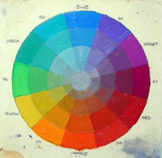
Let’s start with the basic color wheel with the primary and secondary colors are arranged around the outside of the circle in the normal way. As each of these colors approaches the center, it becomes a neutral gray. Any individual color can be pinpointed on the surface of the wheel in terms of its hue and chroma (“chroma” is also known as “intensity” or “saturation”). For the moment, we’re ignoring value as a dimension of color.
If a single color can be charted on the circle, then it follows that the whole scheme can be charted, too. To chart an entire color scheme, it helps to think not only which colors are included in a composition, but also which colors are left out.
Let’s look at some actual pictures to see which colors are in and which are out of the color scheme.

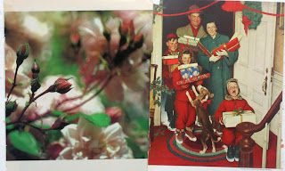
On the left is a photo of some roses and leaves; on the right is a Christmas painting by Norman Rockwell. Each of these painting has greens and reds in different distributions. Both essentially lack yellow, orange, violet and blue.

Here’s another photo and painting paired together. What they have in common is blue and orange—but no red, no yellow, no yellow-green.

Here are two more pictures. Their color schemes are not identical, but basically they’ve got strong reds and yellows, some greens, and a dull blue-violet. What they’re both missing are full-intensity blues and greens.

Now let’s see if we can design a mask to fit over the color wheel to fit these schemes. We want the mask to show only the colors we see in the picture and to leave out the colors that are absent. The Rockwell painting is pretty easy, because it only includes greens and reds (plus a hint of blue in the package and very dull yellow in the ribbon).
The color mask here is a long diamond shape that includes the complementary colors that oppose each other across the middle of the wheel, leaving out everything else.

Here are the images with the blue-orange polarity, along with a masked color wheel. Note that inside this diamond shape, there are some other colors near the center: just a hint of red and a touch of yellow-green and blue-green. The colors inside the perimeter feel sufficient for a complete color scheme, even though we’ve left out a lot.

The mask doesn’t have to be this long diamond shape, because not all color schemes are complementary. Nor does it have to go all the way to the edges, because plenty of paintings lack full-intensity chromatics.
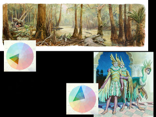
The mask can also be a small triangle in one part of the wheel. Here I’ve taken two paintings from Dinotopia: Journey to Chandara and mapped out their color schemes by digitally defining a shape on the wheel and ghosting the rest.

The swamp scene has dull yellow-greens and browns (browns are really dull oranges). The colors can be contained in the small triangle. The corners of that triangle never touch the edges of the wheel, because the painting doesn’t have any colors of full intensity. As you can see from the ghosted perimeter, the color scheme excludes blue, purple, and red.
Now all of a sudden we have a great way to describe any existing color scheme. But that’s just the first application of color wheel masking. Next Sunday I’ll show you a range of shapes for color wheel masks. Following that, I’ll describe exactly how to use color wheel masks to generate and experiment with color schemes.
In the intervening time, if you get a chance, I recommend that you can paint or digitally create your own color wheel to use as a tool for your own experiments.
Tomorrow: Inner and Outer Growth


24 comments:
Wow. This is some brilliant stuff. I imagine that less representational, more abstract art would need a mask with more than one cutout.
Someone should write a computer program (if it doesn't already exist) where a user could define a color wheel mask and then have the computer search through a database of artwork for images that have a matching color scheme. Or maybe the program could take the mask and apply it to a pre-existing image, keeping the same color relationships, but just "biasing" the hues towards the selected color scheme.
An software interface based on color wheel masking might an interesting tool for artists, designers and art directors.
This is a fantastic way to see how your colours are working in a visceral and direct way. Very helpful for understanding the 'statement' your colours are making. It would also be interesting to define what sort of mask shapes have what sort of effect on your schemes (for instance, creating a banana shaped mask and then seeing what this shape produces as rotated around the wheel). Perhaps that is what you will be looking at in your upcoming posts - I very much look forward to them. I will create my wheel, one in oil and one digital, after work today and will be standing by for further instructions :P
Also, if you havn't come across it yet, one of my old lecturers at Julian Ashtons in Sydney, David Briggs, has a great colour theory website and he uses quite an interesting way of mapping colours. I thought you would get a kick out of it. Hope you dont mind me linking elsewhere on here:
www.huevaluechroma.com
victor: I believe google is close to completing its new image search tool, which lets you upload or link an image and then it will search for you to find the name of the artwork, identify its subject matter, search for images with the same colour scheme, etc etc. I forget where I heard about it though, sorry. And i dont know if it will be part of their website or a downloadable app like sketchup either. Should be fun though. As for an addon program, there are programs that allow you to create a static image that 'floats' over your whole screen - if you had your colour wheel open in photoshop or painter you could effectively create a mask in the float program to cover your wheel as you wanted :)
Incidentally, I also have a colour wheel swatch pallette for photoshop, if anyone wants it just shoot me an email... sorry for the hijack James!
Wow. Your explanations of color are amazing, especially the Color Wheel Masking! Those paintings seem so much more attainable in a design sense when you explain it!
Absolutely amazing, thanks for sharing!
Fantastic information. A friend of mine is working on paintings with limited pallets and so this hits home.
I am looking forward to trying the techniques with some paintings I want to do.
Brian
Yes! Thanks again, your blog is so helpful. When you painted the color wheel, how did you de-intensify the colors? Did you add grays? Judy
Probably the most helpful blog on the net! Judy
I agree with Judy, this is the most helpful blog on the net. I'm a bit mystified by the shapes, are they limitless or do you see a set number of colour scheme shapes?You really have a renaissance spirit.
Very interesting. You have illustrated it so well with your examples.
It seems that one could use a few pieces of paper that could be moved around and change the size and shape of the hole until you found your palette.
well, all I gotta say is thanks. Like 13-15 years ago your Dinotopia book was the first spark I recieved in wanting to become an illustrator/designer, and it's good to see that you are much more open minded about your methods than most famous illustrators out there.. which is very admirable. Thanks again!
A lot of thoughtful and helpful comments, thanks to all of you!
First off, I don't mind at all if you give links in your comments. Please do. The Briggs one was terrific, thanks Adam. Also, it's fine to link to your own blog or website. In fact I wish there was a better forum for you to show your own work and experiments. Is there some way to do this? (I'm very primitive with the internet.)
Victor, I'm really intrigued by your idea of a computer program that could do color scheme mapping. It would be helpful to see a "color wheel histogram" that plotted the actual shape, just the way Photoshop gives us a value scale histogram in "Levels." Just seeing those value histograms have revolutionized my thinking as artist.
Adam and Eric: next week I'll share a bunch of different mask shapes that you can move around, and it sounds like you've figured a way to do that digitally.
Michael, Brian, Frank, and Gringo, I appreciate your kind words, and I think the insights you folks offer are what make this blog fun, and it's a learning experience for me, too.
Judy: to gray down the colors, I think I mixed an optical gray and mixed it into each of the primaries in varying amounts, though you could use a B+W gray--or mix the whole thing with complements—-and it would work just as well. My wheel isn't very scientific, and the steps aren't very even; I'm sure if you make a wheel you can measure the increments more carefully than I did!
wow, im kinda new to painting with color, and i have trouble connecting them up (if that makes any sense at all)into a meaningful color scheme, I think your methods can help a beginner like me choose a palette without accidentally going all over the place.
Very interesting post. I think I will try starting some paintings with a masked section of the color wheel.
Wonderful advice. Thanks so much!
I'm wondering if you do anything special to preserve your oil brushes? Do you have any tips for cleaning and preserving them? I go through them so fast, that I figure I must be doing something wrong.
Thanks again!
Thanks. I'n not sure what you mean by optical gray. A tube color? Judy
Hi, Judy,
I'm glad you asked. I use the term "optical gray" to mean a color that's completely neutral--that is it doesn't lean toward blue or orange or green.
It is mixed from complementary colors, say blue plus orange or green plus red. I also brought the tonal value of the gray up to a middle tone (say about 40% from white to black) by mixing in some Titanium white so that you can see it clearly.
You could also mix a gray from black and white, and it would be more or less indistinguishable from a gray mixed from complements, but you can't really control where a B&W gray ends up as well as you can with an optical gray, and when I'm painting indoors or out I very rarely have black on the palette anyway.
Thanks,this is a real Eureka! type of eye opener. Discussions of color are often sooooo esoteric that they lose me.I'll be interested to play around with this idea of color selection. It is kind of like an endlessly variable limited palette and I've always found that limiting the colors makes for the strongest paintings. I love Color Sundays!
What a great way to visualize a color scheme! Thank you for this. I'm looking forward to part 2.
long time reader, first time commenter.
truly great idea!
as a struggling student artist, color composition is a huge hurtle for me right now. a question as simple as 'which colors do i use?' has been very daunting.
your system makes sense and is brilliant in its simplicity.
thanks for sharing.
your posts have been a great asset to me.
Thanks, Geoff, for leaving a comment. And you're not alone in feeling puzzled about which colors to use in a picture. I do, too--not only which to use, but which to leave out, which for me takes more discipline. That's where color wheel masking really helps. Stay tuned for the next couple of Sunday posts.
this is a great idea, thanks for sharing it! I have posted about this article and linked to you on my blog Fossfor's lab.
I love your blog,it's full of fascinating info and advice.
Mr.Gurney
I think this is a terrific method of selecting colors for someone like me that has what I can only describe as color dyslexia. I am wondering if you have a way of figuring out what masked section of the color wheel works best in an illustration before you use it in a actual piece?
Thank you for taking the time to post this.
This article is brimming with information about Image masking for more like this. I have additionally discovered an article anybody can check for more data Image Masking , It was knowingly more instructive. You may discover more insights regarding it here.
Me gusta mucho su blog , tengo el libro Color and Light, casi todos sus vídeos y le sigo en YouTube. Solo escribo esto para darle las gracias por lo que me ha enseñado y me ha hecho disfrutar.
Muchas Gracias
Una aficionada a la pintura.
Desde España, Ima Gallego
Post a Comment