Tuesday, March 31, 2009

Humber College

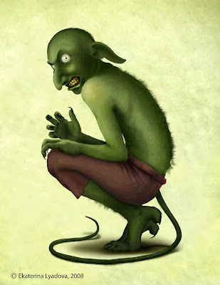
At Humber College in Toronto, Ontario, visual and digital art student Ekaterina Lyadova needed to come up with a character design. Her school assignment came with a backstory:


“In a time before memory, predating the Pyramids, the Sphinx and even ancient Atlantis… from the mists of an earlier age of humankind…there were unicorns, giants, and a race of tall, beautiful superior beings who came to us from another world beyond our skies.

They dwelt among us, and finding our women fair to look upon, joined with them, creating offspring. These star-children became the heroes of old, subject of legend, lore and fable, and leaders of humankind.

With the biogenetic knowledge of their forebears, they began to experiment with mixing the species. This led to the legends of the centaur, the Minotaur, the griffin and other hybrid beings, terrible servants of cruel masters."


Ms. Lyadova began by thumbnailing rough ideas, and then worked out her conception of a long-eared creature with a whiplike tail.

According to Gary Richardson, above, a faculty member and program coordinator who prepared the new curriculum for the School of Media Studies and Information Technology, “this is part of a sequence of lessons beginning with thumbnailing and roughing out figures and composition, to story/script outline development, to character design, set design, and finally, a storyboarded sequence.”

Mr. Richardson is dedicated to the value of traditional drawing and painting skills, and is himself a student of classic instructional texts like Bargue, Loomis, and the Famous Artists’ Course.

The students work from casts and the live model, and develop a familiarity with perspective, color theory, anatomy, and composition before they move on to mastering digital skills.

“Initially there’s some resistance to accepting traditional approach,” he said, “But once they adopt it, it does so much to advance their skill set.”

After my slide lecture, I did a sketch demo with water-soluble colored pencils. I drew an old brass samovar in a small sketchbook, with the sketch blown up onto a giant TV screen.

Humber is transitioning to a degree granting institution, offering 4-year degrees, 2 and 3-year diplomas, and an array of graduate certificates. It prides itself in 91% job placement for its graduates. There are 17,000 full- and part-time students in the college overall, and about 3,000 in the Media Studies program. The art program prepares students for traditional illustration, animation, or web-based opportunities.

Humber College's Visual and Digital Arts Diploma Program curriculum can be seen at:,Link.

Monday, March 30, 2009

Creature Design Workshop

This July I will be offering a week-long workshop in creature design at the Woodstock School of Art
and I hope to see you there.

Each student will design a Pan figure, "half man, half goat," a classic character from Greek mythology who appears throughout western art history.

Starting with sketches from the imagination, students will do observational studies of live goats and sheep and a posed human model. They can sculpt a maquette to work out the design in three dimensions, and they will also have access to ram’s skulls, rocks, and roots for reference.

By the end of the class each student will make a believable fantasy composition in the classic tradition. Students can choose their preferred medium for the final work, but I will be demonstrating in pencil, charcoal, and oil. I’ll also do a brief presentation each day on mythology, anatomy, or composition.

The title of the course is: CREATING REALISTIC FANTASY. Dates are: July27 - 31, Monday - Friday, 9 AM - 4 PM. Cost: $400.

Age 18 or older, please. Some figure drawing experience expected. Limited to 25 students. First come, first served. For more information about enrollment and accommodations, contact the Woodstock School of Art at their website, or call them at 845. 679. 2388

Sunday, March 29, 2009

Plane Heads

Here’s another painting exercise that I learned from Paul Souza, who taught the “scumbling the lights” method on a previous post.

As you look at a real posed model, try to analyze the head in terms of simple planes.

State the lines bounding the planes in pencil on chipboard. Seal the board as before, and apply the white oil paint with a bristle brush in varying degrees of thickness until you get the relative tone just right. Leave the shadows untouched by the paint.

I recommend that you use this plane breakdown as a guide. Both the forehead and the upper lip are divided into three planes. The chin and the nose each end in a flat shape.

The same analysis, in varying proportions and angles, can describe very different face types. If you try this plane analysis, and it just doesn’t fit the face, try an alternate breakdown, but keep it simple.

It should look like a puppet being carved from wood, as was stated in the Carolus-Duran post recently.

Seeing forms in simple terms helps you to draw or paint them better. As you proceed with a real portrait, you can subdivide the planes and blend their edges. If you establish a portrait in these terms at the beginning, you’re much more likely to get a three-dimensional appearance and a good likeness.

Saturday, March 28, 2009

Orientalist and Academic Exhibitions

While the Dahesh Museum is looking for a new permanent home for its collection of academic painting, it is loaning works to other museums.


The Joseph I. Lubin House at Syracuse University is currently exhibiting "In Pursuit of the Exotic: Artists Abroad in 19th Century Egypt and the Holy Land." The show will be up until April 30, 2009, and the museum is open Monday - Saturday, 11 a.m. until 4 p.m.

Lubin House Link..
Image is by Fräre "Along the Nile at Gyzeh."

The other exhibition of work from the Dahesh is "Academic Allure: Art and Instruction in Nineteenth-Century Paris" at the Suzanne H. Arnold Art Gallery at Lebanon Valley College through April 19, 2009, link.

Dahesh Museum, link.
Thanks, Steve!

Kossin and Karn in Illustration Magazine

Illustration Magazine comes out every three months with gorgeous color features on twentieth century illustrators.


The new Issue 25 takes a look at the pulp and fashion work of Gloria Stoll Karn and the bold designs of Sandy Kossin.

Kossin himself wrote the second article, which includes 41 illustrations. He looks back on a career that included everything from children's magazines and movie posters to visualizations of the Bay of Pigs invasion for LIFE magazine.
------
Illustration Magazine website, link.

Friday, March 27, 2009

501 Queen

Among Toronto's beloved streetcar routes, 501 Queen is the centerpiece. At over 15 miles, it is the longest route in Toronto, and one of the longest in the world.

When I rode it yesterday between Spadina and Gladstone, it was so crowded I had to stand facing sideways near the front. I was attracted by a man bundled in his hooded coat, oblivious to everything and dozing off.

I used a dark brown Caran d'Ache Supracolor colored pencil and a water brush to try to capture the window light on his coat.

The water brush helped to unify tones and to soften some of the edges. For example the edge between his back and the seat gets progressively softer from his shoulder downward.
-----
More on the water brush and water-soluble colored pencils on a previous GJ post, link.

More about the legendary Route 501, link.

Thursday, March 26, 2009

Unicorns

Unicorns have been spotted in Toronto.

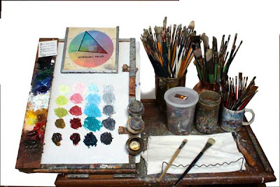
Premixing Color

Recently blog reader S. J. asked me whether I premix colors on the palette or just mix each color from scratch from the component pigments.

It’s a good question, and I don’t recall any of my teachers ever talking about it.

The answer is that in the studio I usually do premix colors. It saves paint and it saves time. If you don't premix you waste effort with the mechanics of color mixing and you use up a lot of palette area. Mixing with the brush alone often leads to skimpy mixtures. There’s also the tendency to end up with habitual mixtures—reaching for the same colors over and over again.

Early in my career I was influenced by the teaching of Art Student's League instructor Frank Reilly (known mainly now from the excellent instructional works of his students and grandstudents).

Mr. Reilly had his students mix several strings of colors from light to dark tones. He used a 10-step value or tone sequence of each principal hue, along with a corresponding scale of grays. But I think ten value steps is more steps than you really need. Mixing four or five steps gives you plenty of control for intermediate values.

If you’re curious about that color wheel at the top of the palette and how those colors were chosen, I’ve done a lot of blog posts about my color wheel masking system. If you click on the “color” button at the left of the blogroll, you can read those back posts.

In a future post I’ll show how I use premixed color for plein air painting.

Wednesday, March 25, 2009

Love Story

The Arkell Museum in Canajoharie, New York is currently presenting an exhibition exploring the history of romance illustration.

The Arkell Museum recently built a modern new addition with plenty of space for their permanent collection of Homer, Dewing, Inness, and even a full-size copy of Rembrandt’s Night Watch. Now they have ample space for special and traveling exhibitions.

The “Love Story” show, on view through May 3, contains 53 original illustrations borrowed from the New Britain Museum of American Art.

The artwork illustrated amorous stories from the books and magazines published during the Golden Age of illustration. Many of the great illustrators are represented: James Montgomery Flagg, Harvey Dunn, Dean Cornwell, Henry Raleigh, Coby Whitmore, Al Parker, Pruett Carter (shown above), and Alice Barber Stephens.

Arkell’s curator Diane Forsberg explained the changes in social history reflected by the artwork. “The goal was for women to get married and stay married, no matter what,” she said, “and it stayed that way” even into the 60s and 70s when the final works were created.

Guest curator Martha Hoppin observed, “about half the works shown here accompanied stories about troubled marriages.” But they all had happy endings. The advent of television soap operas undercut the demand for illustrated women’s magazines and most of the illustrators found work in paperbacks or other places.

The guard told us, “People come in here and they spend a lot of time looking at the art.”

Arkell Museum, link.

Tuesday, March 24, 2009

Toronto Talk

Yesterday Jeanette and I drove to Toronto, stopping along the way to see Niagara Falls still surrounded by mountains of mist-formed ice.

For those in Toronto who might like to attend my illustrated lecture "Dinotopia: Behind the Scenes," please come to Seneca College this Wednesday at 5:00.

Here are the coordinates: Room S1206, Seneca @York, 70 The Pond Road, Toronto. Phone
416-491-5050 X 3422, link.

Sunday, March 22, 2009

Belgian Mama


About a kilometer from my house is a horse farm with five Belgian draft horses. They're strong pullers and very gentle.

One of them, named Sophie, is pregnant. She's expecting her foal in just a week or two. This is a rare event at the farm. Last time it happened was more than ten years ago. I'll try to document the little one with my sketchbook, so stay tuned!

Saturday, March 21, 2009

Squash, Stretch, Inflate

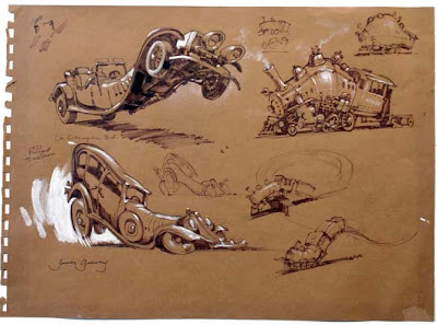
No one says you have to draw exactly what you see when you’re making studies on location. I was sitting in a museum drawing cars and trains, and I wondered what they would look life if they reared up on their hind wheels or inflated with a big breath of air.

Being on location lets you see the objects in three dimensions, walk around them, peer under them. That’s the first step to understanding their forms so that you can transform them any way you want.

A tip: try a little thumbnail sketch first before you leap into a larger drawing.

Friday, March 20, 2009

Baby Tattooville

The art movement known as pop or lowbrow surrealism has excited collectors with its mixture of nostalgia, decadence, and delicious weirdness.


According to Wikipedia, Juxtapoz, the flagship magazine of the movement, is the number one art magazine in America.

One of the prime movers of pop surrealism is Bob Self, publisher of Baby Tattoo books. This coming October, for the third year running, Mr. Self will host an event for artists and collectors at the Mission Inn in California. Ten invited artists spend a few days with 50 collectors, who pay a package price to participate. The event is called “Baby Tattooville.” In his words:

"Baby Tattooville provides a unique opportunity for a small group of celebrated artists and serious collectors to spend time together in a relaxed yet creatively stimulating environment. Without the time constraints of a typical personal appearance, or the crowd control issues of a standing-room-only event, artists and collectors will have a weekend-long opportunity to discuss and explore their mutual interests. Original work will be created and celebrated around-the-clock. No one will leave empty handed. Only 50 event packages are being offered."


One of the standouts in this year’s lineup is Travis Louie, whose affectionate portraits of unusual beings has won him an enthusiastic following among collectors.

Bob Self also asked me to be part of the event next fall, so I’ll be reporting to you from the inside. If you’re a collector, you might want to sign up soon, because the spaces are likely to disappear quickly.
--------
Baby Tattooville 2009 (the art gathering), link.
Art of Travis Louie Blog, link.
Baby Tattoo home page, link.
Vinyl pulse report on the last BT event (pictured in this post), link.
Wikipedia on Juxtapoz, link.

Thursday, March 19, 2009

Using Photo Reference

Yesterday’s post about “Drawing from Maquettes,” brought up some really interesting comments about the pros and cons of using reference, especially photo reference.

Some realist painters scrupulously avoid photo reference altogether, including Jacob Collins and his group of artists studying with the Hudson River Fellowship, mentioned in an earlier post yesterday. They get fine results by concentrating on purely observational work.

Other artists in the comics and fantasy field, such as Moebius and Frazetta, achieve extraordinary artwork by drawing entirely from their imaginations, creating forms from their visual memory.

And some artists use photo reference extensively and unabashedly, especially for action poses and effects that are difficult to observe, such as water effects, explosions, or action poses.

An interesting historical note is that some realist artists, including artists in the academic tradition, have been using photos for nearly a century and a half. According to art historian Ross King, forty percent of all photographs taken in Paris in the later part of the nineteenth century were commissioned by artists, usually taking photographs of nude models for “academies” or figure reference studies.

When Pascal Dagnan Bouveret painted “Breton Women at a Pardon” in 1887 (above), he took photos of women sitting outdoors. But in his final composition he clearly didn’t use the photo literally, and was in control of the design of his picture.

In this photo you can see that he drew each of the figures on a separate piece of tracing paper, a method I’ve discussed in a previous post.

My own views on this topic are moderate and pragmatic. There’s no right or wrong method: the final result is the test, and you should choose a process that will give you the results you want.

I have done some paintings without photo reference and others with it. I use photos as one kind of reference, along with traditional charcoal studies from observation, maquettes, and scrap file reference.

The caution I feel about using photos is that I’m easily lured into copying their
random details. Photos are compelling. Without conscious effort, I tend to forget what I had in my mind’s eye at the beginning of the picturemaking process. Characters based on photos of friends or neighbors sometimes have a mundane snapshot quality, rather than an otherworldly “storybook” feeling.

There’s also the danger of copying the colors and the black shadows literally from the photos.

If you want to work only from observation or only from imagination, more power to you! But if you want to use photos, let me suggest the following four safeguards:

1. Do your initial sketches purely from your imagination and develop those sketches as much as you can before going after reference. Even if those sketches don’t look that great, trust your mental image and let it guide you later.

2. Try using the photos only for the comprehensive stage, and put them away for the final painting.

3. Print your photos in black and white to avoid being influenced by the color.

4. Take lots of photos, and use more than one model or more than one costume.

I’d be very interested in your thoughts on this topic.
-----------
I am indebted to art historian Gabriel Weisberg’s article on Dagnan’s use of photography, link.

GJ post on tone paper studies, link.
GJ post on action poses and photography, link.
GJ post on tracing paper as a compositional tool, link.

More in my book: Color and Light: A Guide for the Realist Painter

Wednesday, March 18, 2009

Drawing from Maquettes

Andy Wales, a frequent commentator on this blog and a contributor to Art By Committee, is also an elementary school art teacher at the Lynch Bustin Elementary School in Athens, Pennsylvania.

In anticipation of my visit next month, he has been using maquettes with his young art students so that they can make their fantasy drawings more realistic.

"We're not building our own models, but we are using dinosaur toys and action figures to imagine scenes. Above you see that Cyclops of the X-Men is taped to a dinosaur. We're working with the lights off, using only the lights that come in from the skylights. In my demonstration sketch, I'm showing the kids how to use charcoal, blending stump and erasers to create shadows and highlights on objects."


Andrew Wales’ blog Panel Discussion, link.
The Lynch Bustin Art Room, link.

Hudson River Fellowship

A juried group of landscape painters with an unusual mission will be working in the Catskill Mountains this summer for the third year in a row. If you want to join them, you've got a little over a month to apply.

The group, called the Hudson River Fellowship, is dedicated to the principle of close and prolonged observation of nature, patterned after the practices of pre-impressionist painters like Asher B. Durand and Frederic Church.

Artist Tom Kegler of Buffalo, New York completed this forest floor study last summer, when I paid a visit to the school.

The artists selected to attend the fellowship will enjoy a month-long residency with full-tuition scholarship for all members and free housing. There’s a spirit of comraderie at the periodic exhibits of work in progress and at the group suppers.

The teachers include founder Jacob Collins of the Grand Central Academy, Edward Minoff, Travis Schlaht, and Nicholas Hiltner.

The curriculum includes lectures by guest speakers and a series of assignments, beginning with field studies in pencil, tonal renderings, and plein air observations. These studies aren’t done merely as an end in themselves.

The ultimate goal is to use these preliminaries to develop a large composition, what Bierstadt used to call a “Great Picture,” back in the studio after the fellowship is over.

Acceptance into the program requires a portfolio review and an application. The deadline for applying for this summer’s fellowship is May 1, 2009.
---------
Thomas Kegler (artist of the study above), link.
Home page of the Hudson River Fellowship, link.
Previous GJ Post, link.

Tuesday, March 17, 2009

Timberjack Walking Machine


When I designed the walking vehicles for the Dinotopia prequel universe in First Flight (1999), I scarcely could have imagined the actual machines that were already emerging from engineers’ drawing boards.


The PlusTech Oy company, a division of John Deere, unveiled a prototype for a walking timber harvester called the Timberjack. It may be a little slow, but it has adjustable ground clearance, automatic leveling, and the ability to walk sideways, never mind what it does to trees.
---------
Thanks, Art! Previous GJ Posts:
Walking Vehicles, part 1, link.
Walking Vehicles, part 2, link.
Sultan's Elephant, link.

Monday, March 16, 2009

Carolus Duran’s Method

Carolus-Duran was the teacher of John Singer Sargent, whose technical approach to painting generated considerable interest on a recent post.


Sargent’s portrait of his teacher (above) is in the collection the Clark Art Institute in Williamstown, Massachusetts. The paintings below are by Carolus-Duran

Here’s a firsthand account of what was taught in Carolus-Duran’s atelier:

“The model was posed on Monday, always in full light, without shadow effect, and against a strongly-coloured backround, which we had to imitate exactly in its relations to the figure. The figure was drawn in in charcoal, then we were allowed to take a sable and strengthen the outline with some dark colour mixed with turpentine, but not to make any preparation, nor put in conventional dark brown shadows.

The palette was set as follows: Black, verte emeraude, raw umber, cobalt, laque ordinaire, brun rouge or light red, yellow ochre, and white (the colors being placed on the palette in this order from left to right).

We were supposed to mix to or three gradations of yellow ochre with white, two of light red with white, two of cobalt with white, and also of black and raw umber to facilitate the choice of tones.

We were not allowed any small brushes, at any rate not for a long time—many months or years.

On Tuesday Duran came to criticize and correct the drawing, or the laying in of painting if it was sufficiently advanced. We blocked in the curtain first, and then put in the figure or face in big touches like a coarse wooden head hewn with a hatchet; in fact, in a big mosaic, not bothering to soften things down, but to get the right amount of light and the proper colour, attending first to the highest light.

The hair was not smoothed into the flesh at first, but just pasted on in the right tone like a coarse wig; then other touches were placed on the junctions of the big mosaic touches, to model them and make the flesh more supple.

Of course these touches were a gradation between the touches they modelled. All was solid, and there were no gradations by brushing the stuff off the lights gently into the darks or vice versa, because Duran wished us to actually make and match each bit of the tone of the surface. He came again on Friday to criticise and on that day we finished off.”


Carolus-Duran’s teaching was considered progressive among academic instructors because of its painterly, direct handling and its emphasis on form and color rather than line. He was an ardent admirer of Velazquez and a friend of Manet.

The essence of Carolus-Duran's method, according to one of his students, is to “seek first of all for absolute truth of tone and colour, and getting this truth in the simplest and most obvious way.”
----------
Sources: John Collier, A Manual of Oil Painting, London 1891, 5th Edition, page 57-59.
Barbara Weinberg: The Lure of Paris: Nineteenth Century American Painters and Their French Teachers. New York, 1991.
-------
More on Carolus-Duran at Art Renewal Center, link.
Lines and Colors on Carolus-Duran, link.
A Manual of Oil Painting by John Collier on Google Books, link.
Ciudad de la Pintura, link.

Sunday, March 15, 2009

Academic and Illustration Museums

I was trying to compile a list of museums, and I wonder if you can help me. I'm looking for museums with an especially good selection of 19th century academic realism, fantasy or science fiction artwork, or golden age American illustration, where the collection is usually on display, not locked in the basement.


Here's what I've got so far:

Brandywine River Museum, Chadds Ford, PA
Delaware Art Museum, Wilmington, Delaware
Haggin Museum
, Stockton, California
Metropolitan Museum, New York, New York
Musee d’Orsay, Paris, France
National Museum of American Illustration, Newport, Rhode Island
New Britain Museum
, New Britain, Connecticut
Norman Rockwell Museum
, Stockbridge, Massachusetts
Sterling and Francine Clark Art Institute, Williamstown, Massachusetts
Walters Art Museum
, Baltimore, Maryland

Please let me know if I've missed your favorite museum, specifically for this type of artwork.

Art By Committee: Banana Tree

The 15th of the month is the day for a group sketch game called "Art by Committee." I share an excerpt from a science fiction story and you visualize it.

This month's quote was: “I lashed out with my left arm, clutched at something thin and hard, tore at it; the next second a banana tree fell across my chest. But the pain was…”

This assignment was quite specific, but at the same time completely strange. As always, each of you gave it a clever, memorable twist. Thanks for participating!


Dave Harshberger
Image/Blog


"Mei-Yi Chun"
Image


Andy Wales
Image/Blog

Roberta Baird
Image
Website


Andy SketchEAS
Image/Blog


Michael Geissler.
Image
Blog


Marisa Bryan
Image


...and the one from the original Art By Committee sketchbook (click to enlarge).


The next quote for April is:
“Behind the bar, polishing four glasses at the same time with his blue tentacles, was the Tookah. Two of his three eyes didn’t bother to look up, but it was the third one, the upper eye, the sleepy one that appears bored by everything but never misses anything. That one sleepily looked over at me and then blinked and opened wide.”

Have fun! Please scale your JPG to 300 pixels across and compress it as much as possible. Title it with your name, send it to: jgurneyart(at)yahoo.com, subject line ABC. Please let me know in your email the full URL of the link to a larger image or your blog or website so people can see your image in all its glory and learn more about your non-Tookah work. Please have your entries in by the 12th of April. I'll post the results April 15.

Saturday, March 14, 2009

The Falls Remain the Same


Fernando Emmanuel Laverde Bohórquez of Columbia has traveled to some of the same places that Frederic Church painted, including Tequendama Falls, 1854. In spite of the human damage (and natural erosion), he has discovered that the landscape is almost the same as it was. Thanks, Fernando.

Antibubbles

A regular soap bubble is a thin film of liquid surrounding a sphere of air and floating in an air medium.

Now think of the exact inverse: a thin film of air surrounding a sphere of liquid and floating in a liquid medium. That is called an antibubble. You can make them in a beaker of soap bubble solution.

An antibubble, with its modest bouyancy, floats slowly upward to the surface just as a soap bubble floats delicately downward.

This YouTube video has other permutations: zero gravity bubbles, bubbles-within-droplets, and a "bubble war" filmed in slow motion and explained by a NASA scientist.


Wikipedia on Antibubbles, link.

Friday, March 13, 2009

Netter’s Medical Illustration

One of the places art meets science is medical illustration, and one of the masters of the field was Frank Netter, M.D. (1906-1991), whose contribution to the field is on the order of Vesalius or Leonardo.

Trained as a doctor, he began doing illustrations to clarify his understanding of anatomy. “I found that I could learn my subjects best by drawing," he said. His life work of more than 4,000 illustrations grew, he said, “in response to the desires and requests of the medical profession.”

The paintings of bones, muscles, cross sections, and internal organs often use color coding to clarify separate subsystems. Dr. Netter used watercolor and gouache, with colored pencils and pastels for shading and fine detail. He once said:

"It is important to achieve a happy medium between complexity and simplification. If the pictures are too complex, they may be difficult and confusing to read; if oversimplified, they may not be adequately definitive or may even be misleading. I have therefore striven for a middle course of realism without the clutter of confusing minutiae."


His work is collected in the Atlas of Human Anatomy (1989), which is still held up as a gold standard among students of medical illustration. For those interested in studying medical illustration, there are specialized programs at Johns Hopkins in Maryland, the Medical College of Georgia, Rochester Institute of Technology, and Cleveland Institute of Art, and the University of Toronto.
-------
Wikipedia: link.
Graphic Witness: link.
Netter Images: link.

Thursday, March 12, 2009

Paris Salon Statistics

Today’s blockbuster museum exhibitions are a sideshow compared with the Paris Salon.

Most modern large exhibitions at the Met or the Louvre display between 100 and 150 paintings. The Salon hung as many as 5,318 works (1887), making it about 50 times larger.

If you took all the paintings and lined them up side by side along a highway, frame touching frame, they would stretch for six or eight miles.

The proper term was “The Exhibition of Living Artists.” After 1855 it opened in the Palais des Champs-Elysees, a vast warehouse-like space.

The Salon opened during the first week in May. Admission was one franc, well within the means of working people. As a result, the appreciation for Salon artwork cut across all social classes, as movies do today.

The paintings were grouped by the letter of the artists’ last name, so Manet, Monet, and Meissonier shared a room. Popular paintings were accompanied by guards to keep people from trampling each other.

Paris had a population of around 1.4 million in the later part of the 19th century. Of that number, about a million people visited the exhibition at least once during its six-week run. About 23,000 visitors passed through the doors on average each day.

By comparison, amongst of the best attended shows at the Met were the Leonardo da Vinci and the El Greco exhibitions. Each of those averaged less than 7,000 people per day, a mere third of the Salon’s attendance.
---------
Adapted from The Judgment of Paris: The Decade that Gave Us Impressionism, By Ross King, link. and The Studios of Paris, by John Milner, link.
Image courtesy Bearded Roman, link.

Wednesday, March 11, 2009

Lazy Edges

Nicolas Poussin was a great artist, but he suffered from lazy edges.

‘Lazy edges’ is a compositional fault where all the elements in a composition stop short of the edge of the picture. Everything fits into a neat little box in the middle of the design.

Nothing crosses into the outer margins of the picture. The action seems to take place on a theatrical stage or in a shop window. It’s fine if you want a painting to look artificial, but a problem if you want it to look natural.

Artists since the invention of photography have tended to load the edges. Take any photo of real life, follow along its edges, and there’s plenty happening. The photograph above is by Henri Cartier-Bresson.

A good composition should have some important elements near the margin. One of the masterpieces of loaded edges is Sir Lawrence Alma-Tadema’s A Reading from Homer.

1. The reader’s left hand is at the extreme edge. Above the hand is a crucial inscription.

2. The prone figure lies along the bottom edge.

3. The standing figure is tucked into the upper left corner. Part of his face is cropped.

4. You can’t see it in this reproduction, but the very top edge of the painting shows the horizon only about an inch below the edge of the frame in the original painting. Unfortunately all the online versions of this image are compromised by slight cropping.

In a good composition, the slightest cropping destroys the meaning of the picture.

Other artists who use loaded edges effectively: Rembrandt, Edgar Degas, Carl Larsson, Norman Rockwell (1940s and 50s), Edwin Austin Abbey, Pascal Dagnan-Bouveret, and Howard Pyle.