Earlier this month, the gargantuan marionettes returned to Nantes in western France, this time with a deep sea diver (Le Scaphandrier) in search of his gigantic niece.
In the second half of this video you can see how the operators lunge off the moving platform to lift the legs for each step.
The spectacle was produced by the street theater company Royal de Luxe of Nantes, who brought us the Sultan’s Elephant.
--------
Image from Flickr user misterstf
Previous GurneyJourney post on the Sultan's Elephant, link.
Report on BoingBoing, link.
More Flickr images of the Giant Diver, link.
Wikipedia on Royal de Luxe, link.
Nantes municipal website with pictures and info, link.
Tuesday, June 30, 2009
The Deep Sea Diver
Labels:
Rabbit Trails
Mystery Artist: Water Lilies
Can you name the artist who painted these water lilies? I'll send a deluxe Dinotopia map to the first person who guesses the correct answer.
-----
Addendum: Zelas correctly identified the Russian painter Isaac Levitan (1860-1900). The painting is 95cm x 128cm and was painted in 1895, before Claude Monet's famous water lily paintings.
More samples of Levitan at Athaeneum.org/Levitan and Wikipedia/Levitan
Labels:
Plein Air Painting
Monday, June 29, 2009
The Elgin Marbles and the Parthenon
Here’s the debate in a nutshell: the Parthenon is perhaps the most famous icon of Athens.
Between 1801 and 1812, during the Ottoman occupation of Greece, Thomas Bruce, the 7th Earl of Elgin removed many of the Parthenon’s sculptural elements and took them to London. The so-called Elgin marbles now reside in the British Museum.
Greece would like to have the Elgin marbles back, and has just opened the New Acropolis Museum in Athens to house them. The argument for returning them is more than simply an appeal to return art to its land of origin. As a single work of art, proponents, say, the Parthenon cannot be fully understood unless the pieces are seen together.
Why keep them in London? Some argue that their safekeeping in London has protected them from looting, weathering, and other damage that might have occurred in the intervening years. But the British Museum admits that they have suffered from the act of removal, from overzealous cleaning, and from the 19th century pollution of London.
It’s safe to assume that they would receive responsible curatorial care in either location today, and either way they would end up in a museum, not adorning the Parthenon itself. But museum officials are understandably reluctant to agree to all restitution claims, which would ultimately empty the museums.
What is your feeling on the issue? Where should the Elgin marbles live? Do they represent a different case than other works of art? Please vote in the poll at left and offer your thoughts in the comments.
------
Wikipedia's gives the full story of their removal and both sides of the issue for repatriation, link.
NPR's radio coverage yesterday, link.
British Museum's official story and position, link.
New Acropolis Museum, link.
Issue blog "Elginism," with various angles on the story, link.
-------
Addendum: July 1: In the poll, 210 people voted on the question: "Should the Elgin Marbles Be Returned to Greece?" 47 (22%) voted to keep them in London; 150 (71%) wanted them to be returned to Greece; 13 (6%) voted for "no comment/other."
Labels:
Pencil Sketching
Sunday, June 28, 2009
Church and the Mirror
I had supper last night with the great-granddaughter of Frederic Church at her home less than a mile from Olana. She said she found one of Church’s journals from his Near East expedition as she was exploring the attic a year or two ago.
“The reason I liked him,” she said, “is he seemed to have no fear.”
During his 1868 expedition to the lost city of Petra, she told me that Church was in mortal danger from the local Bedouin tribes, who had killed an artist in the region not long before. It was considered blasphemy to make graven images. But Church “hired a bunch of people to guide him. He payed them a great deal of money so they didn’t want to kill him.”
At one point the locals blocked his way and threatened his life. Church then asked to borrow a mirror, because “he realized a mirror was a sacred thing.” He took the mirror, and, while the Bedouins weren’t looking, he painted a crack on it. He then showed the cracked mirror to the angry men.
Then, announcing he would restore the mirror to its original condition, “he went behind the tent and erased the crack.” The men believed him to have divine powers, and they alllowed him to pass safely.
Labels:
Hudson River School
Saturday, June 27, 2009
Blackfriar Pub
Here's a pencil sketch of The Black Friar Pub in London. What attracts me to a scene like this is the weird juxtaposition of elements. The wedge-shaped art nouveau landmark stands alone, surrounded with stark geometric postwar forms.
I used two grades of graphite pencils, an HB and a 3B. I sharpened the soft pencil into a chisel tip, which helped with the treatment of the window details..
Labels:
Pencil Sketching
Friday, June 26, 2009
Daguerre, Painter
Louis Daguerre is best known as one of the pioneers of photography, but he was first a painter.
In 1803 he became a pupil of Degotti, a scene painter for the Paris Opera, and soon began he working on panorama paintings. He created enormous realistic depictions of cities and historical scenes.
To add to the illusion of reality, Daguerre’s paintings were arranged in rotundas lit from above. In 1822 he invented the diorama, a form of scenic entertainment that combined the panorama with a “diaphanorama,” which used translucent oiled paper lit from the side in subtly changing vistas.
To audiences of his day, these spectacles must have held the same “gee-whiz” appeal of HDTV or 3D movies in our time.
Labels:
Academic Painters
Thursday, June 25, 2009
Tor Gallery
Tor.com has just posted a set of my images in their web gallery. The TOR Gallery is a great place to survey what's going on in contemporary fantasy art. My pictures can be seen here, and all of these will be included in the upcoming book.
Rear View Tip
Here’s a handy way to get a fresh look at a painting. For just a few dollars at an auto part store you can get one of these stick-on convex mirrors.
They help you see your work in a new way because they both reverse and miniaturize your composition, making it immediately clear if you’re getting the Big Statement right.
Remember: objects in mirror are closer than they appear!
Related GJ post on getting a fresh eye and Lorrain mirrors.
They help you see your work in a new way because they both reverse and miniaturize your composition, making it immediately clear if you’re getting the Big Statement right.
Remember: objects in mirror are closer than they appear!
Related GJ post on getting a fresh eye and Lorrain mirrors.
Labels:
Painting Gear
Wednesday, June 24, 2009
Sal Westrich
Art students at Pratt Institute in New York will know Sal Westrich. He teaches history there during the school year and then spends the summers in southern France, enjoying the delights of tomates à la Provençale and salade niçoise. What could be a better life?
Labels:
Pencil Sketching,
Portraits
Tuesday, June 23, 2009
Pen Disaster
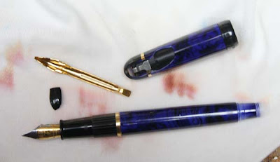
Just heard a scream from the laundry room upstairs. Looks like I left my fountain pen in a load of whites. It busted up and bled in the spin cycle. Now we'll be walking around covered in strange brown spots.
Labels:
Rabbit Trails
Costumes, Part 2
Continuing yesterday's costume tips:
7. You can improvise a lot of costume details with samples of fabric combined with old clothes from your closet. It doesn’t matter if the color matches or if it looks good enough to go on stage. You’re just looking for information about folds and drapery.
8. If you can’t fine the right costume, don’t worry! Remnants of leather, satin, brocade, or velvet from a fabric store can provide you with helpful information about the behavior of the fabric. Steel bowls from the kitchen can give ideas for how armor would look.
9. For simple togas and capes, you can drape and pin fabric samples over your artist mannikin or dressmaker’s dummy. For the fabric to scale down to a miniature size, it should be a very light weight. Cellophane scales down really well over a miniature figure, and can be spray painted to give it opacity (Thanks, Graydon).
10. Don’t be shy to ask for help. If you know someone who is clever with a sewing machine and can think laterally, they might be able to help you improvise a few basic things.
11. Once you get your model (or yourself) in costume, you can take reference photos in a variety of poses. If it’s an easy pose to hold, you can work directly from the model. That's how I did the painting of Oriana above, which appears in Dinotopia: The World Beneath. I put pieces of tape on the floor to mark where the model's feet should return between breaks. The whole session only took about an hour and a half, which saved time over shooting reference or doing drawn studies.
12. If you attend a sketch group, ask if your fellow artists might enjoy sketching from a costumed model. If so, everyone can pitch in a costume or two, or the models may come with something. You can usually pay the model to stay after the sketch session to work with you for reference.
Labels:
Dinotopia,
Models Posing
Monday, June 22, 2009
Costumes, Part 1
An artist like Edwin Austin Abbey (below: "Who is Sylvia") was legendary among his peers for lavishing a fortune on the right costume for reference. (More Abbey samples here)
Good costumes can be expensive to buy or rent. And they can be difficult to make. But having a real costume makes a huge difference in your finished work. You can tell right away if an artist just made up a costume or went to the trouble to get a real one.
Abbey’s illustrations commanded princely sums a hundred years ago. What are we mortals to do nowadays on a shoestring budget? Today and tomorrow I'll offer 12 tips to save you money, time, and trouble.
1. You can find costumes at thrift stores or junk shops. Almost every garage sale has a Halloween costume or an unusual hat that you may want to use later.
2. Many smaller communites have a local theater company with costume collections. They are sometimes willing to loan their costumes to illustrators.
3. Renaissance festivals have vendors with an assortment of hats, cloaks, corsets, gowns, breeches, and doublets. Example: Moresca Clothing and Costume. That’s where the blue and red jacket came from, and I’ve used it in many Dinotopia pictures.
4. People who work in living history museums wear very authentic costumes. I've found they're glad to model for a sketchbook study. They may also be willing to pose for photo reference, but be sure to get their written permission first. Examples: Plimouth Plantation, Old Sturbridge Village, Colonial Williamsburg.
5. Big cities like New York, London, or Los Angeles have rental agencies serving theatrical or movie productions. Sometimes they will sell off their older, worn-out costumes. That’s where the doublet with the slashed sleeves above came from. Examples: Palace Costumes, Adele's Costumes.
6. Large museums, like the Metropolitan Museum or the Victoria and Albert in London have costume collections which can usually be sketched or photographed. Examples: Metropolitan Museum Costume Institute, Victoria and Albert Museum, London.
Tomorrow: Six more costume tips.
Labels:
Dinotopia,
Models Posing
Sunday, June 21, 2009
Too-Smooth Tones
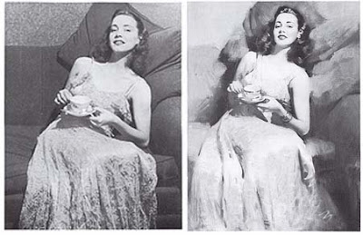
When he translated his reference photo into a painting, Andrew Loomis softened the edges and subordinated the unimportant small forms. For example, he simplified the details under the model’s left hand, and eliminated the delicate tracery in the lower half of the dress.
To idealize the figure, he made the head of the model slightly smaller in the painting than it appeared in the reference.
He was also conscious of breaking up the flat tones of the photo.
“One of the main things that identify a photo as a photo,” he wrote in his classic book Creative Illustration, “is the ultra-smoothness of the tones.”
Where the photo presented monotonous values, such as in the pillows behind the model’s shoulders, he activated the surface with painterly variations.
“Note the accents placed here and here of dark against light, to add punch,” Loomis says. “The lights have been forced somewhat to obtain extra brilliancy. The background has been lightened in spots to avoid the monotony of tone in the photo.”
-------
From Creative Illustration (1947)
Labels:
Paint Technique
Saturday, June 20, 2009
Waterhouse in London
On June 23, The Royal Academy of Arts in London will present the largest retrospective ever assembled on the art of John William Waterhouse (1849-1917).
This exhibition includes 92 paintings and drawings, along with sketchbooks. The London exhibition will continue through September 13, after which it will continue at The Montreal Museum of Fine Arts in Canada from October 1, 2009 – 7 February 2010.
------
Royal Academy website, link.
This exhibition includes 92 paintings and drawings, along with sketchbooks. The London exhibition will continue through September 13, after which it will continue at The Montreal Museum of Fine Arts in Canada from October 1, 2009 – 7 February 2010.
------
Royal Academy website, link.
Labels:
Academic Painters,
Museum Visits
Sargent by Herford
Here's Sargent doing the Duchess X
In pink velours and pea-green checks.
"It helps," says he, "to lift your Grace
A bit above the commonplace."
--Oliver Herford, from Confessions of a Caricaturist
-------
Download Herford's book of caricatures at Project Gutenberg, link.
Feature on Oliver Herford on 100 Years of Illustration, link.
Labels:
Comics/Cartooning
Friday, June 19, 2009
Creature Design Workshop Update
Plans are going well for the fantasy art workshop that I'll be teaching July 27-31 at the Woodstock School of Art in New York State.
Each of us will be creating an image of Pan, the famous character from Greek mythology.
Pan, as you’ll recall, is half man and half goat. We’ll be doing observational studies from a live human model. I’ll offer lots of tips for animal drawing and creature design and I’ll bring glass goat eyes from a taxidermist, three gorgeous skulls and a pelt from Icelandic rams, and I’m working on getting a live goat (a first for the school).
The materials list that I’d like you to bring is now online, if you follow this link and click on "Supply Lists." You can do your finished art in whatever painting or sculpting medium you choose.
There’s still room in the class if you’d like to join.
Woodstock School of Art, link.
2470 Route 212
Woodstock NY 12498
For any questions about registration, lodging, costs, etc, please call the school at 845. 679. 2388 or email: wsart@earthlink.net.
Any questions about the class itself, you can ask me in the comments.
Labels:
Animals
Thursday, June 18, 2009
The Anatomy of the Ear
The external ear is also called the auricula or pinna. The outer rim or helix spirals up out of the bowl-like conchal fossa. A swelling known as Darwin’s tubercle is present in 10.4% of the population.
The antihelix curves inside the helix, separated by the groove called the scapha. It splits at the top into the superior and inferior crux or leg, with the triangular fossa in between.
The flap called the tragus protects of the auditory meatus, or earhole. Often with two distinct swellings, it uses the Greek name for goat because of its beard-like hairs.
Across the intertragical notch is the prominence known as the antitragus, part of the stiff cartilaginous shelf from which hangs the fleshy auricular lobule (earlobe). The depression behind the ear is called the auricular sulcus.
Wikipedia on external ear,
Darwin's tubercle (thanks, Donna)
tragus (thanks, Stape)
Labels:
Figure Drawing
Wednesday, June 17, 2009
Two Things to Remember
Before his students graduate from the Hartford Art School, instructor Dennis Nolan sits each one of them down and gives them his intense wild-man look.
“You can forget everything else I taught you,” he tells them. “But I want you to remember just two things: how to place the horizon line, and how to draw an ear.”
Mr. Nolan told me that it’s rare to find a well-drawn ear these days, even among professional artists. “Most people forget to show the leg of the helix descending into the conchal fossa,” he said. “And not many artists know about Darwin’s tuber.”
Uh-oh, I thought to myself. I’m supposed to be a professional artist, but I’m not sure what he’s talking about.
So tonight after the workday is done I’m going to sit down and figure out the artistic anatomy of the ear. I’ll show you the results and we'll compare notes tomorrow.
------
GJ post on the horizon line or eye level, part 1, part 2, and part 3.
GJ post on the Hartford Art School.
Labels:
Pencil Sketching,
Portraits
Tuesday, June 16, 2009
Puttin’ on Daubs
One day Edgar Payne was painting outdoors, far from any sign of habitation. He was surprised to find a man behind him, watching.
Then the man said, “ Why that’s nuthin but puttin’ on daubs!”
A little later the man shook his head and said, “But you sure gotta know where to put them daubs!” and walked away.
------
Recollection by Evelyn Payne Hatcher in an addendum to Composition of Outdoor Painting by Edgar A. Payne.
Then the man said, “ Why that’s nuthin but puttin’ on daubs!”
A little later the man shook his head and said, “But you sure gotta know where to put them daubs!” and walked away.
------
Recollection by Evelyn Payne Hatcher in an addendum to Composition of Outdoor Painting by Edgar A. Payne.
Labels:
Paint Technique,
Plein Air Painting
Monday, June 15, 2009
ABC: Harvard Depository
The 15th of the month is the day for a group sketch game called "Art by Committee." The way it works is I share a prompt and you come up with a picture to go with it. This time we started with a business card:
I must admit that I thought the assignment was unpromising, but I was blown away. You came up with some amazing characterizations for Trudy and imaginative ideas for her environment. You can practically smell the dust on the bookshelves.
Dave Lebow
Image
Website
Mei-Yi Chun
Image
Link:
Ginger Nielson
Image:
Website
Blog:
Mario Zara
Blog
Andy Wales
Blog
Image:
Michael Manomivibul
Website
Michael Geissler
Read or Die, link.
Image:
Marisa Bryan
Image
Dave Harshberger
Blog
Rob Hummer
Image
Jared Updike
Image
Here's my solution. To show you how clueless I am, I thought Trudy was a guy’s name until Jeanette pointed out it’s short for Gertrude. And all I could think of for “depository” was a piggy bank.
Now get ready for next month. The quote for July is: “But when the dots did not vanish even after he scrubbed his fists across his eyes three times, he shouted hoarsely…”
Have fun! Please scale your JPG to 400 pixels across and compress it as much as possible. Title it with your name, send it to: jgurneyart(at)yahoo.com, subject line ABC. Please let me know in your email the full URL of the link to a larger image or your blog or website so people can see your image in all its glory and learn more about your other work. Please have your entries in by the 12th of July. I'll post the results July 15.
-----
Previous Art-By-Committees
Labels:
Art By Committee
Sunday, June 14, 2009
Irish Music Party
Here's yesterday's sketchbook page, with quick portraits from Irish accordion player John Whelan's 50th birthday party last night. Along the top are drawings of the Half Moon, the Clearwater, and the Onrust, flagships of the Henry Hudson Quadricentennial celebrations. We watched them from the shores of the Hudson River as they sailed by.
More about the Quadricentennial, link.
Labels:
Pencil Sketching,
Portraits
Saturday, June 13, 2009
Csont and New Urbanism
David Csont is one of the most admired members of the American Society of Architectural Illustrators (ASAI). He’s a principal of the firm Urban Design Associates in Pittsburgh, which is a leader in New Urbanism. New Urbanism is a movement to design communities to be more walkable, diverse, and sustainable.
Mr. Csont spends a lot of time meeting with his clients all over the world. He brings his watercolor setup to those meetings and paints right there at the conference table. Seeing his colorful renderings take shape before their eyes energizes planning groups and gets them thinking about specifics.
Although his firm uses computers extensively, this role of visualizing with traditional media can’t be replaced by the machine because of the artist’s ability to select and accentuate detail and to convey mood. Below: overviews produced by his team.
For Mr. Csont, the appeal of new urbanism grows out of childhood experiences of intact traditional communities. “I grew up in a suburban neighborhood,” Mr. Csont told me. “My grandmother lived in an old house in a traditional neighborhood. We’d sit on the front porch and watch the cars go by. There was a store on the corner and she would send me out for a loaf of bread. Those were my fondest memories.”
--------
New Urbanism on Wikipedia and Official Site
Urban Design Associates website
Dave Csont Bio
American Society of Architectural Illustrators (ASAI) website
Labels:
Watercolor Painting
Friday, June 12, 2009
Brush Washer
Here's an easy and cheap way of making a brush washer for oil painting using a glass jar and a plastic container, with kerosene as the solvent. The holes in the plastic container are made with a power drill and a 1/4 inch high speed drill.
After the jar fills up with sediment it can be discarded at the recycling center on toxic waste day.
Also check out the GJ post on Ed Ahlstrom's design for a coffee can brush washer, link.
After the jar fills up with sediment it can be discarded at the recycling center on toxic waste day.
Also check out the GJ post on Ed Ahlstrom's design for a coffee can brush washer, link.
Labels:
Painting Gear
Thursday, June 11, 2009
Clotheslines
Clotheslines are beautiful things.
Charles Curran painted these sheets drying on the line, using the cloth as a back projection screen for the cast shadows of the nearby foliage.
Clothes dried on the line smell fresher. Hanging laundry floods the soul with joyful light. And it uses free energy.
So why don’t we see more clotheslines in America? The energy and appliance companies ran a relentless series of ads in the 1950s and 1960s brainwashing people into thinking clotheslines are ugly or old fashioned. Many communities have laws against clotheslines. You could get fined for hanging out your laundry.
Labels:
Academic Painters,
Rabbit Trails
Wednesday, June 10, 2009
Abe in Two
Labels:
Pen and Ink,
Portraits,
Video
Tuesday, June 9, 2009
Genesis by R. Crumb
R. Crumb, the comic artist who brought us Fritz the Cat and Mr. Natural, has chosen an unexpected subject for his latest project: the book of Genesis.
The current issue of New Yorker includes a long excerpt. The 200-page book will come with a warning label “Adult supervision recommended for minors.” Crumb, who was raised Catholic, was fascinated by the raw power of the imagery. He started with the idea of doing a satire, and instead decided to present it straight, verse by verse.
In a recent interview with TIME’s Robert Hughes, he said,
Interview in Time, link.
The current issue of New Yorker includes a long excerpt. The 200-page book will come with a warning label “Adult supervision recommended for minors.” Crumb, who was raised Catholic, was fascinated by the raw power of the imagery. He started with the idea of doing a satire, and instead decided to present it straight, verse by verse.
In a recent interview with TIME’s Robert Hughes, he said,
“My problem was, how am I going to draw God? Should I just draw him as a light in the sky that has dialogue balloons coming out from it? Then I had this dream. God came to me in this dream, only for a split second, but I saw very clearly what he looked like. And I thought, ok, there it is, I've got God."
HUGHES: "And what did she look like?"
CRUMB: "I went through that whole thing too; maybe I'll draw God as a black woman. But if you actually read the Old Testament he's just an old, cranky Jewish patriarch. It's a lot of fun doing Genesis, actually. It's very visual. It's lurid. Full of all kinds of crazy, weird things that will really surprise people."
Interview in Time, link.
Labels:
Comics/Cartooning
Monday, June 8, 2009
Transparency of Foliage
Foliage in trees has different degrees of transparency.
When the leaves emerge in the spring, you can easily see the sky through the tree. The leaves make a whisper-thin veil that has to be painted very delicately.
Some trees, like the one on the left, cover the sky more completely, with fewer skyholes. (Asher B. Durand)
The tree on the right is an oak, and it happens to be very opaque. As the foliage becomes more opaque, you can begin to see the form of the tree in terms of a light side and a shadow side. The maple on the left is more transparent. The foliage was drybrushed over the sky to suggest the delicacy of the leaves.
Look for a variety of degrees of transparency within a single picture, for beauty almost always accompanies variety. Claude Lorrain almost always had one tree that was very transparent adjacent to another that was more opaque.
Labels:
Plein Air Painting
Sunday, June 7, 2009
Style
Thanks for all the fascinating and helpful comments in yesterday's post about the subject of teachers drawing on top of student work.
To follow up and finish, here's a twelve panel cartoon called "Style," by A. B. Frost, published in Scribners in 1891. Note that the young artist asks the older artist to rework his piece, so he has only himself to blame for the calamatous result. (Click to enlarge.)
Labels:
Comics/Cartooning,
Golden Age Illustration
Subscribe to:
Posts (Atom)