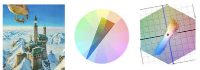
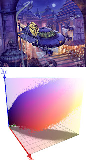
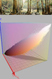
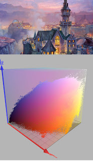
(If this embedded video doesn't play, try this link to YouTube). Each painting will be followed by an irregular shape that represents the range of colors used within that composition.
If you’ve read this blog for a while or dug back in the archives, you may remember seeing how we can chart a color scheme as a shape or gamut that takes up part of a color wheel. Everything outside the gamut is left out of the composition.
 The painting Palace in the Clouds, above, has a gamut limited to intense blue, opposed by fairly dull reds and yellows, and some fairly dull dark greens.
 To the right of that is a computer-generated image made by sampling all the pixels and charting them on a color wheel. The software was created by Phillipe Colantoni, and is available for Windows users at couleur.org.
 We can also combine the value or lightness data to see the color scheme as a 3D representation inside an RGB cube. The RGB color space is created by graphing red, green, and blue as three separate vectors in XYZ space. (The green vector above is hidden by the gamut.)
 Where the vectors intersect is pure black. At the opposite corner is pure white. In this configuration, the secondaries are cyan, magenta, and yellow, which would lie on the plane between each of the two vectors. A pure yellow, for example, would be on the plane formed by red and green (the horizontal plane in this view).
 By comparing each of the paintings with its gamut in RGB color space, and then comparing the gamuts to each other, you can see how the gamuts vary. The gamut for Crocodile Swamp is narrower because the color scheme is more limited. There are hardly any blues.
  The yellow windows in this scene show up as a scattering of yellow dots at the bottom of the gamut.
------
Software by P. Colantoni at couleur.org.
Animation by Lester Yocum at lesteryocum.com
Previously on GurneyJourney: Color Wheel Masking Update


9 comments:
This is an interesting way to look at the colors in a piece. It put in mind the color sphere concept:
http://en.wikipedia.org/wiki/Munsell_color_system
James, how much thought goes into the selection of the palette colors for a piece and how much of it is intuition at this point for you?
I have been eagerly consuming every word from your recent and past posts about color. I wish I could have learned all of this 20 years ago instead of stumbling about like I have.
I feel like my paintings will only get better.
THANK YOU!
Chris--My pleasure, thanks for reading.
Tyler, I don't methodically plan every composition, but often will use the gamut planning method when I'm doing an important piece or planning the color script for a longer work. The biggest challenge for me is to move beyond color mixing and color arranging habits, and to try new schemes that are right for a given picture.
James, maybe I'm just old school (or missing the point) but I don't understand the worth of that 3D video. What do you gain from looking at the model that you couldn't take from just squinting at your picture?
Justin, I know what you mean. It's just a different way of looking at a color scheme. There's not necessarily much practical value in it. But I find it reveals things that I didn't see just looking at the painting directly: such as the first one of the skimmer had a lot of clipping in the lights--that is, the gamut was bunched into the white corner of the cube.
James,
The clipping you mentioned seems odd as there doesn't appear to be much pure white in the image. Maybe, the color space that the software is using is smaller than that of the scanned image.
Jake
BTW, my sister gave me a copy of Dinotopia from your online store for Christmas and we were all quite impressed with the personalized inscription and drawing. Very cool! Thanks!
are there any simplified explanations anywhere that shows how to use this? I have the book but would love to find a working process to understand it.
Anon, I find that it's a real conceptual challenge to think of gamuts in three dimensions. To make practical use of gamut mapping for designing color schemes, it helps me to reduce them to a regular two dimensional color wheel.
3D Animation https://pinksquare.com/3d-animation/ : Precisely What Your Product Needs
The global animation market was valued at $254 billion by 2017. It has, however, become apparent that the rise was but the beginning. As animation makes its way into the world of marketing, we'll unquestionably see its popularity rise even higher.
3D animation is conventionally a reserve of the entertainment industry. This is simply because animation has kept us interested in cinemas for the longest time. The capability to captivate and motivate is in fact the key reason why animation is very popular among marketers these days.
Does 3D animation beat conventional methods of showcasing products?
Well, to be honest, it WORTH More Than THAT!
Just take a look at brand names such as Gillette and Apple. Take a look at the Gillette ads and you'll realize that a simple animation changed a lowly shave into an adventure. The big gain for the brand name is the perception the animation creates. Gillette sets itself apart from its rivals by taking this new strategy to marketing. The quality of the animation is considered reflective of the brand's quality. This is exactly what 3D product animation intends to achieve- to help you tower over the competition.
When 3d animation is utilized as a marketing tool, three main advantages are realized:
1.Prototyping Made Easy: Prototypes are costly. These pricey prototypes yield the necessary feedback but, what if you could have the feedback at a cheaper price? Well, now you can. 3D product animation models your product in a virtual world and exposes it to the market. This way, you have the feedback synonymous with prototypes without the expense.
2. First Impressions Come Once: Let's face it, most products are boring. Think about Gillette adverts without the entertaining 3D aspect. How dull would that have been?
3D product animation has the capability to transform even the most boring of products into a blockbuster. In the virtual world, any product gets exciting with a few 360-degree turns and just the correct amount of special effects. When done properly, animation will endear your brand to the relevant niche.
Apple's iPhone X is a good example of this trend. Its marketing relied greatly on 3D models. Some other brands including Microsoft, Huawei, and Samsung have also used 3D product animations. This is why it's so difficult to defeat these firms.
3. All about The Money: 3D product animation will help you save plenty of money. The 3D model can even be utilized to identify glitches in an unfinished product. Designers can modify the product after evaluating its model without physical prototyping.
Animation is also easily the most cost-effective marketing technique there is. With the increasing popularity of Virtual Reality (VR) and 3D printing, it helps to show that you're acquainted with the latest trends.
Your product can gain a lot from 3D technologies. The animation will provide your product an aura of suspense and class that the market simply finds irresistible. The animation procedure also makes the brand feel modern and worthy of a place in the modern market. You will be amazed to know how many excellent products fail to sell due to how they introduced themselves to the market.
Don't be part of that statistic. Spice things up. Turn your advertising into a 3D adventure. Everybody loves those, or don't you?
Post a Comment