A golf ball seems to be a solid object, incapable of flexing. But if you whack it hard enough, and film it with a fast enough camera, what appears rigid squishes and stretches like a water balloon.
Monday, May 31, 2010
Sunday, May 30, 2010
Jill the Farm Dog
Jill is a 14-year old border collie that lives on the farm. She only has three legs.
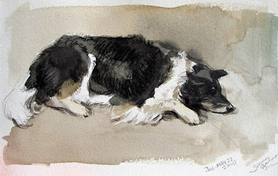
She lost her left hind leg eight years ago when a young stallion that she had been provoking kicked her. Lenny, the farmer, took her in for three operations, but finally they had to amputate.
She gets around OK on three legs, but now she has back problems and she’s deaf.
She likes to lie on the cool floor of the barn and watch the baby pigs through the slats of their stall door. Every time they move, she follows them with her eyes.
Labels:
Animals,
Watercolor Painting
Saturday, May 29, 2010
Introducing Color and Light
On Thursday I traveled to New York City to visit the Book Expo, the annual convention where the publishing industry presents the fall book titles.
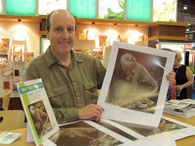 At the Andrews McMeel Publishing booth I signed posters for Color and Light: A Guide for the Realist Painter (224 pages, Fall 2010).
Andrews McMeel is known for their cartoon collections and gift books, but art books are something new for them. When I first presented the idea for Imaginative Realism a couple of years ago, the head of the company was a little skeptical whether there would be an audience for such a book.
Nevertheless, Andrews McMeel went all out to support the book, just as they did for Dinotopia: Journey to Chandara. The total commitment that they made was a great risk for them.
 It was a risk for me, too, but I was rescued by you, my audience. In the last six months since the release of Imaginative Realism, it has reached the #1 position on Amazon.com in the categories of both art instruction and painting, and I was surprised to learn that it is already in its third printing.
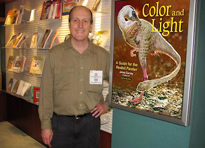 So I am very appreciative to of each of you readers of the book and the blog for helping support my work in the rough waters of this economy.
The advance response for Color and Light has also been very encouraging. Here is a sampling of some of the preliminary reaction:
Andrews McMeel Publishing's page on Color and Light
Amazon's page on Imaginative Realism and customer reviews
Order Imaginative Realism signed.
 At the Andrews McMeel Publishing booth I signed posters for Color and Light: A Guide for the Realist Painter (224 pages, Fall 2010).
Andrews McMeel is known for their cartoon collections and gift books, but art books are something new for them. When I first presented the idea for Imaginative Realism a couple of years ago, the head of the company was a little skeptical whether there would be an audience for such a book.
Nevertheless, Andrews McMeel went all out to support the book, just as they did for Dinotopia: Journey to Chandara. The total commitment that they made was a great risk for them.
 It was a risk for me, too, but I was rescued by you, my audience. In the last six months since the release of Imaginative Realism, it has reached the #1 position on Amazon.com in the categories of both art instruction and painting, and I was surprised to learn that it is already in its third printing.
  So I am very appreciative to of each of you readers of the book and the blog for helping support my work in the rough waters of this economy.
The advance response for Color and Light has also been very encouraging. Here is a sampling of some of the preliminary reaction:
“This is the book I wish I had in art school”
—Dylan Cole, Concept Art Director, Avatar
“This is the text book that we’ve been searching for but until now, never existed.”
—Mark Tocchet, Chair, Illustration, University of the Arts, Philadelphia
“There has been a profound lack of a clear and comprehensive volume on color and light for the representational painter until now. James Gurney’s outstanding new book gives traditional and digital artists the means to give accurate and compelling expression to their subject matter.”
—Nathan Fowkes, concept artist for DreamWorks and teacher at the L.A. Academy of Figurative Art
“James Gurney’s new book, Color and Light, cleverly bridges the gap between artistic observation and scientific explanation. Not only does he eloquently describe all the effects of color and light an artist might encounter, but he thrills us with his striking paintings in the process.”
—Armand Cabrera, Artist
"The world we all see is a light painting. Gurney gives you the tools you need to understand and paint the light you see."
Tobey Sanford, Photographer and Author of Capturing Light
“James Gurney’s book Color and Light is a rich compendium of practical information vital to any artist concerned with depicting visual reality. With a fresh intelligence, Gurney moves from foundation principles for creating form and premixing a palette, to advanced concepts of color gamut mapping. He gives us a new look at the traditional color wheel, and essential advice for the plein-air painter. I enthusiastically recommend this book to my students.”
—Ed Ahlstrom, Professor of Painting,
Montgomery College
Andrews McMeel Publishing's page on Color and Light
Amazon's page on Imaginative Realism and customer reviews
Order Imaginative Realism signed.
Labels:
Color and Light Book,
Imaginative Realism
Friday, May 28, 2010
Portrait Lighting: Split Lighting
Light that comes straight from the side is known as split lighting. The dividing line or terminator between light and shadow runs right along the center line of the face.
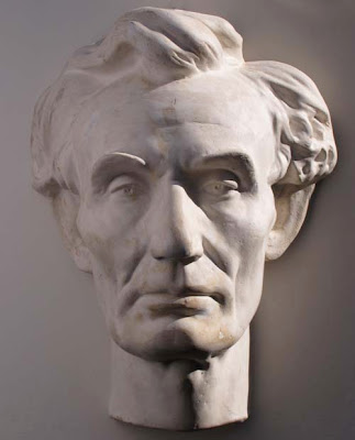 It’s not a light arrangement that you see too often, but it has its purpose, especially in film and comics. Because it places equal importance on the light side and the shadow side, it can convey the sense that the subject is a doppelganger, a person whose soul is a battleground of equal and opposing forces.
Like this fellow, for instance.
 One thing you get with split lighting is reflected light bouncing back into the nasolabial furrow (the smile crease). This bounced light is very warm because it comes off the nose, so the N.L. furrow will likely be the warmest skin tone in the face.
 It’s not a light arrangement that you see too often, but it has its purpose, especially in film and comics. Because it places equal importance on the light side and the shadow side, it can convey the sense that the subject is a doppelganger, a person whose soul is a battleground of equal and opposing forces.
Like this fellow, for instance.
 One thing you get with split lighting is reflected light bouncing back into the nasolabial furrow (the smile crease). This bounced light is very warm because it comes off the nose, so the N.L. furrow will likely be the warmest skin tone in the face.
Wednesday, May 26, 2010
BEA Signing Tomorrow
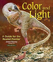
For those of you at the Book Expo in New York, tomorrow, Thursday May 27, I'll be signing posters for my upcoming book Color and Light: A Guide for the Realist Painter at 11:00-11:30 at Table 18, and from 1:00 to 1:30 at Andrews McMeel Publishing, Booth #3559.
 Above: a photo from the BEA in 2007. I'll resume the posts on portrait lighting on Friday.
More about Color and Light.
More about Book Expo.
Labels:
Color and Light Book
Portrait Lighting: Underlighting
Strong light doesn’t usually come from below a face, so when you see it, it grabs your attention. We tend to associate it with firelight or theatrical footlights, which can suggest a magical, sinister, or dramatic feeling.
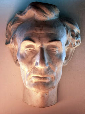 We hardly recognize family, friends, and celebrities when we see them with the light shining upward on their features.
Sources of light that shine upward are often strongly colored, either with the warm orange glow of firelight, or with the blue flicker of a computer screen.
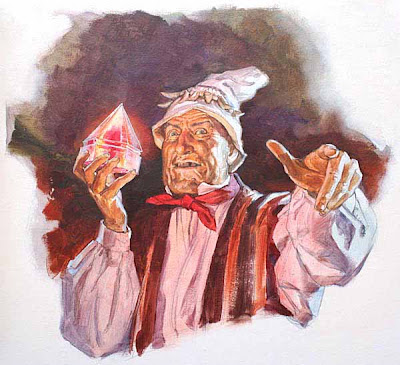 The portrait of the character Lee Crabb from Dinotopia, below, shows him at a dramatic moment when he wants to take control of a powerful glowing sunstone. The ruby-colored light from the sunstone gives him a threatening, power-mad look. The underlighting is combined with a strong, cool edge light from the right.
Not all upward light arrangements suggest drama or evil. A person relaxing with a sun-flooded book might have her face lit mainly by the reflected light, which would have positive connotations.
 We hardly recognize family, friends, and celebrities when we see them with the light shining upward on their features.
Sources of light that shine upward are often strongly colored, either with the warm orange glow of firelight, or with the blue flicker of a computer screen.
 The portrait of the character Lee Crabb from Dinotopia, below, shows him at a dramatic moment when he wants to take control of a powerful glowing sunstone. The ruby-colored light from the sunstone gives him a threatening, power-mad look. The underlighting is combined with a strong, cool edge light from the right.
Not all upward light arrangements suggest drama or evil. A person relaxing with a sun-flooded book might have her face lit mainly by the reflected light, which would have positive connotations.
Tuesday, May 25, 2010
Portrait Lighting: Frontal and Contre Jour
In frontal lighting, the light comes straight toward the form, so the planes get darker as they turn away.
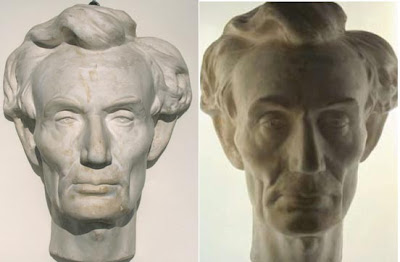 Contre-jour lighting is the opposite: The head is seen against a field of light, which spills over the edges of the form.
The planes that are darker in one are lighter than the other.
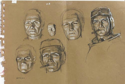 Here are some charcoal studies using frontal lighting that I did as reference for a portrait of a spaceman on a paperback book cover (below, left).
 I used contre jour lighting for the Asteroid Miner painting, right, which I did as a portfolio sample. I later sold the rights for a paperback cover, but the black type behind him sort of killed the effect.
Both frontal and contre jour lighting are a bit unusual, and can be used for dramatic or poetic effect.
-----
Previously: Contre Jour Lighting
Frontal Lighting
Asteroid Miner (without the type)
 Contre-jour lighting is the opposite: The head is seen against a field of light, which spills over the edges of the form.
The planes that are darker in one are lighter than the other.
 Here are some charcoal studies using frontal lighting that I did as reference for a portrait of a spaceman on a paperback book cover (below, left).
  I used contre jour lighting for the Asteroid Miner painting, right, which I did as a portfolio sample. I later sold the rights for a paperback cover, but the black type behind him sort of killed the effect.
 Both frontal and contre jour lighting are a bit unusual, and can be used for dramatic or poetic effect.
-----
Previously: Contre Jour Lighting
Frontal Lighting
Asteroid Miner (without the type)
Monday, May 24, 2010
Portrait Lighting: Top
In top lighting, the light comes straight down onto the head. It occurs often under a streetlight, a hallway light, or a noonday sun.
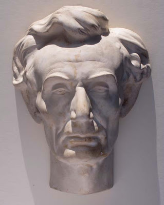
The forehead and the nose intercept most of the light. These parts of the face carry relatively little expression. The mouth and eyes, the chief agents of sympathy, are lost in shadow.
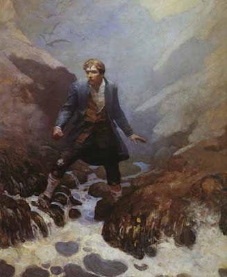 As a result, the subject’s emotion is masked. The effect can be threatening, mysterious, or inscrutable. Above: N.C. Wyeth, from Kidnapped.
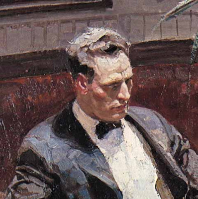 You probably wouldn’t want to use this lighting arrangement for portraits, but it can yield powerful effects for a dramatic entrance of a dangerous character, or for conveying a feeling of cool detachment. Above: Dean Cornwell.

The forehead and the nose intercept most of the light. These parts of the face carry relatively little expression. The mouth and eyes, the chief agents of sympathy, are lost in shadow.
 As a result, the subject’s emotion is masked. The effect can be threatening, mysterious, or inscrutable. Above: N.C. Wyeth, from Kidnapped.
 You probably wouldn’t want to use this lighting arrangement for portraits, but it can yield powerful effects for a dramatic entrance of a dangerous character, or for conveying a feeling of cool detachment. Above: Dean Cornwell.
Sunday, May 23, 2010
Portrait Lighting: Short
Let’s try lighting Abe by placing the light on the “short side” of the face—the farther, foreshortened side.
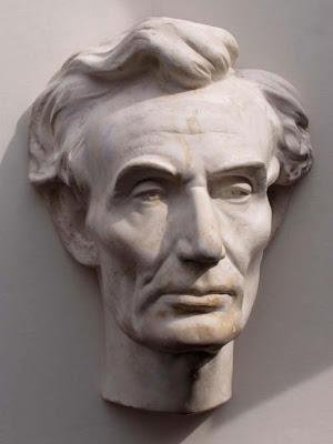 The lighted triangle now appears on the cheek closest to the viewer. Short lighting emphasizes the cheek contour, and it can help make a face look thinner.
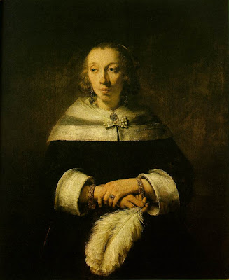 When short lighting is arranged so that the nose shadow merges with the shaded side of the face, many photographers call it “Rembrandt lighting.” Here’s Rembrandt’s “Lady with an Ostrich Fan,” a classic example.
As blog reader Rockhopper pointed out, some photographers use the term “Rembrandt lighting” more broadly for any three-quarter lighting, either broad or short. Rembrandt himself certainly used both broad and short lighting.
All of the arrangements we’ve seen so far are flattering and unobtrusive, good reasons why portrait painters and photographers have used them almost universally.
Rockhopper
 The lighted triangle now appears on the cheek closest to the viewer. Short lighting emphasizes the cheek contour, and it can help make a face look thinner.
  When short lighting is arranged so that the nose shadow merges with the shaded side of the face, many photographers call it “Rembrandt lighting.” Here’s Rembrandt’s “Lady with an Ostrich Fan,” a classic example.
As blog reader Rockhopper pointed out, some photographers use the term “Rembrandt lighting” more broadly for any three-quarter lighting, either broad or short. Rembrandt himself certainly used both broad and short lighting.
All of the arrangements we’ve seen so far are flattering and unobtrusive, good reasons why portrait painters and photographers have used them almost universally.
Rockhopper
Saturday, May 22, 2010
Portrait Lighting: Broad
When a face is turned slightly to the side, the nearer side appears wider or broader. It’s called the “broad” side, and the farther, foreshortened side is called the “short” side.

Light striking the broad side is called broad lighting. Mr. Lincoln here is lit “broad three-quarter.”
The portrait below of Arthur Denison and Bix, from Dinotopia: The World Beneath,
uses a low, broad, three-quarter light coming from the right. Note how the cheek on the shadow side has that inverted triangle we saw in the last post, a characteristic feature of three-quarter lighting.
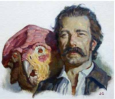 The forehead and cheekbone planes on the illuminated side are turned with color temperature, rather than with value. The blue color of those planes that angle back suggests the effects of light from a blue sky beyond, even though we can’t see any background in this vignette.
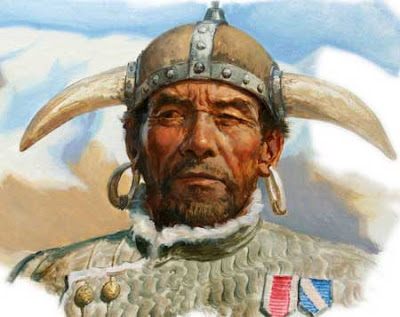 The dramatic broad lighting brings out character in this mountain man from Dinotopia: Journey to Chandara. The shadows help to define the wrinkles in the brow, and the low sun increases the squint.

Light striking the broad side is called broad lighting. Mr. Lincoln here is lit “broad three-quarter.”
The portrait below of Arthur Denison and Bix, from Dinotopia: The World Beneath,
uses a low, broad, three-quarter light coming from the right. Note how the cheek on the shadow side has that inverted triangle we saw in the last post, a characteristic feature of three-quarter lighting.
 The forehead and cheekbone planes on the illuminated side are turned with color temperature, rather than with value. The blue color of those planes that angle back suggests the effects of light from a blue sky beyond, even though we can’t see any background in this vignette.
 The dramatic broad lighting brings out character in this mountain man from Dinotopia: Journey to Chandara. The shadows help to define the wrinkles in the brow, and the low sun increases the squint.
Labels:
Dinotopia,
Journey to Chandara,
Lighting,
Portraits
Friday, May 21, 2010
Portrait Lighting: Three Quarter
How to light a head is one of the most basic decisions that every portrait artist makes. For the next ten posts or so, we’ll take a look at various types of lighting and the effects they give your portrait.
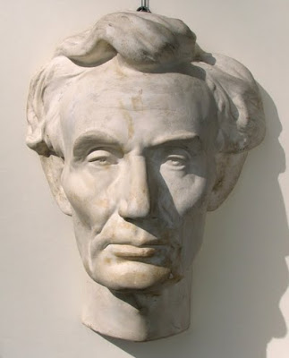
Most portraits are painted with light coming from about forty-five degrees in front of the model. The light reaches most of the visible form, leaving only a fraction of the form in shadow. The light is low enough to illuminate both eyes.
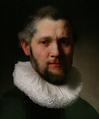 In this portrait by Rembrandt, the main light casts a shadow onto the man’s left cheek, leaving a lighted triangle on the shaded side.
This pattern is called three-quarter lighting since three-fourths of the form is illuminated. Three-quarter lighting is straightforward, clear, and flattering. It’s good to use if you want to capture a recognizable likeness.

Most portraits are painted with light coming from about forty-five degrees in front of the model. The light reaches most of the visible form, leaving only a fraction of the form in shadow. The light is low enough to illuminate both eyes.
 In this portrait by Rembrandt, the main light casts a shadow onto the man’s left cheek, leaving a lighted triangle on the shaded side.
 This pattern is called three-quarter lighting since three-fourths of the form is illuminated. Three-quarter lighting is straightforward, clear, and flattering. It’s good to use if you want to capture a recognizable likeness.
Thursday, May 20, 2010
Ringlets of Foam
In breaking waves, whitewater, or ships’ wakes, water currents pull foaming bubbles beneath the surface. Seen through the water, the foam appears warmer and darker. As it rises to the surface, it forms ringlets of bubbles around each spreading cell of rising water.
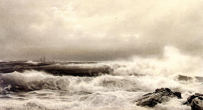 Above: William Trost Richards, “The Storm” (click to enlarge).
The bubbles quickly disperse as the upwelling cell of water travels outward.
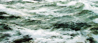 To make the foam appear to ride on the surface of the water, it should be painted last, while the underwater foam should be painted first. Above: A detail of an oceanscape by Montague Dawson (1895-1973). Full image at Animation Treasures
 Above: William Trost Richards, “The Storm” (click to enlarge).
The bubbles quickly disperse as the upwelling cell of water travels outward.
 To make the foam appear to ride on the surface of the water, it should be painted last, while the underwater foam should be painted first. Above: A detail of an oceanscape by Montague Dawson (1895-1973). Full image at Animation Treasures
Labels:
Paint Technique
Wednesday, May 19, 2010
Flag That Head
The upcoming June/July edition of International Artist magazine has the latest installment of my masterclass series.
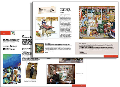 The topic is “Flagging the Head,” a compositional strategy introduced on this blog and in Imaginative Realism.
The magazine feature includes some art and photos not included elsewhere. The issue also contains fascinating features on artist’s studios and on travel sketching on the Arabian peninsula.
 The topic is “Flagging the Head,” a compositional strategy introduced on this blog and in Imaginative Realism.
 The magazine feature includes some art and photos not included elsewhere. The issue also contains fascinating features on artist’s studios and on travel sketching on the Arabian peninsula.
Labels:
Composition
Tuesday, May 18, 2010
Graduation Clichés
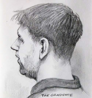 Note to commencement speakers: There are a few lines you might want to delete from your speeches. They’re nice sentiments, but we’ve heard them too many times already.
“I want to congratulate each of you on your journey.”
“Each of you has incredible talents.”
“This isn’t an end, but rather a beginning.”
“Always follow your passion.”
Labels:
Pencil Sketching,
Portraits,
Writing
Monday, May 17, 2010
Rockwell’s Palette
Here is Norman's Rockwell's palette as of 1946:
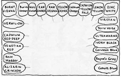
From Norman Rockwell, Illustrator, by Arthur Guptill. Thanks, Jason

“The arrangement of these colors on Norman’s palette may vary somewhat, but the accompanying sketch shows a typical disposition. The colors in capital letters are those most frequently used.
“The palette consists of a heavy adjustable drawing table (the metal stand type) on top of which is a large piece of white glass known as “milk glass.” Such a stand permits the raising or lowering of the palette to the desired height. It can be used horizontally or tipped to any degree. Norman has equipped his stand with a box designed to accommodate tubes of color.
“He keeps red at the left, yellows next, then white, and at the right his blues, greens, black, and miscellaneous colors. An attached shelf behind this box accommodates his brushes.”
From Norman Rockwell, Illustrator, by Arthur Guptill. Thanks, Jason
Labels:
Color,
Golden Age Illustration,
Paint Technique
Sunday, May 16, 2010
Monge's New Blog

Whimsical portraitist to the faerie world, Jean-Baptiste Monge has been posting on his blog about his work since he moved to Montreal, and he mentioned some of my monkeybusiness on yesterday's post.
Check out his website, which has a French version and an English version if you scroll down and click the link.
Loose vs. Tight Underdrawings
Blog reader and academic painting student Stephen J. asked me the following question:
“I, and some of my classmates, have been dealing with the issue of how much drawing one should do on the surface of a canvas (board, panel, paper etc) before jumping into paint. This is outside of the studies that are done beforehand and assumes that a drawing is not being transferred. Basically we've bumped into the issue of doing relatively tight, refined lay-ins in pencil and then completely losing those delicate drawings once paint is applied. Some of the teachers and students believe in "finding" the drawing with paint rather than doing a tight charcoal/graphite underdrawing. This could be related to the fact that most of our teachers here seem to advocate the thicker paint application of a certain style of Alla Prima, but I'm not sure.”
-
Dear Stephen:
I practice and recommend both extremes, depending on the picture. When I'm painting outdoors on location or doing a portrait from life, I completely find the subject with the brush (no pencil drawing at all), beginning with spots, big divisions, and measurements.
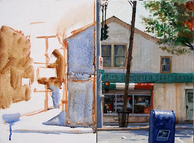 Here’s the loose lay-in demonstrated on a 9x12 inch plein-air study, shown with the finish on the right half and the first statement on the left.
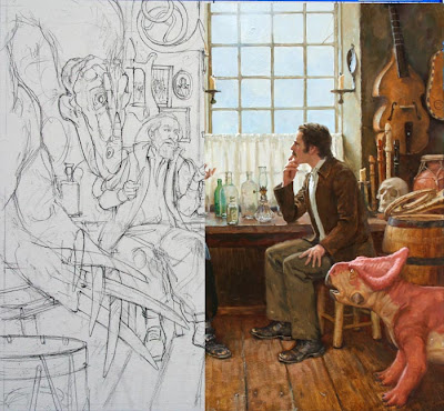 With other pictures, however, it's a different story. In this painting from Dinotopia: Journey to Chandara, I did a careful pencil drawings directly on the final surface, and I sometimes work out the drawing on a separate piece of paper.
With a very complex subject, like a sinking Civil War sailing ship, there's no other way I can imagine approaching it.
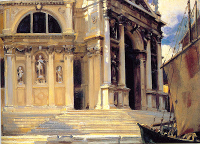 Sargent, the maestro of alla prima, sometimes did very careful pencil drawings before he tried to tackle some of his Venetian studies of architecture. Richard Ormond’s new book on his Venetian work includes a reproduction of a line drawing that he did to work out the perspective of the church of Santa Maria della Salute.
With an imaginary scene with a lot of figures, historical elements, mechanical forms, lettering, or anything of that kind, I recommend following something like Rockwell's method of the separate full size charcoal comprehensive, or "cartoon" as they used to call it. Of course that practice in one form or another goes back to many of the old masters.
The charcoal comprehensive pays dividends because you're not trying to solve basic problems with paint. It’s much easier to do either a line drawing or a full-on tonal study as Lovell tended to do. On top of that, it really helps to do small tonal studies and color studies.
Once you've worked out your picture you can be confident of the painting. If the drawing is "saved" in a separate tracing, you should paint boldly with no fear of covering up lines. You can always find them again if you need to.
It should be said that there are others who got great results with complex multi-figure scenes without always doing the comprehensive preliminary drawing. They bravely “found it” in the paint, and the painting shows the fascinating struggles.
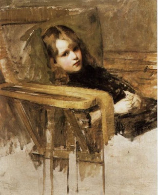 They would include Howard Pyle, Lawrence Alma-Tadema, and John William Waterhouse (above).
I’ve also seen demos by Richard Estes and Frank McCarthy, which show a ‘find-it-in-the-paint’ approach on at least some paintings.
You can figure out these methods by looking at half-finished paintings, in strokes of overpainted elements or pentimenti that have transparentized, or in the edges of the picture normally hidden by frames.
Waterhouse from “I am a Child” website.
More about the charcoal comprehensive and preliminary drawings in my book Imaginative Realism.
“I, and some of my classmates, have been dealing with the issue of how much drawing one should do on the surface of a canvas (board, panel, paper etc) before jumping into paint. This is outside of the studies that are done beforehand and assumes that a drawing is not being transferred. Basically we've bumped into the issue of doing relatively tight, refined lay-ins in pencil and then completely losing those delicate drawings once paint is applied. Some of the teachers and students believe in "finding" the drawing with paint rather than doing a tight charcoal/graphite underdrawing. This could be related to the fact that most of our teachers here seem to advocate the thicker paint application of a certain style of Alla Prima, but I'm not sure.”
-
Dear Stephen:
I practice and recommend both extremes, depending on the picture. When I'm painting outdoors on location or doing a portrait from life, I completely find the subject with the brush (no pencil drawing at all), beginning with spots, big divisions, and measurements.
 Here’s the loose lay-in demonstrated on a 9x12 inch plein-air study, shown with the finish on the right half and the first statement on the left.
 With other pictures, however, it's a different story. In this painting from Dinotopia: Journey to Chandara, I did a careful pencil drawings directly on the final surface, and I sometimes work out the drawing on a separate piece of paper.
 With a very complex subject, like a sinking Civil War sailing ship, there's no other way I can imagine approaching it.
 Sargent, the maestro of alla prima, sometimes did very careful pencil drawings before he tried to tackle some of his Venetian studies of architecture. Richard Ormond’s new book on his Venetian work includes a reproduction of a line drawing that he did to work out the perspective of the church of Santa Maria della Salute.
With an imaginary scene with a lot of figures, historical elements, mechanical forms, lettering, or anything of that kind, I recommend following something like Rockwell's method of the separate full size charcoal comprehensive, or "cartoon" as they used to call it. Of course that practice in one form or another goes back to many of the old masters.
The charcoal comprehensive pays dividends because you're not trying to solve basic problems with paint. It’s much easier to do either a line drawing or a full-on tonal study as Lovell tended to do. On top of that, it really helps to do small tonal studies and color studies.
Once you've worked out your picture you can be confident of the painting. If the drawing is "saved" in a separate tracing, you should paint boldly with no fear of covering up lines. You can always find them again if you need to.
It should be said that there are others who got great results with complex multi-figure scenes without always doing the comprehensive preliminary drawing. They bravely “found it” in the paint, and the painting shows the fascinating struggles.
 They would include Howard Pyle, Lawrence Alma-Tadema, and John William Waterhouse (above).
 I’ve also seen demos by Richard Estes and Frank McCarthy, which show a ‘find-it-in-the-paint’ approach on at least some paintings.
You can figure out these methods by looking at half-finished paintings, in strokes of overpainted elements or pentimenti that have transparentized, or in the edges of the picture normally hidden by frames.
Waterhouse from “I am a Child” website.
More about the charcoal comprehensive and preliminary drawings in my book Imaginative Realism.
Labels:
Dinotopia,
Journey to Chandara,
Paint Technique
Last Day for Dinotopia in Delaware

Today is the last day for the exhibition of Dinotopia originals at the Delaware Museum of Art. The next stop will be the Norton Museum of Art in West Palm Beach, Florida, which opens June 5 and runs through September 5.
Labels:
Dinotopia,
Museum Visits
Saturday, May 15, 2010
N.C. Wyeth's Studio
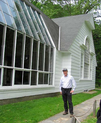 Yesterday we had the chance to visit N.C. Wyeth's studio. He built his home and studio in Chadd's Ford, Pennsylvania using the proceeds from the success of his illustrations for Treasure Island, which was published in 1911.
 The studio has a large north-facing Palladian window, as well as an even larger greenhouse window on a wing of the studio added later to accommodate his mural commissions.
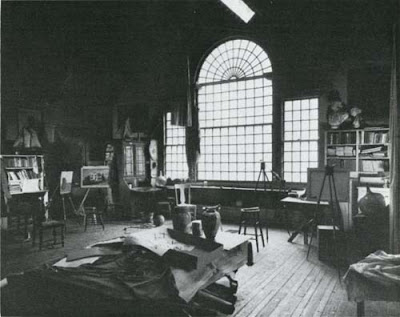 This historic photo shows the studio in Wyeth's time. It was kept intact fortunately, so all the props, costumes, and references are still there.
 There are ship models, death masks of Lincoln and Beethoven (his favorite composer), a gun collection, horse ecorches, an authentic birchbark canoe, a native American drum, a skull with a bowler hat, saddles, and a lantern slide projector, which he used for projecting up his preliminary drawings.
His large handheld palette, kept intact from the day from the day he died, seemed to contain (as near as I could tell from looking at it): white, cadmium yellow light, cadmium yellow deep, yellow ochre, raw sienna, cadmium red, alizarin crimson, Venetian red, burnt sienna, raw umber, burnt umber, ultramarine blue, viridian green, and black.
 This drawing by a teenage Andrew Wyeth shows N.C. at work, with the light conditioned by drapes dangled from the window.
 The studio wasn't electrified until 1923, so until then he could only work by daylight. Once they brought in power, Wyeth installed a state-of-the-art artificial lighting system of twelve 200-watt light bulbs, most of which are still working.
That was before the light bulb manufacturers came up with their most lucrative innovation: planned obsolescence.
The studio can be visited in spring, summer, and fall by guided tour from the Brandywine River Museum in Chadd's Ford, PA. Information and more photos.
Thanks, Jason, Jane, and Gail
Labels:
Golden Age Illustration
Friday, May 14, 2010
Window Light
Interior scenes in daylight are often lit by the light that enters the room through windows or open doors. This light has traditionally been popular with artists because of its constancy and its simplifying effect.
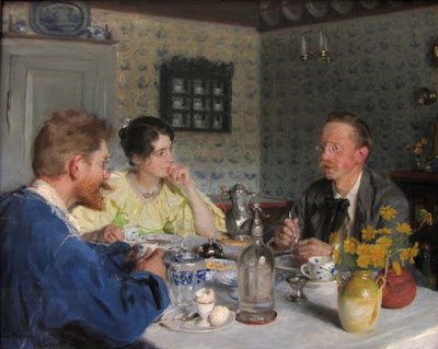 Assuming the sun is not shining directly through the window, the daylight that enters a room from outside is a soft source, meaning the light comes from a broad area and it doesn't cast hard-edged shadows. In this group portrait by Peder Krøyer (1851-1909), note how the shadow cast by the vase quickly dissolves into blurry edges.
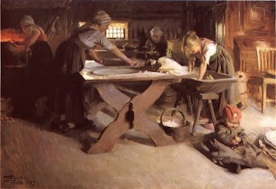 When window or doorway light falls on a floor, there's often a lot of fall-off, or weakening of the light, as you travel back from the window, as with this interior scene by Anders Zorn (1860-1920). This is because the amount of window light available is usually in proportion to how large a slice of the blue sky you can see from a given point in the room.
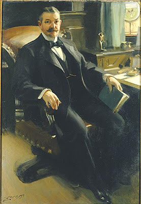 Even though Zorn used a very limited palette, he loved to play with the relationship between the slightly cool window light and the relatively warm interior light from incandescent or flame-based lamps.
Thanks, Tim A. And thanks to BoingBoing for picking up the studio shot.
See a bunch more high-res images by Krøyer at Tim's blog.
 Assuming the sun is not shining directly through the window, the daylight that enters a room from outside is a soft source, meaning the light comes from a broad area and it doesn't cast hard-edged shadows. In this group portrait by Peder Krøyer (1851-1909), note how the shadow cast by the vase quickly dissolves into blurry edges.
 When window or doorway light falls on a floor, there's often a lot of fall-off, or weakening of the light, as you travel back from the window, as with this interior scene by Anders Zorn (1860-1920). This is because the amount of window light available is usually in proportion to how large a slice of the blue sky you can see from a given point in the room.
 Even though Zorn used a very limited palette, he loved to play with the relationship between the slightly cool window light and the relatively warm interior light from incandescent or flame-based lamps.
Thanks, Tim A. And thanks to BoingBoing for picking up the studio shot.
See a bunch more high-res images by Krøyer at Tim's blog.
Labels:
Lighting
Wednesday, May 12, 2010
3-D Ramp Illusion
This video shows a 3-D optical illusion where balls appear to roll uphill. Thanks, Colin (via BoingBoing)
Labels:
Visual Perception
Studio Shot in ImagineFX
ImagineFX magazine asked me to take a picture of my studio (click to enlarge), and to add a few comments about the work environment:
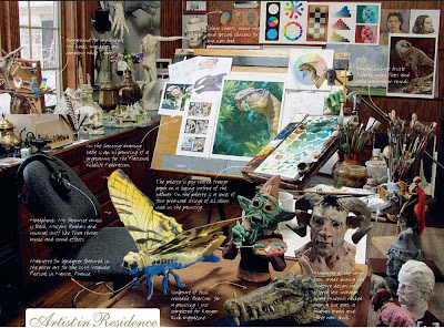 “I specialize in painting realistic images of things that can’t be photographed. My imagination only takes me so far, so I sculpt 3D reference maquettes. In the foreground is a butterfly ornithopter, an elf alien, a BoarCroc, and a satyr.
The day starts with a few cups of strong coffee, or sometimes tea from the pot I found on a research sketching trip to North Africa in 2008. Not all of my sketching junkets are so exotic. I also sketch in fast-food parking lots and farmyards. Some of the oil sketches on the back wall are from observation. The cloud study was painted on a July day. The two head studies come from a figure drawing class.
Beyond the Alladin’s lamp is a set of dip pens. I began my art life as a calligrapher, and I still love to write letters in the Copperplate style. Maybe it’s a reaction to the blandness and transience of email.
The human skull on the counter is a drawing aid and a memento mori. Behind it are architectural maquettes made of cardboard and Styrofoam. The hand-painted color wheels and optical illusions are for my upcoming book called Color and Light: A Guide for the Realist Painter, a companion volume to Imaginative Realism.
The dinosaur painting is surrounded by skull photos, sketches, and a reference maquette. The premixed strings of oil colors on the freezer paper palette help me control the mixing gamut of the color scheme I want.”
Pick up a copy of ImagineFX at your local bookstore, and check out their website at ImagineFX.com
More about that painting of the dinosaur on the table: Gryposaurus Part 1, Part 2
Interesting post on artists' studios on David Apatoff's blog Illustration Art.
Labels:
Lettering,
Paint Technique
Tuesday, May 11, 2010
Matania’s Models and Props
Fortunino Matania’s father was one of the best known painters and illustrators of Italy. He taught his son not only to paint and draw, but also to model, carve, and work in metal or wood.
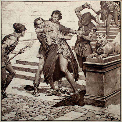 Above: Fortunino Matania (1881-1963), ”Rienzi, Roman Deliverer,” Brittania & Eve, February,1931.
Young Fortunino was a child prodigy, sculpting a whole zoo full of animals at age 11. By age 13 he was working as an illustrator for Italy’s primary illustrated journal.
He made furniture in the style of Rome and other classic eras, and he made replicas of historic costumes, and miniature figures from Egyptian and Elizabethan times. (Source: Percy Bradshaw, The Artist magazine, April, 1943)
Matania’s grandson, Robert, told me in a recent letter:
“My grandfather died when I was 9 years old….I remember sitting with him sometimes while he painted and chose some of the colours. From what my aunt told me, when I was older, he had many models that came to his studio and posed and he also used members of the family. I have seen several paintings where one can see objects from his studio such as mantelpieces and furniture etc.
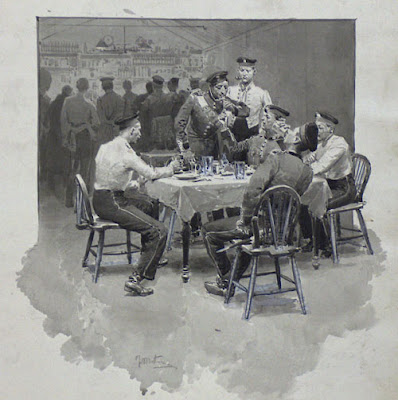 “I remember he would make a light but fairly detailed sketch before painting because in some of his water colours one can still see the pencil lines especially where he decided to make changes.
“He painted many scenes from Roman history and he would often make certain objects himself and then use them in his paintings. He constructed accurate replicas of Roman furniture complete with mother of pearl decoration as he was a skilled carpenter and cabinet maker.”
-------
Thanks, Robert!
Book Palace is in the process of publishing a book on Matania, and their website has many excellent reproductions
Previously on GJ: Matania, Without a Net (An eyewitness account where an observer watches him work with no references).
 Above: Fortunino Matania (1881-1963), ”Rienzi, Roman Deliverer,” Brittania & Eve, February,1931.
Young Fortunino was a child prodigy, sculpting a whole zoo full of animals at age 11. By age 13 he was working as an illustrator for Italy’s primary illustrated journal.
He made furniture in the style of Rome and other classic eras, and he made replicas of historic costumes, and miniature figures from Egyptian and Elizabethan times. (Source: Percy Bradshaw, The Artist magazine, April, 1943)
Matania’s grandson, Robert, told me in a recent letter:
“My grandfather died when I was 9 years old….I remember sitting with him sometimes while he painted and chose some of the colours. From what my aunt told me, when I was older, he had many models that came to his studio and posed and he also used members of the family. I have seen several paintings where one can see objects from his studio such as mantelpieces and furniture etc.
 “I remember he would make a light but fairly detailed sketch before painting because in some of his water colours one can still see the pencil lines especially where he decided to make changes.
“He painted many scenes from Roman history and he would often make certain objects himself and then use them in his paintings. He constructed accurate replicas of Roman furniture complete with mother of pearl decoration as he was a skilled carpenter and cabinet maker.”
-------
Thanks, Robert!
Book Palace is in the process of publishing a book on Matania, and their website has many excellent reproductions
Previously on GJ: Matania, Without a Net (An eyewitness account where an observer watches him work with no references).
Labels:
Golden Age Illustration,
Miniatures
Monday, May 10, 2010
Frank Frazetta 1928-2010
 According to Locus Online and Comic Book Resources, fantasy and comics artist Frank Frazetta has died of a stroke at the age of 82.
 Frazetta revived the field of fantasy art with a fresh sense of the iconic image, drawn from his own vivid sense of drama and conflict. His moon maidens, thundering dragons, and sword-wielding barbarians took on a powerful life of their own, which shaped the imagination of many artists working today, me included.
I had the privilege of working as a background painter on his animated film Fire and Ice, released from Baskhi productions in 1983 (poster image above). We always tried to get Frank to give the studio a class on figure drawing and composition, but he never did, probably because much of what he did was intuitive. That intuition, combined with a fierce confidence in the power of pure imagination, made his images unforgettable and truly immortal.
Fire and Ice movie trailer on YouTube
Obit in the Washington Post
Color Scheme Designer
A free online interactive tool called Color Scheme Designer lets you play with color relationships. You start by selecting the type of color scheme, such as monochromatic, complementary, or triadic (The small circles at top left).
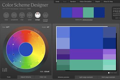 You can dial the scheme around the wheel by placing your cursor onto the floating dark dot. In this way you can see how color relationships change. Here’s a set of cool analogous colors.
 The color swatches on the right are from a complementary scheme playing blues against orange-yellows. The swatches that come out are automatically produced in a variety of values.
For the designer or decorator, this tool is an interesting way to stimulate new ideas and try things on for size.
Color Scheme Designer
Thanks, Gene
 You can dial the scheme around the wheel by placing your cursor onto the floating dark dot. In this way you can see how color relationships change. Here’s a set of cool analogous colors.
 The color swatches on the right are from a complementary scheme playing blues against orange-yellows. The swatches that come out are automatically produced in a variety of values.
 For the designer or decorator, this tool is an interesting way to stimulate new ideas and try things on for size.
Color Scheme Designer
Thanks, Gene
Labels:
Color
Sunday, May 9, 2010
Loading
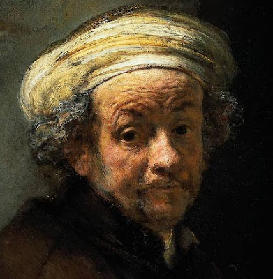
“Loading is a term applied to laying colours in thick masses on the lights, so as to make them project considerably from the surface, with the view of their being strongly illuminated by the light that falls on the picture, and thus mechanically to aid in producing roundness and relief, or in giving a sparkling effect to polished or glittering objects ; this artifice however, must be had recourse to sparingly, otherwise it defeats its own object, and gives the execution a coarse and vulgar air.”
—From an 1845 painting manual
Detail from a Rembrandt self portrait.
Previously on GJ: Impasto
Labels:
Paint Technique
Saturday, May 8, 2010
Christen Købke
Christen Købke (1810-1848) was a realist painter who produced scrupulously observed landscapes and portraits. Unfortunately, he is not well known outside of his native Denmark.
 This oil portrait of an old sailor dates from 1832, when he was just 22 years old.
 The paintings of Købke (pronounced keub-kuh) were penetrating and uncompromising in their realism, placing him in the company of Thomas Eakins, Adolf von Menzel, Ivan Kramskoi, and John Constable.
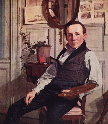 Købke was active in the 1830s, during Denmark’ Golden Age. This was the time of Hans Christian Andersen and Søren Kierkegaard.
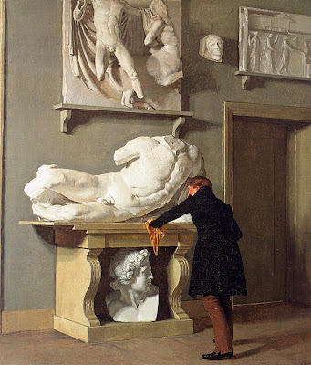 Why is he not better known? His paintings are very small (the sailor portrait is 12 x 10 inches); they show modest subjects; he didn’t sell paintings or otherwise engage with the critical establishment or the marketplace; few of his paintings left Denmark; and he died fairly young.
There’s a good book in English on him written by Sanford Schwartz (Timken Publishers, 1992) though the reproductions are small on the page.
Wikipedia
Exhibit through June 13 at London's National Gallery. (Video included on link).
 This oil portrait of an old sailor dates from 1832, when he was just 22 years old.
 The paintings of Købke (pronounced keub-kuh) were penetrating and uncompromising in their realism, placing him in the company of Thomas Eakins, Adolf von Menzel, Ivan Kramskoi, and John Constable.
  Købke was active in the 1830s, during Denmark’ Golden Age. This was the time of Hans Christian Andersen and Søren Kierkegaard.
  Why is he not better known? His paintings are very small (the sailor portrait is 12 x 10 inches); they show modest subjects; he didn’t sell paintings or otherwise engage with the critical establishment or the marketplace; few of his paintings left Denmark; and he died fairly young.
There’s a good book in English on him written by Sanford Schwartz (Timken Publishers, 1992) though the reproductions are small on the page.
Wikipedia
Exhibit through June 13 at London's National Gallery. (Video included on link).
Labels:
Academic Painters
Subscribe to:
Posts (Atom)


