


 Welcome to the GJ Book Club. Today we'll cover pages 192-216 of the chapter on "Tone and Colour Design," from Harold Speed's 1924 art instruction book Oil Painting Techniques and Materials
I'll present Speed's main points in boldface type either verbatim or paraphrased, followed by my comments. If you want to add a comment, please use the numbered points to refer to the relevant section of the chapter.
 |
| Veronese—Allegory of Love: Infidelity |
Speed does a diagrammatic analysis of the painting, and notes the large arc formed by the woman's arms and shoulders.
2. Warm and Cool Color
Speed groups the following as cool colors: lemon yellow, green, greenish blue and full blue.
Warm colors include orange yellow, orange, orange red and full red. Purple is on the dividing line.
3. If the colors are very vivid and violent they will tend to make their complementary colors tell in the picture.
Harmony and contrast are not always in agreement. More of one quality makes for less of the other.
4. When the color introduced is of a quieter order, those similar to it in the other parts of the picture sing up in sympathy.
For example, a blue note will bring out all the cool colors.
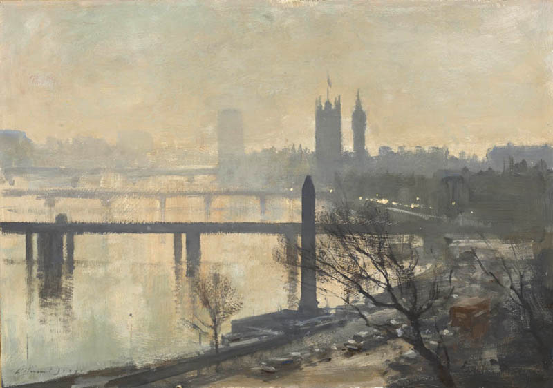 |
| Seago --Thames Embankment |
5. The picture that has a prevailing unity of hue, but is full of color varieties subtly introduced in the tones is one of the most beautiful of schemes.
With all the coal smoke in Speed's day, London subjects were often gray days, mostly monochromatic schemes with subtle color—He advises not to overdo it trying to make a pretty picture. Important to get the sober feeling. The prevailing hue must never be of a very pronounced color, but always in the more neutral range.
6. The selection of too many varieties of colour masses should be avoided....A lavish display is apt to be vulgar.
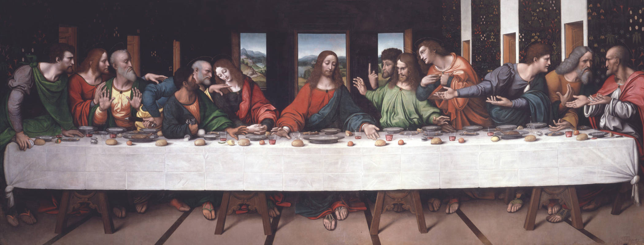 |
| Giampietrino Last Supper ca. 1520 after Leonardo |
8. Arrange masses of color so that warm colors are grouped together and cold colors together.
Kind of like shape welding using color temperature instead of value.
Kind of like shape welding using color temperature instead of value.
9. "Whenever any composition device becomes too obvious, one's sympathy is alienated."
Speed cautions against making the contrasts too violent, and leaves that for the poster designer.
10. Begin planning your color scheme with the broad idea and let the varieties be added to this large intention.
11. White masses always need very careful designing, as they catch the eye.
 |
| Harold Speed -- The Alcantara, Toledo |
 |
| Sargent Wyndham sisters. |
13. Grouping multiple white masses into a larger mass.
White needs careful observing. Beware of harsh chalky whites.
14. When painting outdoors, it's easier to get the overall color impression, but when painting from imagination, it's harder to invent a convincing color statement.
Beware of using blue too much as a unifier.
15. Good exercise: Start with a black and white reproduction and invent various color schemes consistent with those tonal values.
16. Two sources of inspiration: the study of nature and the study of the best art of all times.
These are also the keys to freeing oneself from the fashion of the moment, says Speed.
17. Page 211. "What a better world we might have if real experts were allowed to control the formation of our habits, and were consulted by those in authority when anything demanding taste came up for discussion."
Speed goes on a rant here. He argues that ordinary people end up preferring art of lower standards merely from habit, because they're not exposed to finer things. His appeal for a cultural elite must have seemed like a reasonable bastion against the artistic excesses of his time, but I don't think such a top-down program would work in free countries, particularly given the penchant for artists to defy authority.
Today the aesthetic standards are largely defined by commerce. In the USA art lives or dies in the marketplace, with art that sells for higher prices or movies that make big box office results being justified on those terms.
However, the Internet has fostered the growth of a citizen band of book critics, movie commentators, and teachers of form and style. And the Internet has also introduced crowd-sourcing as a new model of funding and distribution. This crowd-sourced check-valve on the arts has changed how and why creators do what they do. I wonder what Speed would have thought of it.
However, the Internet has fostered the growth of a citizen band of book critics, movie commentators, and teachers of form and style. And the Internet has also introduced crowd-sourcing as a new model of funding and distribution. This crowd-sourced check-valve on the arts has changed how and why creators do what they do. I wonder what Speed would have thought of it.
18. Art takes patience to appreciate.
Speed says, "The mind only opens to the reception of ideas and experiences that are beyond one's present capacity." He says that art takes patience and reverence to really appreciate. He tells the story of the young museum-goer asking him to explain the merits of an old master to him. Speed advocates spending time with older painters and "getting past the brown varnish" to understand its retiring qualities.
Speed says, "The mind only opens to the reception of ideas and experiences that are beyond one's present capacity." He says that art takes patience and reverence to really appreciate. He tells the story of the young museum-goer asking him to explain the merits of an old master to him. Speed advocates spending time with older painters and "getting past the brown varnish" to understand its retiring qualities.
19. Beware the "one better" type.
He might be referring to Cubists and Fauvists, and he makes specific reference to poster designers, all artists in his opinion who strive for effect by making extreme statements. Speed is always a voice for restraint, reserve, and balance.
 Next week—We'll continue with Materials on page 217.
GurneyJourney YouTube channel
My Public Facebook page
GurneyJourney on Pinterest
JamesGurneyArt on Instagram
@GurneyJourney on Twitter
 Next week—We'll continue with Materials on page 217.
-----
In its original edition, the book is called "The Science and Practice of Oil Painting ." Unfortunately it's not available in a free edition, but there's an inexpensive print edition that Dover publishes under a different title "Oil Painting Techniques and Materials
 (with a Sargent cover)," and there's also a Kindle edition.
----GurneyJourney YouTube channel
My Public Facebook page
GurneyJourney on Pinterest
JamesGurneyArt on Instagram
@GurneyJourney on Twitter
4 comments:
"11. White masses always need very careful designing, as they catch the eye."
The late, great, gardener/writer Christopher Lloyd had a line on white that I've never forgotten -
"Cold, staring and assertive, white catches your eye and makes you wish it hadn't."
"17. Page 211. "What a better world we might have if real experts were allowed to control the formation of our habits, and were consulted by those in authority when anything demanding taste came up for discussion."
I have a lot of sympathy for his views here, which I will resist turning into a rant of my own, but one day - after I have been swept to power - the architects will head my list.
Chuey: "Uh Oh! Here come the guys with the Clip-Boards!"
Lil' Squint: "Quick, down the alley and over the fence, I'll meet you by the river."
Ross/Bobby, I know what you mean, having been lost yesterday several times in a badly designed building on a college campus yesterday. Architecture is in a different category because you don't have to look at a painting, but we all have to use buildings. The only person that doesn't have to suffer from them is the architect himself. I would like to hope that bad architects will be consigned to a Hadesville filled with their own design errors.
Over here the contemporary campus buildings are reserved for the architects whose work is considered the most topical. That can be unkindly read as the most expensive, bewildering, useless, pretentious, craftless mish mash of unresolved CAD wet dreams imaginable. Grand gestures signifying nothing, devoid of ornament, connection and tradition and the whole pitiable mess overlaid with text borrowed from some dead, obscure, irrelevant French social theorist.
One day we shall have our march James......
Regards Ross
:)
Post a Comment