 |
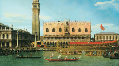
| Canaletto, The Bucintoro at the Molo on Ascension Day |
Nowadays most oil painters would go for a general overall impression first and refine it further and further with spots of paint.

Canaletto is rhythmic and precise, like visual music. The way he achieved this look was by painting the big background tones first. When those tones were completely dry, he would go back in with paint on a long thin brush and define the smaller forms almost like calligraphy.
Because of the drying time, I would guess that he would have had several canvases going at the same time.
Overlapping forms like figures and boats were painted from background to foreground. So those stairs going down to the water were painted all the way across and allowed to dry before the figures were added over them.
As the paint has transparentized slightly over the centuries, you can see the earlier layers through the figures.


8 comments:
The Basic rule " thin darks to opaquer Lights in the foreground " used in Oil ,actually leads to the Same procedure.
Or am i making a cognitive mistake Heere?
The word of the day: Transparentized
James, on painting programs on my computer I realized that if I lowered the chroma of a color, especially yellow, it looks darker. I made a sphere with gradating chromas of yellow where all the tonal levels were exactly the same, but the chromas were lowered. The lowest chroma yellow looked the darkest, and I used that for the shadow side, and I made gradating yellows of higher and higher chromas for the parts of the sphere going towards the light, with the pure chroma yellow for the highlight. It really looked like the lowest chroma yellow was darker, and even if I squinted my eyes the pure yellow looked much brighter than the low chroma brownish yellow. But they were all set to be exactly the same tone. Then to check, I made the image black and white to check the tones, and they all resolved into exactly the same grey tone and that proved that they all were exactly the same tones. But when I put the chroma of the colors back, the low chroma yellow again looked much darker than the pure chroma yellow. Is this a well known phenomenon of color?
Robert, that's the Helmholtz-Kohlrausch Effect! There's an entry on Wikipedia about it.
Paolo Rivera, awesome, thanks. I don't know if I would have ever come across the Helmholtz-Kohlrausch Effect if it weren't for your message. So thanks, I really appreciate it.
IPPOLITO CAFFI another great Venetian painter used to paint the very same way. I hade the opportunity to check him out the past summer in Venice where there was an exposition going on . If you don't know him , you should definetly check him out :-D
This work lacks the emphasis or focal point that I look for in "a painting"--my modern sensibilities talking? So, It feels a little dull/"where's the point"?
I mention this because I was pleased and surprised how much interest and life your crops (and call outs) brought back into the image for me--even the colors seem more saturated! I especially like the boating scene, and the calligraphic comparison added a lot of life and movement for me.
Perhaps our modern opportunities of travel and wide availability of photography also make it harder to get excited about this image "as is", too.
Berit, Yeah, as I look at it, the painting strikes me as unnaturalistic in a lot of ways, especially the way all the boats are so parallel to the picture plane.
Ghostvillage, thanks for mentioning IPPOLITO CAFFI. Didn't know about him.
Gyrus, Yes, normally you would proceed in that way, but Canaletto was using a lot more overlapping strokes in oil, a style that resembles the way you would paint in gouache or casein.
Robert and Paolo, thanks for mentioning the Helmholtz–Kohlrausch effect. I always wondered about the way fluorescent colors look lighter than the paper they're painted on. Is that because they're converting UV to visible light and actually reflecting more visible light than white paper, or is it because of the H-K effect?
Berit, It's true Canaletto’s pictures lack a central focus, not only in comparison with more recent compositional conventions, but also in contrast with generations of Venetian masters that preceded him. To be fair, you have to see the scale of these in person as you can easily get involved in the details the James posted here. Also, it helps to consider that his clientele were mostly English tourists making extended stays in Venice, measured not in days, but months, and were looking for something of the spectacle of the city itself, and on that score, he delivered. Other than festival pictures, such as in this example, his subject was mostly the architecture of the city itself, its exotic waterways, and its many monuments – all of which his patrons would have learned a lot about over lengthy stays there. His large, super-wide views served as sun-drenched visual encyclopedias rich with architecturally significance, not only for structures themselves, but for the hidden art treasures they contained (and still contain) inside. As you suspect, the overwhelming availability of photography today undercuts what Canaletto and others view painters accomplished. That started in the 19th century, when much cheaper photographs became available for travelers making much shorter stays. Now it's hoards of day travelers with selfie sticks. But still an experience not to be missed.
Post a Comment